“Oh man, sorry, my big thumbs!” my friend says, half laughing next to me. “Oh my god, now I’ve lost it!” I peer over my shoulder to glance at her screen – the film we want to see is starting in two minutes, and we’ve spent the last 10 trying to buy the tickets on her phone.
“We’re definitely going to miss the previews -” I start to say. “Sorry, walking and scrolling is hard!” She says huffily.
I see her scrolling and pinching the screen, presumably trying to find the ‘confirm payment’ button she’d been having trouble with earlier.
“Ok seriously, where is the stupid button?” She hits the back arrow.
“Oh nooo, don’t do that!” I say. “You’re going to have to enter your card details all over again!” “Let’s just buy the tickets when we get there at the counter. I know there’ll be a line, but this site is useless.”
“Ok fine,” my friend says, pocketing her phone. We both sprint to the cinema.
This little scenario begs the question – could that user experience have been better by simply adding a stick-to-scroll CTA? The short answer: Yes.
The Mobile Mind Shift, Thumb Zone and Thinking Contextually
“Our lives have become a collection of mobile moments in which we pull out a mobile device to get something done immediately wherever we are.”
Forrester Research’s Ted Schadler wrote these words when describing his idea of the ‘mobile mind shift’ back in 2014.
He was describing the impact of mobile technology on our daily lives, and what people all over the world have come to expect from their tablets and smartphones – and brands at large – namely:
- Usability, accessibility, availability
- Convenience and agility
- Contextuality
These are big concepts that need to be applied to an entire business model, of course.
Zooming in on the micro-context of UI design, applying the principles of the ‘mobile mind shift’ can mean something as simple as making a main CTA easy-to-use, accessible and contextual.
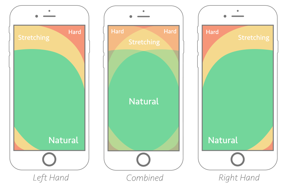
Above is an illustration of Steven Hoober’s notion of ‘the thumb zone’, or “the most comfortable area for touch with one-handed use.”
Chances are, if your main CTA doesn’t fall within the ‘natural’ reach zone, it’s going to cause frustration.
What’s worse is when your website or mobile app visitor starts scrolling and actually loses sight of your CTA – as we know, real estate on mobile is hard to come by, and every millimeter needs to be carefully thought through.
Browsing or goal-oriented searching on mobile is not the same as on desktop. When we’re looking to buy a movie ticket on mobile, we’re very likely walking around, multitasking or in a hurry. When we’re buying one on desktop, we’re likely to be less distracted, and can take our time.
On mobile, we’re in the moment. The UX and UI needs to take into account this context. Enlarged, stick-to-scroll CTAs – at least the main ones – can help an end user who’s in a hurry, distracted, using their phone with one hand while buying a metro ticket with the other, and who’s phone screen is a fraction of the size of their laptop’s.
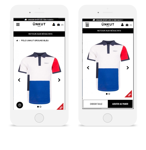
The French fashion retailer Ünkut saw the effectiveness of a sticky CTA firsthand after running an A/B test on its mobile product pages. From this test, CTA clicks increased by 55%, and transactions grew by 7%.
That’s why, by and large, the usefulness of stick-to-scroll CTAs on mobile for increasing conversions is no myth – we’ve collected countless use cases, from e-commerce to telecommunications, that prove its effectiveness. So we’re ready to label this ‘myth’ true – and if you have questions on how to apply a stick-to-screen element, don’t hesitate to reach out.
CRO Myth Busters is a mini series for conversion rate optimization professionals. We take a quick look at commonly held CRO beliefs and determine if they’re true, sometimes true, or simply CRO myths!


