Case Studies

Avid Increases Transactions by 34% with Promotional Banners

34% Increase in transactions

1 A/B test

Avid is a trailblazer for multimedia content creation. Its nonlinear editor was the first to digitize video content, effectively changing the media and entertainment industry. Today, Avid platforms are trusted by audio, music, film, and television professionals to create, manage, and distribute content.

Challenge

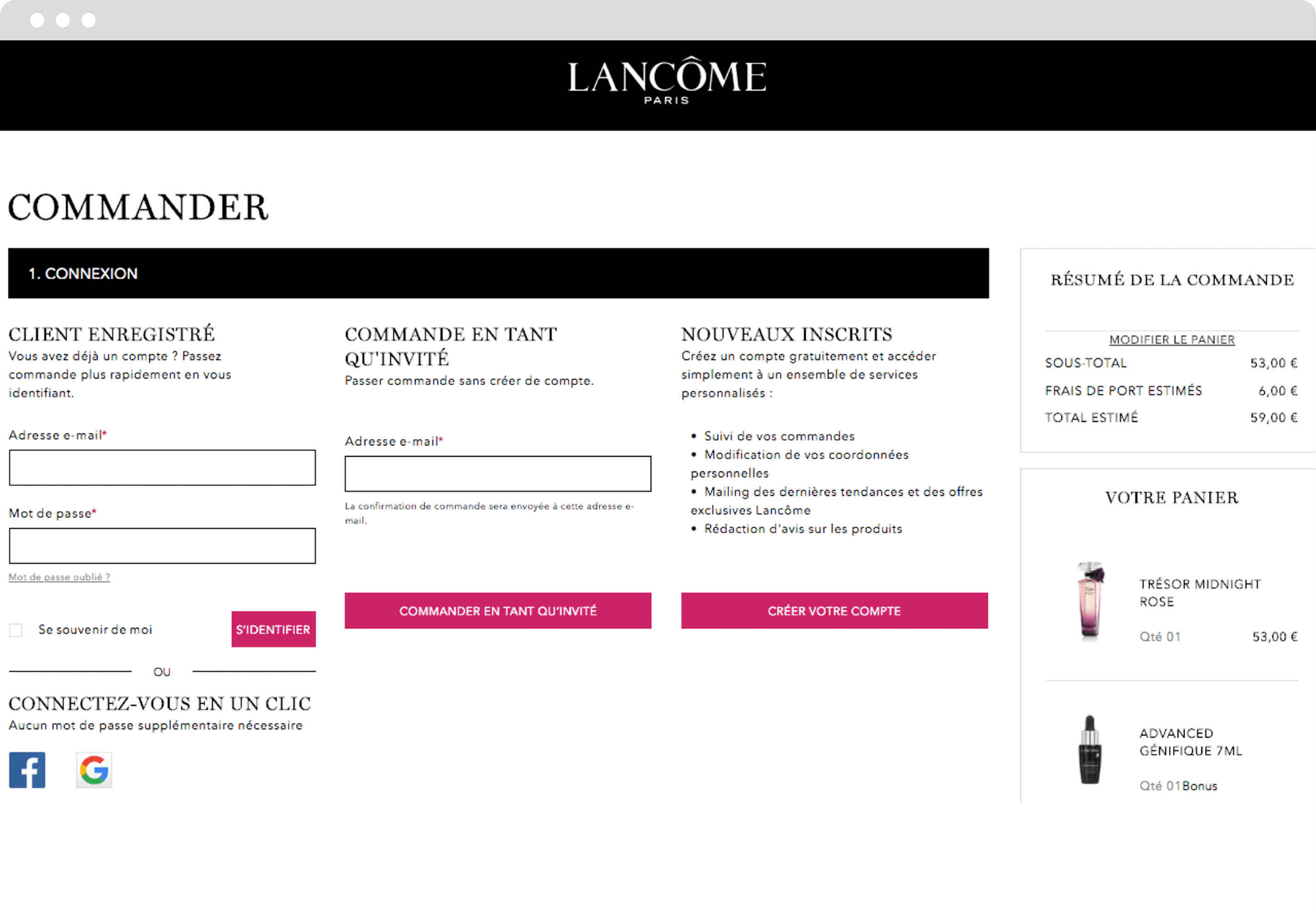
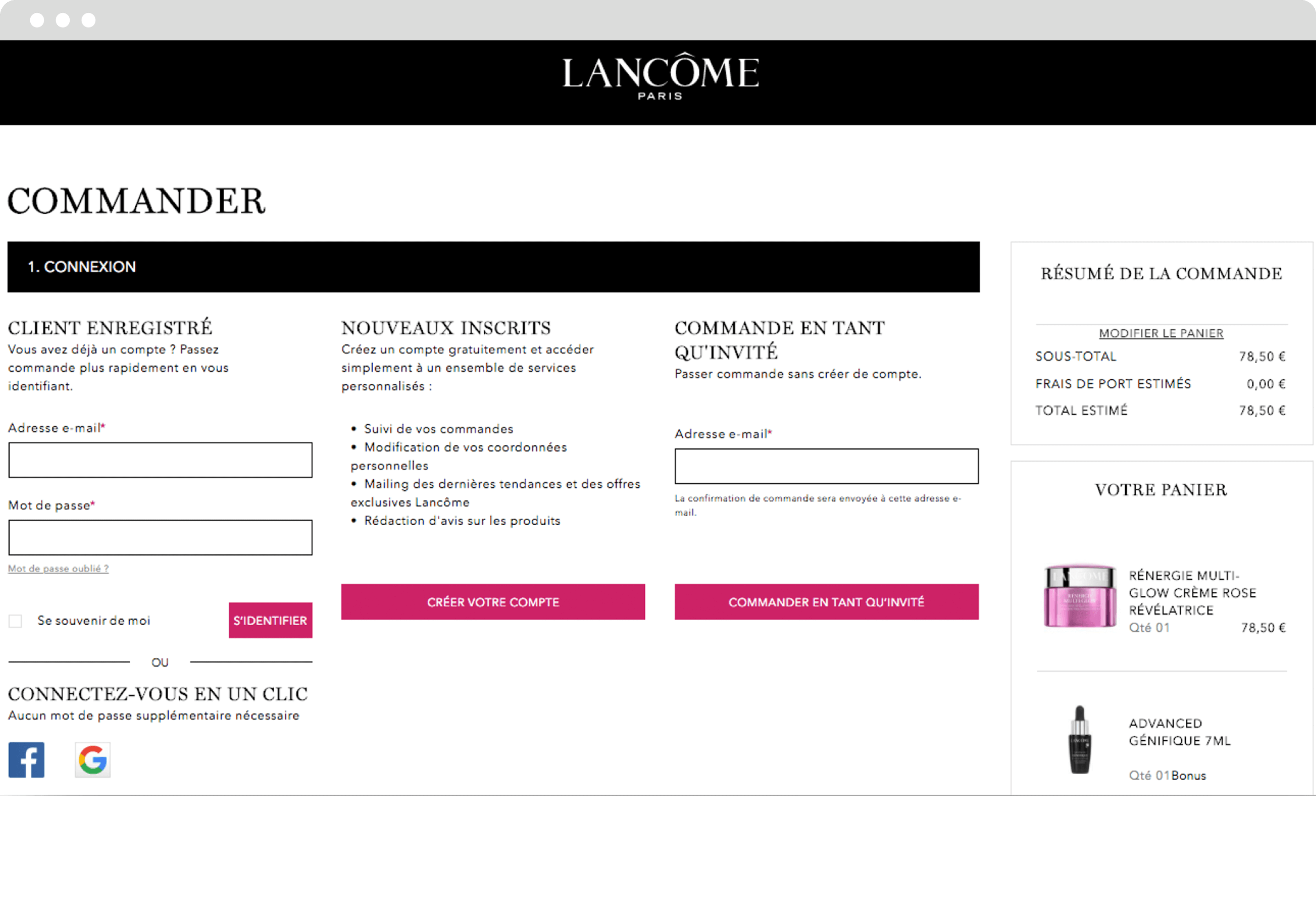
Avid wanted to optimize how it displayed promotional offers across its site to increase conversions and further cultivate customer loyalty.

Test Idea

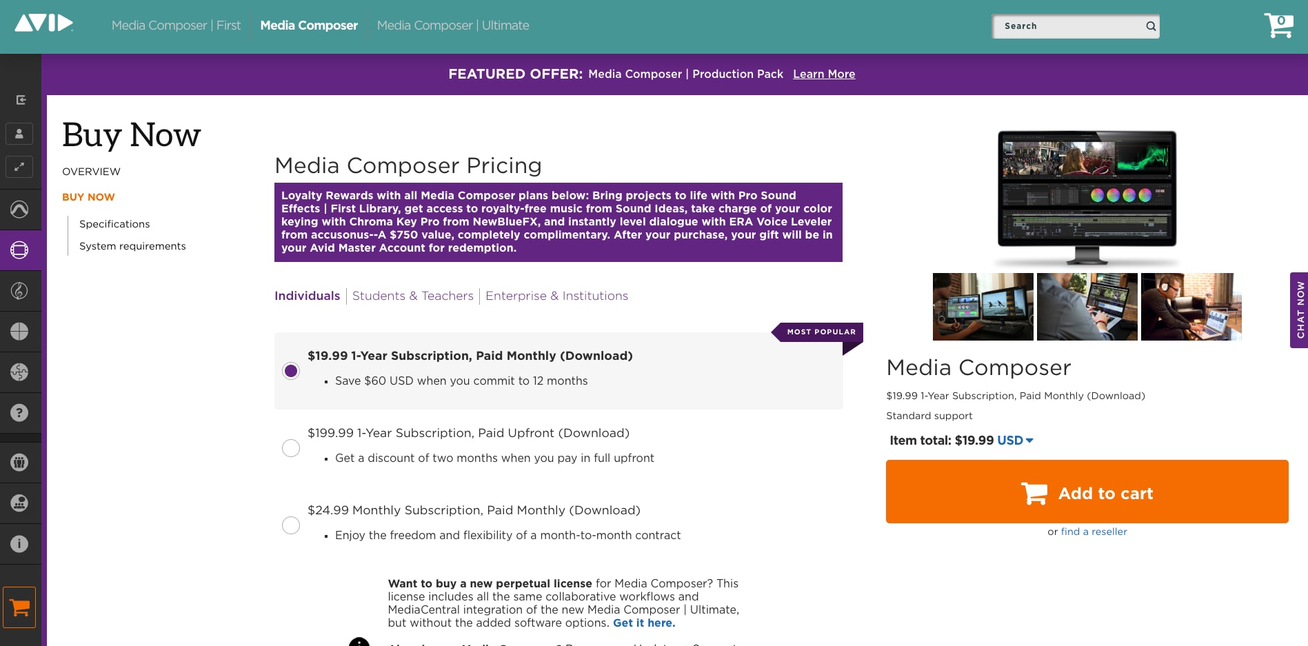
Avid offers a bonus gift with each subscription to its Media Composer software—a point the team wanted to highlight to visitors on these product pages. Using an A/B test, Avid decided to experiment with the offer’s placement and presentation to see what effect it had on conversions.

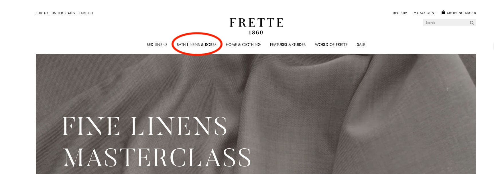
In the first variation, details on the bonus gift were presented in a purple banner at the top of the page.


avid promotional banner
Avid highlighted its offer with a purple banner at the top of the page


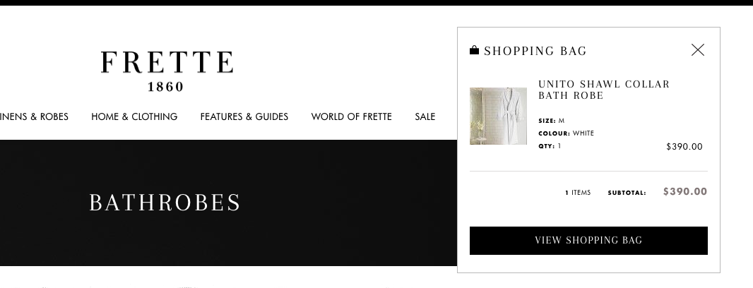
In the second variation, details on the bonus gift were presented in bold as a bullet under each subscription option.


avid promotion
Avid highlighted its promotional offer in a bullet beneath the subscription summary


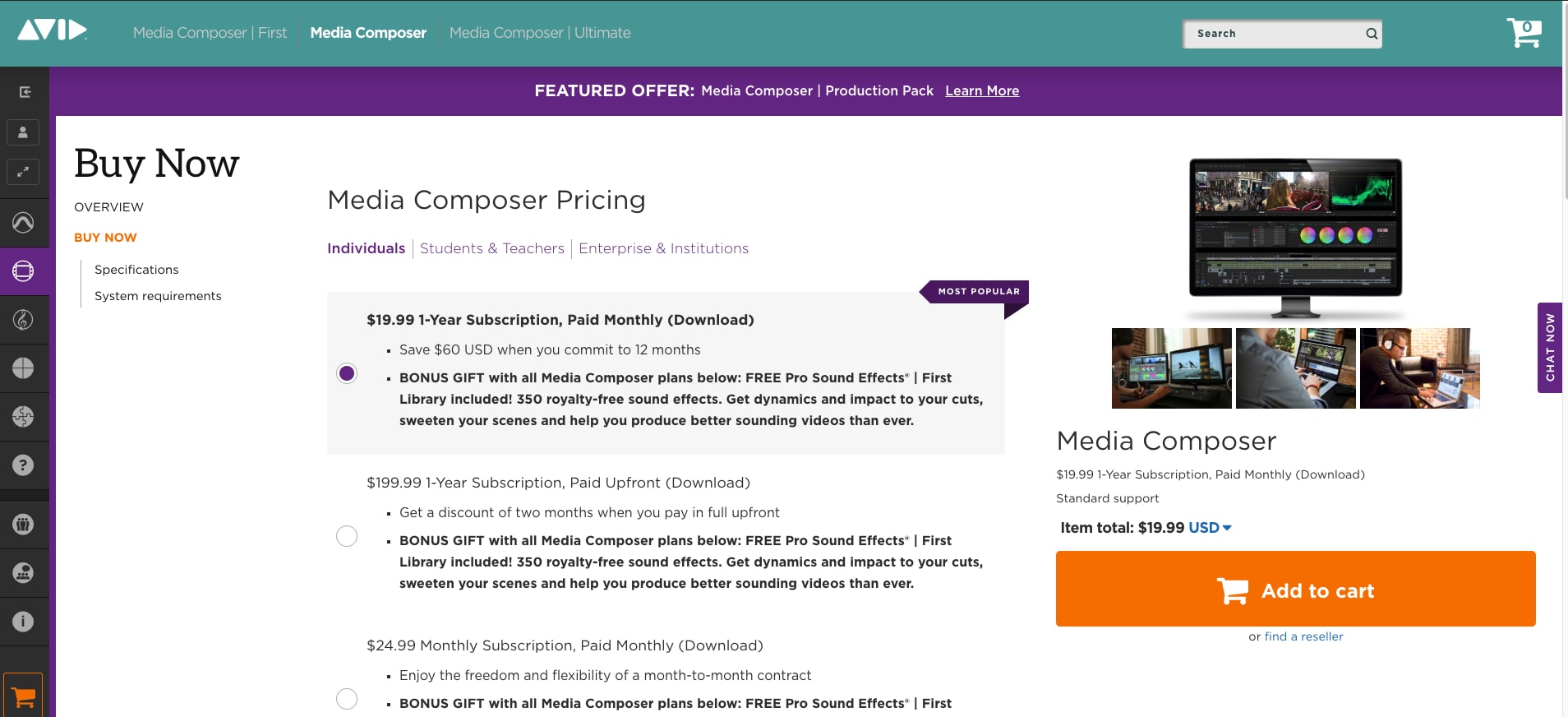
For the duration of the test, traffic to these product pages was split evenly between the two versions to determine which formatting was more effective.

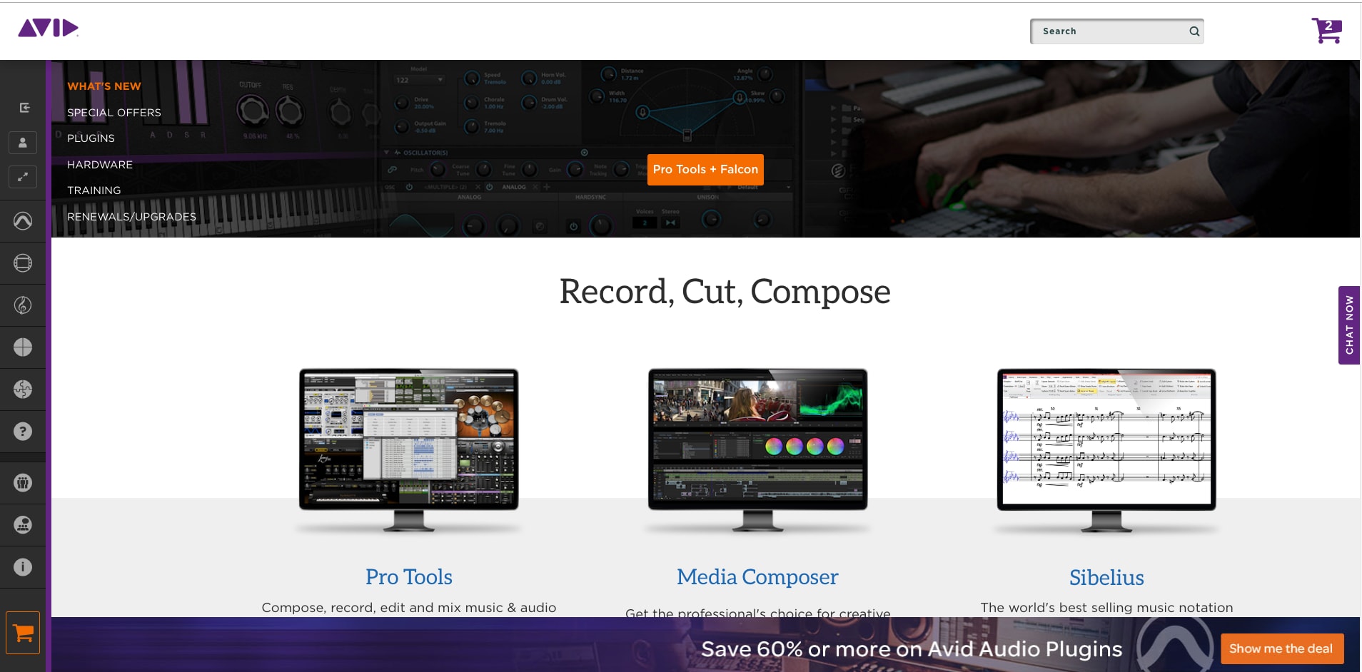
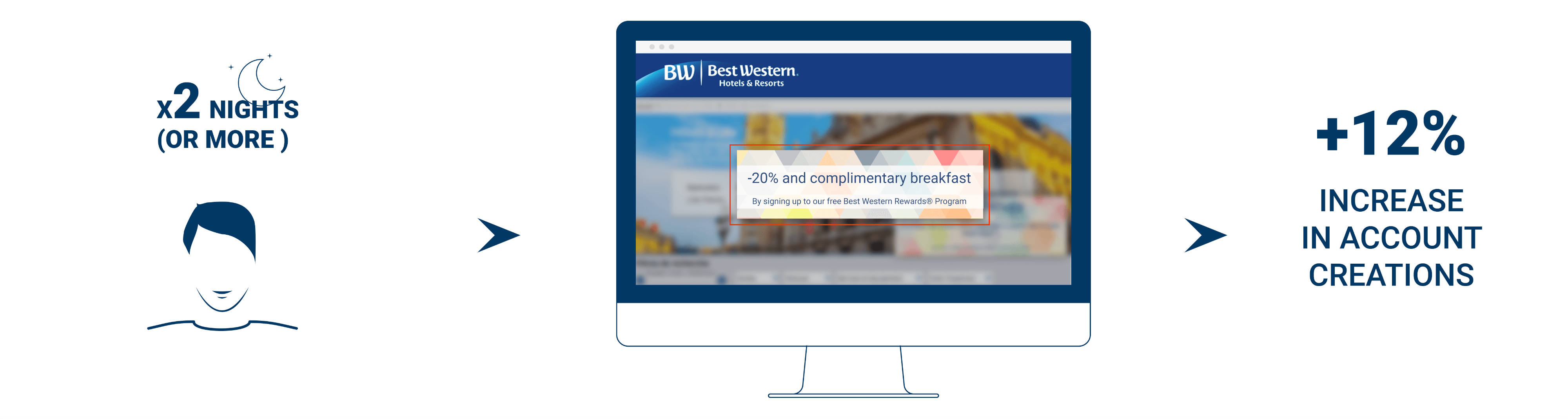
Avid then focused on optimizing a January promotion that offered a 60% discount on audio plugins. An AB Tasty Technical Support Engineer placed a sticky banner on the bottom of Avid’s homepage, shopping site, and blogs, that—when clicked—would take visitors to the audio plugins page for more details on the feature and the opportunity to purchase.


avid custom css
Avid promoted audio plugins with a custom CSS banner created by one of AB Tasty’s Technical Support Engineers

Results

For the Media Composer product pages, highlighting the bonus offer with a purple banner was ultimately the winning variation, showing a 34% increase in transactions.

Following the success of this version, Avid used AB Tasty to convert it to a personalization—and the banner is still live on the site today. As for the sticky banner for audio plugins, results from the test showed that—out of those who clicked on the promotion—15% ended up converting on the site.

These tests show the power of presentation when trying to relay key messages to visitors on a site, and the importance of testing to know which formatting resonates with your users.

Driving an e-commerce business without A/B testing is like washing your car without soap – you can’t really succeed if you don’t have any soap. AB Tasty’s robust tools and widgets allow us to do it all – set up quick tests, comprehensive tests, personalizations, and multi-variate testing, all the while being supported by robust analytics and fantastic customer service“. Jeffrey Copetas, Senior Director of Web & E-Commerce at Avid

Spark
your curiosity!

Get your copy of "Avid Increases Transactions by 34% with Promotional Banners" now.

Case Studies

Luxury Brand Frette Increases Revenue By Over 8% with Web Copy Optimization

8.69% Increase in revenue

2 A/B tests

Frette has been a symbol of luxury since its establishment in 1860. Its linens have been draped across the altar of St. Peter’s Basilica, were the bedding of choice for European royal families, and continue to be a staple of five-star hotels.

Challenge

In the luxury industry, there’s always been a strong emphasis on the buying experience. Retailers have imbued it with a sense of ceremony—exclusivity paired with exceptional customer service to create a one-of-a-kind exchange. One of the challenges luxury retailers face today is translating the in-store experience to digital platforms.

For the Frette team, bringing the brand ethos online meant creating a frictionless user experience. Their website needed to be receptive to visitors’ interests while having an elegant design and easy-to-navigate interface. Frette focused on optimizing the website’s top navigation bar and the call-to-action on the shopping cart pop-up to ensure synchronicity between the UX and online shoppers.

Test Idea

Frette conducted a simple A/B test to see if modifying the top navigation bar would optimize the customer journey and increase traffic to certain pages. Noting that bathrobes were the top search item on the site, the team decided to clearly reference them in the header. So, they changed “Bath Linens” to “Bath Linens & Robes” and implemented action tracking to chart the results.

navigation bar


Then, Frette focused on the purchasing funnel. When users would click on the shopping cart in the top corner of the site, a customary pop-up would appear with a preview of selected items and the option to “Proceed To Checkout.” Luxury shopping is generally marked by long lead-in times, so Frette decided to tweak this language to the less definitive call-to-action, “View Shopping Bag.” The goal was to create a more fluid transition from browsing to purchasing in which customers didn’t feel rushed.


shopping cart pop-up

Results

While these website modifications were relatively minor, they had a significant impact on engagement and sales.

By adding “Robes” to the Bath Linens title in the top navigation bar, Frette was able to increase clicks to this category by 29%, and visits to bathrobe pages grew by an astounding 101%. As for changing the checkout semantics, the wording “View Shopping Bag” increased clicks by 5% and bumped total revenue by 8.69%.

These two A/B tests each took approximately 15 minutes to implement, without any IT support. Having the autonomy to test and learn is crucial for website optimization; it allows for precision in your strategy so even subtle changes have a pivotal effect on visitors’ satisfaction.

“We had been using [a previous conversion optimization] tool and it wasn’t user-intuitive, you really needed to work with an agency to do something very simple—you couldn’t really customize it to track specific things for a campaign, not in the way that AB Tasty allow you to. What we’re doing with AB Tasty now on our own, we would not have been able to do before.” – Vivienne So, Sr. Manager of E-commerce at Frette

Spark
your curiosity!

Get your copy of "Luxury Brand Frette Increases Revenue By Over 8% with Web Copy Optimization" now.

Case Studies

How Best Western® Hotels & Resorts Increased Loyalty Program Engagement

12% Increase in account creations

3 Audience segments

The American-based Best Western® Hotels & Resorts brand has been a leader in the hospitality industry for over 70 years, with a global network of 4,200 hotels in more than 100 countries and territories. With a strong presence in France, the group reported an annual revenue of 2.2 billion dollars in 2017. They have been an AB Tasty client since March, 2017

Challenge

For hotel brands like Best Western® Hotels & Resorts, customer loyalty is paramount; they aim to create a long-lasting relationship with each client. One of the ways to foster this kind of engagement is through an online membership community. For example, as a Best Western Rewards® member, customers can log in and benefit from discounts and other perks, like free stays, complimentary breakfasts, and upgrades.

The digital team at Best Western® France was looking for a way to encourage visitors to become members, use their accounts, and especially to take advantage of one of their discounts applicable to visits of two nights or longer. They decided the best way to do this would be to run a website personalization campaign using AB Tasty.

Personalization Campaign Idea

The team had an elegant idea: an internet user would be more likely to join the Best Western Rewards® program if they were shown offers directly relevant to their search query. For this, the team simply needed to create appropriate audience segments in AB Tasty using data from their data layer. Since their main goal was to encourage visitors to use or create their membership account, they opted for the following scenarios:

Upsell scenario: Trigger a pop-in to visitors who were logged in to their membership accounts and looking for a one-night stay, with an incentive to prolong their visit
Encourage Best Western Rewards® account creation: Trigger a pop-in to visitors who were not logged in to a membership account and looking for at least a two-night stay, with a special promotional offer available only with a Rewards Account
Upsell and account creation: Trigger a pop-in to visitors who were not logged in to a membership account and looking for a one-night stay, with an incentive to create an account and prolong their stay

This way, the digital team could show discounts only to visitors who were eligible for them, making the browsing experience more relevant, and encouraging non-members to sign up. By promoting incentives and reduced rates for longer visits, they also aimed to increase revenue. In other words: they pushed the right message to the right website visitor at the right time.


Best western mock up personalization

Results

The results showed that this kind of personalized messaging can have big effects on engagement. The most successful scenario turned out to be the second one, with around 12% more Best Western Rewards® program sign-ups originating from this campaign. Unsurprisingly, it was easier to convince visitors to sign up for a free account to receive an incentive than to add an extra night’s stay! In addition, the team was able to say that they created a smoother, more relevant customer experience, by only showing promotional messages relevant to each visitor.

Takeaway Tip

Take advantage of your visitor data to create relevant, personalized messages. Not only will you create a more pleasant browsing experience, you’ll increase the number of ways you can increase engagement, transactions, and revenue, all the while optimizing an existing client scenario.

Spark
your curiosity!

Get your copy of "How Best Western® Hotels & Resorts Increased Loyalty Program Engagement" now.

Case Studies

Kiehl’s Increases Revenue by 31% with Basket Page Optimization

+5% Basket size

+31% Total revenue

Inspired by other brands in the L’Oréal Luxe portfolio, such as Lancôme, Biotherm, Urban Decay and YSL Beauty, the digital teams at Kiehl’s started working with AB Tasty in January 2018. With the help of Léa Benquet, their dedicated Customer Success Manager, the team was even able to surpass their initial targets.

Challenge

Our e-commerce clients often have the same main KPI: maximize the total revenue generated on their website. As for Kiehl’s, they have an impressive success story to tell: the brand began selling their products in stores such as Colette (in 1997) before opening their own boutiques (almost 15 in France). Naturally, their proprietary website’s performance is particularly vital to the brand.

In order to tackle this challenge head on, the digital teams at Kiehl’s decided to concentrate on the basket page. The idea? Create a visual that would be presented to the shopper before they finalized their purchase, encouraging them to take advantage of a free gift over a certain basket amount. For the brand, the advantages are numerous: increase the average order value (interested shoppers will increase their basket size in order to receive the gift), as well as strengthen client loyalty with exclusive, branded Kiehl’s gifts!

A/B Test

Kiehl’s decided to implement a sort of visual gauge on the basket page that indicates how much more the browser has to add to their basket in order to get the gift (in this case, a free product).

AB Tasty’s WYSIWYG editor made it easy to implement this visual barometer. In order to determine how well the test performed, different KPIs were measured, such as the click rate, access to the rest of the purchase funnel, number of transactions and the impact on the average basket size.

Kiehl's AB Tasty A/B Test“One of our e-commerce clients’ biggest expectations is to be able to increase their average basket size per visitor. With Kiehl’s, our main challenge was to find a way to optimize this KPI by combining agility, scalability and a visual effect. We consider our work here a success since this campaign’s positive performance inspired other brands in the L’Oréal group.” – Léa Benquet, Customer Success Manager at AB Tasty

Results

Kiehl’s website visitors were particularly receptive to this barometer. This very visible incentive led to 7% more clicks on the CTA ‘continue’, and importantly, it also led to an increase in the average basket size of almost 5%! We also were able to report an increase in total revenue of 31%, with 25% more additional purchases and 31% more revenue per visitor.

Takeaway Tip

The urgency principle is being used more and more frequently. However, it needs to be applied intelligently. The trick is to find the right balance between creating anxiety in the shopper, while at the same time offering them a substantive incentive (free shipping, exclusive gift, etc.). Showing how much one needs to spend before receiving a free gift isn’t enough anymore: it’s the visual aspect – the barometer – that makes the message truly impactful. The image allows one to better retain the message. A semantic incentive, coupled with a relevant visual, is the perfect combination for prompting an internet user to make a decision at this stage in the purchase funnel.

Spark
your curiosity!

Get your copy of "Kiehl’s Increases Revenue by 31% with Basket Page Optimization" now.

Case Studies

Lancôme Increases Revenue by 15% With Login Page Optimization

+30% Clicks on 'create account'

+17% Transactions

Part of the L’Oréal Luxe brand portfolio, Lancôme was founded in 1935 by Frenchman Armand Petitjean. Today, the brand is known the world over for their luxurious skincare, cosmetics and fragrance products.

Challenge

When consulting their data, Lancôme’s digital team noticed an unusually high bounce rate on their login page. This lead Lancôme’s team, along with AB Tasty, to analyze the page’s structure and the behavior of its visitors. Together, they were able to identify a potential point of friction, related to the fact that there were numerous ways for a visitor to sign in. Indeed, someone who wished to purchase a product could log in as a client or guest, or they could create a new account – all potential exit points for visitors to leave the page.

A/B Test

Working with Léa Benquet, their dedicated Customer Success Manager at AB Tasty, Lancôme decided to try a simple design change. Up until then, on their login page, they had (from left to right) presented the different sign-in options as listed above. However, they decided to test moving the ‘create a new account’ option to the center of the page, therefore shifting ‘sign in as a guest’ to the right. ‘Log in as a client’ would remain on the left. They wanted to test if this would be a more logical organization for visitors, therefore encouraging transactions, account sign-ups, and perhaps even overall revenue.

The test was easy and quick to set up with the AB Tasty WYSIWYG editor. In thirty minutes it was up and running, with no help from the IT team needed. All that was left to do was let the test run for a few weeks, and analyze the results.

lancomeorginal

Lancome variation

Results

Perhaps unsurprisingly, moving the ‘create a new account’ block to the center of the page increased clicks to this CTA by 30%. What was more exciting, and more unexpected, was that transactions increased by 17%, with an associated bump in revenue of 15%.

Takeaway Tip

The login page is one of the most important pages to optimize on your site. In the physical world, shoppers don’t have to worry about logging in or creating an account to make a purchase. But in a digital context, this extra step is often the source of significant friction, and even of drop off and cart abandonment. Designing a user experience on this page that is logical and intuitive for your audience can have a real impact on sales, as the above case study shows.

Spark
your curiosity!

Get your copy of "Lancôme Increases Revenue by 15% With Login Page Optimization" now.

Case Studies

Yves Saint Laurent Beauty Increases Online Transactions by +10%

+9% Access to basket page

+13% Access to checkout page

Part of the L’Oréal Luxe brand portfolio, Yves Saint Laurent Beauty is known around the world for their luxurious skincare, makeup and fragrance products for men and women.

Challenge

As with the other brands in the L’Oréal Luxe portfolio, YSL Beauty products are sold in both online third party boutiques, as well as on their own proprietary website. For this reason, optimizing every aspect of the homepage and checkout funnel is key to making sure consumers purchase on the actual YSL Beauty site.

One of the crucial questions that needed answering was, what is the best order of the menu bar tabs? As a high end fashion house, YSL Beauty has plenty of news and products to showcase – but they still didn’t know what to emphasize on the homepage menu bar to maximize transactions.

A/B Test Idea

AB Tasty’s consulting team proposed a simple A/B test – switch the positions of the ‘New Products’ and ‘Exclusive Offers’ tabs to see if this would impact sales. By putting the ‘Exclusive Offers’ tab first – which takes browsers to current offers and gifts with purchase – instead of the ‘New Products’ tab, they aimed to test the appetite of website visitors for special and exclusive offers over new releases.

The test was easy to configure – with the WYSIWYG editor, the new version of the homepage and the parameters of the test were up and running in 30 minutes.

originalYSL
Original


variationYSL
Variation

Results

After letting the test run for a month on over 150k visitors, the results were conclusive: emphasizing the ‘Exclusive Offers’ tab had a visible effect on sales. Not only did access to the basket page shoot up by 9%, and to the checkout page by 13%, but overall transactions enjoyed a 10% increase. The team wasted no time pushing 100% of the test’s traffic to the winning variation and hardcoding these changes into their website.

Takeaway Tip

For high-end brands like YSL Beauty, accenting exclusive offers, over and above new products, proved to be especially effective. This is probably because shoppers of luxury brands are particularly susceptible to messaging about rarity and exclusive treatment. These consumers are likely to appreciate a product that’s shown to be exclusive and generous offers (reminding them of the ‘high end’ nature of the brand).

Spark
your curiosity!

Get your copy of "Yves Saint Laurent Beauty Increases Online Transactions by +10%" now.

Case Studies

UNICEF France Maximizes On-Site User Feedback

3.6% Visitors filled in survey

6 Week campaign

The nonprofit organization UNICEF works tirelessly across 190 countries to save and improve the lives of children from some of the world’s toughest places.

Challenge

As with any business, organization or nonprofit, the UNICEF website is crucial to their operations. Not only is it one of the ways to make a donation, it’s also where people go to understand what UNICEF does, what they stand for, and how donations are used to carry out their mission. It was therefore essential for UNICEF France to optimize their website to both increase donations, and also relay a positive image. With a big website redesign coming up, their digital team decided they needed to better understand how visitors actually experienced their website.

Marketing Campaign Idea

As an AB Tasty client, UNICEF France had various user insight tools at their disposal: heat mapping, session recording, and NPS surveys, to name a few. However, the UNICEF team was looking for in-depth feedback that would let them get inside the heads of their website visitors. They therefore opted to use a Google form, allowing them to ask both open-ended and ‘yes/no’ questions.

With the help of the AB Tasty team, they set up a pop-in in just one hour – which triggered on exit intent – that encouraged the website visitor to fill out the survey. They asked five questions about the design and usefulness of the site, the visitor’s reason for visiting, and their overall level of satisfaction.

Results

Over the 6 weeks the campaign was running, the team collected 310 responses, which represented 3.6% of the total visitors to the site. They were pleasantly surprised by the results: 92% of visitors said they liked the homepage! However, they also gained valuable insights regarding where their audience was most engaged, and what visitors wanted to see more of.

These insights served at the basis for many of the redesign changes. For example, 30% of respondents said the search bar was the most useful part of the homepage, so the search bar was enlarged in the update. Similarly, according to respondents, the least useful part of the homepage were the social share logos, which are slated to be removed.

“We were very happy to see that respondents overwhelmingly said they liked the homepage, and found what they were looking for. Overall, our donors were familiar with our website, even if they did ask for more video and photographic content. Our next step is to use this information to expand on the personalization campaigns around the visitor personas we’ve discovered, using AB Tasty.” – Léonore Manciaux, Digital Donation Officer at UNICEF France

Takeaway Tip

Understanding your audience is key for website optimization. So is choosing the right user insight tool to match your goals. Long-form surveys will let you get more in-depth, while NPS surveys are designed to show an evolution over time, and heat maps and session recording let you zoom in on points of friction or high engagement.

Spark
your curiosity!

Get your copy of "UNICEF France Maximizes On-Site User Feedback" now.

Case Studies

Urban Decay Increases Revenue by 7%

+7% Revenue increase during test

+8% Average basket size

The cosmetics line Urban Decay, which includes makeup for eyes, lips, nails, and skin, is known and admired for its edgy style. Part of the L’Oréal Luxe brand portfolio, alongside Kiehl’s, Lancôme, and Biotherm, Urban Decay products are sold online and in brick-and-mortar stores worldwide.

Challenge

“Each L’Oréal Luxe brand has its own website, based on a similar template,” explained Virginie Robert, Digital Project Manager at L’Oréal Luxe, “but each line has a different brand identity and target audience. Optimizations that might work for one won’t necessarily work for the others. That’s why we knew we needed a tool like AB Tasty.” Furthermore, since L’Oréal Luxe products are sold both on the brand’s own ecommerce website, as well as by third-party vendors, it’s especially important for their marketing teams to optimize transactions on their own site. The particular challenge for Urban Decay was increasing average basket size – both in terms of value and number of products – during sales.

A/B Test Idea

Working with Léa Benquet, their dedicated Customer Success Manager at AB Tasty, Urban Decay’s digital team decided to run an A/B test during one of their sales. They wanted to determine if a promotional banner, advertising a discount for 85 euros spent, would increase average basket size, quantity of items, and ultimately, revenue.

With the help of AB Tasty’s technical specialists, the banner – designed in an eye-catching green – was placed atop all basket pages on Urban Decay’s site. If a shopper had fewer than 85 euros in their basket, the banner was triggered, informing them of how much more they needed to spend in order to take advantage of the discount.


The banner was triggered to all shoppers with fewer than 85 euros in their basket. It reads, “Only X more euros until you can benefit from a discount on your purchase!”

Results

The promotional banner significantly increased all of Urban Decay’s KPIs: average basket size increased by 8%, the average number of items in the basket jumped by 7%, and revenue generated increased by an impressive 7%!

“We were very pleased to be able to work with Urban Decay to boost their revenue by 7% using just one A/B test. These kinds of optimizations can have a real impact on profits – over one year alone, this small change would have generated an extra 190,000 euros!” – Léa Benquet, Customer and Partners Success Manager Team Leader at AB Tasty

Takeaway Tip

Sales are particularly fruitful times to test website optimizations. Well-thought-out promotional messaging along the checkout process is key to maximizing profits.

“We were very happy with the results of this test, and we’re absolutely going to use the banner again during our next sale. The best part is that duplicating and implementing the banner design will be very easy to do, and won’t require any IT help, now that the template is all set up – this is part of the beauty of the AB Tasty platform.” – Guillaume Totis, e-Commerce Manager at Urban Decay


Spark
your curiosity!

Get your copy of "Urban Decay Increases Revenue by 7%" now.