Case Studies

OUI.sncf Relies on AB Tasty for Risk-Free Innovation

61% Increase in conversion rate

Faster innovation

For Hélène Doré, brand loyalty is her bread and butter. 

As a Conversion Rate Optimization Manager at OUI.sncf, her day-to-day consists of thinking up ways to make customer experiences smoother and conversions higher. It’s a job she loves, but it’s not without its challenges. Today’s consumers are fickle and their expectations are exacting; one poor experience on an app or website can create a long-lasting negative feeling, potentially spiralling into poor brand perception, a drop off to a competitor, or bad word of mouth.

“More likely than not, when a customer faces a problem during his/her visit, it creates a bad memory, which may mean the customer doesn’t return. Creating an exceptional, personalized, and fluid customer experience gives a sentiment of recognition to the customer, which will incite him/her to complete a transaction and potentially come back. If we work on creating the most seamless and personalized customer journey, over time, this recognition will transform into loyalty and create stickiness, inciting the customer to come back and therefore form a virtuous relationship with us.”

 – Hélène Doré, Conversion Rate Optimization Manager at OUI.sncf

The conversion rate optimization team, along with the product feature teams, at OUI.sncf has plenty of ideas for how to avoid these scenarios and create truly exceptional customer experiences. The question is: which ideas should they implement? Which should they scale? And how can they be sure an idea won’t backfire? 

A/B Testing: The way of data, not debates

What Hélène and her manager Sunny Song, Lead CRO, needed was the ability to run data-driven experiments in order to know which of their ideas will perform best (to optimize the customer experience), and to mitigate risk in case the idea goes south. AB Tasty was able to provide this capability!

“When we have a goal to achieve and we have several possible propositions to achieve the same goal, AB Tasty helps us by allowing us to test these propositions. We can then make the best decision by determining which proposition has the greatest impact,” explains Sunny.

One great example is OUI.sncf’s ‘Exploration Assistant’. 

Think of the ‘Exploration Assistant’ as an AI-powered travel agent. Based on an in-house algorithm, the Assistant is displayed to visitors with a high enough ‘interest score’, and suggests a trip itinerary for the visitor.  The idea sounds great on paper, but would the Exploration Assistant actually make a business impact on bookings?

Using AB Tasty to run a statistically rigorous A/B test, the team determined that conversion rates did significantly increase for those visitors that engaged with the Assistant.  

“This test showed extremely positive results: +61% for web responsive and +33% for desktop impact on the conversion rate,” explains Sunny. This particular experiment was important for more than its impact on these KPIs: “This test was a milestone project for Oui.sncf because it was a very technically complex A/B test and was the first test that incorporated AI algorithms. But the work doesn’t stop here. It’s really essential for the teams to continuously iterate on this version of the algorithm, to test and tweak it for better and better results, so that we’re always proposing the most efficient itinerary to our customers. This is how algorithms evolve, and it goes hand in hand with a continuous optimization strategy.”

In other words: targeted, data-driven testing helps validate strategic decisions at key moments, confirming high-level strategy choices and setting future roadmaps.

“Thanks to the Exploration Assistant A/B test and its very impactful results, we will now industrialize this test. This test was very strategic because it was the first which included AI, which plays a key role in OUI.sncf’s strategy.” 

– Sunny Song, Lead CRO at OUI.sncf

Another advantage to attaching numbered results to testing ideas? Avoiding circular, time-sapping discussions about whose idea to run with. “By implementing A/B tests and providing concrete results and data to prove the effectiveness of certain ideas, we were able to eliminate the “endless” debates we could have where each person has his own opinion on topics,” concludes Sunny.

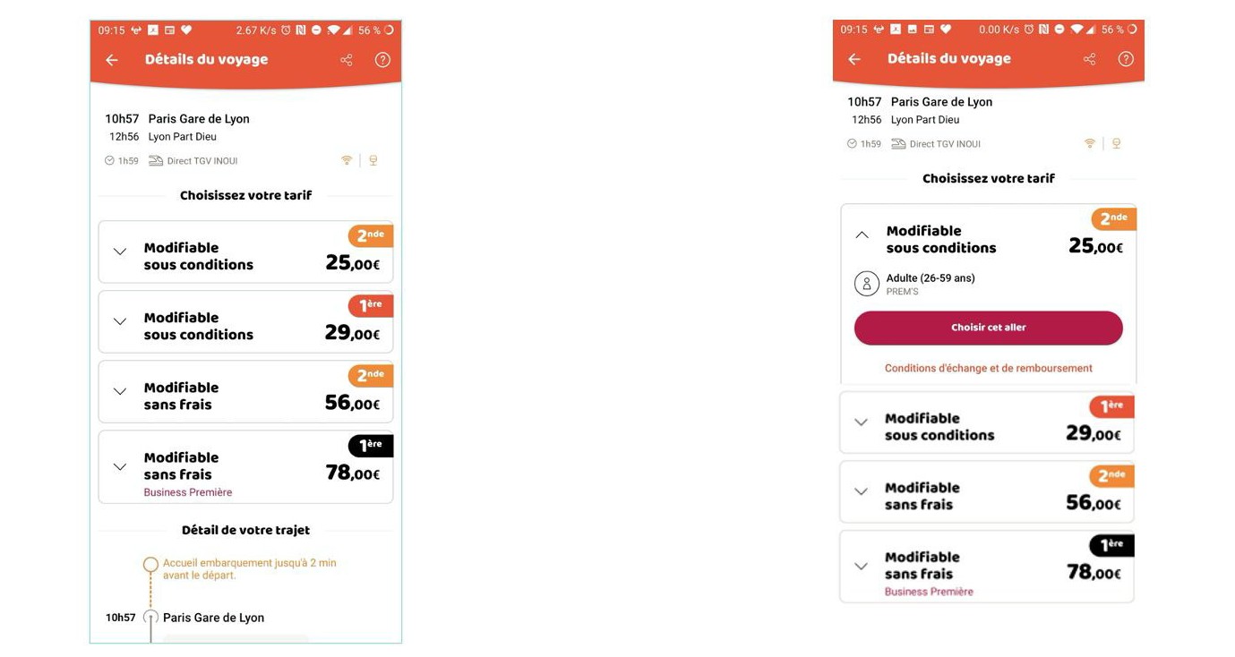
For example, low click-through rate data indicated to the team that unfolding travel details on the ticket information page on their app could increase clicks to a key CTA.

This idea could have led to hours of endless debate around the respective value of each of these blocks.

Instead, the team used Flagship (AB Tasty’s server-side platform) to run an A/B test on the app. This allowed them to quickly validate the winning variation – which happened to be the version B, where the details of the first trip were automatically unfolded. This led to a 2.49% increase in the click-through rate to the CTA “Choose this trip”, as well as 0.28% more arrivals to the basket page.

This is an image of an A/B test run on OUIsncf using AB Tasty

Flagship: The platform behind the magic

“Our strategy is to offer the most fluid and seamless user experience possible to our clients, the vast majority of whom browse and book on our OUI.sncf mobile app, which has become extremely popular.” 

– Ingrid Peiniau Head of Customer Experience at OUI.sncf

Customer experience has become increasingly mobile-first. Alongside buying their groceries, clothing and movie tickets on their smartphones, consumers expect to be able to search, book, or reschedule travel via a user-friendly app. This is especially true for OUI.sncf, where a majority of visits are generated via their mobile app.

This meant that it made sense for OUI.sncf to turn to AB Tasty’s server-side solution, Flagship, for their optimization efforts. It’s the platform they used for tests run on their mobile app, versus their website.

Not only does Flagship enable the kind of experiments OUI.sncf was running on their mobile app, it also allows product teams to release new features with virtually no risk. Why? Teams are able to not only rollout a new feature progressively – that is, not exposing all of their user base at once – but they can also easily rollback that feature if they notice a dip in KPIs.  

Benoit Bouffart, Chief Tech & Product Officer at e.Voyageurs SNCF., explains:

“We’re particularly interested in Flagship’s progressive rollout capabilities. We want to be done with publication planning dependencies. Progressive rollout lets us stop or fully rollout a test as soon as it reaches statistical significance without having to wait for a new publication of the app. If the chosen KPIs worsen, we can avoid prolonging a sub-optimal experience. On the other hand, if the test is positive, all of our clients can start feeling the benefits immediately.”

From increasing conversion rates on their mobile app to validating high-level strategy and reducing the risk inherent in feature rollouts, Flagship has become a strategic partner for OUI.sncf.

Spark
your curiosity!

Get your copy of "OUI.sncf Relies on AB Tasty for Risk-Free Innovation" now.

Case Studies

How Pets at Home Increased Their Average Order Value by 1.2%

23% Increase in clicks on recommended products

1.2% Uplift in average order value

Pets at Home is the UK’s largest pet care business and provides pet owners with everything they need to be able to look after their pet – from food, toys and bedding, and grooming services, to first opinion veterinary care and world-class specialist veterinary hospitals.

The Challenge

Pets at Home found that its users were repeatedly missing product recommendations at the bottom of the product display page. After adding an item to their basket, many users missed the opportunity to view related products which led to low engagement with suggested product recommendations.

Test Hypothesis

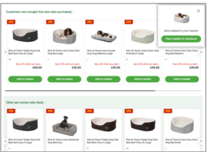
To drive more engagement to the overlooked product recommendations section Pets at Home briefed Good Growth, using AB Tasty, to set up a simple A/B test inserting an anchor link in the variation. The anchor link variation would automatically scroll the page down to the recommended products after a user had added a product to their basket. The “add to basket” action would trigger the anchor link to drop the user down to the product recommendations, which in turn would increase engagement and the number of items per order.

Results

The anchor link variation outperformed the original variation, proving statistical significance after 3 weeks. Running the variation to both desktop and mobile users increased the engagement with the product recommendations and saw an uplift of + 1.2 % in average order value.

Anchor Link Variation

Takeaway Tips

  • Ensuring good visibility of product recommendations on the product display page can drive a higher average order value and increase user engagement
  • Leverage anchor links to highlight sections of your website that you want to call attention to

Spark
your curiosity!

Get your copy of "How Pets at Home Increased Their Average Order Value by 1.2%" now.

Case Studies

How Lush’s Focus on Human Connection Optimized the Digital Customer Experience

250% Increase in click-through rate

$7.5K Increase in sales during the experiment

Lush is a cosmetics company known for its emphasis on fresh ingredients and cruelty-free products—not to mention being credited as the original inventor of the bath bomb. From early days in England to currently operating 250 stores across North America, Lush continues to have a dedicated following for its soaps, shampoo bars, moisturizers, and scrubs.

The Challenge

For retailers (and all businesses for that matter) entire strategies had to be reworked in response to COVID-19. Digital became the central, if not sole, channel to focus on.

At Lush, the team had implemented a travel campaign before social distancing and non-essential business closures were government-mandated. While the campaign had initially been performing well, there was a drastic dip in engagement as travel restrictions tightened.

Lush knew that they needed to pivot. But they also needed to consider how current circumstances were affecting their customers. What was the best way to connect with people during this time? How could they strike a balance between offering familiarity while not coming across as out of touch?

The Test

Lush focused on their homepage promotions, evaluating everything from the banner image to CTA phrasing and featured products. The team created two campaigns that subtly addressed the new reality of staying at home and socially distancing.

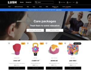
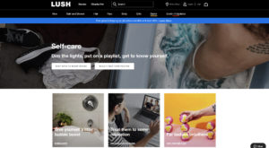
The first variation was centered around self-care. Lush offers head-to-toe cosmetics products that range from relaxing to invigorating. The idea was for customers to put together an entire regimen for themselves, perhaps gravitating to products they wouldn’t normally have had time for (like scalp treatments and bath bombs). The second variation was built around the theme of sending care packages to loved ones. Even though people couldn’t physically see friends and family, they could send these gifts as a thoughtful gesture or for special occasions.


Results: Part 1

It quickly became clear that the care package promotion was the better performer, with a 250% higher click-through rate than the self-care campaign. During this experiment, the care package promotion also generated $7,500 more in sales than the variation. While the team couldn’t know with absolute certainty if people were buying care packages for their own use, it was clear that this messaging had more of a pull. So, Lush decided to dig deeper into this trend. They launched another A/B test that compared the general care package promotion with a variation focused specifically on Mother’s Day.

Truthfully, the team wasn’t sure how users would react. Would they gravitate to the theme of Mother’s Day or would it be unintentionally upsetting for those unable to see their parents in person? Testing provided a safe framework to find out. 

Results: Part 2

The Mother’s Day campaign did appear to resonate with users more, gaining a higher click-through rate than the more general care package promotion. Following the results from this test, Lush started mapping out a similar campaign that focused on Father’s Day to keep the momentum going. 

As Lush demonstrates, effective experimentation is continuous. In one of the first tests launched in this series, Lush saw the positive impact of messaging that focused on human connection. Leveraging this insight, they were able to develop a series of campaigns that explored this further: considering everything from how users would respond to specific holidays to whether promotional images that featured people performed better than those with just products.

Takeaway Tip

It takes users approximately 50 milliseconds to visually assess a website and decide whether to stay or leave. Lush’s strategy shows a sharp awareness of this short time frame. They weren’t concentrating on refining just one or two details of their website, but how every element came together to form a holistic experience. In this way, their approach became more psychographic, asking questions related to what piqued users’ interest and how this impacted the customer experience. And in doing so, Lush was able to stay in sync with its customer base during a time of rapid and widespread change.

Spark
your curiosity!

Get your copy of "How Lush’s Focus on Human Connection Optimized the Digital Customer Experience" now.

Case Studies

How Fenty Increased CTA Clicks by 42%

42% more CTA clicks

15 min. test setup

Musician and entrepreneur Robyn Rihanna Fenty partnered with LVMH to release her namesake clothing line, FENTY, in 2019.

Challenge

One of the first KPIs the FENTY team wanted to measure and optimize was the clicks to its homepage CTA, which brought visitors to the latest collection.

Experiment

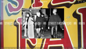
FENTY wanted to see if CTA size had an effect on the click rate. Using the AB Tasty platform, they set up a split test that would compare the performance of a CTA sized at 13 pixels versus a CTA that was slightly bigger at 15 pixels.

FENTY-homepage

FENTY homepage

Results

In the end, bigger was better. The 15-pixel CTA generated 42% more clicks than the 13-pixel variation and was permanently added to the FENTY homepage.

Takeaway Tip

FENTY proved that simple tests can have a significant impact. In this example, it took 15 minutes to set up the test, and a difference of 2 pixels, to increase CTA clicks by an impressive 42%. Focus on making the key elements of your web page (which could be a call to action, a navigation button, etc.) a focal point for your visitors by considering both size and placement.


Spark
your curiosity!

Get your copy of "How Fenty Increased CTA Clicks by 42%" now.

Case Studies

Luxury Brand Frette Increases Revenue By Over 8% with Web Copy Optimization

8.69% Increase in revenue

2 A/B tests

Frette has been a symbol of luxury since its establishment in 1860. Its linens have been draped across the altar of St. Peter’s Basilica, were the bedding of choice for European royal families, and continue to be a staple of five-star hotels.

Challenge

In the luxury industry, there’s always been a strong emphasis on the buying experience. Retailers have imbued it with a sense of ceremony—exclusivity paired with exceptional customer service to create a one-of-a-kind exchange. One of the challenges luxury retailers face today is translating the in-store experience to digital platforms.

For the Frette team, bringing the brand ethos online meant creating a frictionless user experience. Their website needed to be receptive to visitors’ interests while having an elegant design and easy-to-navigate interface. Frette focused on optimizing the website’s top navigation bar and the call-to-action on the shopping cart pop-up to ensure synchronicity between the UX and online shoppers.

Test Idea

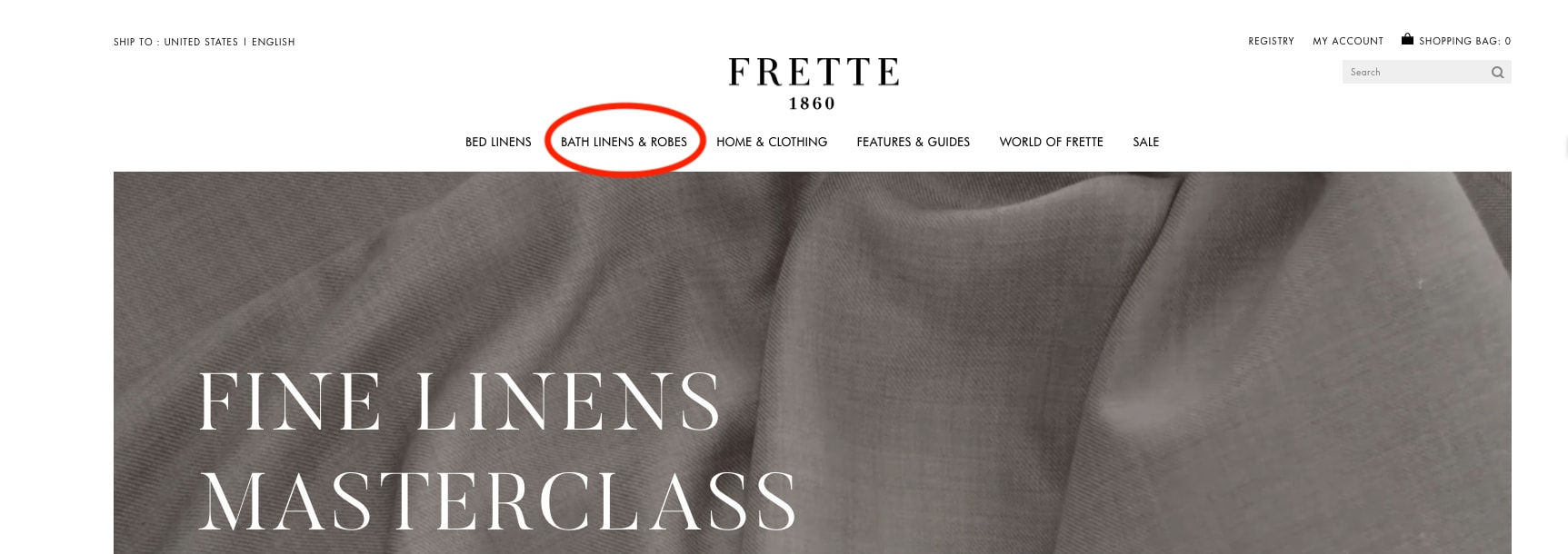
Frette conducted a simple A/B test to see if modifying the top navigation bar would optimize the customer journey and increase traffic to certain pages. Noting that bathrobes were the top search item on the site, the team decided to clearly reference them in the header. So, they changed “Bath Linens” to “Bath Linens & Robes” and implemented action tracking to chart the results.

navigation bar


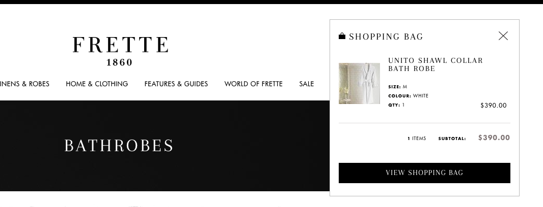
Then, Frette focused on the purchasing funnel. When users would click on the shopping cart in the top corner of the site, a customary pop-up would appear with a preview of selected items and the option to “Proceed To Checkout.” Luxury shopping is generally marked by long lead-in times, so Frette decided to tweak this language to the less definitive call-to-action, “View Shopping Bag.” The goal was to create a more fluid transition from browsing to purchasing in which customers didn’t feel rushed.


shopping cart pop-up

Results

While these website modifications were relatively minor, they had a significant impact on engagement and sales.

By adding “Robes” to the Bath Linens title in the top navigation bar, Frette was able to increase clicks to this category by 29%, and visits to bathrobe pages grew by an astounding 101%. As for changing the checkout semantics, the wording “View Shopping Bag” increased clicks by 5% and bumped total revenue by 8.69%.

These two A/B tests each took approximately 15 minutes to implement, without any IT support. Having the autonomy to test and learn is crucial for website optimization; it allows for precision in your strategy so even subtle changes have a pivotal effect on visitors’ satisfaction.

“We had been using [a previous conversion optimization] tool and it wasn’t user-intuitive, you really needed to work with an agency to do something very simple—you couldn’t really customize it to track specific things for a campaign, not in the way that AB Tasty allow you to. What we’re doing with AB Tasty now on our own, we would not have been able to do before.” – Vivienne So, Sr. Manager of E-commerce at Frette

Spark
your curiosity!

Get your copy of "Luxury Brand Frette Increases Revenue By Over 8% with Web Copy Optimization" now.

Case Studies

NYX Professional Makeup Increases Transactions and Decreases Bounce Rate Using Social Proof Messaging

43% Increase in click-through rate

2x Increase in transaction rate

The Proof Behind ‘Social Proof’

Though the brand NYX Professional Makeup is rooted in ancient mythology – the name comes from the eponymous Greek goddess of the night – its marketing strategy is anything but old-fashioned. Founded in 1999 and headquartered in Los Angeles, NYX Professional Makeup (owned by the L’Oréal Group) is today present in 70 countries around the world.

Their rapid expansion, especially in North America, is due in large part to their savvy digital practices and their strong e-commerce presence. Indeed, the brand, which has been able to retain its affordable price-point and is adored by bloggers, influencers and everyday consumers, is pioneering the use of virtual reality and live-streaming to bring the same in-store service right to the consumer’s home.

NYX Professional Makeup at the Forefront of Digital Strategy

“Digital is at the core of our marketing strategy. Driven by the strength of social media, the fear of products being out of stock can be strong around star launches,” comments Guilhem Cussonnet, Data Scientist at L’Oréal Consumer Products France, who is also in charge of Digital Projects. “Brands like ours are benefiting from a makeup boom in the era of social beauty, and it’s essential for our brand to stay on the cutting edge.”

When the team at NYX Professional Makeup heard that AB Tasty was developing a social proof messaging solution, they were eager to be one of the first clients to try it out. Léa Benquet, Customer Success Strategist at AB Tasty, elaborated: “Our social proof messaging was a perfect fit for NYX Professional Makeup, who are extremely strong in their digital promotional strategy. We had already implemented similar tactics with their sister brand, Urban Decay – who target a near-identical consumer segment – to great effect.”

What was really appealing about AB Tasty’s solution was that it was in a ready-to-use format – there was little to no code to implement. We were able to set up the messaging template on our own in only a few weeks, shortening significantly our usual IT lead times,” added Guilhem.

Social Proof NYX Professional Makeup Screen 1
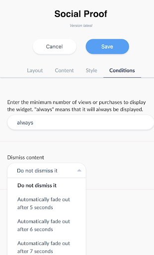
AB Tasty’s social proof solution comes in an industry-specific, ready-to-use format. It only takes two clicks to choose and customize the social proof messaging you want to display.

Social Proof: Why it Works

Social Proof messaging is based on one of the many cognitive biases inherent in human thinking – basically, we look to other people to help us decide what to do. It’s a fluke in the way people’s brains are wired, and one that many marketers already tap into. In contexts that are particularly influenced by trends and social norms, such as the beauty and fashion industry, social proof is especially salient. “Influencers, recommendations, reviews, celebrity endorsements…all of these tactics work because consumers care about what people they admire, or people like them, are liking, buying, and wearing,” commented Léa.

NYX Professional Makeup Puts Social Proof to the (A/B) Test

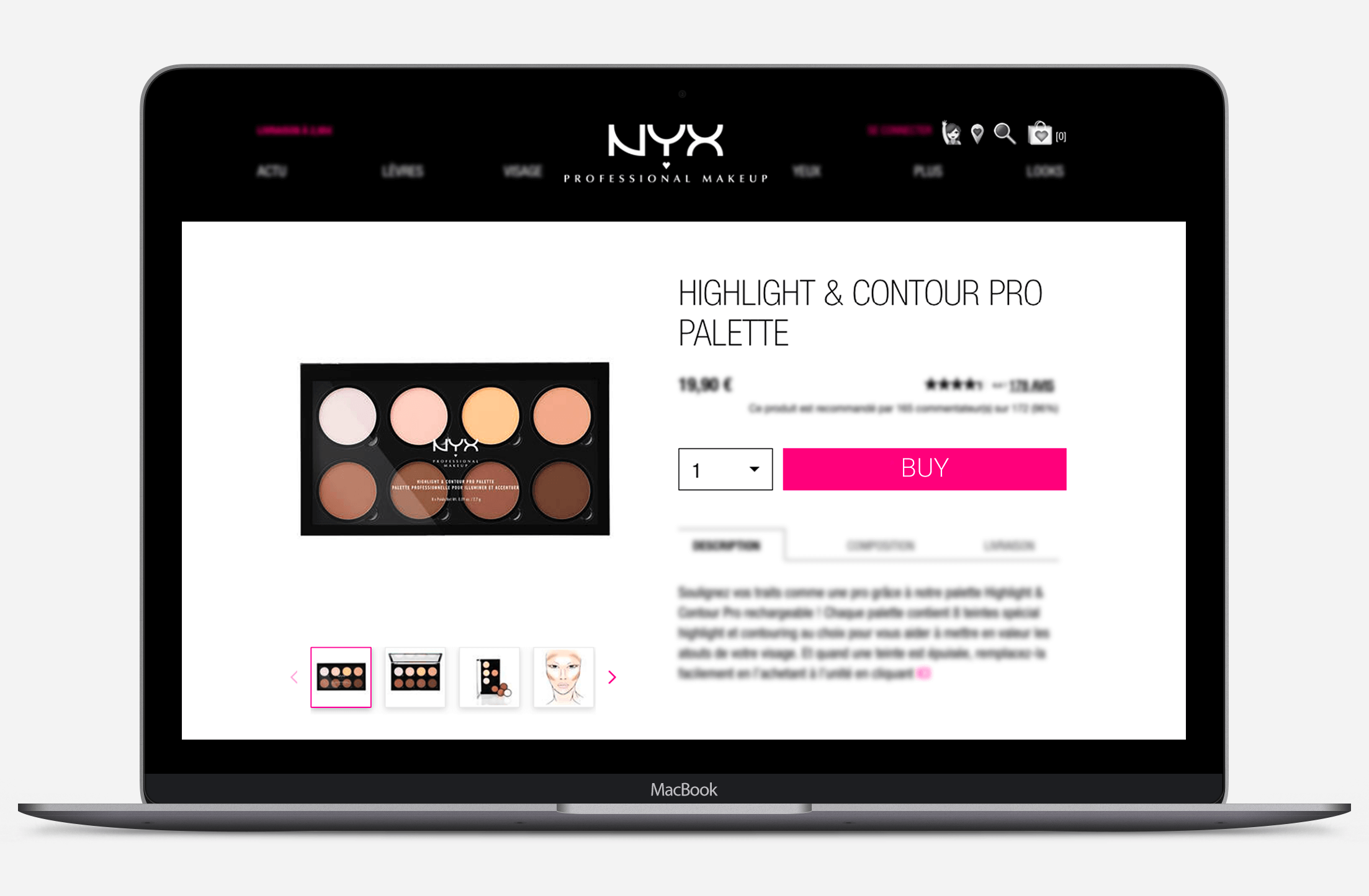
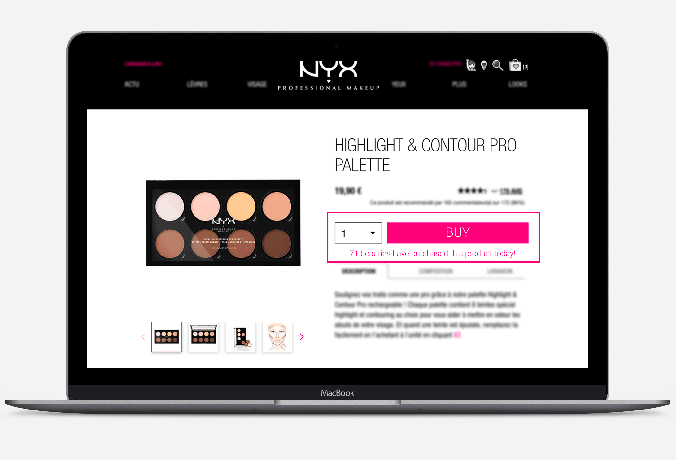
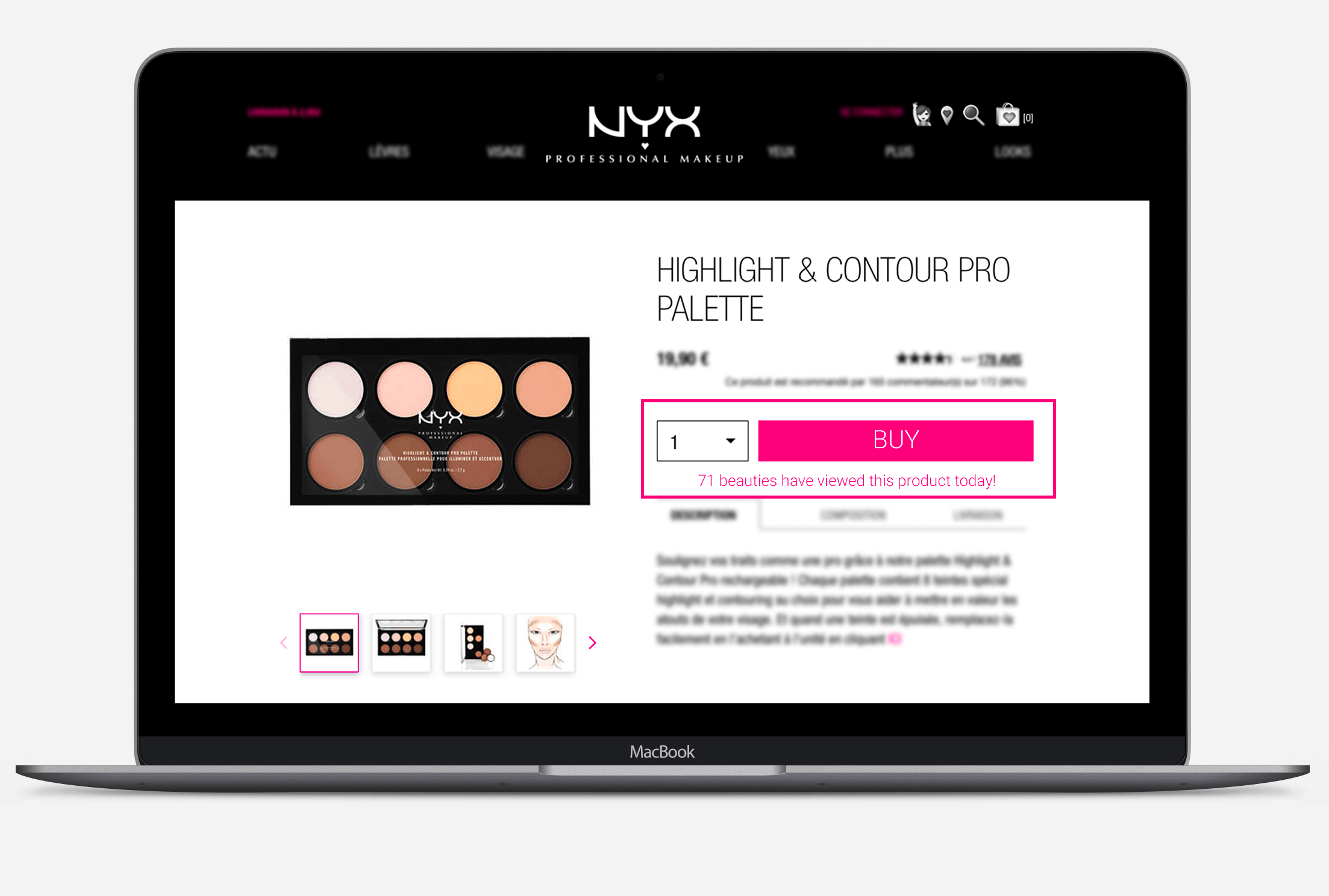
The team at NYX Professional Makeup decided to run a simple A/B test on the product pages of their French e-commerce site to try out just how effective a simple line of social proof messaging could be. Version A of the test remained the same – a typical product page already in use. They then tested two alternate versions (for desktop visitors), with slightly different social proof messaging just below the ‘buy’ call-to-action. The first variation indicated how many of the items had been purchased that day; the second variation referred to the number of items viewed.

Concretely, they wanted to test how effective these simple lines of text would be at encouraging browsers to click on ‘buy’, as well as actually confirming their purchase. How powerful would the simple act of displaying what consumers’ peers were buying be at influencing their own behavior?

NYX professional makeup PNG original version Original Version – No Social Proof Messaging


NYX Professional make up social proof messaging First Variation of Social Proof Messaging


NYX Professional make up social proof messaging Second Variation of Social Proof Messaging

Double the Transaction Rate

After letting the test run for a full business cycle, the results were in: both styles of social proof messaging had a positive effect on click-through rate, transactions and bounce rate.

Overall, the wording based around ‘purchases’ instead of ‘views’ was more impactful. When compared to the original page, it bumped up the click-through rate on ‘buy’ by 43%, and it also doubled the transaction rate. The variation based on views also performed well – it increased the click-through rate by 32%, and the transaction rate by 33%.

An added bonus was the significant reduction in bounce rates to the pages with either social proof messaging; both variations brought that down by around 38%.

Clearly, this social proof messaging caught buyers’ attention and stimulated them to continue down the purchase funnel.

Next Steps for Social Proof

“The results of this first test were far beyond our expectations,” concluded Guilhem. “This is just the beginning: we are eager to scale the use of social proof on many more use cases in order to maximize the business impact.” In addition to implementing this kind of messaging on a wider range of pages, NYX Professional Makeup can also use AB Tasty to run further experiments to test different types of social proof messaging. Adding more emphasis on creating urgency – for example, inciting consumers to ‘act fast’ to purchase very popular products – may also be effective in certain cases. AB Tasty’s social proof templates are completely customizable, so NYX Professional Makeup will also be able to test different variations that play with the look and feel of the messaging.

“Social proof messaging is a kind of website personalization,” explained Arthur Charbit, Product Manager at AB Tasty. “And just like with website personalization, best practice is to experiment to discover which messages resonate best with which audience segments.”

Spark
your curiosity!

Get your copy of "NYX Professional Makeup Increases Transactions and Decreases Bounce Rate Using Social Proof Messaging" now.

Case Studies

Yves Saint Laurent Beauty Increases Online Transactions by +10%

+9% Access to basket page

+13% Access to checkout page

Part of the L’Oréal Luxe brand portfolio, Yves Saint Laurent Beauty is known around the world for their luxurious skincare, makeup and fragrance products for men and women.

Challenge

As with the other brands in the L’Oréal Luxe portfolio, YSL Beauty products are sold in both online third party boutiques, as well as on their own proprietary website. For this reason, optimizing every aspect of the homepage and checkout funnel is key to making sure consumers purchase on the actual YSL Beauty site.

One of the crucial questions that needed answering was, what is the best order of the menu bar tabs? As a high end fashion house, YSL Beauty has plenty of news and products to showcase – but they still didn’t know what to emphasize on the homepage menu bar to maximize transactions.

A/B Test Idea

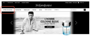
AB Tasty’s consulting team proposed a simple A/B test – switch the positions of the ‘New Products’ and ‘Exclusive Offers’ tabs to see if this would impact sales. By putting the ‘Exclusive Offers’ tab first – which takes browsers to current offers and gifts with purchase – instead of the ‘New Products’ tab, they aimed to test the appetite of website visitors for special and exclusive offers over new releases.

The test was easy to configure – with the WYSIWYG editor, the new version of the homepage and the parameters of the test were up and running in 30 minutes.

originalYSL
Original


variationYSL
Variation

Results

After letting the test run for a month on over 150k visitors, the results were conclusive: emphasizing the ‘Exclusive Offers’ tab had a visible effect on sales. Not only did access to the basket page shoot up by 9%, and to the checkout page by 13%, but overall transactions enjoyed a 10% increase. The team wasted no time pushing 100% of the test’s traffic to the winning variation and hardcoding these changes into their website.

Takeaway Tip

For high-end brands like YSL Beauty, accenting exclusive offers, over and above new products, proved to be especially effective. This is probably because shoppers of luxury brands are particularly susceptible to messaging about rarity and exclusive treatment. These consumers are likely to appreciate a product that’s shown to be exclusive and generous offers (reminding them of the ‘high end’ nature of the brand).

Spark
your curiosity!

Get your copy of "Yves Saint Laurent Beauty Increases Online Transactions by +10%" now.