Case Studies

NYX Professional Makeup Increases Transactions and Decreases Bounce Rate Using Social Proof Messaging

43% Increase in click-through rate

2x Increase in transaction rate

The Proof Behind ‘Social Proof’

Though the brand NYX Professional Makeup is rooted in ancient mythology – the name comes from the eponymous Greek goddess of the night – its marketing strategy is anything but old-fashioned. Founded in 1999 and headquartered in Los Angeles, NYX Professional Makeup (owned by the L’Oréal Group) is today present in 70 countries around the world.

Their rapid expansion, especially in North America, is due in large part to their savvy digital practices and their strong e-commerce presence. Indeed, the brand, which has been able to retain its affordable price-point and is adored by bloggers, influencers and everyday consumers, is pioneering the use of virtual reality and live-streaming to bring the same in-store service right to the consumer’s home.

NYX Professional Makeup at the Forefront of Digital Strategy

“Digital is at the core of our marketing strategy. Driven by the strength of social media, the fear of products being out of stock can be strong around star launches,” comments Guilhem Cussonnet, Data Scientist at L’Oréal Consumer Products France, who is also in charge of Digital Projects. “Brands like ours are benefiting from a makeup boom in the era of social beauty, and it’s essential for our brand to stay on the cutting edge.”

When the team at NYX Professional Makeup heard that AB Tasty was developing a social proof messaging solution, they were eager to be one of the first clients to try it out. Léa Benquet, Customer Success Strategist at AB Tasty, elaborated: “Our social proof messaging was a perfect fit for NYX Professional Makeup, who are extremely strong in their digital promotional strategy. We had already implemented similar tactics with their sister brand, Urban Decay – who target a near-identical consumer segment – to great effect.”

What was really appealing about AB Tasty’s solution was that it was in a ready-to-use format – there was little to no code to implement. We were able to set up the messaging template on our own in only a few weeks, shortening significantly our usual IT lead times,” added Guilhem.

Social Proof NYX Professional Makeup Screen 1
AB Tasty’s social proof solution comes in an industry-specific, ready-to-use format. It only takes two clicks to choose and customize the social proof messaging you want to display.

Social Proof: Why it Works

Social Proof messaging is based on one of the many cognitive biases inherent in human thinking – basically, we look to other people to help us decide what to do. It’s a fluke in the way people’s brains are wired, and one that many marketers already tap into. In contexts that are particularly influenced by trends and social norms, such as the beauty and fashion industry, social proof is especially salient. “Influencers, recommendations, reviews, celebrity endorsements…all of these tactics work because consumers care about what people they admire, or people like them, are liking, buying, and wearing,” commented Léa.

NYX Professional Makeup Puts Social Proof to the (A/B) Test

The team at NYX Professional Makeup decided to run a simple A/B test on the product pages of their French e-commerce site to try out just how effective a simple line of social proof messaging could be. Version A of the test remained the same – a typical product page already in use. They then tested two alternate versions (for desktop visitors), with slightly different social proof messaging just below the ‘buy’ call-to-action. The first variation indicated how many of the items had been purchased that day; the second variation referred to the number of items viewed.

Concretely, they wanted to test how effective these simple lines of text would be at encouraging browsers to click on ‘buy’, as well as actually confirming their purchase. How powerful would the simple act of displaying what consumers’ peers were buying be at influencing their own behavior?

NYX professional makeup PNG original version 
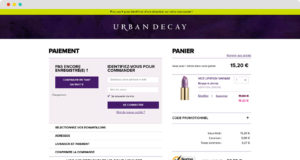
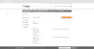
Original Version – No Social Proof Messaging


NYX Professional make up social proof messaging 
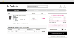
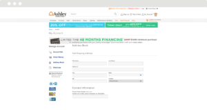
First Variation of Social Proof Messaging


NYX Professional make up social proof messaging 
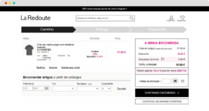
Second Variation of Social Proof Messaging

Double the Transaction Rate

After letting the test run for a full business cycle, the results were in: both styles of social proof messaging had a positive effect on click-through rate, transactions and bounce rate.

Overall, the wording based around ‘purchases’ instead of ‘views’ was more impactful. When compared to the original page, it bumped up the click-through rate on ‘buy’ by 43%, and it also doubled the transaction rate. The variation based on views also performed well – it increased the click-through rate by 32%, and the transaction rate by 33%.

An added bonus was the significant reduction in bounce rates to the pages with either social proof messaging; both variations brought that down by around 38%.

Clearly, this social proof messaging caught buyers’ attention and stimulated them to continue down the purchase funnel.

Next Steps for Social Proof

“The results of this first test were far beyond our expectations,” concluded Guilhem. “This is just the beginning: we are eager to scale the use of social proof on many more use cases in order to maximize the business impact.” In addition to implementing this kind of messaging on a wider range of pages, NYX Professional Makeup can also use AB Tasty to run further experiments to test different types of social proof messaging. Adding more emphasis on creating urgency – for example, inciting consumers to ‘act fast’ to purchase very popular products – may also be effective in certain cases. AB Tasty’s social proof templates are completely customizable, so NYX Professional Makeup will also be able to test different variations that play with the look and feel of the messaging.

“Social proof messaging is a kind of website personalization,” explained Arthur Charbit, Product Manager at AB Tasty. “And just like with website personalization, best practice is to experiment to discover which messages resonate best with which audience segments.”

Spark
your curiosity!

Get your copy of "NYX Professional Makeup Increases Transactions and Decreases Bounce Rate Using Social Proof Messaging" now.

Case Studies

Kiehl’s Increases Revenue by 31% with Basket Page Optimization

+5% Basket size

+31% Total revenue

Inspired by other brands in the L’Oréal Luxe portfolio, such as Lancôme, Biotherm, Urban Decay and YSL Beauty, the digital teams at Kiehl’s started working with AB Tasty in January 2018. With the help of Léa Benquet, their dedicated Customer Success Manager, the team was even able to surpass their initial targets.

Challenge

Our e-commerce clients often have the same main KPI: maximize the total revenue generated on their website. As for Kiehl’s, they have an impressive success story to tell: the brand began selling their products in stores such as Colette (in 1997) before opening their own boutiques (almost 15 in France). Naturally, their proprietary website’s performance is particularly vital to the brand.

In order to tackle this challenge head on, the digital teams at Kiehl’s decided to concentrate on the basket page. The idea? Create a visual that would be presented to the shopper before they finalized their purchase, encouraging them to take advantage of a free gift over a certain basket amount. For the brand, the advantages are numerous: increase the average order value (interested shoppers will increase their basket size in order to receive the gift), as well as strengthen client loyalty with exclusive, branded Kiehl’s gifts!

A/B Test

Kiehl’s decided to implement a sort of visual gauge on the basket page that indicates how much more the browser has to add to their basket in order to get the gift (in this case, a free product).

AB Tasty’s WYSIWYG editor made it easy to implement this visual barometer. In order to determine how well the test performed, different KPIs were measured, such as the click rate, access to the rest of the purchase funnel, number of transactions and the impact on the average basket size.

Kiehl's AB Tasty A/B Test
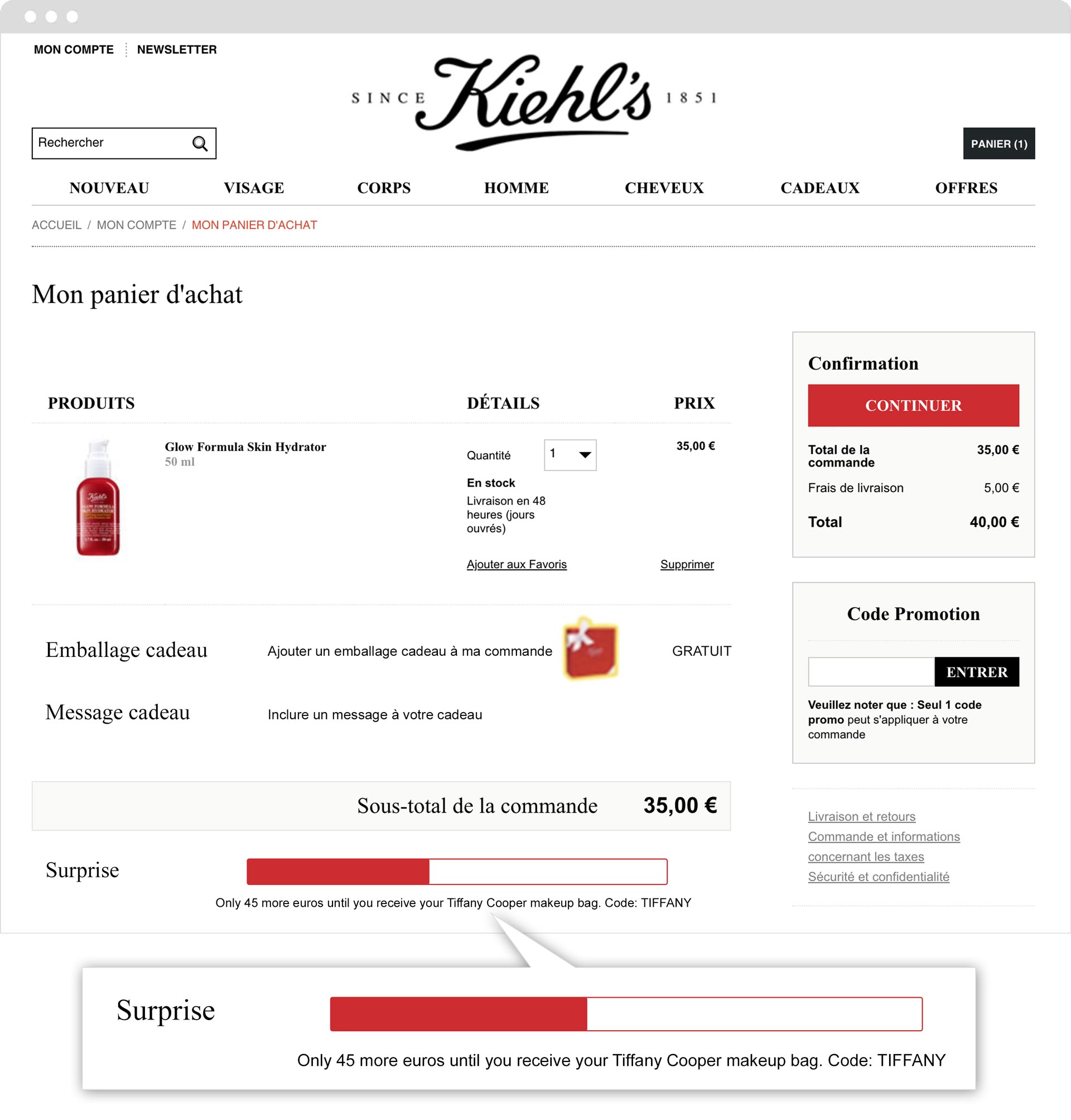
“One of our e-commerce clients’ biggest expectations is to be able to increase their average basket size per visitor. With Kiehl’s, our main challenge was to find a way to optimize this KPI by combining agility, scalability and a visual effect. We consider our work here a success since this campaign’s positive performance inspired other brands in the L’Oréal group.” – Léa Benquet, Customer Success Manager at AB Tasty

Results

Kiehl’s website visitors were particularly receptive to this barometer. This very visible incentive led to 7% more clicks on the CTA ‘continue’, and importantly, it also led to an increase in the average basket size of almost 5%! We also were able to report an increase in total revenue of 31%, with 25% more additional purchases and 31% more revenue per visitor.

Takeaway Tip

The urgency principle is being used more and more frequently. However, it needs to be applied intelligently. The trick is to find the right balance between creating anxiety in the shopper, while at the same time offering them a substantive incentive (free shipping, exclusive gift, etc.). Showing how much one needs to spend before receiving a free gift isn’t enough anymore: it’s the visual aspect – the barometer – that makes the message truly impactful. The image allows one to better retain the message. A semantic incentive, coupled with a relevant visual, is the perfect combination for prompting an internet user to make a decision at this stage in the purchase funnel.

Spark
your curiosity!

Get your copy of "Kiehl’s Increases Revenue by 31% with Basket Page Optimization" now.

Case Studies

Lancôme Increases Revenue by 15% With Login Page Optimization

+30% Clicks on 'create account'

+17% Transactions

Part of the L’Oréal Luxe brand portfolio, Lancôme was founded in 1935 by Frenchman Armand Petitjean. Today, the brand is known the world over for their luxurious skincare, cosmetics and fragrance products.

Challenge

When consulting their data, Lancôme’s digital team noticed an unusually high bounce rate on their login page. This lead Lancôme’s team, along with AB Tasty, to analyze the page’s structure and the behavior of its visitors. Together, they were able to identify a potential point of friction, related to the fact that there were numerous ways for a visitor to sign in. Indeed, someone who wished to purchase a product could log in as a client or guest, or they could create a new account – all potential exit points for visitors to leave the page.

A/B Test

Working with Léa Benquet, their dedicated Customer Success Manager at AB Tasty, Lancôme decided to try a simple design change. Up until then, on their login page, they had (from left to right) presented the different sign-in options as listed above. However, they decided to test moving the ‘create a new account’ option to the center of the page, therefore shifting ‘sign in as a guest’ to the right. ‘Log in as a client’ would remain on the left. They wanted to test if this would be a more logical organization for visitors, therefore encouraging transactions, account sign-ups, and perhaps even overall revenue.

The test was easy and quick to set up with the AB Tasty WYSIWYG editor. In thirty minutes it was up and running, with no help from the IT team needed. All that was left to do was let the test run for a few weeks, and analyze the results.

lancomeorginal

Lancome variation

Results

Perhaps unsurprisingly, moving the ‘create a new account’ block to the center of the page increased clicks to this CTA by 30%. What was more exciting, and more unexpected, was that transactions increased by 17%, with an associated bump in revenue of 15%.

Takeaway Tip

The login page is one of the most important pages to optimize on your site. In the physical world, shoppers don’t have to worry about logging in or creating an account to make a purchase. But in a digital context, this extra step is often the source of significant friction, and even of drop off and cart abandonment. Designing a user experience on this page that is logical and intuitive for your audience can have a real impact on sales, as the above case study shows.

Spark
your curiosity!

Get your copy of "Lancôme Increases Revenue by 15% With Login Page Optimization" now.

Case Studies

Yves Saint Laurent Beauty Increases Online Transactions by +10%

+9% Access to basket page

+13% Access to checkout page

Part of the L’Oréal Luxe brand portfolio, Yves Saint Laurent Beauty is known around the world for their luxurious skincare, makeup and fragrance products for men and women.

Challenge

As with the other brands in the L’Oréal Luxe portfolio, YSL Beauty products are sold in both online third party boutiques, as well as on their own proprietary website. For this reason, optimizing every aspect of the homepage and checkout funnel is key to making sure consumers purchase on the actual YSL Beauty site.

One of the crucial questions that needed answering was, what is the best order of the menu bar tabs? As a high end fashion house, YSL Beauty has plenty of news and products to showcase – but they still didn’t know what to emphasize on the homepage menu bar to maximize transactions.

A/B Test Idea

AB Tasty’s consulting team proposed a simple A/B test – switch the positions of the ‘New Products’ and ‘Exclusive Offers’ tabs to see if this would impact sales. By putting the ‘Exclusive Offers’ tab first – which takes browsers to current offers and gifts with purchase – instead of the ‘New Products’ tab, they aimed to test the appetite of website visitors for special and exclusive offers over new releases.

The test was easy to configure – with the WYSIWYG editor, the new version of the homepage and the parameters of the test were up and running in 30 minutes.

originalYSL
Original


variationYSL
Variation

Results

After letting the test run for a month on over 150k visitors, the results were conclusive: emphasizing the ‘Exclusive Offers’ tab had a visible effect on sales. Not only did access to the basket page shoot up by 9%, and to the checkout page by 13%, but overall transactions enjoyed a 10% increase. The team wasted no time pushing 100% of the test’s traffic to the winning variation and hardcoding these changes into their website.

Takeaway Tip

For high-end brands like YSL Beauty, accenting exclusive offers, over and above new products, proved to be especially effective. This is probably because shoppers of luxury brands are particularly susceptible to messaging about rarity and exclusive treatment. These consumers are likely to appreciate a product that’s shown to be exclusive and generous offers (reminding them of the ‘high end’ nature of the brand).

Spark
your curiosity!

Get your copy of "Yves Saint Laurent Beauty Increases Online Transactions by +10%" now.

Case Studies

UNICEF France Maximizes On-Site User Feedback

3.6% Visitors filled in survey

6 Week campaign

The nonprofit organization UNICEF works tirelessly across 190 countries to save and improve the lives of children from some of the world’s toughest places.

Challenge

As with any business, organization or nonprofit, the UNICEF website is crucial to their operations. Not only is it one of the ways to make a donation, it’s also where people go to understand what UNICEF does, what they stand for, and how donations are used to carry out their mission. It was therefore essential for UNICEF France to optimize their website to both increase donations, and also relay a positive image. With a big website redesign coming up, their digital team decided they needed to better understand how visitors actually experienced their website.

Marketing Campaign Idea

As an AB Tasty client, UNICEF France had various user insight tools at their disposal: heat mapping, session recording, and NPS surveys, to name a few. However, the UNICEF team was looking for in-depth feedback that would let them get inside the heads of their website visitors. They therefore opted to use a Google form, allowing them to ask both open-ended and ‘yes/no’ questions.

With the help of the AB Tasty team, they set up a pop-in in just one hour – which triggered on exit intent – that encouraged the website visitor to fill out the survey. They asked five questions about the design and usefulness of the site, the visitor’s reason for visiting, and their overall level of satisfaction.

Results

Over the 6 weeks the campaign was running, the team collected 310 responses, which represented 3.6% of the total visitors to the site. They were pleasantly surprised by the results: 92% of visitors said they liked the homepage! However, they also gained valuable insights regarding where their audience was most engaged, and what visitors wanted to see more of.

These insights served at the basis for many of the redesign changes. For example, 30% of respondents said the search bar was the most useful part of the homepage, so the search bar was enlarged in the update. Similarly, according to respondents, the least useful part of the homepage were the social share logos, which are slated to be removed.

“We were very happy to see that respondents overwhelmingly said they liked the homepage, and found what they were looking for. Overall, our donors were familiar with our website, even if they did ask for more video and photographic content. Our next step is to use this information to expand on the personalization campaigns around the visitor personas we’ve discovered, using AB Tasty.” – Léonore Manciaux, Digital Donation Officer at UNICEF France

Takeaway Tip

Understanding your audience is key for website optimization. So is choosing the right user insight tool to match your goals. Long-form surveys will let you get more in-depth, while NPS surveys are designed to show an evolution over time, and heat maps and session recording let you zoom in on points of friction or high engagement.

Spark
your curiosity!

Get your copy of "UNICEF France Maximizes On-Site User Feedback" now.

Case Studies

Urban Decay Increases Revenue by 7%

+7% Revenue increase during test

+8% Average basket size

The cosmetics line Urban Decay, which includes makeup for eyes, lips, nails, and skin, is known and admired for its edgy style. Part of the L’Oréal Luxe brand portfolio, alongside Kiehl’s, Lancôme, and Biotherm, Urban Decay products are sold online and in brick-and-mortar stores worldwide.

Challenge

“Each L’Oréal Luxe brand has its own website, based on a similar template,” explained Virginie Robert, Digital Project Manager at L’Oréal Luxe, “but each line has a different brand identity and target audience. Optimizations that might work for one won’t necessarily work for the others. That’s why we knew we needed a tool like AB Tasty.” Furthermore, since L’Oréal Luxe products are sold both on the brand’s own ecommerce website, as well as by third-party vendors, it’s especially important for their marketing teams to optimize transactions on their own site. The particular challenge for Urban Decay was increasing average basket size – both in terms of value and number of products – during sales.

A/B Test Idea

Working with Léa Benquet, their dedicated Customer Success Manager at AB Tasty, Urban Decay’s digital team decided to run an A/B test during one of their sales. They wanted to determine if a promotional banner, advertising a discount for 85 euros spent, would increase average basket size, quantity of items, and ultimately, revenue.

With the help of AB Tasty’s technical specialists, the banner – designed in an eye-catching green – was placed atop all basket pages on Urban Decay’s site. If a shopper had fewer than 85 euros in their basket, the banner was triggered, informing them of how much more they needed to spend in order to take advantage of the discount.


The banner was triggered to all shoppers with fewer than 85 euros in their basket. It reads, “Only X more euros until you can benefit from a discount on your purchase!”

Results

The promotional banner significantly increased all of Urban Decay’s KPIs: average basket size increased by 8%, the average number of items in the basket jumped by 7%, and revenue generated increased by an impressive 7%!

“We were very pleased to be able to work with Urban Decay to boost their revenue by 7% using just one A/B test. These kinds of optimizations can have a real impact on profits – over one year alone, this small change would have generated an extra 190,000 euros!” – Léa Benquet, Customer and Partners Success Manager Team Leader at AB Tasty

Takeaway Tip

Sales are particularly fruitful times to test website optimizations. Well-thought-out promotional messaging along the checkout process is key to maximizing profits.

“We were very happy with the results of this test, and we’re absolutely going to use the banner again during our next sale. The best part is that duplicating and implementing the banner design will be very easy to do, and won’t require any IT help, now that the template is all set up – this is part of the beauty of the AB Tasty platform.” – Guillaume Totis, e-Commerce Manager at Urban Decay


Spark
your curiosity!

Get your copy of "Urban Decay Increases Revenue by 7%" now.

Case Studies

La Redoute increases RPV by 2.7%

+4% Increase in average order value

+11,600€ Revenue over 6 weeks

La Redoute is a leading French e-retailer in fashion and home decoration. Known for its typically French style, the brand has a strong international presence, including in the UK, Belgium, Switzerland, Russia, Spain, Portugal, Italy, and Poland.

Challenge

When the Portuguese branch of La Redoute began working with AB Tasty, their aim was simple: increase revenue per visitor. However, the means were less than obvious. As a widely international brand, the team at La Redoute’s headquarters noticed that consumer behavior varied significantly according to country.

La Redoute Portugal knew, for example, that their visitors had smaller average order values (AOV) than their French counterparts, and purchased less frequently. In order to increase their revenue per visitor, what would be the best approach? They decided to use a simple A/B test to find out.

A/B Test Idea

The Portuguese team knew that their customers had less spending power than consumers in France. They liked to window-shop, for example, and would often abandon their cart without finalizing their purchase. Based on these insights, the team decided to test using a free shipping incentive on purchase pages, to see if it would positively affect AOV, and potentially revenue per visitor.

They tested two different versions against their original site (with no free shipping messaging): The first variation read ‘Free shipping over 30 euros’, and the second would inform browsers how much more they had to add to their cart before hitting the 30 euro free shipping mark.

Original
Variation

“In an e-commerce context, increasing revenue per visitor is all about finding the right combination of messages and incentives along the purchase funnel. For some audiences, opting for promotional offers works best. For others, it’s stress marketing techniques, or free shipping messages, like for La Redoute. The only way to know for sure what approach is effective – and how to perfect that approach for maximum impact – is to test it.” – Alexandre Anquetil, Customer Success Manager at AB Tasty

Results

Website visitors were clearly incentivized by the free shipping messaging. The first test version boosted revenue per visitor over the 6-week test by an impressive 2.7%, and the second version by 1.9%. This was accompanied by a jump in AOV of 3.7% for both versions. And the difference in revenue? The first variation brought in an extra 11,600 euros during the six weeks of the test alone. Over a year, that could translate into roughly 100,500 euros!

Takeaway Tip

Insights surrounding user behavior and mindset are the starting point of any good website optimization campaign. Start with analytics and insights tools, internal surveys and client feedback to get to know your customers.

Spark
your curiosity!

Get your copy of "La Redoute increases RPV by 2.7%" now.

Case Studies

How Ashley Furniture Increased Conversions by +15%

+15% Conversions

-4% Bounce rate

Context

As a leading furniture and bedding company in the United States, Ashley Furniture generates a high volume of visitors to its online store, AshleyFurnitureHomeStore.com. For this reason, optimizing its purchase process was a key step in improving conversion rates for new visitors.

Issue

How to eliminate frustration during the purchase process to ensure hassle-free checkout conversions?

Objective

Reduce the amount of time spent in the purchase funnel and lead the user to a faster and more effective conversion.

Implementation

We hypothesized that Ashley Furniture was struggling to convert new visitors due to their lengthy checkout process. On the original site, if the user did not enter their delivery and billing address while creating their  account, they would need to add in this information during the conversion funnel.

We decided to remove this step from the conversion funnel and test if that would improve conversion rates. The question was where in the customer journey this step would be implemented?

We tested a variation where, if the user had not entered their address information during the initial account creation phase, they would be prompted to log in to their account, then led to a form where they would be asked to fill in their delivery address.


Ashely HomeStore Screen 1
Step 1 in the original checkout process
Ashley HomeStore step 2
Step 2 in the original checkout process
Ashley HomeStore variation
Simplified checkout process

The objective of this test was to get the user to fill in their personal information before checkout, thus saving them time and simplifying the purchase process. We know that checkout is already a lengthy process with a number of different steps such as logging in, selecting a delivery option and payment method before finalizing a purchase. Our goal was to simplify this process as much as possible.

Results

With this test, we eliminated client frustration by shortening the checkout process, thus reducing cart abandonment rates during the checkout process and creating a more fluid transition to the payment step. By removing this form from the purchase funnel, conversion rates increased by 15%.

“We use AB Tasty to execute A/B and multivariate tests and personalization of our online store AshleyFurnitureHomestore.com. Currently, our UX teams use AB Tasty to gain knowledge of user experience to solve a range of problems and to build new functionalities. With this tool, it is easy to A/B test our ideas to learn whether our hypothesis increases conversion rates, before implementing them on all of our traffic.” – Matt Sparks, eCommerce Optimization Manager, Ashley Furniture

Spark
your curiosity!

Get your copy of "How Ashley Furniture Increased Conversions by +15%" now.