

When it comes to using A/B testing to improve the user experience, the end goal is about increasing revenue. However, we more often hear about improving conversion rates (in other words, changing a visitor into a buyer).
If you increase the number of conversions, you’ll automatically increase revenue and increase your number of transactions. But this is just one method among many…another tactic is based on increasing the ‘average basket size’. This approach is, however, much less often used. Why? Because it’s rather difficult to measure the associated change.
A Measurement and Statistical Issue
When we talk about statistical tests associated with average basket size, what do we mean? Usually, we’re referring to the Mann-Whitney-U test (also called the Wilcoxon), used in certain A/B testing software, including AB Tasty. A ‘must have’ for anyone who wants to improve their conversion rates. This test shows the probability that variation B will bring in more gain than the original. However, it’s impossible to tell the magnitude of that gain – and keep in mind that the strategies used to increase the average basket size most likely have associated costs. It’s therefore crucial to be sure that the gains outweigh the costs.
For example, if you’re using a product recommendation tool to try and increase your average basket size, it’s imperative to ensure that the associated revenue lift is higher than the cost of the tool used….
Unfortunately, you’ve probably already realized that this issue is tricky and counterintuitive…
Let’s look at a concrete example: the beginner’s approach is to calculate the average basket size directly. It’s just the sum of all the basket values divided by the number of baskets. And this isn’t wrong, since the math makes sense. However, it’s not very precise! The real mistake is comparing apples and oranges, and thinking that this comparison is valid. Let’s do it the right way, using accurate average basket data, and simulate the average basket gain.
Here’s the process:
- Take P, a list of basket values (this is real data collected on an e-commerce site, not during a test).
- We mix up this data, and split them into two groups, A and B.
- We leave group A as is: it’s our reference group, that we’ll call the ‘original’.
- Let’s add 3 euros to all the values in group B, the group we’ll call the ‘variation’, and which we’ve run an optimization campaign on (for example, using a system of product recommendations to website visitors).
- Now, we can run a Mann-Whitney test to be sure that the added gain is significant enough.
With this, we’re going to calculate the average values of lists A and B, and work out the difference. We might naively hope to get a value near 3 euros (equal to the gain we ‘injected’ into the variation). But the result doesn’t fit. We’ll see why below.
How to Calculate Average Basket Size
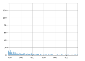
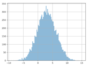
The graph below shows the values we talked about: 10,000 average basket size values. The X (horizontal) axis represents basket size, and the Y (vertical) axis, the number of times this value was observed in the data.
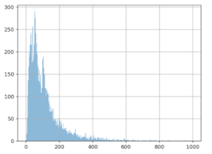
It seems that the most frequent value is around 50 euros, and that there’s another spike at around 100 euros, though we don’t see many values over 600 euros.
After mixing the list of amounts, we split it into two different groups (5,000 values for group A, and 5,000 for group B).
Then, we add 3 euros to each value in group B, and we redo the graph for the two groups, A (in blue) and B (in orange):
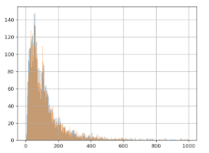
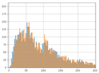
We already notice from looking at the chart that we don’t see the effect of having added the 3 euros to group B: the orange and blue lines look very similar. Even when we zoom in, the difference is barely noticeable:
However, the Mann-Whitney-U test ‘sees’ this gain:

More precisely, we can calculate pValue = 0.01, which translates into a confidence interval of 99%, which means we’re very confident there’s a gain from group B in relation to group A. We can now say that this gain is ‘statistically visible.’
We now just need to estimate the size of this gain (which we know has a value of 3 euros).
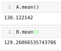
Unfortunately, the calculation doesn’t reveal the hoped for result! The average of group A is 130 euros and 12 cents, and for version B, it’s 129 euros and 26 cents. Yes, you read that correctly: calculating the average means that average value of B is smaller than the value of A, which is the opposite of what we created in the protocol and what the statistical test indicates. This means that, instead of gaining 3 euros, we lose 0.86 cents!
So where’s the problem? And what’s real? A > B or B > A?
The Notion of Extreme Values
The fact is, B > A! How is this possible? It would appear that the distribution of average basket values is subject to ‘extreme values’. We do notice on the graph that the majority of the values is < 500 euros.
But if we zoom in, we can see a sort of ‘long tail’ that shows that sometimes, just sometimes, there are values much higher than 500 euros. Now, calculating averages is very sensitive to these extreme values. A few very large basket size values can have a notable impact on the calculation of the average.
What’s happening then? When we split up the data into groups A and B, these ‘extreme’ values weren’t evenly distributed in the two groups (neither in terms of the number of them, nor their value). This is even more likely since they’re infrequent, and they have high values (with a strong variance).
NB: when running an A/B test, website visitors are randomly assigned into groups A and B as soon as they arrive on a site. Our situation is therefore mimicking the real-life conditions of a test.
Can this happen often? Unfortunately, we’re going to see that yes it can.
A/A Tests
To give a more complete answer to this question, we’d need to use a program that automates creating A/A tests, i.e. a test in which no change is made to the second group (that we usually call group B). The goal is to check the accuracy of the test procedure. Here’s the process:
- Mix up the initial data
- Split it into two even groups
- Calculate the average value of each group
- Calculate the difference of the averages
By doing this 10,000 times and by creating a graph of the differences measured, here’s what we get:
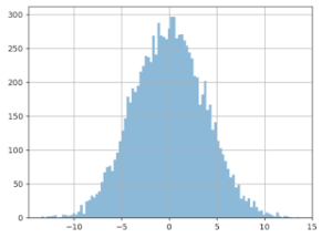
X axis: the difference measured (in euros) between the average from groups A and B.
Y axis: the number of times this difference in size was noticed.
We see that the distribution is centered around zero, which makes sense since we didn’t insert any gain with the data from group B. The problem here is how this curve is spread out: gaps over 3 euros are quite frequent. We could even wager a guess that it’s around 20%. What can we conclude? Based only on this difference in averages, we can observe a gain higher than 3 euros in about 20% of cases – even when groups A and B are treated the same!
Similarly, we also see that in about 20% of cases, we think we’ll note a loss of 3 euros per basket….which is also false! This is actually what happened in the previous scenario: splitting the data ‘artificially’ increased the average for group A. The gain of 3 euros to all the values in group B wasn’t enough to cancel this out. The result is that the increase of 3 euros per basked is ‘invisible’ when we calculate the average. If we look only at the simple calculation of the difference, and decide our threshold is 1 euro, we have about an 80% chance of believing in a gain or loss…that doesn’t exist!
Why Not Remove These ‘Extreme’ Values?
If these ‘extreme’ values are problematic, we might be tempted to simply delete them and solve our problem. To do this, we’d need to formally define what we call an extreme value. A classic way of doing this is to use the hypothesis that the data follow ‘Gaussian distribution’. In this scenario, we would consider ‘extreme’ any data that differ from the average by more than three times the standard deviation. With our dataset, this threshold comes out to about 600 euros, which would seem to make sense to cancel out the long tail. However, the result is disappointing. If we apply the A/A testing process to this ‘filtered’ data, we see the following result:
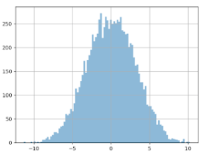
The distribution of the values of the difference in averages is just as big, the curve has barely changed.
If we were to do an A/B test now (still with an increase of 3 euros for version B), here’s what we get (see the graph below). We can see that the the difference is being shown as negative (completely the opposite of the reality), in about 17% of cases! And this is discounting the extreme values. And in about 18% of cases, we would be led to believe that the gain of group B would be > 6 euros, which is two times more than in reality!
Why Doesn’t This Work?
The reason this doesn’t work is because the data for the basket values doesn’t follow Gaussian distribution.
Here’s a visual representation of the approximation mistake that happens:
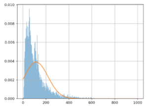
The X (horizontal) axis shows basket values, and the Y (vertical) axis shows the number of times this value was observed in this data.
The blue line represents the actual basket values, the orange line shows the Gaussian model. We can clearly see that the model is quite poor: the orange curve doesn’t align with the blue one. This is why simply removing the extreme values doesn’t solve the problem.
Even if we were able to initially do some kind of transformation to make the data ‘Gaussian’, (this would mean taking the log of the basket values), to significantly increase the similarity between the model and the data, this wouldn’t entirely solve the problem. The variance of the different averages is just as great.
During an A/B test, the estimation of the size of the gain is very important if you want to make the right decision. This is especially true if the winning variation has associated costs. It remains difficult today to accurately calculate the average basket size. The choice comes down soley to your confidence index, which only indicates the existence of gain (but not its size). This is certainly not ideal practice, but in scenarios where the conversion rate and average basket are moving in the same direction, the gain (or loss) will be obvious. Where it becomes difficult or even impossible to make a relevant decision is when they aren’t moving in the same direction.
This is why A/B testing is focused mainly on ergonomic or aesthetic tests on websites, with less of an impact on the average basket size, but more of an impact on conversions. This is why we mainly talk about ‘conversion rate optimization’ (CRO) and not ‘business optimization’. Any experiment that affects both conversion and average basket size will be very difficult to analyze. This is where it makes complete sense to involve a technical conversion optimization specialist: to help you put in place specific tracking methods aligned with your upsell tool.
To understand everything about A/B testing, check out our article: The Problem is Choice.


