Case Studies

Avid Transforms Internal Culture and Website Experience With AB Tasty

+49% supporters

Increase customer satisfaction

Avid, a global provider of software and solutions for media creation and management, has been steadily building and infusing a culture of experimentation across the business — and it shows. Here’s how Jeff Copetas, VP of E-Commerce & Digital, has been able to seamlessly collaborate across departments and continuously improve the customer experience.

image-avid-3

When Jeff Copetas joined Avid in 2017, there wasn’t exactly a playbook on website optimization. The Burlington, Massachusetts-based multimedia production company — a favorite among Hollywood TV/film producers and most recently, partnered with NBC on its coverage of the 2021 Olympics Games — was struggling to modernize its website to keep up with the latest digital trends and consumer demands.

So the VP of E-Commerce & Digital set out to build a foundation not only for website optimization, but also for a data-driven culture of experimentation within the offices of Avid.  The latter, Jeff says, was significant to enabling e-commerce teams to be more autonomous through internal organization and structuring.

As a dynamic, fast-paced technology company, Avid’s lean development team was 100% focused on the product roadmap and the core needs of operating a website. The team’s use of an agile sprint system meant any experiments from the e-commerce team had to wait for prioritization — oftentimes, taking months for deployment.

“The push-and-pull of web, e-commerce teams and IT teams is quite common. They have their roadmap, we have ours. The point of A/B testing is that it doesn’t go through a series of sprints. We need to test quickly and pivot just as fast,” Jeff says.

Enter AB Tasty, whose partnership with Avid has resulted in double-digit increases in transactions, a material uptick in conversions, and an overall better user experience. The capability to test at scale was a prerequisite for Jeff and his team.

“The deciding factor for us was the partnership that we would build with AB Tasty. We didn’t want to feel like we were being nickel-and-dimed each time we needed help. AB Tasty, at the core, is customer-centric and their customer success team has brought forward so many great ideas,” Jeff explains.

The deciding factor for us was the partnership that we would build with AB Tasty. AB Tasty, at the core, is customer-centric and their customer success team has brought forward so many great ideas.

Jeff Copetas, Avid VP of E-Commerce & Digital

Implementing a “test and learn” mindset

In some form or another, Jeff has always been a proponent of testing for most of his 20-plus- year career in e-commerce, digital marketing, and social media. His approach is rooted in data-driven decision-making, A/B testing, and most importantly, the customer’s perspective.

“I don’t let my own opinion of what I think looks good cloud the performance of a website. I need data to tell me that. I would rather survey customers,” he shares.

It was this mentality that Jeff was keen on implementing at Avid, not only within his e-commerce team, but across the entire organization. Before implementing any experimentation programs, Jeff wanted a companywide buy-in.

“We had to move from a mindset of ‘I think …’ to ‘let’s test and learn,’ by taking the albatross of opinions out of our decision-making process,” Jeff recalls. “You can make a pretty website, but if it doesn’t perform well and you’re not learning what drives conversion, then all you have is a pretty website that doesn’t perform.”

The problem to root out before implementing experimentation, Jeff advises, is opinions. Whose opinion is “right”? According to Jeff, it’s the one that drives conversion. It’s why he turned to AB Tasty as an internal validation tool. The ease of use and implementation through the visual editor enabled the team to test quickly — without requiring prioritization from the development team — and collect data that Jeff could use to drive his strategy for generating leads and driving revenue.

“My opinion on the color or copy of a CTA doesn’t matter. What matters is the data and what converts. Everyone will come to the table with their opinions or test ideas. With AB Tasty, we can quickly decide which design or copy is the best based on the highest conversion rate,” he says.

You can make a pretty website, but if it doesn’t perform well and you’re not learning what drives conversion, then all you have is a pretty website that doesn’t perform

Jeff Copetas, Avid VP of E-Commerce & Digital

Turning to the customers, always

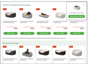
Avid runs a lot of tests — from the seemingly minute, such as color changes, to heavier page redesigns — always depending on users’ responses as they navigate through the website. That customer-centric strategy became crucial when it came time to revamp the global site navigation.

Jeff and his team had identified a pain point of their website UX: Visitors typically headed to the navigation bar, which was on the left side of the site and only expanded on hover. However, based on Avid’s deep dive into their search logs, most people ended up using the search bar instead because the navigation bar wasn’t optimally categorized.

The challenge lay in uncovering the different purposes of a navigation bar and search bar for Avid’s clientele. What are the top products they search for? How can that be displayed properly in the navigation bar? What categories or design needed to be drawn up to sufficiently address this particular user experience?

Well, if you know Jeff, you would also know that he went directly to the source: the users. With AB Tasty’s NPS widget, he set up a two-week campaign to collect data points before redesigning the experiment. The no-code widget prompted users via a pop-up to share their feedback about the navigation experience after 1 minutes and 20 seconds — the average time a user spent on the page.

The data collected from this enabled Jeff’s team to prioritize their roadmap based on which improvement would have the highest positive impact. Their first plan of action was to make the navigation bar more visible by moving it to the top of the page and create mega-menus to include more clickable categories to address the main user feedback: The site, simply, was just too hard to navigate.

A week after the test, Jeff relaunched the NPS widget with the same questions to collect feedback on the ease of navigation. The results of his experiment saw an increase of 49% in supporters, who also cited improved overall user experience.

Original
New navigation bar

Next-gen experimentation at Avid

Avid’s website addresses two markets. There’s the B2B audience, in which the website serves as a lead generation tool to sell its products and services to companies. Avid also has a B2C segment of individual musicians and media creators that purchase subscriptions, hardware, training materials and other digital downloads directly from a self-service model.

The different segments also mean different growth strategies and website optimization complexities. This, however, doesn’t deter Jeff and his team. Their goal has always been to implement a “test and learn” mindset to drive conversion, whether it’s a form-fill for enterprise leads or a purchase from an individual. And with AB Tasty’s support, particularly in personalization and building customer segments, Jeff is continuously optimizing the website.

AB Tasty has really brought so much to the table. We’ve done so much brainstorming together over the years, and the partnership is only getting stronger and stronger.

Jeff Copetas, Avid VP of E-Commerce & Digital

“AB Tasty has really brought so much to the table. It’s a true partnership that we have on the development side, with the velocity and accuracy of the delivery,” Jeff says. “We’ve done so much brainstorming together over the years, and the partnership is only getting stronger and stronger.”

The tables have also turned since then. Let’s revisit 2017, when Jeff had to rely on the tech team to help him implement his A/B testing. A few years have passed since then, so how well has his “test and learn” philosophy influenced Avid?

“We’ve come a long way. We have shown the value of experimentation to the company by pairing opinions with data. We have enough people coming to my team now to propose tests that we’ve had to introduce an online ticketing system to manage requests,” Jeff says. “I consider that a success. The mindset has absolutely shifted.”

ABOUT JEFF COPETAS

Jeff Copetas has spent over 20 years in the e-commerce and digital marketing space, helping teams create value within their organizations and driving revenue growth consistently. Jeff currently leads the global end-to-end digital experience strategy at Avid, where he serves as VP of E-Commerce & Digital. His responsibilities include ensuring a best-in-class website experience that generates leads and revenue for Avid’s B2C, reseller and enterprise efforts.

ABOUT AVID

Avid delivers the most open and efficient media platform, connecting content creation with collaboration, asset protection, distribution, and consumption. Avid’s preeminent customer community uses Avid’s comprehensive tools and workflow solutions to create, distribute and monetize the most watched, loved and listened to media in the world — from prestigious and award-winning feature films to popular television shows, news programs and televised sporting events, and celebrated music recordings and live concerts. With the most flexible deployment and pricing options, Avid’s industry-leading solutions include Media Composer®, Pro Tools®, Avid NEXIS®, MediaCentral®, iNEWS®, AirSpeed®, Sibelius®, Avid VENUE™, FastServe®, and Maestro™. For more information about Avid solutions and services, visit www.avid.com.

Spark
your curiosity!

Get your copy of "Avid Transforms Internal Culture and Website Experience With AB Tasty" now.

Case Studies

How Hanna Andersson Experiments Its Way to Higher Lifetime Value

+8% PLP Clicks

+22% Purchase Rate

About Hanna Andersson

Adored by parents around the world, Hanna Andersson offers a wide range of children’s clothing and matching pajamas for the entire family. Founded in Portland, OR by Gun Denhart in 1983 as a purely catalogue company, the brand has since successfully made the transition to online sales.

Increasing Customer Lifetime Value

“One of our challenges is marketing our toddler collection,” explains Morganne Hatfield, Marketing Analyst at Hanna Andersson. “We recently combined the kids line and the toddler line into one collection. But toddler is a key demographic – if we can get moms to discover and fall in love with Hanna Andersson clothing for their young children, chances are they’ll stay loyal customers as their kids grow, increasing their overall customer lifetime value (CLV).”

Creating an e-commerce growth engine

Expanding a product line is a far-reaching goal that affects all aspects of a business. Morganne’s challenge was to figure out how to use Hanna Andersson’s website to increase awareness and sales. But where to start! The team could rewrite product descriptions, increase or decrease product image sizes, add customer reviews or implement a cross-sell bar…

The possibilities were endless: what was the best tactic to increase growth?

Experiment to increase uplift

Enter experimentation. Hanna Andersson’s SVP of Digital was a firm believer in the merits of testing and using data-driven rationales for optimization. Through a prioritized experimentation roadmap, the team could systematically test their optimization ideas, learn from the results, and implement winning variations. No more guesswork or time lost in internal debates. 

Is a picture worth a thousand conversions?

One idea Morganne was eager to test involved the default image shown on the product listing pages (PLPs) and product description pages (PDPs) of the toddler section.

When someone went browsing through the toddler collection, the first image on the page showed the clothing item sized for an older child – not a 1 to 3 year old. Though the product itself was identical, it certainly didn’t look the same when sized for a lanky seven year old versus a toddler still round with baby fat. Her idea was to test whether it was worth the effort to photograph the smaller sizes and use them for the toddler product page images. Would they convert better?

Morganne decided to test swapping out the default image with one where the item was sized for a toddler, but only if the user was navigating from the toddler section of the site. “I wanted to test if buyers would react more positively to the age-appropriate clothing, whether this would increase basket rate and overall conversion rate.”

Hanna Andersson control
Control
Hanna Andersson variation
Test

Significant revenue impact

After a quick set up, the test was live and results rolled in: the experiment was an absolute success. “I was honestly surprised by just how well it worked – clicks on PLPs increased by about 8%, and purchase rate on those items by 22%, which is huge. At the time of this test we only had a handful of toddler-sized items online. But we’ll soon be offering 100% of our line in these sizes, so if you multiply these results by hundreds of products, the revenue impact is significant.”

“Our merchandising team was thrilled”

Not only did the test have a positive impact on immediate business metrics, it was also another step in solidifying the marketing for the toddler clothing line.

“When I shared these results in our quarterly review, our merchandising team was thrilled,” explained Morganne. “Having this kind of data-driven evidence helps us confidently make strategic investments – this knowledge is really helpful,” concludes Morganne.

AB Tasty enables agility

AB Tasty’s ease of use was instrumental in the success of this experiment.  Without the marketing-friendly interface and widget library, it wouldn’t have been possible to get this test up and running in under a week.

 “It’s great to be able to use AB Tasty to launch these kinds of campaigns independently, without having to bother our dev team,” says Morganne. “We’re really pleased with the results we’ve had, and how agile the AB Tasty Customer Success team has been. The widget library especially – the countdown banners, NPS surveys – have been key in enabling us to be autonomous and launch campaigns fast. ”

Looking forward

This test on the toddler line was undoubtedly a success. But that doesn’t mean the testing ends. Continuous optimization is key to fully reaping the benefits of experimentation and personalization, and Morganne intends to continue perfecting the customer journey. “We dug into the data and realized that, although 70% of our traffic comes from mobile devices, there’s still a lot of room for improvement when it comes to converting that traffic,” explains Morganne. “We’re excited to see what more we can achieve with AB Tasty!”

Spark
your curiosity!

Get your copy of "How Hanna Andersson Experiments Its Way to Higher Lifetime Value" now.

Case Studies

How Clarins Uses AB Tasty for Personalization and Retention

+89% Conversions

+145% Add to Basket

The e-commerce team at Clarins is a true “testing lab,” managing their 5 websites (Germany, Spain, Ireland, Benelux, and Portugal) and helping the other nearby countries to grow their e-commerce business. The goal of this ‘incubator’ is to create an internal community of experimenters to help share testing best practices. This approach paid off with the creation of the ‘Wheel of Fortune,’ a gamification concept launched on Singles Day, November 11, 2020.

While testing using AB Tasty was initiated by the International Content team, Clarins decided in 2020 to not only extend its partnership with AB Tasty to include a commercial component but also to expand to the regional and local level. The tool that the EMEA teams were using previously was limited to creating pop-ins, which wasn’t enough to tackle Clarins’ goals involving retention and personalization.

Personalization via gamification

For Célia Rigaux, E-Commerce Director, EMEA, this was an opportunity to instill a test and learn culture across the EMEA teams. “Our goal is to exchange with our customers, to create a link with them, and to inspire loyalty, by bringing them value through our websites. AB Tasty’s experimentation capabilities enable us to challenge our CRM, Acquisition, and E-store teams using innovative tests that we weren’t able to run before.”

With the strategic holiday season approaching, the time was right to launch a far-reaching test across all of the sites managed by the EMEA e-commerce team. Singles Day (celebrated on November 11 in many countries) was the perfect option, seeing as it was also only a few days before Black Friday. All that was left was to decide what kind of game to display.

Everyone’s a winner

At the end of September 2020, Clarins got in touch with their Customer Success Manager at AB Tasty to see if their idea was feasible. After a few exchanges, they decided on the right set-up that struck a perfect balance between technical feasibility and a smooth user experience. 

The idea was simple: Every person who visits any of Clarins’ EMEA websites, whether on desktop or mobile, sees the game appear. If they click on it, the wheel spins and stops at one of 6 gifts. The gifts are promo codes, automatically applied to the winning visitor’s basket, which makes for a great user experience (especially on mobile).
Clarins singles day campaign

Clarins wheel of fortune campaign
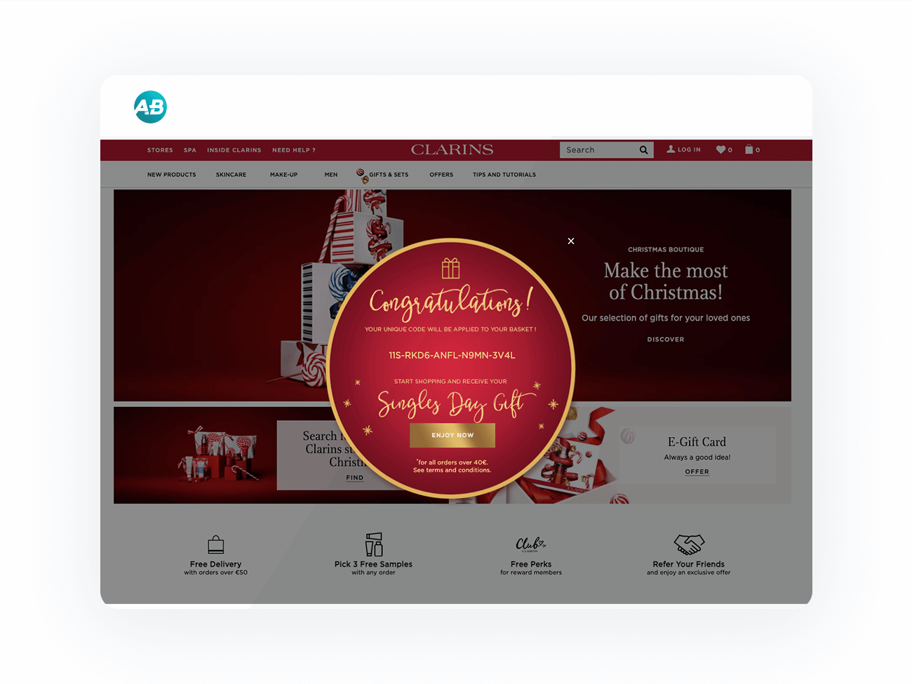
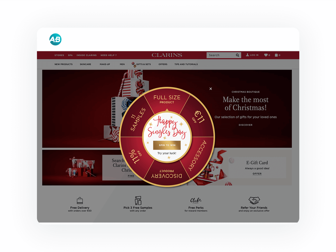
“We were able to launch our tests in two weeks,” explains Anaëlle Thomas, E-store Project Manager EMEA, who was responsible for the development of the project. One of the major advantages of AB Tasty was the ability to duplicate each experiment for each of Clarins’ sites. If the first test took 20 hours to implement, this number shrank by 5 for each of the other 4 sites. This experience is now live for all of the other countries Clarins’ is present in, and adaptable for other offers.

4x the orders

The first gamification test was a success for Clarins’ EMEA e-commerce team. The game, buoyed up by the increased web traffic brought on by the pandemic, performed very well. Live for 24 hours (from the 10th to the 11th in the evening), the total number of orders completed on the 4 main sites (Germany, Spain, Ireland and Benelux) quadrupled when compared to the results of November 11, 2019. Ireland stood out, with an order increase of +495% and a +585% increase in revenue.

The conversion rate did well, increasing by +89.34% compared to 2019. Finally, the add-to-basket rate increased by +145% compared to the 2020 average.  It should be noted that, though the game performed well in all countries, it was Ireland that attracted the most visitors, with 61.37% of visitors trying their luck.

“We systematically test on all our sites to see how each country reacts according to the local culture. So we shared the success of this experiment with the other countries,” elaborated Anaëlle Thomas. “South Africa was particularly interested and launched their own version in December. The United Arab Emirates also ran the test during the 4 days of Black Friday.”

Pursuing personalization in 2021

Previously known mostly as an A/B testing tool, AB Tasty has attained the level of ‘business partner.’ The EMEA teams even share their experimentation tips via Teams. Next step: Further develop their personalization strategy, especially by learning from other AB Tasty clients’ experiences. See you in 2021!

“The ability to duplicate tests in AB Tasty allows us to exchange more often with the other EMEA countries and to share experiments. We rely on AB Tasty to guide us in driving our personalization strategy forward.”

– Célia Rigaux, E-Commerce Director, EMEA, Clarins

Spark
your curiosity!

Get your copy of "How Clarins Uses AB Tasty for Personalization and Retention" now.

Case Studies

How a Dedicated Optimization Program Helped Fragrance Direct Delight Its Customers

+21% Revenue Uplift

+20% Increase in Transactions

Fragrance Direct is a UK-based pure-play beauty retailer who has been operating since 1993. It sells over 14,000 products across 600 big-name brands, designer labels, and high street favorites. In addition to fragrances, Fragrance Direct sells makeup, skincare, and haircare products from both everyday and luxury brands. Fragrance Direct has been partnering with AB Tasty for over 2 years, and for just under 2 years with Endless Gain.

The Objective

To improve Fragrance Direct’s customers’ experience and generate the business more sales and profit. AB Tasty and Endless Gain approached this in three key ways with outstanding results.

The Approach

Social proof messaging helps instill trust in Fragrance Direct among customers

Research showed that the wider market awareness of Fragrance Direct was quite low. A variety of social proof messages were successfully introduced to new customers. These social proof experiences delivered an increase of over 8% in the user conversion rate.

Personalization helps strengthen an already-strong trading period

Fragrance Direct does very well during three gifting seasons: Valentine’s Day, Mother’s Day, and Christmas, through the Fragrance Finder page.

However, research showed that traffic volumes were low on this page (even during peak periods) despite high conversion rates, and users surveyed said they didn’t actually know what they were looking for from a gifting point of view when they arrived on this page. Using AB Tasty’s Audiences feature, Endless Gain identified users arriving on-site either looking for gifts or unsure about what to buy. These specific user segments were prompted with the question “Searching for gift?”.

Users who clicked on the prompt were taken to the Fragrance Finder page where they were then able to, through a series of personalized questions, engage with and find their desired gift.
The prompt was not shown to users who were not looking for gifts, in order to avoid distracting them and disrupting their journey with the brand. With tactical usage, this personalized strategy delivered a 10% increase in the user conversion rate for Fragrance Direct during their peak periods.

Helping customers checkout faster, and easily, increases sales

Multiple pieces of research highlighted the checkout funnel as one of the key priorities. Various steps within the funnel (and the fields within them) caused considerable friction for customers. Each of these elements, either singularly or combined, were likely to be harming conversions. Endless Gain redesigned multiple elements with the checkout. Through experimentation, the improvements increased the user conversion rate by 2%.

“Using AB Tasty, an efficient and flexible experimentation and personalization platform, enabled us to build on our optimization approach. To continue to build on that, we decided to hire Endless Gain. Working with Endless Gain means we get dedicated resources who are focused 100% of their time on improving our
customers experience without the distraction of day-to-day business challenges.”

– Julian Thompson, E-Commerce Director, Fragrance Direct

Spark
your curiosity!

Get your copy of "How a Dedicated Optimization Program Helped Fragrance Direct Delight Its Customers" now.

Case Studies

Pets at Home Drives More Users to the Checkout & Confirmation Page

>3% Increase in users reaching the basket page

>2.5% More users reaching the confirmation page

Pets at Home is the UK’s largest pet care business and provides pet owners with everything they need to be able to look after their pet – from food, toys and bedding, and grooming services, to first opinion veterinary care and world-class specialist veterinary hospitals.

The Challenge

Analysis indicated that Pets at Home’s users were not progressing further down the purchase funnel, with over two-thirds of users not moving past the basket page to reach checkout. It became clear that the website needed to be optimized to lower the abandonment rate and push more users into checkout.

Test Hypothesis

To lower the abandonment rate, the team at Pets at Home decided to implement a pop-up displaying the user’s basket items upon returning to the website. Reminding users of the items in their basket would hopefully encourage them to view their basket and drive more users to ultimately convert.

Winning Variation – Saved Basked Prompt

Results

The test was set up to target desktop users who had at least one product in their basket. Directing approximately half of their traffic to the variation, the variation proved successful after having run for 3 weeks. The variation significantly drove more users to the checkout & confirmation page.


“Introducing a saved basket prompt for returning users when they return on Pets at Home’s website increased more users to checkout and convert. We’ll also be running this test on mobile to see how this performs.” – Halima Satheya, Digital Optimisation Lead @ Pets at Home

Spark
your curiosity!

Get your copy of "Pets at Home Drives More Users to the Checkout & Confirmation Page" now.

Case Studies

OUI.sncf Relies on AB Tasty for Risk-Free Innovation

61% Increase in conversion rate

Faster innovation

For Hélène Doré, brand loyalty is her bread and butter. 

As a Conversion Rate Optimization Manager at OUI.sncf, her day-to-day consists of thinking up ways to make customer experiences smoother and conversions higher. It’s a job she loves, but it’s not without its challenges. Today’s consumers are fickle and their expectations are exacting; one poor experience on an app or website can create a long-lasting negative feeling, potentially spiralling into poor brand perception, a drop off to a competitor, or bad word of mouth.

“More likely than not, when a customer faces a problem during his/her visit, it creates a bad memory, which may mean the customer doesn’t return. Creating an exceptional, personalized, and fluid customer experience gives a sentiment of recognition to the customer, which will incite him/her to complete a transaction and potentially come back. If we work on creating the most seamless and personalized customer journey, over time, this recognition will transform into loyalty and create stickiness, inciting the customer to come back and therefore form a virtuous relationship with us.”

 – Hélène Doré, Conversion Rate Optimization Manager at OUI.sncf

The conversion rate optimization team, along with the product feature teams, at OUI.sncf has plenty of ideas for how to avoid these scenarios and create truly exceptional customer experiences. The question is: which ideas should they implement? Which should they scale? And how can they be sure an idea won’t backfire? 

A/B Testing: The way of data, not debates

What Hélène and her manager Sunny Song, Lead CRO, needed was the ability to run data-driven experiments in order to know which of their ideas will perform best (to optimize the customer experience), and to mitigate risk in case the idea goes south. AB Tasty was able to provide this capability!

“When we have a goal to achieve and we have several possible propositions to achieve the same goal, AB Tasty helps us by allowing us to test these propositions. We can then make the best decision by determining which proposition has the greatest impact,” explains Sunny.

One great example is OUI.sncf’s ‘Exploration Assistant’. 

Think of the ‘Exploration Assistant’ as an AI-powered travel agent. Based on an in-house algorithm, the Assistant is displayed to visitors with a high enough ‘interest score’, and suggests a trip itinerary for the visitor.  The idea sounds great on paper, but would the Exploration Assistant actually make a business impact on bookings?

Using AB Tasty to run a statistically rigorous A/B test, the team determined that conversion rates did significantly increase for those visitors that engaged with the Assistant.  

“This test showed extremely positive results: +61% for web responsive and +33% for desktop impact on the conversion rate,” explains Sunny. This particular experiment was important for more than its impact on these KPIs: “This test was a milestone project for Oui.sncf because it was a very technically complex A/B test and was the first test that incorporated AI algorithms. But the work doesn’t stop here. It’s really essential for the teams to continuously iterate on this version of the algorithm, to test and tweak it for better and better results, so that we’re always proposing the most efficient itinerary to our customers. This is how algorithms evolve, and it goes hand in hand with a continuous optimization strategy.”

In other words: targeted, data-driven testing helps validate strategic decisions at key moments, confirming high-level strategy choices and setting future roadmaps.

“Thanks to the Exploration Assistant A/B test and its very impactful results, we will now industrialize this test. This test was very strategic because it was the first which included AI, which plays a key role in OUI.sncf’s strategy.” 

– Sunny Song, Lead CRO at OUI.sncf

Another advantage to attaching numbered results to testing ideas? Avoiding circular, time-sapping discussions about whose idea to run with. “By implementing A/B tests and providing concrete results and data to prove the effectiveness of certain ideas, we were able to eliminate the “endless” debates we could have where each person has his own opinion on topics,” concludes Sunny.

For example, low click-through rate data indicated to the team that unfolding travel details on the ticket information page on their app could increase clicks to a key CTA.

This idea could have led to hours of endless debate around the respective value of each of these blocks.

Instead, the team used Flagship (AB Tasty’s server-side platform) to run an A/B test on the app. This allowed them to quickly validate the winning variation – which happened to be the version B, where the details of the first trip were automatically unfolded. This led to a 2.49% increase in the click-through rate to the CTA “Choose this trip”, as well as 0.28% more arrivals to the basket page.

This is an image of an A/B test run on OUIsncf using AB Tasty

Flagship: The platform behind the magic

“Our strategy is to offer the most fluid and seamless user experience possible to our clients, the vast majority of whom browse and book on our OUI.sncf mobile app, which has become extremely popular.” 

– Ingrid Peiniau Head of Customer Experience at OUI.sncf

Customer experience has become increasingly mobile-first. Alongside buying their groceries, clothing and movie tickets on their smartphones, consumers expect to be able to search, book, or reschedule travel via a user-friendly app. This is especially true for OUI.sncf, where a majority of visits are generated via their mobile app.

This meant that it made sense for OUI.sncf to turn to AB Tasty’s server-side solution, Flagship, for their optimization efforts. It’s the platform they used for tests run on their mobile app, versus their website.

Not only does Flagship enable the kind of experiments OUI.sncf was running on their mobile app, it also allows product teams to release new features with virtually no risk. Why? Teams are able to not only rollout a new feature progressively – that is, not exposing all of their user base at once – but they can also easily rollback that feature if they notice a dip in KPIs.  

Benoit Bouffart, Chief Tech & Product Officer at e.Voyageurs SNCF., explains:

“We’re particularly interested in Flagship’s progressive rollout capabilities. We want to be done with publication planning dependencies. Progressive rollout lets us stop or fully rollout a test as soon as it reaches statistical significance without having to wait for a new publication of the app. If the chosen KPIs worsen, we can avoid prolonging a sub-optimal experience. On the other hand, if the test is positive, all of our clients can start feeling the benefits immediately.”

From increasing conversion rates on their mobile app to validating high-level strategy and reducing the risk inherent in feature rollouts, Flagship has become a strategic partner for OUI.sncf.

Spark
your curiosity!

Get your copy of "OUI.sncf Relies on AB Tasty for Risk-Free Innovation" now.

Case Studies

How Pets at Home Increased Their Average Order Value by 1.2%

23% Increase in clicks on recommended products

1.2% Uplift in average order value

Pets at Home is the UK’s largest pet care business and provides pet owners with everything they need to be able to look after their pet – from food, toys and bedding, and grooming services, to first opinion veterinary care and world-class specialist veterinary hospitals.

The Challenge

Pets at Home found that its users were repeatedly missing product recommendations at the bottom of the product display page. After adding an item to their basket, many users missed the opportunity to view related products which led to low engagement with suggested product recommendations.

Test Hypothesis

To drive more engagement to the overlooked product recommendations section Pets at Home briefed Good Growth, using AB Tasty, to set up a simple A/B test inserting an anchor link in the variation. The anchor link variation would automatically scroll the page down to the recommended products after a user had added a product to their basket. The “add to basket” action would trigger the anchor link to drop the user down to the product recommendations, which in turn would increase engagement and the number of items per order.

Results

The anchor link variation outperformed the original variation, proving statistical significance after 3 weeks. Running the variation to both desktop and mobile users increased the engagement with the product recommendations and saw an uplift of + 1.2 % in average order value.

Anchor Link Variation

Takeaway Tips

  • Ensuring good visibility of product recommendations on the product display page can drive a higher average order value and increase user engagement
  • Leverage anchor links to highlight sections of your website that you want to call attention to

Spark
your curiosity!

Get your copy of "How Pets at Home Increased Their Average Order Value by 1.2%" now.

Case Studies

How Three Ships Drove Traffic to Partner Pages Using a Single Widget

7% Increase in CTA clicks to partner pages

2 weeks Test duration

Three Ships is a marketing agency dedicated to driving growth for its partners. Their multifaceted approach spans affiliate marketing, performance-driven content, conversion rate optimization, and media investment management.

Three Ships teamed up with AB Tasty to accelerate growth for its partners through experimentation. By thinking critically about the connection between user intent, device, and UX design, they were able to increase visits to partner pages by 7%. Here’s how they did it.

The Situation

Mattress Advisor is a comprehensive resource for shoppers looking to purchase a new bed— complete with user reviews, product guides, and general resources on all things sleep-related. The Three Ships team wanted to focus on Mattress Advisor’s branded pages, which featured only one mattress brand (as opposed to comparing multiple, like on non-branded pages).

The goal was to get users to click on the CTA (“Buy Now”), which would send shoppers to the brand’s own page to complete the conversion.

Three Ships knew that visitors to Mattress Advisor’s branded pages had a strong intent (incoming traffic was via paid search links, meaning shoppers had used brand-specific keywords in their search). These shoppers were nearing the end of their research, had a specific mattress in mind, and were closing in on a purchase decision.

In analyzing this website traffic further, Three Ships saw that roughly two-thirds of visitors were using mobile devices. So, optimizing the CTA had to consider both the stage in the customer journey and mobile usability (e.g. smaller screen sizes, the role of touch in the user experience).

The Experiment

Three Ships used an AB Tasty banner widget to place a sticky CTA at the bottom of the screen and duplicated this test across all branded pages.

The idea was that a sticky CTA would be easily accessible to visitors on mobile devices without blocking important information like reviews and ratings that often influence decision-making.

Results

It only took two weeks for this experiment to reach statistical significance due to the high traffic of these pages.

In the end, the sticky CTA across branded mobile pages was a success, with the conversion rate averaging at about 7%. It’s since been hard-coded onto the site.

Takeaway Tip

Mattresses are big purchases with long periods between return customers. It’s important to find a balance between encouraging a conversion while not coming across as too pushy. In this scenario, Three Ships knew that visitors were close to making a purchase. So, it was important that taking the next step to convert was easily accessible while not overtaking the entire web page.  Implementing this experiment was simple, fast, and scalable thanks to AB Tasty’s widget library. No developer support was needed to create the sticky CTA, and it took only two weeks to prove its effectiveness.

Spark
your curiosity!

Get your copy of "How Three Ships Drove Traffic to Partner Pages Using a Single Widget" now.

Case Studies

Cluse Sees an Uplift in Transactions With Product Landing Page Optimization

+1.12% Uplift in transactions

+2.39% Increase click-through rate to the PDP

Known for their modern, simple, and elegant watches & jewelry, Dutch watch brand Cluse has established itself as one of the fastest-growing accessories brands.

The Challenge

Cluse noticed that the bounce rate for their product landing pages was high and found that not many users clicked through to the product display pages. There was no clear call-to-action for the user to progress to the product display page.

Original

Test Hypothesis

To encourage more users to click through to the individual product pages Cluse set up an A/B/n test including different CTA color variations. The “View Details” CTA button was inserted below the product image, linking to the respective product display pages (PDP). With a clear CTA the objective of the test was to increase users reaching the PDP from the product landing page, which in turn would increase the add-to-cart clicks and transactions.

Results

Targeting all users across desktop and mobile, the A/B/n test ran for 3 weeks across Cluse’ French domain. The winning variation (pictured below) significantly increased the click-through rate from the product landing page to the product display page as well as driving an increase in transactions.

  • +2.39% increase in click-through rate to the product display page
  • +1.12% uplift in transactions

Winning Variation

Takeaway Tips

  • Make it easy & clear for your users to reach the product display page. Optimizing the gateway to your product pages can help you convert users into customers.
  • Small changes to your CTA’s can help you achieve quick wins.
  • Analyze the data you have from an AA test or insights from other means, to better understand the user behavior on your site, and help you come up with test ideas that could help improve the users’ experience on the site.

Spark
your curiosity!

Get your copy of "Cluse Sees an Uplift in Transactions With Product Landing Page Optimization" now.

Case Studies

How Lush’s Focus on Human Connection Optimized the Digital Customer Experience

250% Increase in click-through rate

$7.5K Increase in sales during the experiment

Lush is a cosmetics company known for its emphasis on fresh ingredients and cruelty-free products—not to mention being credited as the original inventor of the bath bomb. From early days in England to currently operating 250 stores across North America, Lush continues to have a dedicated following for its soaps, shampoo bars, moisturizers, and scrubs.

The Challenge

For retailers (and all businesses for that matter) entire strategies had to be reworked in response to COVID-19. Digital became the central, if not sole, channel to focus on.

At Lush, the team had implemented a travel campaign before social distancing and non-essential business closures were government-mandated. While the campaign had initially been performing well, there was a drastic dip in engagement as travel restrictions tightened.

Lush knew that they needed to pivot. But they also needed to consider how current circumstances were affecting their customers. What was the best way to connect with people during this time? How could they strike a balance between offering familiarity while not coming across as out of touch?

The Test

Lush focused on their homepage promotions, evaluating everything from the banner image to CTA phrasing and featured products. The team created two campaigns that subtly addressed the new reality of staying at home and socially distancing.

The first variation was centered around self-care. Lush offers head-to-toe cosmetics products that range from relaxing to invigorating. The idea was for customers to put together an entire regimen for themselves, perhaps gravitating to products they wouldn’t normally have had time for (like scalp treatments and bath bombs). The second variation was built around the theme of sending care packages to loved ones. Even though people couldn’t physically see friends and family, they could send these gifts as a thoughtful gesture or for special occasions.


Results: Part 1

It quickly became clear that the care package promotion was the better performer, with a 250% higher click-through rate than the self-care campaign. During this experiment, the care package promotion also generated $7,500 more in sales than the variation. While the team couldn’t know with absolute certainty if people were buying care packages for their own use, it was clear that this messaging had more of a pull. So, Lush decided to dig deeper into this trend. They launched another A/B test that compared the general care package promotion with a variation focused specifically on Mother’s Day.

Truthfully, the team wasn’t sure how users would react. Would they gravitate to the theme of Mother’s Day or would it be unintentionally upsetting for those unable to see their parents in person? Testing provided a safe framework to find out. 

Results: Part 2

The Mother’s Day campaign did appear to resonate with users more, gaining a higher click-through rate than the more general care package promotion. Following the results from this test, Lush started mapping out a similar campaign that focused on Father’s Day to keep the momentum going. 

As Lush demonstrates, effective experimentation is continuous. In one of the first tests launched in this series, Lush saw the positive impact of messaging that focused on human connection. Leveraging this insight, they were able to develop a series of campaigns that explored this further: considering everything from how users would respond to specific holidays to whether promotional images that featured people performed better than those with just products.

Takeaway Tip

It takes users approximately 50 milliseconds to visually assess a website and decide whether to stay or leave. Lush’s strategy shows a sharp awareness of this short time frame. They weren’t concentrating on refining just one or two details of their website, but how every element came together to form a holistic experience. In this way, their approach became more psychographic, asking questions related to what piqued users’ interest and how this impacted the customer experience. And in doing so, Lush was able to stay in sync with its customer base during a time of rapid and widespread change.

Spark
your curiosity!

Get your copy of "How Lush’s Focus on Human Connection Optimized the Digital Customer Experience" now.