Musician and entrepreneur Robyn Rihanna Fenty partnered with LVMH to release her namesake clothing line, FENTY, in 2019.
Challenge
One of the first KPIs the FENTY team wanted to measure and optimize was the clicks to its homepage CTA, which brought visitors to the latest collection.
Experiment
FENTY wanted to see if CTA size had an effect on the click rate. Using the AB Tasty platform, they set up a split test that would compare the performance of a CTA sized at 13 pixels versus a CTA that was slightly bigger at 15 pixels.
FENTY homepage
Results
In the end, bigger was better. The 15-pixel CTA generated 42% more clicks than the 13-pixel variation and was permanently added to the FENTY homepage.
Takeaway Tip
FENTY proved that simple tests can have a significant impact. In this example, it took 15 minutes to set up the test, and a difference of 2 pixels, to increase CTA clicks by an impressive 42%. Focus on making the key elements of your web page (which could be a call to action, a navigation button, etc.) a focal point for your visitors by considering both size and placement.
Spark your curiosity!
Get your copy of "How Fenty Increased CTA Clicks by 42%" now.
Generali’s Chatbot Averages 800 Conversations a Day to Streamline Customer Support
800conversions per day
2,400calls avoided
Generali is a global insurance and assets management group that’s been focused on building life-long partnerships with customers since its establishment in 1831.
Situation
No one likes being put on hold—especially when you’re trying to reach customer support with a question related to your livelihood (like insurance or wealth management). So, Generali decided to streamline the entire process.
The goal was to help visitors more readily find the information they needed on Generali’s website and curb calls to customer support (particularly for questions that could more easily be answered online). This way, Generali’s customer support team would have the increased bandwidth needed to help individuals with complex questions.
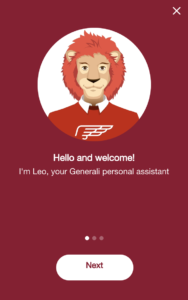
Generali developed a chatbot that was able to interact with visitors on its site by answering basic questions and highlighting relevant insurance offers. If there was a question the bot couldn’t answer, it would connect users to the appropriate Generali agent directly.
The Generali team had tested various names and avatars for its bot among a small pool of clients before ultimately settling on ‘Leo.’
Then, Generali worked with AB Tasty to integrate Leo into its website and track performance.
Campaign
AB Tasty Technical Solution Engineers were able to write the JavaScript and CSS code needed to trigger Leo on desktop devices. Data was then collected in real-time (in the AB Tasty platform) to track Leo’s engagement rates and highlight how visitors interacted with the chatbot during a 6-month period.
Generali also used AB Tasty’s visual editor to quickly make cosmetic changes to the site and measure the impact of these modifications on Leo’s performance.
Results
Leo was clearly a hit with Generali’s clients. At the end of the campaign, there were 100,000 recorded interactions with Leo on the website and more than 2,400 calls avoided, giving Generali the reassurance they needed to integrate the chatbot on mobile and tablet devices.
These high engagement rates, and reduced customer support wait times, proved Leo’s positive impact on the user experience. This campaign also provided a benchmark for evaluating Leo’s ongoing performance—which is essential for continuous optimization.
Currently, interactions with Leo are averaging 800 conversations a day.
Takeaway Tip
Chatbots have the potential to streamline customer support and enhance user experiences—when implemented strategically. As Generali shows, simply integrating a chatbot into your site isn’t enough. You need to set performance goals, collect analytics and track engagement to understand how visitors use this feature. With AB Tasty, Generali was able to easily modify their interface and collect data on Leo’s performance to know with certainty that it benefited the user experience.
This campaign also points to the ways in which artificial intelligence can increase the efficiency of human operations. Leo wasn’t created to take the place of customer support representatives, but to help them by handling straightforward tasks so team members could focus on more complex, higher-level questions.
Spark your curiosity!
Get your copy of "Generali’s Chatbot Averages 800 Conversations a Day to Streamline Customer Support" now.
How Eurosport’s Survey Pop-In Got 5K Responses in Less Than Two Weeks
5000responses
3countries
Eurosport is the go-to network for sports coverage in Europe. Working with AB Tasty since 2016, stakeholders across their Product, Web Analytics, and Digital Marketing teams have quickly excelled at more nuanced experimentation that leverages personalization and precise targeting to create relevant experiences for the company’s international clientele.
Challenge
The Australian Open, like all Grand Slam tournaments, is a huge event for Eurosport. Coverage is comprehensive to meet the demand of its viewership, spanning best-of-the day replays, clips of press conferences, and interview-style videos of athletes sharing insights. But, as one would expect, the main attraction is consistently the real-time streaming of matches. These high-profile events will always be top performers when it comes to traffic and streams. But Eurosport wanted to more concretely evaluate the quality of its coverage from viewers’ perspectives—using these insights to drive and refine their larger live event strategy.
Campaign
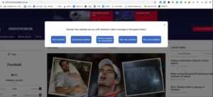
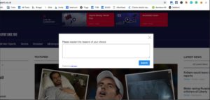
Using AB Tasty’s NPS widget, Eurosport set up a short campaign in which a survey pop-in would appear for desktop users in France, the UK, and Italy who viewed any Australian Open content. The first pop-in asked users to rank their satisfaction with the Australian Open coverage on a scale that ranged from “Very Satisfied” to “Not at all Satisfied.” After making this initial selection, a second pop-in would ask users to explain their reasoning in a write-in field.
First survey pop-in
Second survey pop-in
Results
At the end of the two-week experiment, roughly 5,000 written insights were collected from users—invaluable information on the strengths of Eurosport’s coverage and what could be improved (and how these sentiments varied between regions). But, two key reasons why this test succeeded was the timing and the targeting. Eurosport adapted the pop-ins to suit three different markets, which were strategically chosen for this test. They then ran the experiment during peak viewership as there was an increased likelihood of responses.
Takeaway Tip
As a pan-European company, Eurosport saw an opportunity to gain international insights on its viewership by running a survey during the Australian Open. This is one of the pillars of conversion rate optimization: sending the right message at the right time. While surveys and/or NPS pop-ins will always be valuable, maximize their potential by launching them during peak traffic times or high-profile events
Spark your curiosity!
Get your copy of "How Eurosport’s Survey Pop-In Got 5K Responses in Less Than Two Weeks" now.
ŠKODA Jump-Starts Test-Drive Bookings with Countdown Banner
2xNumber of booked test-drives
8Day campaign
One of the gems of the Czech industry, ŠKODA has evolved into a modern, respected car manufacturer present in more than 100 markets worldwide. Known today for their unique and reliable designs, the ŠKODA brand started out over a hundred years ago crafting bicycles, followed by motorcycles and, ultimately, cars.
Challenge
In the automotive industry, booking a test-drive is a crucial step in the purchase funnel. Marketers spend considerable time, resources and budget converting website traffic into test-drive appointments; naturally, people who are willing to leave their personal information to physically try out a vehicle are exhibiting high buyer intent.
On a more pragmatic level, retailers also prefer potential customers to book ahead of time, instead of stopping by on the fly, so they can better manage their schedules. All around, increasing the number of online test-drive bookings generates hot leads and better pipeline visibility.
In addition to this ever-present goal, the digital marketing team at ŠKODA’s French branch had a particular challenge to address. They wanted to capitalize on a rare, time-limited promotional offer – a zero-interest loan program – to jump-start their online test-drive bookings. They just weren’t sure of the best website optimization tactic to employ.
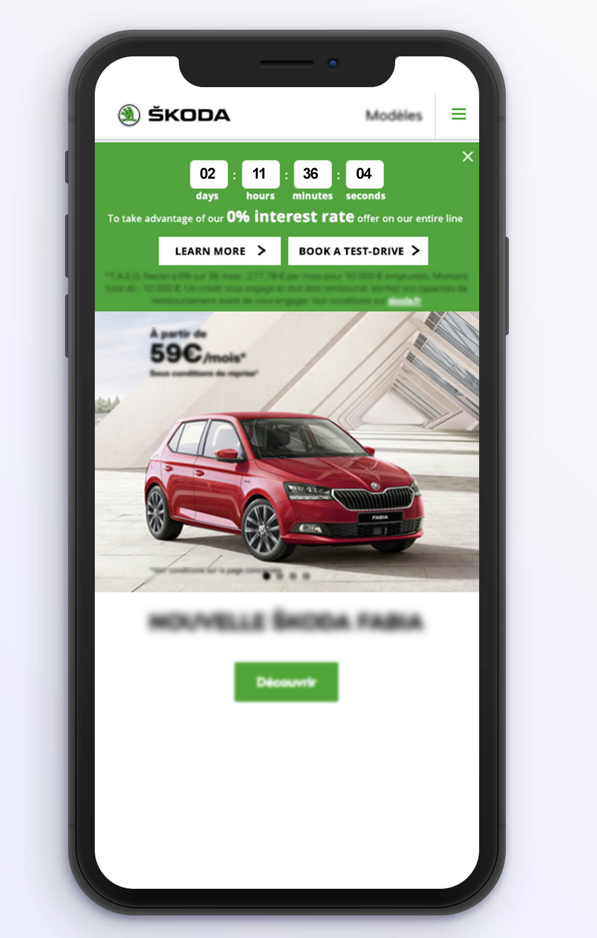
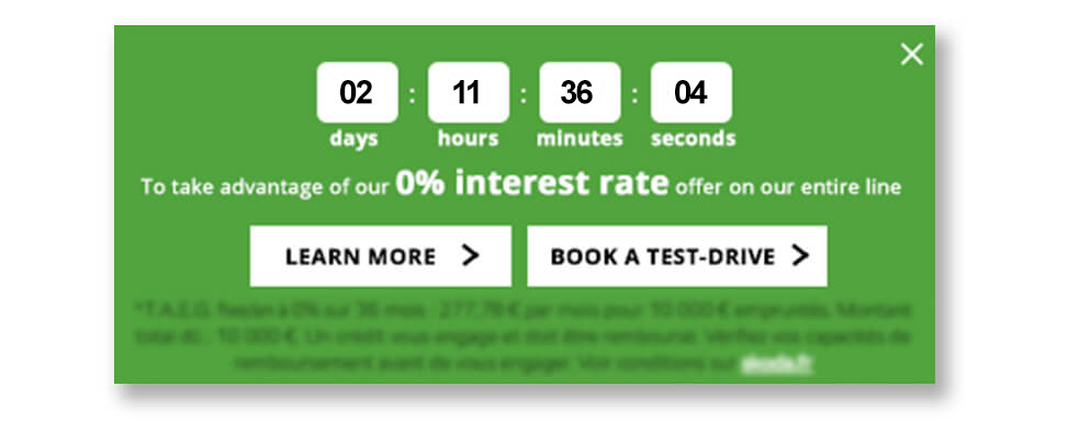
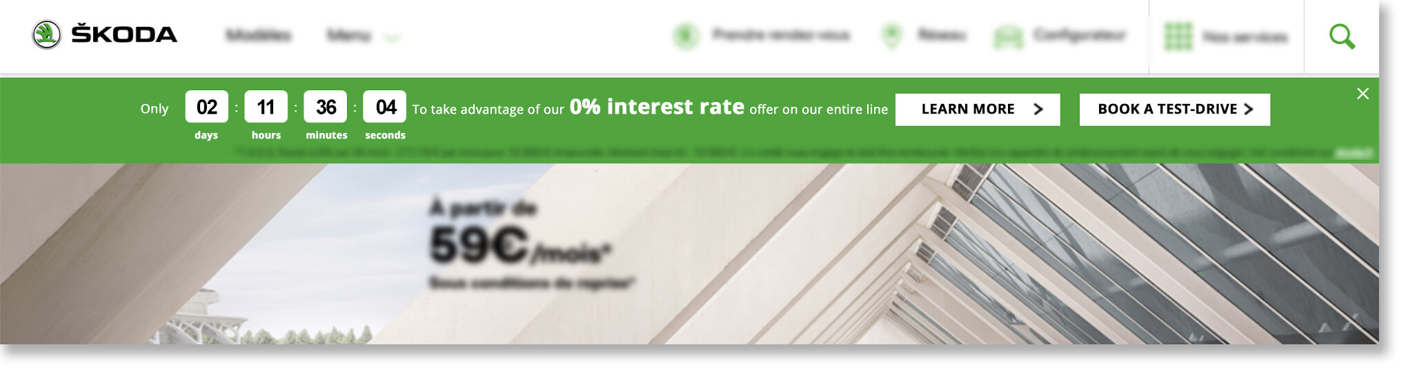
Urgency Principle and Engagement Idea
They brought the opportunity to the attention of AB Tasty and Rosapark, their digital marketing agency. “We talked through a few options for how to make the most of this valuable offer,” explained Laura Rérolle, Partnership Success Manager at AB Tasty. “We decided on a simple countdown banner that would show how much time was left before the zero-interest loan option ended. The idea was to give the offer the air of an event, to make it prominent on the homepage and other key areas of the site. This would attract attention and draw interested viewers down the purchase funnel. Since this type of engagement technique is not frequently used in this industry, we wanted to try it out in this limited scope to test the idea.”
The team at ŠKODA then worked with Rosapark on the creative design and deployment aspects. They ran the campaign using AB Tasty for mobile and desktop viewers for the full duration of the offer (eight days), on their homepage and the product pages (those that detailed the cars for sale).
The countdown clock banner included two calls-to-action: one to ‘learn more’ about the offer, (which redirected to an explanatory landing page), and the other, ‘book a test-drive,’ to a booking page.
Zoom in on mobile version of countdown bannerCountdown clock on desktop
Results
There was no doubt about it – the countdown banner clearly drew positive attention, encouraging online visitors to book the coveted test-drives. “We ran this campaign with AB Tasty as part of a big media blast around this offer. We were thrilled to see that, the week of the campaign, we more than doubled the number of booked test-drives compared to the previous week. In fact, a full 13% of that week’s leads came directly from this countdown clock. This is a significant uplift in qualified leads, at very little extra effort or resources. We’re very happy with these results,” explained Sebastien Toussaint, Customer Experience & Data Performance Manager at ŠKODA, France.
“The countdown banner was very effective during this key offer. While taking care not to overuse this engagement tactic, ŠKODA could certainly employ it again during their open house events two or three times per year,” elaborated Laura.
Takeaway Tip
Engagement techniques like countdown banners, when used judiciously, can effectively nudge website visitors into converting.
Spark your curiosity!
Get your copy of "ŠKODA Jump-Starts Test-Drive Bookings with Countdown Banner" now.
Kiehl’s Increases Revenue by 31% with Basket Page Optimization
+5%Basket size
+31%Total revenue
Inspired by other brands in the L’Oréal Luxe portfolio, such as Lancôme, Biotherm, Urban Decay and YSL Beauty, the digital teams at Kiehl’s started working with AB Tasty in January 2018. With the help of Léa Benquet, their dedicated Customer Success Manager, the team was even able to surpass their initial targets.
Challenge
Our e-commerce clients often have the same main KPI: maximize the total revenue generated on their website. As for Kiehl’s, they have an impressive success story to tell: the brand began selling their products in stores such as Colette (in 1997) before opening their own boutiques (almost 15 in France). Naturally, their proprietary website’s performance is particularly vital to the brand.
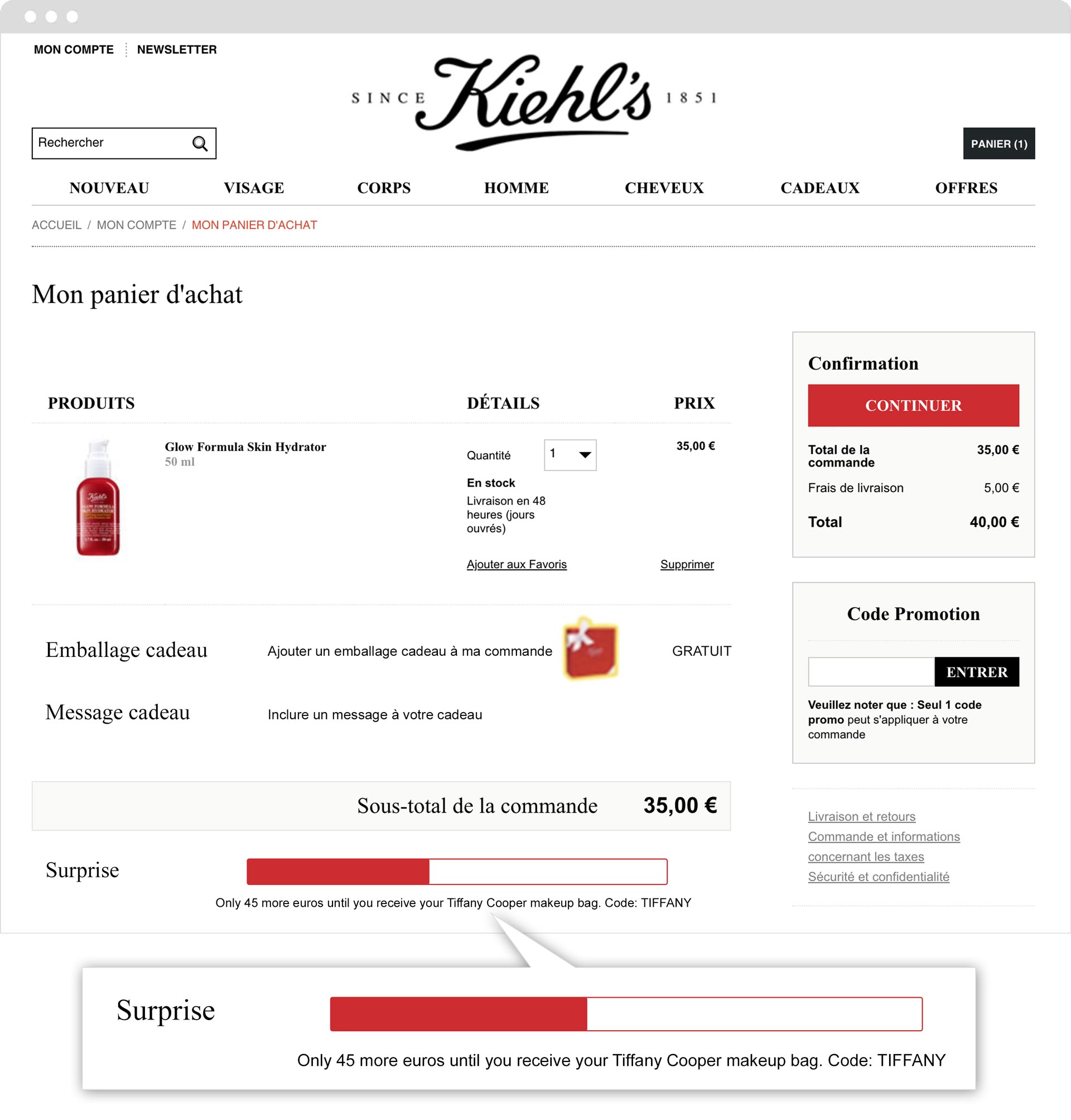
In order to tackle this challenge head on, the digital teams at Kiehl’s decided to concentrate on the basket page. The idea? Create a visual that would be presented to the shopper before they finalized their purchase, encouraging them to take advantage of a free gift over a certain basket amount. For the brand, the advantages are numerous: increase the average order value (interested shoppers will increase their basket size in order to receive the gift), as well as strengthen client loyalty with exclusive, branded Kiehl’s gifts!
A/B Test
Kiehl’s decided to implement a sort of visual gauge on the basket page that indicates how much more the browser has to add to their basket in order to get the gift (in this case, a free product).
AB Tasty’s WYSIWYG editor made it easy to implement this visual barometer. In order to determine how well the test performed, different KPIs were measured, such as the click rate, access to the rest of the purchase funnel, number of transactions and the impact on the average basket size.
“One of our e-commerce clients’ biggest expectations is to be able to increase their average basket size per visitor. With Kiehl’s, our main challenge was to find a way to optimize this KPI by combining agility, scalability and a visual effect. We consider our work here a success since this campaign’s positive performance inspired other brands in the L’Oréal group.” – Léa Benquet, Customer Success Manager at AB Tasty
Results
Kiehl’s website visitors were particularly receptive to this barometer. This very visible incentive led to 7% more clicks on the CTA ‘continue’, and importantly, it also led to an increase in the average basket size of almost 5%! We also were able to report an increase in total revenue of 31%, with 25% more additional purchases and 31% more revenue per visitor.
Takeaway Tip
The urgency principle is being used more and more frequently. However, it needs to be applied intelligently. The trick is to find the right balance between creating anxiety in the shopper, while at the same time offering them a substantive incentive (free shipping, exclusive gift, etc.). Showing how much one needs to spend before receiving a free gift isn’t enough anymore: it’s the visual aspect – the barometer – that makes the message truly impactful. The image allows one to better retain the message. A semantic incentive, coupled with a relevant visual, is the perfect combination for prompting an internet user to make a decision at this stage in the purchase funnel.
Spark your curiosity!
Get your copy of "Kiehl’s Increases Revenue by 31% with Basket Page Optimization" now.
Lancôme Increases Revenue by 15% With Login Page Optimization
+30%Clicks on 'create account'
+17%Transactions
Part of the L’Oréal Luxe brand portfolio, Lancôme was founded in 1935 by Frenchman Armand Petitjean. Today, the brand is known the world over for their luxurious skincare, cosmetics and fragrance products.
Challenge
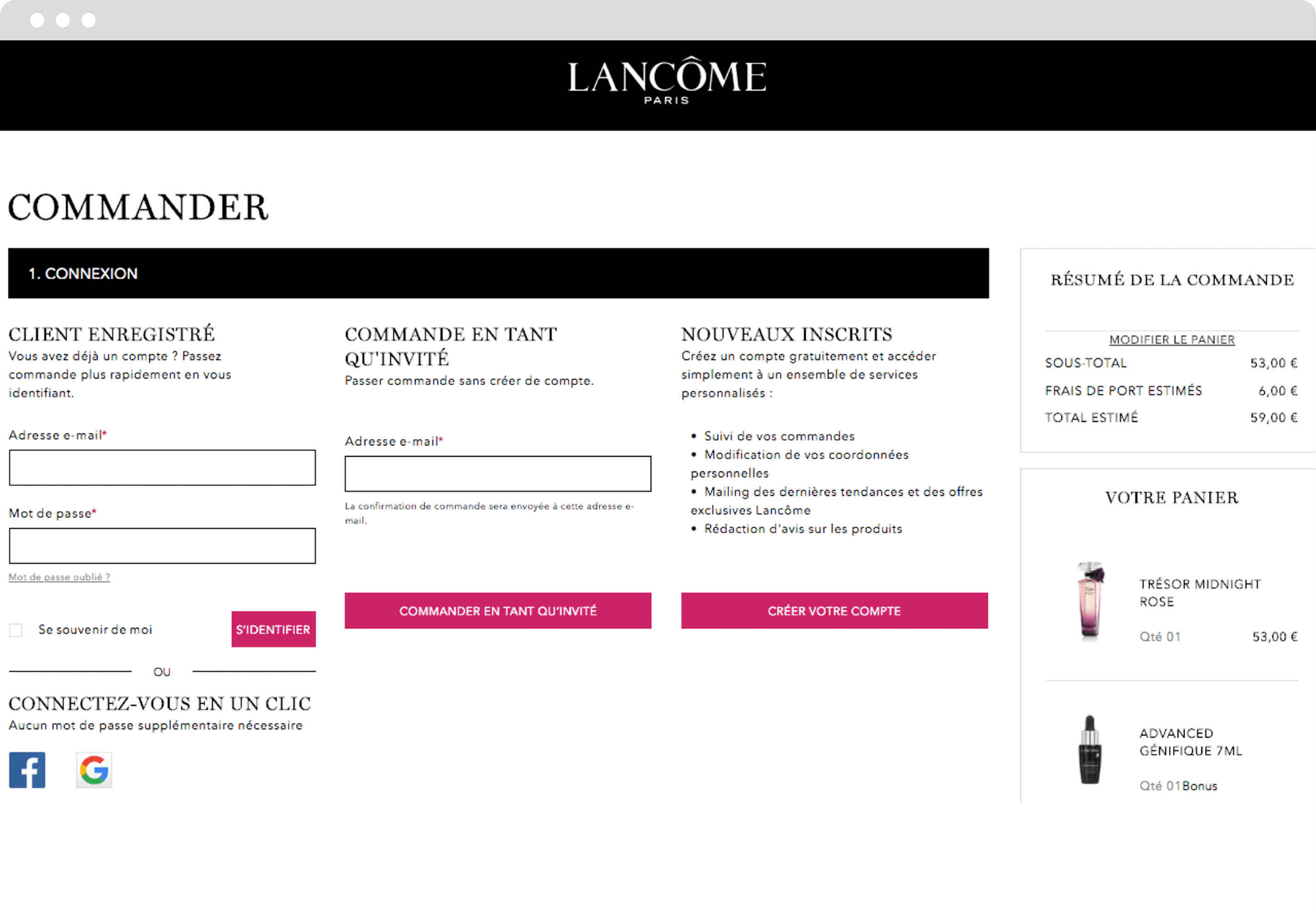
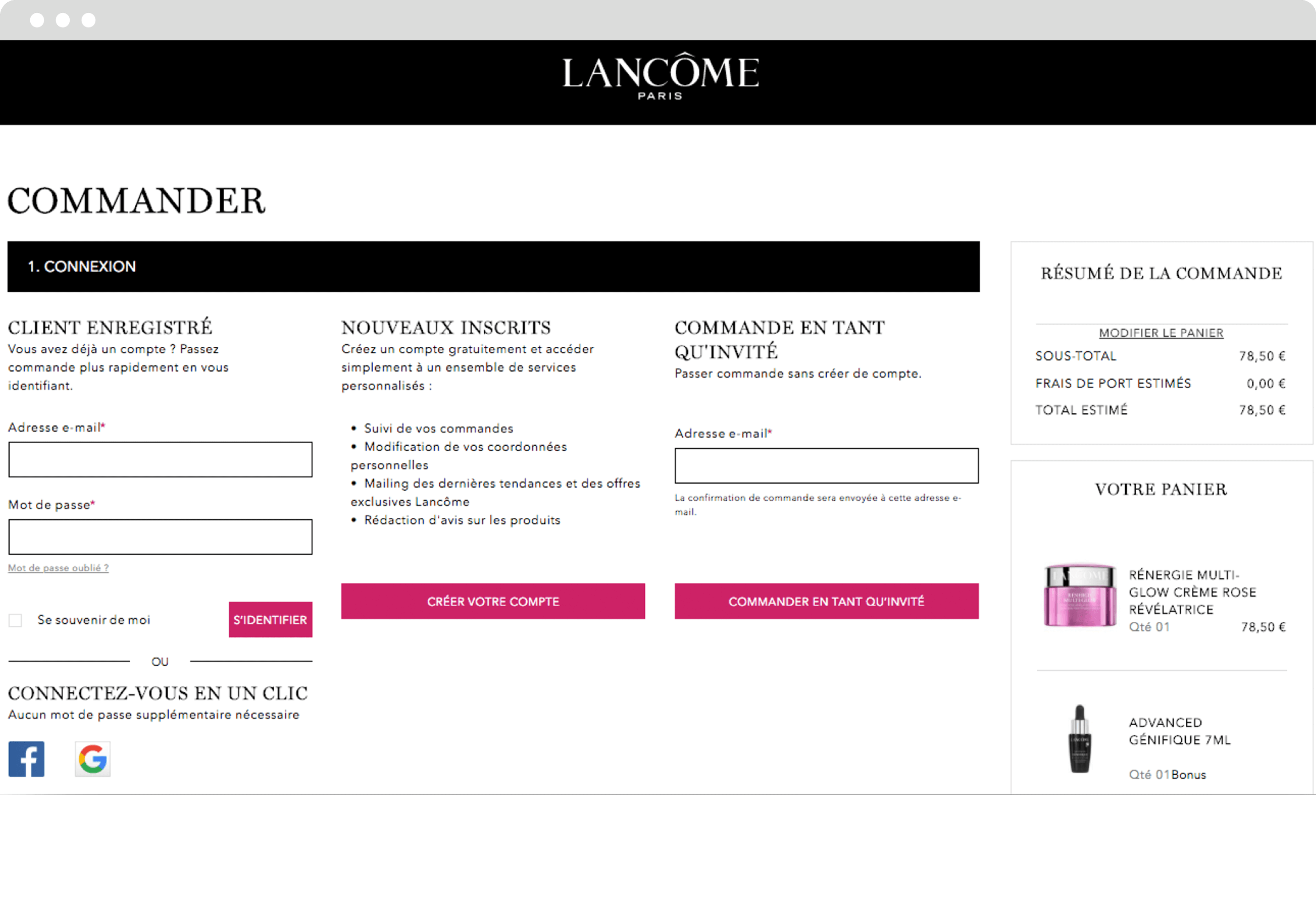
When consulting their data, Lancôme’s digital team noticed an unusually high bounce rate on their login page. This lead Lancôme’s team, along with AB Tasty, to analyze the page’s structure and the behavior of its visitors. Together, they were able to identify a potential point of friction, related to the fact that there were numerous ways for a visitor to sign in. Indeed, someone who wished to purchase a product could log in as a client or guest, or they could create a new account – all potential exit points for visitors to leave the page.
A/B Test
Working with Léa Benquet, their dedicated Customer Success Manager at AB Tasty, Lancôme decided to try a simple design change. Up until then, on their login page, they had (from left to right) presented the different sign-in options as listed above. However, they decided to test moving the ‘create a new account’ option to the center of the page, therefore shifting ‘sign in as a guest’ to the right. ‘Log in as a client’ would remain on the left. They wanted to test if this would be a more logical organization for visitors, therefore encouraging transactions, account sign-ups, and perhaps even overall revenue.
The test was easy and quick to set up with the AB Tasty WYSIWYG editor. In thirty minutes it was up and running, with no help from the IT team needed. All that was left to do was let the test run for a few weeks, and analyze the results.
Results
Perhaps unsurprisingly, moving the ‘create a new account’ block to the center of the page increased clicks to this CTA by 30%. What was more exciting, and more unexpected, was that transactions increased by 17%, with an associated bump in revenue of 15%.
Takeaway Tip
The login page is one of the most important pages to optimize on your site. In the physical world, shoppers don’t have to worry about logging in or creating an account to make a purchase. But in a digital context, this extra step is often the source of significant friction, and even of drop off and cart abandonment. Designing a user experience on this page that is logical and intuitive for your audience can have a real impact on sales, as the above case study shows.
Spark your curiosity!
Get your copy of "Lancôme Increases Revenue by 15% With Login Page Optimization" now.
Yves Saint Laurent Beauty Increases Online Transactions by +10%
+9%Access to basket page
+13%Access to checkout page
Part of the L’Oréal Luxe brand portfolio, Yves Saint Laurent Beauty is known around the world for their luxurious skincare, makeup and fragrance products for men and women.
Challenge
As with the other brands in the L’Oréal Luxe portfolio, YSL Beauty products are sold in both online third party boutiques, as well as on their own proprietary website. For this reason, optimizing every aspect of the homepage and checkout funnel is key to making sure consumers purchase on the actual YSL Beauty site.
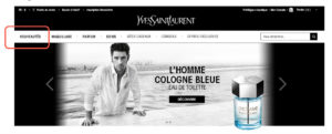
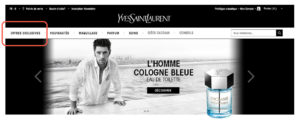
One of the crucial questions that needed answering was, what is the best order of the menu bar tabs? As a high end fashion house, YSL Beauty has plenty of news and products to showcase – but they still didn’t know what to emphasize on the homepage menu bar to maximize transactions.
A/B Test Idea
AB Tasty’s consulting team proposed a simple A/B test – switch the positions of the ‘New Products’ and ‘Exclusive Offers’ tabs to see if this would impact sales. By putting the ‘Exclusive Offers’ tab first – which takes browsers to current offers and gifts with purchase – instead of the ‘New Products’ tab, they aimed to test the appetite of website visitors for special and exclusive offers over new releases.
The test was easy to configure – with the WYSIWYG editor, the new version of the homepage and the parameters of the test were up and running in 30 minutes.
Original
Variation
Results
After letting the test run for a month on over 150k visitors, the results were conclusive: emphasizing the ‘Exclusive Offers’ tab had a visible effect on sales. Not only did access to the basket page shoot up by 9%, and to the checkout page by 13%, but overall transactions enjoyed a 10% increase. The team wasted no time pushing 100% of the test’s traffic to the winning variation and hardcoding these changes into their website.
Takeaway Tip
For high-end brands like YSL Beauty, accenting exclusive offers, over and above new products, proved to be especially effective. This is probably because shoppers of luxury brands are particularly susceptible to messaging about rarity and exclusive treatment. These consumers are likely to appreciate a product that’s shown to be exclusive and generous offers (reminding them of the ‘high end’ nature of the brand).
Spark your curiosity!
Get your copy of "Yves Saint Laurent Beauty Increases Online Transactions by +10%" now.
The nonprofit organization UNICEF works tirelessly across 190 countries to save and improve the lives of children from some of the world’s toughest places.
Challenge
As with any business, organization or nonprofit, the UNICEF website is crucial to their operations. Not only is it one of the ways to make a donation, it’s also where people go to understand what UNICEF does, what they stand for, and how donations are used to carry out their mission. It was therefore essential for UNICEF France to optimize their website to both increase donations, and also relay a positive image. With a big website redesign coming up, their digital team decided they needed to better understand how visitors actually experienced their website.
Marketing Campaign Idea
As an AB Tasty client, UNICEF France had various user insight tools at their disposal: heat mapping, session recording, and NPS surveys, to name a few. However, the UNICEF team was looking for in-depth feedback that would let them get inside the heads of their website visitors. They therefore opted to use a Google form, allowing them to ask both open-ended and ‘yes/no’ questions.
With the help of the AB Tasty team, they set up a pop-in in just one hour – which triggered on exit intent – that encouraged the website visitor to fill out the survey. They asked five questions about the design and usefulness of the site, the visitor’s reason for visiting, and their overall level of satisfaction.
Results
Over the 6 weeks the campaign was running, the team collected 310 responses, which represented 3.6% of the total visitors to the site. They were pleasantly surprised by the results: 92% of visitors said they liked the homepage! However, they also gained valuable insights regarding where their audience was most engaged, and what visitors wanted to see more of.
These insights served at the basis for many of the redesign changes. For example, 30% of respondents said the search bar was the most useful part of the homepage, so the search bar was enlarged in the update. Similarly, according to respondents, the least useful part of the homepage were the social share logos, which are slated to be removed.
“We were very happy to see that respondents overwhelmingly said they liked the homepage, and found what they were looking for. Overall, our donors were familiar with our website, even if they did ask for more video and photographic content. Our next step is to use this information to expand on the personalization campaigns around the visitor personas we’ve discovered, using AB Tasty.” – Léonore Manciaux, Digital Donation Officer at UNICEF France
Takeaway Tip
Understanding your audience is key for website optimization. So is choosing the right user insight tool to match your goals. Long-form surveys will let you get more in-depth, while NPS surveys are designed to show an evolution over time, and heat maps and session recording let you zoom in on points of friction or high engagement.
Spark your curiosity!
Get your copy of "UNICEF France Maximizes On-Site User Feedback" now.
The cosmetics line Urban Decay, which includes makeup for eyes, lips, nails, and skin, is known and admired for its edgy style. Part of the L’Oréal Luxe brand portfolio, alongside Kiehl’s, Lancôme, and Biotherm, Urban Decay products are sold online and in brick-and-mortar stores worldwide.
Challenge
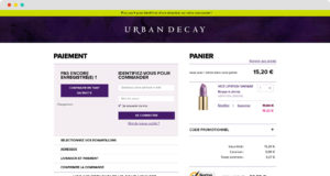
“Each L’Oréal Luxe brand has its own website, based on a similar template,” explained Virginie Robert, Digital Project Manager at L’Oréal Luxe, “but each line has a different brand identity and target audience. Optimizations that might work for one won’t necessarily work for the others. That’s why we knew we needed a tool like AB Tasty.” Furthermore, since L’Oréal Luxe products are sold both on the brand’s own ecommerce website, as well as by third-party vendors, it’s especially important for their marketing teams to optimize transactions on their own site. The particular challenge for Urban Decay was increasing average basket size – both in terms of value and number of products – during sales.
A/B Test Idea
Working with Léa Benquet, their dedicated Customer Success Manager at AB Tasty, Urban Decay’s digital team decided to run an A/B test during one of their sales. They wanted to determine if a promotional banner, advertising a discount for 85 euros spent, would increase average basket size, quantity of items, and ultimately, revenue.
With the help of AB Tasty’s technical specialists, the banner – designed in an eye-catching green – was placed atop all basket pages on Urban Decay’s site. If a shopper had fewer than 85 euros in their basket, the banner was triggered, informing them of how much more they needed to spend in order to take advantage of the discount.
The banner was triggered to all shoppers with fewer than 85 euros in their basket. It reads, “Only X more euros until you can benefit from a discount on your purchase!”
Results
The promotional banner significantly increased all of Urban Decay’s KPIs: average basket size increased by 8%, the average number of items in the basket jumped by 7%, and revenue generated increased by an impressive 7%!
“We were very pleased to be able to work with Urban Decay to boost their revenue by 7% using just one A/B test. These kinds of optimizations can have a real impact on profits – over one year alone, this small change would have generated an extra 190,000 euros!” – Léa Benquet, Customer and Partners Success Manager Team Leader at AB Tasty
Takeaway Tip
Sales are particularly fruitful times to test website optimizations. Well-thought-out promotional messaging along the checkout process is key to maximizing profits.
“We were very happy with the results of this test, and we’re absolutely going to use the banner again during our next sale. The best part is that duplicating and implementing the banner design will be very easy to do, and won’t require any IT help, now that the template is all set up – this is part of the beauty of the AB Tasty platform.” – Guillaume Totis, e-Commerce Manager at Urban Decay
Spark your curiosity!
Get your copy of "Urban Decay Increases Revenue by 7%" now.
How Ashley Furniture Increased Conversions by +15%
+15%Conversions
-4%Bounce rate
Context
As a leading furniture and bedding company in the United States, Ashley Furniture generates a high volume of visitors to its online store, AshleyFurnitureHomeStore.com. For this reason, optimizing its purchase process was a key step in improving conversion rates for new visitors.
Issue
How to eliminate frustration during the purchase process to ensure hassle-free checkout conversions?
Objective
Reduce the amount of time spent in the purchase funnel and lead the user to a faster and more effective conversion.
Implementation
We hypothesized that Ashley Furniture was struggling to convert new visitors due to their lengthy checkout process. On the original site, if the user did not enter their delivery and billing address while creating their account, they would need to add in this information during the conversion funnel.
We decided to remove this step from the conversion funnel and test if that would improve conversion rates. The question was where in the customer journey this step would be implemented?
We tested a variation where, if the user had not entered their address information during the initial account creation phase, they would be prompted to log in to their account, then led to a form where they would be asked to fill in their delivery address.
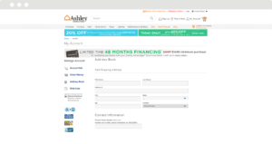
Step 1 in the original checkout process
Step 2 in the original checkout process
Simplified checkout process
The objective of this test was to get the user to fill in their personal information before checkout, thus saving them time and simplifying the purchase process. We know that checkout is already a lengthy process with a number of different steps such as logging in, selecting a delivery option and payment method before finalizing a purchase. Our goal was to simplify this process as much as possible.
Results
With this test, we eliminated client frustration by shortening the checkout process, thus reducing cart abandonment rates during the checkout process and creating a more fluid transition to the payment step. By removing this form from the purchase funnel, conversion rates increased by 15%.
“We use AB Tasty to execute A/B and multivariate tests and personalization of our online store AshleyFurnitureHomestore.com. Currently, our UX teams use AB Tasty to gain knowledge of user experience to solve a range of problems and to build new functionalities. With this tool, it is easy to A/B test our ideas to learn whether our hypothesis increases conversion rates, before implementing them on all of our traffic.” – Matt Sparks, eCommerce Optimization Manager, Ashley Furniture
Spark your curiosity!
Get your copy of "How Ashley Furniture Increased Conversions by +15%" now.


 “One of our e-commerce clients’ biggest expectations is to be able to increase their average basket size per visitor. With Kiehl’s, our main challenge was to find a way to optimize this KPI by combining agility, scalability and a visual effect. We consider our work here a success since this campaign’s positive performance inspired other brands in the L’Oréal group.” – Léa Benquet, Customer Success Manager at AB Tasty