

You’ve clicked on a CTA before. Whether it was adding an item to a shopping cart, opting in to an email list, or submitting a form, you were guided by a succinct but clear button that served as a call to action.
These calls to action, or CTAs, are peppered throughout the customer journey. They appear on web pages, social posts, emails, etc. and are like gold for marketers because—when they have the right wording, design, and placement—they secure conversions and/or move visitors forward through the funnel.
Whether it’s encouraging users to make a purchase, download a piece of content, or sign up to your newsletter, CTAs need to be engaging, and enticing enough to get users to click. Remember, you only have around 3 seconds to grab someone’s attention and persuade them to act.
We gathered 14 examples of convincing CTAs to examine the elements that go into creating an effective call to action. Keep reading to see how brands tackled these short but essential phrases to gain an upswing in clicks and conversions.
1. Amazon’s Audible
Amazon’s Audible entices users with a free trial, using the all-important buzzword (free) for CTA success. They also eliminate any hesitancy or skepticism that could come with signing up—like the possibility of hidden fees—by making the timeframe clear from the get-go.

2. Netflix
Netflix also uses a free trial to appeal to audiences. The language is conversational, clear, and accompanied by explanatory text that gives users a quick rundown of how the trial works. Any fears of being charged during the trial, or forgetting to cancel the subscription before the trial ends, are dissuaded by Netflix’s promise to send an email reminder and that users can cancel at any time (without incurring a fee) during the allotted 30 days.

3. Meditation app Calm
The meditation app Calm also uses the word free to encourages clicks, further highlighting this popular and effective trend. Unlike Netflix and Amazon, Calm doesn’t include a timeframe in its CTA, which isn’t necessarily a bad thing. In fact, it could be more of sway to get interested users to click and learn more about trying the app without having to commit to a payment (just yet).

4. Bloom&Wild
UK-based floral postal company, Bloom&Wild, smartly centered customer’s satisfaction when crafting their CTA.
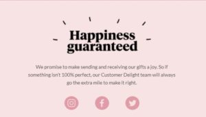
Paired with their message of happiness guaranteed, as seen above, Bloom&Wild includes the CTA, “Send Joy,” that brings visitors to the pages that display their flower collections.

This is a catchy and unique CTA that has an emotional appeal for users. It isn’t just a matter of buying or sending flowers, but brightening people’s day with a beautiful bouquet and sweet gesture.
5. Ancestry
The world-renowned DNA and genealogy site Ancestry uses actionable and informative language to encourage people to sign up. Like Netflix, they include an explanation above the CTA that succinctly tells visitors what they’re able to do with the service: explore your family history.

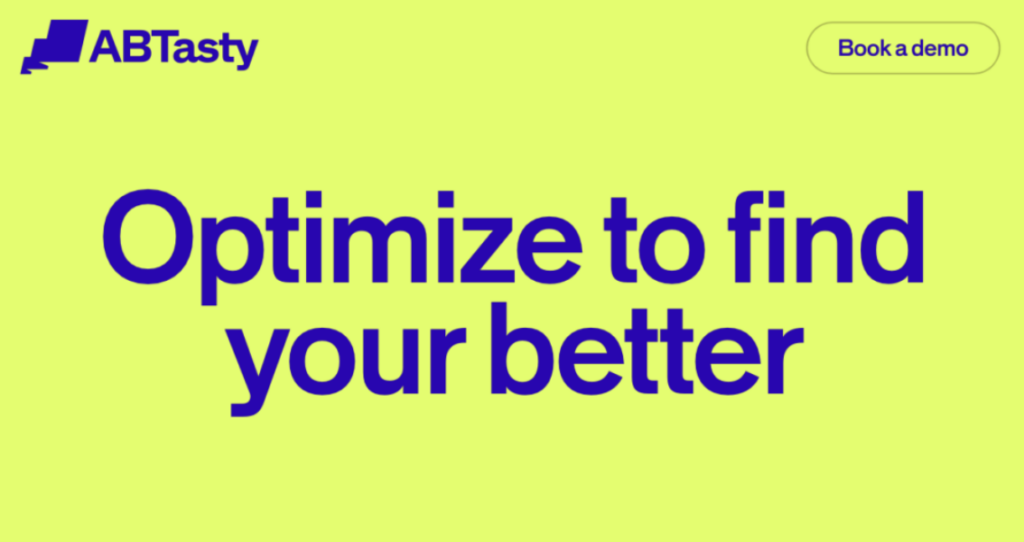
6. AB Tasty
Not to blow our own horn here at AB Tasty, we are quite proud of the CTA used on our own homepage. As a company that specializes in creating personalized customer experiences, we wanted to be clear that a demo of our platform would be tailored to each business interested in using our services.
7. Zoom
Screen-sharing and conference call company Zoom uses a combination of two tried-and-tested phrases for its homepage CTA. It is simple and direct which is a major element of any well-performing call to action, while also taking on a confident tone that doesn’t come across as too pushy.

8. HelloFresh
Food delivery company, HelloFresh, use their business model as a clever CTA on their homepage, to showcase their tasty-looking food options in a ‘no strings attached’ manner. HelloFresh are confident their food will do all the talking when it comes to actual subscriptions, as their fun, non-committal CTA shows!

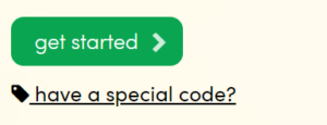
9. Graze
UK-based snack company graze opt for a simple prompt on their CTA, get started, which takes visitors to a landing page that shows the different box options available to them.
10. Homesense
TK Maxx’s home and furniture company, Homesense, recently ran a campaign to increase sales of their gift cards online. The CTA, buy now, was straight to the point and the only call to action on the homepage during the entire campaign.

11. Go Ape
The UK-based adventure park Go Ape used just two words for their effective homepage CTA, to ensure visitors are guided to their one and only conversion measure- booking tickets!

12. Space NK
Make-up company Space NK recently ran a campaign for visitors in which they offered money off. Their main CTA simply being ‘shop now’ which definitely speaks to their target audiences.

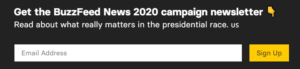
13. Buzzfeed
Buzzfeed, ran a recent campaign to increase subscribers to its newsletter on the upcoming 2020 election in the US. The CTA is paired with a field that’s faded text tells users to enter their email address to start receiving updates—making the entire process fast and simple, two essential elements in any user interaction with your brand.
14. TransferGo
Money-transfer site TransferGo also adopt the simple-but-effective approach when it comes to their CTA, to encourage users to act quickly. While the company offers a couple of services, the main draw is the money transfer, which is tactfully reflected in the CTA.

Conclusion
What were the common threads between the CTAs listed above? For one, they were written with a clear intent as to what the desired conversion was for the brand. These calls to action were quickly recognizable, with colors often contrasting the page, email, or post they were presented in. Some implicitly appealed to a sense of urgency, (telling visitors to shop now, buy now, start now) —an effective marketing tactic. Others recognized the importance of price among users and offered free trials.
While there are many other variations to consider when creating a great call to action, the trick is to find what works for your individual business. As always, testing variants for a CTA will give a much better understanding of what works for your target audience.
Tweaking small elements of a CTA such as the language, colors and even placement will give the best insight on creating an irresistible CTA.


