

Let’s paint the scene:
You’re browsing on a typical e-commerce website, looking for a new hair dryer. You poke around a few product pages until you find what you’re after, and add your product (Power Dry 500) to your basket.
Once at the checkout page, you realize you forgot to see if the appliance comes with a diffuser – the last thing you want are dried out locks. You decide to go back to the product page to be sure. You move your mouse confidently to the top of the screen to the navigation bar to make your way back – but lo and behold, it’s disappeared! No nav bar in site on the checkout page.
Slightly annoyed, you exit the site entirely – you’re late for drinks with friends anyway – and tell yourself you’ll buy it over the weekend. But Friday night, you pass by a department store on the way home. You pop in and find the perfect Pro Dryer Soft and Smooth appliance. The e-commerce site is out a purchase.
So, as a Conversion Rate Optimization professional, now you’re wondering – should that site have kept the navigation bar on the checkout page?
Let’s see if it’s CRO myth, fact, or fiction.
The Navigation Bar: Problematic Distraction or Useful Cross and Upsell Enabler?
There are generally two schools of thought when it comes to the question of whether to include a navigation bar on the checkout page. The first school argues that it’s important to keep the visitor oriented, and that it can increase upsell and cross-sell opportunities, like in the example vignette above. The second school argues it’s mainly a hindrance, distracting the visitor from the immediate goal of finalizing the purchase already underway.
At AB Tasty, we’re generally of the second school – a navigation bar on the checkout page is usually a distraction.
Navigation Bars on Checkout Pages are Distracting
Why? Because we’ve rarely seen an experiment where adding the nav bar has helped, and not hindered, finalizing a transaction. And you don’t have to take our word for it – Amazon, the e-commerce page design expert par excellence, was the pioneer of throwing the checkout page nav bar to the curb.
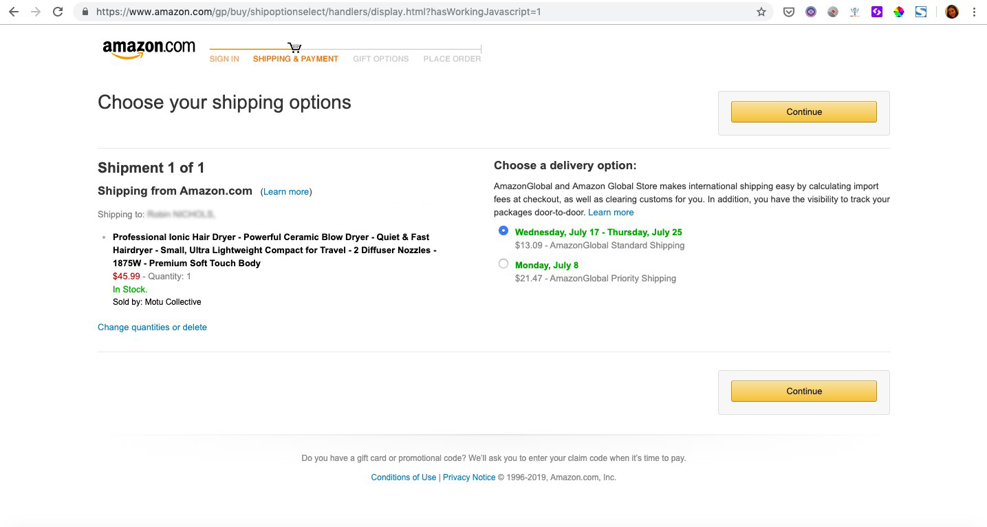
Just look at the example above – as soon as you put an item in your basket and proceed to check out, the standard navigation bar, plus the search bar, vanish. They’re replaced by a short, focused (and unclickable) progression bar to tell them just where they are in the checkout process, and some very visible next step CTAs.
And really, this makes sense. There are a fair amount of steps to go through before finalizing a purchase – confirming your address, payment info, shipping times. At this stage, a navigation bar is just one more glittery object that could pull a website visitor out of a ‘buy now’, goal-oriented mindset and back into browsing mode. And while browsing can obviously lead to sales, when you have someone so close to converting, you want to focus on closing the deal at hand.
Breadcrumb Compromise
Now, we’re not saying to drop your visitors on a desert island with no escape route, of course. Keeping your company logo, say in the corner of the page, will at least enable them to get back to the homepage.
And if you still think your website visitors need a bit more orientation, you can compromise by adding a breadcrumb navigation path to your checkout page. This way, they can at least easily backtrack, to say, double check they chose the right mailing address or payment option. This still keeps them in the goal-oriented ‘buy now’ mindset, and enables them to convert the current opportunity.
We saw this type of compromise work very well for our client Sephora. In part by adding a breadcrumb style navigation (Your Basket – Your Delivery – Your Payment) to their purchase pages, they were able to increase transactions by 12%.

So, final conclusion? The idea that it’s better to keep a navigation bar on your checkout page is a MYTH, with the caveat that a breadcrumb navigation system can be an effective compromise.
CRO Myth Busters is a mini series for conversion rate optimization professionals. We take a quick look at commonly held CRO beliefs and determine if they’re true, sometimes true, or simply CRO myths!


