Case Studies

ŠKODA Jump-Starts Test-Drive Bookings with Countdown Banner

2x Number of booked test-drives

8 Day campaign

One of the gems of the Czech industry, ŠKODA has evolved into a modern, respected car manufacturer present in more than 100 markets worldwide. Known today for their unique and reliable designs, the ŠKODA brand started out over a hundred years ago crafting bicycles, followed by motorcycles and, ultimately, cars.

Challenge

In the automotive industry, booking a test-drive is a crucial step in the purchase funnel. Marketers spend considerable time, resources and budget converting website traffic into test-drive appointments; naturally, people who are willing to leave their personal information to physically try out a vehicle are exhibiting high buyer intent.

On a more pragmatic level, retailers also prefer potential customers to book ahead of time, instead of stopping by on the fly, so they can better manage their schedules. All around, increasing the number of online test-drive bookings generates hot leads and better pipeline visibility.

In addition to this ever-present goal, the digital marketing team at ŠKODA’s French branch had a particular challenge to address. They wanted to capitalize on a rare, time-limited promotional offer – a zero-interest loan program – to jump-start their online test-drive bookings. They just weren’t sure of the best website optimization tactic to employ.

Urgency Principle and Engagement Idea

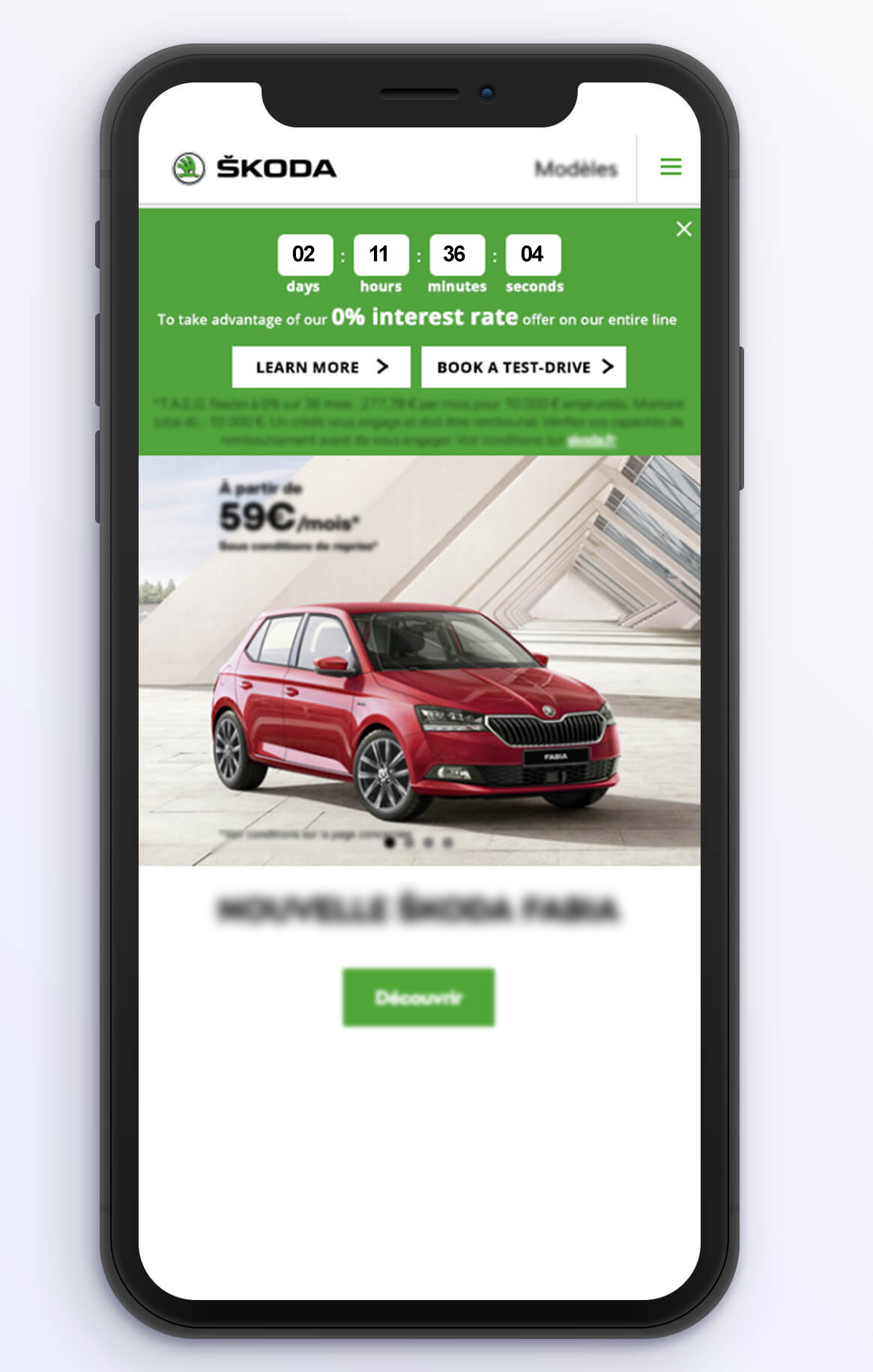
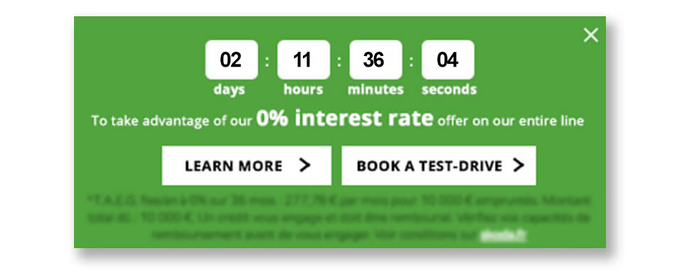
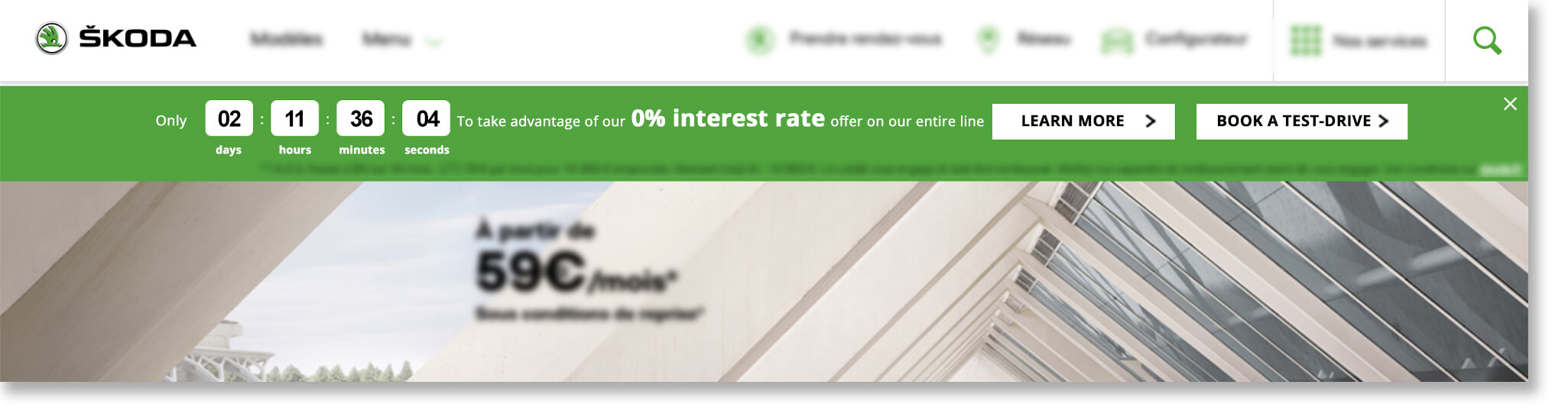
They brought the opportunity to the attention of AB Tasty and Rosapark, their digital marketing agency. “We talked through a few options for how to make the most of this valuable offer,” explained Laura Rérolle, Partnership Success Manager at AB Tasty. “We decided on a simple countdown banner that would show how much time was left before the zero-interest loan option ended. The idea was to give the offer the air of an event, to make it prominent on the homepage and other key areas of the site. This would attract attention and draw interested viewers down the purchase funnel. Since this type of engagement technique is not frequently used in this industry, we wanted to try it out in this limited scope to test the idea.”

The team at ŠKODA then worked with Rosapark on the creative design and deployment aspects. They ran the campaign using AB Tasty for mobile and desktop viewers for the full duration of the offer (eight days), on their homepage and the product pages (those that detailed the cars for sale).

The countdown clock banner included two calls-to-action: one to ‘learn more’ about the offer, (which redirected to an explanatory landing page), and the other, ‘book a test-drive,’ to a booking page.

mock-up mobile skoda

mock-up mobile skoda
Zoom in on mobile version of countdown banner
mock-up website skoda
Countdown clock on desktop

Results

There was no doubt about it – the countdown banner clearly drew positive attention, encouraging online visitors to book the coveted test-drives. “We ran this campaign with AB Tasty as part of a big media blast around this offer. We were thrilled to see that, the week of the campaign, we more than doubled the number of booked test-drives compared to the previous week. In fact, a full 13% of that week’s leads came directly from this countdown clock. This is a significant uplift in qualified leads, at very little extra effort or resources. We’re very happy with these results,” explained Sebastien Toussaint, Customer Experience & Data Performance Manager at ŠKODA, France.

“The countdown banner was very effective during this key offer. While taking care not to overuse this engagement tactic, ŠKODA could certainly employ it again during their open house events two or three times per year,” elaborated Laura.

Takeaway Tip

Engagement techniques like countdown banners, when used judiciously, can effectively nudge website visitors into converting.

Spark
your curiosity!

Get your copy of "ŠKODA Jump-Starts Test-Drive Bookings with Countdown Banner" now.

Case Studies

Luxury Brand Frette Increases Revenue By Over 8% with Web Copy Optimization

8.69% Increase in revenue

2 A/B tests

Frette has been a symbol of luxury since its establishment in 1860. Its linens have been draped across the altar of St. Peter’s Basilica, were the bedding of choice for European royal families, and continue to be a staple of five-star hotels.

Challenge

In the luxury industry, there’s always been a strong emphasis on the buying experience. Retailers have imbued it with a sense of ceremony—exclusivity paired with exceptional customer service to create a one-of-a-kind exchange. One of the challenges luxury retailers face today is translating the in-store experience to digital platforms.

For the Frette team, bringing the brand ethos online meant creating a frictionless user experience. Their website needed to be receptive to visitors’ interests while having an elegant design and easy-to-navigate interface. Frette focused on optimizing the website’s top navigation bar and the call-to-action on the shopping cart pop-up to ensure synchronicity between the UX and online shoppers.

Test Idea

Frette conducted a simple A/B test to see if modifying the top navigation bar would optimize the customer journey and increase traffic to certain pages. Noting that bathrobes were the top search item on the site, the team decided to clearly reference them in the header. So, they changed “Bath Linens” to “Bath Linens & Robes” and implemented action tracking to chart the results.

navigation bar


Then, Frette focused on the purchasing funnel. When users would click on the shopping cart in the top corner of the site, a customary pop-up would appear with a preview of selected items and the option to “Proceed To Checkout.” Luxury shopping is generally marked by long lead-in times, so Frette decided to tweak this language to the less definitive call-to-action, “View Shopping Bag.” The goal was to create a more fluid transition from browsing to purchasing in which customers didn’t feel rushed.


shopping cart pop-up

Results

While these website modifications were relatively minor, they had a significant impact on engagement and sales.

By adding “Robes” to the Bath Linens title in the top navigation bar, Frette was able to increase clicks to this category by 29%, and visits to bathrobe pages grew by an astounding 101%. As for changing the checkout semantics, the wording “View Shopping Bag” increased clicks by 5% and bumped total revenue by 8.69%.

These two A/B tests each took approximately 15 minutes to implement, without any IT support. Having the autonomy to test and learn is crucial for website optimization; it allows for precision in your strategy so even subtle changes have a pivotal effect on visitors’ satisfaction.

“We had been using [a previous conversion optimization] tool and it wasn’t user-intuitive, you really needed to work with an agency to do something very simple—you couldn’t really customize it to track specific things for a campaign, not in the way that AB Tasty allow you to. What we’re doing with AB Tasty now on our own, we would not have been able to do before.” – Vivienne So, Sr. Manager of E-commerce at Frette

Spark
your curiosity!

Get your copy of "Luxury Brand Frette Increases Revenue By Over 8% with Web Copy Optimization" now.

Case Studies

How Best Western® Hotels & Resorts Increased Loyalty Program Engagement

12% Increase in account creations

3 Audience segments

The American-based Best Western® Hotels & Resorts brand has been a leader in the hospitality industry for over 70 years, with a global network of 4,200 hotels in more than 100 countries and territories. With a strong presence in France, the group reported an annual revenue of 2.2 billion dollars in 2017. They have been an AB Tasty client since March, 2017

Challenge

For hotel brands like Best Western® Hotels & Resorts, customer loyalty is paramount; they aim to create a long-lasting relationship with each client. One of the ways to foster this kind of engagement is through an online membership community. For example, as a Best Western Rewards® member, customers can log in and benefit from discounts and other perks, like free stays, complimentary breakfasts, and upgrades.

The digital team at Best Western® France was looking for a way to encourage visitors to become members, use their accounts, and especially to take advantage of one of their discounts applicable to visits of two nights or longer. They decided the best way to do this would be to run a website personalization campaign using AB Tasty.

Personalization Campaign Idea

The team had an elegant idea: an internet user would be more likely to join the Best Western Rewards® program if they were shown offers directly relevant to their search query. For this, the team simply needed to create appropriate audience segments in AB Tasty using data from their data layer. Since their main goal was to encourage visitors to use or create their membership account, they opted for the following scenarios:

Upsell scenario: Trigger a pop-in to visitors who were logged in to their membership accounts and looking for a one-night stay, with an incentive to prolong their visit
Encourage Best Western Rewards® account creation: Trigger a pop-in to visitors who were not logged in to a membership account and looking for at least a two-night stay, with a special promotional offer available only with a Rewards Account
Upsell and account creation: Trigger a pop-in to visitors who were not logged in to a membership account and looking for a one-night stay, with an incentive to create an account and prolong their stay

This way, the digital team could show discounts only to visitors who were eligible for them, making the browsing experience more relevant, and encouraging non-members to sign up. By promoting incentives and reduced rates for longer visits, they also aimed to increase revenue. In other words: they pushed the right message to the right website visitor at the right time.


Best western mock up personalization

Results

The results showed that this kind of personalized messaging can have big effects on engagement. The most successful scenario turned out to be the second one, with around 12% more Best Western Rewards® program sign-ups originating from this campaign. Unsurprisingly, it was easier to convince visitors to sign up for a free account to receive an incentive than to add an extra night’s stay! In addition, the team was able to say that they created a smoother, more relevant customer experience, by only showing promotional messages relevant to each visitor.

Takeaway Tip

Take advantage of your visitor data to create relevant, personalized messages. Not only will you create a more pleasant browsing experience, you’ll increase the number of ways you can increase engagement, transactions, and revenue, all the while optimizing an existing client scenario.

Spark
your curiosity!

Get your copy of "How Best Western® Hotels & Resorts Increased Loyalty Program Engagement" now.

Case Studies

Yves Saint Laurent Beauty Increases Online Transactions by +10%

+9% Access to basket page

+13% Access to checkout page

Part of the L’Oréal Luxe brand portfolio, Yves Saint Laurent Beauty is known around the world for their luxurious skincare, makeup and fragrance products for men and women.

Challenge

As with the other brands in the L’Oréal Luxe portfolio, YSL Beauty products are sold in both online third party boutiques, as well as on their own proprietary website. For this reason, optimizing every aspect of the homepage and checkout funnel is key to making sure consumers purchase on the actual YSL Beauty site.

One of the crucial questions that needed answering was, what is the best order of the menu bar tabs? As a high end fashion house, YSL Beauty has plenty of news and products to showcase – but they still didn’t know what to emphasize on the homepage menu bar to maximize transactions.

A/B Test Idea

AB Tasty’s consulting team proposed a simple A/B test – switch the positions of the ‘New Products’ and ‘Exclusive Offers’ tabs to see if this would impact sales. By putting the ‘Exclusive Offers’ tab first – which takes browsers to current offers and gifts with purchase – instead of the ‘New Products’ tab, they aimed to test the appetite of website visitors for special and exclusive offers over new releases.

The test was easy to configure – with the WYSIWYG editor, the new version of the homepage and the parameters of the test were up and running in 30 minutes.

originalYSL
Original


variationYSL
Variation

Results

After letting the test run for a month on over 150k visitors, the results were conclusive: emphasizing the ‘Exclusive Offers’ tab had a visible effect on sales. Not only did access to the basket page shoot up by 9%, and to the checkout page by 13%, but overall transactions enjoyed a 10% increase. The team wasted no time pushing 100% of the test’s traffic to the winning variation and hardcoding these changes into their website.

Takeaway Tip

For high-end brands like YSL Beauty, accenting exclusive offers, over and above new products, proved to be especially effective. This is probably because shoppers of luxury brands are particularly susceptible to messaging about rarity and exclusive treatment. These consumers are likely to appreciate a product that’s shown to be exclusive and generous offers (reminding them of the ‘high end’ nature of the brand).

Spark
your curiosity!

Get your copy of "Yves Saint Laurent Beauty Increases Online Transactions by +10%" now.

Case Studies

UNICEF France Maximizes On-Site User Feedback

3.6% Visitors filled in survey

6 Week campaign

The nonprofit organization UNICEF works tirelessly across 190 countries to save and improve the lives of children from some of the world’s toughest places.

Challenge

As with any business, organization or nonprofit, the UNICEF website is crucial to their operations. Not only is it one of the ways to make a donation, it’s also where people go to understand what UNICEF does, what they stand for, and how donations are used to carry out their mission. It was therefore essential for UNICEF France to optimize their website to both increase donations, and also relay a positive image. With a big website redesign coming up, their digital team decided they needed to better understand how visitors actually experienced their website.

Marketing Campaign Idea

As an AB Tasty client, UNICEF France had various user insight tools at their disposal: heat mapping, session recording, and NPS surveys, to name a few. However, the UNICEF team was looking for in-depth feedback that would let them get inside the heads of their website visitors. They therefore opted to use a Google form, allowing them to ask both open-ended and ‘yes/no’ questions.

With the help of the AB Tasty team, they set up a pop-in in just one hour – which triggered on exit intent – that encouraged the website visitor to fill out the survey. They asked five questions about the design and usefulness of the site, the visitor’s reason for visiting, and their overall level of satisfaction.

Results

Over the 6 weeks the campaign was running, the team collected 310 responses, which represented 3.6% of the total visitors to the site. They were pleasantly surprised by the results: 92% of visitors said they liked the homepage! However, they also gained valuable insights regarding where their audience was most engaged, and what visitors wanted to see more of.

These insights served at the basis for many of the redesign changes. For example, 30% of respondents said the search bar was the most useful part of the homepage, so the search bar was enlarged in the update. Similarly, according to respondents, the least useful part of the homepage were the social share logos, which are slated to be removed.

“We were very happy to see that respondents overwhelmingly said they liked the homepage, and found what they were looking for. Overall, our donors were familiar with our website, even if they did ask for more video and photographic content. Our next step is to use this information to expand on the personalization campaigns around the visitor personas we’ve discovered, using AB Tasty.” – Léonore Manciaux, Digital Donation Officer at UNICEF France

Takeaway Tip

Understanding your audience is key for website optimization. So is choosing the right user insight tool to match your goals. Long-form surveys will let you get more in-depth, while NPS surveys are designed to show an evolution over time, and heat maps and session recording let you zoom in on points of friction or high engagement.

Spark
your curiosity!

Get your copy of "UNICEF France Maximizes On-Site User Feedback" now.