Case Studies

AB Tasty Enables MoneySmart to Innovate at the Pace of Their Ideas

+12% CTA clicks

+40% Use of filters

MoneySmart Group is South East Asia’s leading personal finance portal, helping consumers compare loans, insurance, and credit cards. From everyday decisions like choosing the best credit card to big decisions like buying a home, MoneySmart shows their customers what’s out there, recommends what’s best for them and helps with the application process. 

AB Tasty accelerates experimentation

Today, MoneySmart’s product team can get an experiment up and running – and see results – in under 24 hours. Someone has an idea to test a form length, button color or banner? No sweat! But it wasn’t always like this, as Vincent Paca, Engineering Manager at MoneySmart, explains:

“Before AB Tasty, we were running our own, experimental platform. A lot of the developers’ time was spent creating and coding in different variations of tests. What this meant was that you could spend a sprint just to launch a very simple test. It was a very costly endeavor.” 

Sanjiv Shah, Product Manager at MoneySmart, elaborates: “It took a long time to set up a test, it was very manual and painful. While we wanted to experiment with speed, it just took such a long time.”  

This sluggish process is less than ideal.  

First, testing inertia can mean missed opportunities to convert traffic to leads, or leads into customers. This can eat away at a business’s bottom line.  Perhaps more crucially however, it can also entail falling behind competitors who are more rapidly refining the experience on their websites. Consumers increasingly expect financial sector brands to offer digital experiences that are as smooth and delightful as those of e-commerce or social media sites. If MoneySmart wanted to keep up, it was time to make a change.

That change came in the form of AB Tasty.

No such thing as a losing test

“What AB Tasty gave us was a tool that let us easily make changes to our website, deploy these changes and get the results out of the door within a day,” explains Vincent. “The QA function is fantastic,” adds Sanjiv. “You can actually see what a test will really look like for your customers by doing a test in production on just your computer’s IP address.” The best part? No flickering effect and virtually no change to the load speed time.

AB Tasty’s arrival was a watershed moment for the product and tech teams at MoneySmart.

Gone was the manual, tedious process of aligning devops and data teams to regulate traffic flows and build dashboards from scratch. Gone, too, was the stress of not knowing if a new idea would be a hit or a flop. “With AB Tasty, even if a test idea doesn’t ‘win’, we still save a lot on production cost and avoid frustration from developers, product managers and designers,” concludes Efrim Bartosik, Head of Product Design. 

Teams come together around experimentation

One of the most appreciated aspects of AB Tasty, according to Bui Hanh, Product Manager at MoneySmart, is the perfect balance between features for technical and non-technical profiles. Not only is MoneySmart’s product team champing at the bit to run a multitude of tests, but so are the commercial, marketing and content teams. Through a testing tool that’s accessible to everyone, a true culture of experimentation is starting to take root, aligning departments around common goals and igniting growth.

A perfect example is the test shown below. Design, product and developer teams worked together to test a new layout for the ‘apply for a personal loan’ feature. The goal was to increase clicks to the ‘Apply Now’ CTA, and the new version did just that. CTR increased by nearly 12%, as did the use of the filters function (by 40%).


Version A of MoneySmart experiment MoneySmart experiment Version B

Takeaway

When barriers to experimentation – whether they be in terms of time, money or company culture – are removed, growth flourishes. Aligning teams around creativity and agility is a key ingredient to increasing both business outcomes as well as customer satisfaction. AB Tasty is the perfect partner to help product and marketing teams achieve both.

Spark
your curiosity!

Get your copy of "AB Tasty Enables MoneySmart to Innovate at the Pace of Their Ideas" now.

Case Studies

Pets at Home Drives More Users to the Checkout & Confirmation Page

>3% Increase in users reaching the basket page

>2.5% More users reaching the confirmation page

Pets at Home is the UK’s largest pet care business and provides pet owners with everything they need to be able to look after their pet – from food, toys and bedding, and grooming services, to first opinion veterinary care and world-class specialist veterinary hospitals.

The Challenge

Analysis indicated that Pets at Home’s users were not progressing further down the purchase funnel, with over two-thirds of users not moving past the basket page to reach checkout. It became clear that the website needed to be optimized to lower the abandonment rate and push more users into checkout.

Test Hypothesis

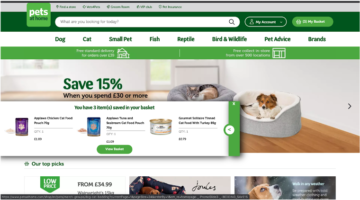
To lower the abandonment rate, the team at Pets at Home decided to implement a pop-up displaying the user’s basket items upon returning to the website. Reminding users of the items in their basket would hopefully encourage them to view their basket and drive more users to ultimately convert.

Winning Variation – Saved Basked Prompt

Results

The test was set up to target desktop users who had at least one product in their basket. Directing approximately half of their traffic to the variation, the variation proved successful after having run for 3 weeks. The variation significantly drove more users to the checkout & confirmation page.


“Introducing a saved basket prompt for returning users when they return on Pets at Home’s website increased more users to checkout and convert. We’ll also be running this test on mobile to see how this performs.” – Halima Satheya, Digital Optimisation Lead @ Pets at Home

Spark
your curiosity!

Get your copy of "Pets at Home Drives More Users to the Checkout & Confirmation Page" now.

Case Studies

How Pets at Home Increased Their Average Order Value by 1.2%

23% Increase in clicks on recommended products

1.2% Uplift in average order value

Pets at Home is the UK’s largest pet care business and provides pet owners with everything they need to be able to look after their pet – from food, toys and bedding, and grooming services, to first opinion veterinary care and world-class specialist veterinary hospitals.

The Challenge

Pets at Home found that its users were repeatedly missing product recommendations at the bottom of the product display page. After adding an item to their basket, many users missed the opportunity to view related products which led to low engagement with suggested product recommendations.

Test Hypothesis

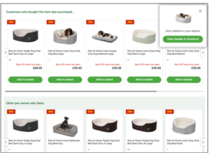
To drive more engagement to the overlooked product recommendations section Pets at Home briefed Good Growth, using AB Tasty, to set up a simple A/B test inserting an anchor link in the variation. The anchor link variation would automatically scroll the page down to the recommended products after a user had added a product to their basket. The “add to basket” action would trigger the anchor link to drop the user down to the product recommendations, which in turn would increase engagement and the number of items per order.

Results

The anchor link variation outperformed the original variation, proving statistical significance after 3 weeks. Running the variation to both desktop and mobile users increased the engagement with the product recommendations and saw an uplift of + 1.2 % in average order value.

Anchor Link Variation

Takeaway Tips

  • Ensuring good visibility of product recommendations on the product display page can drive a higher average order value and increase user engagement
  • Leverage anchor links to highlight sections of your website that you want to call attention to

Spark
your curiosity!

Get your copy of "How Pets at Home Increased Their Average Order Value by 1.2%" now.

Case Studies

How Three Ships Drove Traffic to Partner Pages Using a Single Widget

7% Increase in CTA clicks to partner pages

2 weeks Test duration

Three Ships is a marketing agency dedicated to driving growth for its partners. Their multifaceted approach spans affiliate marketing, performance-driven content, conversion rate optimization, and media investment management.

Three Ships teamed up with AB Tasty to accelerate growth for its partners through experimentation. By thinking critically about the connection between user intent, device, and UX design, they were able to increase visits to partner pages by 7%. Here’s how they did it.

The Situation

Mattress Advisor is a comprehensive resource for shoppers looking to purchase a new bed— complete with user reviews, product guides, and general resources on all things sleep-related. The Three Ships team wanted to focus on Mattress Advisor’s branded pages, which featured only one mattress brand (as opposed to comparing multiple, like on non-branded pages).

The goal was to get users to click on the CTA (“Buy Now”), which would send shoppers to the brand’s own page to complete the conversion.

Three Ships knew that visitors to Mattress Advisor’s branded pages had a strong intent (incoming traffic was via paid search links, meaning shoppers had used brand-specific keywords in their search). These shoppers were nearing the end of their research, had a specific mattress in mind, and were closing in on a purchase decision.

In analyzing this website traffic further, Three Ships saw that roughly two-thirds of visitors were using mobile devices. So, optimizing the CTA had to consider both the stage in the customer journey and mobile usability (e.g. smaller screen sizes, the role of touch in the user experience).

The Experiment

Three Ships used an AB Tasty banner widget to place a sticky CTA at the bottom of the screen and duplicated this test across all branded pages.

The idea was that a sticky CTA would be easily accessible to visitors on mobile devices without blocking important information like reviews and ratings that often influence decision-making.

Results

It only took two weeks for this experiment to reach statistical significance due to the high traffic of these pages.

In the end, the sticky CTA across branded mobile pages was a success, with the conversion rate averaging at about 7%. It’s since been hard-coded onto the site.

Takeaway Tip

Mattresses are big purchases with long periods between return customers. It’s important to find a balance between encouraging a conversion while not coming across as too pushy. In this scenario, Three Ships knew that visitors were close to making a purchase. So, it was important that taking the next step to convert was easily accessible while not overtaking the entire web page.  Implementing this experiment was simple, fast, and scalable thanks to AB Tasty’s widget library. No developer support was needed to create the sticky CTA, and it took only two weeks to prove its effectiveness.

Spark
your curiosity!

Get your copy of "How Three Ships Drove Traffic to Partner Pages Using a Single Widget" now.

Case Studies

Cluse Sees an Uplift in Transactions With Product Landing Page Optimization

+1.12% Uplift in transactions

+2.39% Increase click-through rate to the PDP

Known for their modern, simple, and elegant watches & jewelry, Dutch watch brand Cluse has established itself as one of the fastest-growing accessories brands.

The Challenge

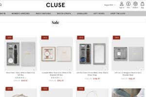
Cluse noticed that the bounce rate for their product landing pages was high and found that not many users clicked through to the product display pages. There was no clear call-to-action for the user to progress to the product display page.

Original

Test Hypothesis

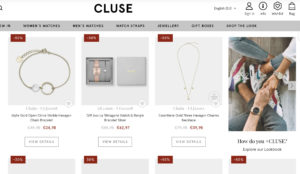
To encourage more users to click through to the individual product pages Cluse set up an A/B/n test including different CTA color variations. The “View Details” CTA button was inserted below the product image, linking to the respective product display pages (PDP). With a clear CTA the objective of the test was to increase users reaching the PDP from the product landing page, which in turn would increase the add-to-cart clicks and transactions.

Results

Targeting all users across desktop and mobile, the A/B/n test ran for 3 weeks across Cluse’ French domain. The winning variation (pictured below) significantly increased the click-through rate from the product landing page to the product display page as well as driving an increase in transactions.

  • +2.39% increase in click-through rate to the product display page
  • +1.12% uplift in transactions

Winning Variation

Takeaway Tips

  • Make it easy & clear for your users to reach the product display page. Optimizing the gateway to your product pages can help you convert users into customers.
  • Small changes to your CTA’s can help you achieve quick wins.
  • Analyze the data you have from an AA test or insights from other means, to better understand the user behavior on your site, and help you come up with test ideas that could help improve the users’ experience on the site.

Spark
your curiosity!

Get your copy of "Cluse Sees an Uplift in Transactions With Product Landing Page Optimization" now.

Case Studies

How Lush’s Focus on Human Connection Optimized the Digital Customer Experience

250% Increase in click-through rate

$7.5K Increase in sales during the experiment

Lush is a cosmetics company known for its emphasis on fresh ingredients and cruelty-free products—not to mention being credited as the original inventor of the bath bomb. From early days in England to currently operating 250 stores across North America, Lush continues to have a dedicated following for its soaps, shampoo bars, moisturizers, and scrubs.

The Challenge

For retailers (and all businesses for that matter) entire strategies had to be reworked in response to COVID-19. Digital became the central, if not sole, channel to focus on.

At Lush, the team had implemented a travel campaign before social distancing and non-essential business closures were government-mandated. While the campaign had initially been performing well, there was a drastic dip in engagement as travel restrictions tightened.

Lush knew that they needed to pivot. But they also needed to consider how current circumstances were affecting their customers. What was the best way to connect with people during this time? How could they strike a balance between offering familiarity while not coming across as out of touch?

The Test

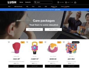
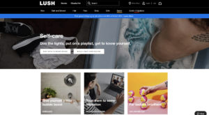
Lush focused on their homepage promotions, evaluating everything from the banner image to CTA phrasing and featured products. The team created two campaigns that subtly addressed the new reality of staying at home and socially distancing.

The first variation was centered around self-care. Lush offers head-to-toe cosmetics products that range from relaxing to invigorating. The idea was for customers to put together an entire regimen for themselves, perhaps gravitating to products they wouldn’t normally have had time for (like scalp treatments and bath bombs). The second variation was built around the theme of sending care packages to loved ones. Even though people couldn’t physically see friends and family, they could send these gifts as a thoughtful gesture or for special occasions.


Results: Part 1

It quickly became clear that the care package promotion was the better performer, with a 250% higher click-through rate than the self-care campaign. During this experiment, the care package promotion also generated $7,500 more in sales than the variation. While the team couldn’t know with absolute certainty if people were buying care packages for their own use, it was clear that this messaging had more of a pull. So, Lush decided to dig deeper into this trend. They launched another A/B test that compared the general care package promotion with a variation focused specifically on Mother’s Day.

Truthfully, the team wasn’t sure how users would react. Would they gravitate to the theme of Mother’s Day or would it be unintentionally upsetting for those unable to see their parents in person? Testing provided a safe framework to find out. 

Results: Part 2

The Mother’s Day campaign did appear to resonate with users more, gaining a higher click-through rate than the more general care package promotion. Following the results from this test, Lush started mapping out a similar campaign that focused on Father’s Day to keep the momentum going. 

As Lush demonstrates, effective experimentation is continuous. In one of the first tests launched in this series, Lush saw the positive impact of messaging that focused on human connection. Leveraging this insight, they were able to develop a series of campaigns that explored this further: considering everything from how users would respond to specific holidays to whether promotional images that featured people performed better than those with just products.

Takeaway Tip

It takes users approximately 50 milliseconds to visually assess a website and decide whether to stay or leave. Lush’s strategy shows a sharp awareness of this short time frame. They weren’t concentrating on refining just one or two details of their website, but how every element came together to form a holistic experience. In this way, their approach became more psychographic, asking questions related to what piqued users’ interest and how this impacted the customer experience. And in doing so, Lush was able to stay in sync with its customer base during a time of rapid and widespread change.

Spark
your curiosity!

Get your copy of "How Lush’s Focus on Human Connection Optimized the Digital Customer Experience" now.

Case Studies

Panasonic Reduces Costly Call Volumes With AB Tasty’s CXO Solutions

11.6% Increase in digital customer support

$30,000 Yearly cost reduction

Customer journeys are more nuanced than ever before. As consumers switch between devices, channels, and touchpoints, businesses on the digital frontier, like Panasonic, are focusing on the not-so-simple task of bringing continuity to each interaction and delivering an omnichannel experience.

We spoke with Michelle Esgar, who is spearheading the brand experience for Panasonic Consumer Electronics, about the challenges and strategy involved in delivering this integrated experience. We started by looking at an experiment we worked on together to reduce calls to customer support (and as a result, avoid lengthy wait times for users and bottlenecked workflows internally).

From there, we discussed how this experiment fits within Panasonic’s overarching strategy—and how successful customer experiences are built with an integrated understanding of every consumer touchpoint.

Here’s a snapshot of Panasonic’s 360-degree approach.

The Challenge

Panasonic has a recurring goal: reduce customer support costs year-over-year. Currently, every call to the support center costs up to 5 dollars, which quickly adds up to be: expensive. And along with optimizing the budget, Panasonic also needed to improve the entire experience.

Consumers reach out to customer support when their product isn’t working as intended. So, from the gate, there’s an element of frustration. More often than not, users will check the website first to help solve their problem. If they can’t find the answer, frustration mounts. That’s when they’ll call a representative, and have to go through a complicated IVR for an average of six minutes before getting someone on the line. 

Consider how exit rates will exponentially increase on web pages after load time passes three seconds. Asking someone to wait six minutes in “the age of instant” isn’t sustainable.

By conducting a call center analysis, it became clear that for the majority of incoming calls, Panasonic already had self-service information available that could answer the question. So, the underlying issue wasn’t so much about bandwidth as it was about putting the right information in front of the right user at the right time. This meant tackling everything from the website’s information architecture to physical product manuals; a concerted effort that would, of course, take time. So, while refining this ongoing strategy, Panasonic focused on a more immediate tactical next step: driving customers to their digital channels for faster support.

Test Hypothesis

Since representatives could handle multiple chat queries and emails at a time, it was important that these channels were properly promoted. Originally, these links were placed in the middle of Panasonic’s customer support page—easy to miss if users were scrolling through quickly.

Panasonic-Contact-Header

Michelle believed that if this contact information was more visible—in the header of the web page—consumers would be more likely to engage with these channels. Using AB Tasty’s visual editor, Panasonic was able to quickly add this option in the navigation bar as an A/B Test (splitting traffic 50/50).

Results

Measuring the success of this test was based on the percent of digital customer support contacts vs. phone calls. In the few weeks this test ran, this ratio shifted 11.6% in favor of digital support. Based on average call volume, this equates to approximately $2,500 a month in costs saved, or roughly $30,000 a year. Based on these results, this new header was made visible to 100% of web traffic.

Takeaway Tip

How do you make sure you’re solving the root cause of a problem and not just one of its symptoms?  In this scenario, leveraging online support would create a faster experience for users and significantly reduce costs. But this experiment represents just one facet of Panasonic’s multi-pronged strategy: to eliminate the pain points prompting these queries in the first place. Improving documentation and recognizing when issues are the result of user error, as a chance to improve product usability, are just two examples of this integrated approach. At AB Tasty, we’re excited to keep working with Panasonic on this omnichannel strategy to further enhance the customer experience.

Spark
your curiosity!

Get your copy of "Panasonic Reduces Costly Call Volumes With AB Tasty’s CXO Solutions" now.

Case Studies

Displaying More Product Sizes Leads to More Transactions

3% More Transactions

€3,000 More Revenue

Yves Rocher is an internationally renowned company that focuses on plant-based cosmetics. They sell skin, body and hair care products, as well as make-up and perfume.

Challenge

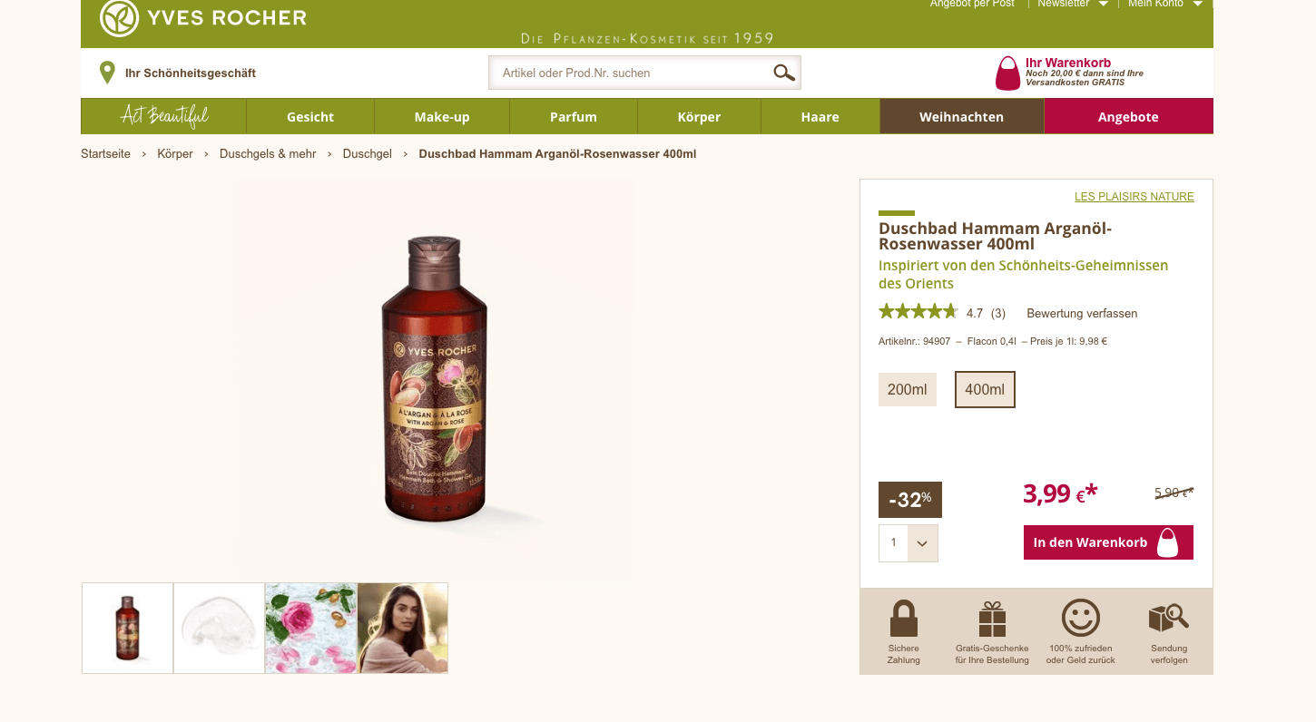
On Yves Rocher’s website, customers can find a wide range of products in varying sizes. However, the company wondered whether users were aware of this. Once they reached the product page of an item in a certain size, customers didn’t always know it was available in other sizes. The team at Yves Rocher wanted to run an initial test campaign with AB Tasty to clarify whether showing alternative article sizes on product detail pages could increase sales figures.

A/B Test

From this idea, a clear test hypothesis was formulated: if size options for selected items were displayed, would the number of transactions and sales increase? The team decided to choose a specific product category – shower gels – to run this initial experiment. On the website, these are available in 200ml and 400ml bottles. The team set up an A/B test for all items that fell into this category.

Yves Rocher Product Page

Results

A total of 8,787 unique visitors were tested during the shower gel campaign. And indeed, the test results were positive: 5% more clicks on the size options were recorded. 4% more users reached the shopping cart in the test variation, which led to an increase in the transaction rate of 3% and accounted for approximately 3,000 euros more revenue than in the original version without size options.

Takeaway Tip

This first test campaign was only conducted on a small segment of the website – the shower gels product category. The team at Yves Rocher had a sound approach: test a hypothesis on a small segment of their website, and verify the results. Now that they’re sure of these positive results, they can apply these learnings elsewhere. If the data-driven results continue to look good, Yves Rocher can invest the necessary time and energy to incorporate different size categories on all product detail pages, without risk.

Spark
your curiosity!

Get your copy of "Displaying More Product Sizes Leads to More Transactions" now.

Case Studies

Decathlon Scores Big With Social Proof

3.3% Increase in Transactions

2.8% Revenue Lift for Returning Visitors

Whether you’re a converted couch potato or an experienced athlete, Decathlon has something for everyone. Present in 52 countries, Decathlon designs and sells sporting goods, both online and in 1,600 brick-and-mortar locations.

Challenge

Decathlon’s mission is to make sports accessible to all. One of the ways they accomplish this is through offering a wide array of choice – 10,000 products covering 80 sports are sold on Decathlon’s website. With a range of price points and styles, there is an almost dizzying array of items to choose from. For some shoppers – especially those trying out an activity for the first time – this amount of choice might seem overwhelming.

How could Decathlon help shoppers get situated?

Social Proof Hypothesis

“We know that social proof – the idea that, when unsure, people look to others for direction – is a powerful and effective concept,” explains David Harari, Customer Success Manager at AB Tasty. “In the context of e-commerce, this means people are influenced by what their peers are interested in when deciding what to buy. We wanted to test out if a simple line of social proof messaging would nudge website visitors further down the purchase funnel.”

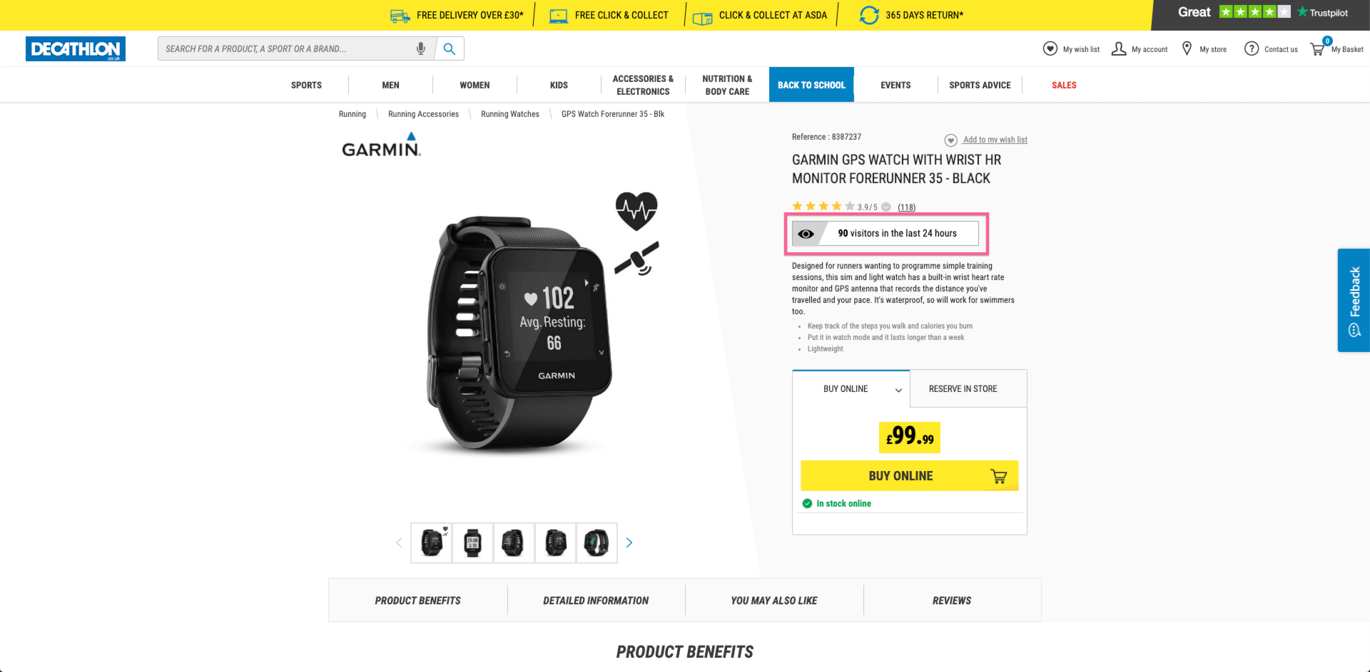
To do this, Decathlon’s UK digital team ran an experiment based on AB Tasty’s Social Proof widget. The AI-powered widget dynamically surfaces the number of times a product is viewed by other shoppers on a site in a given timeframe. This gives other browsers an idea of which items are getting more traction.

Decathlon social proof messaging
Product page with social proof messaging

“We thought it could be that extra little nudge to hit ‘add to basket’ – and might help certain customers continue through the purchase funnel,” elaborates Florent Beck, UX Leader at Decathlon UK. The team set up an A/B test on 400 product pages to see whether this kind of social proof messaging would have an impact on visitors’ purchase decisions. The text was inserted automatically just below the customer reviews ratings (another element of social proof), and above the product description. “What was really handy about the AB Tasty widget was that we can set a minimum amount of views before the message showed. In this case, we chose 20 – so if fewer than that number of people viewed the product, the message wouldn’t show, and once it hit 20, it would automatically appear,” explained Florent.

Results

Adding this simple line of social proof messaging not only increased clicks on the ‘Add to cart’ button, it also bumped up transactions and revenue. For all audiences, clicks increased by 1.5%, transactions by 2.4% and revenue by 1.3%.

Interestingly, when the team segmented the results by certain audience profiles, they realized that the social proof messaging worked better on returning visitors. They clicked 2.8% more, with an increase of 3.3% on transactions and 2.8% for revenue lift. “This might indicate that shoppers that know and trust the Decathlon brand are even more likely to put stock in others in the Decathlon community, versus first time visitors who are more wary,” explained David.

Even more interesting was when they dove into the data to look for what kinds of products this messaging worked best with. They also discovered that the social proof approach worked better for lower priced items – less than 10 pounds – versus more expensive, ‘investment items’, like a nice bike or set of skis. This kind of information can help Decathlon increase the efficacy of their campaigns in the future, and scale up this tactic for other markets.

“We value our community at Decathlon. What’s great about this kind of social proof messaging is that it’s a way to automatically let people take the opinions of other Decathlon shoppers into account – if a certain product is popular or trending, others can know that in real time as they’re browsing. From a business perspective, it increases our transaction rate and revenue, and from a customer experience perspective, it helps orient shoppers.” – Florent Beck, UX Leader, Decathlon UK

Spark
your curiosity!

Get your copy of "Decathlon Scores Big With Social Proof" now.

Case Studies

How Fenty Increased CTA Clicks by 42%

42% more CTA clicks

15 min. test setup

Musician and entrepreneur Robyn Rihanna Fenty partnered with LVMH to release her namesake clothing line, FENTY, in 2019.

Challenge

One of the first KPIs the FENTY team wanted to measure and optimize was the clicks to its homepage CTA, which brought visitors to the latest collection.

Experiment

FENTY wanted to see if CTA size had an effect on the click rate. Using the AB Tasty platform, they set up a split test that would compare the performance of a CTA sized at 13 pixels versus a CTA that was slightly bigger at 15 pixels.

FENTY-homepage

FENTY homepage

Results

In the end, bigger was better. The 15-pixel CTA generated 42% more clicks than the 13-pixel variation and was permanently added to the FENTY homepage.

Takeaway Tip

FENTY proved that simple tests can have a significant impact. In this example, it took 15 minutes to set up the test, and a difference of 2 pixels, to increase CTA clicks by an impressive 42%. Focus on making the key elements of your web page (which could be a call to action, a navigation button, etc.) a focal point for your visitors by considering both size and placement.


Spark
your curiosity!

Get your copy of "How Fenty Increased CTA Clicks by 42%" now.