Case Studies

Urban Decay Increases Revenue by 7%

+7% Revenue increase during test

+8% Average basket size

The cosmetics line Urban Decay, which includes makeup for eyes, lips, nails, and skin, is known and admired for its edgy style. Part of the L’Oréal Luxe brand portfolio, alongside Kiehl’s, Lancôme, and Biotherm, Urban Decay products are sold online and in brick-and-mortar stores worldwide.

Challenge

“Each L’Oréal Luxe brand has its own website, based on a similar template,” explained Virginie Robert, Digital Project Manager at L’Oréal Luxe, “but each line has a different brand identity and target audience. Optimizations that might work for one won’t necessarily work for the others. That’s why we knew we needed a tool like AB Tasty.” Furthermore, since L’Oréal Luxe products are sold both on the brand’s own ecommerce website, as well as by third-party vendors, it’s especially important for their marketing teams to optimize transactions on their own site. The particular challenge for Urban Decay was increasing average basket size – both in terms of value and number of products – during sales.

A/B Test Idea

Working with Léa Benquet, their dedicated Customer Success Manager at AB Tasty, Urban Decay’s digital team decided to run an A/B test during one of their sales. They wanted to determine if a promotional banner, advertising a discount for 85 euros spent, would increase average basket size, quantity of items, and ultimately, revenue.

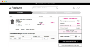
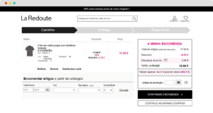
With the help of AB Tasty’s technical specialists, the banner – designed in an eye-catching green – was placed atop all basket pages on Urban Decay’s site. If a shopper had fewer than 85 euros in their basket, the banner was triggered, informing them of how much more they needed to spend in order to take advantage of the discount.


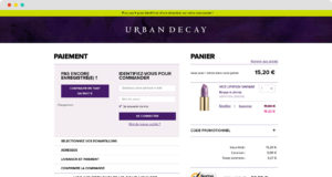
The banner was triggered to all shoppers with fewer than 85 euros in their basket. It reads, “Only X more euros until you can benefit from a discount on your purchase!”

Results

The promotional banner significantly increased all of Urban Decay’s KPIs: average basket size increased by 8%, the average number of items in the basket jumped by 7%, and revenue generated increased by an impressive 7%!

“We were very pleased to be able to work with Urban Decay to boost their revenue by 7% using just one A/B test. These kinds of optimizations can have a real impact on profits – over one year alone, this small change would have generated an extra 190,000 euros!” – Léa Benquet, Customer and Partners Success Manager Team Leader at AB Tasty

Takeaway Tip

Sales are particularly fruitful times to test website optimizations. Well-thought-out promotional messaging along the checkout process is key to maximizing profits.

“We were very happy with the results of this test, and we’re absolutely going to use the banner again during our next sale. The best part is that duplicating and implementing the banner design will be very easy to do, and won’t require any IT help, now that the template is all set up – this is part of the beauty of the AB Tasty platform.” – Guillaume Totis, e-Commerce Manager at Urban Decay


Spark
your curiosity!

Get your copy of "Urban Decay Increases Revenue by 7%" now.

Case Studies

La Redoute increases RPV by 2.7%

+4% Increase in average order value

+11,600€ Revenue over 6 weeks

La Redoute is a leading French e-retailer in fashion and home decoration. Known for its typically French style, the brand has a strong international presence, including in the UK, Belgium, Switzerland, Russia, Spain, Portugal, Italy, and Poland.

Challenge

When the Portuguese branch of La Redoute began working with AB Tasty, their aim was simple: increase revenue per visitor. However, the means were less than obvious. As a widely international brand, the team at La Redoute’s headquarters noticed that consumer behavior varied significantly according to country.

La Redoute Portugal knew, for example, that their visitors had smaller average order values (AOV) than their French counterparts, and purchased less frequently. In order to increase their revenue per visitor, what would be the best approach? They decided to use a simple A/B test to find out.

A/B Test Idea

The Portuguese team knew that their customers had less spending power than consumers in France. They liked to window-shop, for example, and would often abandon their cart without finalizing their purchase. Based on these insights, the team decided to test using a free shipping incentive on purchase pages, to see if it would positively affect AOV, and potentially revenue per visitor.

They tested two different versions against their original site (with no free shipping messaging): The first variation read ‘Free shipping over 30 euros’, and the second would inform browsers how much more they had to add to their cart before hitting the 30 euro free shipping mark.

Original
Variation

“In an e-commerce context, increasing revenue per visitor is all about finding the right combination of messages and incentives along the purchase funnel. For some audiences, opting for promotional offers works best. For others, it’s stress marketing techniques, or free shipping messages, like for La Redoute. The only way to know for sure what approach is effective – and how to perfect that approach for maximum impact – is to test it.” – Alexandre Anquetil, Customer Success Manager at AB Tasty

Results

Website visitors were clearly incentivized by the free shipping messaging. The first test version boosted revenue per visitor over the 6-week test by an impressive 2.7%, and the second version by 1.9%. This was accompanied by a jump in AOV of 3.7% for both versions. And the difference in revenue? The first variation brought in an extra 11,600 euros during the six weeks of the test alone. Over a year, that could translate into roughly 100,500 euros!

Takeaway Tip

Insights surrounding user behavior and mindset are the starting point of any good website optimization campaign. Start with analytics and insights tools, internal surveys and client feedback to get to know your customers.

Spark
your curiosity!

Get your copy of "La Redoute increases RPV by 2.7%" now.

Case Studies

How Ashley Furniture Increased Conversions by +15%

+15% Conversions

-4% Bounce rate

Context

As a leading furniture and bedding company in the United States, Ashley Furniture generates a high volume of visitors to its online store, AshleyFurnitureHomeStore.com. For this reason, optimizing its purchase process was a key step in improving conversion rates for new visitors.

Issue

How to eliminate frustration during the purchase process to ensure hassle-free checkout conversions?

Objective

Reduce the amount of time spent in the purchase funnel and lead the user to a faster and more effective conversion.

Implementation

We hypothesized that Ashley Furniture was struggling to convert new visitors due to their lengthy checkout process. On the original site, if the user did not enter their delivery and billing address while creating their  account, they would need to add in this information during the conversion funnel.

We decided to remove this step from the conversion funnel and test if that would improve conversion rates. The question was where in the customer journey this step would be implemented?

We tested a variation where, if the user had not entered their address information during the initial account creation phase, they would be prompted to log in to their account, then led to a form where they would be asked to fill in their delivery address.


Ashely HomeStore Screen 1
Step 1 in the original checkout process
Ashley HomeStore step 2
Step 2 in the original checkout process
Ashley HomeStore variation
Simplified checkout process

The objective of this test was to get the user to fill in their personal information before checkout, thus saving them time and simplifying the purchase process. We know that checkout is already a lengthy process with a number of different steps such as logging in, selecting a delivery option and payment method before finalizing a purchase. Our goal was to simplify this process as much as possible.

Results

With this test, we eliminated client frustration by shortening the checkout process, thus reducing cart abandonment rates during the checkout process and creating a more fluid transition to the payment step. By removing this form from the purchase funnel, conversion rates increased by 15%.

“We use AB Tasty to execute A/B and multivariate tests and personalization of our online store AshleyFurnitureHomestore.com. Currently, our UX teams use AB Tasty to gain knowledge of user experience to solve a range of problems and to build new functionalities. With this tool, it is easy to A/B test our ideas to learn whether our hypothesis increases conversion rates, before implementing them on all of our traffic.” – Matt Sparks, eCommerce Optimization Manager, Ashley Furniture

Spark
your curiosity!

Get your copy of "How Ashley Furniture Increased Conversions by +15%" now.