CleanChoice Energy is a leading 100% renewable energy supplier in the U.S., building solar farms and providing consumers with alternative ways to access clean energy.
CHALLENGE
While the CleanChoice team’s paid media campaigns drove heavily engaged traffic to the website, they found those visitors weren’t quite ready to commit to pursuing clean energy.
In an effort to boost the performance of top-of-funnel and awareness campaigns, they decided to test if a timed pop-in on certain pages would drive better lead capture.
TEST IDEAS
The CleanChoice Energy team hypothesized that displaying an email pop-in within 15 seconds of users landing on one of three different test pages would generate more email sign-ups for their newsletter campaigns than its original placement as a button at the bottom of each page.
RESULTS
On average, the tests resulted in a 204% increase in email submissions with the pop-in than without. This helped increase the performance of the top-of-funnel awareness campaigns significantly.
TAKEAWAYS
Not every website visitor is ready to immediately make a purchase. This test proved to the CleanChoice Energy team that they could benefit from a lead-capture strategy for visitors across all stages of the funnel. The team made this pop-in a permanent feature of the site and began testing pop-ins with different messaging on other site pages to target visitors across additional funnel stages.
Spark your curiosity!
Get your copy of "CleanChoice Energy Drives Lead Gen with Pop-In" now.
Le Slip Français Boosts Online Sales with AB Tasty
€1,200Daily sales generated by Recommendations
€540Daily sales generated by targeted pop-ups
Le Slip Français, a prominent French digital-native vertical brand (DNVB) celebrated for its 100% Made in France apparel, partnered with AB Tasty to elevate its e-commerce performance and boost online sales.
Facing increasing competition and a growing product catalog, Le Slip Français recognized the need for more effective on-site personalization. By integrating AB Tasty’s AI-driven product recommendations at critical touchpoints throughout the customer journey, the brand successfully increased revenue by an impressive €181,000.
Visitors who engaged with these personalized recommendations spent, on average, nine times more than those who did not. Additionally, targeted pop-ups implemented by AB Tasty played a significant role in enhancing conversion rates, generating an additional €20,000 in just two months.
AB Tasty’s innovative, cookie-free technology not only ensures a seamless and personalized shopping experience but also guarantees compliance with evolving privacy regulations. If you’re looking to optimize your online strategy and achieve similar success, discover how AB Tasty can transform your e-commerce business.
Spark your curiosity!
Get your copy of "Le Slip Français Boosts Online Sales with AB Tasty " now.
Shiseido revitalizes experience optimization strategy with AB Tasty
6Markets Testing
The cosmetics giant has perfected the blend of beauty and data science.
Now Cynthia Bevilacqua, who leads EMEA e-commerce CRO & digital product roadmaps, wants to harness it.
6 Markets Testing
11 tests per month
1 Year WIth AB Tasty
When it comes to the beauty industry, competition is fierce. New brands pop up every day and that means legacy brands need to evolve or risk getting left on the shelf.
With a company philosophy rooted in the artful blend between beauty and science, Shiseido has fully embraced digital transformation in pursuit of being the leader in the data-driven beauty industry.
Today, the company works with AB Tasty to optimize e-commerce experiences for brand Shiseido and NARS in the EMEA region. Just one year into the partnership, Shiseido is now actively running around 11 tests per month across six markets.
But it wasn’t always like this.
At the start of 2022, Shiseido wanted to transform their existing but constricted experimentation strategy into an intuitive and scalable optimization program. The product team was eager to reach a new level of A/B testing capabilities as well as better optimize the time and resources spent on implementation and execution.
Cynthia Bevilacqua, digital product and user experience manager at Shiseido, knew it was time for a change. “This was March 2022, so the CRO mindset was new. We were doing some A/B tests, but it was limited to three or four tests in one year,” she recalls. “Up until this point, optimization was not a core focus. And I really wanted to change that.”
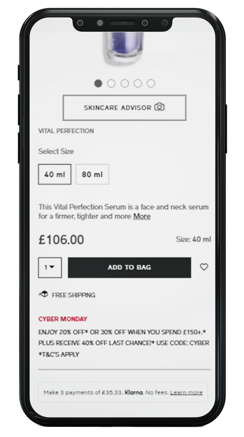
Place alternative payment options closer to “add to cart”
Offering payment installments is one way to motivate users to add more items to their cart. Even if a user doesn’t take advantage of the offer, having the option helps alleviate hesitancy around pricing.
The team at Shiseido wondered whether moving the Klarna payment copy block closer to the “add to cart” CTA could improve the click rate. With an A/B test targeted to the NARS and brand Shiseido UK markets, the team tested placing the price, Klarna copy and CTA closer together.
This small layout change led to a massive improvement with 129% increased clicks on “add to cart” for mobile and 159% for desktop.
ORIGINAL / VARIATION
Mobile
129% increased clicks on “add to cart”
24% increased clicks across all payment options
Desktop
159% increased clicks on “add to cart”
72% increased clicks across all payment options
New partner. New mindset.
A large global footprint requires a lot of cross-team collaboration. From their vantage point within the regional division, Cynthia’s team fields incoming requests from their local markets while also balancing strategic brand ideas from the global HQ in Tokyo.
With oversight on A/B testing and CRO strategies for the Shiseido EMEA region, Cynthia’s next hurdle would be setting a strategy for experimentation across each of the region’s unique markets. More frequent testing enabled by AB Tasty meant simply replicating any test in a new country wouldn’t cut it if they wanted to grow strategically.
“When we made the switch to AB Tasty, we wanted a partner who could help us with specialized testing in each market. We knew a one-size-fits-all did not work for our brand. You cannot say that because a test works well in the UK, that it will equally be successful in France or Germany because the consumer behavior can be quite different across each market.”
To sift through the prioritization of rolling out tests to new regions, Cynthia leveraged AB Tasty’s testing capabilities to implement internal processes. First, evaluating hypotheses through testing and data. Then, successful tests are added to the development roadmap, while the learnings from unsuccessful ones are shared with regional stakeholders and a new round of iterations starts.
“This process helps us ensure that we are not wasting valuable resources and bandwidth. AB Tasty not only enables us to quickly validate the hypothesis with data, but they also help us to say ‘no’ to a request because the data shows it’s not beneficial to the end customers.”
“AB Tasty not only enables us to quickly validate the hypothesis with data, but they also help us to say ‘no’ to a request because the data shows it’s not beneficial to the end customers.”
Cynthia Bevilacqua Digital product and user experience manager at Shiseido
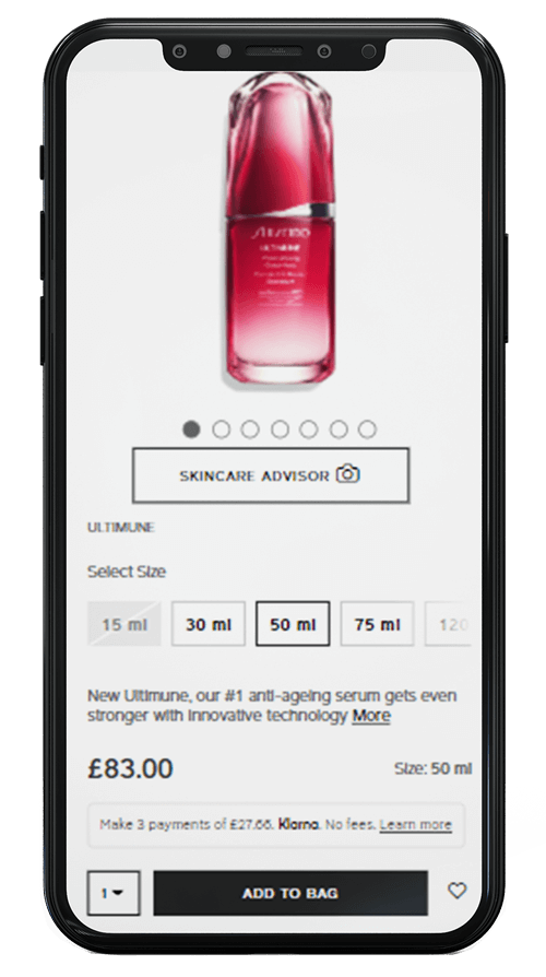
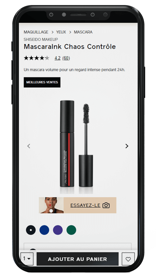
Boost engagement with a higher visibility virtual try-on CTA
Shiseido collected insights that showed customers who interacted with a feature during their decision-making process had a tendency to convert.
Focusing on the French market, the team set up a variation giving the virtual try-on CTA a complete makeover. A small image, camera icon and brighter button color helped increase the CTA’s visibility on the product page.
Compared to the original CTA (which saw an average of 10% click rate), the revamped virtual try-on button saw a whopping 95% increase in clicks. “Add to cart” clicks also increased by 73% for those who used the feature.
ORIGINAL / VARIATION
95% clicks on virtual try-on
73% clicks on “add to cart” for virtual try-on users
16% overall clicks on “add to cart”
61% in transaction rate
Celebrating a culture of experimentation
After a year of working with AB Tasty, the team at Shiseido is thrilled by the tangible results and internal adoption of a CRO mindset. Since moving from four tests per year to over 10 tests per month with AB Tasty, Shiseido has significantly improved the customer experience. The success from 2022’s experimentation rollout resulted in an opportunity for Cynthia to grow the expertise of her team notably on strategic decision-making and roadmap management.
“The partnership we have with AB Tasty’s customer success team is great because we strategize together about our objectives. They feed us different ideas for testing and understand what’s working from other clients. It is fuel to get us thinking about our roadmap and what we should try to implement next.”
The experimentation mindset also fits perfectly into Shiseido’s desire to be a key player within data-driven beauty companies. With stakeholders invested in the testing mindset, Cynthia’s team is empowered to continue putting ideas to the test first before rolling them into a development roadmap.
“The test-and-learn approach is important to have because it’s not about what you think. ‘I think’ is not something we can use. We need data to tell that story,” Cynthia explains. “And now, this is our new reality with AB Tasty.”
WINNING TOGETHER 5 tips for operational excellence
It’s not easy (or practical) to tell someone their opinion is wrong. That’s why Cynthia Bevilacqua, digital product and user experience manager at Shiseido, advocates for using experience optimization platforms like AB Tasty to deliver data-driven decision-making from individual team members all the way up to stakeholders. It’s essential to sustainable growth.
Here are five tips to optimize team operations:
Monthly team meetings for individual tests and results
Quarterly stakeholder meetings for KPI deep dives and macro-insights
Clear KPIs and tracking dashboard
Gradual data-backed rollout to other relevant teams
Business performance or customer pain points at the center of every test
Deepening the partnership with AB Tasty
One learning that Cynthia’s team is incorporating into their 2023 strategy is giving tests more room to breathe in order to collect better data. Launching fewer tests and running them for a longer duration of six weeks with a minimum detectable effect (MDE) calculation allows the team to gather accurate data to inform the actions for the next iteration.
Entering year two of the partnership with AB Tasty, Cynthia is looking to unlock the next level of experience optimization by expanding the solution to Shiseido’s other EMEA brands. For Shiseido’s mature markets, the team plans to introduce personalization campaigns and build more mature testing. And by encouraging digital to local market teams to incorporate experimentation and the testing-first mindset, Cynthia is further driving Shiseido’s data-driven beauty company vision.
“Initially, we were focused on setting up the team for success through processes and an embedded CRO strategy. Now, we’re ready to accelerate with AB Tasty by using the data intelligence from the past year to drive our global experimentation program,” Cynthia says. “We won’t test just anything — we need to always make sure our tests are addressing a user pain point.”
MeUndies Lifts Revenue with Product Page Promo Banner
+9.98%Transactions
MeUndies, a leading retailer of underwear and loungewear, has made waves by offering comfortable and sustainable products with fun and stylish designs at an affordable price. Using AB Tasty, they were able to improve transaction rate by quickly adding promo banners to product description pages.
CHALLENGE
With ad campaigns driving traffic directly to product pages, MeUndies needed to capitalize on a segment of users that may have bypassed messaging informing that traffic of current sales and promotions.
TEST IDEA
Using AB Tasty, MeUndies tested the addition of a promotional widget to the product description pages during a peak sales time (Valentine’s Day) to increase clarity and remind visitors of the available promo code on select products.
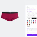
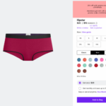
Original PDP (Left) vs. the Variation with Banner (Right)
RESULTS
MeUndies brought more visibility to their promotions — no matter the user’s entry point into their website. The result was an increase in transactions by 9.8% with 10% more clicks on the “add to bag” option.
TAKEAWAYS
Creating eye-catching and relevant promotional banners on product pages improved the ROI on MeUndies’ ad campaign. Bringing more visibility to available promotional codes on product description pages through AB Tasty ultimately led to more purchases and greater revenue.
Spark your curiosity!
Get your copy of "MeUndies Lifts Revenue with Product Page Promo Banner" now.
AB Tasty Enables MoneySmart to Innovate at the Pace of Their Ideas
+12%CTA clicks
+40%Use of filters
MoneySmart Group is South East Asia’s leading personal finance portal, helping consumers compare loans, insurance, and credit cards. From everyday decisions like choosing the best credit card to big decisions like buying a home, MoneySmart shows their customers what’s out there, recommends what’s best for them and helps with the application process.
AB Tasty accelerates experimentation
Today, MoneySmart’s product team can get an experiment up and running – and see results – in under 24 hours. Someone has an idea to test a form length, button color or banner? No sweat! But it wasn’t always like this, as Vincent Paca, Engineering Manager at MoneySmart, explains:
“Before AB Tasty, we were running our own, experimental platform. A lot of the developers’ time was spent creating and coding in different variations of tests. What this meant was that you could spend a sprint just to launch a very simple test. It was a very costly endeavor.”
Sanjiv Shah, Product Manager at MoneySmart, elaborates: “It took a long time to set up a test, it was very manual and painful. While we wanted to experiment with speed, it just took such a long time.”
This sluggish process is less than ideal.
First, testing inertia can mean missed opportunities to convert traffic to leads, or leads into customers. This can eat away at a business’s bottom line. Perhaps more crucially however, it can also entail falling behind competitors who are more rapidly refining the experience on their websites. Consumers increasingly expect financial sector brands to offer digital experiences that are as smooth and delightful as those of e-commerce or social media sites. If MoneySmart wanted to keep up, it was time to make a change.
That change came in the form of AB Tasty.
No such thing as a losing test
“What AB Tasty gave us was a tool that let us easily make changes to our website, deploy these changes and get the results out of the door within a day,” explains Vincent. “The QA function is fantastic,” adds Sanjiv. “You can actually see what a test will really look like for your customers by doing a test in production on just your computer’s IP address.” The best part? No flickering effect and virtually no change to the load speed time.
AB Tasty’s arrival was a watershed moment for the product and tech teams at MoneySmart.
Gone was the manual, tedious process of aligning devops and data teams to regulate traffic flows and build dashboards from scratch. Gone, too, was the stress of not knowing if a new idea would be a hit or a flop. “With AB Tasty, even if a test idea doesn’t ‘win’, we still save a lot on production cost and avoid frustration from developers, product managers and designers,” concludes Efrim Bartosik, Head of Product Design.
Teams come together around experimentation
One of the most appreciated aspects of AB Tasty, according to Bui Hanh, Product Manager at MoneySmart, is the perfect balance between features for technical and non-technical profiles. Not only is MoneySmart’s product team champing at the bit to run a multitude of tests, but so are the commercial, marketing and content teams. Through a testing tool that’s accessible to everyone, a true culture of experimentation is starting to take root, aligning departments around common goals and igniting growth.
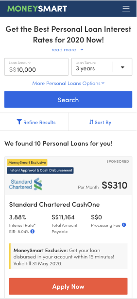
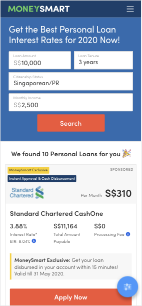
A perfect example is the test shown below. Design, product and developer teams worked together to test a new layout for the ‘apply for a personal loan’ feature. The goal was to increase clicks to the ‘Apply Now’ CTA, and the new version did just that. CTR increased by nearly 12%, as did the use of the filters function (by 40%).
Takeaway
When barriers to experimentation – whether they be in terms of time, money or company culture – are removed, growth flourishes. Aligning teams around creativity and agility is a key ingredient to increasing both business outcomes as well as customer satisfaction. AB Tasty is the perfect partner to help product and marketing teams achieve both.
Spark your curiosity!
Get your copy of "AB Tasty Enables MoneySmart to Innovate at the Pace of Their Ideas" now.
How Three Ships Drove Traffic to Partner Pages Using a Single Widget
7%Increase in CTA clicks to partner pages
2 weeksTest duration
Three Ships is a marketing agency dedicated to driving growth for its partners. Their multifaceted approach spans affiliate marketing, performance-driven content, conversion rate optimization, and media investment management.
Three Ships teamed up with AB Tasty to accelerate growth for its partners through experimentation. By thinking critically about the connection between user intent, device, and UX design, they were able to increase visits to partner pages by 7%. Here’s how they did it.
The Situation
Mattress Advisor is a comprehensive resource for shoppers looking to purchase a new bed— complete with user reviews, product guides, and general resources on all things sleep-related. The Three Ships team wanted to focus on Mattress Advisor’s branded pages, which featured only one mattress brand (as opposed to comparing multiple, like on non-branded pages).
The goal was to get users to click on the CTA (“Buy Now”), which would send shoppers to the brand’s own page to complete the conversion.
Three Ships knew that visitors to Mattress Advisor’s branded pages had a strong intent (incoming traffic was via paid search links, meaning shoppers had used brand-specific keywords in their search). These shoppers were nearing the end of their research, had a specific mattress in mind, and were closing in on a purchase decision.
In analyzing this website traffic further, Three Ships saw that roughly two-thirds of visitors were using mobile devices. So, optimizing the CTA had to consider both the stage in the customer journey and mobile usability (e.g. smaller screen sizes, the role of touch in the user experience).
The Experiment
Three Ships used an AB Tasty banner widget to place a sticky CTA at the bottom of the screen and duplicated this test across all branded pages.
The idea was that a sticky CTA would be easily accessible to visitors on mobile devices without blocking important information like reviews and ratings that often influence decision-making.
Results
It only took two weeks for this experiment to reach statistical significance due to the high traffic of these pages.
In the end, the sticky CTA across branded mobile pages was a success, with the conversion rate averaging at about 7%. It’s since been hard-coded onto the site.
Takeaway Tip
Mattresses are big purchases with long periods between return customers. It’s important to find a balance between encouraging a conversion while not coming across as too pushy. In this scenario, Three Ships knew that visitors were close to making a purchase. So, it was important that taking the next step to convert was easily accessible while not overtaking the entire web page.Implementing this experiment was simple, fast, and scalable thanks to AB Tasty’s widget library. No developer support was needed to create the sticky CTA, and it took only two weeks to prove its effectiveness.
Spark your curiosity!
Get your copy of "How Three Ships Drove Traffic to Partner Pages Using a Single Widget" now.
Panasonic Reduces Costly Call Volumes With AB Tasty’s CXO Solutions
11.6%Increase in digital customer support
$30,000Yearly cost reduction
Customer journeys are more nuanced than ever before. As consumers switch between devices, channels, and touchpoints, businesses on the digital frontier, like Panasonic, are focusing on the not-so-simple task of bringing continuity to each interaction and delivering an omnichannel experience.
We spoke with Michelle Esgar, who is spearheading the brand experience for Panasonic Consumer Electronics, about the challenges and strategy involved in delivering this integrated experience. We started by looking at an experiment we worked on together to reduce calls to customer support (and as a result, avoid lengthy wait times for users and bottlenecked workflows internally).
From there, we discussed how this experiment fits within Panasonic’s overarching strategy—and how successful customer experiences are built with an integrated understanding of every consumer touchpoint.
Here’s a snapshot of Panasonic’s 360-degree approach.
The Challenge
Panasonic has a recurring goal: reduce customer support costs year-over-year. Currently, every call to the support center costs up to 5 dollars, which quickly adds up to be: expensive. And along with optimizing the budget, Panasonic also needed to improve the entire experience.
Consumers reach out to customer support when their product isn’t working as intended. So, from the gate, there’s an element of frustration. More often than not, users will check the website first to help solve their problem. If they can’t find the answer, frustration mounts. That’s when they’ll call a representative, and have to go through a complicated IVR for an average of six minutes before getting someone on the line.
Consider how exit rates will exponentially increase on web pages after load time passes three seconds. Asking someone to wait six minutes in “the age of instant” isn’t sustainable.
By conducting a call center analysis, it became clear that for the majority of incoming calls, Panasonic already had self-service information available that could answer the question. So, the underlying issue wasn’t so much about bandwidth as it was about putting the right information in front of the right user at the right time. This meant tackling everything from the website’s information architecture to physical product manuals; a concerted effort that would, of course, take time. So, while refining this ongoing strategy, Panasonic focused on a more immediate tactical next step: driving customers to their digital channels for faster support.
Test Hypothesis
Since representatives could handle multiple chat queries and emails at a time, it was important that these channels were properly promoted. Originally, these links were placed in the middle of Panasonic’s customer support page—easy to miss if users were scrolling through quickly.
Michelle believed that if this contact information was more visible—in the header of the web page—consumers would be more likely to engage with these channels. Using AB Tasty’s visual editor, Panasonic was able to quickly add this option in the navigation bar as an A/B Test (splitting traffic 50/50).
Results
Measuring the success of this test was based on the percent of digital customer support contacts vs. phone calls. In the few weeks this test ran, this ratio shifted 11.6% in favor of digital support. Based on average call volume, this equates to approximately $2,500 a month in costs saved, or roughly $30,000 a year. Based on these results, this new header was made visible to 100% of web traffic.
Takeaway Tip
How do you make sure you’re solving the root cause of a problem and not just one of its symptoms?In this scenario, leveraging online support would create a faster experience for users and significantly reduce costs. But this experiment represents just one facet of Panasonic’s multi-pronged strategy: to eliminate the pain points prompting these queries in the first place. Improving documentation and recognizing when issues are the result of user error, as a chance to improve product usability, are just two examples of this integrated approach. At AB Tasty, we’re excited to keep working with Panasonic on this omnichannel strategy to further enhance the customer experience.
Spark your curiosity!
Get your copy of "Panasonic Reduces Costly Call Volumes With AB Tasty’s CXO Solutions" now.
Displaying More Product Sizes Leads to More Transactions
3%More Transactions
€3,000More Revenue
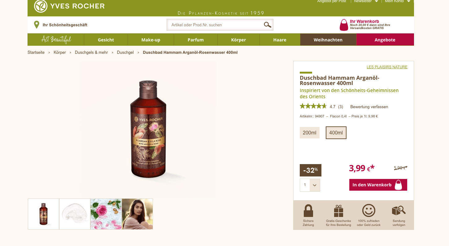
Yves Rocher is an internationally renowned company that focuses on plant-based cosmetics. They sell skin, body and hair care products, as well as make-up and perfume.
Challenge
On Yves Rocher’s website, customers can find a wide range of products in varying sizes. However, the company wondered whether users were aware of this. Once they reached the product page of an item in a certain size, customers didn’t always know it was available in other sizes. The team at Yves Rocher wanted to run an initial test campaign with AB Tasty to clarify whether showing alternative article sizes on product detail pages could increase sales figures.
A/B Test
From this idea, a clear test hypothesis was formulated: if size options for selected items were displayed, would the number of transactions and sales increase? The team decided to choose a specific product category – shower gels – to run this initial experiment. On the website, these are available in 200ml and 400ml bottles. The team set up an A/B test for all items that fell into this category.
Results
A total of 8,787 unique visitors were tested during the shower gel campaign. And indeed, the test results were positive: 5% more clicks on the size options were recorded. 4% more users reached the shopping cart in the test variation, which led to an increase in the transaction rate of 3% and accounted for approximately 3,000 euros more revenue than in the original version without size options.
Takeaway Tip
This first test campaign was only conducted on a small segment of the website – the shower gels product category. The team at Yves Rocher had a sound approach: test a hypothesis on a small segment of their website, and verify the results. Now that they’re sure of these positive results, they can apply these learnings elsewhere. If the data-driven results continue to look good, Yves Rocher can invest the necessary time and energy to incorporate different size categories on all product detail pages, without risk.
Spark your curiosity!
Get your copy of "Displaying More Product Sizes Leads to More Transactions" now.
Musician and entrepreneur Robyn Rihanna Fenty partnered with LVMH to release her namesake clothing line, FENTY, in 2019.
Challenge
One of the first KPIs the FENTY team wanted to measure and optimize was the clicks to its homepage CTA, which brought visitors to the latest collection.
Experiment
FENTY wanted to see if CTA size had an effect on the click rate. Using the AB Tasty platform, they set up a split test that would compare the performance of a CTA sized at 13 pixels versus a CTA that was slightly bigger at 15 pixels.
FENTY homepage
Results
In the end, bigger was better. The 15-pixel CTA generated 42% more clicks than the 13-pixel variation and was permanently added to the FENTY homepage.
Takeaway Tip
FENTY proved that simple tests can have a significant impact. In this example, it took 15 minutes to set up the test, and a difference of 2 pixels, to increase CTA clicks by an impressive 42%. Focus on making the key elements of your web page (which could be a call to action, a navigation button, etc.) a focal point for your visitors by considering both size and placement.
Spark your curiosity!
Get your copy of "How Fenty Increased CTA Clicks by 42%" now.
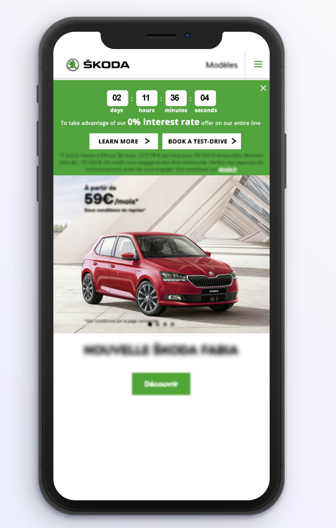
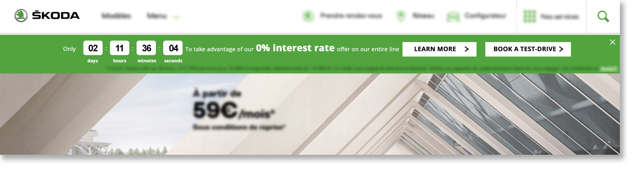
ŠKODA Jump-Starts Test-Drive Bookings with Countdown Banner
2xNumber of booked test-drives
8Day campaign
One of the gems of the Czech industry, ŠKODA has evolved into a modern, respected car manufacturer present in more than 100 markets worldwide. Known today for their unique and reliable designs, the ŠKODA brand started out over a hundred years ago crafting bicycles, followed by motorcycles and, ultimately, cars.
Challenge
In the automotive industry, booking a test-drive is a crucial step in the purchase funnel. Marketers spend considerable time, resources and budget converting website traffic into test-drive appointments; naturally, people who are willing to leave their personal information to physically try out a vehicle are exhibiting high buyer intent.
On a more pragmatic level, retailers also prefer potential customers to book ahead of time, instead of stopping by on the fly, so they can better manage their schedules. All around, increasing the number of online test-drive bookings generates hot leads and better pipeline visibility.
In addition to this ever-present goal, the digital marketing team at ŠKODA’s French branch had a particular challenge to address. They wanted to capitalize on a rare, time-limited promotional offer – a zero-interest loan program – to jump-start their online test-drive bookings. They just weren’t sure of the best website optimization tactic to employ.
Urgency Principle and Engagement Idea
They brought the opportunity to the attention of AB Tasty and Rosapark, their digital marketing agency. “We talked through a few options for how to make the most of this valuable offer,” explained Laura Rérolle, Partnership Success Manager at AB Tasty. “We decided on a simple countdown banner that would show how much time was left before the zero-interest loan option ended. The idea was to give the offer the air of an event, to make it prominent on the homepage and other key areas of the site. This would attract attention and draw interested viewers down the purchase funnel. Since this type of engagement technique is not frequently used in this industry, we wanted to try it out in this limited scope to test the idea.”
The team at ŠKODA then worked with Rosapark on the creative design and deployment aspects. They ran the campaign using AB Tasty for mobile and desktop viewers for the full duration of the offer (eight days), on their homepage and the product pages (those that detailed the cars for sale).
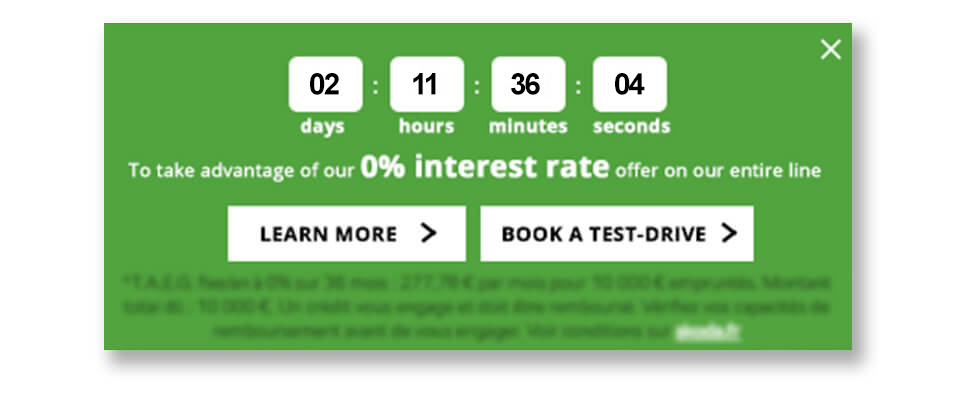
The countdown clock banner included two calls-to-action: one to ‘learn more’ about the offer, (which redirected to an explanatory landing page), and the other, ‘book a test-drive,’ to a booking page.
Zoom in on mobile version of countdown bannerCountdown clock on desktop
Results
There was no doubt about it – the countdown banner clearly drew positive attention, encouraging online visitors to book the coveted test-drives. “We ran this campaign with AB Tasty as part of a big media blast around this offer. We were thrilled to see that, the week of the campaign, we more than doubled the number of booked test-drives compared to the previous week. In fact, a full 13% of that week’s leads came directly from this countdown clock. This is a significant uplift in qualified leads, at very little extra effort or resources. We’re very happy with these results,” explained Sebastien Toussaint, Customer Experience & Data Performance Manager at ŠKODA, France.
“The countdown banner was very effective during this key offer. While taking care not to overuse this engagement tactic, ŠKODA could certainly employ it again during their open house events two or three times per year,” elaborated Laura.
Takeaway Tip
Engagement techniques like countdown banners, when used judiciously, can effectively nudge website visitors into converting.
Spark your curiosity!
Get your copy of "ŠKODA Jump-Starts Test-Drive Bookings with Countdown Banner" now.