Case Studies

Whitepages Boosts Subscriptions with AB Tasty’s Feature Experimentation

+23% Conversion Rate Increase

The Whitepages’ company mission is to build trusted connections in today’s digital world. Since 1997, Whitepages has excelled at meeting customers’ needs by providing information designed to help them stay connected, protected, and make informed decisions.


CHALLENGE

The Whitepages’ marketing team set a goal to increase conversion rate and boost memberships for their monthly plan by improving the structure of the pricing page and make it easier for customers to compare the different plans.

TEST IDEA

The layout of the price subscription page was changed so that all three plans were more prominently displayed next to each other in the form of expanded vertical menus to clearly showcase what’s included in each plan. 

Dynamic toggles were also placed at the top so users could compare monthly and annual pricing plans while the bottom of the page featured a larger payment tab under the plans instead of next to them.

RESULTS

With the new layout, the team was able to present a simpler and easier navigation for Whitepages customers to seamlessly compare different plans with just the right amount of information they need to make a decision.

As a result, after one week, the team saw a 23% increase in conversion rate and a 31% increase in monthly membership plans.

TAKEAWAYS

Feature experimentation has given the Whitepages team the ability to quickly make adjustments while running a test, target a specific audience, and turn on or off a test or device type. This has given the marketing team greater flexibility and autonomy without relying on engineering sources which resulted in faster workflows.

The test involved more complex and dynamic elements (such as the inclusion of the contact’s record of the current plan to which the user is subscribed). This required each of these elements to interact with the entire IT system, which was only possible through server-side testing. The team plans to continue using server-side experimentation to test pricing pages to drive more conversions for the plan upgrades for current members and new users.

Spark
your curiosity!

Get your copy of "Whitepages Boosts Subscriptions with AB Tasty’s Feature Experimentation" now.

Case Studies

Embark Veterinary Optimizes Product Pages to Drive Growth

+7% Conversion rate

How Embark Veterinary Optimizes Product Pages to Drive Growth

Learn more about how the e-commerce team at Embark Veterinary leverages experimentation and a data-driven approach to drive improvements across every key performance indicator.

  • 7% increase in conversion rate
  • 10% increase in revenue per session

​​Embark Veterinary, Inc. was founded on a passion for scientific research and a lifelong love of dogs. Their DNA test kits and online platform enable dog owners to better understand their dog’s breed, health, and much more while helping to advance research into the best ways to care for man’s best friend.

The Experimentation Program at Embark Veterinary

The team at Embark uses a few KPIs when determining the success of experiments. Of course, they always attempt to improve the conversion rate, but they also place a heavy emphasis on average order value.

Lastly, the team analyzes revenue per session as a primary KPI because it takes into account both conversion rate and average order value.

How can you best identify what information to present to customers at the right time and right place?

Because Embarks sells two products, a baseline product and a premium product, the team strives to sell more kits, but they also want to sell more premium kits.

The premium kits include information about dogs’ genetic health (not included in the baseline kits), and this particular experiment was designed to help customers understand the benefits of knowing additional health details for their pets.

The Embark team wanted to understand if different types of product copy would result in higher sales for their premium dog DNA test kits. In order to determine this, the team developed two tests: an initial test to understand the style of product copy that resonated with customers, ranging from clinical to emotional, and a second test to understand the impact of including examples in the product copy.

Test #1 included three variations of product copy ranging from more emotional to more clinical.

In this test, the team prepared three variations of copy. Variation 1 featured more “emotional” copy, variation 2 featured more “clinical” copy, and variation 3 struck a balance between “emotional” and “clinical.”

Results

The first test resulted in a very clear winner, not only indicating that the product copy makes a difference for customers but also that clinical copy resonates the most with their customers.

The clinical copy in variation 2 resulted in a 4% increase in conversion rate, a 3.5% decrease in average order value, and a 1% increase in revenue per session with the increase in conversion rate compensating for the decrease in average order value.

Test #2 included 3 variations of product copy with health examples ranging from less severe to more severe.

In this test, again, the team prepared three variations featuring examples ranging from “less severe” to “more severe.” Variation 1 included a “more severe” example, variation 2 included a somewhat balance example, and variation 3 included a less severe example.

Results

The addition of examples in the product copy made a huge difference. Showing customers a real scenario where they may need to have their dog’s additional health info has a direct impact on revenue. The “less severe” drove the most impact with a 7% increase in conversion rate, a $9 increase in average order value, and 10% increase in revenue per session.

Key Learnings

Understanding your customers and their needs is core to driving growth and delivering a better buying experience.

The Embark team always keeps a “what’s next” mentality. After seeing the potential impact of product copy through the first test, the team asked “what’s next” to figure out how to use a second test to draw more value out of that component of the product detail page.

ABOUT EMBARK

Embark Veterinary, Inc. was launched in 2015 with a passion for scientific research and a lifelong love for dogs. Starting with its best-in-class canine DNA test, Embark is building a powerful platform for scientific discovery that will accelerate advancements in personalized dog care. Embark offers the most scientifically advanced, most trusted, and highest-rated dog DNA tests on the market that helps dog owners, breeders, and veterinarians learn about their dog’s breed, health, and ancestry. Customers gain hundreds of actionable insights that inform more proactive care, and every test fuels new research to help all dogs lead longer, healthier lives. Embark is an official research partner of Cornell University College of Veterinary Medicine, was named to the Inc. 5000 list for the past two years, and was included on Forbes‘ next billion-dollar startups list.

For more information, visit Embark’s website at EmbarkVet.com.

Spark
your curiosity!

Get your copy of "Embark Veterinary Optimizes Product Pages to Drive Growth" now.

Case Studies

How Hunter Boots Drove Value with Social Proof

+9% Conversion Rate

+6% Conversion Rate US

Founded in 1856, Hunter is a progressive British heritage brand renowned for its iconic original boot and holds two Royal Warrants of Appointment to HM The King and HRH The Duke of Edinburgh. The brand has a rich history of innovation and continues to design to protect from the elements and perform on varied landscapes.


The Social Proof Hypothesis

“Social proof is one of the most useful tools of persuasion a brand can employ. Used well it can enrich the customer experience and help customers make an informed decision based on what others are doing” explains Beth Hodge, Head of Optimisation at Conversio. “Working together with Hunter Boots and AB Tasty we wanted to measure whether social proof can improve the experience for Hunter customers and ultimately drive incremental value. Importantly we also had to consider how to serve a message that aligned with the Hunter brand and how it should be applied to different geographic segments considering Hunter Boot’s broad international customer base”

 To do this Conversio defined a strategy to test and measure AB Tasty’s social proof capabilities and individually measure the impact on UK and US customers. Conversio’s detailed data-first approach wanted to establish which messaging and metrics most resonate with the customer, which pages and locations social proof has the highest impact and the optimum thresholds that define exposure. “It’s critical that when launching social proof you optimize all the elements of the experience to maximize your results, it’s about the continuous refinement of the experience” adds Beth.

About Conversio

Conversio is a leading independent optimization and analytics agency, headquartered in London and partners with AB Tasty. They are down-to-earth e-commerce experts who use data, insight, and continuous experimentation to sustainably grow your business

IMPLEMENTATION

After an initial proof of concept and refining the experience with optimized messaging and positioning social proof demonstrated a +9% conversion rate improvement for the UK site and +6 for the US site.

“What was clear from our analysis of those customers exposed to social proof was that we needed to apply specific tactics and design by market to maximize the value of this feature, for example, it was clear that product view data had a bigger impact on US customers than it did in the UK” explained Beth.

Hunter Boots now had a solid foundation on which to grow and expand their use of social proof.

As part of Conversio’s approach to further refining the customer experience of social proof they worked closely with the AB Tasty team to make use of the social proof API. This gave Hunter Boots greater flexibility about where and when to serve these messages to their customers. This included intelligently rotating two different social proof metrics on the product pages vs. a single message which had shown the initial promising results. This further improved on the conversion uplift already seen by 2% in the UK and 1% in the US.

Next Steps – Building on the success

“We are pleased to see the addition of social proof resonating so well with our customers, we have worked with Conversio to ensure the messaging feels on-brand while still highlighting product popularity. This is especially impactful for the rollout of new footwear product categories like commando boots and sandals as customers are less knowledgeable on these products. Social proof really helps us drive newness, and supports conversion rate across our well-known rubber boots. We are excited to see where we can optimse this experience going forward”

 Bryony Longden – Head of eCommerce Operations

Conversio already has plans in place to trial social proof badging on the product list pages as well as using it in the post-add-to-bag experience. Providing extensive experience and end-to-end conversion expertise, applying pre-eminent data analysis, insight and testing methodology to the optimization of e-commerce businesses by means of continuous improvements to their website performance and efficiency.

TAKEAWAYS

The implementation of social proof on Hunter Boots’ website proved to be a successful tactic, resulting in a significant increase in conversion rates for both the UK and US sites. A data-first approach and optimization strategy allowed for the refinement of the social proof experience, tailoring it to specific markets and product categories. It provided Hunter Boots with greater flexibility and opportunities for further optimization.

This success serves as an example of how social proof can be a valuable tool for brands to enrich the customer experience and drive incremental value.

Spark
your curiosity!

Get your copy of "How Hunter Boots Drove Value with Social Proof" now.

Case Studies

How Clarins Uses AB Tasty for Personalization and Retention

+89% Conversions

+145% Add to Basket

The e-commerce team at Clarins is a true “testing lab,” managing their 5 websites (Germany, Spain, Ireland, Benelux, and Portugal) and helping the other nearby countries to grow their e-commerce business. The goal of this ‘incubator’ is to create an internal community of experimenters to help share testing best practices. This approach paid off with the creation of the ‘Wheel of Fortune,’ a gamification concept launched on Singles Day, November 11, 2020.

While testing using AB Tasty was initiated by the International Content team, Clarins decided in 2020 to not only extend its partnership with AB Tasty to include a commercial component but also to expand to the regional and local level. The tool that the EMEA teams were using previously was limited to creating pop-ins, which wasn’t enough to tackle Clarins’ goals involving retention and personalization.

Personalization via gamification

For Célia Rigaux, E-Commerce Director, EMEA, this was an opportunity to instill a test and learn culture across the EMEA teams. “Our goal is to exchange with our customers, to create a link with them, and to inspire loyalty, by bringing them value through our websites. AB Tasty’s experimentation capabilities enable us to challenge our CRM, Acquisition, and E-store teams using innovative tests that we weren’t able to run before.”

With the strategic holiday season approaching, the time was right to launch a far-reaching test across all of the sites managed by the EMEA e-commerce team. Singles Day (celebrated on November 11 in many countries) was the perfect option, seeing as it was also only a few days before Black Friday. All that was left was to decide what kind of game to display.

Everyone’s a winner

At the end of September 2020, Clarins got in touch with their Customer Success Manager at AB Tasty to see if their idea was feasible. After a few exchanges, they decided on the right set-up that struck a perfect balance between technical feasibility and a smooth user experience. 

The idea was simple: Every person who visits any of Clarins’ EMEA websites, whether on desktop or mobile, sees the game appear. If they click on it, the wheel spins and stops at one of 6 gifts. The gifts are promo codes, automatically applied to the winning visitor’s basket, which makes for a great user experience (especially on mobile).
Clarins singles day campaign

Clarins wheel of fortune campaign“We were able to launch our tests in two weeks,” explains Anaëlle Thomas, E-store Project Manager EMEA, who was responsible for the development of the project. One of the major advantages of AB Tasty was the ability to duplicate each experiment for each of Clarins’ sites. If the first test took 20 hours to implement, this number shrank by 5 for each of the other 4 sites. This experience is now live for all of the other countries Clarins’ is present in, and adaptable for other offers.

4x the orders

The first gamification test was a success for Clarins’ EMEA e-commerce team. The game, buoyed up by the increased web traffic brought on by the pandemic, performed very well. Live for 24 hours (from the 10th to the 11th in the evening), the total number of orders completed on the 4 main sites (Germany, Spain, Ireland and Benelux) quadrupled when compared to the results of November 11, 2019. Ireland stood out, with an order increase of +495% and a +585% increase in revenue.

The conversion rate did well, increasing by +89.34% compared to 2019. Finally, the add-to-basket rate increased by +145% compared to the 2020 average.  It should be noted that, though the game performed well in all countries, it was Ireland that attracted the most visitors, with 61.37% of visitors trying their luck.

“We systematically test on all our sites to see how each country reacts according to the local culture. So we shared the success of this experiment with the other countries,” elaborated Anaëlle Thomas. “South Africa was particularly interested and launched their own version in December. The United Arab Emirates also ran the test during the 4 days of Black Friday.”

Pursuing personalization in 2021

Previously known mostly as an A/B testing tool, AB Tasty has attained the level of ‘business partner.’ The EMEA teams even share their experimentation tips via Teams. Next step: Further develop their personalization strategy, especially by learning from other AB Tasty clients’ experiences. See you in 2021!

“The ability to duplicate tests in AB Tasty allows us to exchange more often with the other EMEA countries and to share experiments. We rely on AB Tasty to guide us in driving our personalization strategy forward.”

– Célia Rigaux, E-Commerce Director, EMEA, Clarins

Spark
your curiosity!

Get your copy of "How Clarins Uses AB Tasty for Personalization and Retention" now.

Case Studies

How a Dedicated Optimization Program Helped Fragrance Direct Delight Its Customers

+21% Revenue Uplift

+20% Increase in Transactions

Fragrance Direct is a UK-based pure-play beauty retailer who has been operating since 1993. It sells over 14,000 products across 600 big-name brands, designer labels, and high street favorites. In addition to fragrances, Fragrance Direct sells makeup, skincare, and haircare products from both everyday and luxury brands. Fragrance Direct has been partnering with AB Tasty for over 2 years, and for just under 2 years with Endless Gain.

The Objective

To improve Fragrance Direct’s customers’ experience and generate the business more sales and profit. AB Tasty and Endless Gain approached this in three key ways with outstanding results.

The Approach

Social proof messaging helps instill trust in Fragrance Direct among customers

Research showed that the wider market awareness of Fragrance Direct was quite low. A variety of social proof messages were successfully introduced to new customers. These social proof experiences delivered an increase of over 8% in the user conversion rate.

Personalization helps strengthen an already-strong trading period

Fragrance Direct does very well during three gifting seasons: Valentine’s Day, Mother’s Day, and Christmas, through the Fragrance Finder page.

However, research showed that traffic volumes were low on this page (even during peak periods) despite high conversion rates, and users surveyed said they didn’t actually know what they were looking for from a gifting point of view when they arrived on this page. Using AB Tasty’s Audiences feature, Endless Gain identified users arriving on-site either looking for gifts or unsure about what to buy. These specific user segments were prompted with the question “Searching for gift?”.

Users who clicked on the prompt were taken to the Fragrance Finder page where they were then able to, through a series of personalized questions, engage with and find their desired gift.
The prompt was not shown to users who were not looking for gifts, in order to avoid distracting them and disrupting their journey with the brand. With tactical usage, this personalized strategy delivered a 10% increase in the user conversion rate for Fragrance Direct during their peak periods.

Helping customers checkout faster, and easily, increases sales

Multiple pieces of research highlighted the checkout funnel as one of the key priorities. Various steps within the funnel (and the fields within them) caused considerable friction for customers. Each of these elements, either singularly or combined, were likely to be harming conversions. Endless Gain redesigned multiple elements with the checkout. Through experimentation, the improvements increased the user conversion rate by 2%.

“Using AB Tasty, an efficient and flexible experimentation and personalization platform, enabled us to build on our optimization approach. To continue to build on that, we decided to hire Endless Gain. Working with Endless Gain means we get dedicated resources who are focused 100% of their time on improving our
customers experience without the distraction of day-to-day business challenges.”

– Julian Thompson, E-Commerce Director, Fragrance Direct

Spark
your curiosity!

Get your copy of "How a Dedicated Optimization Program Helped Fragrance Direct Delight Its Customers" now.

Case Studies

OUI.sncf Relies on AB Tasty for Risk-Free Innovation

61% Increase in conversion rate

Faster innovation

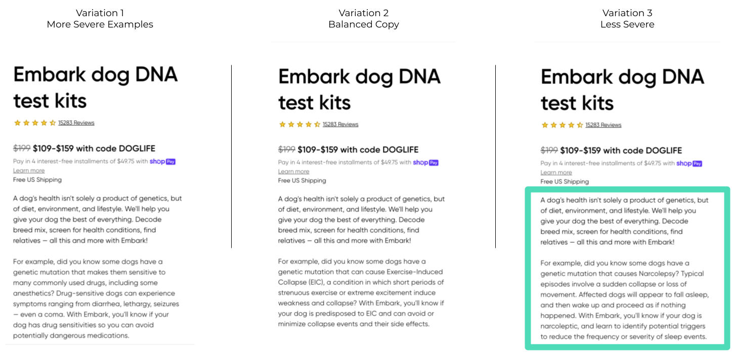
For Hélène Doré, brand loyalty is her bread and butter. 

As a Conversion Rate Optimization Manager at OUI.sncf, her day-to-day consists of thinking up ways to make customer experiences smoother and conversions higher. It’s a job she loves, but it’s not without its challenges. Today’s consumers are fickle and their expectations are exacting; one poor experience on an app or website can create a long-lasting negative feeling, potentially spiralling into poor brand perception, a drop off to a competitor, or bad word of mouth.

“More likely than not, when a customer faces a problem during his/her visit, it creates a bad memory, which may mean the customer doesn’t return. Creating an exceptional, personalized, and fluid customer experience gives a sentiment of recognition to the customer, which will incite him/her to complete a transaction and potentially come back. If we work on creating the most seamless and personalized customer journey, over time, this recognition will transform into loyalty and create stickiness, inciting the customer to come back and therefore form a virtuous relationship with us.”

 – Hélène Doré, Conversion Rate Optimization Manager at OUI.sncf

The conversion rate optimization team, along with the product feature teams, at OUI.sncf has plenty of ideas for how to avoid these scenarios and create truly exceptional customer experiences. The question is: which ideas should they implement? Which should they scale? And how can they be sure an idea won’t backfire? 

A/B Testing: The way of data, not debates

What Hélène and her manager Sunny Song, Lead CRO, needed was the ability to run data-driven experiments in order to know which of their ideas will perform best (to optimize the customer experience), and to mitigate risk in case the idea goes south. AB Tasty was able to provide this capability!

“When we have a goal to achieve and we have several possible propositions to achieve the same goal, AB Tasty helps us by allowing us to test these propositions. We can then make the best decision by determining which proposition has the greatest impact,” explains Sunny.

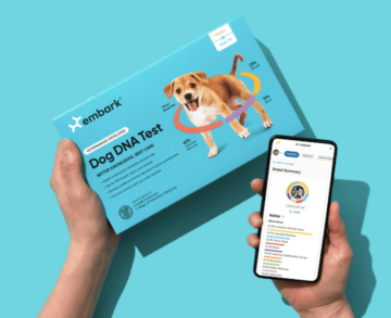
One great example is OUI.sncf’s ‘Exploration Assistant’. 

Think of the ‘Exploration Assistant’ as an AI-powered travel agent. Based on an in-house algorithm, the Assistant is displayed to visitors with a high enough ‘interest score’, and suggests a trip itinerary for the visitor.  The idea sounds great on paper, but would the Exploration Assistant actually make a business impact on bookings?

Using AB Tasty to run a statistically rigorous A/B test, the team determined that conversion rates did significantly increase for those visitors that engaged with the Assistant.  

“This test showed extremely positive results: +61% for web responsive and +33% for desktop impact on the conversion rate,” explains Sunny. This particular experiment was important for more than its impact on these KPIs: “This test was a milestone project for Oui.sncf because it was a very technically complex A/B test and was the first test that incorporated AI algorithms. But the work doesn’t stop here. It’s really essential for the teams to continuously iterate on this version of the algorithm, to test and tweak it for better and better results, so that we’re always proposing the most efficient itinerary to our customers. This is how algorithms evolve, and it goes hand in hand with a continuous optimization strategy.”

In other words: targeted, data-driven testing helps validate strategic decisions at key moments, confirming high-level strategy choices and setting future roadmaps.

“Thanks to the Exploration Assistant A/B test and its very impactful results, we will now industrialize this test. This test was very strategic because it was the first which included AI, which plays a key role in OUI.sncf’s strategy.” 

– Sunny Song, Lead CRO at OUI.sncf

Another advantage to attaching numbered results to testing ideas? Avoiding circular, time-sapping discussions about whose idea to run with. “By implementing A/B tests and providing concrete results and data to prove the effectiveness of certain ideas, we were able to eliminate the “endless” debates we could have where each person has his own opinion on topics,” concludes Sunny.

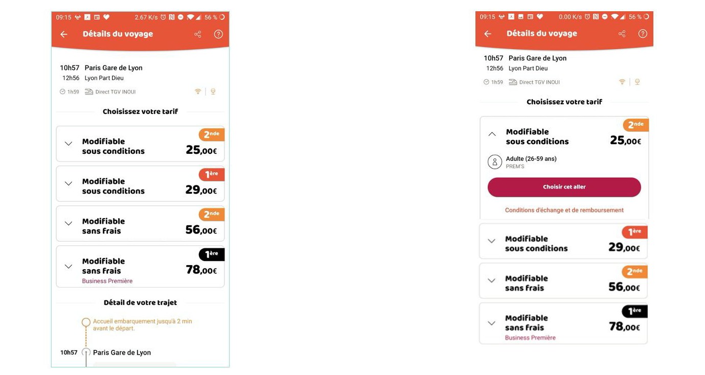
For example, low click-through rate data indicated to the team that unfolding travel details on the ticket information page on their app could increase clicks to a key CTA.

This idea could have led to hours of endless debate around the respective value of each of these blocks.

Instead, the team used Flagship (AB Tasty’s server-side platform) to run an A/B test on the app. This allowed them to quickly validate the winning variation – which happened to be the version B, where the details of the first trip were automatically unfolded. This led to a 2.49% increase in the click-through rate to the CTA “Choose this trip”, as well as 0.28% more arrivals to the basket page.

This is an image of an A/B test run on OUIsncf using AB Tasty

Flagship: The platform behind the magic

“Our strategy is to offer the most fluid and seamless user experience possible to our clients, the vast majority of whom browse and book on our OUI.sncf mobile app, which has become extremely popular.” 

– Ingrid Peiniau Head of Customer Experience at OUI.sncf

Customer experience has become increasingly mobile-first. Alongside buying their groceries, clothing and movie tickets on their smartphones, consumers expect to be able to search, book, or reschedule travel via a user-friendly app. This is especially true for OUI.sncf, where a majority of visits are generated via their mobile app.

This meant that it made sense for OUI.sncf to turn to AB Tasty’s server-side solution, Flagship, for their optimization efforts. It’s the platform they used for tests run on their mobile app, versus their website.

Not only does Flagship enable the kind of experiments OUI.sncf was running on their mobile app, it also allows product teams to release new features with virtually no risk. Why? Teams are able to not only rollout a new feature progressively – that is, not exposing all of their user base at once – but they can also easily rollback that feature if they notice a dip in KPIs.  

Benoit Bouffart, Chief Tech & Product Officer at e.Voyageurs SNCF., explains:

“We’re particularly interested in Flagship’s progressive rollout capabilities. We want to be done with publication planning dependencies. Progressive rollout lets us stop or fully rollout a test as soon as it reaches statistical significance without having to wait for a new publication of the app. If the chosen KPIs worsen, we can avoid prolonging a sub-optimal experience. On the other hand, if the test is positive, all of our clients can start feeling the benefits immediately.”

From increasing conversion rates on their mobile app to validating high-level strategy and reducing the risk inherent in feature rollouts, Flagship has become a strategic partner for OUI.sncf.
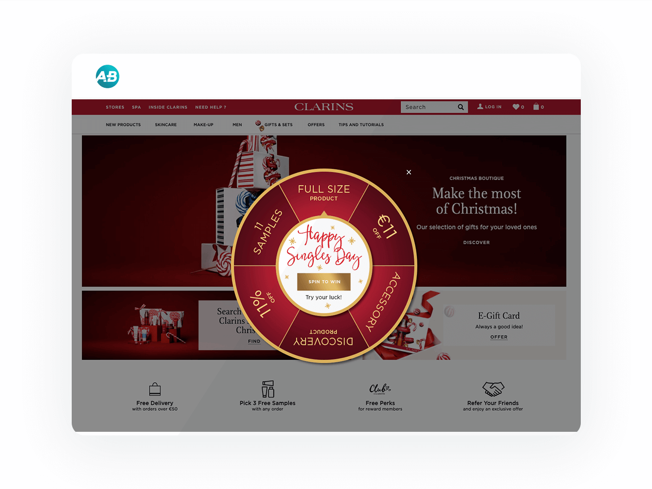
Spark
your curiosity!

Get your copy of "OUI.sncf Relies on AB Tasty for Risk-Free Innovation" now.

Case Studies

How Three Ships Drove Traffic to Partner Pages Using a Single Widget

7% Increase in CTA clicks to partner pages

2 weeks Test duration

Three Ships is a marketing agency dedicated to driving growth for its partners. Their multifaceted approach spans affiliate marketing, performance-driven content, conversion rate optimization, and media investment management.

Three Ships teamed up with AB Tasty to accelerate growth for its partners through experimentation. By thinking critically about the connection between user intent, device, and UX design, they were able to increase visits to partner pages by 7%. Here’s how they did it.

The Situation

Mattress Advisor is a comprehensive resource for shoppers looking to purchase a new bed— complete with user reviews, product guides, and general resources on all things sleep-related. The Three Ships team wanted to focus on Mattress Advisor’s branded pages, which featured only one mattress brand (as opposed to comparing multiple, like on non-branded pages).

The goal was to get users to click on the CTA (“Buy Now”), which would send shoppers to the brand’s own page to complete the conversion.

Three Ships knew that visitors to Mattress Advisor’s branded pages had a strong intent (incoming traffic was via paid search links, meaning shoppers had used brand-specific keywords in their search). These shoppers were nearing the end of their research, had a specific mattress in mind, and were closing in on a purchase decision.

In analyzing this website traffic further, Three Ships saw that roughly two-thirds of visitors were using mobile devices. So, optimizing the CTA had to consider both the stage in the customer journey and mobile usability (e.g. smaller screen sizes, the role of touch in the user experience).

The Experiment

Three Ships used an AB Tasty banner widget to place a sticky CTA at the bottom of the screen and duplicated this test across all branded pages.

The idea was that a sticky CTA would be easily accessible to visitors on mobile devices without blocking important information like reviews and ratings that often influence decision-making.

Results

It only took two weeks for this experiment to reach statistical significance due to the high traffic of these pages.

In the end, the sticky CTA across branded mobile pages was a success, with the conversion rate averaging at about 7%. It’s since been hard-coded onto the site.

Takeaway Tip

Mattresses are big purchases with long periods between return customers. It’s important to find a balance between encouraging a conversion while not coming across as too pushy. In this scenario, Three Ships knew that visitors were close to making a purchase. So, it was important that taking the next step to convert was easily accessible while not overtaking the entire web page.  Implementing this experiment was simple, fast, and scalable thanks to AB Tasty’s widget library. No developer support was needed to create the sticky CTA, and it took only two weeks to prove its effectiveness.

Spark
your curiosity!

Get your copy of "How Three Ships Drove Traffic to Partner Pages Using a Single Widget" now.

Case Studies

Cluse Sees an Uplift in Transactions With Product Landing Page Optimization

+1.12% Uplift in transactions

+2.39% Increase click-through rate to the PDP

Known for their modern, simple, and elegant watches & jewelry, Dutch watch brand Cluse has established itself as one of the fastest-growing accessories brands.

The Challenge

Cluse noticed that the bounce rate for their product landing pages was high and found that not many users clicked through to the product display pages. There was no clear call-to-action for the user to progress to the product display page.

Original

Test Hypothesis

To encourage more users to click through to the individual product pages Cluse set up an A/B/n test including different CTA color variations. The “View Details” CTA button was inserted below the product image, linking to the respective product display pages (PDP). With a clear CTA the objective of the test was to increase users reaching the PDP from the product landing page, which in turn would increase the add-to-cart clicks and transactions.

Results

Targeting all users across desktop and mobile, the A/B/n test ran for 3 weeks across Cluse’ French domain. The winning variation (pictured below) significantly increased the click-through rate from the product landing page to the product display page as well as driving an increase in transactions.

  • +2.39% increase in click-through rate to the product display page
  • +1.12% uplift in transactions

Winning Variation

Takeaway Tips

  • Make it easy & clear for your users to reach the product display page. Optimizing the gateway to your product pages can help you convert users into customers.
  • Small changes to your CTA’s can help you achieve quick wins.
  • Analyze the data you have from an AA test or insights from other means, to better understand the user behavior on your site, and help you come up with test ideas that could help improve the users’ experience on the site.

Spark
your curiosity!

Get your copy of "Cluse Sees an Uplift in Transactions With Product Landing Page Optimization" now.

Case Studies

Displaying More Product Sizes Leads to More Transactions

3% More Transactions

€3,000 More Revenue

Yves Rocher is an internationally renowned company that focuses on plant-based cosmetics. They sell skin, body and hair care products, as well as make-up and perfume.

Challenge

On Yves Rocher’s website, customers can find a wide range of products in varying sizes. However, the company wondered whether users were aware of this. Once they reached the product page of an item in a certain size, customers didn’t always know it was available in other sizes. The team at Yves Rocher wanted to run an initial test campaign with AB Tasty to clarify whether showing alternative article sizes on product detail pages could increase sales figures.

A/B Test

From this idea, a clear test hypothesis was formulated: if size options for selected items were displayed, would the number of transactions and sales increase? The team decided to choose a specific product category – shower gels – to run this initial experiment. On the website, these are available in 200ml and 400ml bottles. The team set up an A/B test for all items that fell into this category.

Yves Rocher Product Page

Results

A total of 8,787 unique visitors were tested during the shower gel campaign. And indeed, the test results were positive: 5% more clicks on the size options were recorded. 4% more users reached the shopping cart in the test variation, which led to an increase in the transaction rate of 3% and accounted for approximately 3,000 euros more revenue than in the original version without size options.

Takeaway Tip

This first test campaign was only conducted on a small segment of the website – the shower gels product category. The team at Yves Rocher had a sound approach: test a hypothesis on a small segment of their website, and verify the results. Now that they’re sure of these positive results, they can apply these learnings elsewhere. If the data-driven results continue to look good, Yves Rocher can invest the necessary time and energy to incorporate different size categories on all product detail pages, without risk.

Spark
your curiosity!

Get your copy of "Displaying More Product Sizes Leads to More Transactions" now.

Case Studies

Avid Increases Transactions by 34% with Promotional Banners

34% Increase in transactions

1 A/B test

Avid is a trailblazer for multimedia content creation. Its nonlinear editor was the first to digitize video content, effectively changing the media and entertainment industry. Today, Avid platforms are trusted by audio, music, film, and television professionals to create, manage, and distribute content.

Challenge

Avid wanted to optimize how it displayed promotional offers across its site to increase conversions and further cultivate customer loyalty.

Test Idea

Avid offers a bonus gift with each subscription to its Media Composer software—a point the team wanted to highlight to visitors on these product pages. Using an A/B test, Avid decided to experiment with the offer’s placement and presentation to see what effect it had on conversions.

In the first variation, details on the bonus gift were presented in a purple banner at the top of the page.


avid promotional banner
Avid highlighted its offer with a purple banner at the top of the page


In the second variation, details on the bonus gift were presented in bold as a bullet under each subscription option.


avid promotion
Avid highlighted its promotional offer in a bullet beneath the subscription summary


For the duration of the test, traffic to these product pages was split evenly between the two versions to determine which formatting was more effective.

Avid then focused on optimizing a January promotion that offered a 60% discount on audio plugins. An AB Tasty Technical Support Engineer placed a sticky banner on the bottom of Avid’s homepage, shopping site, and blogs, that—when clicked—would take visitors to the audio plugins page for more details on the feature and the opportunity to purchase.


avid custom css
Avid promoted audio plugins with a custom CSS banner created by one of AB Tasty’s Technical Support Engineers

Results

For the Media Composer product pages, highlighting the bonus offer with a purple banner was ultimately the winning variation, showing a 34% increase in transactions.

Following the success of this version, Avid used AB Tasty to convert it to a personalization—and the banner is still live on the site today. As for the sticky banner for audio plugins, results from the test showed that—out of those who clicked on the promotion—15% ended up converting on the site.

These tests show the power of presentation when trying to relay key messages to visitors on a site, and the importance of testing to know which formatting resonates with your users.

Driving an e-commerce business without A/B testing is like washing your car without soap – you can’t really succeed if you don’t have any soap. AB Tasty’s robust tools and widgets allow us to do it all – set up quick tests, comprehensive tests, personalizations, and multi-variate testing, all the while being supported by robust analytics and fantastic customer service“. Jeffrey Copetas, Senior Director of Web & E-Commerce at Avid

Spark
your curiosity!

Get your copy of "Avid Increases Transactions by 34% with Promotional Banners" now.