Case Studies

Sage Sees Transaction Lift From A/B Testing Website Copy

+30% Traffic

+7% Transactions

When Sage, a global provider of cloud business management systems, needed to revamp their homepage and conversion funnel, they knew who exactly to turn to: CRO manager Marion Ravel. Here’s how she has used experimentation to test her optimization ideas, leading to higher transaction volume for Sage France’s B2B e-commerce website.

sage-ab tasty

As one of the world’s biggest business management software providers, Sage doesn’t just offer cloud technology services — it also enables entrepreneurs around the world to make smart and fast decisions. From finances, operations, and human resources, Sage prides itself on being a partner to 6 million customers at small and medium businesses in more than 20 countries.

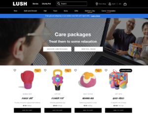
Sage’s digital footprint is made up of local e-commerce websites, supporting multiple products for different personas. For the team at Sage France, this means aligning regional initiatives with the global corporate strategy, while also ensuring a seamless buying experience within a complex website infrastructure. Intuitive user navigation is a must for Sage France’s website, which offers subscription-based software based on business size, profession and sector.

It’s a challenge that Marion Ravel knows too well in her 10-year career of working in marketing and conversion rate optimization (CRO). So much so that Sage France created a position specifically for her to tackle the team’s growing complexities of website optimization.

As Sage France’s CRO manager, Marion places experimentation and customer experience at the forefront of her strategy. She handles both e-commerce and customer product marketing, where she works to build a bridge between selling software and providing customers with product updates and specialized offers.

ABOUT MARION RAVEL

Marion Ravel, CRO manager at Sage France, has over 10 years of CRO, A/B testing, UX, and e-commerce marketing experience. At Sage France, she is responsible for mapping the online customer journey, identifying user personas and ensuring that each pathway is highly optimized through A/B testing and continuous iteration.

The challenges of building a seamless CX

While Sage France had a successful acquisition strategy in place, the website was not fully optimized nor suited for today’s customer demands.

“To update a website, you need to tackle it bit by bit through testing. It would be a huge investment, and potentially erroneous, to redo an entire website and not be sure of which change ignited the positive impact,” Marion explains.

Sage’s e-commerce website is also linked to the customer support page, meaning that any change had to be seamless. For example, conversion can happen on the e-commerce site, but then invoicing would take place on the customer page, so a heavy amount of coordination was needed to ensure a cohesive customer experience.

Recognizing the scale of the challenge ahead of her, Marion knew she needed to find the right technical partner to test, validate, and seamlessly implement her optimization strategies. Luckily, Marion was already a champion of AB Tasty’s client-side solution since 2016.

“The support I’ve received from AB Tasty has never wavered throughout the years, even when I’ve changed companies,” Marion says. “At Sage, we tested many other website optimization solutions for the sake of comparison, but there was no one that came close. AB Tasty is the best tool to implement all your testing with intuitive plug-ins and a dashboard that provides clear insights. On top of that, the Customer Success team has always been helpful and friendly so I didn’t see why I would switch partners.”

At Sage, we tested many other website optimization solutions for the sake of comparison, but there was no one that came close. AB Tasty is the best tool to implement all your testing with intuitive plug-ins and a dashboard that provides clear insights.

Marion Ravel, Sage CRO manager

The ROI of testing with AB Tasty

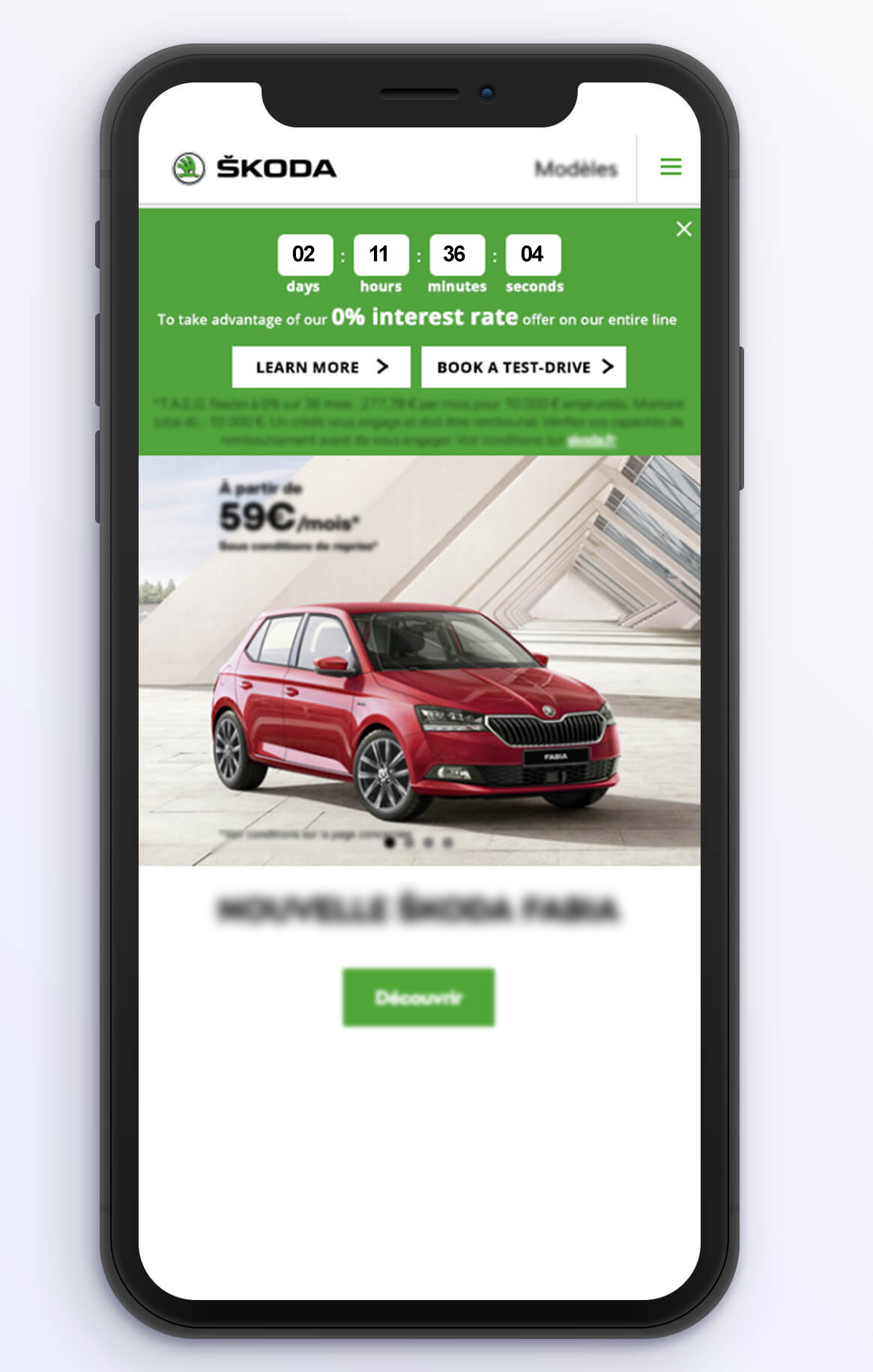
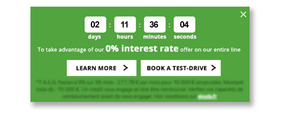
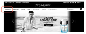
In its most basic form, the conversion funnel represents the potential buyer’s journey, from the moment they land on the homepage to when they make a transaction or, in the case of a B2B SaaS business, generate a lead or subscription sign-up. The team at Sage noticed there was a drop in their conversion funnel between the homepage and the product page. Nearly 18% of visitors from the homepage bounced without viewing the product page.

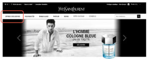
From Marion’s perspective, the product page simply was too crowded with text and CTAs that were competing for attention. Before investing in radical changes like creating new icons that needed corporate sign-off, Marion wanted to test her theory that the UX had to be simplified. She stripped each product category of its clutter, leaving only the title. Quickly, Marion learned that it was not the right direction.

“From the testing, we realized that people were still hesitating about clicking on product categories. The data was showing the category titles were not enough. So we iterated by adding more copy to guide visitors into clicking further into the products,” Marion explains.

Testing isn’t always about finding the winning formula; it’s about learning — quickly. After a month of modifying the product pages, Marion saw an increase of 30% in traffic from the homepage to product pages, representing an increase of 7% in transactions and a decrease of 7% in bounce rate.

“Before AB Tasty, we couldn’t measure how effective our changes were and how customers were reacting. We were just working with opinions and assumptions, and really struggling to put both of them aside. Now with AB Tasty, I’m always surprised with the results of an experiment,” she says.

Before AB Tasty, we couldn’t measure how effective our changes were and how customers were reacting. We were just working with opinions and assumptions, and really struggling to put both of them aside. Now with AB Tasty, I’m always surprised with the results of an experiment.

Marion Ravel, Sage CRO manager

The evangelizing of experimentation

In the two years that Marion has been working with Sage, nothing has changed internally more than the user-feedback mentality. AB Tasty has helped the team collect unbiased data through experimentation and derive insights for future continuous iterations.

“The way our culture has changed internally is also resonating well with our users, since they see how their feedback is being implemented. It’s the combination of AB Tasty and customer feedback that enabled us to build an optimized website that delivers on the customer experience,” Marion says.

She is also on a mission to take data-driven experimentation to center stage at Sage, via monthly newsletters to stakeholders within Sage where she shares CRO achievements and learnings.

“I realized quite early in my career that it’s important to share your successes and how you got there. It’s more interesting why certain variables or differentiations didn’t work, and what we changed to achieve the positive results,” Marion says. “It’s a continuous effort of testing, learning and optimizing.”

ABOUT SAGE

Sage is cloud business management system provider, offering integrated accounting, payroll, and payment systems — enabling entrepreneurs worldwide to make fast, informed business decisions and improvements. The global enterprise software company was founded in 1981 in Newcastle upon Tyne, England, and has since expanded to over 20 countries, 13,000 employees and millions of clients.

Spark
your curiosity!

Get your copy of "Sage Sees Transaction Lift From A/B Testing Website Copy" now.

Case Studies

How Clarins Uses AB Tasty for Personalization and Retention

+89% Conversions

+145% Add to Basket

The e-commerce team at Clarins is a true “testing lab,” managing their 5 websites (Germany, Spain, Ireland, Benelux, and Portugal) and helping the other nearby countries to grow their e-commerce business. The goal of this ‘incubator’ is to create an internal community of experimenters to help share testing best practices. This approach paid off with the creation of the ‘Wheel of Fortune,’ a gamification concept launched on Singles Day, November 11, 2020.

While testing using AB Tasty was initiated by the International Content team, Clarins decided in 2020 to not only extend its partnership with AB Tasty to include a commercial component but also to expand to the regional and local level. The tool that the EMEA teams were using previously was limited to creating pop-ins, which wasn’t enough to tackle Clarins’ goals involving retention and personalization.

Personalization via gamification

For Célia Rigaux, E-Commerce Director, EMEA, this was an opportunity to instill a test and learn culture across the EMEA teams. “Our goal is to exchange with our customers, to create a link with them, and to inspire loyalty, by bringing them value through our websites. AB Tasty’s experimentation capabilities enable us to challenge our CRM, Acquisition, and E-store teams using innovative tests that we weren’t able to run before.”

With the strategic holiday season approaching, the time was right to launch a far-reaching test across all of the sites managed by the EMEA e-commerce team. Singles Day (celebrated on November 11 in many countries) was the perfect option, seeing as it was also only a few days before Black Friday. All that was left was to decide what kind of game to display.

Everyone’s a winner

At the end of September 2020, Clarins got in touch with their Customer Success Manager at AB Tasty to see if their idea was feasible. After a few exchanges, they decided on the right set-up that struck a perfect balance between technical feasibility and a smooth user experience. 

The idea was simple: Every person who visits any of Clarins’ EMEA websites, whether on desktop or mobile, sees the game appear. If they click on it, the wheel spins and stops at one of 6 gifts. The gifts are promo codes, automatically applied to the winning visitor’s basket, which makes for a great user experience (especially on mobile).
Clarins singles day campaign

Clarins wheel of fortune campaign
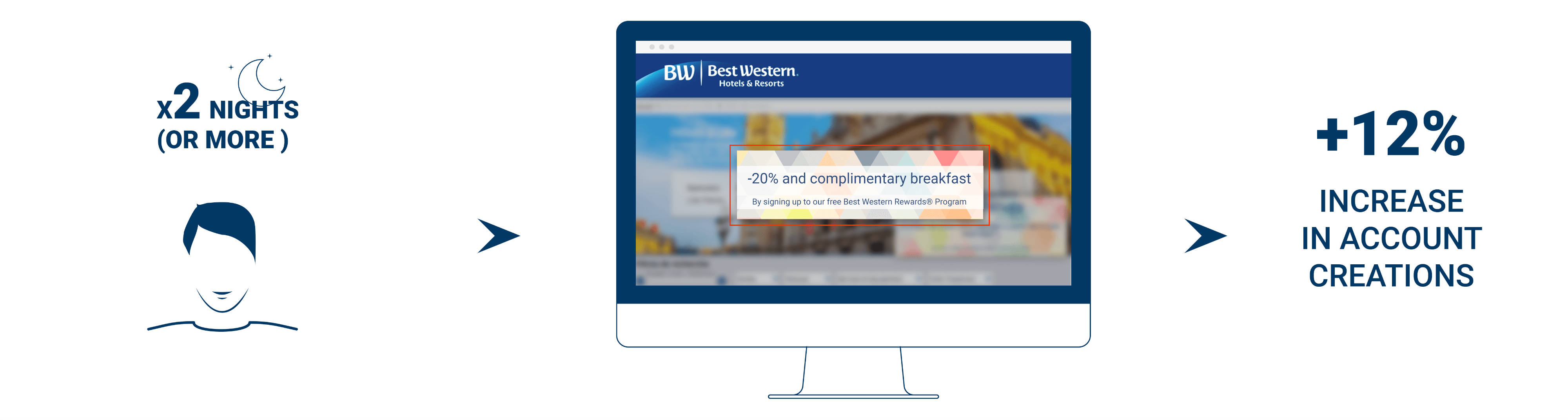
“We were able to launch our tests in two weeks,” explains Anaëlle Thomas, E-store Project Manager EMEA, who was responsible for the development of the project. One of the major advantages of AB Tasty was the ability to duplicate each experiment for each of Clarins’ sites. If the first test took 20 hours to implement, this number shrank by 5 for each of the other 4 sites. This experience is now live for all of the other countries Clarins’ is present in, and adaptable for other offers.

4x the orders

The first gamification test was a success for Clarins’ EMEA e-commerce team. The game, buoyed up by the increased web traffic brought on by the pandemic, performed very well. Live for 24 hours (from the 10th to the 11th in the evening), the total number of orders completed on the 4 main sites (Germany, Spain, Ireland and Benelux) quadrupled when compared to the results of November 11, 2019. Ireland stood out, with an order increase of +495% and a +585% increase in revenue.

The conversion rate did well, increasing by +89.34% compared to 2019. Finally, the add-to-basket rate increased by +145% compared to the 2020 average.  It should be noted that, though the game performed well in all countries, it was Ireland that attracted the most visitors, with 61.37% of visitors trying their luck.

“We systematically test on all our sites to see how each country reacts according to the local culture. So we shared the success of this experiment with the other countries,” elaborated Anaëlle Thomas. “South Africa was particularly interested and launched their own version in December. The United Arab Emirates also ran the test during the 4 days of Black Friday.”

Pursuing personalization in 2021

Previously known mostly as an A/B testing tool, AB Tasty has attained the level of ‘business partner.’ The EMEA teams even share their experimentation tips via Teams. Next step: Further develop their personalization strategy, especially by learning from other AB Tasty clients’ experiences. See you in 2021!

“The ability to duplicate tests in AB Tasty allows us to exchange more often with the other EMEA countries and to share experiments. We rely on AB Tasty to guide us in driving our personalization strategy forward.”

– Célia Rigaux, E-Commerce Director, EMEA, Clarins

Spark
your curiosity!

Get your copy of "How Clarins Uses AB Tasty for Personalization and Retention" now.

Case Studies

How Lush’s Focus on Human Connection Optimized the Digital Customer Experience

250% Increase in click-through rate

$7.5K Increase in sales during the experiment

Lush is a cosmetics company known for its emphasis on fresh ingredients and cruelty-free products—not to mention being credited as the original inventor of the bath bomb. From early days in England to currently operating 250 stores across North America, Lush continues to have a dedicated following for its soaps, shampoo bars, moisturizers, and scrubs.

The Challenge

For retailers (and all businesses for that matter) entire strategies had to be reworked in response to COVID-19. Digital became the central, if not sole, channel to focus on.

At Lush, the team had implemented a travel campaign before social distancing and non-essential business closures were government-mandated. While the campaign had initially been performing well, there was a drastic dip in engagement as travel restrictions tightened.

Lush knew that they needed to pivot. But they also needed to consider how current circumstances were affecting their customers. What was the best way to connect with people during this time? How could they strike a balance between offering familiarity while not coming across as out of touch?

The Test

Lush focused on their homepage promotions, evaluating everything from the banner image to CTA phrasing and featured products. The team created two campaigns that subtly addressed the new reality of staying at home and socially distancing.

The first variation was centered around self-care. Lush offers head-to-toe cosmetics products that range from relaxing to invigorating. The idea was for customers to put together an entire regimen for themselves, perhaps gravitating to products they wouldn’t normally have had time for (like scalp treatments and bath bombs). The second variation was built around the theme of sending care packages to loved ones. Even though people couldn’t physically see friends and family, they could send these gifts as a thoughtful gesture or for special occasions.


Results: Part 1

It quickly became clear that the care package promotion was the better performer, with a 250% higher click-through rate than the self-care campaign. During this experiment, the care package promotion also generated $7,500 more in sales than the variation. While the team couldn’t know with absolute certainty if people were buying care packages for their own use, it was clear that this messaging had more of a pull. So, Lush decided to dig deeper into this trend. They launched another A/B test that compared the general care package promotion with a variation focused specifically on Mother’s Day.

Truthfully, the team wasn’t sure how users would react. Would they gravitate to the theme of Mother’s Day or would it be unintentionally upsetting for those unable to see their parents in person? Testing provided a safe framework to find out. 

Results: Part 2

The Mother’s Day campaign did appear to resonate with users more, gaining a higher click-through rate than the more general care package promotion. Following the results from this test, Lush started mapping out a similar campaign that focused on Father’s Day to keep the momentum going. 

As Lush demonstrates, effective experimentation is continuous. In one of the first tests launched in this series, Lush saw the positive impact of messaging that focused on human connection. Leveraging this insight, they were able to develop a series of campaigns that explored this further: considering everything from how users would respond to specific holidays to whether promotional images that featured people performed better than those with just products.

Takeaway Tip

It takes users approximately 50 milliseconds to visually assess a website and decide whether to stay or leave. Lush’s strategy shows a sharp awareness of this short time frame. They weren’t concentrating on refining just one or two details of their website, but how every element came together to form a holistic experience. In this way, their approach became more psychographic, asking questions related to what piqued users’ interest and how this impacted the customer experience. And in doing so, Lush was able to stay in sync with its customer base during a time of rapid and widespread change.

Spark
your curiosity!

Get your copy of "How Lush’s Focus on Human Connection Optimized the Digital Customer Experience" now.

Case Studies

How Fenty Increased CTA Clicks by 42%

42% more CTA clicks

15 min. test setup

Musician and entrepreneur Robyn Rihanna Fenty partnered with LVMH to release her namesake clothing line, FENTY, in 2019.

Challenge

One of the first KPIs the FENTY team wanted to measure and optimize was the clicks to its homepage CTA, which brought visitors to the latest collection.

Experiment

FENTY wanted to see if CTA size had an effect on the click rate. Using the AB Tasty platform, they set up a split test that would compare the performance of a CTA sized at 13 pixels versus a CTA that was slightly bigger at 15 pixels.

FENTY-homepage

FENTY homepage

Results

In the end, bigger was better. The 15-pixel CTA generated 42% more clicks than the 13-pixel variation and was permanently added to the FENTY homepage.

Takeaway Tip

FENTY proved that simple tests can have a significant impact. In this example, it took 15 minutes to set up the test, and a difference of 2 pixels, to increase CTA clicks by an impressive 42%. Focus on making the key elements of your web page (which could be a call to action, a navigation button, etc.) a focal point for your visitors by considering both size and placement.


Spark
your curiosity!

Get your copy of "How Fenty Increased CTA Clicks by 42%" now.

Case Studies

ŠKODA Jump-Starts Test-Drive Bookings with Countdown Banner

2x Number of booked test-drives

8 Day campaign

One of the gems of the Czech industry, ŠKODA has evolved into a modern, respected car manufacturer present in more than 100 markets worldwide. Known today for their unique and reliable designs, the ŠKODA brand started out over a hundred years ago crafting bicycles, followed by motorcycles and, ultimately, cars.

Challenge

In the automotive industry, booking a test-drive is a crucial step in the purchase funnel. Marketers spend considerable time, resources and budget converting website traffic into test-drive appointments; naturally, people who are willing to leave their personal information to physically try out a vehicle are exhibiting high buyer intent.

On a more pragmatic level, retailers also prefer potential customers to book ahead of time, instead of stopping by on the fly, so they can better manage their schedules. All around, increasing the number of online test-drive bookings generates hot leads and better pipeline visibility.

In addition to this ever-present goal, the digital marketing team at ŠKODA’s French branch had a particular challenge to address. They wanted to capitalize on a rare, time-limited promotional offer – a zero-interest loan program – to jump-start their online test-drive bookings. They just weren’t sure of the best website optimization tactic to employ.

Urgency Principle and Engagement Idea

They brought the opportunity to the attention of AB Tasty and Rosapark, their digital marketing agency. “We talked through a few options for how to make the most of this valuable offer,” explained Laura Rérolle, Partnership Success Manager at AB Tasty. “We decided on a simple countdown banner that would show how much time was left before the zero-interest loan option ended. The idea was to give the offer the air of an event, to make it prominent on the homepage and other key areas of the site. This would attract attention and draw interested viewers down the purchase funnel. Since this type of engagement technique is not frequently used in this industry, we wanted to try it out in this limited scope to test the idea.”

The team at ŠKODA then worked with Rosapark on the creative design and deployment aspects. They ran the campaign using AB Tasty for mobile and desktop viewers for the full duration of the offer (eight days), on their homepage and the product pages (those that detailed the cars for sale).

The countdown clock banner included two calls-to-action: one to ‘learn more’ about the offer, (which redirected to an explanatory landing page), and the other, ‘book a test-drive,’ to a booking page.

mock-up mobile skoda

mock-up mobile skoda
Zoom in on mobile version of countdown banner
mock-up website skoda
Countdown clock on desktop

Results

There was no doubt about it – the countdown banner clearly drew positive attention, encouraging online visitors to book the coveted test-drives. “We ran this campaign with AB Tasty as part of a big media blast around this offer. We were thrilled to see that, the week of the campaign, we more than doubled the number of booked test-drives compared to the previous week. In fact, a full 13% of that week’s leads came directly from this countdown clock. This is a significant uplift in qualified leads, at very little extra effort or resources. We’re very happy with these results,” explained Sebastien Toussaint, Customer Experience & Data Performance Manager at ŠKODA, France.

“The countdown banner was very effective during this key offer. While taking care not to overuse this engagement tactic, ŠKODA could certainly employ it again during their open house events two or three times per year,” elaborated Laura.

Takeaway Tip

Engagement techniques like countdown banners, when used judiciously, can effectively nudge website visitors into converting.

Spark
your curiosity!

Get your copy of "ŠKODA Jump-Starts Test-Drive Bookings with Countdown Banner" now.

Case Studies

Luxury Brand Frette Increases Revenue By Over 8% with Web Copy Optimization

8.69% Increase in revenue

2 A/B tests

Frette has been a symbol of luxury since its establishment in 1860. Its linens have been draped across the altar of St. Peter’s Basilica, were the bedding of choice for European royal families, and continue to be a staple of five-star hotels.

Challenge

In the luxury industry, there’s always been a strong emphasis on the buying experience. Retailers have imbued it with a sense of ceremony—exclusivity paired with exceptional customer service to create a one-of-a-kind exchange. One of the challenges luxury retailers face today is translating the in-store experience to digital platforms.

For the Frette team, bringing the brand ethos online meant creating a frictionless user experience. Their website needed to be receptive to visitors’ interests while having an elegant design and easy-to-navigate interface. Frette focused on optimizing the website’s top navigation bar and the call-to-action on the shopping cart pop-up to ensure synchronicity between the UX and online shoppers.

Test Idea

Frette conducted a simple A/B test to see if modifying the top navigation bar would optimize the customer journey and increase traffic to certain pages. Noting that bathrobes were the top search item on the site, the team decided to clearly reference them in the header. So, they changed “Bath Linens” to “Bath Linens & Robes” and implemented action tracking to chart the results.

navigation bar


Then, Frette focused on the purchasing funnel. When users would click on the shopping cart in the top corner of the site, a customary pop-up would appear with a preview of selected items and the option to “Proceed To Checkout.” Luxury shopping is generally marked by long lead-in times, so Frette decided to tweak this language to the less definitive call-to-action, “View Shopping Bag.” The goal was to create a more fluid transition from browsing to purchasing in which customers didn’t feel rushed.


shopping cart pop-up

Results

While these website modifications were relatively minor, they had a significant impact on engagement and sales.

By adding “Robes” to the Bath Linens title in the top navigation bar, Frette was able to increase clicks to this category by 29%, and visits to bathrobe pages grew by an astounding 101%. As for changing the checkout semantics, the wording “View Shopping Bag” increased clicks by 5% and bumped total revenue by 8.69%.

These two A/B tests each took approximately 15 minutes to implement, without any IT support. Having the autonomy to test and learn is crucial for website optimization; it allows for precision in your strategy so even subtle changes have a pivotal effect on visitors’ satisfaction.

“We had been using [a previous conversion optimization] tool and it wasn’t user-intuitive, you really needed to work with an agency to do something very simple—you couldn’t really customize it to track specific things for a campaign, not in the way that AB Tasty allow you to. What we’re doing with AB Tasty now on our own, we would not have been able to do before.” – Vivienne So, Sr. Manager of E-commerce at Frette

Spark
your curiosity!

Get your copy of "Luxury Brand Frette Increases Revenue By Over 8% with Web Copy Optimization" now.

Case Studies

How Best Western® Hotels & Resorts Increased Loyalty Program Engagement

12% Increase in account creations

3 Audience segments

The American-based Best Western® Hotels & Resorts brand has been a leader in the hospitality industry for over 70 years, with a global network of 4,200 hotels in more than 100 countries and territories. With a strong presence in France, the group reported an annual revenue of 2.2 billion dollars in 2017. They have been an AB Tasty client since March, 2017

Challenge

For hotel brands like Best Western® Hotels & Resorts, customer loyalty is paramount; they aim to create a long-lasting relationship with each client. One of the ways to foster this kind of engagement is through an online membership community. For example, as a Best Western Rewards® member, customers can log in and benefit from discounts and other perks, like free stays, complimentary breakfasts, and upgrades.

The digital team at Best Western® France was looking for a way to encourage visitors to become members, use their accounts, and especially to take advantage of one of their discounts applicable to visits of two nights or longer. They decided the best way to do this would be to run a website personalization campaign using AB Tasty.

Personalization Campaign Idea

The team had an elegant idea: an internet user would be more likely to join the Best Western Rewards® program if they were shown offers directly relevant to their search query. For this, the team simply needed to create appropriate audience segments in AB Tasty using data from their data layer. Since their main goal was to encourage visitors to use or create their membership account, they opted for the following scenarios:

Upsell scenario: Trigger a pop-in to visitors who were logged in to their membership accounts and looking for a one-night stay, with an incentive to prolong their visit
Encourage Best Western Rewards® account creation: Trigger a pop-in to visitors who were not logged in to a membership account and looking for at least a two-night stay, with a special promotional offer available only with a Rewards Account
Upsell and account creation: Trigger a pop-in to visitors who were not logged in to a membership account and looking for a one-night stay, with an incentive to create an account and prolong their stay

This way, the digital team could show discounts only to visitors who were eligible for them, making the browsing experience more relevant, and encouraging non-members to sign up. By promoting incentives and reduced rates for longer visits, they also aimed to increase revenue. In other words: they pushed the right message to the right website visitor at the right time.


Best western mock up personalization

Results

The results showed that this kind of personalized messaging can have big effects on engagement. The most successful scenario turned out to be the second one, with around 12% more Best Western Rewards® program sign-ups originating from this campaign. Unsurprisingly, it was easier to convince visitors to sign up for a free account to receive an incentive than to add an extra night’s stay! In addition, the team was able to say that they created a smoother, more relevant customer experience, by only showing promotional messages relevant to each visitor.

Takeaway Tip

Take advantage of your visitor data to create relevant, personalized messages. Not only will you create a more pleasant browsing experience, you’ll increase the number of ways you can increase engagement, transactions, and revenue, all the while optimizing an existing client scenario.

Spark
your curiosity!

Get your copy of "How Best Western® Hotels & Resorts Increased Loyalty Program Engagement" now.

Case Studies

Yves Saint Laurent Beauty Increases Online Transactions by +10%

+9% Access to basket page

+13% Access to checkout page

Part of the L’Oréal Luxe brand portfolio, Yves Saint Laurent Beauty is known around the world for their luxurious skincare, makeup and fragrance products for men and women.

Challenge

As with the other brands in the L’Oréal Luxe portfolio, YSL Beauty products are sold in both online third party boutiques, as well as on their own proprietary website. For this reason, optimizing every aspect of the homepage and checkout funnel is key to making sure consumers purchase on the actual YSL Beauty site.

One of the crucial questions that needed answering was, what is the best order of the menu bar tabs? As a high end fashion house, YSL Beauty has plenty of news and products to showcase – but they still didn’t know what to emphasize on the homepage menu bar to maximize transactions.

A/B Test Idea

AB Tasty’s consulting team proposed a simple A/B test – switch the positions of the ‘New Products’ and ‘Exclusive Offers’ tabs to see if this would impact sales. By putting the ‘Exclusive Offers’ tab first – which takes browsers to current offers and gifts with purchase – instead of the ‘New Products’ tab, they aimed to test the appetite of website visitors for special and exclusive offers over new releases.

The test was easy to configure – with the WYSIWYG editor, the new version of the homepage and the parameters of the test were up and running in 30 minutes.

originalYSL
Original


variationYSL
Variation

Results

After letting the test run for a month on over 150k visitors, the results were conclusive: emphasizing the ‘Exclusive Offers’ tab had a visible effect on sales. Not only did access to the basket page shoot up by 9%, and to the checkout page by 13%, but overall transactions enjoyed a 10% increase. The team wasted no time pushing 100% of the test’s traffic to the winning variation and hardcoding these changes into their website.

Takeaway Tip

For high-end brands like YSL Beauty, accenting exclusive offers, over and above new products, proved to be especially effective. This is probably because shoppers of luxury brands are particularly susceptible to messaging about rarity and exclusive treatment. These consumers are likely to appreciate a product that’s shown to be exclusive and generous offers (reminding them of the ‘high end’ nature of the brand).

Spark
your curiosity!

Get your copy of "Yves Saint Laurent Beauty Increases Online Transactions by +10%" now.

Case Studies

UNICEF France Maximizes On-Site User Feedback

3.6% Visitors filled in survey

6 Week campaign

The nonprofit organization UNICEF works tirelessly across 190 countries to save and improve the lives of children from some of the world’s toughest places.

Challenge

As with any business, organization or nonprofit, the UNICEF website is crucial to their operations. Not only is it one of the ways to make a donation, it’s also where people go to understand what UNICEF does, what they stand for, and how donations are used to carry out their mission. It was therefore essential for UNICEF France to optimize their website to both increase donations, and also relay a positive image. With a big website redesign coming up, their digital team decided they needed to better understand how visitors actually experienced their website.

Marketing Campaign Idea

As an AB Tasty client, UNICEF France had various user insight tools at their disposal: heat mapping, session recording, and NPS surveys, to name a few. However, the UNICEF team was looking for in-depth feedback that would let them get inside the heads of their website visitors. They therefore opted to use a Google form, allowing them to ask both open-ended and ‘yes/no’ questions.

With the help of the AB Tasty team, they set up a pop-in in just one hour – which triggered on exit intent – that encouraged the website visitor to fill out the survey. They asked five questions about the design and usefulness of the site, the visitor’s reason for visiting, and their overall level of satisfaction.

Results

Over the 6 weeks the campaign was running, the team collected 310 responses, which represented 3.6% of the total visitors to the site. They were pleasantly surprised by the results: 92% of visitors said they liked the homepage! However, they also gained valuable insights regarding where their audience was most engaged, and what visitors wanted to see more of.

These insights served at the basis for many of the redesign changes. For example, 30% of respondents said the search bar was the most useful part of the homepage, so the search bar was enlarged in the update. Similarly, according to respondents, the least useful part of the homepage were the social share logos, which are slated to be removed.

“We were very happy to see that respondents overwhelmingly said they liked the homepage, and found what they were looking for. Overall, our donors were familiar with our website, even if they did ask for more video and photographic content. Our next step is to use this information to expand on the personalization campaigns around the visitor personas we’ve discovered, using AB Tasty.” – Léonore Manciaux, Digital Donation Officer at UNICEF France

Takeaway Tip

Understanding your audience is key for website optimization. So is choosing the right user insight tool to match your goals. Long-form surveys will let you get more in-depth, while NPS surveys are designed to show an evolution over time, and heat maps and session recording let you zoom in on points of friction or high engagement.

Spark
your curiosity!

Get your copy of "UNICEF France Maximizes On-Site User Feedback" now.