Case Studies

How Lush’s Focus on Human Connection Optimized the Digital Customer Experience

250% Increase in click-through rate

$7.5K Increase in sales during the experiment

Lush is a cosmetics company known for its emphasis on fresh ingredients and cruelty-free products—not to mention being credited as the original inventor of the bath bomb. From early days in England to currently operating 250 stores across North America, Lush continues to have a dedicated following for its soaps, shampoo bars, moisturizers, and scrubs.

The Challenge

For retailers (and all businesses for that matter) entire strategies had to be reworked in response to COVID-19. Digital became the central, if not sole, channel to focus on.

At Lush, the team had implemented a travel campaign before social distancing and non-essential business closures were government-mandated. While the campaign had initially been performing well, there was a drastic dip in engagement as travel restrictions tightened.

Lush knew that they needed to pivot. But they also needed to consider how current circumstances were affecting their customers. What was the best way to connect with people during this time? How could they strike a balance between offering familiarity while not coming across as out of touch?

The Test

Lush focused on their homepage promotions, evaluating everything from the banner image to CTA phrasing and featured products. The team created two campaigns that subtly addressed the new reality of staying at home and socially distancing.

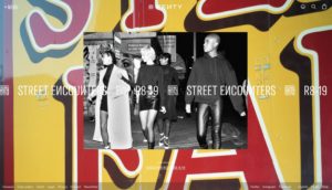
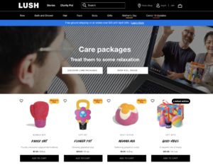
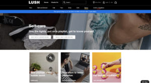
The first variation was centered around self-care. Lush offers head-to-toe cosmetics products that range from relaxing to invigorating. The idea was for customers to put together an entire regimen for themselves, perhaps gravitating to products they wouldn’t normally have had time for (like scalp treatments and bath bombs). The second variation was built around the theme of sending care packages to loved ones. Even though people couldn’t physically see friends and family, they could send these gifts as a thoughtful gesture or for special occasions.


Results: Part 1

It quickly became clear that the care package promotion was the better performer, with a 250% higher click-through rate than the self-care campaign. During this experiment, the care package promotion also generated $7,500 more in sales than the variation. While the team couldn’t know with absolute certainty if people were buying care packages for their own use, it was clear that this messaging had more of a pull. So, Lush decided to dig deeper into this trend. They launched another A/B test that compared the general care package promotion with a variation focused specifically on Mother’s Day.

Truthfully, the team wasn’t sure how users would react. Would they gravitate to the theme of Mother’s Day or would it be unintentionally upsetting for those unable to see their parents in person? Testing provided a safe framework to find out. 

Results: Part 2

The Mother’s Day campaign did appear to resonate with users more, gaining a higher click-through rate than the more general care package promotion. Following the results from this test, Lush started mapping out a similar campaign that focused on Father’s Day to keep the momentum going. 

As Lush demonstrates, effective experimentation is continuous. In one of the first tests launched in this series, Lush saw the positive impact of messaging that focused on human connection. Leveraging this insight, they were able to develop a series of campaigns that explored this further: considering everything from how users would respond to specific holidays to whether promotional images that featured people performed better than those with just products.

Takeaway Tip

It takes users approximately 50 milliseconds to visually assess a website and decide whether to stay or leave. Lush’s strategy shows a sharp awareness of this short time frame. They weren’t concentrating on refining just one or two details of their website, but how every element came together to form a holistic experience. In this way, their approach became more psychographic, asking questions related to what piqued users’ interest and how this impacted the customer experience. And in doing so, Lush was able to stay in sync with its customer base during a time of rapid and widespread change.

Spark
your curiosity!

Get your copy of "How Lush’s Focus on Human Connection Optimized the Digital Customer Experience" now.

Case Studies

Panasonic Reduces Costly Call Volumes With AB Tasty’s CXO Solutions

11.6% Increase in digital customer support

$30,000 Yearly cost reduction

Customer journeys are more nuanced than ever before. As consumers switch between devices, channels, and touchpoints, businesses on the digital frontier, like Panasonic, are focusing on the not-so-simple task of bringing continuity to each interaction and delivering an omnichannel experience.

We spoke with Michelle Esgar, who is spearheading the brand experience for Panasonic Consumer Electronics, about the challenges and strategy involved in delivering this integrated experience. We started by looking at an experiment we worked on together to reduce calls to customer support (and as a result, avoid lengthy wait times for users and bottlenecked workflows internally).

From there, we discussed how this experiment fits within Panasonic’s overarching strategy—and how successful customer experiences are built with an integrated understanding of every consumer touchpoint.

Here’s a snapshot of Panasonic’s 360-degree approach.

The Challenge

Panasonic has a recurring goal: reduce customer support costs year-over-year. Currently, every call to the support center costs up to 5 dollars, which quickly adds up to be: expensive. And along with optimizing the budget, Panasonic also needed to improve the entire experience.

Consumers reach out to customer support when their product isn’t working as intended. So, from the gate, there’s an element of frustration. More often than not, users will check the website first to help solve their problem. If they can’t find the answer, frustration mounts. That’s when they’ll call a representative, and have to go through a complicated IVR for an average of six minutes before getting someone on the line. 

Consider how exit rates will exponentially increase on web pages after load time passes three seconds. Asking someone to wait six minutes in “the age of instant” isn’t sustainable.

By conducting a call center analysis, it became clear that for the majority of incoming calls, Panasonic already had self-service information available that could answer the question. So, the underlying issue wasn’t so much about bandwidth as it was about putting the right information in front of the right user at the right time. This meant tackling everything from the website’s information architecture to physical product manuals; a concerted effort that would, of course, take time. So, while refining this ongoing strategy, Panasonic focused on a more immediate tactical next step: driving customers to their digital channels for faster support.

Test Hypothesis

Since representatives could handle multiple chat queries and emails at a time, it was important that these channels were properly promoted. Originally, these links were placed in the middle of Panasonic’s customer support page—easy to miss if users were scrolling through quickly.

Panasonic-Contact-Header

Michelle believed that if this contact information was more visible—in the header of the web page—consumers would be more likely to engage with these channels. Using AB Tasty’s visual editor, Panasonic was able to quickly add this option in the navigation bar as an A/B Test (splitting traffic 50/50).

Results

Measuring the success of this test was based on the percent of digital customer support contacts vs. phone calls. In the few weeks this test ran, this ratio shifted 11.6% in favor of digital support. Based on average call volume, this equates to approximately $2,500 a month in costs saved, or roughly $30,000 a year. Based on these results, this new header was made visible to 100% of web traffic.

Takeaway Tip

How do you make sure you’re solving the root cause of a problem and not just one of its symptoms?  In this scenario, leveraging online support would create a faster experience for users and significantly reduce costs. But this experiment represents just one facet of Panasonic’s multi-pronged strategy: to eliminate the pain points prompting these queries in the first place. Improving documentation and recognizing when issues are the result of user error, as a chance to improve product usability, are just two examples of this integrated approach. At AB Tasty, we’re excited to keep working with Panasonic on this omnichannel strategy to further enhance the customer experience.

Spark
your curiosity!

Get your copy of "Panasonic Reduces Costly Call Volumes With AB Tasty’s CXO Solutions" now.

Case Studies

Displaying More Product Sizes Leads to More Transactions

3% More Transactions

€3,000 More Revenue

Yves Rocher is an internationally renowned company that focuses on plant-based cosmetics. They sell skin, body and hair care products, as well as make-up and perfume.

Challenge

On Yves Rocher’s website, customers can find a wide range of products in varying sizes. However, the company wondered whether users were aware of this. Once they reached the product page of an item in a certain size, customers didn’t always know it was available in other sizes. The team at Yves Rocher wanted to run an initial test campaign with AB Tasty to clarify whether showing alternative article sizes on product detail pages could increase sales figures.

A/B Test

From this idea, a clear test hypothesis was formulated: if size options for selected items were displayed, would the number of transactions and sales increase? The team decided to choose a specific product category – shower gels – to run this initial experiment. On the website, these are available in 200ml and 400ml bottles. The team set up an A/B test for all items that fell into this category.

Yves Rocher Product Page

Results

A total of 8,787 unique visitors were tested during the shower gel campaign. And indeed, the test results were positive: 5% more clicks on the size options were recorded. 4% more users reached the shopping cart in the test variation, which led to an increase in the transaction rate of 3% and accounted for approximately 3,000 euros more revenue than in the original version without size options.

Takeaway Tip

This first test campaign was only conducted on a small segment of the website – the shower gels product category. The team at Yves Rocher had a sound approach: test a hypothesis on a small segment of their website, and verify the results. Now that they’re sure of these positive results, they can apply these learnings elsewhere. If the data-driven results continue to look good, Yves Rocher can invest the necessary time and energy to incorporate different size categories on all product detail pages, without risk.

Spark
your curiosity!

Get your copy of "Displaying More Product Sizes Leads to More Transactions" now.

Case Studies

Decathlon Scores Big With Social Proof

3.3% Increase in Transactions

2.8% Revenue Lift for Returning Visitors

Whether you’re a converted couch potato or an experienced athlete, Decathlon has something for everyone. Present in 52 countries, Decathlon designs and sells sporting goods, both online and in 1,600 brick-and-mortar locations.

Challenge

Decathlon’s mission is to make sports accessible to all. One of the ways they accomplish this is through offering a wide array of choice – 10,000 products covering 80 sports are sold on Decathlon’s website. With a range of price points and styles, there is an almost dizzying array of items to choose from. For some shoppers – especially those trying out an activity for the first time – this amount of choice might seem overwhelming.

How could Decathlon help shoppers get situated?

Social Proof Hypothesis

“We know that social proof – the idea that, when unsure, people look to others for direction – is a powerful and effective concept,” explains David Harari, Customer Success Manager at AB Tasty. “In the context of e-commerce, this means people are influenced by what their peers are interested in when deciding what to buy. We wanted to test out if a simple line of social proof messaging would nudge website visitors further down the purchase funnel.”

To do this, Decathlon’s UK digital team ran an experiment based on AB Tasty’s Social Proof widget. The AI-powered widget dynamically surfaces the number of times a product is viewed by other shoppers on a site in a given timeframe. This gives other browsers an idea of which items are getting more traction.

Decathlon social proof messaging
Product page with social proof messaging

“We thought it could be that extra little nudge to hit ‘add to basket’ – and might help certain customers continue through the purchase funnel,” elaborates Florent Beck, UX Leader at Decathlon UK. The team set up an A/B test on 400 product pages to see whether this kind of social proof messaging would have an impact on visitors’ purchase decisions. The text was inserted automatically just below the customer reviews ratings (another element of social proof), and above the product description. “What was really handy about the AB Tasty widget was that we can set a minimum amount of views before the message showed. In this case, we chose 20 – so if fewer than that number of people viewed the product, the message wouldn’t show, and once it hit 20, it would automatically appear,” explained Florent.

Results

Adding this simple line of social proof messaging not only increased clicks on the ‘Add to cart’ button, it also bumped up transactions and revenue. For all audiences, clicks increased by 1.5%, transactions by 2.4% and revenue by 1.3%.

Interestingly, when the team segmented the results by certain audience profiles, they realized that the social proof messaging worked better on returning visitors. They clicked 2.8% more, with an increase of 3.3% on transactions and 2.8% for revenue lift. “This might indicate that shoppers that know and trust the Decathlon brand are even more likely to put stock in others in the Decathlon community, versus first time visitors who are more wary,” explained David.

Even more interesting was when they dove into the data to look for what kinds of products this messaging worked best with. They also discovered that the social proof approach worked better for lower priced items – less than 10 pounds – versus more expensive, ‘investment items’, like a nice bike or set of skis. This kind of information can help Decathlon increase the efficacy of their campaigns in the future, and scale up this tactic for other markets.

“We value our community at Decathlon. What’s great about this kind of social proof messaging is that it’s a way to automatically let people take the opinions of other Decathlon shoppers into account – if a certain product is popular or trending, others can know that in real time as they’re browsing. From a business perspective, it increases our transaction rate and revenue, and from a customer experience perspective, it helps orient shoppers.” – Florent Beck, UX Leader, Decathlon UK

Spark
your curiosity!

Get your copy of "Decathlon Scores Big With Social Proof" now.

Case Studies

How Fenty Increased CTA Clicks by 42%

42% more CTA clicks

15 min. test setup

Musician and entrepreneur Robyn Rihanna Fenty partnered with LVMH to release her namesake clothing line, FENTY, in 2019.

Challenge

One of the first KPIs the FENTY team wanted to measure and optimize was the clicks to its homepage CTA, which brought visitors to the latest collection.

Experiment

FENTY wanted to see if CTA size had an effect on the click rate. Using the AB Tasty platform, they set up a split test that would compare the performance of a CTA sized at 13 pixels versus a CTA that was slightly bigger at 15 pixels.

FENTY-homepage

FENTY homepage

Results

In the end, bigger was better. The 15-pixel CTA generated 42% more clicks than the 13-pixel variation and was permanently added to the FENTY homepage.

Takeaway Tip

FENTY proved that simple tests can have a significant impact. In this example, it took 15 minutes to set up the test, and a difference of 2 pixels, to increase CTA clicks by an impressive 42%. Focus on making the key elements of your web page (which could be a call to action, a navigation button, etc.) a focal point for your visitors by considering both size and placement.


Spark
your curiosity!

Get your copy of "How Fenty Increased CTA Clicks by 42%" now.

Case Studies

Generali’s Chatbot Averages 800 Conversations a Day to Streamline Customer Support

800 conversions per day

2,400 calls avoided

Generali is a global insurance and assets management group that’s been focused on building life-long partnerships with customers since its establishment in 1831.

Situation

No one likes being put on hold—especially when you’re trying to reach customer support with a question related to your livelihood (like insurance or wealth management). So, Generali decided to streamline the entire process.

The goal was to help visitors more readily find the information they needed on Generali’s website and curb calls to customer support (particularly for questions that could more easily be answered online). This way, Generali’s customer support team would have the increased bandwidth needed to help individuals with complex questions.

Generali developed a chatbot that was able to interact with visitors on its site by answering basic questions and highlighting relevant insurance offers. If there was a question the bot couldn’t answer, it would connect users to the appropriate Generali agent directly.

The Generali team had tested various names and avatars for its bot among a small pool of clients before ultimately settling on ‘Leo.’

Then, Generali worked with AB Tasty to integrate Leo into its website and track performance.

Campaign

AB Tasty Technical Solution Engineers were able to write the JavaScript and CSS code needed to trigger Leo on desktop devices. Data was then collected in real-time (in the AB Tasty platform) to track Leo’s engagement rates and highlight how visitors interacted with the chatbot during a 6-month period.

Generali also used AB Tasty’s visual editor to quickly make cosmetic changes to the site and measure the impact of these modifications on Leo’s performance.

Results

Leo was clearly a hit with Generali’s clients. At the end of the campaign, there were 100,000 recorded interactions with Leo on the website and more than 2,400 calls avoided, giving Generali the reassurance they needed to integrate the chatbot on mobile and tablet devices.

These high engagement rates, and reduced customer support wait times, proved Leo’s positive impact on the user experience. This campaign also provided a benchmark for evaluating Leo’s ongoing performance—which is essential for continuous optimization.

Currently, interactions with Leo are averaging 800 conversations a day.

Takeaway Tip

Chatbots have the potential to streamline customer support and enhance user experiences—when implemented strategically. As Generali shows, simply integrating a chatbot into your site isn’t enough. You need to set performance goals, collect analytics and track engagement to understand how visitors use this feature. With AB Tasty, Generali was able to easily modify their interface and collect data on Leo’s performance to know with certainty that it benefited the user experience.

This campaign also points to the ways in which artificial intelligence can increase the efficiency of human operations. Leo wasn’t created to take the place of customer support representatives, but to help them by handling straightforward tasks so team members could focus on more complex, higher-level questions.

Spark
your curiosity!

Get your copy of "Generali’s Chatbot Averages 800 Conversations a Day to Streamline Customer Support" now.

Case Studies

How Eurosport’s Survey Pop-In Got 5K Responses in Less Than Two Weeks

5000 responses

3 countries

Eurosport is the go-to network for sports coverage in Europe. Working with AB Tasty since 2016, stakeholders across their Product, Web Analytics, and Digital Marketing teams have quickly excelled at more nuanced experimentation that leverages personalization and precise targeting to create relevant experiences for the company’s international clientele.

Challenge

The Australian Open, like all Grand Slam tournaments, is a huge event for Eurosport. Coverage is comprehensive to meet the demand of its viewership, spanning best-of-the day replays, clips of press conferences, and interview-style videos of athletes sharing insights. But, as one would expect, the main attraction is consistently the real-time streaming of matches. These high-profile events will always be top performers when it comes to traffic and streams. But Eurosport wanted to more concretely evaluate the quality of its coverage from viewers’ perspectives—using these insights to drive and refine their larger live event strategy.

Campaign

Using AB Tasty’s NPS widget, Eurosport set up a short campaign in which a survey pop-in would appear for desktop users in France, the UK, and Italy who viewed any Australian Open content. The first pop-in asked users to rank their satisfaction with the Australian Open coverage on a scale that ranged from “Very Satisfied” to “Not at all Satisfied.” After making this initial selection, a second pop-in would ask users to explain their reasoning in a write-in field.

eurosport nps 1

First survey pop-in

eurosport pop-in

Second survey pop-in

Results

At the end of the two-week experiment, roughly 5,000 written insights were collected from users—invaluable information on the strengths of Eurosport’s coverage and what could be improved (and how these sentiments varied between regions). But, two key reasons why this test succeeded was the timing and the targeting. Eurosport adapted the pop-ins to suit three different markets, which were strategically chosen for this test. They then ran the experiment during peak viewership as there was an increased likelihood of responses.

Takeaway Tip

As a pan-European company, Eurosport saw an opportunity to gain international insights on its viewership by running a survey during the Australian Open. This is one of the pillars of conversion rate optimization: sending the right message at the right time. While surveys and/or NPS pop-ins will always be valuable, maximize their potential by launching them during peak traffic times or high-profile events

Spark
your curiosity!

Get your copy of "How Eurosport’s Survey Pop-In Got 5K Responses in Less Than Two Weeks" now.

Case Studies

ŠKODA Jump-Starts Test-Drive Bookings with Countdown Banner

2x Number of booked test-drives

8 Day campaign

One of the gems of the Czech industry, ŠKODA has evolved into a modern, respected car manufacturer present in more than 100 markets worldwide. Known today for their unique and reliable designs, the ŠKODA brand started out over a hundred years ago crafting bicycles, followed by motorcycles and, ultimately, cars.

Challenge

In the automotive industry, booking a test-drive is a crucial step in the purchase funnel. Marketers spend considerable time, resources and budget converting website traffic into test-drive appointments; naturally, people who are willing to leave their personal information to physically try out a vehicle are exhibiting high buyer intent.

On a more pragmatic level, retailers also prefer potential customers to book ahead of time, instead of stopping by on the fly, so they can better manage their schedules. All around, increasing the number of online test-drive bookings generates hot leads and better pipeline visibility.

In addition to this ever-present goal, the digital marketing team at ŠKODA’s French branch had a particular challenge to address. They wanted to capitalize on a rare, time-limited promotional offer – a zero-interest loan program – to jump-start their online test-drive bookings. They just weren’t sure of the best website optimization tactic to employ.

Urgency Principle and Engagement Idea

They brought the opportunity to the attention of AB Tasty and Rosapark, their digital marketing agency. “We talked through a few options for how to make the most of this valuable offer,” explained Laura Rérolle, Partnership Success Manager at AB Tasty. “We decided on a simple countdown banner that would show how much time was left before the zero-interest loan option ended. The idea was to give the offer the air of an event, to make it prominent on the homepage and other key areas of the site. This would attract attention and draw interested viewers down the purchase funnel. Since this type of engagement technique is not frequently used in this industry, we wanted to try it out in this limited scope to test the idea.”

The team at ŠKODA then worked with Rosapark on the creative design and deployment aspects. They ran the campaign using AB Tasty for mobile and desktop viewers for the full duration of the offer (eight days), on their homepage and the product pages (those that detailed the cars for sale).

The countdown clock banner included two calls-to-action: one to ‘learn more’ about the offer, (which redirected to an explanatory landing page), and the other, ‘book a test-drive,’ to a booking page.

mock-up mobile skoda

mock-up mobile skoda
Zoom in on mobile version of countdown banner
mock-up website skoda
Countdown clock on desktop

Results

There was no doubt about it – the countdown banner clearly drew positive attention, encouraging online visitors to book the coveted test-drives. “We ran this campaign with AB Tasty as part of a big media blast around this offer. We were thrilled to see that, the week of the campaign, we more than doubled the number of booked test-drives compared to the previous week. In fact, a full 13% of that week’s leads came directly from this countdown clock. This is a significant uplift in qualified leads, at very little extra effort or resources. We’re very happy with these results,” explained Sebastien Toussaint, Customer Experience & Data Performance Manager at ŠKODA, France.

“The countdown banner was very effective during this key offer. While taking care not to overuse this engagement tactic, ŠKODA could certainly employ it again during their open house events two or three times per year,” elaborated Laura.

Takeaway Tip

Engagement techniques like countdown banners, when used judiciously, can effectively nudge website visitors into converting.

Spark
your curiosity!

Get your copy of "ŠKODA Jump-Starts Test-Drive Bookings with Countdown Banner" now.

Case Studies

Avid Increases Transactions by 34% with Promotional Banners

34% Increase in transactions

1 A/B test

Avid is a trailblazer for multimedia content creation. Its nonlinear editor was the first to digitize video content, effectively changing the media and entertainment industry. Today, Avid platforms are trusted by audio, music, film, and television professionals to create, manage, and distribute content.

Challenge

Avid wanted to optimize how it displayed promotional offers across its site to increase conversions and further cultivate customer loyalty.

Test Idea

Avid offers a bonus gift with each subscription to its Media Composer software—a point the team wanted to highlight to visitors on these product pages. Using an A/B test, Avid decided to experiment with the offer’s placement and presentation to see what effect it had on conversions.

In the first variation, details on the bonus gift were presented in a purple banner at the top of the page.


avid promotional banner
Avid highlighted its offer with a purple banner at the top of the page


In the second variation, details on the bonus gift were presented in bold as a bullet under each subscription option.


avid promotion
Avid highlighted its promotional offer in a bullet beneath the subscription summary


For the duration of the test, traffic to these product pages was split evenly between the two versions to determine which formatting was more effective.

Avid then focused on optimizing a January promotion that offered a 60% discount on audio plugins. An AB Tasty Technical Support Engineer placed a sticky banner on the bottom of Avid’s homepage, shopping site, and blogs, that—when clicked—would take visitors to the audio plugins page for more details on the feature and the opportunity to purchase.


avid custom css
Avid promoted audio plugins with a custom CSS banner created by one of AB Tasty’s Technical Support Engineers

Results

For the Media Composer product pages, highlighting the bonus offer with a purple banner was ultimately the winning variation, showing a 34% increase in transactions.

Following the success of this version, Avid used AB Tasty to convert it to a personalization—and the banner is still live on the site today. As for the sticky banner for audio plugins, results from the test showed that—out of those who clicked on the promotion—15% ended up converting on the site.

These tests show the power of presentation when trying to relay key messages to visitors on a site, and the importance of testing to know which formatting resonates with your users.

Driving an e-commerce business without A/B testing is like washing your car without soap – you can’t really succeed if you don’t have any soap. AB Tasty’s robust tools and widgets allow us to do it all – set up quick tests, comprehensive tests, personalizations, and multi-variate testing, all the while being supported by robust analytics and fantastic customer service“. Jeffrey Copetas, Senior Director of Web & E-Commerce at Avid

Spark
your curiosity!

Get your copy of "Avid Increases Transactions by 34% with Promotional Banners" now.

Case Studies

Luxury Brand Frette Increases Revenue By Over 8% with Web Copy Optimization

8.69% Increase in revenue

2 A/B tests

Frette has been a symbol of luxury since its establishment in 1860. Its linens have been draped across the altar of St. Peter’s Basilica, were the bedding of choice for European royal families, and continue to be a staple of five-star hotels.

Challenge

In the luxury industry, there’s always been a strong emphasis on the buying experience. Retailers have imbued it with a sense of ceremony—exclusivity paired with exceptional customer service to create a one-of-a-kind exchange. One of the challenges luxury retailers face today is translating the in-store experience to digital platforms.

For the Frette team, bringing the brand ethos online meant creating a frictionless user experience. Their website needed to be receptive to visitors’ interests while having an elegant design and easy-to-navigate interface. Frette focused on optimizing the website’s top navigation bar and the call-to-action on the shopping cart pop-up to ensure synchronicity between the UX and online shoppers.

Test Idea

Frette conducted a simple A/B test to see if modifying the top navigation bar would optimize the customer journey and increase traffic to certain pages. Noting that bathrobes were the top search item on the site, the team decided to clearly reference them in the header. So, they changed “Bath Linens” to “Bath Linens & Robes” and implemented action tracking to chart the results.

navigation bar


Then, Frette focused on the purchasing funnel. When users would click on the shopping cart in the top corner of the site, a customary pop-up would appear with a preview of selected items and the option to “Proceed To Checkout.” Luxury shopping is generally marked by long lead-in times, so Frette decided to tweak this language to the less definitive call-to-action, “View Shopping Bag.” The goal was to create a more fluid transition from browsing to purchasing in which customers didn’t feel rushed.


shopping cart pop-up

Results

While these website modifications were relatively minor, they had a significant impact on engagement and sales.

By adding “Robes” to the Bath Linens title in the top navigation bar, Frette was able to increase clicks to this category by 29%, and visits to bathrobe pages grew by an astounding 101%. As for changing the checkout semantics, the wording “View Shopping Bag” increased clicks by 5% and bumped total revenue by 8.69%.

These two A/B tests each took approximately 15 minutes to implement, without any IT support. Having the autonomy to test and learn is crucial for website optimization; it allows for precision in your strategy so even subtle changes have a pivotal effect on visitors’ satisfaction.

“We had been using [a previous conversion optimization] tool and it wasn’t user-intuitive, you really needed to work with an agency to do something very simple—you couldn’t really customize it to track specific things for a campaign, not in the way that AB Tasty allow you to. What we’re doing with AB Tasty now on our own, we would not have been able to do before.” – Vivienne So, Sr. Manager of E-commerce at Frette

Spark
your curiosity!

Get your copy of "Luxury Brand Frette Increases Revenue By Over 8% with Web Copy Optimization" now.