Known for their modern, simple, and elegant watches & jewelry, Dutch watch brand Cluse has established itself as one of the fastest-growing accessories brands.
The Challenge
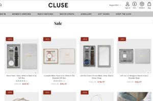
Cluse noticed that the bounce rate for their product landing pages was high and found that not many users clicked through to the product display pages. There was no clear call-to-action for the user to progress to the product display page.

Original
Test Hypothesis
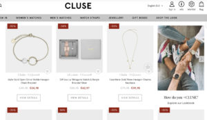
To encourage more users to click through to the individual product pages Cluse set up an A/B/n test including different CTA color variations. The “View Details” CTA button was inserted below the product image, linking to the respective product display pages (PDP). With a clear CTA the objective of the test was to increase users reaching the PDP from the product landing page, which in turn would increase the add-to-cart clicks and transactions.
Results
Targeting all users across desktop and mobile, the A/B/n test ran for 3 weeks across Cluse’ French domain. The winning variation (pictured below) significantly increased the click-through rate from the product landing page to the product display page as well as driving an increase in transactions.
- +2.39% increase in click-through rate to the product display page
- +1.12% uplift in transactions

Winning Variation
Takeaway Tips
- Make it easy & clear for your users to reach the product display page. Optimizing the gateway to your product pages can help you convert users into customers.
- Small changes to your CTA’s can help you achieve quick wins.
- Analyze the data you have from an AA test or insights from other means, to better understand the user behavior on your site, and help you come up with test ideas that could help improve the users’ experience on the site.


