Introduction
When you’re on a mission to save the planet, every donation counts. The World Wide Fund for Nature (WWF) knows this better than anyone. As the world’s leading independent conservation organization, they’re on the front lines – defending wildlife, restoring habitats, and inspiring millions to take action.
As part of their digital strategy, the team is continually looking for ways to improve how its supporters can engage with their mission, especially when it comes to online donations, adoptions, and memberships. That’s why they teamed up with Merkle and AB Tasty: to take a closer look at the little moments in the donation journey that could make a big difference. The goal? Make it easier, faster, and more compelling for people to give by improving the user experience, removing friction, and increasing conversion rates.
The Challenge
The challenge arose when the WWF’s digital experience team noticed a common problem that many mission-driven organizations face. People want to help; they’ll land on donation pages, engage with the donation widgets, and show clear intent to give. But often, something small will break the momentum, and they’ll drop off.
Working alongside Merkle, WWF dug into the data. Hotjar heatmaps and session recordings painted a clear picture: their donation widget was creating friction instead of flow. Users were getting stuck, seeking more information, and ultimately abandoning their donations.
The mission was clear: use A/B testing to explore small, targeted changes that could reduce friction, increase clarity, and help donors act on their intent, without adding clutter or complexity.
The Testing Strategy
Rather than relying on assumptions, the WWF team partnered with AB Tasty to test hypotheses grounded in behavioral science.
Test 1: Reordering Donation Amounts
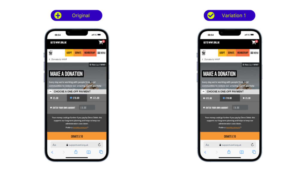
Behavioral research shows that users tend to ‘anchor’ to the first number they see – meaning they use it as a reference point for all future judgments. To test the impact of this effect, the team reversed the order of suggested donation values to present higher amounts first, with the ultimate goal of including the average order value (AOV).
- Control: Donation amounts displayed from low to high (£5, £10, £25)
- Variation: Amounts reordered from high to low (£25, £10, £5)
Results:
- +20% click-through rate (CTR) to the donate CTA
- +18% increase in overall checkout starts
- +87% uplift in end conversion rate (ECR) on desktop
The higher-to-lower layout encouraged users to consider larger gifts early, particularly on desktop, where scanning patterns favored top-loaded options.
Test 2: Increasing Suggested Donation Values
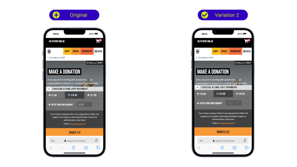
The team hypothesized that adjusting the default donation amounts upward could lift AOV without creating drop-offs.
- Control: Preset amounts at £5, £10, and £25
- Variation: Increased to £10, £25, and £50
Results:
- 9% increase in overall checkout starts
- 23% increase in checkout starts on desktop
- Strongest engagement around the £25 mid-tier value
This variation leveraged the Goldilocks effect, where users gravitate to the middle option. By raising the donation value across the board, the team encouraged more generous giving while keeping the decision-making structure intuitive.
Test 3: Adding Context to Donation Amounts
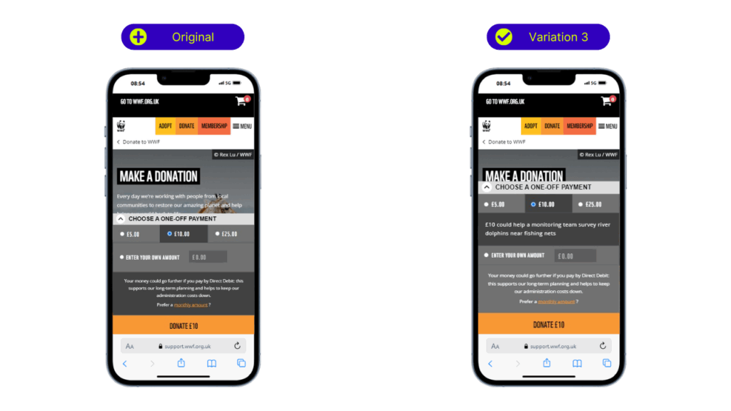
To strengthen emotional connection and clarify the impact of each contribution, contextual messaging was introduced alongside donation values.
- Control: Standard widget with preset amounts only
- Variation: Added messaging (e.g., “£10 could help a monitoring team survey river dolphins near fishing nets”)
Results:
- 16% increase in overall CTR to the donate CTA
- 31% increase in CTR on desktop
- 12% increase in checkout Starts
Users spent more time engaging with the contextual content. The addition of impact-focused messaging helped users feel more confident that their donations would make a difference. The results show that pairing emotional storytelling with simple donation options creates a more engaging and trustworthy experience, one that encourages stronger connections and boosts conversions.
Key Takeaways
Anchoring and Value Framing
Presenting higher donation amounts first encouraged more generous giving. Tests showed users were more likely to choose mid-range options when those options were framed within a wider, higher-value context.
Device-Specific Behavior
Testing across desktop and mobile showed important behavioral differences. Desktop users were more responsive to increased donation values and layout changes, while mobile users benefited from simpler interfaces and clearer prompts.
Thanks to the flexibility of AB Tasty’s platform, the team was able to spot these patterns early and adjust the experience to better fit each device. These insights helped improve the mobile journey and will be key as user behavior continues to evolve.
Emotional Resonance Matters
Messaging that linked donation amounts to real-world outcomes improved engagement and confidence. Making the impact of each contribution tangible helped reduce hesitation and encouraged action. This approach helped reduce hesitation and played a key role in creating a more compelling donation experience.
Iteration Drives Insight
Each test provided new data about how users interact with the donation experience. By approaching optimization as an ongoing process, the team was able to continuously refine the journey based on what worked best, while also uncovering new opportunities, such as personalization and smarter use of price anchoring.
Conclusion
By combining data-led experimentation with user-focused design, WWF made meaningful improvements to the online donation experience.
From reordered layouts and adjusted values to more emotionally resonant messaging, the changes were subtle, but the impact was significant: higher CTRs, more completed donations, and stronger support for the mission.
By continuing to test and refine, WWF can keep enhancing the donation journey, removing friction, deepening trust, and empowering even more people to take meaningful action for the planet.