We teamed up with our friends at Creative CX to take a look at the impact of experimentation on Core Web Vitals. Read our guest blog from Creative CX’s CTO Nelson Sousa giving you insights into how CLS can affect your Google ranking, the pros and cons of experiments server and client side, as well as organisational and technical considerations to improve your site experience through testing, personalisation and experimentation.
What are Core Web Vitals?
Core Web Vitals (CWV) are a set of three primary metrics that affect your Google search ranking. According to StarCounter, the behemoth search engine accounts for 92% of the global market share. This change has the potential to reshape the way we look at optimising our websites. As more and more competing businesses seek to outdo one another for the top spots in search results.
One notable difference with CWV is that changes are focused on the user experience. Google wants to ensure that users receive relevant content and are directed to optimised applications. The change aims to minimise items jumping around the screen or moving from their initial position. The ability to quickly and successfully interact with an interface and ensure that the largest painted element appears on the screen in a reasonable amount of time.
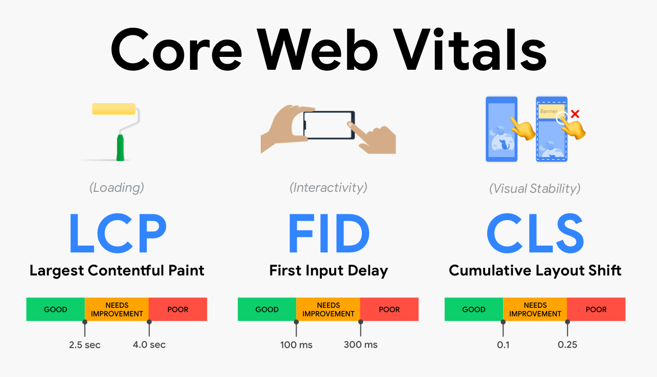
What is CLS?
Let’s imagine the following scenario:
You are navigated to a website. Click on an element. It immediately moves away from its position on the page. This is a common frustration. It means you click elsewhere on a page, or on a link, which navigates you somewhere else again! Forcing you to go back and attempt to click your desired element again.
You have experienced what is known as Cumulative Layout Shift, or for short, CLS; a metric used to determine visual stability during the entire lifespan of a webpage. It is measured by score, and according to Core Web Vitals, webpages should not exceed a CLS score of 0.1
CLS within Experimentation
When working with client-side experimentation, a large percentage of A/B testing focuses on making experimentation changes on the client side (in the browser). This is a common pattern, which normally involves placing a HTML tag in your website, so that the browser can make a request to the experimentation tool’s server. Such experimentation tools have become increasingly important as Tech teams are no longer the sole entities making changes to a website.
For many, this is a great breakthrough.
It means marketing and other less technical teams access friendly user interfaces to manipulate websites without the need of a developer.It also frees up time for programmers to concentrate on other more technical aspects.
One drawback for client-side, is certain elements can be displayed to the user before the experimentation tool has had a chance to perform its changes. Once the tool finally executes and completes its changes, it may insert new elements in the same position where other elements already exist. Pushing those other elements further down the page. This downward push is an example of CLS in action.
Bear in mind that this only affects experiments above the fold. Elements initially visible on the page without the need of scrolling.
So when should you check for CLS and its impact upon the application? The answer is up for debate. Some companies begin to consider it during the design phase, while others during the User Acceptance Testing phase. No matter what your approach is, however, it should always be considered before publishing an experiment live to your customer base.
Common CLS culprits
According to Google’s article on optimising CLS, the most common causes of CLS are:
- Images without dimensions
- Ads, embeds, and iframes without dimensions
- Dynamically injected content
- Web Fonts causing FOIT/FOUT
- Actions waiting for a network response before updating DOM
Overall CLS Considerations
Team awareness and communication
Each variation change creates a unique CLS score. This score is a primary point in your prioritisation mechanism. It shapes the way you approach an idea. It also helps to determine whether or not a specific experiment will be carried out.
Including analysis from performance testing tools during your ideation and design phases can help you understand how your experiment will affect your CLS score. At Creative CX, we encourage weekly communication with our clients, and discuss CLS impact on a per-experiment basis.
Should we run experiments despite possible CLS impact?
Although in an ideal world you would look to keep the CLS score to 0, this isn’t always the case. Some experiment ideas may go over the threshold, but that doesn’t mean you cannot run the experiment.
If you have data-backed reasons to expect the experiment to generate an uplift in revenue or other metrics, the CLS impact can be ignored for the lifetime of the experiment. Don’t let the CLS score to deter you from generating ideas and making them come to life.
Constant monitoring of your web pages
Even after an experiment is live, it is vital to use performance testing tools and continuously monitor your pages to see if your experiments or changes cause unprecedented harmful effects. These tools will help you analyse your CLS impact and other key metrics such as First Contentful Paint and Time to Interactivity
Be aware of everyone’s role and impact
For the impact of experimentation on Web Core Vitals, you should be aware of two main things:
- What is the impact of your provider?
- What is the impact of modifications you make through this platform?
Experimentation platforms mainly impact two Web Vitals: Total Blocking Time and Speed Index. The way you use your platform, on the other hand, could potentially impact CLS and LCP (Largest Contentful Paint).
Vendors should do their best to minimize their technical footprint on TBT and Speed Index. There are best practices you should follow to keep your CLS and LCP values, without the vendor being held liable.
Here, we’ll cover both aspects:
Be aware of what’s downloaded when adding a tag to your site (TBT and Speed Index)
When you insert any snippet from an experimentation vendor onto your pages, you are basically making a network request to download a JavaScript file that will then execute a set of modifications on your page. This file is, by its nature, a moving piece: based on your usage – due to the number and nature of your experimentations, its size evolves.
The bigger the file, the more impact it can have on loading time. So, it’s important to always keep an eye on it. Especially as more stakeholders in your company will embrace experimentation and will want to run tests.
To limit the impact of experimenting on metrics such as Total Blocking Time and Speed Index, you should download strictly the minimum to run your experiment. Providers like AB Tasty make this possible using a modular approach.
Dynamic Imports
Using dynamic imports, the user only downloads what is necessary. For instance, if a user is visiting the website from a desktop, the file won’t include modules required for tests that affect mobile. If you have a campaign that targets only logged in users to your site, modifications won’t be included in the JavaScript file downloaded by anonymous users.
Every import also uses a caching policy based on its purpose. For instance, consent management or analytics modules can be cached for a long time. While campaign modules (the ones that hold your modifications) have a much shorter lifespan because you want updates you’re making to be reflected as soon as possible. Some modules can also be loaded asynchronously which has no impact on performance. For example, analytics modules used for tracking purposes.
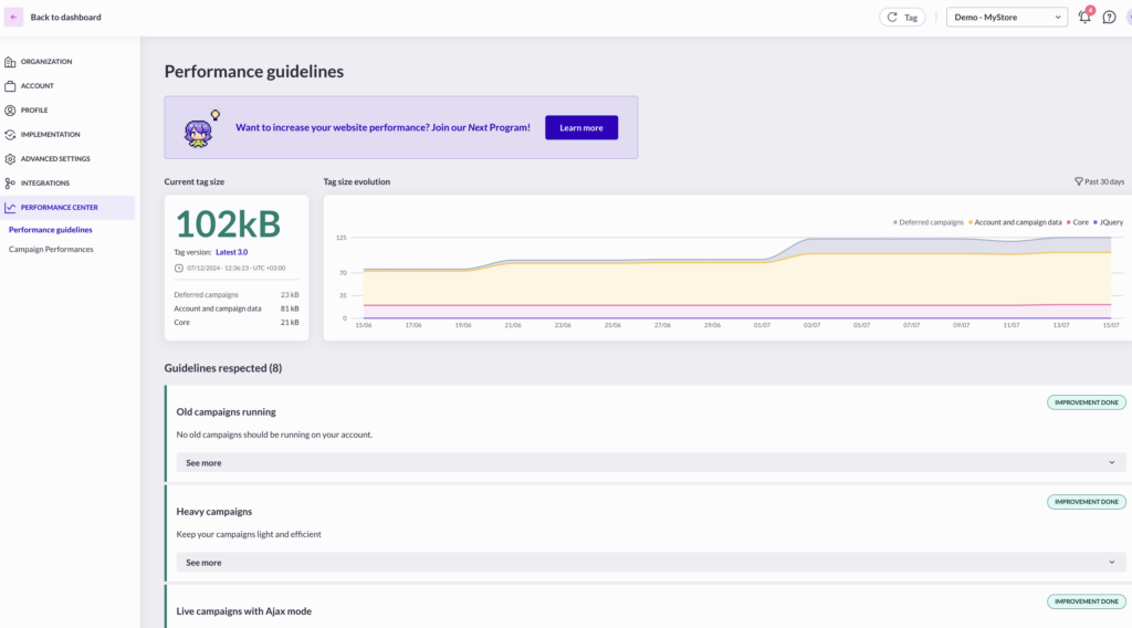
To make it easy to monitor the impact on performance, AB Tasty also includes a tool, named “Performance Center”. The benefit of this is that you get a real time preview of your file size. It also provides on-going recommendations based on your account and campaign setup:
- to stop campaigns that have been running for too long and that add unnecessarily weight to the file,
- to update features on running campaigns, that have benefited from performance updates since their introduction (ex: widgets).
How are you loading your experimentation tool?
A common way to load an A/B testing platform is by inserting a script tag directly into your codebase, usually in the head tag of the HTML. This would normally require the help of a developer; therefore, some teams choose the route of using a tag manager as it is accessible by non-technical staff members.
This is certainly against best practice. Tag managers cannot guarantee when a specific tag will fire. Considering the tool will be making changes to your website, it is ideal for it to execute as soon as possible.
Normally it’s placed as high up the head tag of the HTML as possible. Right after any meta tags (as these provide metadata to the entire document), and before external libraries that deal with asynchronous tasks (e.g. tracking vendors such as ad networks). Even if some vendors provide asynchronous snippets to not block rendering, it’s better to load synchronously to avoid flickering issues, also called FOOC (Flash of Original Content).
Best Practice for flickering issues
Other best practice to solve this flickering issue include:
- Make sure your solution uses vanilla JavaScript to render modifications. Some solutions still rely on the jQuery library for DOM manipulation, adding one additional network request. If you are already using jQuery on your site, make sure that your provider relies on your version rather than downloading a second version.
- Optimize your code. For a solution to modify an element on your site, it must first select it. You could simplify this targeting process by adding unique ids or classes to the element. This avoids unnecessary processing to spot the right DOM element to update. For instance, rather than having to resolve “body > header > div > ul > li:first-child > a > span”, a quicker way would be to just resolve “span.first-link-in-header”.
- Optimize the code auto generated by your provider.When playing around with any WYSIWYG editors, you may add several unnecessary JavaScript instructions. Quickly analyse the generated code and optimize it by rearranging it or removing needless parts.
- Rely as much as possible on stylesheets. Adding a stylesheet class to apply a specific treatment is generally faster than adding the same treatment using a set of JavaScript instructions.
- Ensure that your solution provides a cache mechanism for the script and relies on as many points of presence as possible (CDN)so the script can be loaded as quickly as possible, wherever your user is located.
- Be aware of how you insert the script from your vendor. As performance optimization is getting more advanced, it’s easy to mess around with concepts such as async or defer, if you don’t fully understand them and their consequences.
Be wary of imported fonts
Unless you are using a Web Safe font, which many businesses can’t due to their branding, the browser needs to fetch a copy of the font so that it can be applied to the text on the website. This new font may be larger or smaller than the original font, causing a reflow of the elements. Using the CSS font-display property, alongside preloading your primary webfonts, can increase the change of a font meeting the first paint, and help specify how a font is displayed, potentially eliminating a layout shift.
Think carefully about the variation changes
When adding new HTML to the page, consider if you can replace an existing element with an element of similar size, thus minimising the layout shifts. Likewise, if you are inserting a brand-new element, do preliminary testing, to ensure that the shift is not exceeding the CLS threshold.
Technical CLS considerations
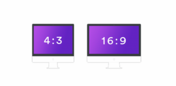
Always use size attributes for the width and height of your images, videos and other embedded items, such as advertisements, and iframes. We suggest using CSS aspect ratio properties for images specifically. Unlike older responsive practices, it will determine the size of the image before it is downloaded by the browser. The more common aspect ratios out there in the present day are 4:3 and 16:9. In other words, for every 4 units across, the screen is 3 units deep, and every 16 units across, the screen is 9 units deep, respectively.
 Knowing one dimension makes it possible to calculate the other. If you have an element with 1000px width, your height would be 750px. This calculation is made as follows:
height = 1000 x (3 / 4)
When rendering elements to the browser, the initial layout often determines the width of a HTML element. With the aspect ratio provided, the corresponding height can be calculated and reserved. Handy tools such as Calculate Aspect Ratio can be used to do the heavy lifting math for you.
Use CSS transform property
The CSS transform property is a CSS trigger which will not trigger any geometry changes or painting. This will allow changing the element’s size without triggering any layout shifts. Animations and transitions, when done correctly with the user’s experience in mind, are a great way to guide the user from one state to another.
Move experiment to the server-side
Experimenting with many changes at once is considered against best practice. The weight of the tags used can affect the speed of the site. It may be worth moving these changes to the server-side, so that they are brought in upon initial page load. We have seen a shift in many sectors, where security in optimal, such as banking, to experiment server-side to avoid the use of tags altogether. This way, once a testing tool completes the changes, layout shift is minimised.
Working hand in hand with developers is the key to running server-side tests such as this. It requires good synchronisation between all stockholders, from marketing to product to engineering teams. Some level of experience is necessary. Moving to server-side experiments just for the sake of performance must be properly evaluated.
Server-side testing shouldn’t be confused with Tag Management server-side implementation. Some websites that implement a client-side experimentation platform through tag managers (which is a bad idea, as described previously), may be under the impressions that they can move their experimentation tag on the server-side as well and get some of tag management server-side benefits, namely reducing the number of networks request to 3rd party vendors. If this is applicable for some tracking vendors (Goggle Analytics, Facebook conversions API…), this won’t work with experiment tags that need to apply updates on DOM elements.
Summary
The above solutions are there to give you an overview of real life scenarios. Prioritise the work to be done in your tech stack. This is the key factor in improving the site experience in general. This could include moving requests to the server, using a front-end or server-side library that better meets your needs. All the way to rethinking your CDN provider and where that are available versus where most of your users are located.
One way to start is by using a free web tool such as Lighthouse and get reports about your website. This would give you the insight to begin testing elements and features that are directly or indirectly causing low scores.
For example, if you have a large banner image that is the cause of your Largest Contentful Paint appearing long after your page begins loading, you could experiment with different background images and test different designs against one another to understand which one loads the most efficiently. Repeat this process for all the CWV metrics, and if you’re feeling brave, dive into other metrics available in the Lighthouse tools.
While much thought has gone into the exact CWV levels to strive for, it does not mean Google will take you out of their search ranking as they will still prioritise overall information and relevant content over page experience. Not all companies will be able to hit these metrics, but it certainly sets standards to aim for.
Written by Nelson Sousa, Chief Technology Officer, Creative CX
Nelson is an expert in the field of experimentation and website development with over 15 years’ experience, specialising in UX driven web design, development, and optimisation.


