


Did you know that 70% of online shoppers abandon their carts?
According to the Baymard Institute, this number comes from an in-depth analysis that benchmarked 48 different studies on shopping cart abandonment rates.
This may not come as a surprise for experienced e-marketers, but the truth is that 7 people out of 10 will actually abandon their cart and end their shopping journey without making a purchase.
This is clearly a lot of lost revenue. So, how can you bring that percentage down?
This article aims to answer that question. We will cover best practices to help you diminish the abandonment rate and optimize your e-commerce shopping cart page for conversions.
Adopt clear UX parameters for shopping cart optimization
First of all, let’s start with a firm foundation. Your shopping cart page should adopt a clear, simple, and fast UX. This simple 3-step formula (CSF) is the cornerstone of any successful cart page:
- Clear – There should be nothing messy, concerning, or misleading about your cart page. It should ideally display all the important information on a single page without the need to scroll too far or visit any other page.
- Simple – Your cart page should display all the information using comprehensible, crystal-clear language and a design that leaves no room for misunderstanding.
- Fast – The more time visitors spend on your cart page, the more likely they will leave it. If you apply the first two critical elements (simple+clear) to your page, the resulting cart page experience should also be fast.
As there are many elements on your page that you can optimize and run tests on to find the best solution, it’s important to follow this CSF framework for harmony.
Want to get started on A/B testing for your shopping cart page? AB Tasty is a great example of an A/B testing tool that allows you to quickly set up tests with low code implementation of front-end or UX changes on your web pages, gather insights via an ROI dashboard and determine which route will increase your revenue.

Knowing these 3 crucial elements, it’s high time we dive into our 10 best practices for e-commerce shopping cart pages.
10 best practices for your shopping cart pages
1. Create a detailed product summary
Just moments before your visitors proceed to checkout, they’ll land on your cart page which has one sole mission: lead your visitors to actually pay.
For most e-commerce buyers, the cart is a page used to review their order.
In order to help them do so, your mission is to clearly display all the relevant information regarding the product.
Below is a great example of a check-out page from ASOS that includes all the necessary details for a clear and easy review. Users know exactly which product they will purchase as well as the color, size, and quantity.
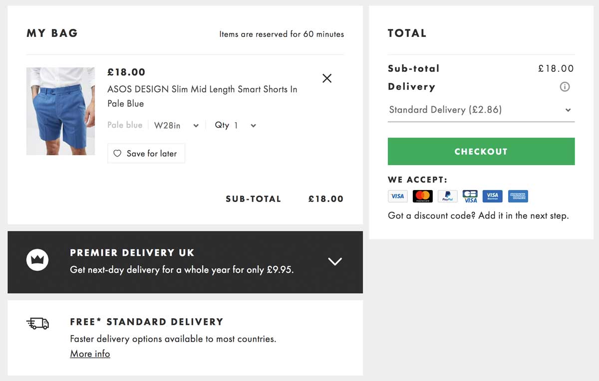
When crafting your cart page, be sure to follow this example and include these elements:
- Item thumbnail
- Exact name
- Item specifications (size, power, capacity, memory, features…)
- Quantity of items in cart
- Item color
Having all these elements shown to your customers allows them to quickly review their order and have confidence in their purchase.
Including all relevant details will decrease the percentage of cart abandonment that is typically caused by the lack of precise information.
2. Choose a clear, user-friendly color code
There have been many studies about the psychology behind colors. However, there’s no single answer on which color will fit all websites and solve all abandonment rate problems.
One thing that we do know for sure is that visitors love harmony and clear designs when it comes to UX.
Let’s look at the luxury shoe brand Jimmy Choo. For their check-out page, they kept a simple design by using a black button that clearly stands out, making it straightforward to click.
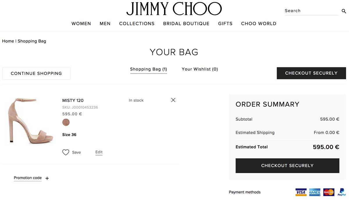
Famous shoe-maker Jimmy Choo uses an elegant yet efficient black and white color code in order to clearly display the information on the cart page.
Notice that the checkout button efficiently stands out as the only black button on the page, making it extremely straightforward to click it.
3. Display explicit and detailed information about shipping and returns
What is the number one reason behind shopping cart abandonment in the US? Hidden shipping costs.
Online buyers despise hidden and last-minute shipping costs. As you can see in the image below from Baymard’s study, it’s by far the most popular reason for cart abandonment compared to others.
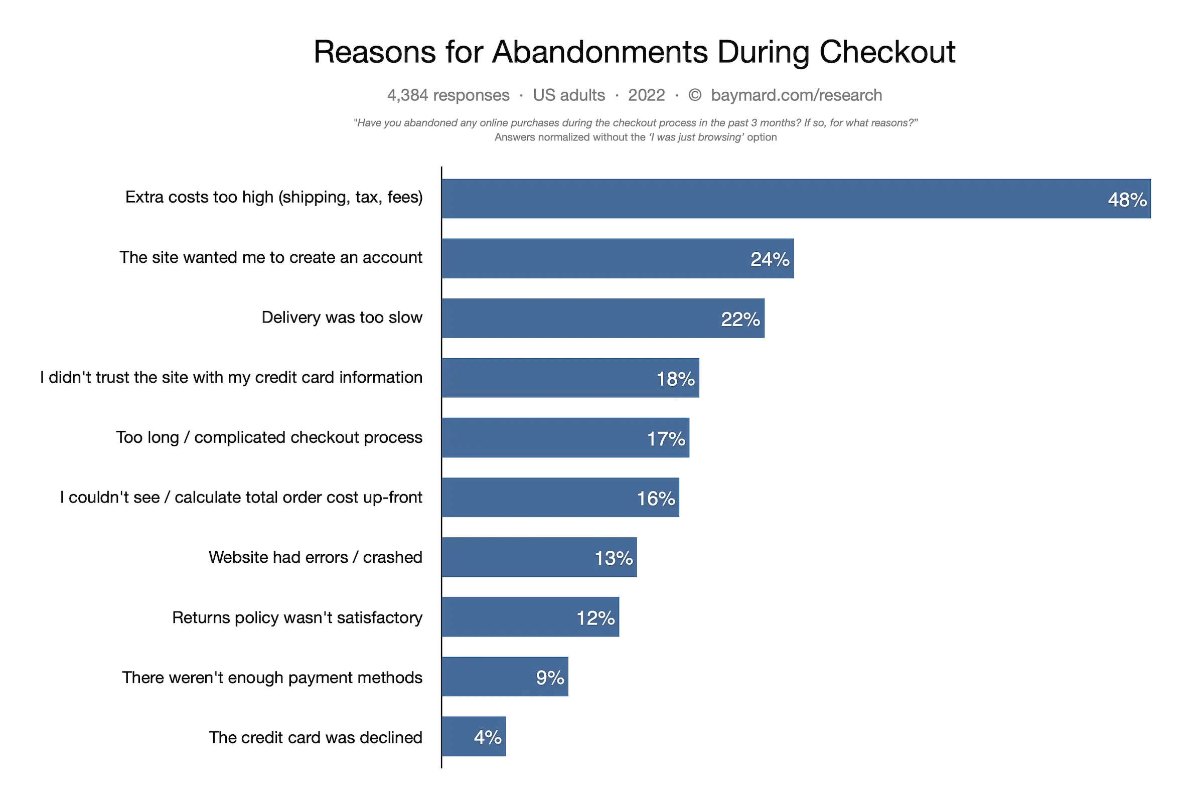
Displaying transparent shipping and return policies is a key factor in enhancing conversion and gaining customers’ trust.
4. Craft clever information hierarchy and non-competing CTAs
Information hierarchy is the structure used to display and rank information according to its importance.
While designing cart pages, pay attention to the logic behind buttons, columns and titles as they will heavily influence the users’ perception.
You can use various colors in your CTAs (preferably matching your brand) although we recommend a maximum of 3-4 colors at a time.
Colors do help you gain visitors’ attention, so use them wisely:
- Highlight important information
- Use a distinct color to distinguish the CTA
- Use lines or columns to structure your page
In the image below, Zappos, a USA-based shoe marketplace, does a great job of providing an efficient and clean shopping experience.
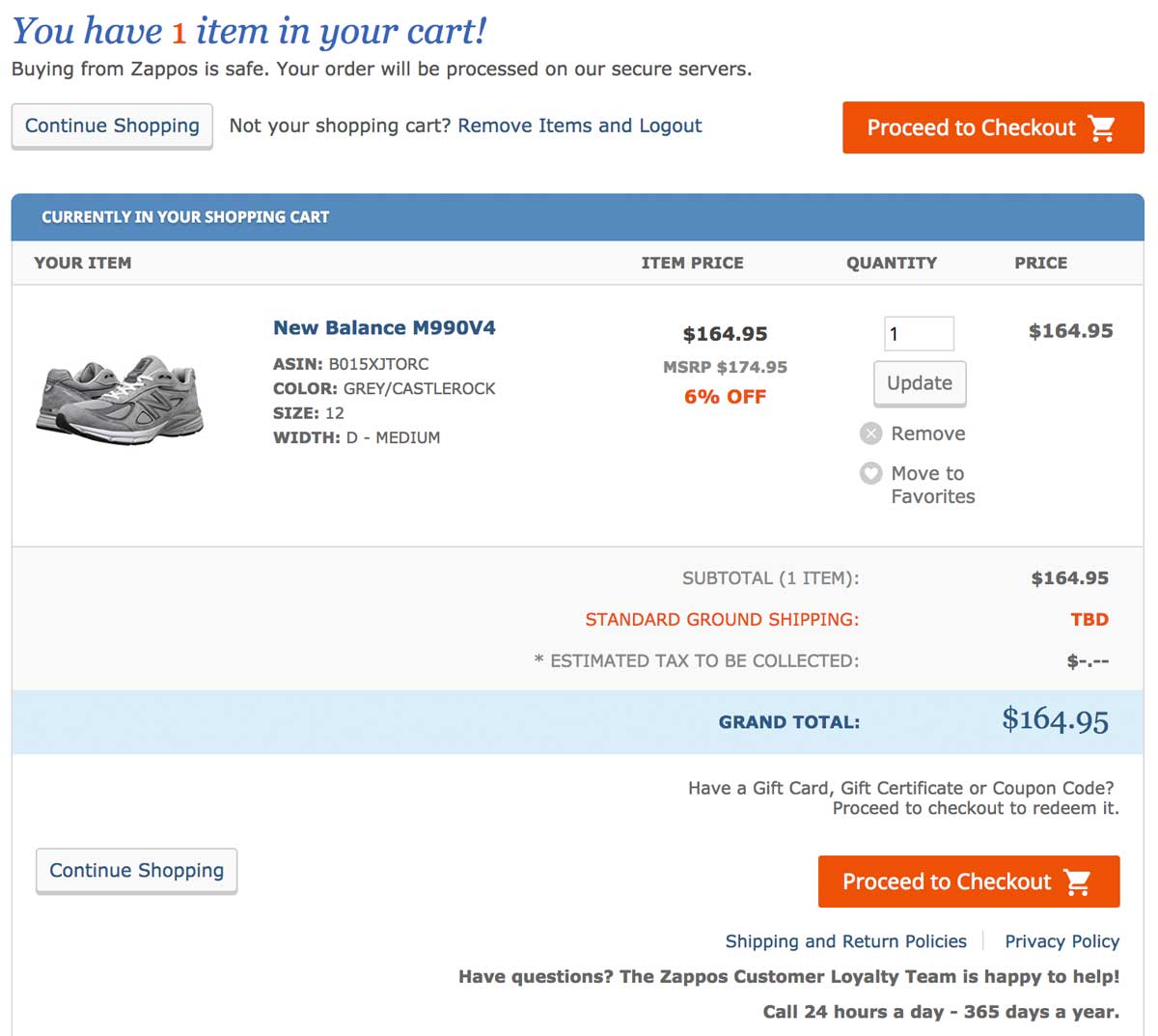
The shopping cart page skillfully guides customers through the buying journey; we appreciate the neat layout emphasized by a simple 3-step color code (orange=very important; blue=important; grey=secondary).
5. Deploy payment options that your users love
Having different payment options is a necessity in today’s ultra-competitive e-commerce environment.
If you run an international e-commerce store, bear in mind that payment methods differ from one country to another: what’s used in North America isn’t necessarily the same as in Europe or in Asia.
To combat this, try to redirect customers based on their IP location to offer them a personalized experience based on the local currency and their preferred payment methods.
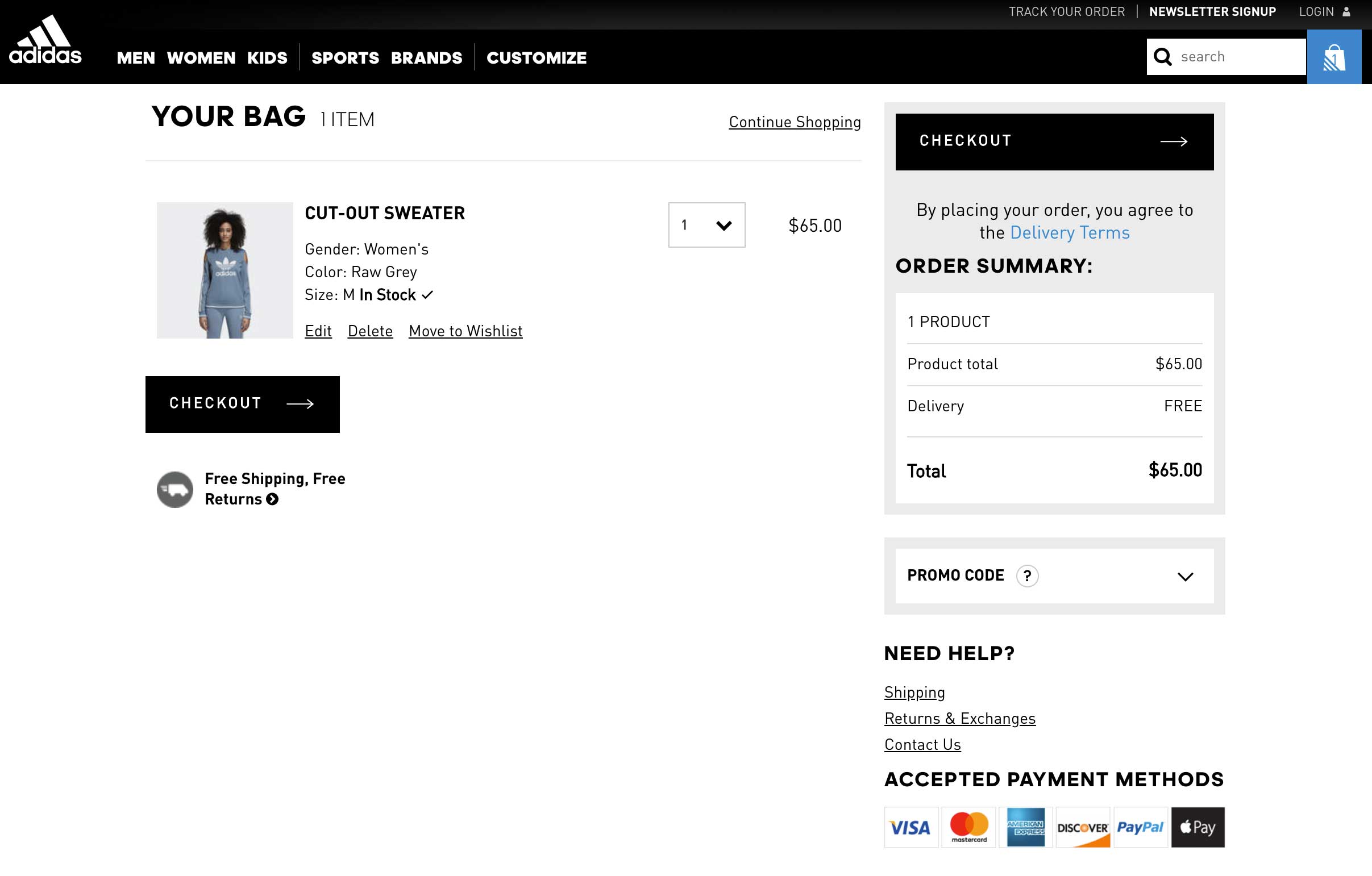
In the image above, Adidas provides 6 different payment methods including Paypal, VISA and Apple Pay. This is an absolute necessity for large and global stores.
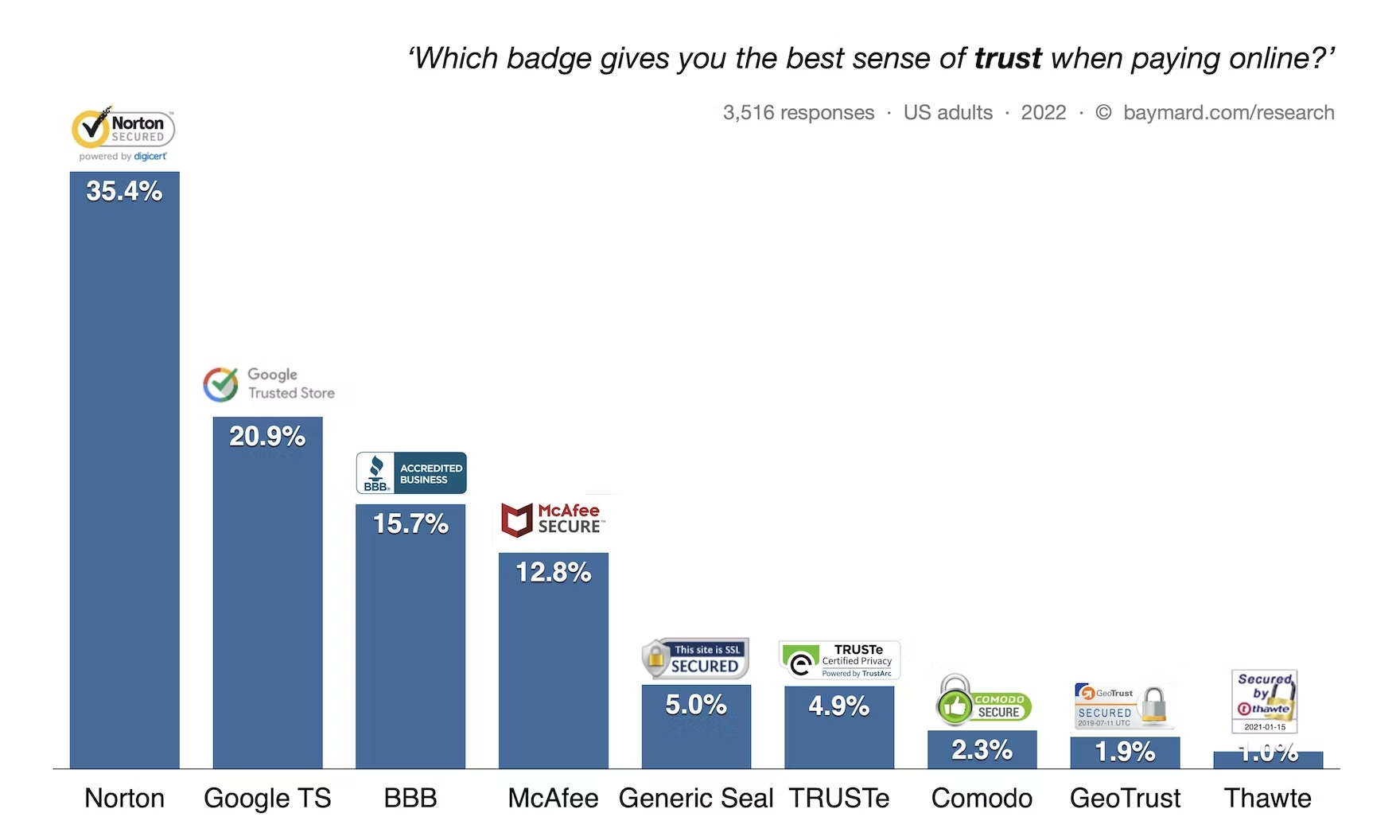
6. Show security seals and reassuring elements
In the same report from Baymard, the lack of trust in the payment accounted for 18% of abandoned cart rates. Trust seals, or trust badges, are very important to show your users that your site is legitimate.
In fact, they actually matter more than peer recommendations or trustworthy design. According to Baymard, here are the badges that give visitors the highest perception of a safe and secure site:
7. Offer phone, chat or email assistance
Displaying a clear contact number and address details can impact your user’s level of trust. Shoppers want to make sure that your business is legitimate and not an online scam.
Furthermore, your visitors want to feel that there are actual humans behind your website.
Offering a live chat or phone assistance service right on the cart page is a great option to gain customers’ trust, legitimize your business and humanize your brand identity.
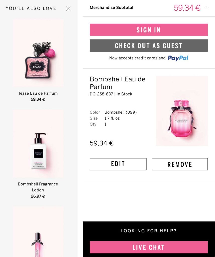
Wondering how to design your chatbox? Take a look at Victoria’s Secret’s page in the image below. They have chosen their most vibrant color, pink, to increase their call-to-action visibility.
8. Add a “continue shopping” option
A “continue shopping” option is a smart way to offer your visitors a way to abandon their cart without leaving your website. They’ll have the freedom to continue browsing after they’ve already added items to their cart.
As some online shoppers actually use carts as “wishlists,” they can store items that they intend on purchasing later on.
9. Display legible thumbnail images
There’s nothing more annoying than a tiny thumbnail that barely helps to identify a product.
When customers review a product, you should give them the opportunity to see it correctly in a convenient size and resolution on both mobile and desktop.
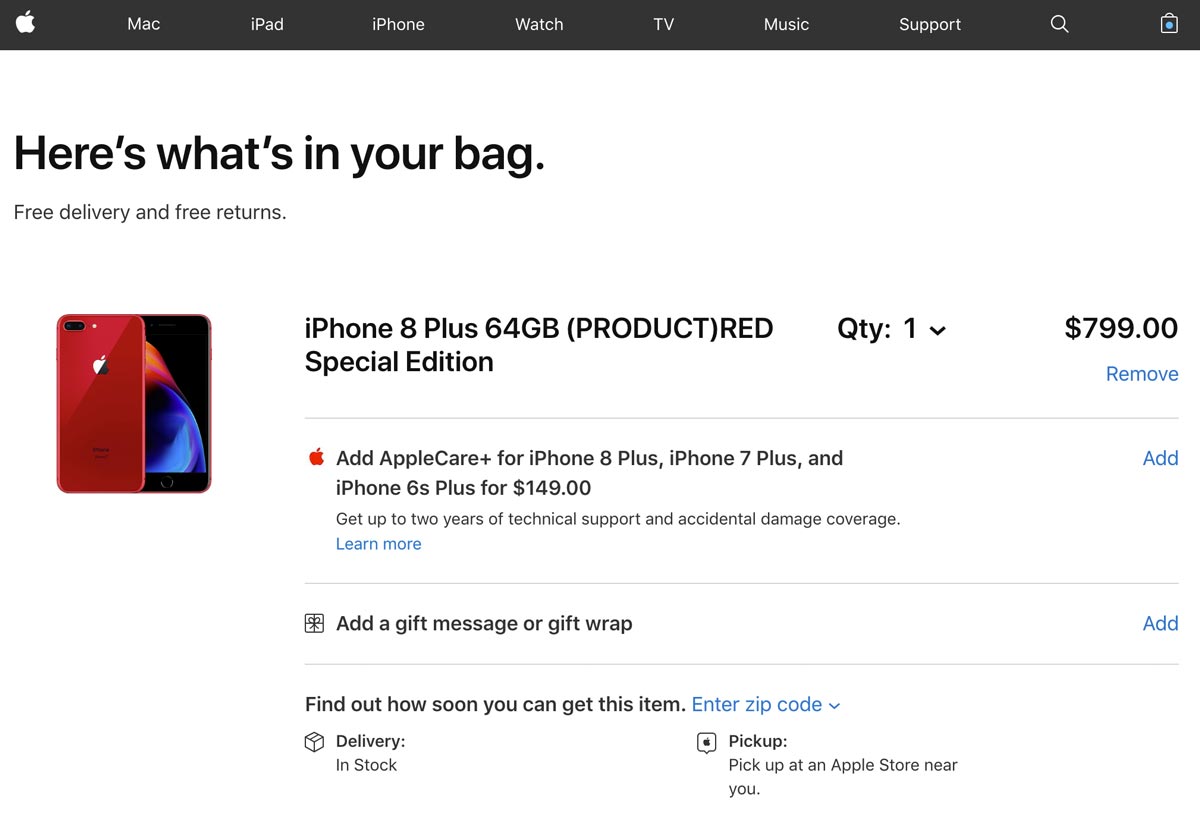
In the image above, Apple makes it very easy to distinguish the chosen product. The image used is bright and clear. Their customers will be absolutely certain that they’ve got the right item in their bag.
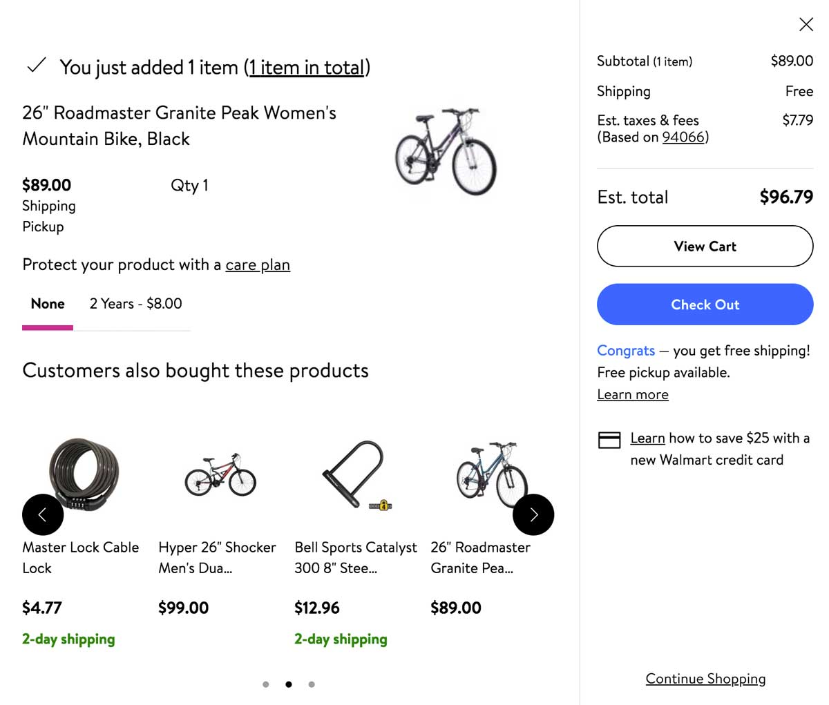
10. Push complementary products
Offering complementary product recommendations, or cross-selling, is nothing new in the e-commerce world.
However, displaying complementary products inside the shopping cart page is something worth testing if it could bring you a higher AOV.
For more testing ideas, check out our e-book: 50 Tests You Should Know For Website Optimization
Why optimize your shopping cart page?
An optimized shopping cart page is crucial to sales.
The shopping cart page is the last step your visitors take before their purchase. In this step of their digital user journey, it’s important to ease customer concerns in any way possible and promote a seamless checkout flow.
Every online e-commerce should be testing different elements of its cart page to find what works best for converting passive visitors into active customers.
Read more: Go one step further and improve your e-commerce product page performance to push your visitors to the cart page.
