

A Call to Action, also known as a CTA, refers, in marketing, to any item that will, using imperative wording, encourage an immediate action or response from the user.
Calls to Action are essential in marketing campaigns. They’re a way to lead customers to a specific action. They generally come as a button, but they also exist in many other forms. In this guide, we’ll tell you everything you need to know about CTAs, how they work and how to use them on your website.
What is a Call to Action?
Behind this mysterious name hides a very simple marketing concept you’ve all seen before. Calls to Action (CTAs) refer to any device conceived to persuade users to do a specific action.
E-commerce companies usually use them in the form of buttons to encourage buyers to add an item to their shopping cart or to complete a transaction. It is a key element to integrate playful interaction with your users and an effective means to increase conversions.
The goal of a CTA is to use a word or a sentence (most of the time containing action verbs) to push your users toward a specific action like “click here”, “subscribe”, “check out” and many others. These action words can also be used with a “now” creating a sense of urgency. Calls to Action were proven to be very effective and to optimize conversion rates.
CTAs can be used to push users down the purchase funnel, but they can also be used for any kind of action like registering, subscribing to a newsletter or adding to cart.
What makes an effective CTA? When creating a CTA for your website, every detail counts. Here are some aspects you need to pay attention to for your CTA button:
- Visual aspect
- Wording
- Action word
- Placement
- Form
- Color
- Size
Do not underestimate the impact your CTA button can have on your conversion rate. A well-written Call to Action needs to be adapted to your audience, their age, their gender or their nationality. Remember that a CTA isn’t just a command or an invitation for your users, it is part of the full purchasing process. That’s why it needs to be discreetly integrated but obvious enough to be noticed by users.
Why do you need a clear Call to Action in your CRO strategy?
Always remember the importance of CTAs in your purchase funnel. Your customer’s path to completing a transaction is paved with CTA buttons. They are a key element in your CRO (Conversion Rate Optimization) strategy, they need to be quite obvious since they are meant to lead users to the action you want them to complete.
A good and clear Call to Action comes with a nice visual, adapted to your target audience, with a clear and straightforward message. That way, and only that way, you will get the best out of your CTA and note effective results in your conversion rate AND your CTR (Click Through Rates).
An efficient CTA is nothing but a perfect compromise between your e-commerce site’s goal, which is to increase sales or to sell a specific product, and users’ needs, i.e. a smooth navigation experience while purchasing a product. That’s why your CTA needs to be neat and easy to find, and user experience always needs to be taken into account.
Best Call to Action examples of 2020
CTAs come in many forms. To help you with your CTA A/B testing, we listed the 5 best forms of CTAs in 2020:
1. Direct Calls to Action
Let’s say your goal is to push your customers down the purchase funnel. Then, you might opt for a direct CTA, such as:
- Shop now
- Buy now
- Add to shopping cart
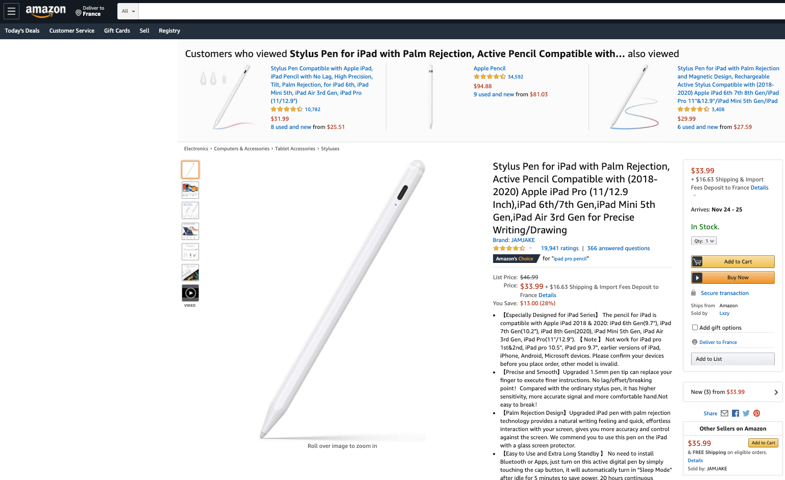 An Amazon product page containing an add to shopping cart and buying button CTA (Image Source).
2. “Get for Free” Calls to Action
With these CTAs, you can highlight an opportunity for the users. Generally, these come with a “subscribe” box. You can collect your users’ email addresses in exchange for a sample of a document or a free trial. These CTAs usually appear as:
- Download for free
- Free 30 day trial
- Start free trial
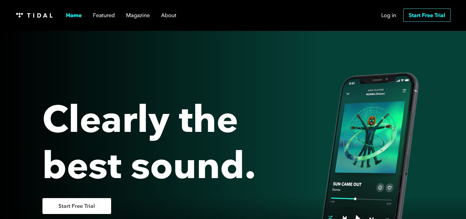
Tidal homepage enticing users to register with a free trial (Image Source).
3. Basic Calls to Action examples
CTAs can be a mere invitation. For instance, on a social media’s ad or as a shortcut to a long text. This kind of CTA is often used in blog posts or Facebooks Ads. Awakening the user’s curiosity, it is supposed to make users want to go further and learn more about a topic with messages like:
- Check it out
- Start here
- Find out more
- Learn more
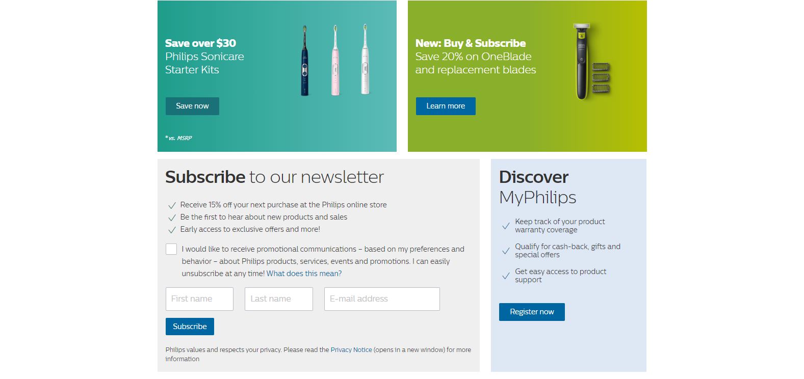 Philips USA homepage with multiple CTAs (Image Source).
4. Registering Calls to Action
This kind of CTA is often found on social media or e-commerce sites. The goal is simple: encourage your visitors to create an account and register with messages such as:
- Create your account
- Sign up
- Join us
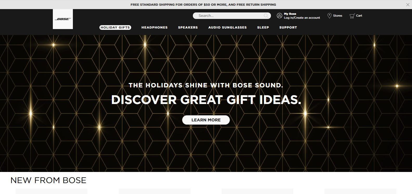 Bose homepage with sign up CTA (Image Source).
5. Email Calls to Action
All of the above have one thing in common: they allow you to connect with your users by collecting their emails, which will be useful for your email marketing campaigns. According to what you are proposing, users can fill in their email to get something like a discount, a coupon or a free PDF. For these, you can use wordings such as:
- Subscribe
- Get coupon
- Download free PDF
- Sign up
For more, read our article about “14 Examples of CTAs You Can’t Resist”.
A/B Test your CTA for better results
A/B testing
A/B testing is the most accurate technique for CRO. This digital marketing strategy consists of making changes on your website and observing the impact of this change on a segment of users.
This is the best method to improve your conversion rate, because you can try out any feature and choose the one whose results are best. It is more reliable since users are the ones determining which feature works best. With this method, you can test your idea with your target users or potential customers.
A/B testing your CTA buttons is the best way to improve your website’s UX and your conversion rate at the same time. At AB Tasty, we offer a super quick and easy way to run these kinds of tests – our drag and drop visual editor.
How to run an A/B test for your CTA?
Here are the different steps you need to follow to A/B test your Call to Action button:
-
Define your test’s goal and the KPIs you want to improve
Changing your button’s feature must serve a goal. It wouldn’t make sense to change your CTA’s color, to run your test and wait for random results. Your goal can be to increase the number of users that subscribe to your newsletter, for instance.
-
Define the original and alternative version (A and B version)
Choose the CTA you want to run your A/B test on, let’s say the red “subscribe to newsletter” button. This red button will be your A version.
What do you want to change about it? Maybe users will be more likely to click on this button if it were blue? Then, change your button’s color. (If you’re using AB Tasty, this takes two seconds with our drag and drop editor). The blue version of the CTA button will be your B version.
-
Run your A/B test
Worried about exposing 50% of your website visitors to this new change? If you have enough traffic, you can run your test on a smaller percentage of your entire website audience to mitigate the risk of any potential lost conversions.
-
Collect data and check your analytics
Usually, A/B tests take several weeks before you get reliable results. During that period, observe your A/B testing tool reporting. Did your conversion rate increase? Did it decrease?
-
Hard code changes (or not)
Figures don’t lie. Based on the test’s results, change what needs to be changed and keep what needs to be kept. Step by step you will find the best combination of features for the perfect CTA.
Conclusion
CTAs are essential in your conversion rate optimization strategy, but they can’t appear randomly or look like any old button. They need to be wisely thought out, otherwise they might not have the expected effect.
Thanks to A/B testing, you will be able to find the right features in order to get the best performance out of them. Remember that visual aspects (like form, color, or size), wording, the chosen action word, and placement matter in your CTA’s performance.
So, what’s the takeaway? An effective Call to Action can boost your website KPIs, and you can A/B test any of your website’s pages – the sky’s the limit.


