Let’s face it: launching a new feature can feel a bit like walking a tightrope. You want to wow your users with something fresh, but you also know that even the best-tested releases can have surprises lurking in the shadows.
What if you could take the nerves—and the guesswork—out of your next launch? That’s exactly what Progressive Rollout is here to do.
The Problem: Risky Feature Releases and Manual Workarounds
Picture this: your team has spent weeks (maybe months!) building a new payment system, a revamped booking flow, or a shiny loyalty program. You’re excited. But you’re also worried. What if something breaks? What if a bug slips through and impacts thousands of users at once?
This is the reality for most product and engineering teams. The stakes are high, and the pressure to “get it right” is real. That’s why so many teams look for ways to release new features gradually—starting with a small group, then expanding as confidence grows.
But here’s the catch: most teams don’t have a dedicated tool for this. Instead, they put together workarounds using feature toggles or A/B tests. These methods can work, but they’re clunky, manual, and often lack the visibility and reassurance everyone craves during a launch.
The Solution: Progressive Rollout
Progressive Rollout is our answer to this all-too-common problem. It’s a feature designed not just for the tech wizards, but for everyone involved in a product launch—product managers, developers, and even business stakeholders.
How does it work?
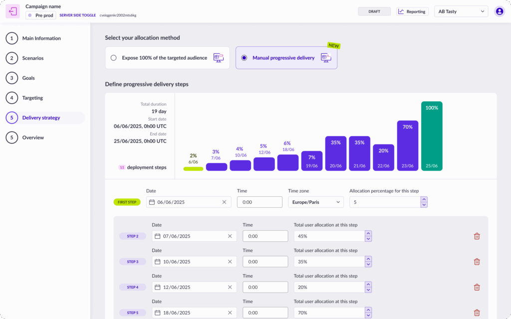
With Manual Progressive Delivery, you can schedule your feature release in stages. Maybe you want to start with 10% of your users, then move to 20%, 40%, and so on. You decide the pace and the audience.
Our platform handles the rest, automatically exposing more users to your new feature at each step. And at every stage, you get clear notifications and a visual overview, so you always know exactly what’s happening.
What Makes Progressive Rollout a Game-Changer?
1. It’s Actually Easy to Use
Let’s be honest: many “enterprise” tools are intimidating. Progressive Rollout is different. The interface is clean, intuitive, and designed so that anyone can set up a rollout in just a few clicks. No advanced segmentation or manual math required. Whether you’re a seasoned developer or a product manager new to experimentation, you’ll feel right at home.
2. Full Control, Full Reassurance
One of the biggest anxieties during a rollout is not knowing what’s happening. With Progressive Rollout, you get a crystal-clear view of your rollout plan: who’s getting the feature, when, and how much of your audience is included at each step. Email notifications keep you in the loop, so you’re never caught off guard. This transparency isn’t just a nice-to-have—it’s a must for teams who want to move fast and stay safe.
3. Flexible for Any Scenario
Want to give early access to your VIPs or most loyal users? Easy. Need to roll out to everyone, but in controlled increments? No problem. You can import user lists, target specific segments, or just roll out to “all users” in stages. Progressive Rollout adapts to your needs, not the other way around.
Fun Fact: Most Teams Aren’t Doing This—Yet
Here’s something surprising: despite the clear benefits, most teams aren’t using dedicated progressive rollout tools. They’re still relying on toggles and A/B tests, or even manual processes. Why? Because until now, the tools have been too complex or not user-friendly enough. Progressive Rollout changes that, making safe, staged launches accessible to everyone.
The Bottom Line: Launch With Confidence
Progressive Rollout isn’t just another feature—it’s peace of mind for your next big launch. By making gradual releases easy, transparent, and accessible, we help you reduce risk, improve user experience, and focus on what matters: delivering value to your customers.