Website performance has never mattered more. Google Core Web Vitals now directly influence organic rankings, mobile conversions continue to dominate, and users expect instant experiences.
In this context, many digital teams ask the same question:
“Will an experimentation or personalization tool slow down my site?”
It’s a valid concern. After all, any third-party script has the potential to impact performance if it’s not engineered carefully.
In this article, we’ll break down what actually affects performance in an experimentation platform — and how AB Tasty has built a performance-first architecture that avoids common pitfalls.
1. The Real Reasons Experimentation Tools Can Slow Down a Website
Not all experimentation platforms behave the same. When performance issues appear, they usually come from a few well-identified causes.
1.1 Heavy, all-in-one tags
Some tools load everything upfront — all features, all experiments, for every visitor — even when most of that code is never used.
This leads to:
Slower execution in the browser
More JavaScript to download and process
Increased pressure on the main thread
Wasted network bandwidth on unused code
The result: a slower page and unnecessary work for the browser.
1.2 “Anti-flicker” scripts that block the page
To prevent visual flicker, many vendors solve flicker by hiding the page (e.g., opacity: 0) until the experiment loads.
While this may avoid a brief visual change, it comes at a cost:
The page cannot render immediately
First visual elements appear later (LCP, FCP)
It hurts SEO rankings
Users may face a noticeable “white screen,” especially on slower connections
The page looks stable — but it loads later than it should.
1.3 Limited optimization for modern websites
Modern websites are no longer simple static pages. Single-page applications, server-side rendering, and hydration flows all require precise timing.
When experimentation scripts are not adapted to these architectures:
They may re-run unnecessarily
They can interfere with rendering
They introduce delays that affect performance
2. AB Tasty’s Philosophy: Performance by Design, Not by Patch
At AB Tasty, we believe an experimentation platform should contribute to user experience — not compromise it. That’s why performance is woven directly into our architecture.
This gives CRO and technical teams full visibility and control over experimentation performance.
Conclusion: You Can Experiment Without Sacrificing Speed
A fast digital experience and an experimentation program are not mutually exclusive.
With its modular architecture, modern rendering logic, and performance-first philosophy, AB Tasty enables brands to run impactful campaigns without jeopardizing SEO or UX.
If performance is a concern for your engineering or CRO teams, we’d be happy to share:
Performance benchmarks
Technical documentation
Best practices for Core Web Vitals
Case studies from top global brands
Experiment boldly — with a platform engineered for speed.
FAQs
Does A/B testing slow down your website?
Yes, but AB Tasty minimizes it. Our tag delivers < 100ms load time, < 500ms execution, and < 10ms from cache—making us 2x faster than Kameleoon. Plus, we block releases if Core Web Vitals degrade by > 2%.
Does A/B testing affect Core Web Vitals?
It can — but AB Tasty minimizes this impact through dynamic imports, optimized rendering logic, and non-blocking execution.
Do I need anti-flicker for A/B testing?
Most of the time, no. Anti-flicker masking can degrade SEO and create a poor user experience.
Is AB Tasty fast?
Yes — benchmarks from independent sources consistently show AB Tasty among the fastest experimentation tags on the market.
Booking a flight is an exercise in high-stakes decision-making. For the customer, it’s a significant purchase filled with dozens of micro-decisions, from dates and times to seat selection and baggage allowances. For an airline, it’s a complex, multi-stage transaction where the smallest point of friction can lead to an abandoned booking and a substantial loss of revenue. Unlike a simple e-commerce purchase, the path from searching for a flight to completing a booking is a long-haul journey in itself.
In this environment, relying on assumptions is a recipe for failure. The color of a CTA button, the order of ancillary services, or the way fees are presented can have an outsized impact on conversion rates. This is why a culture of systematic experimentation isn’t just a “nice-to-have” for airlines; it’s the most effective way to navigate the complexities of the user journey, de-risk critical design decisions, and build a digital experience that turns lookers into bookers, and bookers into loyal customers. It’s about replacing guesswork with the certainty of data, ensuring every change is a step toward a smoother, more profitable customer experience.
The high-friction world of airline UX
An airline website is not a typical e-commerce store. It’s a sophisticated platform balancing user needs, complex business rules, and ancillary revenue goals. A seamless User Experience (UX) here requires a deep understanding of the unique pressures and priorities of the travel booker. Key considerations include:
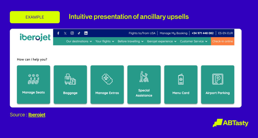
Clarity in search and filtering: The journey begins with a search. Users need to effortlessly filter by dates, stops, airlines, and times. As Spanish travel agency Iberojet discovered, even the initial presentation of search options can have a major impact. They questioned the order of their homepage tabs: “Holiday Packages” vs. “Travel Circuits and Long-Distance Trips.” By running a simple A/B test that swapped the order based on user browsing history, they increased clicks on the “Search” button by a staggering 25%. This shows that getting the very first interaction right is critical.
Transparency in pricing: Nothing erodes trust faster than hidden fees. A modern airline UX presents all costs—from baggage fees to seat selection charges—in a clear and upfront manner. The goal isn’t to hide the costs, but to integrate them so seamlessly into the flow that the user feels informed, not ambushed.
A mobile-first imperative: More and more travelers are booking complex trips entirely on their mobile devices. This demands a responsive, thumb-friendly design where every step, from entering passenger details to selecting a seat on a detailed map, is intuitive on a small screen.
Intuitive ancillary upsells: Baggage options, seat upgrades, and travel insurance are crucial revenue drivers. However, if presented aggressively or confusingly, they become a major point of friction. The best experiences integrate these upsells as helpful, well-timed suggestions rather than mandatory hurdles. A cluttered page that forces users to opt-out of multiple insurance offers feels frustrating, whereas a clean interface that clearly explains baggage options at the right moment feels helpful.
De-risking design with systematic experimentation
Every proposed change to a booking flow is a hypothesis. Does this new layout simplify seat selection? Does this revised copy clarify baggage rules? Experimentation is the process of testing these hypotheses with real users before committing to a full rollout.
A/B testing
This is the workhorse of experimentation. It involves testing one change at a time (e.g., a green “Book Now” button vs. a blue one) to see which performs better against a specific goal, like booking completion rate. It’s simple, direct, and provides clear answers to specific questions. A great example from the vacation package industry comes from Smartbox. They hypothesized that a more prominent “Add to Cart” button would drive more sales. By testing a bright pink CTA against their original aqua one, they saw a 16% increase in clicks. The principle is the same for airlines: small visual changes can yield significant results.
Multivariate testing
This approach allows you to test multiple changes at once. For example, you could simultaneously test two different headlines, three different banner images, and two different CTA buttons to see which combination performs best. This is ideal for redesigning a complex section, like the ancillary services page, where multiple elements interact. Its power lies in not only identifying the best-performing individual elements but also understanding how they influence one another.
Personalization experiments
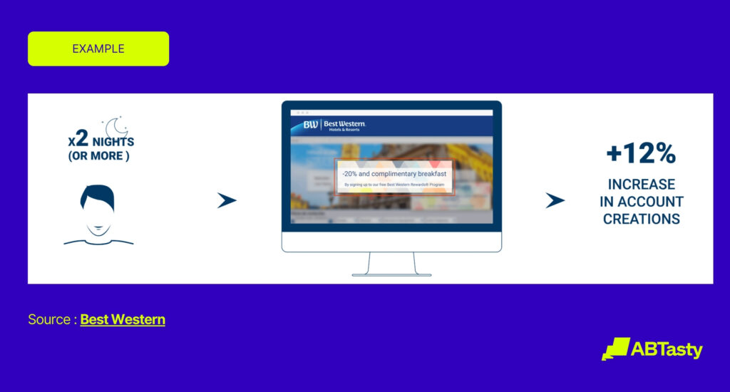
Not all travelers are the same. A frequent flyer logged into their loyalty account has different needs than a first-time visitor booking a family vacation. Personalization involves tailoring the experience to different user segments. For example, Best Western Hotels & Resorts ran a personalization campaign targeting anonymous visitors looking for a multi-night stay. By showing them a pop-up with a special offer available only to loyalty members, they increased program sign-ups by 12%. Airlines can use the same logic to offer targeted promotions to frequent flyers, pre-fill information for logged-in users, or simplify the interface for new customers.
Navigating the challenges of airline experimentation
While incredibly valuable, running experiments on a high-traffic airline website comes with its own set of challenges:
Minimizing disruption: A poorly implemented test can introduce bugs or slow down the site, directly impacting revenue. Rigorous quality assurance and phased rollouts are essential to avoid disrupting the booking process for thousands of users.
Complex technical environment: Airline websites are often a web of internal systems, third-party APIs (for everything from payment to loyalty programs), and global distribution systems. Implementing a test that touches multiple systems requires careful planning and deep technical expertise. A test on the seat selection page, for instance, might rely on an external API for the seat map; if that API is slow, it could invalidate the test results.
Measuring long-term impact: While it’s easy to measure the immediate impact of a test on bookings, measuring its effect on long-term loyalty or repeat business is more difficult. This requires a mature analytics setup and a commitment to tracking user cohorts over time to see if a winning variation today leads to more valuable customers tomorrow.
Recommendations: Building a culture of continuous improvement
To successfully navigate the turbulence of the online travel market, airlines should treat their website not as a static brochure, but as a dynamic product that is always evolving.
Embrace an ongoing process: Experimentation should not be a one-off project. It’s an iterative, continuous loop of hypothesizing, testing, learning, and improving. The insights from one test should fuel the ideas for the next, creating a powerful engine for growth.
Reduce guesswork with data: Use data-driven insights to inform every UX decision, from the grand redesigns down to the smallest copy change. A powerful example of this comes from Evolve Vacation Rental. By analyzing user intent from different traffic sources, they tested changing a CTA from “Start for Free” to “See if You Qualify.” This simple, intent-aligned copy change drove a 161% increase in conversions, demonstrating the immense impact of data-driven copywriting.
Balance optimization with brand: While optimizing for conversion is critical, it must be balanced with the airline’s brand promise and regulatory requirements. The goal is a journey that is not only efficient but also reassuring, trustworthy, and compliant.
By adopting a disciplined, data-driven approach to UX and experimentation, airlines can move beyond simply selling tickets. They can design digital journeys that are smoother, more intuitive, and build the kind of trust that keeps passengers coming back.
Ready to find your better? If you’re looking to build a data-driven experimentation program that drives revenue and builds customer trust, we’re here to help. Talk to one of our experts today to start your journey.
The travel and hospitality industry operates in one of the most competitive digital landscapes.
With customers comparing prices, experiences, and options across multiple platforms in seconds, every element of your website can make or break a booking. That’s where feature experimentation, personalization, a/b tests, and rollouts come in—giving travel brands the power to test, learn, and optimize their digital experiences with confidence.
The Power of Experimentation
Experimentation isn’t just about testing button colors or headlines. It’s about de-risking innovation, understanding your guests, and optimizing every experience—from the first website visit to post-stay engagement. With AB Tasty, travel and hospitality brands can:
Validate ideas before full rollout
Personalize journeys for every traveler segment
React quickly to market changes and guest feedback
Drive measurable business impact—fast
Let’s look at how leading brands are using AB Tasty to solve real challenges and unlock growth. In this article, we’ll explore five travel and hospitality use cases that demonstrate how experimentation and personalization strategies are driving measurable results.
1. Creating Urgency with Countdown Timers
The Challenge: A major theme park operator had been using countdown timers on their season pass pages during promotional periods, but they had never actually tested whether these timers were driving purchases—or just taking up space.
The Experiment: The team ran an A/B test to measure the true impact of countdown timers on their season pass sales page. The timer was designed to create urgency and encourage faster purchasing decisions during limited-time offers.
The Results: The test confirmed what many marketers assume but rarely prove: urgency works. The variation with the countdown timer delivered a +7.2% increase in transaction rate, with particularly strong performance on desktop, where the majority of purchases occurred.
Key Takeaway: Don’t assume your tactics are working—test them. Even widely used conversion techniques like countdown timers deserve validation through experimentation.
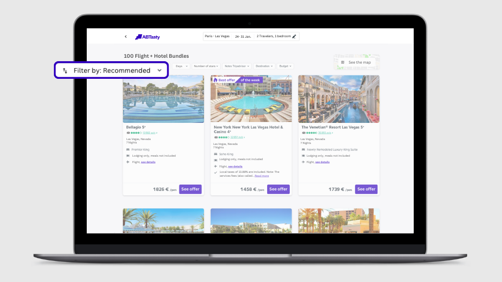
2. Smarter Sorting with Algorithmic Recommendations
The Challenge: A travel booking platform was sorting their listing pages by ascending price—a logical approach, but one that didn’t always surface the most relevant offers for customers. Lower prices don’t always mean better value, and the team suspected they were leaving revenue on the table.
The Experiment: Using feature experimentation, the team tested a new “Recommended” sorting algorithm that factored in product relevance and historical performance data, rather than price alone.
The Results: The smarter sorting approach delivered impressive gains:
+2.8% revenue uplift
+4.6% increase in average order value (AOV)
Key Takeaway: How you present options matters as much as what options you present. Algorithmic sorting that considers relevance and performance can guide users toward better choices—and better business outcomes.
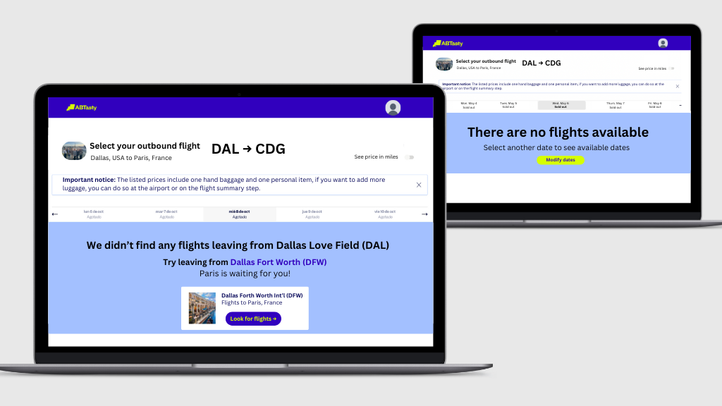
3. Turning Dead Ends into Opportunities with Personalized Alternatives
The Challenge: When travelers searched for a route with no available flights, they hit a frustrating dead end: a cold “no flights available” message. This led to drop-offs, lost revenue, and a poor user experience.
The Experiment: Instead of showing an error message, the team implemented a personalized experience that displayed smart alternatives—nearby airports, flexible date options, or connecting routes.
The Results: The personalized approach transformed a point of frustration into a conversion opportunity:
+35% increase in flight search modifications
+14% improvement in conversion rate
Key Takeaway: Every dead end is an opportunity in disguise. Personalization can rescue frustrated users and turn potential abandonment into completed bookings.
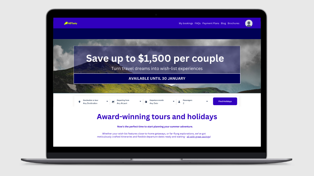
4. Testing Discount Framing: Percentages vs. Monetary Values
The Challenge: A travel company was presenting discounts as percentages (e.g., “Save 15%”), but they weren’t sure if this framing was maximizing customer response. Would travelers respond better to seeing the actual monetary savings?
The Experiment: The team tested a variation that displayed monetary savings instead (e.g., “Save up to $1,500 per couple”) across all devices.
The Results: The monetary framing significantly outperformed the percentage version:
+41% increase in revenue
+18% more clicks on the homepage promotional link
Key Takeaway: How you frame value matters. For high-ticket travel purchases, concrete monetary savings can feel more tangible and compelling than abstract percentages.
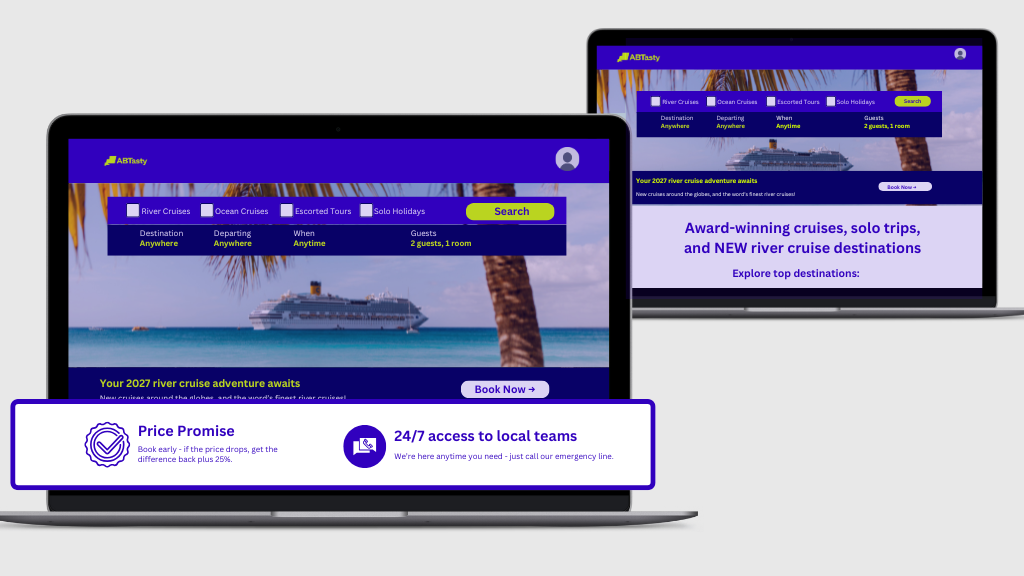
5. Elevating Trust Signals for Higher Conversions
The Challenge: A travel operator had key trust signals—their Price Promise guarantee and 24/7 customer support—displayed in a banner on their homepage. However, the banner was positioned too low on the page, limiting its visibility and impact on user confidence.
The Experiment: The team tested moving the trust signal banner higher on the page to make these reassurances more prominent earlier in the customer journey.
The Results: The simple repositioning delivered remarkable results:
+35% increase in transaction rate
Key Takeaway: Trust is everything in travel. Make sure your credibility signals are visible early in the user journey—don’t bury them below the fold.
Why Experimentation Matters for Travel & Hospitality
These five use cases illustrate a fundamental truth: assumptions are expensive. Whether it’s the effectiveness of urgency tactics, the optimal way to sort listings, or how to frame a discount, the only way to know what works is to test it.
Experimentation gives travel and hospitality brands the ability to:
Validate ideas before full deployment – Reduce risk by testing changes with a subset of users first
Make data-driven decisions – Move beyond gut feelings to measurable results
Personalize at scale – Deliver the right experience to the right user at the right time
Iterate quickly – Learn fast, fail fast, and continuously improve
In an industry where margins are tight and competition is fierce, the brands that embrace experimentation will be the ones that thrive.
Ready to Start Experimenting?
The travel and hospitality industry is perfect for optimization. From booking flows to search results, from promotional messaging to trust signals, every touchpoint is an opportunity to improve the customer experience and drive business results.
At AB Tasty, we have dedicated CSMs specialized in travel and hospitality to help you on your experimentation journey. Looking to see which clients are already onboard? Check out our customers page!
The question isn’t whether you should be experimenting—it’s how quickly you can start.
Schedule a demo today. Start experimenting tomorrow.
Why should travel and hospitality brands invest in an experimentation platform?
Travel and hospitality brands need to optimize complex journeys: search, comparison, booking, and post-booking. AB Tasty provides a unified experimentation and personalization platform that lets you: – Test changes to search, listing, and booking flows with A/B and multivariate testing
– Roll out new features safely using feature flags and progressive rollouts
– Personalize experiences for different traveler segments (families, business, frequent flyers, etc.)
How does AB Tasty help optimize booking funnels on travel websites and apps?
AB Tasty lets you experiment across every step of the funnel from homepage to booking flows. With client-side and server-side experimentation, you can optimize both front-end UX and back-end logic (like ranking algorithms or pricing rules) without compromising performance.
Can AB Tasty support feature experimentation, not just marketing A/B tests?
Yes. AB Tasty goes beyond traditional marketing tests with Feature Experimentation & Rollout. You can use feature flags to control who sees new features, run server-side experiments on your booking engine, search logic, and algorithms, and use progressive rollouts to launch features gradually, monitor impact, and roll back instantly if needed
How does AB Tasty help personalize experiences for travelers?
AB Tasty’s personalization capabilities enable you to tailor journeys based on behavior, context, and profile data. This includes showing different content or offers to first-time visitors vs. loyal customers, surfacing relevant destinations, hotels, or packages based on previous searches or bookings, and more!
Is AB Tasty suitable for high-traffic, seasonal travel campaigns?
Yes. AB Tasty is built to handle the seasonality and peaks that are typical in travel and hospitality. You can confidently test urgent campaigns—like flash sales or early-bird offers—during your busiest periods while keeping control over performance and user experience.
Can non-technical teams in travel and hospitality use AB Tasty?
Yes. AB Tasty is designed for marketing, product, and development teams:
Marketers can use the visual editor and ready-made widgets to launch tests and personalization without code
Product teams can design and analyze experiments on flows, features, and UX
Developers can implement feature flags, server-side tests, and complex rollouts
This collaborative approach helps travel brands move faster while keeping control and governance over what goes live.
Customer experience optimization (EXO) used to be your secret weapon. Go the extra mile, win the customer. Simple. But the game has changed, and now everyone’s optimizing. It’s no longer about gaining an edge; it’s about staying relevant in a market where a solid customer experience strategy isn’t just nice to have, it’s the baseline for survival.
What does that actually mean? It means shaping every interaction a customer has with your brand across all touchpoints, from website browsing and mobile app experiences to in-store interactions, chatbot conversations, and tablet interfaces. Every touchpoint matters because these interactions don’t just influence purchasing decisions; they shape loyalty, trust, and whether someone comes back or walks away for good.
Why Does EXO Matter Now More Than Ever ?
Deliver solid experiences, and you’ll build a reputation that sticks. Conversion rates climb. Customer loyalty strengthens. But here’s the catch: you can’t stop moving. Stand still, and you’ll get overtaken. Fast. So what does it take to stay ahead?
You need to:
Figure out what your customers actually want – not what you think they want
Find the sweet spot between their needs and what you offer
Keep evolving your interactions on an ongoing basis
That’s where superior experiences live. That’s where business success happens.
Optimization isn’t a one-time project. It’s the bare minimum. To stay competitive and stay ahead, the work never stops.
You need a continuous feedback loop:
Test hypotheses
Gather behavioral data
Analyze results
Iterate improvements
This is how you maximize customer experience and hold onto your edge. Not through one big launch. Through brave, ongoing iteration.
Why Must You Optimize Your CX Strategy Continuously ?
Technology shifts every second, and customer attitudes evolve even faster. The only way to keep pace is by adapting continuously. Your optimization practices need to respond to customer demands in real time—unlocking value, building loyalty, and staying relevant.
When teams work together, everything clicks. Living and breathing this approach means your teams collaborate seamlessly:
Marketing teams understand user behavior
Product teams prioritize features that matter
Tech teams implement changes efficiently
They share the same mission. They work from the same experimentation roadmap. And when they do resources unlock, improvements roll out at the right time and, most importantly, your business stays on the road to success.
Why Is Digital Customer Experience Optimization Essential?
At the core, every business—no matter the product or sales channel—tries to satisfy customers. Customer centricity isn’t new.
But customer experience optimization really took flight when technology advanced and brand touchpoints multiplied. Add in the fact that data is everywhere—collectible, analyzable, actionable—and suddenly you have the means to understand your customers better than they understand themselves.
Still not convinced it matters? The numbers tell the story. According toPwC’s Customer Experience Survey and Future of CX research:
One in three consumers will walk away from a brand after just one bad experience
73% of consumers say their experience with a brand is a major factor in purchasing decisions
Customers will pay up to 16% more for products and services from brands that deliver better experiences
Think about your own habits. Pause for a moment. Think about your own online shopping:
Which brands do you gravitate toward? Which ones leave you cold?
Do they see you as a person—or just another transaction?
It only takes a second to realize: optimizing customer experiences isn’t just important. It’s essential.
How to improve digital customer experience: 10 Proven Strategies
Improving digital customer experience isn’t a one-and-done project—it’s an ongoing commitment to making every online interaction better. Whether you’re optimizing your website, mobile app, or omnichannel strategy, these proven tactics will help you deliver seamless, personalized experiences that keep customers coming back.
1. Map the Digital Customer Journey
Start by understanding every touchpoint your customers encounter—from discovery to purchase and beyond.Customer journey mapping helps you identify pain points, friction, and opportunities to improve the experience.
Use tools and frameworks to visualize each phase of the journey, then prioritize the touchpoints that matter most to your audience. Resources likeAB Tasty’s Digital Customer Journey Kit offer practical guidance for mapping and optimizing these paths.
Advanced segmentation—including emotional and behavioral insights—can help you address different customer needs and motivations more effectively. Learn how AI-powered personalization works in AB Tasty’s EmotionsAI case studies.
3. Optimize UX Across All Devices
Your website and app should be intuitive, visually appealing, and easy to navigate—especially on mobile. Mobile optimization is non-negotiable, as more customers interact with brands on smartphones than ever before.
Streamline navigation, simplify checkout processes, and remove any friction points that slow users down. A well-optimized UX directly impacts conversion rates and customer satisfaction.
4. Test, Learn, and Iterate Continuously
A/B testing and experimentation are essential for digital customer experience optimization. Continuously test different layouts, messaging, CTAs, and features to discover what resonates best with your audience.
Use the results to refine your digital experiences over time. Remember: even small improvements can lead to big wins in engagement and conversions.
5. Ensure Omnichannel Consistency
Provide a unified, seamless experience whether customers engage via desktop, mobile, app, social media, or chat. Omnichannel customer experience builds trust and makes transitions between channels effortless.
Consistency in branding, messaging, and service quality across all digital touchpoints is critical for customer retention and loyalty.
6. Leverage AI and Automation
AI-powered tools can transform how you deliver digital experiences. Use AI to automate personalization, product recommendations, and customer support—boosting both efficiency and satisfaction.
Automation frees up your team to focus on higher-value activities while ensuring customers get fast, relevant responses at every stage of their journey.
7. Collect and Act on Customer Feedback
Regularly gather feedback through surveys, reviews, and direct interactions. Use tools like Net Promoter Score (NPS), Customer Satisfaction (CSAT), and Customer Effort Score (CES) to measure digital CX performance.
More importantly, act on what you learn. Customer feedback is one of the most valuable resources for continuous improvement.
8. Simplify Processes and Reduce Friction
Make every process—from sign-up to checkout to support—as simple and fast as possible. Reducing friction means removing unnecessary steps, providing clear guidance, and ensuring smooth, intuitive flows.
Speed and ease of use are non-negotiable for modern customers. The easier you make it, the more likely they are to convert and return.
9. Use Data and Analytics to Drive Decisions
Data-driven insights are critical for shaping exceptional digital customer experiences. Track user behavior, conversion funnels, and engagement metrics using tools like Google Analytics and heatmaps.
Analyze performance regularly, identify trends, and use these insights to inform your optimization strategy.
10. Foster a Customer-Centric Culture
Improving digital CX isn’t just the job of one team—it requires cross-functional collaboration. Share data, insights, and goals across departments to align everyone around the mission of delivering better experiences.
When customer experience becomes an organization-wide priority, the results speak for themselves: higher satisfaction, stronger loyalty, and sustained growth.
3 Key Ingredients to Supercharge Your Customer Experience Optimization Strategy
1. Optimize Your User Experience (UX)
Know your customer journey—and dial it up. When a customer lands on your site, they’re on a mission: searching for products, comparing options, learning more about features, and making purchase decisions.
Each step they take is part of a path—one filled with opportunities and pitfalls. The more you understand that journey and remove friction along the purchase funnel, the better your site performs.
Here’s how to make it happen:
Gather data about customer behavior and preferences
Run experiments using A/B testing to find the optimal setup
Test everything – calls-to-action, landing page configurations, product images, navigation structure, form length
Not sure if your CTAs have the best wording? Test them. Trying to nail the perfect landing page? Run an experiment. Debating whether product images should be cropped or full body? We can examine that too.
Ultimately, you’re aiming for one thing: more conversions. Driving UX optimization on an ever-changing customer pathway keeps you ahead.
2. Improve Your Personalization Efforts
Know your customers—and tailor to their needs. Personalizing digital brand interactions builds loyalty and drives repeat business. In the experience economy, you’re not just selling a product—you’re selling the interaction, the purchase moment, the entire journey.
The user experience when acquiring and consuming your product is just as important as what it does. So personalizing these digital exchanges is key to long-term retention.
To understand customers on a personal level:
Build a solid data foundation to collect behavioral insights
Identify their needs through analytics and feedback
Deliver personalized experiences that keep shoppers returning
As with your customer journey, responding to ever-changing desires can be challenging. Knowing your customers intimately is crucial. Get it right, and the impact is huge. So don’t leave any stone unturned when exploring improvement opportunities.
3. Implement Server-Side Testing and Feature Management
Bring in the tech teams to expand your optimization activities. This is where we bring in the heavy hitters.
While A/B testing can be rapidly implemented by marketing teams, server-side experimentation requires the buy-in and expertise of tech teams and developers. Collaboration between the two is essential to deliver seamless customer experiences.
Think of it this way:
The front-end (client-side) lures customers in with compelling design
The back-end (server-side) runs smoothly to ensure effortless shopping
For instance: presenting a promotional offer (front-end) only delivers results if the payment gateway runs glitch-free and page loading times are fast (back-end).
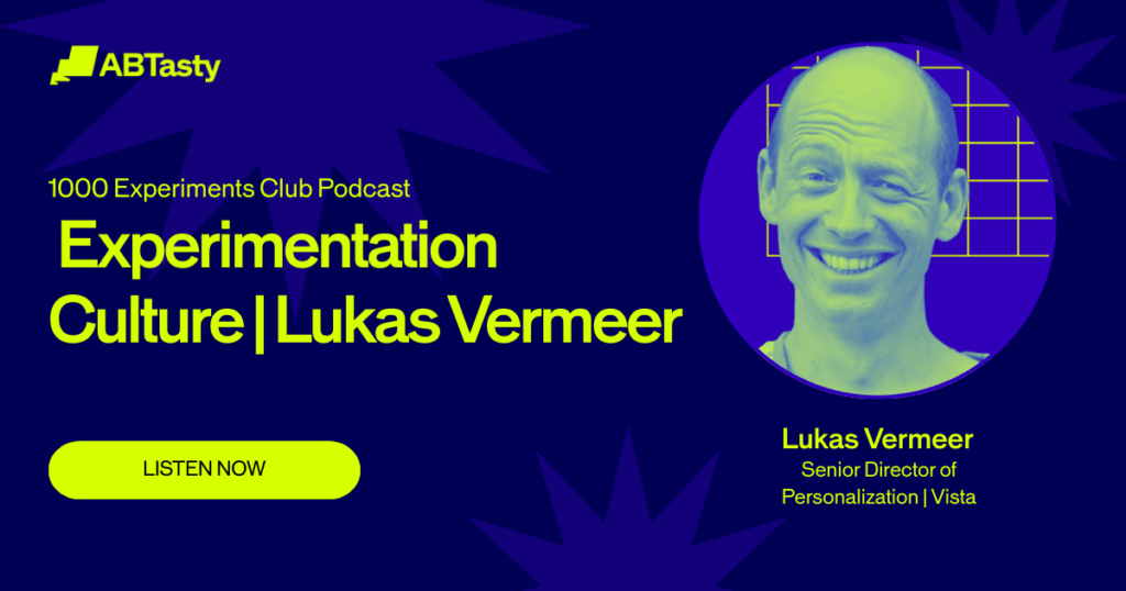
Lukas Vermeer, director of experimentation at Vista, champions testing both sides:
“A lot of the value from experimentation comes from two things: One is not shipping the bad stuff—a huge value point. The other is figuring out strategically, going forward, what you should invest in.”
If your business has reached a certain level of maturity, maximizing bothclient and server-side testing ensures your optimization efforts work as hard as they possibly can.
Customer Experience Optimization Across Industries
E-Commerce Optimization
Drive transactions and boost conversion rates through continuous experimentation. Test and optimize:
Not every website is for purchasing right then and there. Sometimes site visits are the first step on a longer journey.
Optimize for lead generation on big-ticket purchases—automotive, bedroom furniture, holiday rentals—by focusing on:
Site layout and navigation
Call-to-action placement
Access to product information
Store locator functionality
Contact forms and lead capture
Travel and Hospitality
Travel offers a range of solutions—from individual bookings (hotels, transport) to comprehensive packages. When bundling items together, finding that pricing sweet spot is key.
Server-side testing is particularly relevant here. It helps you:
Curate product offerings based on user preferences
Experience optimization isn’t optional anymore—it’s how you stay competitive. Every test you run, every insight you uncover, every iteration you make moves you closer to experiences that truly resonate.
The path forward is clear: map your customer journeys, personalize boldly, test continuously, and let data guide your decisions. Whether you’re optimizing e-commerce checkout flows, refining B2B lead generation, or perfecting travel booking experiences, the principles remain the same—understand your customers deeply, remove friction relentlessly, and never stop improving.
Here’s the truth: your competitors are already optimizing. The question isn’t whether to start—it’s how fast you can move and how brave you’re willing to be with your experiments.
Digital experimentation has matured. Where A/B testing was once handled by a handful of specialists, today it’s a team sport — involving marketing, product, UX, engineering, and data. Organizations now need platforms that connect these roles, reduce friction, and enable collective decision-making.
This is where AB Tasty stands apart. More than an experimentation tool, it is a collaborative ecosystem, designed to help companies run impactful tests at scale while empowering every contributor in the process. From idea generation to final reporting, AB Tasty removes silos and strengthens alignment — a critical ingredient for a successful CRO program.
A Platform Built for Cross-Functional Workflows
Modern experimentation involves teams with different expertise and expectations. AB Tasty addresses this diversity through a unified platform that brings everyone together.
1. Clear Governance and Team-Based Visibility
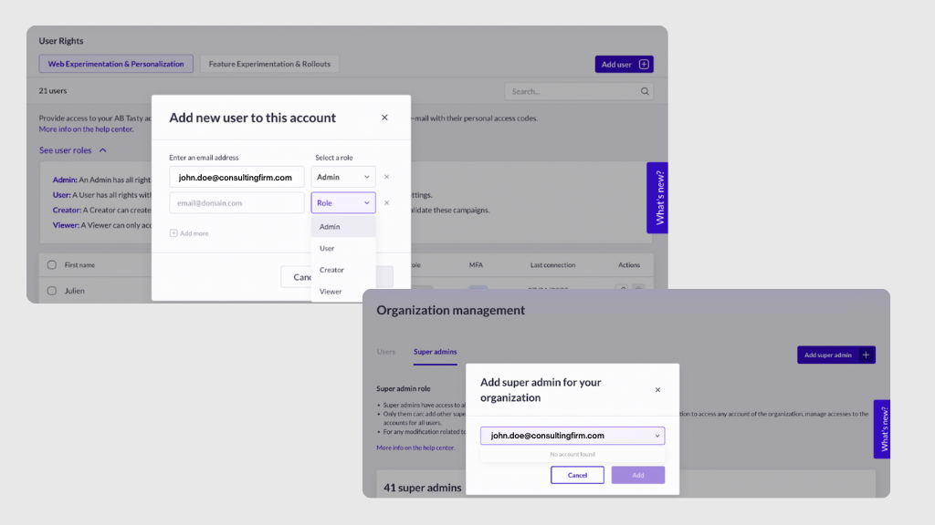
Large organizations often struggle with visibility: too many tests, too many markets, too much noise. AB Tasty’s advanced RBAC system solves this by assigning precise roles and allowing teams to create custom folders and views. A French editor only sees French campaigns; a central CRO manager sees everything; a developer accesses only what they need.
This structure reduces operational clutter and protects the integrity of local workflows, while still enabling global oversight.
2. Collaboration at Every Step of the Experiment Lifecycle
Where AB Tasty excels is its ability to facilitate teamwork throughout the entire testing process.
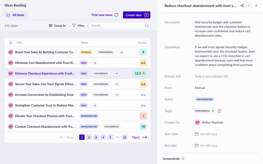
Before a Campaign
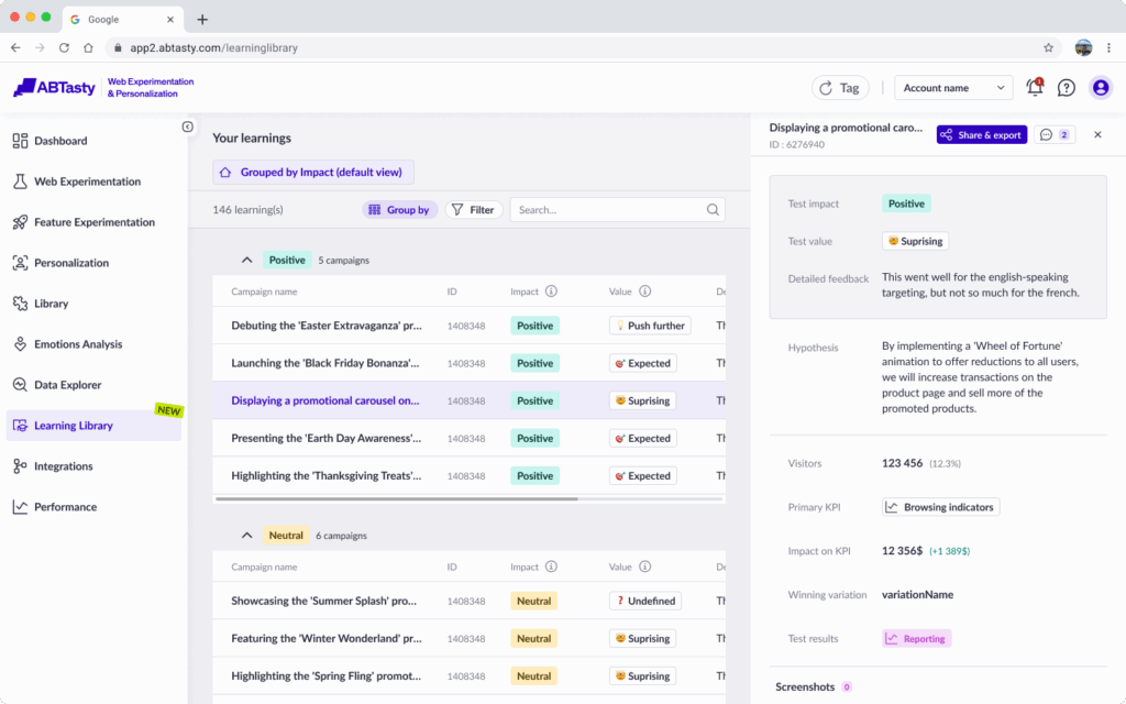
Teams use the Ideas Backlog to surface opportunities and prioritize them together, while the Learnings Library accelerates strategy by making past learnings accessible across markets—and ensures those insights are continuously built upon. Unlike static archives, the Learnings Library is designed to be iterative: every experiment, whether a win or a “failed” test, adds to a living repository that evolves with each new insight, helping teams refine and improve their strategies over time.
During a Campaign
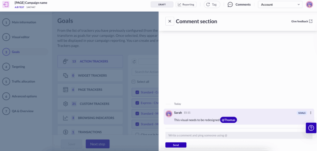
The no-code visual editor empowers marketers, while developers leverage VS Code. Comments can be added anywhere — in the editor, creation flow, or reports — with tagged users notified instantly. Preview and QA links make cross-team collaboration effortless.
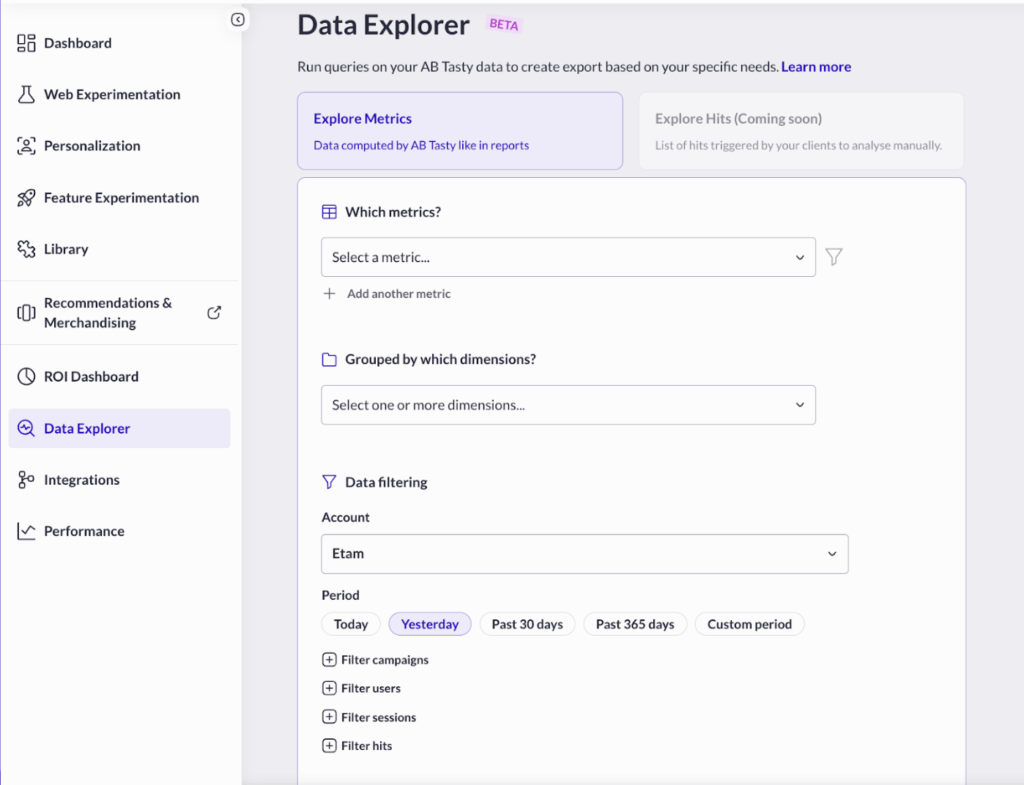
After a Campaign
AB Tasty’s segmentation features and its powerful Data Explorer allow analysts to go deep, while marketing teams can still interpret results intuitively. Reports can be shared externally via secure links or exported automatically to Notion, BI systems, or Slack channels. Visibility becomes effortless and organization-wide.
After a campaign concludes, the true value of the Learnings Library comes into play. Instead of letting critical insights disappear with team turnover or get buried in forgotten files, the Learnings Library transforms every campaign’s results—both qualitative and quantitative—into a permanent, searchable company asset.
Teams can capture not just what happened, but why. This means that even as teams and agencies change, the knowledge stays put—enabling new hires to hit the ground running and decision-makers to build on a growing foundation of proven insights, campaign after campaign.
3. Deep Integrations Strengthen Collective Intelligence
Collaboration is not limited to the experimentation platform itself. AB Tasty integrates with tools teams already use daily:
Slack: receive notifications when campaigns go live or when new learnings are added
Notion: synchronize campaign KPIs and reports automatically into team workspaces
BigQuery, Looker, Metabase: power custom dashboards
GA4, Contentsquare, FullStory: enrich analysis with behavioral and analytics data
And with Microsoft Teams coming soon, AB Tasty is extending its collaborative reach even further.
4. A True “One Platform” for Experimentation, Personalization, and Feature Rollouts
Cross-team alignment is reinforced by AB Tasty’s unique combination of client-side experimentation and Feature Experimentation & Rollout (FE&R). Product teams and engineers can gradually deploy new features, run server-side tests, and secure releases through progressive rollout and rollback automation. Meanwhile, marketing and CRO teams continue to run client-side tests on the same unified platform.
Everyone operates within the same environment, driving shared KPIs and shared business outcomes. And this collaborative foundation is amplified by Evi — AB Tasty’s evidence-based AI agent.
5. How Evi Enhances Collaboration Throughout the Experiment Lifecycle
Evi acts as a shared intelligence layer that supports every role involved in experimentation — ensuring alignment, speed, and evidence-based decisions at every step.
Before launching a test
Evi Ideas generates new experiment opportunities
Teams align faster on hypotheses grounded in evidence
Evi Content creates consistent messaging across markets
During the campaign
Evi provides contextual guidance directly in the workflow
Teams can iterate faster and reduce dependency loops
After the campaign
Evi Analysis turns raw results into clear, actionable insights
Everyone sees the same interpretation of data
Learnings become easier to share and apply across markets
Result: A more autonomous, aligned, and collaborative experimentation program — powered by shared intelligence rather than siloed expertise.
AB Tasty continues to strengthen its collaborative features, with upcoming developments. Stay tuned! These improvements move AB Tasty closer to its long-term vision: a platform that not only enables experimentation but also unlocks organizational intelligence.
Conclusion: Collaboration Is the New CRO Advantage
Companies win with experimentation when they democratize it — when insights circulate openly, when accountability is shared, and when tools empower collaboration instead of slowing it down.
AB Tasty doesn’t just enable experimentation; it turns it into an organizational capability. A place where teams align faster, learn continuously, and make decisions grounded in evidence rather than intuition.
In a world where speed and cross-functional execution define competitive advantage, AB Tasty provides the collaborative foundation businesses need to accelerate growth.
Danielle Harvey shares how travel customers are using different channels, why testing doesn’t always have to end in success, and how travel companies can integrate AI to provide a more engaging customer experience.
Currently Vice President, Industries, Partnerships & Emerging Products at Quantum Metric, Danielle Harvey, has a long experience in the travel industry. She also spent 11 years at one of the world’s largest hotel brands, Wyndham Hotels & Resorts, driving a data-driven approach to optimizing customer experience. With roles including digital acquisition, voice of the customer, CRM, experimentation, and digital analytics, she has a unique understanding of the travel customer journey.
Danielle Harvey spoke with AB Tasty’s Head of Marketing and host of The 1000 Experiments podcast, John Hughes, about the importance of connecting channels in the travel industry, using testing to understand the customer journey, and how brands can best harness the power of AI.
Here are some of the key takeaways from their conversation.
Let customers do what they want where they want
COVID forced the travel industry to undergo an accelerated digital transformation. And travel customers now want a seamless cross-channel experience when booking. This is especially true when people frequently use different platforms at different stages of their buying journey and make multiple visits to your website before making a booking.
“We did some benchmark data and 75-80% of traffic in travel is on mobile at this point, but only about 25% of bookings are. It’s a heavy research channel, a day-of-travel channel, but not necessarily where people are comfortable purchasing yet,” says Danielle.
Enabling customers to transact in their channel of preference and connecting different channels therefore becomes vital. This provides immediate benefits for the customer but also operational efficiencies for providers.
Omnichannel may have been little more than a buzzword a few years ago. But with the true adoption of digital technology and improved methods of data collection, connecting those experiences is becoming more of a reality.
“A lot of travel can still be pretty siloed, but your customers don’t care,” explains Danielle. “They expect that your teams are speaking to each other, that there’s an overarching strategy.”
10 essential ideas to help travel brands win bigger.
Even flat and failed tests can be learning experiences
Testing and experimentation don’t always have to be successful to provide you with valuable information to help you improve the customer experience. An example that Danielle gave was testing customer ratings and reviews on a website.
“Some of the most interesting testing I did was around reviews. Because the assumption was that if you get those out there on the site, they should really have an impact,” says Danielle.
But when almost a quarter of the people researching travel will typically visit your website as least five times before booking, it’s likely that they’re getting much of their information from other sources.
“It was always interesting that whenever we tried testing reviews, they didn’t really move the needle. So, your website is often not the only place people are going to go for information,” notes Danielle.
But this flat result helped drive the realization that while adding reviews might not have a direct financial impact, they were important for transparency. And at the same time, they made things easier for the customer.
And just because a test has failed, that doesn’t mean it shouldn’t help to inform your strategy going forward. The key is to try and understand what happened and learn from that.
“Over time, I would typically see a 50/50 win to fail rate. But my focus on failed tests was always what do we learn from this, digging into the reason why it failed and then building a pipeline of testing and experimentation off of that,” says Danielle.
Use AI to improve the customer experience
AI-powered tools can create time efficiencies for travel providers and provide valuable context about customer intent. And many travel brands are using AI to help their employees service the customer faster.
“We’re doing some cool stuff at Quantum where an AI chat component will send a summary to a support agent who can immediately see what the customer was trying to do, rather than putting the burden on the customer to repeat themselves,” explains Danielle.
Integrating AI can also be extremely valuable for people involved in testing and experimentation.
“A lot of the excitement around AI, especially in things like personalization, is that you don’t need to come up with ideas yourself and test them, but ideally some of that is automated for you,” says Danielle.
If you launch a test and don’t specifically track certain behaviors, for example, it’s often hard to know how a user might interact with it. By using AI to auto capture data, you can watch what users did and use heat maps to see where they were engaging.
There’s also an increasing focus from both customers and travel providers on self-service. But many brands are still hesitant to have a lot of AI facing the customer. The key is finding the right balance.
“The unique thing with travel and hospitality is there is always a human element. You don’t want to digitize it completely,” advises Danielle. “You’re ideally delivering a nice experience as well.”
What else can you learn from our conversation with Danielle Harvey?
The long-haul effect: How the travel customer journey differs from that of e-commerce.
Voice of the customer: The importance of turning qualitative feedback into quantitative data.
On brand: Some of the challenges involved in testing across different brand websites
Experience over things: Why travel will continue to be a priority for many people going forward even though it might look different.
About Danielle Harvey
Danielle Harvey is Vice President, Industries, Partnerships & Emerging Products at Quantum Metric. Passionate about the travel industry, she spent 11 years prior to this leading digital and analytic teams at Wyndham Hotels & Resorts and has also worked for the Avis Budget Group.
About 1,000 Experiments Club
The 1,000 Experiments Club is an AB Tasty-produced podcast hosted by John Hughes, Head of Marketing at AB Tasty. Join John as he sits down with the experts in the world of experimentation to uncover their insights into what it takes to build and run successful experimentation programs.
The Problem: The High Cost of Experimentation Amnesia
In digital optimization, we often obsess over velocity—how fast can we test? But this focus masks a deeper, more expensive problem: Experimentation Amnesia.
At AB Tasty, an analysis of over 1.5 million campaigns revealed a startling trend. While thousands of tests are launched daily, the specific context—why a test won, what surprised us, and the strategic lesson learned—often evaporates the moment the campaign ends.
It vanishes into a 250-slide PowerPoint deck that no one opens again. It disappears into a Slack thread. Or, most painfully, it walks out the door when your CRO Manager or agency partner moves on to their next opportunity.
If you are running tests but not archiving the insights in a retrievable way, you aren’t building a program; you’re just running in circles. It’s time to shift your focus from Execution to Knowledge Management.
The Hidden Cost of “One-and-Done” Testing
The digital industry is notorious for its high turnover. On average, internal digital teams change every 18 months and agencies rotate every two years.
In traditional workflows, knowledge is tied to people, not platforms. When a key manager leaves, they take their “mental hard drive” with them.
This is the “Knowledge Drain.” It is the silent budget killer of CRO programs.
Every time you repeat a test because you couldn’t find the previous results, you are paying double for the same insight. Every time you lose the context of a winning test (i.e., you know that it won, but not why), you lose the ability to iterate and double your gains.
This is why the most mature experimentation teams are moving away from simple testing tools and adopting Program Management platforms that secure their knowledge.
The Solution? AB Tasty’s new Learnings Library.
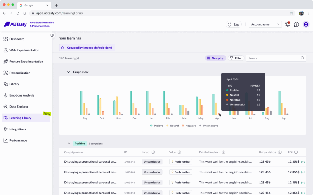
We designed this feature to serve as a centralized, searchable repository that lives directly where your experiments do. It acts as the institutional memory of your digital team, ensuring that every test—whether a massive win or a “flat” result—contributes to a permanent asset library.
Context is King: Why AI Can’t Replace the Human “Why”
In an era where everyone is rushing to automate everything with AI, you might ask: “Why can’t an AI just write my test conclusions?”
While AI is powerful for analyzing raw numbers, it lacks business context. An AI can tell you that “Variation B increased transactions by 12%.” But it cannot tell you why that matters to your strategy.
Was that 12% expected?
Was it a shocking surprise that disproved a long-held internal belief?
Did it cannibalize another product line?
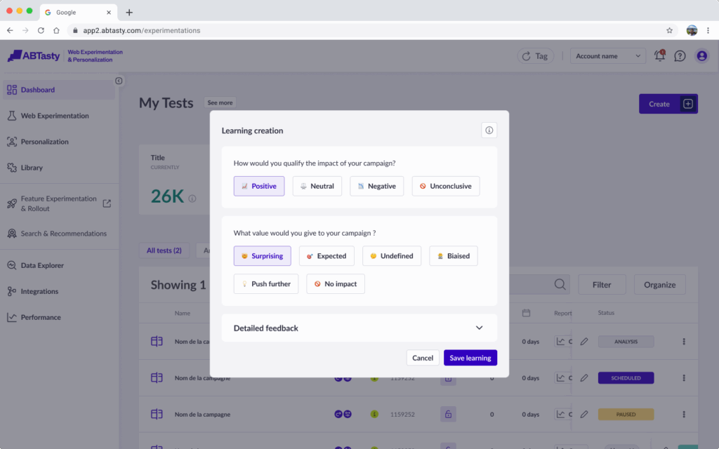
AB Tasty’s Learnings Library is designed to capture Qualitative Intelligence. It prompts your team to manually qualify results with human tags like “Surprising” or “Expected.” It asks for the narrative behind the numbers.
This human layer is critical. A “failed” test (one that produced no uplift) is often more valuable than a win, provided you document the lesson. By recording, “We learned that our users do not care about social proof on the cart page,” you create a defensive asset. You prevent future teams from wasting budget on that specific hypothesis again.
Visual History: The Power of “Before and After”
One of the biggest friction points in reporting is visual documentation. How much time does your team spend taking screenshots, cropping them, pasting them into PowerPoint, and trying to align the “Control” vs. “Variation” images?
Our Learnings Library automates this friction. It should allow you to upload your screenshots and automatically generate a Comparison View—a visual “Before and After” slide that lives alongside the data.
This visual history is vital for continuity. Two years from now, a spreadsheet number won’t spark inspiration. But seeing the exact design that drove a 20% increase in conversions? That is instant clarity for a new Designer, Developer, or Strategist.
Conclusion: Stop Renting Your Insights
If your testing history lives in the heads of your employees or on a local hard drive, you are effectively “renting” your insights. The moment that employee leaves, the lease is up, and you are back to square one.
It is time to own your knowledge.
Don’t let your next great insight slip through the cracks. Start building your library today.
FAQs: Learnings Library
What is AB Tasty’s Learnings Library?
Our Learnings Library is a centralized digital repository that archives the results, visual history, and strategic insights of every A/B test run by an organization. Unlike static spreadsheets, it connects data (uplift/downlift) with qualitative context (hypotheses and observations), transforming individual test results into a permanent, searchable company asset
How does staff turnover impact A/B testing ROI?
Staff turnover creates a “Knowledge Drain.” When optimization managers leave without a centralized system of record, they take valuable historical context with them. This forces new hires to “restart” the learning curve, often leading to redundant testing (paying for the same insight twice) and a slower velocity of innovation.
Should I document “failed” or inconclusive A/B tests?
Yes. A “failed” test is only a failure if the lesson is lost. Documenting inconclusive or negative results creates “defensive knowledge,” which prevents future teams from wasting budget on the same disproven hypotheses. A robust Learning Library treats every result as a data point that refines the customer understanding.
How do I stop my team from re-running the same A/B tests?
The most effective way to prevent redundant testing is to implement a searchable timeline of experiments that includes visual evidence (screenshots of the original vs. variation). This allows any team member to instantly verify if an idea has been tested previously, under what conditions, and what the specific outcome was.
What is the best platform for scaling a CRO program?
Scaling a program isn’t just about running more tests; it’s about running smarter tests. Unlike competitors that focus on “gadget” features (like AI text generation), AB Tasty invests in Program Management infrastructure. By combining execution with a native Knowledge Management system, AB Tasty allows your program to compound its value over time, rather than resetting every year.
Let’s be honest… Most KPI dashboards are where good intentions go to die. They’re meticulously built, packed with charts, and then they’re mostly ignored. Teams are drowning in data but starved for real insight. Why? Because the framework is broken. It’s either tracking metrics that don’t matter, it’s too slow to be useful, or it’s so complex that nobody knows what the numbers are actually telling them.
This creates a frustrating cycle. Marketing, product, and engineering teams work hard on new ideas, but they can’t prove their impact. The result is a culture of guesswork, not growth. But it doesn’t have to be this way. At AB Tasty, we see optimization as a journey of constant learning, where every experiment moves you forward. A great KPI framework is your guide on that journey. It’s not a static report; it’s a dynamic tool that turns raw data into a clear story of progress, aligns your teams around shared goals, and gives you the confidence to make the next move. It’s time to build a framework that your teams will not only use but will champion.
Step 1: Identify KPIs that are actually key
The biggest trap in measurement is vanity. We track clicks, pageviews, and time-on-page because they’re easy to see and feel like progress. But do they connect to the bottom line? Often, they don’t. A truly effective framework starts by asking the big questions first. What are the core outcomes that drive our business forward?
Forget the firehose of data for a moment and focus on your ultimate destination. Are you trying to:
Increase customer lifetime value?
Improve user retention and reduce churn?
Boost average order value?
Drive qualified leads for the sales team?
Once you have your high-level business objective, you can work backward to identify the Key Performance Indicators (KPIs) that directly influence it. These are your true north stars. If your goal is to grow revenue from your e-commerce platform, your key indicators aren’t just traffic numbers. They’re metrics like purchase rate, average order value (AOV), and overall revenue.
This is why we’ve built our platform with these meaningful goals in mind. Right out of the box, you can set up goals in AB Tasty that cut straight to business impact. These include:
Transaction goals, such as AOV, purchase rate, and revenue.
Action tracking, which measures critical user interactions like clicks, scroll depth, and element visibility.
Browsing behavior, to understand revisits, bounces, and pageviews in a meaningful context.
By starting with KPIs that are directly tied to business outcomes, you create a shared language. Your product team’s experiments with the checkout flow, marketing’s new campaign, and the CRO team’s homepage tests all point toward the same measurable goal. You’re no longer just running tests; you’re driving tangible progress.
Step 2: Measure what makes you unique with custom metrics
Standard metrics are a great starting point, but your business isn’t standard. Your user journey has unique steps, critical interactions, and “aha!” moments that generic KPIs will never capture. Maybe it’s a customer using your product configurator, engaging with a new video series, or filling out a multi-step form. These are the interactions that define your unique customer experience, and you need to measure them.
This is where the grit comes in. It takes determination to go beyond the easy-to-track metrics and measure what truly matters. Custom metrics allow you to translate your unique business logic into trackable data points. They answer specific questions like:
“Did users who interacted with our new sizing guide convert at a higher rate?”
“How many people clicked on the ‘request a demo’ button after watching our new feature video?”
“What percentage of users completed all three steps of our new onboarding flow?”
You shouldn’t have to change your user experience to fit your analytics tool. Your tool should adapt to you. That’s why in AB Tasty, you can create Custom Trackings that are directly linked to the DataLayer on your site. This lets you build metrics based on your specific data. You can also create custom trackers with JavaScript, giving your team the flexibility to measure virtually any interaction. It’s even possible to use these custom tracking events to replicate goals from other platforms, like GA4, ensuring consistency across your entire analytics stack.
When you measure what makes you unique, you get insights that your competitors can’t see. You start understanding the why behind the what, turning your data from a simple report into a competitive advantage.
Step 3: Leverage real-time reporting to act fast
The pace of digital is relentless. An insight that’s a week old is already history. For optimization to be effective, the feedback loop between action and insight needs to be as short as possible. If your team has to wait days or weeks for a report on their latest experiment, they’ve already lost momentum. The opportunity to pivot, iterate, or double down on a winner has passed.
A culture of improvement requires a flow of constant learning. This is where real-time reporting becomes essential. When you can see the impact of your changes as they happen, you empower your teams to be proactive, not reactive. They can spot a problem with a new release within minutes, not days. They can see a winning variation pull ahead and make a confident decision to roll it out to all users, capturing its value immediately.
We know that speed is critical. That’s why AB Tasty offers real-time reporting that automatically activates when you push a campaign live. During the initial, most critical phase of a test (up to 1,000 unique visitors or the first 12 hours), your data for every goal and variation is updated every five minutes. We also provide a Live Hits monitoring tool so you can track event data at any moment. This closes the gap between an idea and its outcome, allowing your teams to make smarter, faster decisions fueled by up-to-the-minute data.
Step 4: Understand confidence to make confident decisions
You’ve run a test, and variation B is outperforming the original by 5%. Is it time to celebrate and deploy it to everyone? This is where many teams get stuck. They see a positive lift but are paralyzed by uncertainty. What if it’s just random chance? How “sure” do we have to be?
This is the final, crucial piece of the framework: understanding the story your statistics are telling you. You don’t need to be a data scientist to make a good call, but you do need tools that present statistical confidence in a clear and actionable way.
At AB Tasty, we use Bayesian statistics, which provides direct and intuitive probability statements. Instead of just a confusing p-value, we give you two key things:
The chance to win: This is a straightforward probability that tells you how likely it is that a variation is better than the original. A 98% chance to win means there’s a 98% probability that the variation is the true winner.
A 95% confidence interval: Think of this as a “range of likely outcomes.” If the confidence interval for the gain is [+2%, +8%], we are 95% confident that the true, long-term uplift from this variation is somewhere between 2% and 8%. The remaining 5% represents the margin of error.
This approach removes the ambiguity. It equips your team with the conviction they need to make decisions. It’s not about being 100% certain; it’s about understanding the probability and the potential impact, allowing you to make a calculated business decision. It’s the insightfully sharp wisdom that turns a good idea into proven progress.
Conclusion: Find your better
A KPI framework is so much more than a dashboard. It’s a reflection of your strategy, a tool for alignment, and the engine of your experimentation culture. When you focus on what matters, measure your unique journey, act on insights in real-time, and make decisions with confidence, you create a powerful cycle of continuous improvement.
You stop guessing and start knowing. Your teams feel empowered because they can see the direct impact of their brave ideas. You build a culture that doesn’t just celebrate the wins but learns from every single test. You start your journey to “Find your better.” Your data is already telling this story. It’s time to build the framework that lets you read it.
Frequently Asked Questions (FAQ)
What’s the difference between a KPI and a metric?
Think of it this way: a metric measures a process, but a KPI measures performance against a key business objective. For example, “website traffic” is a metric. But “conversion rate from organic traffic,” when your goal is to increase online sales, is a KPI. All KPIs are metrics, but not all metrics are KPIs.
How many KPIs should we track?
Less is more. A framework with 25 KPIs is a list, not a focus. Aim to identify 3-5 primary KPIs for each major business objective. This forces you to prioritize what truly drives the business forward and keeps your teams from getting lost in the noise.
How do we get our teams to actually use the framework?
Adoption comes from ownership and accessibility. Involve marketing, product, and data teams in the creation process so the KPIs reflect their reality. Then, make the dashboard highly visible and easy to understand. Most importantly, celebrate the insights the framework generates, not just the successful tests. Frame it as a tool for learning, and your teams will embrace it.
What kinds of KPIs are available out of the box in AB Tasty?
You can set up goals at both an account and campaign level. The primary goal types include:
Action Tracking: Clicks, dwell time, element visibility, scroll rate.
Page Tracking: Visits to a specific page or group of pages.
Browsing Behavior: Revisit rate, bounce rate, pageviews per session.
Transaction: Average order value (AOV), purchase rate, total revenue.
DataLayer Goals: Tracking based on variables in your site’s data layer.
Can we create custom metrics?
Yes. You can create Custom Trackings linked directly to your DataLayer, allowing you to build metrics from your unique business data. You can also create custom trackers using JavaScript, which can be used to track specific interactions or even replicate goals from other platforms like GA4.
Is reporting in real-time?
Yes. Real-time reporting activates automatically when a campaign goes live. During the initial phase (the first 1,000 unique visitors or 12 hours), data for each goal and variation are updated every five minutes. We also provide a Live Hits monitoring tool to track event data at any time.
How does AB Tasty report on statistical confidence?
We provide two key figures to make decisions easier. The first is a 95% confidence interval, which gives you a likely range for the true value of the gain. The second is the Chance to Win, which is a direct probability that one variation is better than the other. We use a Bayesian statistical model because it provides these intuitive, actionable results that are easier for teams to understand and act on.
What’s the difference between client-side and server-side testing?
Client-side testing happens in the user’s browser and is ideal for marketing and CRO teams to quickly test visual changes, copy, and layouts without needing developer support. Server-side testing happens on the web server, which is better for product and engineering teams to test more complex functionality, new features, and omnichannel experiences. AB Tasty’s unified platform supports both, allowing teams to work from a single place.
How do we measure the impact of personalization on KPIs?
The key is to always test your personalization efforts. Run an A/B test where Group A sees the standard experience and Group B sees the personalized experience. By comparing the KPIs for both groups—such as conversion rate, AOV, or engagement—you can directly attribute any uplift to your personalization strategy and prove its ROI.
No Compromise with Security: AB Tasty’s Commitment to Safe Experimentation
At AB Tasty, we believe security should never be an afterthought. That’s why we’ve taken a major step forward by removing the use of JavaScript’s eval() function from our platform.
While eval() was once a common way to execute dynamic code for A/B testing, it’s now widely recognized as a security risk—vulnerable to code injection attacks and often blocked by strict Content Security Policies (CSPs).
What does this mean for you?
Our platform is now fully compatible with even the strictest CSPs.
The risk of code injection and related vulnerabilities is dramatically reduced.
You get a safer, more robust experimentation environment—no exceptions or workarounds needed.
What Is eval() and Why Is It Considered Unsafe?
eval() is a native JavaScript function that takes a string of code and executes it as if it were written directly in the script. This flexibility makes it convenient for scenarios where dynamic execution is needed—such as A/B testing, where variations are generated on the fly. However, eval() is often considered a security risk because:
It executes code without validation, making it a potential gateway for malicious scripts.
It is vulnerable to code injection attacks, which can compromise a website’s security.
Many modern security policies, including Content Security Policies (CSPs), explicitly prohibit or restrict the use of eval().
Security at Every Level
Our commitment to security goes far beyond code execution. Here’s how we keep your data and your business safe:
Data Protection: All data is encrypted in transit and stored securely on Google Cloud infrastructure.
Access Management: Only a select, authorized team can access customer data, with all access logged and regularly reviewed.
Authentication & Permissions: We support strong password policies, multi-factor authentication, and role-based access control.
Security-conscious businesses now have an additional reason to choose AB Tasty over other Customer Experience Optimization providers. While some major providers still rely on eval(), our eval()-free approach offers a safer alternative without compromising performance.
By proactively adapting to modern security standards, AB Tasty ensures that our clients can run experiments without worrying about security vulnerabilities or policy restrictions.
The Future of Secure A/B Testing
Security and performance go hand in hand. At AB Tasty, we continuously evolve to meet the highest standards of safety and efficiency. Removing eval() is just one of the many steps we take to provide a secure, high-performance CRO experience.
If you’re looking for a compliant, secure, and high-performing experimentation platform, AB Tasty is the solution. Contact us today to learn more about how we can help you optimize your website—safely and effectively.
FAQs about security and privacy at AB Tasty:
Why is the removal of eval() important for security?
eval() can execute any code, making it a target for code injection attacks. By removing it, AB Tasty eliminates a major security risk and ensures compatibility with strict Content Security Policies.
Will this change affect the performance or flexibility of my experiments?
No. The processing is fully optimized on AB Tasty’s side and completely transparent for you. Tests remain fast, lightweight, and without any impact on page performance.
Do we need to do anything on our IT side?
Nothing at all. No CSP rule to adjust. Integration is now simpler than ever.
What makes AB Tasty more secure than other A/B testing platforms?
AB Tasty has eliminated the use of JavaScript’s eval() function, reducing the risk of code injection and making our platform fully compatible with strict Content Security Policies (CSPs). We also use strong encryption, access controls, and regular security audits.
How does AB Tasty compare to other A/B testing tools like Optimizely or VWO in terms of security?
Unlike some competitors, AB Tasty does not require exceptions for unsafe code execution, making it easier to deploy in secure environments and reducing risk.
On November 13th, AB Tasty brought together over 40 customers, partners, and digital experience leaders in New York City for Experience Next NYC. The event was a celebration of innovation, community, and the future of experimentation and personalization.
Spotlight on Customer Presentations
A highlight of the day was hearing directly from three standout brands, each sharing their unique journeys and results with AB Tasty:
1. Five Below Five Below showcased how they leverage experimentation to better understand their Gen Z audience and optimize the digital experience for a fast-growing, trend-driven retail environment. Their team shared practical examples of how rapid testing and data-driven decision-making have helped them stay ahead of shifting customer preferences and deliver engaging, relevant experiences at scale.
2. Physicians Mutual Physicians Mutual discussed how they leverage AB Tasty’s EmotionsAI to segment users by emotional engagement. This AI-driven tool analyzes user behavior to assign visitors to one of 10 emotional segments, enabling more precise targeting and personalization. By using EmotionsAI, Physicians Mutual can better understand and address the emotional needs of their customers, optimize digital journeys, and drive measurable results, all while maintaining compliance and trust in a regulated industry.
3. FootJoy The FootJoy team inspired the room with their story of achieving a 9 out of 10 test success rate, far above the industry average. With a small team and no prior testing background, they embraced AB Tasty’s AI-powered tools to ideate, execute, and report on experiments quickly and confidently. Their experience is a testament to how accessible, AI-driven experimentation can empower teams of any size to deliver outsized results
More Event Highlights
Hands-On Learning: Attendees got an exclusive first look at Wandz, AB Tasty’s newly acquired real-time adaptive customer experience platform. Wandz enables brands to deliver personalized experiences for the 90% of visitors who are anonymous or non-logged-in, adapting to every click, scroll, and session pattern in real time. With predictive AI, Wandz anticipates visitor intent within milliseconds, setting a new standard for personalization and helping brands achieve up to 15% revenue lift and 13.6% higher conversion rates. Showcasing how Wandz will close the gap for brands looking to engage every visitor, not just those with a known profile.
Meet Evi: The event also introduced Evi, AB Tasty’s new evidence-based marketing agent. Evi is more than just an AI assistant, it’s a suite of intelligent tools designed to empower your entire workflow, from idea generation to reporting. Evi helps teams move faster, test smarter, and turn data into strategy without the guesswork. With features like Evi Ideas, Evi Content, Evi Hypothesize, and Evi Analysis, teams can unlock data-backed inspiration, craft clear hypotheses, and deliver straightforward insights, all in one place. Early adopters are already seeing a 53% increase in campaigns launched and 33% more experiments created, making Evi a true sidekick for digital teams.
Looking Ahead
Experience Next NYC was more than just an event, it was a celebration of our global customer community’s drive to push the boundaries of digital experience. The energy and ideas shared are already translating into new collaborations and customer initiatives, and we’re excited to see how these connections will shape the future of experimentation and personalization together.
Missed the event or want to relive the highlights?
Watch the full recap video here
Stay tuned for more Experience Next events and opportunities to connect, learn, and innovate together!