Did you know it only takes users 90 seconds to form an opinion about your brand? What if we told you that they base the greater part of this assessment purely on the colors you employ? When it comes to call-to-action buttons, we tend to home in on three specific aspects: color, location, and copy. Today, we’ll guide you through… drum roll, please… the best hues for your CTAs!
That being said, what do Yoda, Kermit the Frog, and the wonderful Emerald City have in common? The color green, of course! Plenty of positive associations are linked to this color, transforming it into every run-of-the-mill marketer’s preferred choice when designing their websites.
Now, we know that when it comes to call-to-action best practices, nothing is ever black and white. Does green always prevail? What other alternatives produce the highest CTR rates? Is there truly one color to rule them all?
Let’s see if it’s CRO myth, fact, or fiction that green CTAs produce the best results.
The Power of Color Psychology
Any marketing professional worth their salt can rant for hours on end about how social proof, retargeting, and urgency are surefire ways to boost conversion rates. Yet the answer to which is the best hue to use for call-to-action buttons remains contentious.
Colors play an essential role in our day-to-day decisions by awakening a variety of unconscious impulses. If a debate about the hues of a dress was enough to break the Internet, it’s pretty obvious that they’re a vital element for defining your brand perception.
Are a product’s colors capable of compelling us to purchase one item over another? What about the ones in their logo? Or even the color of a call-to-action button? The answer is yes! If you play your cards right, you’ll find that guiding customers’ choices can be easier than you ever imagined.
How Color Psychology Influences Buying Decisions
Before we dive into the world of CTAs – and the hues that love them – let’s take a look at how, exactly, colors can affect users’ emotions.
“Painting is a blind man’s profession. He paints not what he sees, but what he feels, what he tells himself about what he has seen.”
– Pablo Picasso
Color psychology explores, in a nutshell, how the different feelings and associations each color is linked to affect the decisions people make. Marketers have been in on the secret for decades, capitalizing on this knowledge to improve purchases and optimize their personalization efforts.
There’s a variety of reasons why many companies opt for green CTA buttons: due to all of the positive associations linked to the color (it represents safety, balance, trustworthiness…), many put their money on its capability to coax jittery shoppers down the purchase funnel.
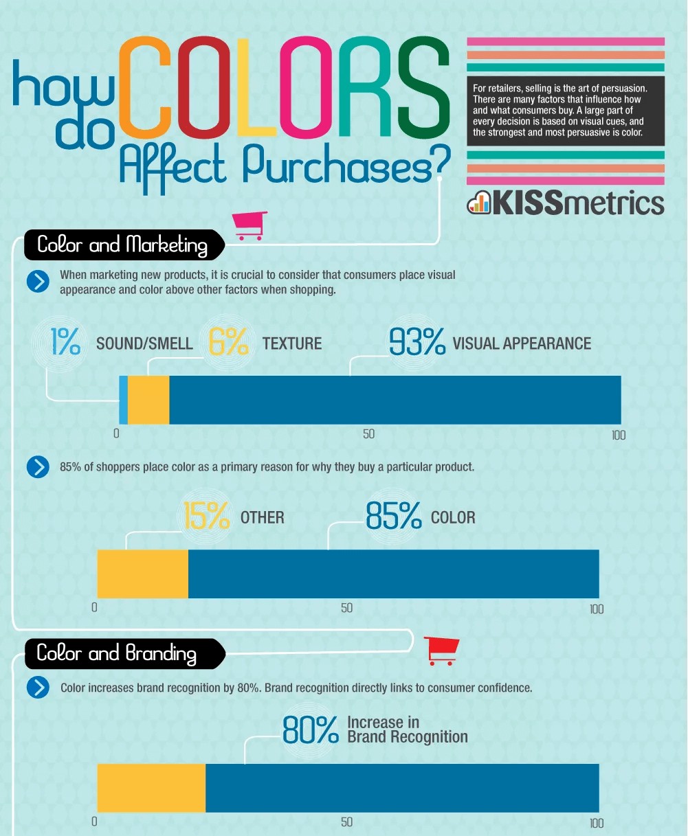
For e-commerce, persuasion is a key component for guiding users. Since we are visual creatures, a strategic design could very well be the key to a new era for your brand! This infographic from Ecommerce Nation and Kissmetrics breaks down the effect of hues on customers’ behavior:
Colors and CTAs: Best Practices
The color green rules over clickable buttons: it seems inevitable that most of the sites you visit will be littered with said shade. Day after day, we’re surrounded by constant reminders of its overwhelmingly positive associations; from traffic lights to checkmarks, users have one message drilled into their brains: in green we trust when going forward.
As we’d mentioned previously, it seems like a pretty safe bet; but before you throw caution into the wind and go with the flow, keep in mind that one size does not always fit all. Take, for example, luxury brands: when was the last time you saw a green CTA on their sites? Hard to put your finger on it, huh? That’s probably because supermarkets and discount stores transformed big green buttons into one of their main identifiers, thus forcing high-scale companies to abandon the design.
Before you take the plunge, let’s review four points to keep in mind when choosing a color for your call-to-action button:
- Context is king: Take a deep breath. Knowing how much is riding on this single decision makes deciding seem like a daunting task – not only does it have to be appropriate for your buyer persona, it must also fit in with your brand’s colors, the website’s design… And, on top of that, it’s nearly impossible to know whether the new CTA is behind the increase in conversions! Thankfully, you can always turn towards A/B testing to significantly optimize your efforts and get data-driven, conclusive evidence.
- Make sure it pops: How can you catch your visitor’s eye? With a call-to-action button that stands out, of course! Increasing the contrast can be a good idea and is likely to increase conversion rates. Complementary colors (the one which is placed on the opposite side of the color wheel from your dominant color) and triadic colors (one of two placed one-third of the way from your dominant color on the color wheel) are your best bet.
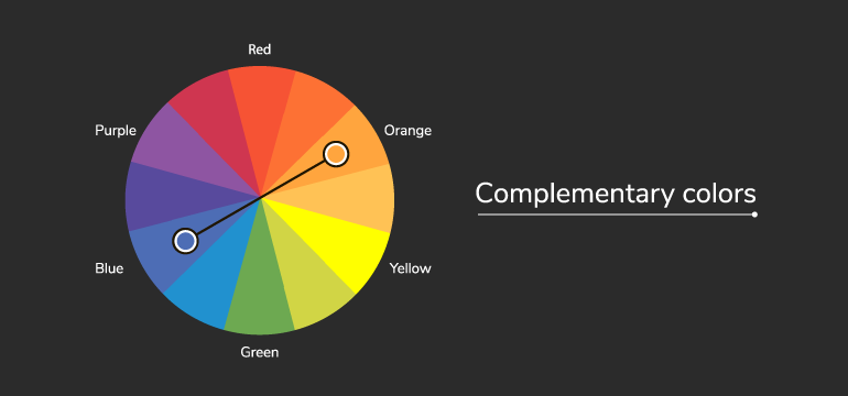
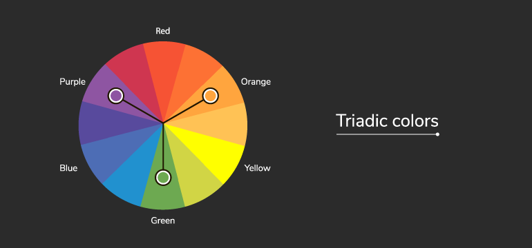
- Coherent designs: Marketers can play with the meanings that customers associate with certain colors. One common example is the use of blue tones for hyperlinks – the link (pardon the pun ☺) between the two makes us assume, automatically, that said text will direct us to another site. Due to this, it’s crucial to follow those guidelines for every single page on your website: respect the colors employed for each action and remember that happy websites equal happy users.
- Keep it simple: How many times have you encountered mismatching, aggravating and downright jarring colors on a website? These careless attempts from lazy marketers do manage to capture their users’ attention… for mere seconds, after which their design spirals into a bottomless pit of damaged credibility and brand images. Invest in your design, and watch the conversions come rolling in!
Conclusion: Which Color Converts the Best?
A call-to-action button may be one of many elements in any successful CRO strategy – but it’s a crucial one, nonetheless. Bear in mind that every website is unique – as a result, the colors which will work best for each one will vary! What may double or even triple your transactions may be a flop for your competitors. Oh, what’s a marketer to do?
Bear in mind that the basic principles of color psychology (for example, green incites feelings of confidence, health, movement…) can be used as a starting point for your hypotheses. You need to test and see if this principle applies well to your particular audience and website, taking into account your website design and graphic guidelines (will the color stand out enough? Will it clash or fit in nicely?); your brand’s context (take, for instance, the aforementioned example of green CTAs being associated with grocery stores and, as a result, being shunned by luxury brands); and your audience (each culture interprets colors differently, so it’s important to take your users into account when designing your site).
In any case, if you’re feeling a bit overwhelmed about how to use colors for your call-to-action buttons (and which ones to choose), you have nothing to fear: A/B testing has got your back! Even though it’s a myth to believe green CTAs will always work better, you can use them as a solid starting point for your tests since they can often work!
CRO Myth Busters is a mini series for conversion rate optimization professionals. We take a quick look at commonly held CRO beliefs and determine if they’re true, sometimes true, or simply CRO myths!


