


The conversion rate on e-commerce homepages is around 2-2.5% on average, according to a study from Adobe Business, while the conversion rate for visitors who land directly on a product page is around 7%.
Can you see the difference between these two types of pages?
Product pages are one of the most essential pages to continually optimize if you want to focus on boosting your e-commerce conversions.
In this article, we will be touching on what a successful e-commerce page looks like, five elements to focus on while optimizing your pages, and ten examples of effective product pages in action.
Let’s dive in.
What does a successful e-commerce product page look like?
Across all industries, the average user spends less than 54 seconds on any given page, according to a digital report from Contentsquare.
You have less than one minute to create a memorable experience and clearly display your information. For product pages, it’s clear to see why they need to be captivating.
The truth is that every second matters in the conversion journey.
So in order to capture your visitors’ attention, you’ll have to capitalize on five elements. Perfecting these elements will require testing and patience.
Want to get started on A/B testing for your product pages? AB Tasty is a great example of an A/B testing tool that allows you to quickly set up tests with low code implementation of front-end or UX changes on your web pages, gather insights via an ROI dashboard, and determine which route will increase your revenue.

The 5 mandatory elements of an effective e-commerce product page.
1. Eye-catching, engaging visuals
It’s no secret that our brains love visuals since they process images much easier and faster than text. Images give us more context.
In fact, visuals are so deeply entrenched in our decision-making mechanisms that they should be a priority for any e-commerce website.
In order to provide your visitors with some eye-catching visuals for your products, here are a few tips:
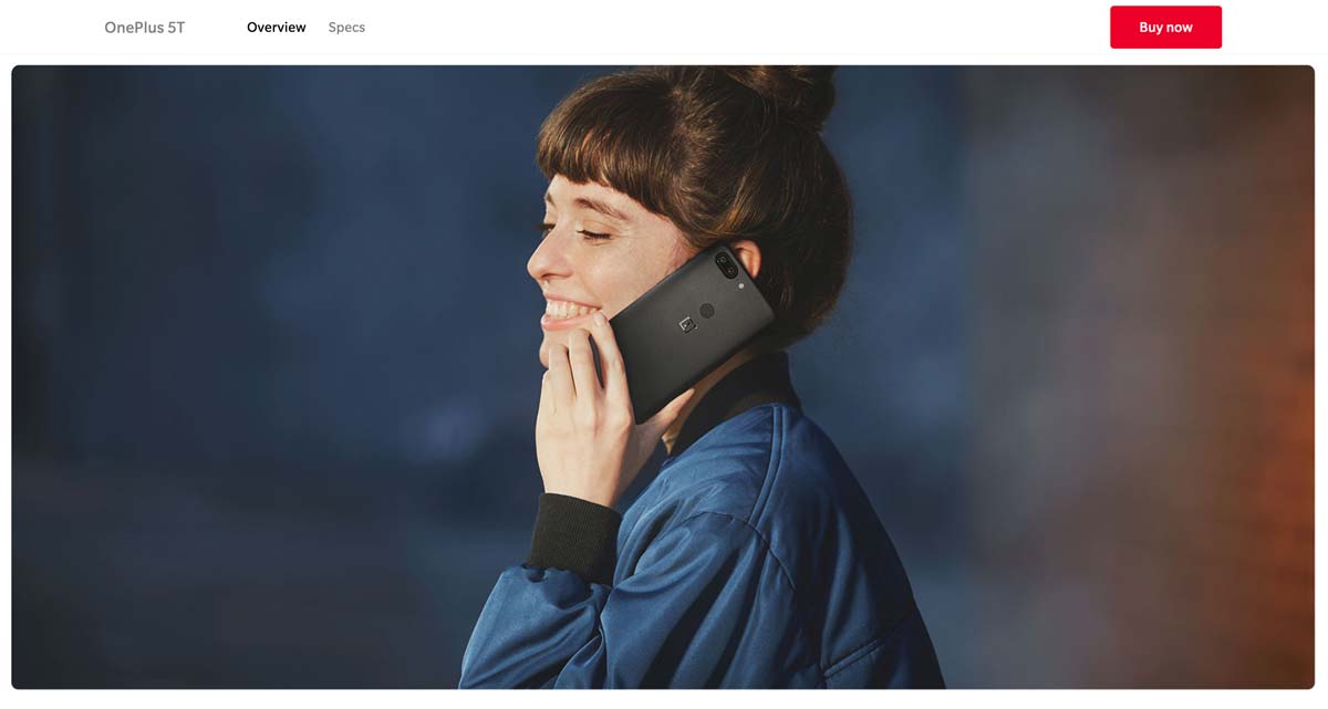
- Humanize the product
People love to envision themselves wearing or using a product. It gives them an idea of whether or not the product is a good fit for them. Thus, it’s important to remember to humanize the product to allow visitors to see themselves as potential customers.
- Use whitespace
Whitespace has many uses in graphic design, but most importantly, it helps the eye focus on what matters the most.
Adding whitespace strategically around your picture will help reduce noise and increase clarity when it comes to showcasing a complex product.
Less can be more.
- Only use HD
It goes without saying that high-definition visuals are incredibly important.
Your potential customers should be able to fall in love with your product on any screen resolution. Give them your best!
- Allow for zoom-in and zoom-out features
Many people are interested in details, especially when it comes to complex or expensive products.
Whether they’re looking for a closer glance at that little button on the side of the jacket, the texture, or the matte finish – allow your potential customers to zoom in and out on your products.
- Add videos
More engaging than photos, videos also help you tell your customers a story.
Videos can help depict why your product is superior and what they get for $200. With that being said, video-making can be costly and time-consuming, so focus your efforts on your best-sellers.
An astounding average of 56% of web traffic worldwide comes from mobile devices.
Mobile optimization has shifted from just an idea to a top priority. It’s essential to make sure that your product images and descriptions are responsive on all mobile devices.
2. A unique, awesome product description
A study led by Shotfarm showed that “detailed descriptions” ranked first in the top 3 factors that influence a customer’s decision to buy, higher than “reviews” (in the 2nd position) and “price” (in the 3rd position).
Simply put, your product descriptions should focus on their unique value proposition, i.e. their main benefit.
As you already know, an average visitor doesn’t spend too long on one page, so it’s important to be impactful.
As Neil Patel puts it, you have to sell benefits, not just features. This means that you have to emphasize the result, not the product.
Clearly, buyers are expecting to gain something from your product, and it’s your task to convince them that they will.
Let’s look at an example from Innocent:
In their product descriptions, Innocent emphasizes the few elements that make their smoothies “great” and “healthy.”
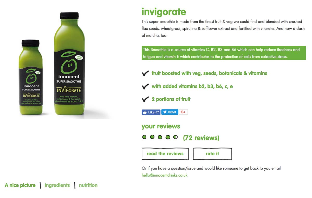 In the image above, you can see that they even highlighted in green that their smoothie is, “a source of vitamins C, B2, B3 and B6 which can help reduce tiredness and fatigue…”
3. Viral social proof
Social proof comes in many forms: reviews, customer testimonials, videos, ratings, etc.
It doesn’t matter what type of social proof you use, as long as it’s relevant to your audience.
Reviews and classic star ratings typically work well for most e-commerce websites as long as they are real and genuine, as most internet buyers are able to spot fake reviews.
4. Addictive product suggestions
Product suggestions are a great way to increase the average order value, cross-sell, upsell, and allow users to explore your products.
Therefore, it’s extremely important to display additional products on your product pages in case your visitors want to see something else.
Otherwise, you may land unqualified visitors on your product pages without giving them the opportunity to discover other products that would fit their needs.
In the image below, you can see that Pandora does a great job of suggesting related products for its customers. The outline is clear and evocative.
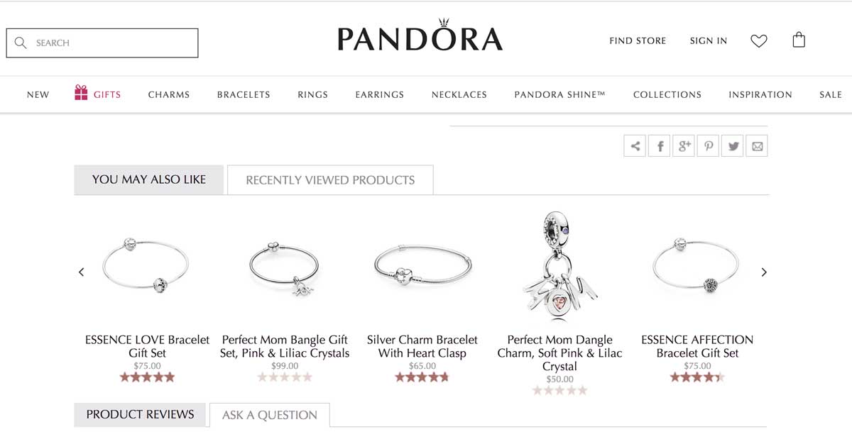
Jewelry maker Pandora does a great job at suggesting related products for its customers. The outline is clear and evocative.
5. Resourceful guidance & help
Can you guess the number one source of frustration for online buyers?
Not being able to touch or interact with the product.
To help overcome this lack of physical touch in an online buyer journey, your website should display clear information about:
- Size guides
- Specific materials
- Refund policy
- Shipping fees
- Prices and VAT
Knowing this stumbling block for many online shoppers, it’s recommended for e-commerce brands to implement a live chat feature, or at least a very detailed Q&A, to help increase conversion rates and decrease abandon cart rates.
Now that you’ve been through the best practices of e-commerce product pages, it’s time to get inspiration by browsing our selection of effective e-commerce product pages.
Note: we’ll cover examples from various industries so that you, as a leader or marketer, can find inspiration for your field.
Let’s dive into our top picks for inspiring successful e-commerce product pages.
10 of the most successful e-commerce product pages
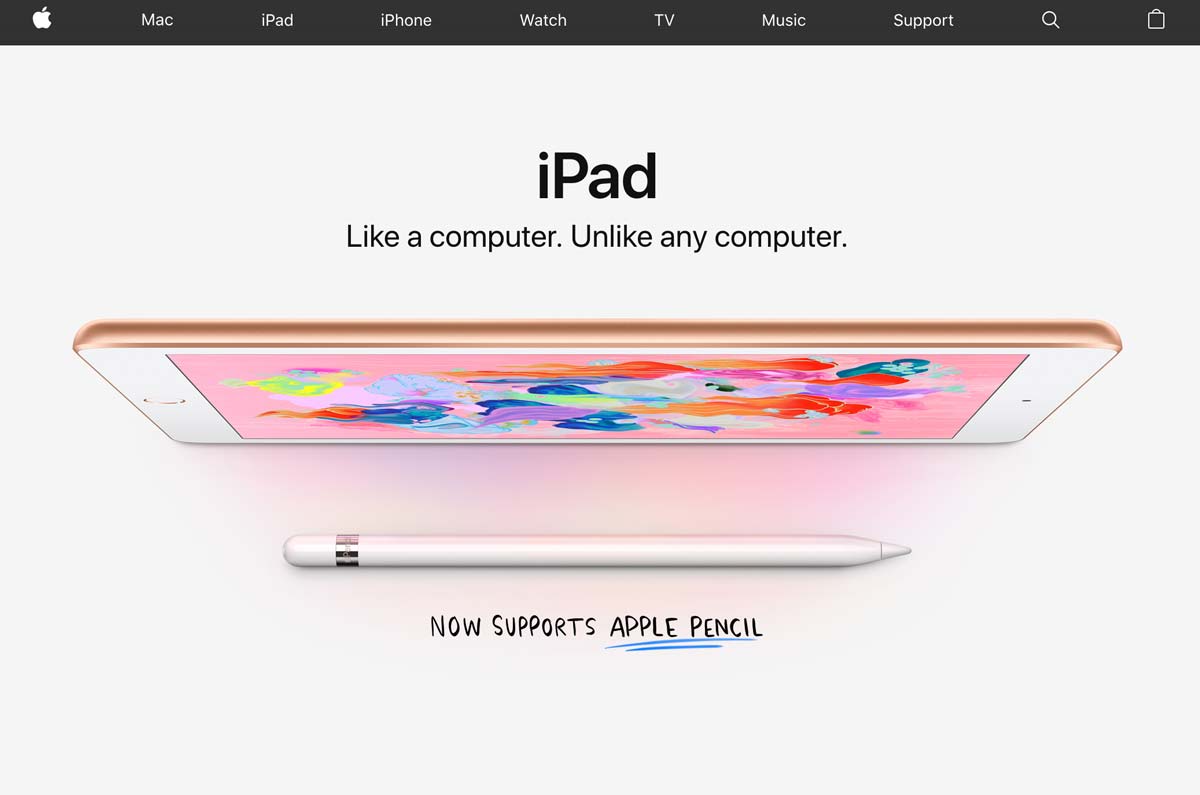
1. Apple – Technology Industry
When it comes to technology, Apple is a world-class example of best practices for e-commerce product pages.
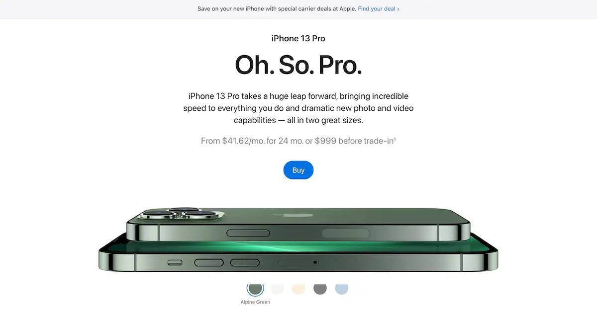
What we love:
- Clean and refined design
- The use of whitespace and large pictures
- Lovely CSS animations
- Good emphasis on benefits as you scroll down (not pictured above)
2. Transavia – Travel Industry
Transavia is a Dutch low-cost airline that is a subsidiary of the Air France-KLM group.
Their website showcases a lot of best practices to be applied to travel and airline companies.
While they’re many websites on the market, Transavia does a great job of converting visitors into travelers. Their website uses clever paths and UX design to lead you through your buyers’ journey.
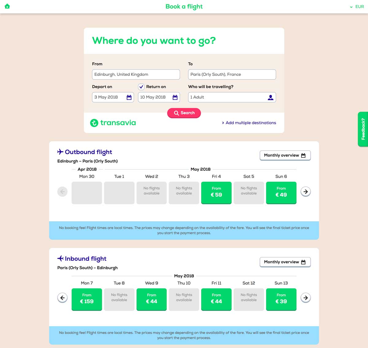
What we love:
- Engaging “3 parts” structure for clarity’s sake
- Simple visual brand identity (green and blue)
- Smart information hierarchy
- User-friendly simplified search engine
- TripAdvisor’s reviews integration
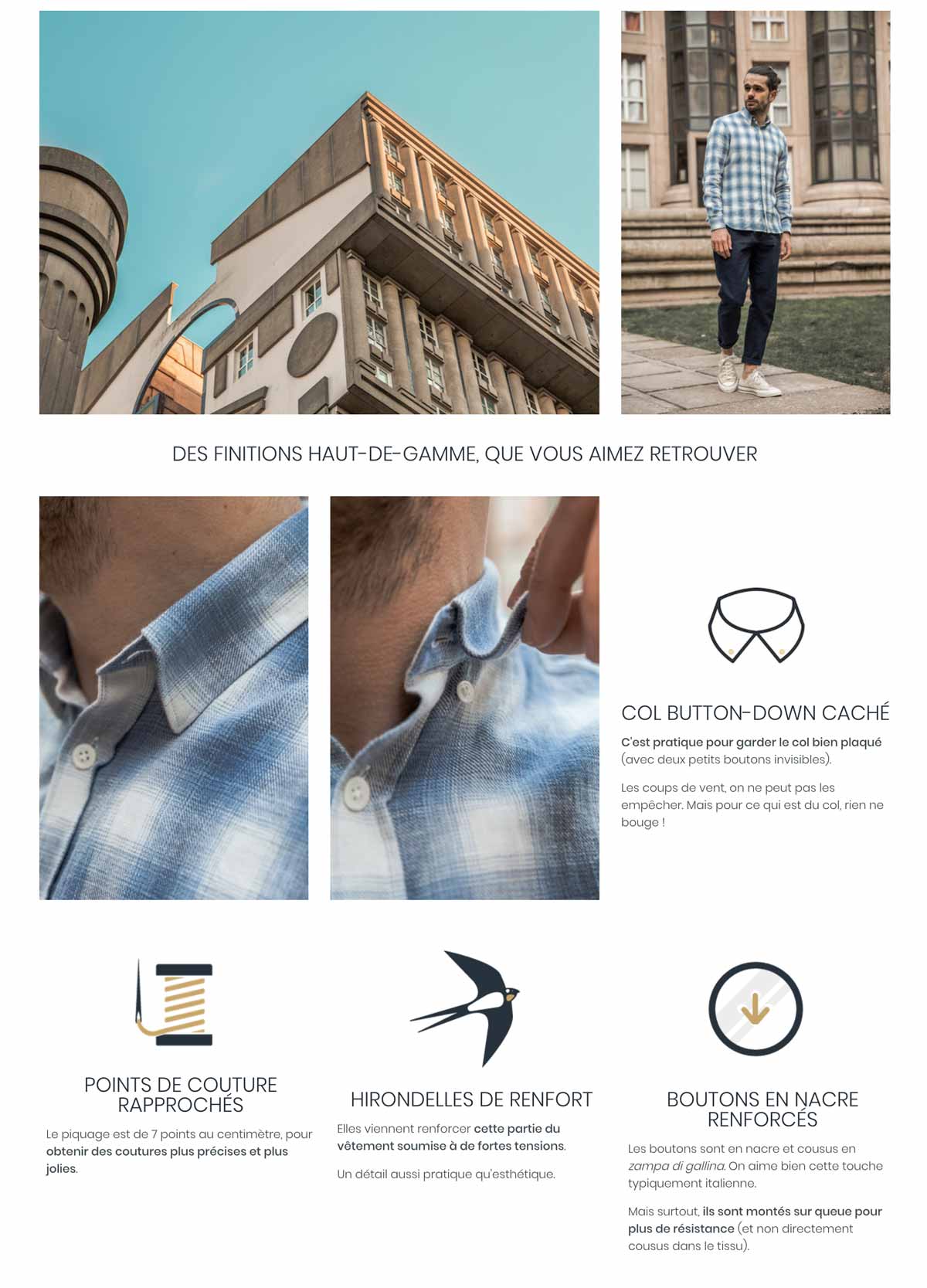
3. Bonnegueule – Fashion / Retail
BonneGueule is a French company specializing in men’s fashion.
While the company is still fairly young, it has rapidly grown into a 1M+ visitors/month e-commerce website, thanks to its amazing content marketing strategy and jaw-dropping e-commerce product pages.
Simply put, they use extremely long product pages where they cleverly use storytelling techniques, photos, and videos to justify the hefty price at which they sell their products.
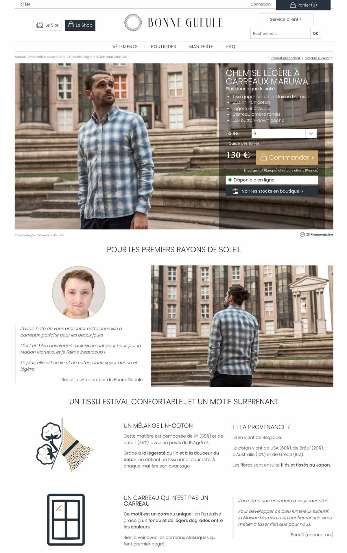
 What we love:
- They display in-store availability
- The clever size guide
- The use of “context” photos
- Amazing storytelling and videos
4. Peak Design – Fashion / Travel Accessories
Peak Design is an American e-commerce company that has successfully raised over $14M since 2011 thanks to its clever bags, pouches and travel kits made famous on Kickstarter.
Notice how clear and detailed their photos are, enhanced by the use of white space and a clear color code on the product page (black/red combo).

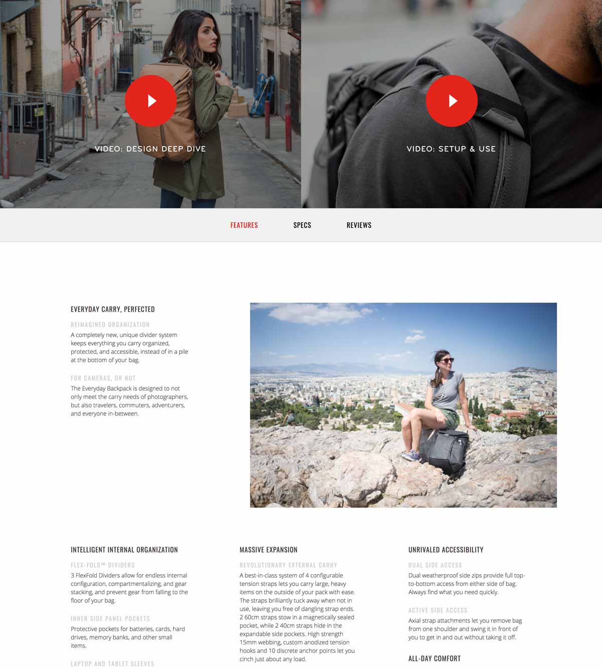
What we love:
- A clear and clever layout
- Generous photo gallery
- In-depth, 6-minute-long product video
- The emphasis put on benefits
What could be improved:
- Large text paragraphs
- Unclear information hierarchy
5. Luxyhair – Beauty
Luxyhair is an e-commerce website specializing in hair extensions – and it nails it.
The team cleverly uses a 3-step funnel prior to landing on their product page: First, you’ll start by choosing your collection, then your hair thickness, and finally your hair color.
This 3-step mechanism is a brilliant way to increase conversions by offering just the right product for any visitor.
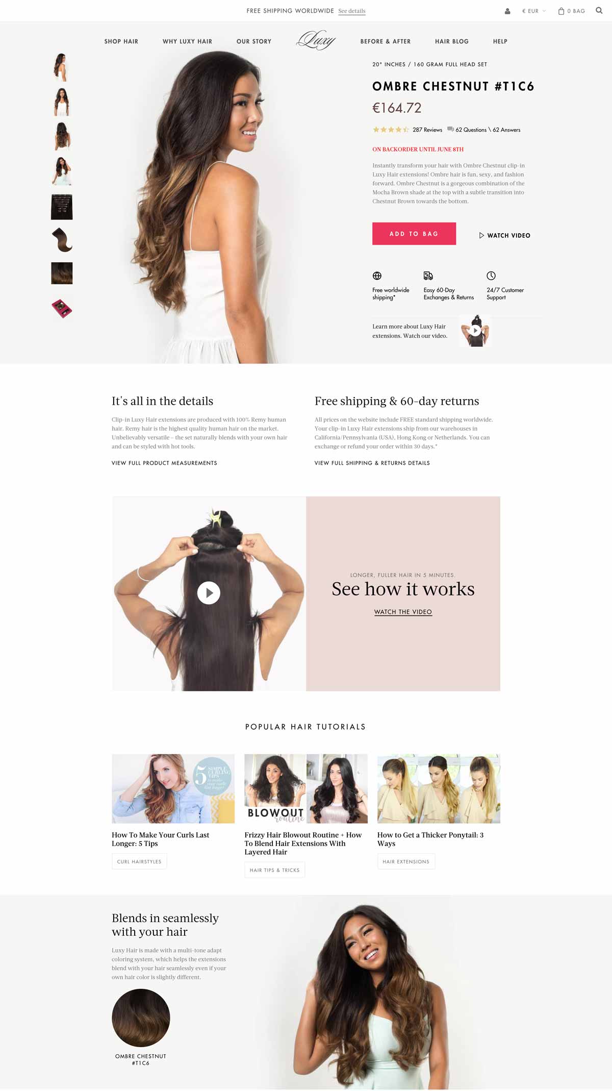
What we love:
- Seamlessly integrated product pictures
- Useful information about shipping/return policy
- Effective use of product video
- Smooth integration of additional content (tutorials)
- Complete FAQ
- Amazon-like customer reviews and Q&A
- Live-chat
6. Made.com – Home / Furniture
Made.com is a British home furniture e-commerce website renowned for its bold designs and web-to-store experience.
At first glance, you can tell that their visuals flawlessly blend with the product page. They’ve also added context-related pictures so that you can immerse yourself in the product.
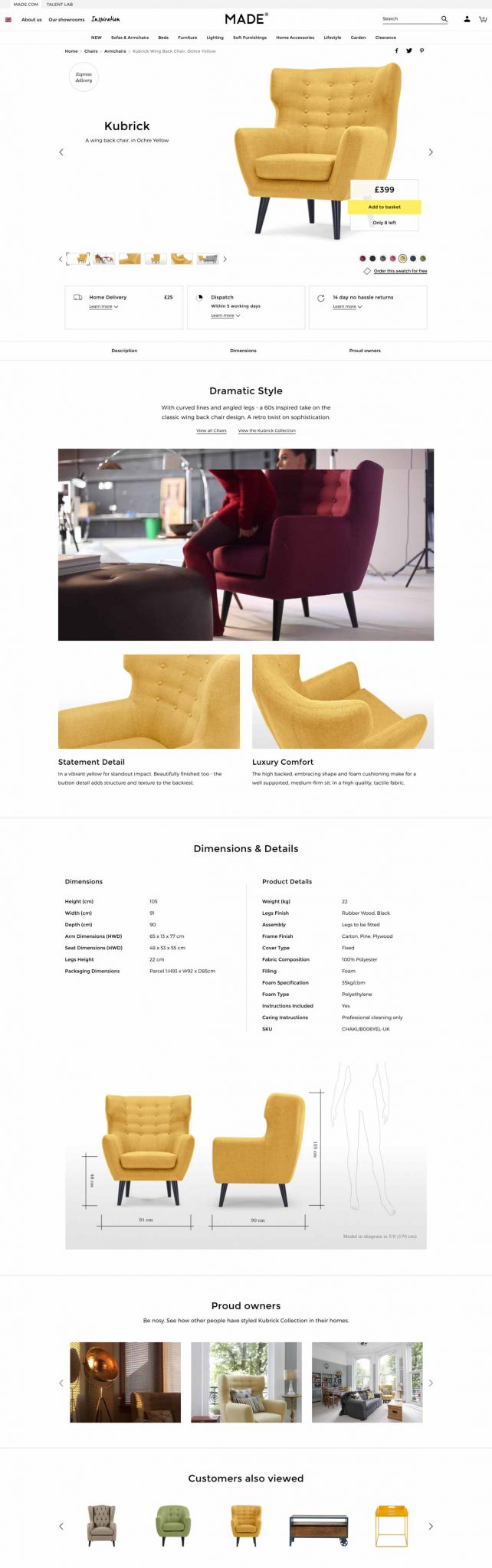
What we love:
- Clear shipping/return policy
- Stunning visuals
- Size comparison
- Smart product video
- Pictures from customers
What could be improved:
- Adding instructions for product maintenance
7. Birchbox – Beauty / Makeup
This famous, subscription-based French-American website sells monthly beauty boxes delivered to your home with personalized products based on your preferences inside.
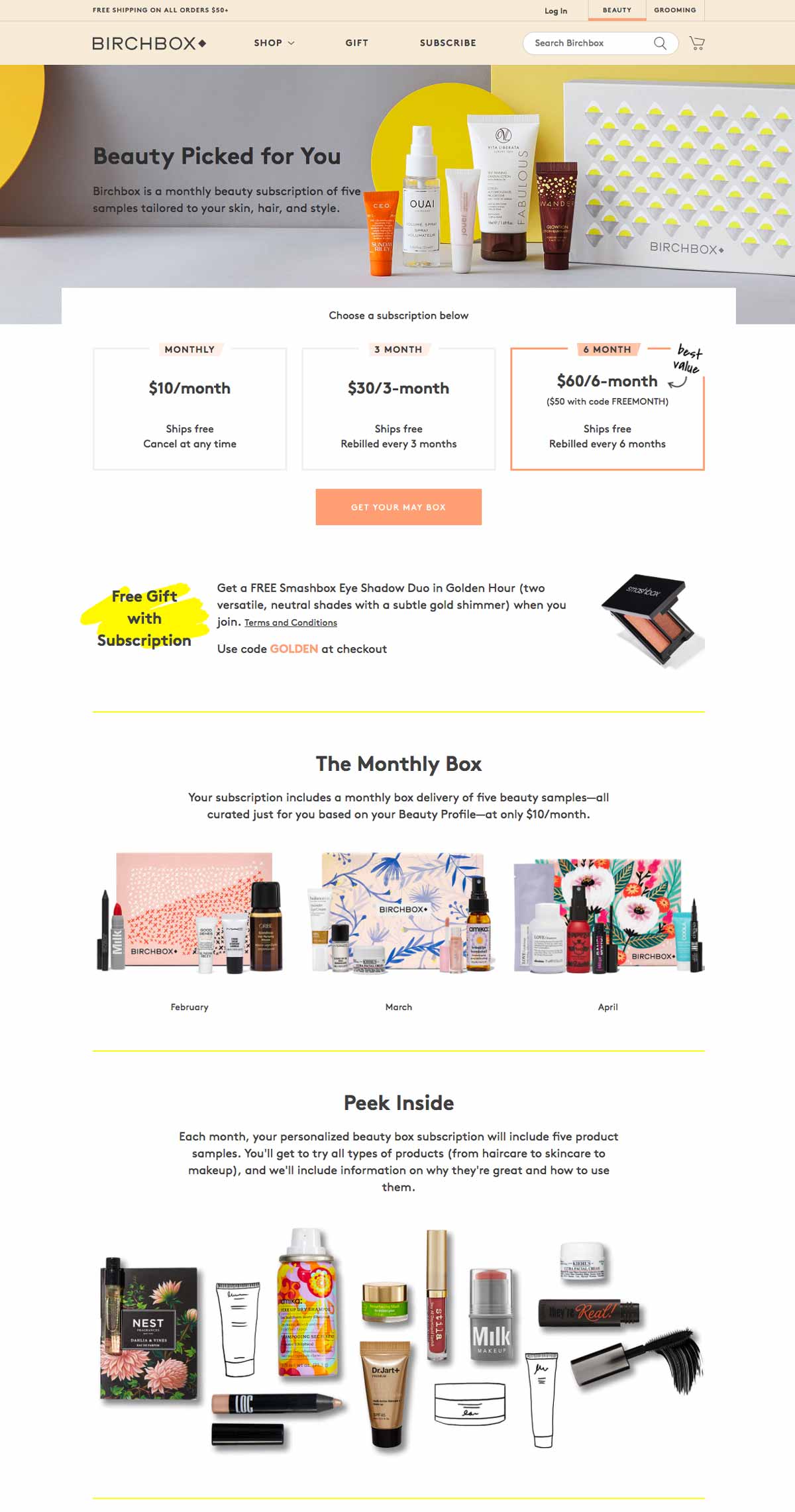
What we love:
- Simple and clean visuals
- Attractive layout and colors
- Free gift offered with subscription
- Complete FAQ
- Instagram integration: good social proof
8. Asos – Fashion / Apparel
Asos is a UK-based company that also operates in the US and in Europe.
Their pledge to provide affordable designs and fashion helped them reach significant market shares in the fashion industry in several countries.
They opted for a rather simple but neat outline that successfully conveys their brand image.
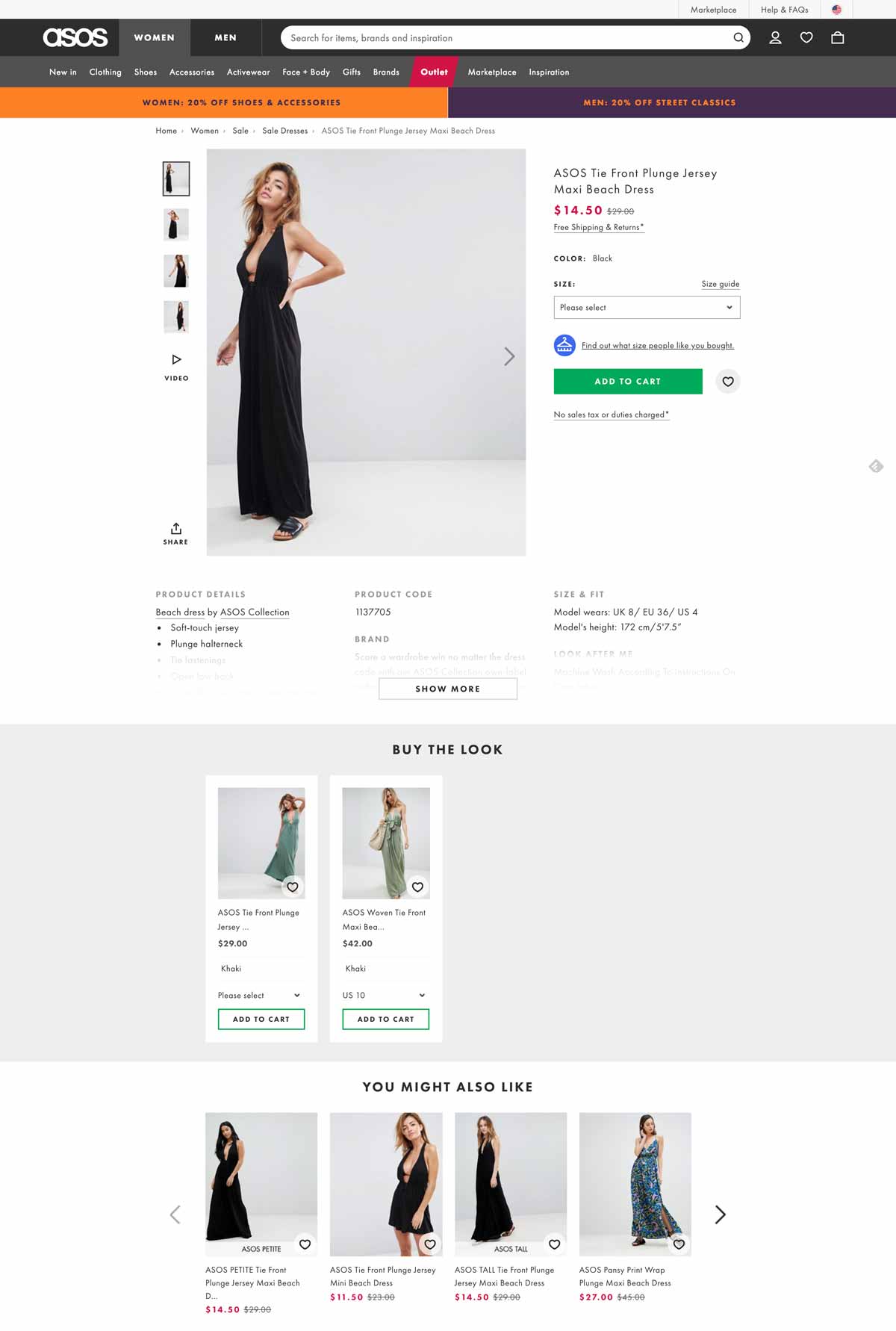
What we love:
- Distinctive, stary green call-to-action
- Sober yet effective design
- Plenty of context photos and a video
- Product recommendations
- Information about shipping & returns
- Size guide
What could be improved:
- Adding customer reviews on their product pages
9. Salesforce – Software, CRM, Business Solutions
We couldn’t end this article without mentioning at least one notable business solutions provider.
Salesforce is undoubtedly one of the most commonly used, famous CRM and sales management tools.
Their small business solutions product page quickly emphasizes the benefits over the features, such as: “Drive faster sales and simpler service with Salesforce Essentials.”
They also display actual results for their customers so as to convince them, even more, to subscribe: “+26% more deals, +32% happier customers.”
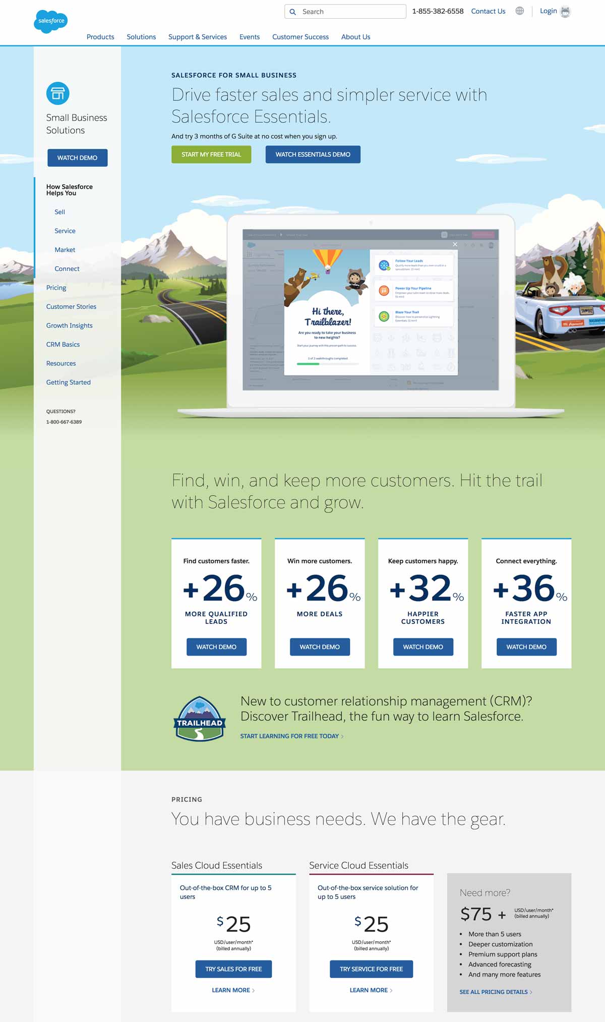
What we love:
- Catchy, original designs
- Real emphasis on actual benefits
- Free trial
- Video demo
- Clear, straightforward pricing plans
- Online chat + phone assistance
- Genuine customer testimonials
10. Airbnb – Travel / Hotel / Accommodation
Airbnb remains a masterclass of UX design and product page efficiency from which a lot of travel or tourism-related websites can seek inspiration.
First of all, they kept an insanely simple and efficient page layout that makes it really intuitive to browse.
Then, notice how they’ve put the photo gallery at the top of the page? Airbnb knows that photos are the most important aspect of any travel website: visitors need to envision themselves swimming in that paradisiac pool.
Finally, Airbnb successfully mastered the art of utilizing customer reviews: they are deeply integrated into each product page (except when there are no reviews, of course…) so that their role as social proof is maximized: people just love to read reviews.
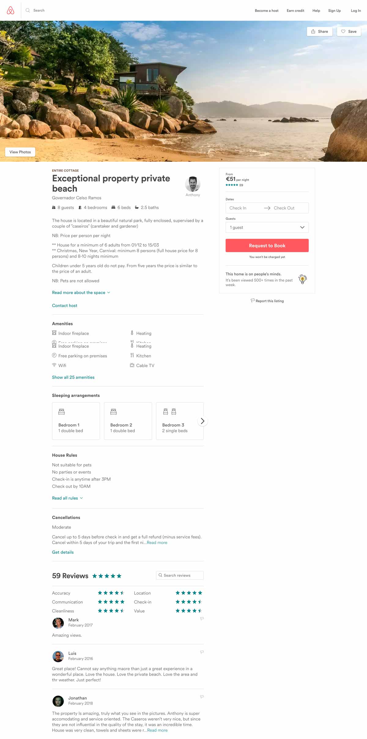
What we love:
- Clear design, good information hierarchy
- Flashy call-to-action
- Seamless integration of travelers’ reviews
- Convenient map at the bottom of the page
- Similar listings to jump from one house to the other
Conclusion
After reading through this article, you see why e-commerce product pages are such a big deal. What works well in one industry may not have the same success rate in others. Due to this, it’s essential to know your customers and test different UX designs to see what gives you optimal results.
Optimizing these types of pages to suit your customers’ needs better is the best way to increase your conversions.
