Every insight starts with a story, and every story deserves to be heard. But when your NPS® or CSAT campaigns generate thousands of responses, how do you turn all that feedback into real action, fast?
That’s why we created Feedback Copilot, the AI-powered assistant that transforms your NPS® or CSAT campaigns into actionable intelligence – instantly.
The problem collecting feedback: Too many voices, not enough time
Let’s face it: analyzing feedback is a nightmare. Even when users leave valuable insights in NPS campaigns, the manual work required to analyze hundreds (or thousands) of verbatim responses can paralyze teams. One client told us:
“We received 5,000 verbatim responses. That’s two weeks of manual work.”
And because it’s so time-consuming, teams either:
Underutilize feedback tools like NPS/CSAT
Or don’t act on the insights at all
The solution to overwhelming feedback? Feedback Copilot
Feedback Copilot was born from this pain point – combining the best of AI with our all-in-one experimentation platform. It’s available for free within AB Tasty, and automatically activated for NPS/CSAT campaigns with over 100 responses.
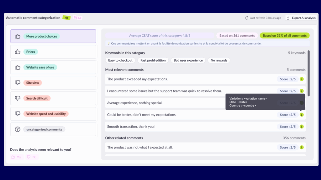
What our Feedback Copilot does:
Segments feedback by sentiment: Instantly separates positive and negative comments based on campaign scores.
Clusters similar comments into key themes: Groups feedback into topics like “price,” “delivery,” or “UX.”
Summarizes each theme: Provides a short description, confidence score, and sample comments for every theme.
Highlights what matters most: Surfaces the top 3 positive and top 3 negative drivers of satisfaction.
Exports labeled feedback: Download results for use in Excel, PowerPoint, and more.
And it does all this while respecting data privacy, using a self-hosted model (Hugging Face) instead of sending sensitive content to third-party LLMs.
What makes our Feedback Copilot unique?
Instant categorization of massive feedback volumes
Quantification of qualitative input – finally, your verbatim responses have numbers to back them
Integrated NPS/CSAT in your test workflows – measure why something works, not just if it does
Enterprise-grade privacy: Comments stay on AB Tasty’s infrastructure
Who benefits from Feedback Copilot?
CROs & Product Managers: Prioritize optimizations based on real user pain points.
UX & Research Teams: Detect trends and go beyond basic survey stats.
Marketing & Customer Success: Understand friction points before and after launches.
What’s next?
Early adopters already report major productivity gains – and they’re asking for more:
Direct A/B test ideas from negative themes
Verbatim-based segmentation for campaign targeting
Improved theme granularity for enterprise-scale campaigns
We’re just getting started. Feedback Copilot is not just a feature – it’s your co-pilot in delivering better, faster, and more human-centered product decisions.
Forget traditional shopping journeys, today’s fashion consumers are rewriting the rules! Our 2025 Fashion Consumer Trends report reveals the shifts in how consumers discover, decide, and commit to fashion brands today.
Introduction
In a recent webinar, 3 experimentation leaders came together to unpack the latest consumer trends shaping the fashion industry. The conversation brought together Ben Labay, CEO of Speero, Jonny Longden, Speero’s Chief Growth Officer, and Mary Kate Cash, Head of Growth Marketing for North America at AB Tasty. They shared valuable insights from AB Tasty’s recent global fashion consumer survey, highlighting what drives inspiration, conversion, and retention in today’s fast-evolving fashion landscape.
Social Media is Changing the Game
Traditional search engines remain the top channel for fashion discovery, followed by direct website visits, Google Shopping, and Social Media ads. However, the differences between these top four channels are shrinking year over year, with social media rapidly gaining ground, especially among Gen Z consumers, where 60% of survey respondents highlighted Social Media ads as their preferred avenue to finding new products. Jonny predicts this trend will expand across all age groups.
“Social and fashion just go so hand in hand. The big change that’s happened with social is that fashion itself has become more rapid in the way it changes, and so it’s really driving different consumer behaviour.”
Jonny Longden, Chief Growth Officer at Speero
Different Channels, Different Mindsets
People use search when they know what they want. Social media, on the other hand, encourages experimentation. As Ben pointed out, shoppers arriving from social media are often inspired to try new styles or connect with communities, engaging in “social shopping” and not just focusing on finding a specific product. This opens the door for more tailored experiences based on where customers are coming from and what type of inspiration they’re seeking.
What the Fashion Consumer Trends 2025 Tell Us About Expectations
Reward Loyalty in Meaningful Ways – When asked how brands could make customers’ experiences more personal, the top answer was clear: rewarding brand loyalty. Discounts, early access, or perks for repeat buyers make shoppers feel seen and increase the chances of account creation and repeat visits.
Jonny pointed out that “the really interesting tension in this whole industry at the moment is the difference between what is the right thing to do and what is the profitable thing to do. about finding that balance is experimentation in the broadest sense of the word.”
Make Recommendations That Actually Fit – Consumers want relevant suggestions that go beyond basic personalization. Jonny compared it to having a personal stylist: a brand should know both the customer and the market, understanding trends and styles while matching these to individual preferences.
What Actually Drives Conversions
When it comes to converting browsers into buyers, shoppers across generations are surprisingly aligned.
Product quality leads the way across all age groups and regions. Shoppers are still willing to pay for craftsmanship, comfort, and durability, even in a price-sensitive market.
Discounts come next, but the strategy matters. Overuse can cheapen brand perception. As Jonny put it: “Fashion, especially the lower price point fashion has ended up in a kind of race to the bottom where discounting is the way to compete. […] and a lot of consumers wouldn’t consider paying full price. The challenge is how to be careful with the commerciality of discounting.”
Sizing and fit clarity also ranks high, especially in fashion, where hesitation often comes from uncertainty about how something will feel or look. Ben noted that some major retailers are tackling this head-on, investing heavily in tools to improve sizing and try-on experiences.
For Gen Z, high-quality reviews and transparency around production methods, sustainability, and pricing are big drivers. Ben shared tactical approaches to transparency on product detail pages, like using engaging CTAs such as “Do you want to know a secret?” to reveal value props related to sustainability and ethical production.
Why Shoppers Abandon Carts
Cart abandonment remains a major friction point, and two reasons dominate globally:
Not ready to buy – Many shoppers use the cart to explore shipping, delivery timeframes, or total cost before making a decision. Jonny explained it simply: “People use the checkout of an ecommerce website just to see what’s gonna happen. […] When’s it gonna be delivered? What are the delivery options? How much is delivery gonna cost?
Payment Methods not being accepted – This came in a close second, showing how overlooked payment flexibility still is. Buy-now-pay-later options like Klarna may move the needle, especially in fashion, where customers often purchase multiple sizes with the intention of returning some items. Jonny emphasized that payment method testing is one of the best arguments for AB testing and experimentation, as the “best practice” of offering many payment options doesn’t always lead to better conversion.
Retention: Loyalty Built on Familiarity
Finally, we explored what drives customers to create accounts with fashion brands, buy products from them, and what motivates them to stick around.
Loyalty Rewards Drive Engagement – Globally, the top reason for account creation is earning loyalty points, especially among Gen Z and Millennials. Discounts and sale updates follow closely behind.
Balancing Novelty and Trust – Shoppers crave both newness and familiarity: new products ranked highest in driving retention, but previously purchased items and trusted brands followed close behind. This balance is key to keeping customers engaged long-term.
Jonny raised an interesting point: a lot of loyalty programs end up rewarding people who would have come back anyway. Mary Kate added that tools like segmentation can help brands tell the difference between genuinely loyal customers and those just passing through, making it easier to design rewards that actually make an impact.
While conventional wisdom discourages forced account creation, Ben challenged this assumption, arguing it can work when paired with compelling promotions or rewards, especially in social ads. “Social ads that inspire and combine short-term promotions, rewards, and discounts are increasingly leading into forced account creation sequences.”
Conclusion
As shown in our 2025 Fashion Consumer Trends report, the e-commerce fashion industry is evolving, along with consumer expectations. To remain competitive, brands must go beyond simply selling products. They must deliver seamless, personalized shopping experiences that speak directly to the modern shopper’s needs.
This is where experimentation becomes a critical advantage. The most successful brands are those willing to test assumptions about everything from product discovery and presentation to payment options, loyalty strategies, and the evolving role of social commerce. Experience optimization is no longer a nice-to-have. It’s the foundation for building trust, loyalty, and long-term growth in the fast-moving world of online fashion.
Want a deeper dive? Watch the full webinar below to hear expert insights and practical strategies shaping the future of fashion commerce.
In CRO (Conversion Rate Optimization), a common dilemma is not knowing what to do with a test that shows a small and non-significant gain.
Should we declare it a “loser” and move on? Or should we collect more data in the hope that it will reach the set significance threshold?
Unfortunately, we often make the wrong choice, influenced by what is called the “sunk cost fallacy.” We have already put so much energy into creating this test and waited so long for the results that we don’t want to stop without getting something out of this work.
However, CRO’s very essence is experimentation, which means accepting that some experiments will yield nothing. Yet, some of these failures could be avoided before even starting, thanks to a statistical concept: the MDE (Minimal Detectable Effect), which we will explore together.
MDE: The Minimal Detectable Threshold
In statistical testing, samples have always been valuable, perhaps even more so in surveys than in CRO. Indeed, conducting interviews to survey people is much more complex and costly than setting up an A/B test on a website. Statisticians have therefore created formulas that link the main parameters of an experiment for planning purposes:
The number of samples (or visitors) per variation
The baseline conversion rate
The magnitude of the effect we hope to observe
This allows us to estimate the cost of collecting samples. The problem is that, among these three parameters, only one is known: the baseline conversion rate.
We don’t really know the number of visitors we’ll send per variation. It depends on how much time we allocate to data collection for this test, and ideally, we want it to be as short as possible.
Finally, the conversion gain we will observe at the end of the experiment is certainly the biggest unknown, since that’s precisely what we’re trying to determine.
So, how do we proceed with so many unknowns? The solution is to estimate what we can using historical data. For the others, we create several possible scenarios:
The number of visitors can be estimated from past traffic, and we can make projections in weekly blocks.
The conversion rate can also be estimated from past data.
For each scenario configuration from the previous parameters, we can calculate the minimal conversion gains (MDE) needed to reach the significance threshold.
For example, with traffic of 50,000 visitors and a conversion rate of 3% (measured over 14 days), here’s what we get:
The horizontal axis indicates the number of days.
The vertical axis indicates the MDE corresponding to the number of days.
The leftmost point of the curve tells us that if we achieve a 10% conversion gain after 14 days, then this test will be a winner, as this gain can be considered significant. Typically, it will have a 95% chance of being better than the original. If we think the change we made in the variation has a chance of improving conversion by ~10% (or more), then this test is worth running, and we can hope for a significant result in 14 days.
On the other hand, if the change is minor and the expected gain is less than 10%, then 14 days will not be enough. To find out more, we move the curve’s slider to the right. This corresponds to adding days to the experiment’s duration, and we then see how the MDE evolves. Naturally, the MDE curve decreases: the more data we collect, the more sensitive the test becomes to smaller effects.
For example, by adding another week, making it a 21-day experiment, we see that the MDE drops to 8.31%. Is that sufficient? If so, we can validate the decision to create this experiment.
If not, we continue to explore the curve until we find a value that matches our objective. Continuing along the curve, we see that a gain of about 5.44% would require waiting 49 days.
That’s the time needed to collect enough data to declare this gain significant. If that’s too long for your planning, you’ll probably decide to run a more ambitious test to hope for a bigger gain, or simply not do this test and use the traffic for another experiment. This will prevent you from ending up in the situation described at the beginning of this article, where you waste time and energy on an experiment doomed to fail.
From MDE to MCE
Another approach to MDE is to see it as MCE: Minimum Caring Effect.
This doesn’t change the methodology except for the meaning you give to the definition of your test’s minimal sensitivity threshold. So far, we’ve considered it as an estimate of the effect the variation could produce. But it can also be interesting to consider the minimal sensitivity based on its operational relevance: the MCE.
For example, imagine you can quantify the development and deployment costs of the variation and compare it to the conversion gain over a year. You could then say that an increase in the conversion rate of less than 6% would take more than a year to cover the implementation costs. So, even if you have enough traffic for a 6% gain to be significant, it may not have operational value, in which case it’s pointless to run the experiment beyond the duration corresponding to that 6%.
In our case, we can therefore conclude that it’s pointless to go beyond 42 days of experimentation because beyond that duration, if the measured gain isn’t significant, it means the real gain is necessarily less than 6% and thus has no operational value for you.
Conclusion
AB Tasty’s MDE calculator feature will allow you to know the sensitivity of your experimental protocol based on its duration. It’s a valuable aid when planning your test roadmap. This will allow you to make the best use of your traffic and resources.
At AB Tasty, we believe a great product experience starts with smooth feature delivery and personalization. Our Feature Experimentation SDK empowers tech teams to control feature rollout and tailor interfaces to each visitor.
But in today’s complex, fast-moving ecosystems, interoperability is key. That’s where OpenFeature comes in.
What is OpenFeature?
OpenFeature is an open-source specification that defines a standardized API for feature flag management. It lets developers manage feature flags consistently across tools and platforms.
Why it matters:
Interoperability: A unified API across providers.
No vendor lock-in: Switch tools without rewriting business logic.
Thriving community: Backed by CNCF and designed for cloud-native development.
What We Built: The Official AB Tasty OpenFeature Provider
To ensure our SDK plays well with OpenFeature, we created an official provider: @flagship.io/openfeature-provider-js
You can now use our feature flags in any OpenFeature-compliant setup, like this simple Node.js example:
We’ve made onboarding even easier. Our CLI tool, which is also bundled with the AB Tasty VSCode Extension, includes a powerful codebase analyzer.
What it does:
Scans your codebase
Detects flags and usage from other providers (e.g., Optimizely, Kameleoon, etc.)
Identifies if you’re already using OpenFeature
Automatically generates corresponding flags in Flagship
Example: Already using OpenFeature with a competitor? Just plug in our CLI, and AB Tasty will detect your flags and preconfigure them for you — saving you hours of manual setup.
This is a guest article written by Edoardo Aliprandi from our partners at Converteo on the effect of US tariff hikes in both the US and Europe. Edoardo is a lead data pricing manager analytics engineer with a background in economics and has given us a guide as to how the threat of new tariffs will impact e-commerce websites, the economy, and price-elasticity.
Entering turbulence and historical precedents
One April morning, standing behind a bed of tulips in the White House garden, Donald Trump unveiled his chart for international trade to a global audience: to sell in America, thou shalt pay tariffs. Very soon, the golden calf took a hit: the bull market, already faltering for weeks, completely collapsed. Since April 2, major stock indices have been in free fall, casting a shadow of uncertainty over the global economic outlook. Price stability—barely recovering from post-Covid turbulence—is once again being tested. This political bombshell and the market turmoil it triggered is reminiscent of the first oil shock of 1973. In the aftermath of the Yom Kippur War, amid declining U.S. oil reserves, OPEC imposed an oil embargo on Western economies, causing oil prices to skyrocket by 70%. The deeper reason? To strengthen their geopolitical standing and wield powerful bargaining leverage—a logic not unlike today’s White House. The outcome is well-known: stalled growth, rising inflation and unemployment… in a word, stagflation, which defined the 1970s as much as ABBA’s greatest hits.
Since then Trump has backtracked, offering a 90-day reprieve for most countries except China, but it’s not exactly clear where anyone stands. While financial markets breathed a sigh of relief—though it remains to be seen whether this marks a true recovery or just a “dead cat bounce”—uncertainty continues to hang over the economic outlook and supply chains of American and European companies. This article explores a scenario in which the United States continues to use tariffs as a geopolitical weapon, along with the economic implications and pricing strategy consequences for businesses.
If tariff hikes are sustained, companies will need to adjust to a new paradigm: rising input costs, lost markets, and the emergence of new ones—forcing a shift in strategies and pricing to reflect these new realities.
Supply and demand shocks: pricing implications
By simulating the behavior of economic agents—businesses and consumers—the Aggregate Supply–Aggregate Demand (AS-AD) macroeconomic model helps estimate the impact of such shocks on activity and prices. It is based on two core principles:
All else equal, companies seek to maximize margins and will try to increase sales as the price index rises. Supply is thus positively correlated with the price index.
Consumers’ real income and savings fall as prices rise, making them feel poorer and less inclined to spend (Pigou effect). Demand is thus negatively correlated with the price index.
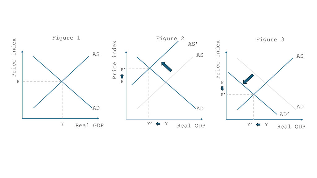
In simple terms, two curves intersect at equilibrium (Figure 1), defining an equilibrium price and output. So, what would be the impact of a shock—like a tariff hike—on prices?
The AS-AD model describes two plausible scenarios, each with different effects on the price index:
Supply shock: Input costs rise, squeezing business margins. For a given price index, companies are willing to produce less, shifting the aggregate supply curve left (Figure 2). In this case, reduced activity and restricted supply push prices up: we’re in a stagflation scenario.
Demand shock: Households experience income losses (e.g., due to reduced exports), and for a given price level, they consume less, shifting the demand curve left (Figure 3). Falling demand pushes businesses to lower prices to sell their products, leading to deflation.
Clearly, a US tariff hike or oil shock affects both supply and demand curves: rising input costs hurt business margins and production capacity, while households lose income due to declining economic activity. Still, one effect usually dominates—stagflation in the 1970s, for instance, was mainly supply-driven. What about the shock triggered by the new U.S. tariffs?
Inflation spiral in the U.S., deflationary pressure in Europe?
Trump’s trade war is turning into a full-blown crusade against the rest of the world (EU, China, BRICS). So the impact will likely differ between the initiator and those on the receiving end: one economy closing itself off, and others losing a major export market.
In the U.S., trade barriers will significantly raise the cost of imports—possibly as much as the tariff increases themselves. Even domestic production won’t be spared, as many raw materials and components are imported and account for a large share of final costs, especially in strategic sectors like autos and electronics. Companies will face a choice: absorb the added costs or relocate production—a risky and expensive move in an uncertain context that could dampen investment. The economy may thus face a supply shock and stagflation, driven by margin pressures that discourage production expansion.
In Europe, falling exports to the U.S. could reduce incomes. Companies may respond by adjusting their labor force, weighing on household demand. While input costs will also rise, the effect should be milder, since retaliation will likely target only U.S. products. A demand shock—and thus deflation—is more likely, potentially worsened by Chinese products dumped onto the European market after being rerouted from the U.S.
These assumptions appear to be confirmed by recent moves from central banks. Jerome Powell at the Fed has become more cautious about rate cuts initiated in late 2024, to curb price surges. In contrast, JP Morgan predicts three rate cuts in Europe this year, aimed at stimulating demand and fighting deflation.
Different challenges for businesses on each side of the Atlantic
In the U.S., businesses will need to revisit sourcing strategies and manage inflationary conditions.
In Europe, they must prepare for falling demand and weaker consumer willingness to pay for certain products.
Pricing in a fragmented world: adapting to local elasticities
In a world marked by trade fragmentation and rising protectionism, businesses must pay renewed attention to pricing strategy. The U.S. trade war—triggered by sudden tariff hikes—will not have symmetric effects across regions. The U.S. may face inflation from rising input costs, while Europe could experience a negative demand shock and deflationary pressures, worsened by Asian imports redirected from America.
In this context, understanding price elasticity becomes crucial — both as a tool for analysis and for experimentation. In Europe, where purchasing power is under pressure, raising prices can quickly lead to a sharp drop in sales volumes. But cutting prices isn’t a silver bullet either: if demand is inelastic, it may have little impact. That’s why businesses need detailed elasticity analysis by segment, drawing on internal data, market insights, and advanced analytics. The goal? Take a defensive approach on highly price-sensitive products, while maintaining stable pricing for high-value items where demand is less elastic.
Experimentation plays a key role in this process. By testing different price points across products and segments, companies can see in real time how cost changes impact conversion rates and overall sales. Understanding the impact of tariffs can help fine-tune pricing strategies to strike the right balance between volume, margin, and customer retention. This test and learn process would eventually enable companies to estimate a price tipping point, for which the business objective is optimized.
In the U.S., the new tariffs shuffle the deck but don’t offer immediate wins for all. Restructuring supply chains, reshoring production, or sourcing from new partners in unaffected regions is complex, risky, and costly. Market leaders—with stronger financial and contractual leeway—are better positioned to invest and possibly turn these challenges into long-term advantages, absorbing costs or even improving margins through price repositioning.
In inflationary settings, market leaders might also pursue aggressive commercial strategies, accepting temporary margin losses to outpace competitors. Weaker players, unable to absorb costs or adjust prices, could suffer under this new paradigm. Competitive pressure may accelerate market consolidation, benefiting the best-prepared firms.
Conclusion
In a reshaped global economy, understanding the Impact of tariffs on E-Commerce pricing elasticity is a critical lever of competitiveness. It requires a tailored, market-specific approach, combining knowledge of local elasticities with logistical adaptability. Only then can companies transform tariff constraints into sustainable competitive advantages.
At AB Tasty, we love providing our users with the best possible experience by making it easy to create and execute optimization campaigns. That’s why we recently significantly improved our Modification Engine, one of the core components of our Visual Editor and our JavaScript tag.
The Modification Engine is the system that dynamically alters our client’s website content and appearance without requiring direct changes to the source code. It applies the modifications defined in campaigns by injecting the changes via JavaScript on the visitor’s browser.
Here are the two big improvements:
Maximum compatibility with our clients’ websites, including Shadow DOM and iFrames support.
Optimized performance for faster loading and smoother execution of modifications, enhancing the experience for visitors on our clients’ sites.
Enhanced Compatibility with Modern Technologies
Our clients are developing increasingly complex websites, utilizing technologies like Shadow DOM and iFrames to structure their web applications. Now, our Visual Editor is compatible with these technologies so you can create, modify, and manage content to deliver the latest in experiences to your visitors.
A lighter JavaScript tag: The overall impact of AB Tasty has already been reduced by 2.3 KB, with further optimizations planned.
Less impact on overall performance: We observed an improvement up to 11% in website performance, depending on the number of modifications applied.
Optimized Loading and Execution Times
More efficient JavaScript execution: The average execution time for modifications is 30% to 55% faster.
Decreased “Render Blocking Time”: Improvements range from 11% to 50%, with even greater benefits for larger campaigns.
No longer classified as a “Long main-thread task”
Faster Application and Reapplication of Modifications
Another key improvement in this update is the speed of applying and reapplying modifications:
Applying modifications is 2.2 to 2.75 times faster.
Reapplying modifications is 4 to 5.7 times faster, a major advantage for dynamic A/B testing.
Real-World Examples
We conducted tests on various campaigns to measure these improvements in action:
Campaign with 19 Modifications:
Total execution time: 1.79ms (down from 3.96ms, 2.2 times faster).
Reapplying time after a modification is removed: 0.58ms (down from 3.34ms, 5.7 times faster).
up to 5% improvement in overall site performance.
Campaign with 64 Modifications:
Total application time: 4ms (down from 10-11ms, 2.5 to 2.75 times faster).
Reapplying time after a modification is removed: 2.7ms (down from 11-12ms, 4 to 4.4 times faster).
Up to 11% improvement in overall site performance.
With these enhancements, our newest Modification Engine version is now more robust, faster, and better suited for modern websites.
You benefit from a smoother user experience, and your visitors enjoy faster loading times. And this is just the beginning: stay tuned for even more powerful optimizations in the coming months.
Feel free to test these improvements and share your feedback with us!
AB Tasty’s Visual Studio Code extension lets developers manage their experimentation and personalization campaigns directly from their IDE. This game-changing tool streamlines technical workflows and makes experimentation more accessible across your organization.
We’re all about making experimentation and personalization seamless for all teams. While AB Tasty’s UI is designed to be intuitive, we know that many developers prefer to work directly in their IDE. That’s why we built the AB Tasty Visual Studio Code extension—inspired by user feedback and driven by our mission to simplify the dev experience.
With this extension, you can:
Eliminate back-and-forth between your IDE and the AB Tasty web interface.
Leverage VS Code’s power: smart autocomplete, built-in linters, syntax highlighting, real-time validation, and more.
The benefits of VS Code Extension for server-side:
With AB Tasty’s Feature Experimentation and Roll-outs, from the Visual Studio Code Extension you can: ✅ Manage feature flags and product experimentation with a code-first approach ✅ Call key campaign resources (flags, targeting keys, goals) ✅ Detect and create feature flags directly from your codebase
The benefits of VS Code Extension for client-side:
With AB Tasty’s Web Experimentation and Personalization, from the Visual Studio Code Extension you can: ✅ Manage product experimentation with a code-first approach ✅ List and access segments, triggers, and favorite-URLs linked to your account ✅ List and access campaigns (variations, targeting, modifications) ✅ Manage JS scripts tied to accounts, campaigns, variations, and modifications
AB Tasty Joins the “Dev-Friendly” Movement
Our vision is clear: AB Tasty should adapt to developers, not the other way around. This extension is just the beginning—we have plenty more enhancements in the pipeline.
Mobile commerce has revolutionized how consumers interact with brands — from browsing products on the go to researching the latest trends. Yet, despite mobile usage soaring, the full potential of mobile commerce remains untapped. While traffic from mobile devices continues to rise, conversion rates still trail behind other channels. What’s driving the gap between browsing and purchasing on mobile?
In this post, we’ll explore key mobile performance stats, delve into the challenges behind these numbers, and showcase how Quantum Metric and AB Tasty collaborate to help brands close this gap. If you want the your own mobile playbook, the insights shared here are based on data from Quantum Metric’s eBook, How Mobile Performance Builds Consumer Confidence.
1. Mobile is everywhere, but conversions lag.
Mobile traffic is not just a trend, it’s the backbone of online shopping. Consumers are increasingly using their phones for everything from discovering products to making final purchase decisions. However, despite this surge in mobile traffic, conversions still don’t match the volume of visits. So, what’s going wrong?
Insight:
Mobile accounts for 73% of monthly traffic, but only 47% of sales.
Travel sees the highest mobile traffic (73%), but the lowest sales share (39%).
Challenge: Consumers love to browse on mobile — reading reviews, comparing prices, and window shopping. But when it comes time to make a purchase, they often shift to desktops or other channels. This disconnect between browsing and buying is a critical challenge.
Solution: Quantum Metric delivers real-time insights to identify where users drop off in their mobile journeys, helping brands pinpoint key friction points. Armed with this data, AB Tasty can run A/B tests and experiments to optimize mobile conversions by improving layouts, simplifying checkout, or personalizing offers based on user behavior.
2. Personalization drives engagement (and sales).
With so much information available at their fingertips, consumers expect personalized experiences that speak to their unique preferences. But while mobile apps can deliver these tailored experiences, it’s not always the case that mobile users receive the level of customization they desire. So, how can brands keep up with the demand for hyper-personalized mobile experiences?
Insight:
39% of consumers prefer mobile apps, but 33% have reduced app usage.
Conversion rates on mobile apps are 3X higher than on mobile web.
Challenge: Consumers are increasingly expecting experiences that are customized to their preferences. Whether it’s personalized product recommendations or location-based offers, users demand content that resonates with them on a deeper level. But how do brands manage to provide this while maintaining convenience and ease of use?
Solution: Quantum Metric provides detailed session data, revealing exactly what users are engaging with and where they’re dropping off. AB Tasty then uses this data to create personalized experiences through hyper-targeted experiments, ensuring that each user sees content that’s most relevant to them — ultimately boosting engagement and driving conversions.
3. Building confidence in mobile transactions.
Even with mobile traffic growing, many consumers are still hesitant to make purchases — especially larger ones — on their phones. Trust is a major factor in whether or not a consumer feels confident enough to complete a mobile transaction. But how can brands overcome the hurdles of security concerns and poor mobile experiences?
Insight:
59% of consumers only feel confident making purchases of $50 or less on mobile.
Desktop AOVs are 70% higher than mobile for retail and nearly 2X higher for travel.
Challenge: Security concerns and clunky mobile experiences can drive away customers before they even hit the checkout button. Many consumers feel more comfortable making purchases on desktops, where they associate higher transaction values with a more secure, familiar environment.
Solution: Quantum Metric identifies friction points — slow load times, security concerns, or error messages — that can erode trust. AB Tasty uses A/B testing and experiments to address these pain points, creating smoother, more secure user flows that enhance trust and improve conversion rates.
4. Performance matters more than ever.
With consumers’ expectations for speed at an all-time high, mobile performance can make or break the user experience. From slow loading times to app crashes, mobile performance issues are a significant barrier to conversions. So how can brands ensure their mobile experiences are fast and seamless?
Insight:
59% of users have experienced slow performance; 43% have faced app crashes.
API error rates are 2-3X higher on mobile than desktop, with issues like long spinner rates causing 48% higher friction.
Challenge: Users have little patience for performance issues. A slow-loading page or app crash can lead to frustration and, ultimately, abandonment. The pressure to deliver fast, smooth mobile experiences is higher than ever.
Solution: Quantum Metric’s real-time data quickly highlights performance issues, from slow page loads to API errors. Once identified, AB Tasty can experiment with various solutions, optimizing mobile performance and delivering a smoother, faster user journey.
5. Turning data into action.
In the fast-paced mobile landscape, time is of the essence. Consumers expect quick, efficient mobile experiences, and if a transaction takes too long, they won’t hesitate to abandon it. So, how can brands ensure they are responding to user behavior in real time?
Insight:
55% of consumers will abandon a mobile transaction if it takes longer than 3-5 minutes.
Challenge: The pressure to scale innovation without losing sight of the customer is real. Mobile transactions need to be fast and seamless, or customers will simply walk away — especially when it comes to on-the-go transactions.
Solution: Quantum Metric empowers brands with real-time behavioral data that shows where and when users drop off during their mobile journey. AB Tasty then helps turn this data into action by running targeted experiments that address specific friction points, reducing abandonment and improving the overall mobile experience.
Conclusion: turning mobile commerce into your competitive edge.
Mobile commerce isn’t just another sales channel — it’s a key competitive advantage. To succeed, brands must focus on delivering fast, personalized, and secure mobile experiences that build consumer trust. By combining Quantum Metric’s real-time behavioral insights with AB Tasty’s experimentation platform, brands can close the gap between browsing and buying, unlocking the true potential of mobile commerce.
The Contentsquare & AB Tasty integration helps you optimize your A/B testing lifecycle, driving high-value outcomes with low-risk scenarios. Let’s dive into how this integration will help you improve your customer experience (CX) and boost your growth metrics.
A side-by-side comparison of 2 webpages using Contentsquare analysis
An overview of the integration
When Contentsquare and AB Tasty are used separately, you only get half the success of your test results. Say you want to test a hero banner. Using AB Tasty, you test 2 versions, and find there’s no improvement to your conversion rate. But, perhaps one of the versions increased customer engagement? Without the help of Contentsquare, you’re limited in your view of how your tests impact your entire customer experience.
Or, let’s say you’ve analyzed your customer journey using Contentsquare and discovered one of your conversion pages has a high drop-off rate. You come up with a hypothesis as to why this might be the case and hard-code a change, but this leads to more drop-offs, not less. Without AB Tasty, you’re unable to test your hypotheses, which results in wasted time, resources, and a potentially worse customer experience.
But, it doesn’t have to be this way. By integrating Contentsquare and AB Tasty, you can dive deeper into your customer experience to pinpoint and prioritize the most critical friction points or opportunities to experiment. You can also build better hypotheses based on key metrics, create and run data-informed tests, and better understand why variations perform well (or not).
With Contentsquare, you gain a more comprehensive understanding of your customer experience, enabling you to conduct more informed, data-driven tests with AB Tasty.
Benefits of the Contentsquare and AB Tasty integration
Where Contentsquare provides deep and meaningful insights into your customer behavior, AB Tasty empowers you to act on those insights, in real time.
“AB Tasty is a technology partner with Contentsquare. We facilitate A/B testing, experimentation, personalization, and audience segmentation. We help facilitate activation of the data that you get out of Contentsquare to fuel that endless cycle of experimentation.”
Mary Kate Cassh, Head of Growth Marketing, North America, AB Tasty
Hyper-personalization features to deliver tailor-made experiences to boost conversion rates
A simplified, streamlined workflow that eliminates data silos by having data accessible across easy-to-understand dashboards
Greater business impact by uncovering hidden opportunities in your customer journey and testing your hypotheses before hard-coding changes
Comprehensive experiment analysis with easy-to-understand visuals and side-by-side comparisons of your control and variation
Continuous improvement to your digital strategy
Want to know the fundamentals of how the Contentsquare and AB Tasty integration works? Learn more.
How Contentsquare can inform your testing in AB Tasty
Let’s look at how this works in practice, using the framework of a continuous testing cycle. There are 5 stages to the continuous testing cycle—here’s how the Contentsquare and AB Tasty integration works to optimize each step along the way:
Stage 1: analysis phase
This first stage involves finding friction points or opportunities at each point of your customer journey. Then, it’s about generating test hypotheses to help solve or optimize the points that need the most attention.
You can break down this stage into 2 forms of analysis.
Innovation analysis, where you work out whether your content is optimized for the best customer experience you can provide
2. Troubleshooting analysis, where you uncover errors or friction points in the customer journey, preventing users from moving forward.
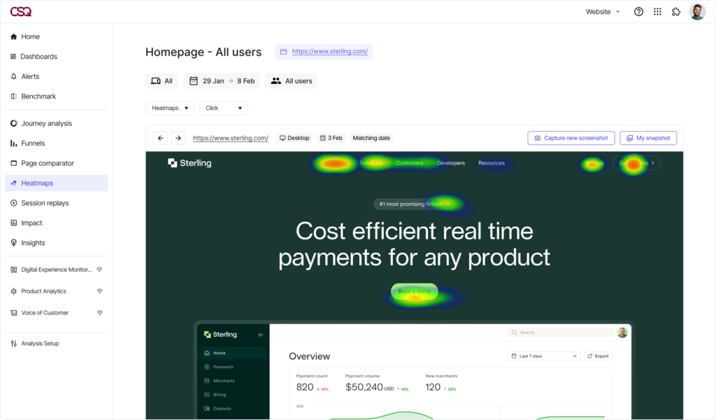
With Contentsquare’s Experience Analytics, you can find out how your customers are behaving page by page, from entry to exit, and why. With a suite of capabilities, you can deep-dive into your customer experience and analyze areas that need the most improvement.
Screenshot of Contentsquare’s Experience Analytics dashboard, open on the Heatmaps capability.
What are the behaviors of customers at critical conversion points?
What’s causing rage clicks or other frustration behaviors?
Where are customers encountering errors?
Rage clicks are when customers click on an element (clickable or not) of a website or app multiple times in frustration or anger. They’re often caused by technical issues, confusing navigation, or a cluttered design.
What’s the most attractive content/category on the page?
What’s leading to the most conversions? Is it visible enough?
In what order do customers consume the page?
Are there any frictions or rage clicks on the page?
Stage 2: analysis resolution
Now you’ve got a few hypotheses to test, it’s time to work out how to prioritize what to test first.
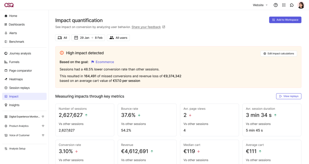
The focus should be on tests with low effort, high reward and those with the biggest impact on your key performance indicators (KPIs). Contentsquare’s Impact Quantification can help you prioritize your tests and make better decisions by assessing the impact of each test. All you need to do is clarify your goal and then segment users based on whether they completed the goal of your A/B test.
Contentsquare’s Impact Quantification in action.
Impact Quantification can then be used to compare these segments and confirm how much revenue the success of the test will likely generate.
Stage 3; experimentation roadmap
Once you’ve established which hypotheses have the greatest potential to impact your KPIs, it’s time to start fleshing out your testing roadmap.
This roadmap will help guide every step of your testing process—from the build to the design and copy and finally, the execution. This roadmap is where you detail who’s doing what and when, giving you an overview of your site. This is especially useful if you’re running tests on multiple pages.
The dos and don’ts of your testing roadmap
Do’s
✅ Run your tests in at least 2-week increments to account for site traffic cycles and seasonality.
✅ Color-code your roadmap for the different stages of your experimentation so it’s easy to quickly see where each test is at.
Don’t
❌ Have 2 tests running on 2 pages at the same time—it can muddy the data and lead you to potentially misread your results.
❌ Don’t run multiple tests on the same page independently—use multivariate tests to see how changes to multiple sections interact with one another.
Stage 4: start A/B testing
All that hard work has finally paid off—it’s time to put your hypotheses into action and start running tests with AB Tasty.
Using your roadmap as a guide, start building out your tests in AB Tasty to optimize, personalize, and improve your customer experience.
Stage 5: analysis and results
Get site statistics directly through AB Tasty and couple that with Contentsquare’s customer behavioral insights.
From AB Tasty, get direct reports based on page statistics—giving you a snapshot of what’s going on in your campaign testing period.
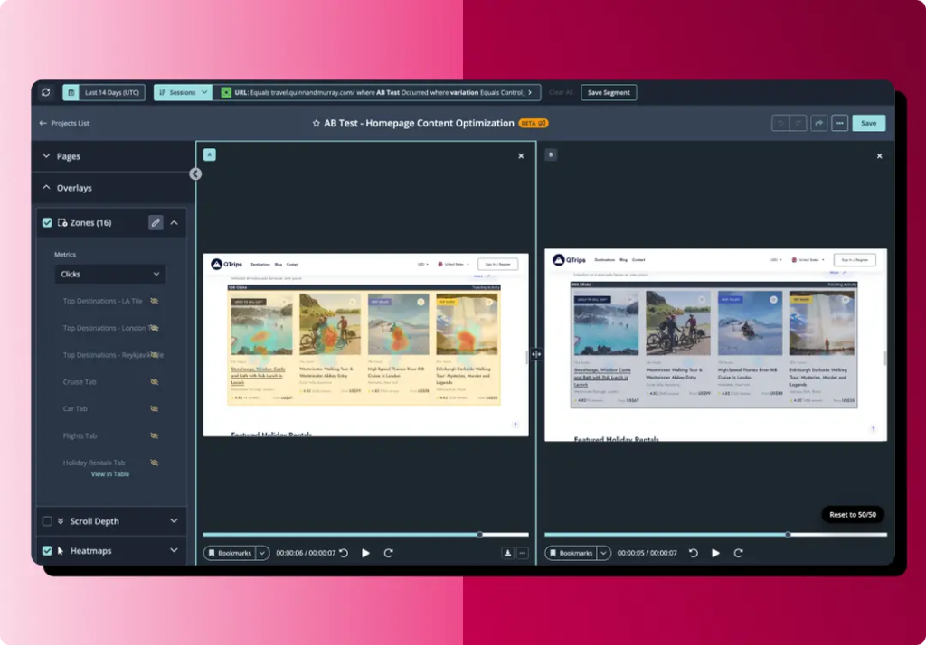
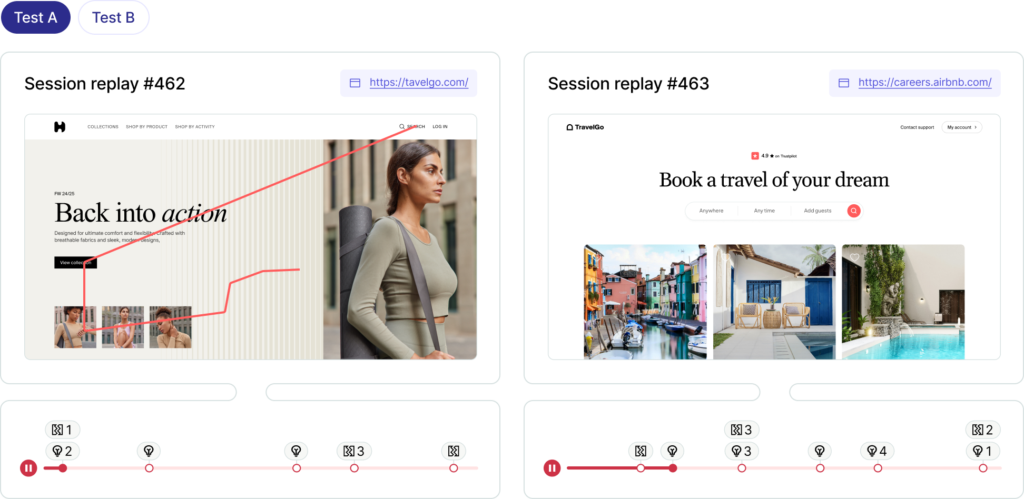
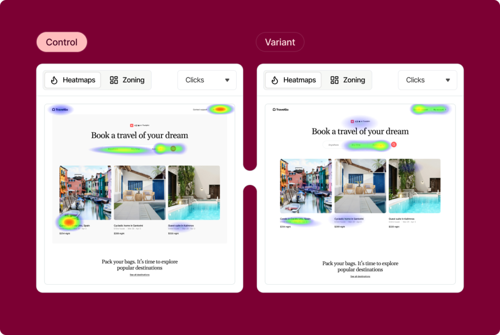
From Contentsquare, as soon as your test goes live, you can watch how your customers behave in the control and variation, side-by-side using Heatmaps and Session Replay. Get a visual understanding of why and how your customers behave differently in your variation and use these insights to inform your next testing phase.
How the partnership works in real life
Now that you know how the Contentsquare and AB Tasty partnership works, it’s time to see what it’s like in the real world.
Here’s how 2 leading brands have embraced the integration of experience analytics and experimentation into their CX to drive real growth outcomes.
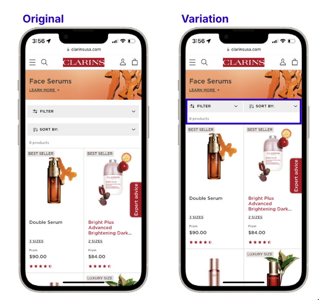
Clarins
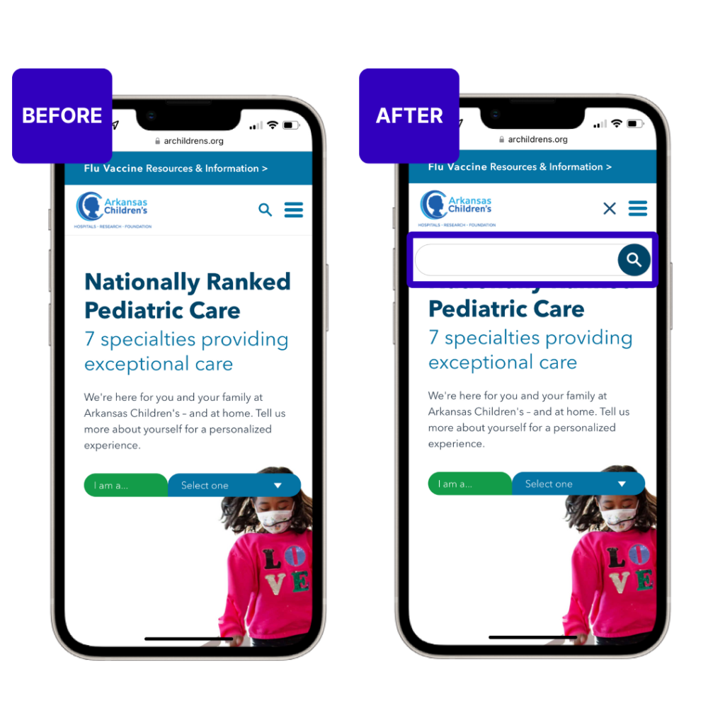
Global skincare company Clarins wanted to find out whether a “wishlist” option on their site would help to increase pageviews and conversions.
Using the Contentsquare integration with AB Tasty, they tested adding a heart icon to their product listing pages (PLPs) and product description pages (PDPs). This heart allowed users to save their favorite products to potentially purchase them at a later stage.
This test increased the overall number of transactions and resulted in
+1.54% increase in basket page views
+1.83% increase in transactions
“We are really passionate about continually optimizing what we’re already doing well plus also testing new theories to drive a great customer experience and continue to drive the commercial priorities of our website.”—Roisin O’Brien, Ecommerce Trading Manager at Clarins UK
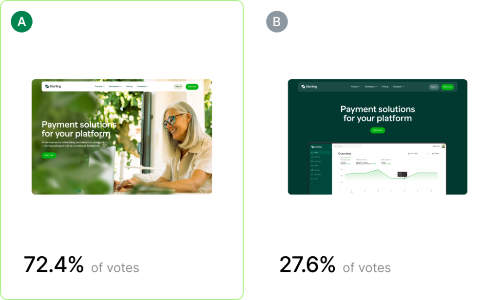
Rather than focusing on conversion rates, Mel Parekh, Head of ecommerce at Hotel Chocolate and his team wanted to focus on engagement and clickthrough rates.
Recognizing the importance of layout and user experience on customer engagement, the goal was to create a more visually appealing and intuitive homepage.
WithContentsquare’s integration with AB Tasty, his team redesigned the homepage, focusing on the category tiles, which were found to be the most attractive elements on the page.
By optimizing the homepage, they saw a
-10% reduction in bounce rates
+1.67% increase in visiting time
+0.54% increase in overall conversion rates, +7.24% increase on desktop
Mel Parekh, Head of ecommerce at Hotel Chocolate talked about customer loyalty at a recent Contentsquare CX Circle event.
Smarter insights with Contentsquare
Contentsquare is the all-in-one Experience Intelligence platform designed to be easily used by anyone that cares about digital journeys. With our flexible and scalable platform, you quickly get a deep understanding of your customers’ whole online journey.
Our AI-powered insights provide those “ah ha” moments you need to deliver the right experiences. You get to work faster and smarter with the confidence to know what to do next to improve your digital experiences. Leading brands use Contentsquare to grow their business, deliver more customer happiness and move with greater agility in a constantly changing world. Our insights are used to optimize the experience on over 1.3 million websites worldwide. For more information, visit: www.contentsquare.com
Online merchandising is more than just showcasing products; it’s capturing your audience’s attention, keeping them engaged, and guiding them smoothly toward a purchase. Let’s explore the essentials of online merchandising, breaking down actionable tips and strategies to elevate your e-commerce storefront.
What is Online Merchandising?
Online merchandising is the art of strategically organizing, showcasing, and promoting products on your e-commerce site to maximize engagement and conversions. Think of it as combining the precision of data analytics with the creativity of visual storytelling. Whether it’s through well-optimized product pages, eye-catching images, or personalized recommendations, the goal is the same: making shopping intuitive and enjoyable.
The Rise of Mobile-First Merchandising
Mobile is king in e-commerce. Have you ever noticed that smartphones seem to be glued to our hands? You’re not alone. According to Statista, over 54% of global website traffic now comes from mobile devices. For e-commerce, this means a mobile-first approach is non-negotiable.
How to master mobile merchandising:
Responsive Design: Online shopping is no longer linear. You have to ensure that your site is responsive across devices for a smoother shopping experience. This means making sure your design is responsive on desktop, mobile, and tablets.
More speed = more spending: According to Deloitte, a mere 0.1s change in loading time can improve the customer journey and improve conversion rates. It’s time to start minimizing code, optimizing images, and reducing redirects to speed up your mobile performance.
Streamlined Filters: Simplify searches with easy-to-use filters that don’t feel overwhelming on a smaller screen.
Mobile-Friendly CTAsand Buttons: On desktops, consumers click. On mobile, visitors tap with their fingers. A CTA (or any button) that’s too small can lead visitors to click on the wrong icon and derail their user journey. The CTA should be an optimal size (around 44×44 pixels) to avoid frustration.
Make your words worth it: With the constraints of a smaller screen, you may need to adapt your copy. Something as simple as changing your CTA button from “Contact Customer Service” to “Contact Us” can have a big impact.
Pro Tip: Dive further into mobile-first merchandising with our Smartphone Survival Guide to see how mobile impacts consumer behavior and how you can optimize your user experience to boost conversions.
Merchandising During Sales Periods
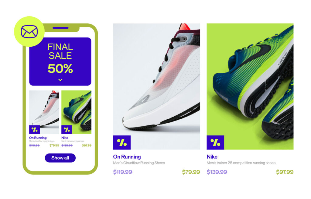
Sales periods like Black Friday, Cyber Monday, Singles Day, Valentine’s Day, or other seasonal events are more than just discounts galore – they’re an opportunity to drive traffic to your website, clear inventory, and welcome new visitors.
How to maximize impact during sales
Curate Themed Landing Pages: Think “Gifts Under $25” or “Holiday Must-Haves.” Tailored pages simplify the shopping journey and give customers exactly what they’re looking for while saving them time browsing.
Urgency Tactics: Phrases like “Limited Stock” or “24-Hour Sale” pressure visitors to buy quicker by creating a sense of FOMO (fear of missing out).
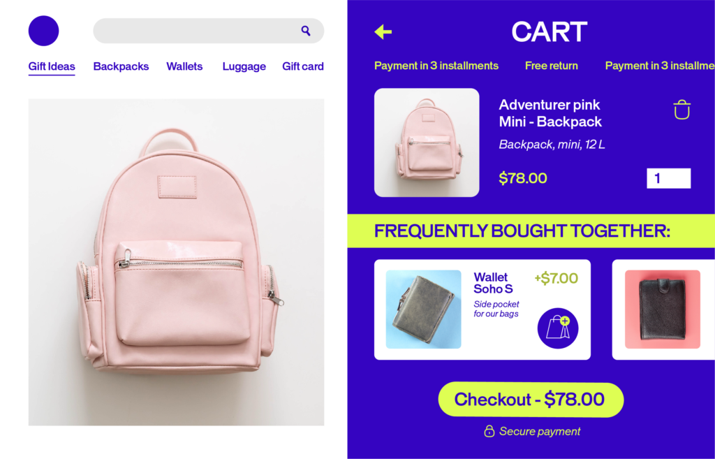
Bundle Deals: Push more products in your inventory by highlighting bundles. Grouping products into bundles with a “frequently bought together” algorithm increases the average order value while offering perceived savings.
These strategies not only boost sales but also make your customers feel like they’ve struck gold on your website by finding just what they’re looking for.
The Power of Personalized Product Recommendations
Ever added a pair of shoes to your cart and instantly been tempted by a matching belt? That’s cross-selling at work. Personalized recommendations, when done right, are like having a helpful salesperson who’s available 24/7 to help you find what you need. So, how do you implement recommendations?
Implementing Recommendations:
Use AI to Analyze Behavior: With experience optimization platforms like AB Tasty, you can implement personalized recommendations by using their AI-powered recommendation engine to predict and personalize what visitors might like based on past activity.
Offer Related Products: When visitors start browsing different products, you can show complementary items to help your customers have the most complete purchase. Selling skincare? Why not recommend helpful products to help your visitors “complete their nighttime routine.”
Personalize Email Follow-ups: Abandoned carts? Send a friendly nudge with personalized email recommendations to remind your customers what’s waiting in their basket.
Want to see the results of recommendations in action? Check out Alltricks’s success story where they saw a +5% in average order value or Jacadi earning +13% more revenue per user with AB Tasty’s recommendations and merchandising solution.
Optimizing Product Pages for Search Engines
Your product pages are like magnets for customers – if they’re SEO-optimized. According to AB Tasty’s E-commerce Consumer Trends Report, nearly half of online experiences begin with a search engine. By improving your SEO and therefore visibility, you’ll make it easier for shoppers to find you.
Must-Have SEO Features:
Targeted Keywords: The more details – the better. It’s always best to use longer, search-friendly terms like “women’s waterproof hiking boots” rather than generic ones like “boots.”
Enticing Meta Descriptions: In addition to a descriptive title, the meta description is your one opportunity to communicate key information about your product with a short, clickable summary to draw in potential buyers.
Alt text for images: Not only does alt text help you meet accessibility standards, but it also improves your chances of showing up in Google Image results.
Detailed Product Descriptions: write descriptions that are informative and keyword-rich while avoiding keyword stuffing.
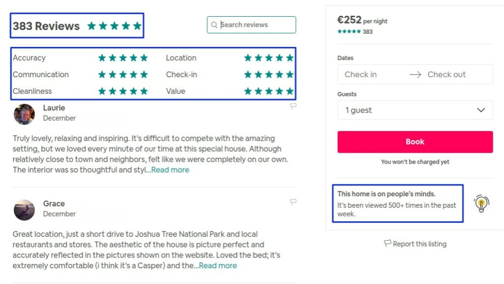
Leveraging Customer Reviews and Returns Data
Did you know that the majority of consumers read reviews before buying? In fact, Gen Z considers reviews to be the most important thing to consider before making a purchase (source). Reviews help build trust and provide social proof which helps undecided shoppers feel more confident in their purchases.
Ways to Leverage Reviews:
Spotlight success stories: We all love a zero-to-hero story! Highlight top-rated reviews directly on product pages to give confidence to your potential buyers.
Encourage feedback: Be proactive in building reviews for your e-commerce site by sending a post-purchase email asking for reviews (bonus tip: offer a small discount or loyalty points as an incentive).
Feature photos: Take your reviews a step further by encouraging your buyers to upload user-generated images of your products in real life to help build trust.
Turn returns into opportunities
Returns aren’t the end of the world, they’re learning opportunities. Analyze return trends to identify products, flaws, sizing issues, or misleading descriptions. Then, tweak your strategy accordingly to reduce future returns.
Conclusion:
Online merchandising is where creativity meets strategy. By embracing mobile-first designs, leveraging AI, optimizing for SEO, and personalizing the shopping experience, you can turn casual browsers into loyal customers. In today’s competitive e-commerce world, standing out isn’t optional – it’s essential.
With these best practices, you’re not just selling products, you’re creating an experience worth remembering.
FAQs: Online Merchandising
What is online merchandising, and why is it important?
Online merchandising is the process of strategically presenting products on your website to boost sales and engagement. It’s vital because it directly impacts the customer experience and your bottom line.
2. How does mobile-first design impact online merchandising?
A mobile-friendly site ensures a seamless experience for the majority of shoppers, who browse and buy via smartphones. This boosts conversions and reduces bounce rates.
3. How can I optimize my product pages for better visibility?
Use targeted keywords, detailed descriptions, high-quality images, and SEO-friendly meta tags to improve both search rankings and user engagement.
4. Why are customer reviews crucial for online sales?
Reviews provide social proof, build trust, and influence purchasing decisions. Highlighting reviews can significantly boost conversions.
5. What tools can help with AI-driven merchandising?
Platforms like AB Tasty offer advanced AI features to personalize recommendations and enhance the overall online shopping experience.


