The combination of intense competition and rapidly evolving technology requires businesses to prioritize customer experience optimization (EXO) to stay ahead.
The fact is, the cost of poor customer experience is high. According to a PWC survey, a third of consumers would stop using a brand they love after just one negative interaction.
In this article, we look at some common EXO challenges businesses face and strategies to overcome them, including practical insights for enhancing the digital customer experience. By implementing these strategies, you can ensure your business takes a customer-centric approach to optimizing the customer experience and building brand loyalty.
What is customer experience optimization?
Customer experience optimization refers to everything your business does to improve the customer’s experience at every touchpoint of their journey. It entails deeply understanding your customer’s needs and preferences and leveraging these insights to develop strategies to improve their interactions with your brand.
In today’s digital landscape, customers are flooded with choices across most categories of products and services. As a result, if you fail to deliver a positive experience, your customers will simply switch to a competing brand. EXO strategies are designed to keep customers satisfied and engaged, build brand loyalty, and reduce churn.
With EXO, it’s essential to deliver an experience that surpasses customers’ expectations and provides them with a seamless experience across all touchpoints and channels, including websites, mobile apps, social media accounts, and email.
Why customer experience optimization is important for business growth
First and foremost, EXO streamlines the customer’s path to purchase. Offering customers a frictionless, positive journey that makes it easy for them to get the information they need to make their purchase decision increases the likelihood of a successful transaction.
Customer EXO is also an ideal way to foster brand loyalty. Customers who have a superior experience with your brand are more likely to become repeat buyers. In fact, Deloitte research shows that a high-quality customer experience makes a customer 2.7 times more likely to keep buying from a business than a low-quality experience. Not only are customers likely to return, but they will also pay up to 16% more for an optimized experience, depending on the product category.
Positive experiences also trigger word-of-mouth recommendations, enhancing your brand’s reputation. Recommendations don’t entail the same acquisition costs as traditional marketing methods, making EXO a comparatively cost-effective way to boost sales and expand your customer base.
Challenges and solutions to customer experience optimization
We recognize there are challenges associated with EXO that may prevent you from delivering the best possible experience to your customers. Here are some strategies for tackling these challenges.
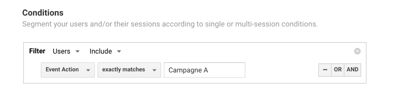
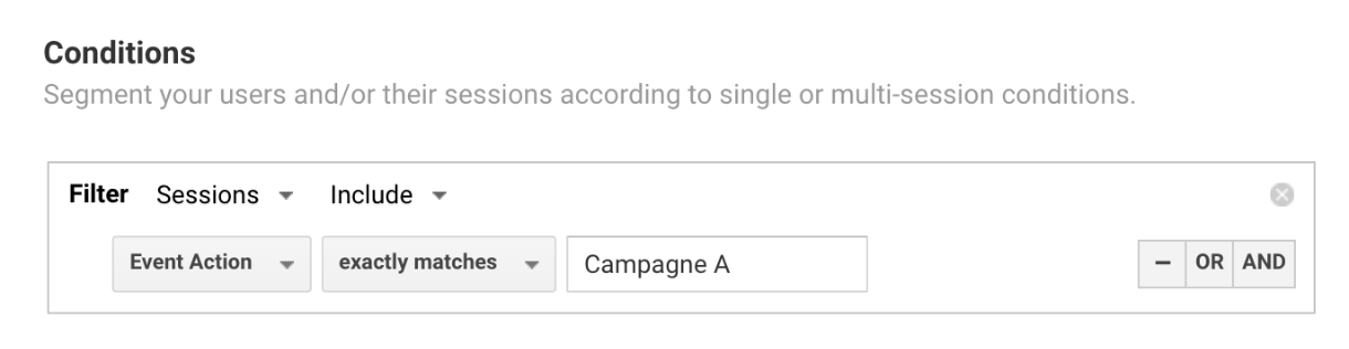
Compiling the right data for accurate measurements
Thanks to the various technologies available, we can now access a wealth of customer data. If interpreted and applied correctly, this data offers invaluable insights into the customer experience and ways of enhancing it. However, the sheer volume of these metrics can lead to information overload. It’s easy to get distracted or focus on the wrong metrics, including pitfall metrics that result in misinformed conclusions when considered in isolation. Some metrics, like cost of sale or cross-sell, don’t offer any meaningful insights into EXO.
The solution is to prioritize the metrics that matter. These include:
- Customer satisfaction (CSAT)
- Churn rates
- Bounce rates
- Customer retention rates
- Trust ratings, conversion rates
- Customer journey analytics
- Repeat purchases
- Customer segmentation
- Buyer personas
- Customer lifetime value (CLV)
- Net Promoter Score (NPS)
Keep in mind that this data may reside in various departments across your organization, extending beyond sales, marketing and customer service teams. Consolidating this disparate data is essential to gaining a complete and accurate picture of customer experience in your organization.
Developing the right hypothesis
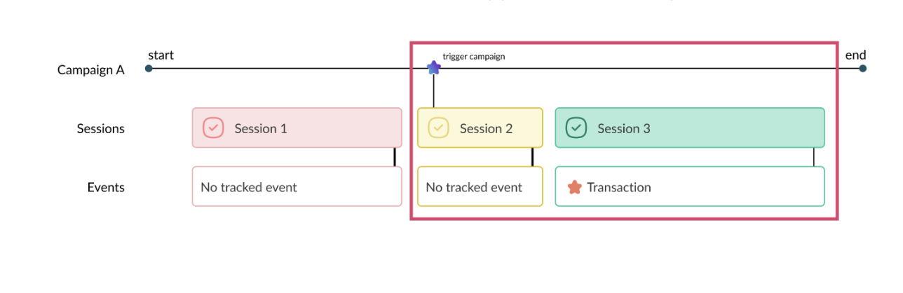
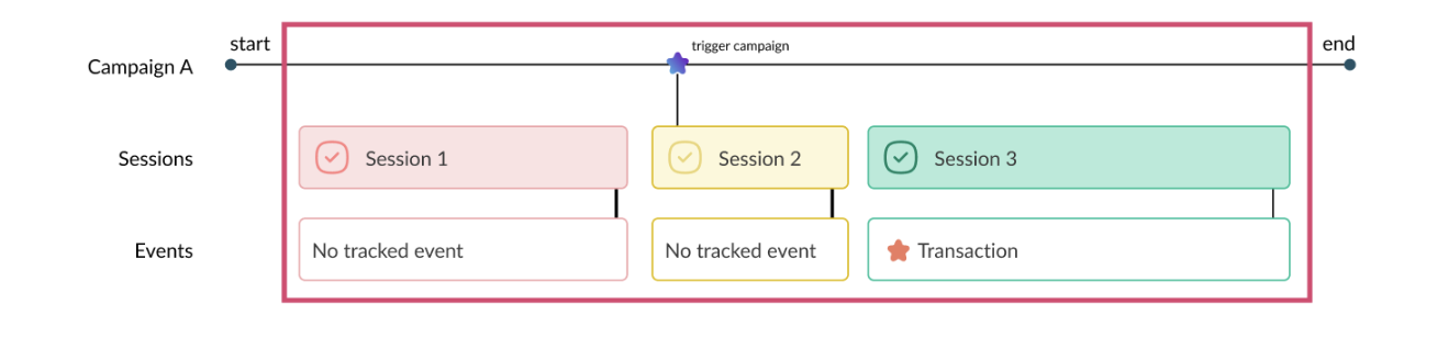
Experimentation is a powerful tool for delivering an optimal customer experience. However, randomly choosing hypotheses to test is a quick route to overlooking optimization opportunities. For example, simply changing the location of the checkout button in response to low conversion rates may not address the underlying issue.
Effective experimentation requires a considered approach to develop the correct hypothesis to test. The first step is identifying the genuine problem that needs addressing. You can then formulate a hypothesis to test to uncover the root cause of the issue and identify a concrete solution.
This second step requires a critical analysis of your current site and potential improvements from the customers’ perspective. Sourcing a range of data, including web analytics, user tests, and customer feedback, can help guide your analysis. You should also consider the psychology of the prospective customer. Getting in their mindset can guide you toward potential solutions.
If we continue with our checkout button example, the core issue may extend beyond conversion rates to a more specific concern: high cart abandonment rates. A hypothesis with a potential solution to this issue may be: “Many customers exit the checkout process at step 5. Reducing the number of steps in our checkout process will reduce cart abandonment rates.” Crafting the right hypothesis is a crucial step in optimizing customer experience.
Resource constraints
Ideally, businesses would have unlimited resources to optimize customer experiences. However, in reality, EXO usually competes with numerous other business priorities, all vying for time, human, and financial resources. Investing in the infrastructure and technology for EXO can be costly. Hiring and retaining people with the necessary skills to implement effective optimization strategies can also be challenging. Data availability is another common resource issue, especially for businesses with lower website traffic who feel they need more information for optimization.
The good news is you can tailor your approach to EXO to align with your business’s circumstances. This includes starting with smaller-scale initiatives and expanding your efforts as your optimization strategies gain traction or more resources become available. Another option is to outsource EXO by engaging the services of a specialist customer optimization agency.
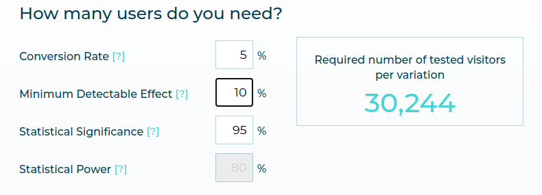
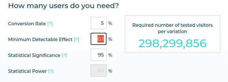
It’s also important to note that high-volume website traffic isn’t a prerequisite for identifying and implementing effective EXO strategies. While a 95% confidence level is often cited as the magic number for drawing meaningful conclusions from your data, you can still optimize websites with less traffic by lowering the threshold. Focusing on optimizing the top of the funnel, where there may be greater opportunities for EXO, is another useful strategy for low-traffic websites.
Related: How to Deal with Low Traffic in CRO
ROI tunnel vision
When a company works on improving EXO, its main focus is often on immediate ROI in experimentation, sometimes at the expense of other important metrics. While the bottom line is relevant to any business strategy, focusing solely on the financial outcomes of EXO can lead to short-sighted decision-making, jeopardizing longer-term sustainability.
Prioritizing immediate revenue gain above all else can negatively impact the customer experience. It makes it almost impossible for an organization to adopt a customer-centric approach, a fundamental requirement for EXO.
Experimentation isn’t always neatly quantifiable. Experiments are typically run within complex contexts and are influenced by various factors. While measuring ROI may be a criterion when assessing the success of your EXO strategies, it should never be the primary or sole one. Instead, shift your focus to the broader impacts of experimentation, like its contribution to better, more informed decision-making.
Not knowing what your customers want
A customer-centric approach is vital to delivering an optimal customer experience. This requires an in-depth understanding of who your customers are, their needs and preferences, and precisely how they interact with your business. Without these insights, you’re in the dark about what your customers want and when they want it. Meeting—let alone exceeding—customers’ expectations is impossible.
Customer wants and needs are as diverse as your customer base. They may include a desire for higher levels of personalization, seamless online interactions, flexible payment methods, faster customer support, better pricing, transparency or increased mobile responsiveness. What customers want also evolves as their journey progresses. If your EXO strategies fail to align with your customers’ desires at the right time, they are unlikely to succeed.
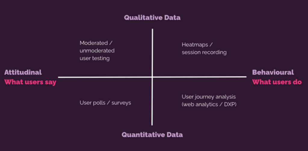
While there are several ways to uncover customer needs and wants, one of the most effective methods is to go directly to the source. Collecting customer feedback at each stage of their journey—via surveys, feedback management systems, voice of customers, and user interviews—lets you tailor your EXO strategies and deliver the improvements your customers truly want.
Lack of customer experience optimization tools
Successful EXO relies on quality data for insights into your customers’ journeys, needs, and preferences. To achieve this, you need the right tools to capture and analyze accurate data in real-time across multiple channels.
These tools include:
- CRM systems to track historical customer behavior and relationships
- Customer feedback and survey software to collect individual feedback for deep insights into what your customers want
- Behavior analytics tools to interpret your customers’ interactions and identify opportunities to improve their experience
- Experience optimization platforms, like AB Tasty, to design and deliver digital omnichannel customer experiences via experimentation

It’s important to review the needs of your EXO strategy and the available tools to choose the ones that best align with your customers’ and business’s needs.
How to improve the digital customer experience
-
Observe user behavior patterns
A robust data foundation lets you observe and understand customer behavior individually and identify broader trends. This information serves as a compass, guiding your EXO efforts.
Customer insights may reveal common pain points. For example, a frequently searched term may highlight a topic customers want more information on. These insights also help you understand how users interact with your site, how that impacts their journey, and potential improvements. Is there a particular page where customers spend a lot of time? Do they have to navigate back and forth between pages to find the details they need?
Behavior patterns also reveal customer preferences, allowing you to personalize touchpoints within their journey and identify what triggers customers to complete their purchases. These insights serve as a powerful foundation for developing EXO strategies and hypotheses for A/B testing.
-
Create a journey map to understand the user flow
EXO involves optimizing every customer interaction with your business. A common pitfall to avoid when addressing EXO is approaching it narrowly from a specific touchpoint rather than considering the entire customer journey. A holistic approach delivers more impactful insights that help you manage the root causes of negative or neutral customer experiences.
A great way to understand your user flow and how it affects customer experience is to create a journey map, setting out every touchpoint during the buying process. Navigate your website like a potential customer, systematically stepping through the user journey and noting your findings.
Putting yourself in the customer’s shoes ensures you don’t overlook opportunities to optimize customer experience. This approach can also help you prioritize measures that make the user journey frictionless, improving customer experience and your site’s performance.
-
Develop a roadmap and set parameters to measure success
The list of available EXO measures is endless. Aligning your strategy with your business objectives requires a considered approach to implementation. To do this, develop a roadmap that outlines your goals, priorities and milestones.
A well-structured roadmap gives your team clear direction and deadlines while guiding decision-making to ensure the greatest impact on customer experience. Everyone understands their role, guaranteeing accountability in the execution of your EXO strategy. It also helps you prioritize initiatives and allocate the necessary resources, including EXO tools.
In your roadmap, you can list the specific metrics and KPIs to measure and track your progress. Doing this allows you to evaluate your EXO measures, readjust those not delivering results, and build on particularly effective ones.
-
Experiment and re-challenge your past experiments
You’re unlikely to unlock the secret to EXO in your organization on the first try. Instead, you’ll need to run continuous experiments using different hypotheses to find the right combination of strategies that work for your business.
The customer experience is dynamic and your EXO strategies should be equally adaptable. Continue to review your previous experiments to see what more you can learn from them, especially in terms of customer preferences. This process enables you to identify emerging opportunities for improvement and further refine the measures with the most impact to deliver an optimal customer experience.
Customer-centric EXO
Acknowledging that your business must prioritize customer EXO is just the beginning. By understanding the customer experience definition, common EXO challenges, and practical strategies to overcome them, you have the tools to deliver a consistently superior customer experience. By integrating a customer-centric ethos with your EXO strategies, you’ll not only strengthen current customer relationships but also cultivate enduring brand loyalty.


