Article

3min read

Supercharge Your Coding Experience With AB Tasty’s VS Code Extension

Throughout the coding and testing process, developers find themselves having to switch between a lot of different tools. At AB Tasty, we’ve understood that this can be a hassle which is why we’ve worked to make it easier to work between your coding environment in VS Code and the AB Tasty feature flagging platform.

AB Tasty’s new open beta for VS Code extension means that teams can work faster and take their coding experience to the next level.Ā 

This new extension will allow you to use AB Tasty Feature Experimentation and Rollouts, formerly Flagship, directly in the VS Code environment.

This means that you no longer have to switch between your Visual Studio code environment and your flags in the AB Tasty platform.

Why should you use AB Tasty’s VS Code extension?

With the VS Code extension, implementing feature flags in your codebase has never been simpler.Ā 

The extension enables you to seamlessly connect your Visual Studio Code environment with AB Tasty for full visibility over feature flags in your files and then retrieve the flag and its details directly in your code, which helps save time and eliminate complexity.Ā 

This significantly boosts productivity as you no longer need to switch between your coding environment and platform making the management and implementation of feature flags much easier.Ā Ā 

Getting startedĀ 

To be able to use this extension, you will need to have an account in AB Tasty. Then all you need to do is follow the steps below:

1)Create an access name on our Remote Control APIĀ 

By creating an access to our Remote Control API, you’ll be able to manage the right scopes and get access to the extension’s features.

2)Save your client ID and client secret

Ā 

You will then receive your ā€œclient IDā€ and ā€œclient secretā€. These credentials will allow you to log in to the extension.Ā 

Ready to get started?

You’ll be able to find the extension on the Microsoft marketplace or in the extension marketplace directly in VS Code in order to download it.

Once the download process is complete, you can then follow the steps in our documentation to create a configuration and start using the extension.Ā Ā 

Don’t forget to rate and review Flagship Code on the VS Code Marketplace to help us continue improving your coding experience.

AB Tasty code supports various programming languages and frameworks, making it adaptable to your tech stack – and if that’s not the case, feel free to get in touch.


Article

6min read

Maximize the Potential of Experience Optimization Platforms: Key Questions to Ask for Performance Success

In the dynamic realm of e-commerce, selecting the right experience optimization platform (EOP) is essential for achieving success. But, how do you assess the impact on your website performance and unleash its full potential on your site?

We’re here to guide you with key questions to ask experimentation and personalization solutions you’re assessing, specifically designed to help you evaluate performance – so buckle up and continue reading to unlock new levels of success!

Bonus audio resource: Curious to know more about what AB Tasty does to address performance and optimize customer experience? Listen to this insightful discussion between LĆ©o, one of our product managers, and Margaret, our product marketing manager. In this chat, LĆ©o explains what AB Tasty specifically does to improve performance for our customers. Want to know even more? Check out LĆ©o’s in-depth blog post.

#1: Does the platform offer 99.9% uptime and availability?

Downtime can be a nightmare for your business. Make sure the EOP is known for its reliability and high uptime. Although it might not sound like a big deal, the difference between 99.5% uptime and 99.9% uptime is huge. With 99.9% uptime, you can expect less than 9 hours of downtime annually, vs. 99.5% which can mean nearly 2 full days of downtime in a year. It’s crucial to choose a platform that can keep your website accessible to customers as often as possible, ensuring a seamless shopping experience around the clock and more revenue for your business.

#2. Does the platform prioritize website speed and load time?

It goes without saying that in the fast-paced online world, speed matters. Does the EOP offer features that prioritize website load time? Look for optimization techniques such as caching, image compression and code optimization to ensure quick and smooth page loading. A snappy website keeps customers engaged and drives conversions.

#3. Does the platform provide a comprehensive performance center?

Acting on detailed performance data ensures your website is always giving users the best experience. Does the EOP offer comprehensive insights into reducing the tag or campaign weight for optimal performance and user experience? Your EOP should have a performance center that guides you to campaign optimization, including ways to reduce tag weight, identify heavy or old campaigns you can delete, or targeting verification.

#4. Do the performance metrics they’re showing you come from sites that are active?

Some EOPs might show you performance metrics that include sites that aren’t actually active. An inactive site has a much lighter tag weight than an active site, which makes their performance metrics look much better than they actually are. Always ask the EOP if their metrics are from active sites to ensure you’re seeing the most accurate representation of what you can expect if you go with them.

#5. Are they regularly adding new features to enhance performance?

To stay ahead in the rapidly evolving digital ecosystem, it’s imperative that your EOP consistently adds new features to optimize performance. With regular updates like these, you can ensure you’re meeting user expectations, addressing emerging challenges, enhancing performance metrics, and keeping an edge on the competition.

Take, for example, dynamic imports. Using dynamic imports has a huge advantage. When we were using a monolithic approach, as some EOPs are still doing, removing a semi-colon in one campaign and pushing this change to production meant that all visitors would have to download the full package again, even though only one character over tens of thousands had changed. With dynamic imports, all visitors redownload the new version of the campaign – and that’s it. Simple.

#6. Can the platform handle spikes in web traffic?

E-commerce sites often face surges in traffic during peak periods or promotional events like Black Friday. How does the EOP handle increased web traffic without compromising performance? Look for platforms with content delivery networks (CDNs) that handle load balancing and scalability to ensure your website remains stable and accessible during high-demand periods.

#7. Does the platform have both server-side and client-side offers?

Having both server-side and client-side EOPs is crucial for e-commerce companies, especially given how much e-commerce is happening on mobile and apps. Server-side optimizes performance with zero flicker and seamless mobile experience, while client-side enhances user experience and puts the power of experimentation and personalization into the hands of marketers, freeing up developer time. Utilizing both platforms enables holistic optimization and consistent experiences, drives business growth, and leads to more satisfied customers.

#8. What level of local customer support and documentation does the platform offer?

Technical support and comprehensive documentation are vital for a smooth experience with your platform. What kind of reliable customer support channels does the EOP provide? Look for platforms that offer timely assistance in your locality and language, and extensive documentation, empowering you to resolve issues and make the most of your platform’s features. Review P2P sites like G2 to understand what EOPs consistently offer the best service.

#9. Is the platform scalable and adaptable to future needs?

As your e-commerce business grows, your optimization needs may change. To what degree is the EOP scalable and flexible enough to accommodate future requirements without affecting performance? Does the platform have well-known medium and large client brands with high traffic demands? Choose a platform that can adapt to evolving business goals and easily incorporate new features. This ensures the platform remains aligned with your growing needs.

#10. Can you test out the tag for yourself?

Tags should be easy to implement. You want to make sure that the one you go with is compatible with your system. While industry reports can give you an idea of what you can expect, they aren’t representative of your site. The best way to tell is to test it for yourself on your site. This lets you see if what the EOP says is actually what you get. It can also give you an idea of implementation, use, accuracy, reliability and confidence. Finally, it lets you see if there may be any issues that could arise and gives the EOP a chance to address them immediately.

Evaluate the Performance of EOPs to unlock your potential

By asking these key questions, you can begin to evaluate the performance of experience optimization platforms and ensure you select one that helps you unlock your potential. Focus on uptime, speed, traffic handling, mobile optimization, integration capabilities, support, and scalability – and ensure the EOP has an answer for every one of these questions, with proof to back it up. This way, you’ll be able to make an informed decision and optimize your ecommerce site for a seamless user experience, driving higher conversions and business growth.

Go through the checklist below, whether you have an EOP already in place, or are looking to start your EOP journey, and ask providers what they offer:

ā˜‘ļø Does the platform offer 99.9% uptime and availability?
ā˜‘ļø How does the platform prioritize website speed and load time?
ā˜‘ļø What does the platform’s performance center look like?
ā˜‘ļø How does the platform handle spikes in traffic?
ā˜‘ļø Does the platform offer both server-side and client-side optimization?
ā˜‘ļø Does the platform integrate with the tools and systems that you already use?
ā˜‘ļø What level of support and documentation does the platform offer?
ā˜‘ļø Is the platform scalable and adaptable to your future business needs?

Article

7min read

Four Ways to Use GA4 to Power Your Web Experimentation Programs

We invited Oliver Walker from our partner Hookflash to talk us through the practical ways you can use GA4 with your experimentation.Ā 

Although many people are talking about GA4 as a different platform from the previous version (Universal Analytics), conceptually it lets you do largely the same things. Its primary functions are to help you to understand and optimize your media; to understand and optimize your website; and to understand and segment your website visitors into audiences. However, with GA4 several features can really help you to power an experimentation program.

Here we’ll outline how to use GA4 to its full potential to drive results for your testing program.

Understanding User Behavior

At its core, Google Analytics has always been great for helping website owners to understand their website traffic. Whether it’s where they started their journey or where they ended their digital journey, or whether they sought help halfway through, there are a few options to know about. What we know about GA4 already is that it’s not the most intuitive tool in the world so here are some quick tips on that front:

  • Landing Pages – use Explorations – although there is a default report for landing pages…it’s not the best. Not just because there’s a known bug resulting in an empty row, but also because it doesn’t have the most useful metrics, i.e. bounce rate or engagement rate. If you build a report in Explorations, you can use a different dimension (called ā€œLanding page + query stringā€) and choose the dimensions you’d find useful:

  • Exit rate – similar to the above, you no longer get Exits (or Exit Rate) in the default Pages & Screens report. Again, rebuilding the report in Explorations gives you both the ability to add Exits as a metric, and you can choose your preferred pages dimension. The default dimension in the Pages and Screens report does not include query strings but if you’d prefer to use the one that does, choose the dimension ā€œPage path + query stringā€.
  • Site search – and finally, where’s the Site Search report gone!? There’s no longer a default report for this but you can rebuild this in Explorations. You can understand which search terms were most often looked for, by building an Exploration with the dimension of ā€œSearch termā€ and the metric ā€œEvent countā€.

Understanding User Flow

What Universal Analytics was not particularly good at is visualizing how people traverse through a website. The flow reports were horribly sampled and just merely teased you as to what you could have had. GA4 has on-the-fly path exploration reports that can be used and tweaked, very flexibly. You can find these within Explorations too, just choose Path Exploration and thenĀ  tweak, as per the following:

  • Get the pages view – for some unhelpful reason, the default view is Event Name, within each step. In the visualization, click the drop-down underneath Step +1 and change Event Name to be your preferred page dimension to get a view of how users move from page to page.
  • Double-click the page you are interested in to see where users go next. You can also click the +15 more (or whichever number) link at the bottom of each column to get the longer tail
  • Choose a dimension to ā€œbreakdownā€ by lets you easily compare routes through the site for different users, for example mobile vs. desktop or for each of the different browsers. Likewise, you can use segments here to review a certain audience type, e.g. non-UK traffic or Purchasers.

Audience targeting & triggers

Speaking of audiences, this was always a great feature of Universal Analytics and when Google Optimize was in its pomp, the ability to share audiences from UA to Optimize was one of its prime features. With GA4 you get the same ability to build audiences and to share audiences natively with other Google Marketing Platform (GMP) plus some neat additional elements:

  • The ability to use user behavior to trigger new types of goals. For example, if you’re a publisher and you want to engage people to read a certain number of articles in a particular time frame, it’s possible to create an audience for this and then have that set of behavior trigger a new event. It’s called audience triggers. And this becomes a powerful new metric with which to optimize your testing campaigns, by importing that conversion into your chosen testing tool
  • The ability to export audiences from GA4 to other platforms. Namely, this is something that the new Google Analytics Data API supports. This is big news. Whilst it’s to be expected that other platforms will catch-up, at the moment AB Tasty is the only one to have published their mechanism for pulling GA4 audiences into their platform:

This is generally a great leap forward as GA4 also has the concept of users being added, and removed from audience groups, whereas most testing tools don’t have this feature.

Advanced analysis using BigQuery

The final area where GA4 really steps forward beyond its predecessor is that all GA4 accounts have a native integration with Google BigQuery. Whilst the integration itself is free, it’s worth noting that you do incur costs by storing or processing data in BigQuery, although a good partner will be able to advise on what that might look like for you.Ā 

So where does BigQuery help? The data schema provided by integrating GA4 and BigQuery is raw-level data – that means each row is effectively an event, with a time stamp, and all the associated parameters. It lets you have a greater degree of flexibility over what you analyze, provided you’re able to query the data (using SQL, or your friendly AI-driven chat tool.) For example:

  • If you want to understand how long it takes a user to complete a particular flow or set of actions. Worth noting that Google Analytics does batch events so this isn’t perfect, but it is easier than within the interface
  • If you want to look at user flows at an even greater level of detail, for example, how users traverse through the site having landed at a particular page
  • If you want to stitch together any data that GA didn’t capture but that also exists in Google Cloud, e.g. following a lead to submission through to outcome.
  • If you want to conduct a deeper analysis within your post-experiment analyses. All testing platforms will pass events and parameters to denote whether a user was part of an experiment and the variation they saw, so GA4 is a powerful additional tool to deep-dive into results

It’s not all doom and gloom

Yup, GA4 does have some limitations, it’s a big change to a tool that lots of people loved and it’s hard to pick-up. BUT when you start to understand certain concepts and familiarize yourself with capabilities, there are lots of features to help you with your experimentation program.

Article

7min read

Understanding shopping engagement software: How do virtual shopping assistants work?

Every visitor shopping online wants to find a product that precisely meets their expectations quickly and efficiently. To achieve this, you can offer your potential customers purchasing advice to guide them throughout their buying journey.

In this article, you will discover the different forms of virtual shopping assistants available in e-commerce and the advantages they bring to you and your customers.

What are virtual shopping assistants?

Virtual shopping assistants, enabled by shopping engagement software, provide your shoppers with support in their product selection through an interactive and personalized exchange. By asking precise questions, your customers can find products that align with their wishes and needs more quickly.

This approach is based on the purchase advice provided in brick-and-mortar retail, aiming to overcome the impersonal components of online shops and enhance the individual user experience.

How do virtual shopping assistants differ from faceted search?

With faceted search, your customers can filter their search results in the online shop to view the products that interest them. For example, when searching through an e-commerce apparel shop they can use faceted navigation to select features, such as women’s blue capris in size 40, providing a user-friendly experience.

However, customers need to already know exactly what they want to buy to filter accordingly. If a customer is uncertain about their purchase or unsure about the specific product features they desire, they require support in the form of virtual shopping assistants.

What kinds of virtual shopping assistants are available?

There are various formats of virtual shopping assistants in e-commerce that can be integrated at different points of the customer journey. Let’s take a closer look at two categories: person-to-person communication tools and automated tools that can handle multiple customer inquiries in real time.

Virtual shopping assistants with human-to-human communication

Below, we present two examples of virtual shopping assistants that utilize human-to-human communication:

Live chat

Live chat is a messenger tool that allows your customers to directly contact an employee of your online shop. Typically integrated as a pop-up window on the company website, it facilitates one-to-one communication, resembling the experience of brick-and-mortar retail.

Video consultation

Video consultation is a rising trend in the e-commerce industry.Ā 

Customers visiting your e-commerce site may still be exploring their needs, making phone, chat or email interactions insufficient. With video consulting, customers can engage in face-to-face conversations with an employee of your online shop, ask questions, and receive individual advice on your products and processes.Ā 

For instance, customers can share their screens and present their ideas and inspiration to the sales representative, leading to a more targeted sales pitch. This combination of online shopping with personalized attention replicates the experience of boutique purchases and ultimately boosts customer loyalty and satisfaction.Ā 

The advantage: Your customers receive immediate, personalized answers to their questions about products and processes while they browse your shop. Especially for complex products that require explanation, customer-oriented live chat can positively influence purchase decisions. Additionally, you can offer appointments for individual purchase advice.

Virtual shopping assistants with AI-based tools

Now, let’s explore two examples of online consulting software that utilize AI-based tools for real-time interactions with multiple customers at once.

AI-based chatbots

Chatbots using artificial intelligence can respond to hundreds of customer inquiries simultaneously and in real time.Ā 

With the emergence of large language model chatbots such as OpenAI’s ChatGPT and Google’s Bard, brands have the potential to revolutionize how they engage with their customers online.

Depending on how the tool is programmed, it can recognize natural language, generate suitable answers from text blocks and databases on your website, and even escalate queries to a human employee if necessary. This enables personnel-friendly automation of various processes.Ā 

Guided Selling

Guided Selling involves guiding your customers through the product selection process to facilitate a confident purchase decision. This is particularly useful for potential buyers who may not possess enough knowledge about the products to make an informed choice.

For instance, when it comes to purchasing a stroller, expectant parents can feel overwhelmed by the countless models available. Guided Selling assists them in narrowing down the selection through targeted questions, leading to the ideal stroller. This can be seen in the example from babymarkt.de, who uses Guided Selling from AB Tasty to provide better shopping experiences for their customers.

This form of assistance, where a customer is guided step-by-step through the consultation process based on specific questions, is especially suitable for products that require explanation and mirrors the experience of a sales pitch in brick-and-mortar retail. Guided Selling can also be used for self-explanatory products, where customers can find the right product selection by selecting certain tags.

What makes Guided Selling special is that the results can be personalized to display suitable products based on the individual click and buying behavior of your customer. This ensures that your customer receives not only products that match their desired features and requirements but also their unique preferences.

Why is good customer engagement important in e-commerce?

Customers who feel well-advised are happy to come back. This applies to both brick-and-mortar stores and e-commerce shops. In addition, there are other reasons for using shopping engagement software like virtual shopping assistants.

Personalized shopping experience

When potential buyers walk into a brick-and-mortar store, they can approach the on-site sales consultants to find the right product.Ā 

By integrating this service into your online shop in the form of live chats, video advice or Guided Selling, you enable your customers to recreate the feeling of an interactive, personalized shopping experience.

Shoppers become customers

Virtual shopping assistants help you convert potential buyers into customers. By putting customers in direct contact with your team or catalog, they get answers to their questions that can positively influence their purchase decision.Ā 

For very personal products such as mattresses, a virtual shopping assistant tool helps visitors to find the one that exactly meets their needs from the multitude of models.Ā 

A better user experience

Your visitors appreciate positive experiences throughout their customer journey.Ā 

Support through virtual shopping assistants gives them a secure feeling when choosing a product and more frequently leads to a purchase decision. In addition, virtual shopping assistants make shopping easier: You present your customers with suitable solutions, they feel understood and the positive user experience is anchored in their memory.

Higher conversion

With virtual shopping assistants and shopper engagement software, you can reduce lost sales opportunities and thus increase your conversions. Sometimes potential buyers leave a shop because they didn’t find a product that is actually there. If they can easily ask a sales representative about the product via live chat, it will improve their shopping experience.

Your potential customers have already added products to their shopping cart, so why are they abandoning the checkout process? One possible reason: They had a question about a process that was not answered quickly enough. With an AI-based chatbot available during the checkout, these questions can be solved quickly and efficiently.

Higher customer satisfaction

The personalized service of a virtual shopping assistant creates an intimate atmosphere – a 1:1 exchange reminiscent of brick-and-mortar experiences. This not only strengthens potential buyers’ trust in your company but also their satisfaction. And satisfied customers turn into loyal customers.Ā 

Fewer Returns

Implementing virtual shopping assistants in your shop reduces the risk of returns. The two most common reasons for returns are either that the product didn’t fit or they didn’t like it.Ā 

With personal, targeted advice, you can help your customers to choose the right products that meet their wishes and needs as precisely as possible. This reduces your costs and makes your returns management easier.

Conclusion: Virtual shopping assistants make e-commerce more human

Virtual shopping assistants are a must-have in e-commerce. It offers advantages for you as an e-commerce marketer as well as for your customers.Ā 

Live chats or chatbots, video advice and Guided Selling make it easier for potential buyers to select a product and improve their user experience. In a 1:1 exchange, they receive personalized answers to their questions – the online shop becomes more human. At the same time, you benefit from higher customer loyalty and fewer returns, which means you can increase your sales.

Article

5min read

A New Chapter for Flagship as it Merges with the AB Tasty Website

We are excited to share that as a part of our ongoing strategy to optimize how you access AB Tasty’s suite of experimentation and personalization tools, Flagship by AB Tasty is now evolving to join the AB Tasty brand and website.

This doesn’t mean your favorite experience rollout and feature management tools are disappearing, but rather it’s part of a new exciting chapter for AB Tasty with the goal to make all our features available in one place under one name.

We have merged the AB Tasty and Flagship websites. All resources and landing pages previously hosted on Flagship’s website (flagship.io) can now be found in one location on the AB Tasty website (abtasty.com).

This branding evolution means the Flagship name will be phased out and then retired. While we feel a little nostalgic for the old name, the end goal is to make it easier to get access to the AB Tasty umbrella of solutions and features and join them together to keep our promise of being your go-to-platform for improving and optimizing the customer experience.

If you have questions about what this change means for you, you’ve come to the right place. Below we will dig into what is changing, helpful links and resources and some general FAQs.

As always, our team of AB Tasty magic makers are available to answer any additional questions that might pop up along the way. If you have any more questions after reading this, don’t hesitate to send us an email at hello@abtasty.com and we will update this page as needed.

How are AB Tasty and Flagship related?

AB Tasty and Flagship have always been the same company, just with different names for the server-side solutions and client-side solutions.

AB Tasty’s experimentation suite enables brands to carry out client-side A/B testing and personalizations in order to provide a richer digital experience and boost conversions.

Meanwhile, Flagship by AB Tasty is also built to provide richer experiences that convert through risk-free feature management, server-side experimentation and personalization. Again, same company, just different ways of helping brands provide the best experience for their customers.

What do you mean when you say merge? Will the Flagship website be gone for good?

Yes, everything on the Flagship website (flagship.io) has moved over to the AB Tasty website (abtasty.com). This means links to existing landing pages and resources are all redirected to AB Tasty, and any new resources will be posted directly on AB Tasty from here on out. Easily access resources like e-books, blogs, guides and more by clicking on the resources tab above or following the link here.

Why are we merging the Flagship and AB Tasty websites and names?

From the start, our focus has always been on what we do best, which is giving clients the tools they need to validate ideas while maximizing impact, minimizing risk and accelerating time to market.

Marketing teams and tech teams are working more closely together than ever before to bring new features to market to stay competitive. Our customer-first approach means we want to make our features more accessible and find the tools you need for all your experimentation and personalization needs. For this reason, we have decided to bring Flagship to the AB Tasty website and to position it as AB Tasty’s Feature Experimentation and Experience Rollouts rather than as a separate solution.

Many of our client-side clients have evolved their experimentation needs to the point where they are running more advanced experiments and rolling out more advanced features. For our clients who are ready to start server-side experimentation, this change makes it much easier and faster to find all the information and support they need about all our features, including our server-side functionality, in one place.

What will happen to all the resources (blog posts, guides, e-books, etc.) on the Flagship.io?

As mentioned above, the Flagship content is now migrated and all links from flagship.io are redirected to the AB Tasty. From there, all our resources from guides to blog posts and e-books about feature management, experimentation and more can all be found on the AB Tasty website.

You’ll find your favorite content can be easily accessed here if you filter for the ā€œRolloutsā€ and ā€œFeature Experimentationā€ topics.

How can I log into my Flagship account? And where can I access the documentation and SDK libraries?

You can access your accounts by visiting abtasty.com and clicking the login button in the top right-hand corner.

All our documentation and SDKs will have the same links as before. You can access them below:

How will the merger affect existing customers of both Flagship and AB Tasty and the support they receive?

All our clients, regardless of whether they are using AB Tasty or Flagship or both, will not be affected. You can continue to use our platform for all your experimentation needs without any changes.

Likewise, you can expect to receive the same level of support and have access to the same dedicated team for client- and/or server-side experiments as before.

As always, your CSM will inform you in a timely manner when/if there any changes to the platform occur.

How will the merger affect new customers? Where can I sign up for a demo for AB Tasty’s Feature Experimentation and Rollouts?

If you’re new and you’d like to try out AB Tasty’s Feature Experimentation or Experience Rollouts, click the banner below or click the “Get a demo” button on the top right-hand corner of the pageĀ to explore how server-side experiments can positively impact your business.

A very special thank you to our customers and our partners for supporting us in this exciting evolution of AB Tasty. Your feedback and support helps shape important changes such as these, and we are grateful for it.

Have any additional questions about AB Tasty? Send us an email at hello@abtasty.com to let us know and stay tuned for more exciting updates and information still to come!

Article

4min read

5 Mistakes to Avoid When Selecting an EOP

If you’re an e-commerce company, you know better than anyone how important it is to optimize your website and have the best possible user experience.

You’ve heard about experience optimization platforms (EOPs) and how they can improve your website’s performance, enhance customer loyalty and increase order size. We know you’re excited – and so are we!

But, before you dive headfirst into the dizzying world of EOP selection, let’s go through the most common mistakes e-commerce companies make so you can avoid them!

Mistake #1: Focusing on quantity over quality

You might be tempted to select an EOP that offers a ton of features, capabilities, and integrations. After all, more is better… right? Not necessarily.

When it comes to experience optimization, quality > quantity.

It’s especially important to make sure that what the EOP provides is right for YOUR company and its goals.

It’s easy to be seduced by an EOP that boasts 50 integrations or hundreds of features. But, a platform that overwhelms you with options and doesn’t deliver real value will end up costing you precious time and resources.

Opt for the platform that offers the most effective features that help you achieve your specific goals.

Mistake #2: Not considering customer success

You’ve worked hard to hire the smartest people for the job and have full faith in your employees. They can probably figure out any problem that comes up. But, when it comes to experience optimization, things don’t always go as planned.

This is why it’s so important to choose a platform that offers excellent customer support.

Look for a platform that not only provides responsive support but also has a community of users with people you genuinely enjoy working with. A platform like this can offer strategic guidance in alignment with your goals.

Mistake #3: Overlooking scalability

We know that part of the reason why you’re looking for an EOP is to grow your customer base. One of the best ways you can do that is by selecting an EOP that can grow with you.

Not every EOP is designed to scale, so make sure you’re choosing one that accommodates your company’s growth goals and can accompany you along the way.

Look for a platform that offers scalability within its plans and can support increased traffic, as well as new features.

Mistake #4: Ignoring mobile and app optimization

More and more customers are choosing to shop from their phones, which means mobile optimization for all devices is critical.

A poorly optimized mobile experience can lead to lost sales – and we know you can’t afford that!

Choose a platform that prioritizes mobile optimization and delivers a seamless experience across all devices, whether it’s web or app.

Omnichannel is the way of the future. A poor mobile experience can leave a bad taste in a customer’s mouth.

Mistake #5: Neglecting data and analytics

Robust data and analytics help you make better business decisions and are absolutely essential for effective experience optimization.

Go for a platform that relies on solid statistical models, creates reports based on your needs as an e-commerce company, and lets you choose the KPIs that are most relevant to your business.

A platform that delivers valuable insights will enable you to make smarter, data-driven decisions, which can lead to higher ROI and revenue.

Selecting the right EOP for e-commerce

Selecting the right EOP is more crucial than ever for e-commerce companies.

We know you have a lot of options out there, big goals to achieve, and even bigger dreams of where you want to take your company next. AB Tasty is here to help guide you through the confusing, often complicated process of selecting an EOP that fits with your business now and in the future.

By choosing a company that addresses the five areas above, you can rest assured that you’re on the right track.

Looking for a solution that addresses all five of these areas? AB Tasty is the best-in-class experience optimization platform that empowers you to create a richer digital experience – fast. From experimentation to personalization, this solution can help you activate and engage your audience to boost your conversions.

Article

17min read

AB Tasty’s JavaScript Tag Performance and Report Analysis

Hello! I am LĆ©o, Product Manager at AB Tasty. I’m in charge, among several things, of our JavaScript tag that is currently running on thousands of websites for our clients. As you can guess, my roadmap is full of topics around data collection, privacy and… performance.

In today’s article, we are going to talk about JavaScript tag performance, open-data monitoring and competition. Let’s go!

Performance investigation

As performance has become a big and hot topic during the past few years, mainly thanks to Google’s initiative to deploy their Core Web Vitals, my team and I have been focused a lot on that. We’ve changed a lot of things, improved many parts of our tag and reached excellent milestones. Many of our users have testified of their satisfaction around that. I have already made a (long) series of blog articles about that here. Sorry though, it’s only in French. ??

From time to time, we get tickled by competitors about a specific report around performance that seems to show us as underperforming based on some metrics. Some competitors claim that they are up to 4 times faster than us! And that’s true, I mean, that’s what the report shows.

You can easily imagine how devastating this can be for the image of my company and how hard it could be for our sales team when a client draws this card. This is especially demoralizing for me and my team after all the work we’ve pushed through this topic during the last few years.

Though it was the first feeling I got when seeing this report, I know for a fact that our performance is excellent. We’ve reached tremendous improvements after the release of several projects and optimizations. Today all the benchmarks and audits I run over our customers’ websites show very good performance and a small impact on the famous Core Web Vitals.

Also, it’s very rare that a customer complains about our performance. It can happen, that’s for sure, but most of the time all their doubts disappear after a quick chat, some explanations and hints about optimization best practices.

But that report is still there, right? So maybe I’m missing something. Maybe I’m not looking at the correct metric. Maybe I’ve only audited customers where everything is good, but there’s a huge army of customers that don’t complain that our tag is drastically slowing their website down.

One easy way to tackle that would be to say that we are doing more with our tag than our competitors do.

Is CRO the same as analytics?Ā 

On the report (I promise I will talk about it in depth below ?), we are grouped in the Analytics Category. However, Conversion Rate Optimization isn’t the same as Analytics. An analytics tool only collects data while we activate campaigns, run personalizations, implement widgets, add pop-ins and more. In this sense, our impact will be higher.

Let’s talk about our competitors: Even though we have the best solution out there (?), our competitors do more or less the same things as us by using the same technics with the same limits and issues. Therefore, it’s legit to compare us with the same metrics. It might be true that we do a bit more than they do, but in the end, this shouldn’t explain a 4x difference in our performance.

Back then, and before digging into the details, I took the results of the report with humility. Therefore, my ambition was to crawl the data, analyze websites where their tag is running and try to find what they do better than us. We call that retro-engineering, and I find it healthy as it would help to have a faster website for everyone.

My engagement with my management was to find where we had a performance leak and solve it to be able to decrease our average execution time and get closer to our competitors.

But first, I needed to analyze the data. And, wow, I wasn’t prepared for that.

The report

The report is a dataset that is being monthly generated by The HTTP Archive. Here is a quote from their About Page:

ā€œSuccessful societies and institutions recognize the need to record their history – this provides a way to review the past, find explanations for current behavior, and spot emerging trends. In 1996, Brewster Kahle realized the cultural significance of the Internet and the need to record its history. As a result he founded the Internet Archive which collects and permanently stores the Web’s digitized content.ā€

ā€œIn addition to the content of web pages, it’s important to record how this digitized content is constructed and served. The HTTP Archive provides this record. It is a permanent repository of web performance information such as size of pages, failed requests, and technologies utilized. This performance information allows us to see trends in how the Web is built and provides a common data set from which to conduct web performance research.ā€

Every month, they run a Lighthouse audit on millions of websites and generate a dataset containing the raw results.

As it is open-source and legit, it can be used by anyone to draw data visualization and ease access to this type of data.

That’s what the inventor of Google Lighthouse, Patrick Hulce, has done. Through his website, GitHub, he provides a nice visualization of this huge dataset and allows anyone to dig into details through several categories such as Analytics, Ads, Social Media and more. As I said, you’ll find the CRO tools in the Analytics category.

The website is fully open-source. The methodology is known and can be accessed.

So, what’s wrong with the report?

Well, there’s nothing technically wrong with it. We could find it disappointing that the dataset isn’t automatically updated every month, but the repository is open-source, so anyone motivated could do it.

However, this is only displaying the data in a fancy manner and not providing any insights or deep analysis of it. Any flaw or inconsistency will remain hidden and it could lead to a situation where a third party is seen as having bad performance compared to others when it is not necessarily the case.

One issue though, not related to the report itself, is the flaw an average could bring with it. That’s also something we are all aware of but that we tend to forget. If you take 10 people, 9 of them earn 800€ a month but one is earning 12 million euros a month, then we could conclude that everyone earns 1.2 million euros per month. Statistically right, but sounds a bit wrong, doesn’t it? More on that in a minute.

Knowing that, it was time to get my hands a bit dirty. With my team, we downloaded the full dataset from February 2023 to run our own audit and understand where we had performance leaks.

Note that downloading the full dataset is something we have been doing regularly for about one and a half years to monitor our trend. However, this time I decided to dig into the February 2023 report in particular.

The analysis

On this dataset, we could find the full list of websites running AB Tasty that have been crawled and the impact our tag had on them. To be more accurate, we have the exact measured execution time of our tag, in milliseconds.

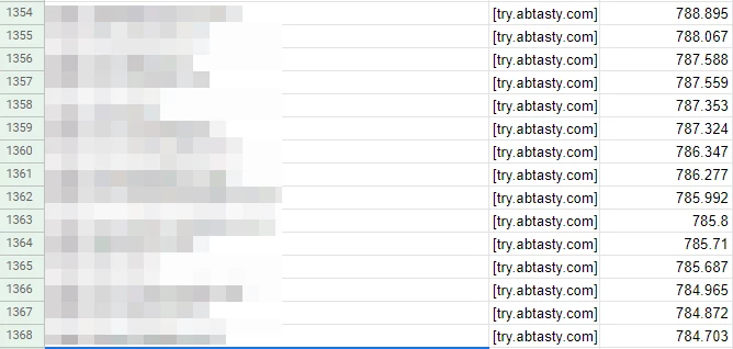
This is what we extracted. The pixellated column is the website URL. The last column is the execution time in milliseconds.

With the raw data, we were able to calculate a lot of useful metrics.

Keep in mind that I am not a mathematician or anything close to a statistics expert. My methodology might sound odd, but it’s adequate for this analysis.

  • Average execution time

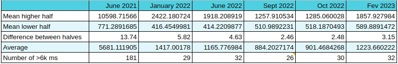
This is the first metric I get — the raw average for all the websites. That’s probably very close, if not equal, to what is used by the thirdpartyweb.today website. We already saw the downside of having an average, however, it’s still an interesting value to monitor.

  • Mean higher half and mean lower half

Then, I split the dataset in half. If I have 2000 rows, I create two groups of 1000 rows. The ā€œhigherā€ one and the ā€œlowerā€ one. It helps me have a view of the websites where we perform – the worst compared to the best. Then, I calculate the average of each half.

  • The difference between the two halves

The difference between the two halves is important as it shows the disparity within the dataset. The closer it is, the less extreme values we have.

  • The number of websites with a value above 6k ms

It’s just an internal metric we follow to give us a mid-term goal of having 0 websites above this value.

  • The evolution of the last dataset

I compute the evolution between the last dataset I have and the current. It helps me see if we get better in general, as well as how many websites are leaving or entering the chart.

The results

These are the results that we have:

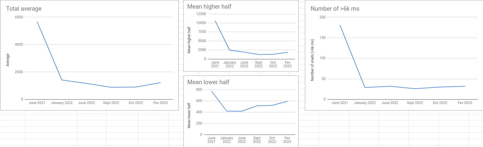
Here are their corresponding graphs:

This is the evolution between October 2022 and February 2023:

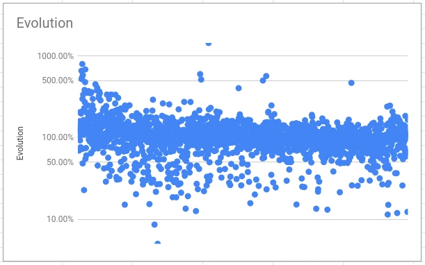
Watch out: Logarithmic scale! Sorted by February 2023 execution time from left to right.

The figures say it all. But, if I can give a global conclusion, it’s that we made tremendous improvements in the first six months and staled a bit after with finer adjustments (the famous 80/20 of Pareto’s).

However, after the initial fall, two key figures are important.

First of all, the difference between the two halves is getting very close. This means that we don’t have a lot of potential performance leaks anymore (features that lead to an abnormal increase in the execution time). This is our first recent win.

Then, the evolution shows that in general, and except for the worst cases, it is steady or going down. Another recent win.

Digging into the details

What I have just shared is the raw results without having a look at the details of each row and each website that is being crawled.

However, as we say, the devil is in the details. Let’s dig in a bit.

Let’s focus on the websites where AB Tasty takes more than six seconds to execute.

Six seconds might sound like a lot (and it is), but don’t forget that the audit simulates a low-end CPU which is not representative of the average device. Instead, it shows the worst-case scenario.

In the February 2023 report, there are 33 of them. This is an average execution time of 19877 ms. I quickly identified that:

  • 27 of them are from the same AB Tasty customer
  • One of them is abtasty.com and the total execution of resources coming from *abtasty.com on this website is very high ?
  • Two others are also coming from one singular AB Tasty customer

In the end, we have only 5 customers on this list (but still 33 websites, don’t get me wrong).

Let’s now try to group up these two customers with duplicates to see the impact on the average. The customer with 27 duplicates also has websites that are below the 6k ms mark, but I’m going to ignore it for now (and to ease things up).

For each of the two customers with duplicates, I’m going to compute the average of all their duplicates. For the first one, the result is 21671 ms. For the second, the result is 14708 ms.

I’m also going to remove abtasty.com, which is not relevant.

With the new list, I went from 1223 ms for the full list average to 1005 ms. I just improved our average by more than 200 ms! ?

Wait, what? But you’re just removing the worst websites. Obviously, you are getting better…

Yep, that’s true. That’s cheating for sure! But, the point of this whole article is to demonstrate that data doesn’t say it all.

Let’s talk first about what is happening with this customer that has 27 duplicates.

The same tag has been deployed on more than 50 very different websites! You might not be very familiar with AB Tasty, so let me explain why this is an issue.

You might have several websites which have the same layout (that’s often the case when you have different languages). It makes sense to have the same tag on these different domains to be able to deploy the same personalizations on all of them at once. That’s not the most optimal way of doing it, but as of today, that’s the easiest way to do it with our tool.

However, if your websites are all different, there is absolutely no point in doing that. You are going to create a lot of campaigns (in this case, hundreds!) that will almost never be executed on the website (because it’s not the correct domain) but are still at least partially included in the tag. So our tag is going to spend its time checking hundreds of campaigns that have no chance to execute as the URL is rarely going to be valid.

Though we are working on a way to block this behavior (as we have alternatives and better options), it will take months before it disappears from the report.

Note: If you start using AB Tasty, you will not be advised to do that. Furthermore, the performance of your tag will be far better than that.

Again, I didn’t take the time to group all the duplicated domains as it is pointless, the goal was to demonstrate that it is easy to show better performance if we exclude anomalies that are not representative. We can imagine that we would improve more than 200+ ms by keeping only one domain.

I took the most obvious case, but a quick look at the rest of the dataset showed me some other examples.

The competitors’ figures

Knowing these facts and how our score might look worse than it is because of one single anomaly, I started looking into our competitors’ figures to see if they have the same type of issue.

I’m going to say it again: I’m not trying to say that we are better (or worse) than any of our competitors here, that’s not my point. I’m just trying to show you why statistics should be deeply analyzed to avoid any interpretation mistakes.

Let’s start by comparing AB Tasty’s figures for February 2023 with the same metrics for one of them.

Competitor's figures

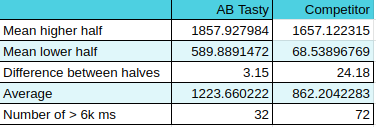
In general, they look a bit better, right? Better average and even the means for each half is better (and the lower half by a lot!).

However, between the two halves, the factor is huge: 24! Does it mean that depending on your usage, the impact of their tag might get multiplied by 24?

If I wanted to tease them a little bit, I would say that when testing the tag on your website, you might find excellent performance but when starting to use it intensely you might face serious performance drops.

But, that would be interpreting a very small part of what the data said.

Also, they have more than twice the number of websites that are above the 6k ms mark (again: this mark is an AB Tasty internal thing). And that is by keeping the duplicates in AB Tasty’s dataset that we discussed just before! They also have duplicates, but not as many as we do.

A first (and premature) conclusion is that they have more websites with a big impact on performance but at the same time, their impact is lower in general.

Now that I know that in our case we have several customers that have duplicates, I wanted to check if our competitors have the same. And this one does – big time.

Among the 2,537 websites that have been crawled, 40% of them belong to the same customer. This represents 1,016 subdomains of the same domain.

How does this impact their score?

Well, their customer wasn’t using the solution at the moment the data was collected (I made sure of it by visiting some of the subdomains). This means that the tag wasn’t doing anything at all. It was there, but inactive.

The average execution time of these 1,016 rows in the dataset is 59 ms!! ? It also has a max value of 527 ms and a min value of 25 ms.

I don’t need to explain why this ā€œanomalyā€ interestingly pulls down their average, right?

The 1,016 subdomains are not fake websites at all. I’m not implying that this competitor cheated on purpose to look better- I’m sure they didn’t. It is just a very nice coincidence for them, whether they are aware of it or not.

To finish, let’s compare the average of our two datasets after removing these 1,016 subdomains.

AB Tasty is at 1223 ms (untouched list) when this competitor is now at… 1471 ms.

They went from 361 ms better to 248 ms worse. I told you that I can let the figures say whatever I want. ?

I would have a lot of other things to say about these datasets, but I didn’t run all the analysis that could have been done here. I already spent too much time on it, to be honest.

Hopefully, though, I’ve made my point of showing that the same dataset can be interpreted in a lot of different manners.

What can we conclude from all of this?

The first thing I want to say is: TEST IT.

Our solution is very easy to implement. You simply put the tag on your website and run an audit. To compare, you can put another tool’s tag on your website and run the same audit. Run it several times with the same conditions and compare. Is the second tool better on your website? Fine, then it will probably perform better for your specific case.

Does a random report on the web says that one solution is better than another? Alright, that’s one insight, but you should either crunch the data to challenge it or avoid paying too much attention to it. Just accepting the numbers as it is displayed (or worse: advertised…) might make you miss a big part of the story.

Does AB Tasty have a bad performance?

No, it doesn’t. Most of our customers never complained about performance and some are very grateful for the latest improvements we’ve released on this topic.

So, some customers are complaining?

Yes. This is because sometimes AB Tasty can have a lower performance depending on your usage. But, we provide tools to help you optimize everything directly from our platform. We call this the Performance Center. It is a full section inside the platform and is dedicated to showing you which campaign is impacting your performance and what you can do to improve it. Just follow the guidelines and you’ll be good. It’s a very innovative and unique feature in the market, and we are very proud of it.

Though, I must admit that a few customers (only a few) have unrealistic expectations about performance. AB Tasty is a JS tag that is doing DOM manipulations, asynchronous checks, data collection and a lot of fancy stuff. Of course, it will impact your website more than a simple analytics tool will. The goal for you is to make sure that the effect of optimizing your conversions is higher than what it costs you in terms of performance. And it will be the same, whatever the CRO tool you are using, except if you use a server-side tool like Flagship by AB Tasty, for example.

I am convinced that we should aim towards a faster web. I am very concerned about my impact on the environment, and I’m trying to keep my devices as long as possible. My smartphone is 7 years old (and I’m currently switching to another one that is 10 years old) and my laptop isn’t very recent either. So, I know that a slow website can be a pain.

Final Remarks

Let me assure you that at AB Tasty we are fully committed to improving our performance because our customers are expecting us to do it, because I am personally motivated to do it, and because that is a very fun and interesting challenge for the team (and also because my management asks me to do it ? ).

Also, kudos to HTTP Archive which does very important work in gathering all this data and especially sharing it with everyone. Kudos to Patrick Hulce who took the time to build a very interesting website that helps people have a visual representation of HTTP Archive’s data. Kudos to anyone that works to build a better, faster and more secure web, often for free and because that’s what they believe in.

Want to test our tool for yourself? AB Tasty is the complete platform for experimentation, content personalization, and AI-powered recommendations equipped with the tools you need to create a richer digital experience for your customers — fast. With embedded AI and automation, this platform can help you achieve omnichannel personalization and revolutionize your brand and product experiences.

Article

11min read

Product Manager vs Product Owner: What’s the Difference?

What’s the difference between a product manager and a product owner or are these roles actually one and the same?

If you’re wondering, you’re not alone. The terms are often used interchangeably and not without reason as sometimes the two roles’ responsibilities may overlap especially in small to medium-sized companies. 

However, Product Manager (PM) and Product Owner (PO) are two distinct roles. Although they do share a common goal, delivering products users love, the scope of their responsibilities is actually not identical. 

Generally, a product manager is responsible for the why. They shape the product roadmap based on users’ needs and desires. They are focused on business metrics and on whether the product is going in the right direction on a larger scale.

The product owner, on the other hand, is responsible for creating and managing the product backlog. They are operational and on a deadline. For them, it’s all about Scrum, back and forth with developers, and getting stuff done.

However, the lines between the two do often blur. Depending on where you work, you might be used to a variety of setups. 

What are the differences in responsibilities of a product manager and a product owner?

The short answer is: it depends.Product Manager Experience

Now, I’m sure you’re thinking ā€˜of course! Isn’t that true for everything?’

But in this case, it really does depend on a lot of different factors. A chunk of this article will go over them in detail but first we will discuss each role to highlight the responsibilities of each one on its own to be able to then understand their differences.

The product owner role

The term ā€œproduct ownerā€ comes from Scrum- an Agile framework that helps teams structure and manage their work and solve complex problems effectively by adopting a set of values and principles. A typical Scrum team consists of Product Owner, a Scrum Master and Developers with specific accountabilities. 

According to the ā€œScrum Guideā€, the product owner is responsible for ā€œmaximizing the value of the product resulting from the work of the Scrum Teamā€. Consequently, this role is usually found in organizations that have adopted an Agile methodology. 

Among the key responsibilities of the product owner is creating user stories for the development team to implement and ensuring that these stories meet customer requirements. In other words, the product owner advocates for customer needs and represents the voice of the customer to the development team by making sure that the right product is being built. 

Some other responsibilities of the product owner include:

  • Manage product backlog by creating and communicating the backlog items and prioritize them accordingly to maximize value
  • Define and manage the product vision 
  • Understand market and customer needs and turn them into actionable user stories
  • Collaborate closely with cross-functional teams such as developers to ensure that products meet customer needs and requirements. They also make sure that goals are clear and business objectives are aligned with the product vision 
  • Act as the primary point of contact for all stakeholders and ensure they have proper buy-in on all major decisions and strategies 

The product manager role

As we’ve seen, product owners are more tactical in that their focus is on maximizing value through creating and managing the product backlog. Additionally, product owners are more detail-oriented and have more of a short- to mid-term focus. 

Meanwhile, product managers play a more strategic role, which means their focus is more on creating the long-term vision of a product as well as aligning the product roadmap with larger organizational goals. 

They then build the product strategy in order to build a concrete product based on its overall vision that spans across the entire roadmap. Put simply, a product manager manages the entire product life cycle and oversees every aspect of its development from the early stages of user research to the moment of product launch.

The responsibilities of the product manager may vary from one organization to the next but they usually include the following tasks:

  • Conduct user research to determine customer needs to determine product vision 
  • Create and align teams around the product roadmap 
  • Decide what features to build next
  • Supervise teams and projects to ensure the successful launch of the product 

A product manager role is usually more outward-facing in that they speak to customers to define the requirements of the product to be built while a product owner is more inward-facing as they work closely with development teams to ensure the product is being built according to these requirements. 

We can look at product owners as an extension of product managers as they apply the strategies outlined by product managers and transform it into an actionable backlog.

In other words, the product manager decides what products or features to build next while the product owner oversees that developers build these products. 

Do organizations need both roles?

The simple answer to this question would be it depends. 

Various factors will need to be taken into account when it comes to deciding whether you need one or the other or both.

In an ideal scenario, there would be a product manager managing the product strategy and vision and a product owner responsible for executing that strategy. On the surface, it may seem that the responsibilities of the two roles may sometimes overlap as they’re working towards common goals but in reality, their day-to-day tasks differ significantly.   

However, not all companies may have the sufficient resources to have two different people dedicated to each of these roles.

Indeed, many small companies may find that having two distinct roles is not necessary and the responsibilities of the product development process can be carried out solely by the product manager. However, processes may become more complex in larger companies and could require a product manager to manage the product life cycle and outline the overall strategy and a product owner overseeing the development process to ensure the tactical execution of that strategy.

It’s important to also keep in mind that the product owner role is tightly linked with the Scrum development approach. Therefore, it’s typically found in teams practicing Scrum. Product managers, for their part, exist in organizations that aren’t necessarily following a specific approach or methodology. They can operate within any framework as part of the product team while product owners in highly Agile businesses come as part of a Scrum team.   

Nonetheless, many organizations struggle with the decision of whether to have one or the other or both. 

The most important consideration when making this decision is focusing on outcomes and not on the titles. Organizations need to examine their objectives and any weaknesses and bottlenecks in their current processes or structures that may hinder them from achieving these objectives. Such insights are key to building your winning team. 

When to consider a product manager vs product owner

Let’s not forget, there are products of all kinds: industrial products, agricultural products, services, chemical products, fashion and software products. 

In the SaaS martech space, the thinking goes that all products are built the same way and that companies are all structured the same way. They tend to think there is always a Product Manager and a Product Owner behind each feature.

We’ve already mentioned some things to consider when you’re deciding whether to have both roles. In this section, we look in further detail at some of these factors that determine the right setup for your organization.

1. Momentum

The most important criteria is ā€˜the momentum of the company.’ What does this mean?

How new/old is the organization?

This question is an important one. It is not directly related to the size of the company or to the number of clients, either. 

But rather, the right question here would be: How far or close is the company in relation to a specific ā€œkey momentā€?

product owner vs product manager ab tasty

What we mean by ā€˜key moment’ are key phases or events in the life cycle of a company. Some examples include: 

  • the creation of the company
  • its sale
  • new funding
  • tax inspection
  • a competitor’s release
  • a crisis
  • replacement of the CEO 
  • … etc 

All these different key stages will have an impact on how the product development is executed.

And therefore, they affect what a product manager does and what a product owner does.

For example, just after a company is founded, the CEO is presumably the best person to take care of the product roles. They are very often (at least in scalable SaaS companies) the one who wears the hat of PO, PM, QA & Support. It is not a choice or a strategy. It is just what the moment implies.

Also, in general, the way a company’s momentum is handled defines how ā€œwellā€ a company is doing. 

Has the moment happening right now been anticipated, or is it just the consequence of the reaction of the last moment? The more a company reacts, the more ā€œAgileā€ you can consider it to be. The more moments are anticipated, the more ā€œvisionaryā€ you can consider the company. It’s challenging to be both.

2. Size matters

Size here doesn’t necessarily refer to the number of employees a company has. The size of a company could also refer to the number of:

  • products
  • models
  • features
  • scopes
  • price grids 
  • or markets they address. 

Cutting the products in the right ā€œdimensionsā€ and deciding if we split per market, per range or per topic can be a lifelong job, because it changes very often and the faster the company evolves, the more it has to be changed.

Size can also be defined by the number of users, clients, partners, retailers, languages, unit systems,… But also and more frequently, a combination of all the above will tell how many PMs, POs and Heads of Product your organization will need. 

For example, in many non-profits, product managers are based on the donor personas. You have a PM for small donation amounts (say $10 to $500), one for larger ones ($500 to $10,000) and one for those that are even bigger. Why? Because expectations from each persona type differ radically, and being able to cater to each will help the non-profit grow in the long run.

In short, the size of the company (its client portfolio, its product catalogue…) may define what the PM does, what the PO does, and how many of each there will be.

3. The remaining criteria

But these are not the only factors that define how many PMs, POs or any other product-facing people you will need. Many other factors can also be taken into account, including: 

  • number of developers
  • number of designers
  • shipping velocity
  • technical stacks
  • tooling
  • product lifecycle 
  • individual wishes
  • growth potential
  • existing need coverage ratio 
  • legacy ratio
  • human resources policy 
  • the market you address
  • the level of politics installed in the company.

There is some kind of global agreement (at least in SaaS businesses) on the fact that the split between PM and PO is based on: vision vs. operations, projection vs. immediacy, value vs. metrics. But both are sides of the same coin.

In short, no two organizations are identical. In other words, there’s no one set answer to the question of what a PM vs. PO should do. Some organizations will need many, some will need none. Enabling people to work successfully together is hard enough. Copying and pasting a method won’t help – you have to find your own. 

What skills are needed to be a good product manager and/or product owner?

Both product managers and product owners need a good balance of hard and soft skills to carry out their tasks efficiently. 

The necessary skills for product managers include:

  • Excellent communication and collaboration skills
  • A good amount of technical expertise
  • Prioritization skills
  • Good business acumen
  • Analytical skills

Meanwhile, the necessary skills for product owners include:

  • Problem solving
  • Project management skills 
  • Great communication and strong storytelling skills
  • Deep understanding of user data and analytics

The skills necessary for product managers and product owners may overlap especially in smaller companies where a product manager could also be a product owner and vice versa. 

What KPIs are used to measure success for product owners and product managers?

It depends and may vary from one organization to the other depending on their objectives 

However, if we tie them into their individual responsibilities, we can give a general overview of the kind of KPIs that can be used to measure their performance. 

A product manager, for example, has a wide range of responsibilities including the creation and prioritization of the product roadmap along with cross-team collaboration to ensure alignment around the roadmap.  

In that sense, a product manager’s performance is primarily related to product success in line with the overall business goals. Thus, usually product managers’ KPIs should be based on business metrics such as growth, revenue, churn rate and costs. 

Meanwhile, product owners have a narrower role and based on the responsibilities we outlined above, their success is measured using KPIs based on delivery, quality, and internal team satisfaction.

Conclusion

A product owner and manager are great assets to have but having both or two separate people taking on these roles is not a must for every organization. 

At the end of the day, the question is not whether you should have both a product manager and product owner but whether having both of those roles is right for your organization. You will have to look inward to understand what your business actually needs. 

How you decide to structure your teams will depend on the processes you have in place and the kind of outcomes you’re hoping to achieve based on business objectives, customer and company needs.

While we give an overall idea of each role, these responsibilities are not set in stone and they could widely vary on a case by case basis.

What really matters is that you have the right people with the right skills working towards a shared goal, which is building a product customers will love and meets their requirements and needs. 

Article

10min read

Why You Should Slot Feature Flags into Your Agile Roadmap

It’s easy to lose your way when building an Agile roadmap.

If you get too detailed with your planning, you end up building a roadmap that is Agile in name alone but looks more like a traditional Waterfall roadmap. If you don’t perform enough planning, then you’ll produce a skeleton of a roadmap that sends you running in multiple directions without ever arriving anywhere meaningful. 

The correct approach lies somewhere in the middle. You keep things loose, nimble, and iterative but you also set a beacon that will guide each of your sprints to an impactful destination.

From our experience, one ā€œbeaconā€ that will keep your Agile product roadmap grounded, and your products moving in the right direction, is a simple function— the feature flag.

It isn’t fancy. It isn’t flashy. And it doesn’t look overly strategic. If you use feature flags properly, then they will keep your Agile roadmap focused on the outcomes that matter most without forcing you down a fixed path. Here’s why. 

First principles: The real benefit of Agile over Waterfall

It feels like a given these days: if you work as a Product Manager (especially in the tech sector) then you’re going to follow some kind of Agile methodology. Depending on your work history, you may never have worked with a Waterfall roadmap, let alone developed one, in your entire career.    

If that’s the case, it might even feel confusing why Waterfall was ever developed. The methodology is slow. It’s rigid. It’s opaque. On the surface, it looks inferior to Agile in every way. But once you dig into it a little, there is one area where waterfall trumps Agile. Waterfall is a better fit within a traditional corporate context than Agile.

While Agile and Waterfall are popular in software development, each one is best suited for different types of projects. 

For example, a Waterfall approach makes sense when a software project has clearly defined requirements with low probability that any changes will occur halfway through.

Waterfall fits really well into that broader corporate world’s standard operating procedures. It collects business requirements in a standard one-off phase and then sets them in stone with a concrete project. Waterfall adopts a more linear way of working so that development phases flow in one direction just like the flow of a waterfall, hence the name and tends to occur over a long period of time. 

It breaks that project into a clear, crisply defined plan and each step must be completed before moving onto the next phase. In the end, the project’s success will be defined by how well its leaders completed the milestones in the project’s plan, and if they delivered to the project’s requirements on-time and on-budget.

Waterfall methodology isn’t really about trying to create the most effective, efficient, or accountable system. It’s about having the product developers and managers operate in a way that makes sense to a large, lumbering corporation.  

A new approach—Agile— was only possible because it was developed outside of this legacy corporate context. In fact, Agile is an iterative approach that came about as a response and alternative to Waterfall’s rigid and linear structure

And here’s what they came up with: product management would deliver a greater impact if it stopped lining up to what a corporation wanted, and if it instead lined up to what actual real-world users want.

In an Agile approach, which introduces flexibility, teams work on multiple phases at the same time with the goal to enable faster software delivery for the purpose of collecting customer feedback. It does this by breaking down the software development life cycle into sprints, which could last from one to four weeks, that include regular feedback loops.

Incremental releases means teams can build better features much quicker that offer more value and optimize and iterate these features based on the feedback received. It aligns the product not only with the product vision but also with customer needs.

This is the real innovation of an Agile roadmap over a Waterfall one. It isn’t the increased speed & efficiency that everyone fixates on. It’s the simple but powerful fact that an Agile roadmap re-aligns the product manager’s focus onto the user. 

Here are some of the advantages of an Agile methodology:

  • Faster feedback loops
  • Higher customer satisfaction
  • Reduced time-to-market
  • Increased flexibility with more room for innovation
  • Enhanced productivity by breaking down projects into smaller, more manageable chunks

And most of Agile methodology’s core user-alignment activities occur during Feature Release Management and are brought to life by the right feature flag tool.  

A quick caveat: Yes, business impact still matters in Agile

Before we move on, let’s make one point very clear.

When we say Waterfall aligns well to corporate context, we mean corporate operational context. But we don’t mean a Waterfall approach offers the best way to deliver results

Most often, these big Waterfall projects deliver poor results because they can take months—or even years—between their initial requirements collection and their project’s completion. During this time, the project’s alignment, and even its viability to its users, often shifts, reducing its chances of producing any meaningful business impact. 

By contrast, a properly developed and managed Agile roadmap will maintain alignment with its users throughout its entire lifecycle and deliver concrete, measurable, and accountable results. 

Feature release management, and feature flags, can also drive this tight connection between user-centered development and KPI improvement. We’ll get to how in just a minute.

Feature release management: The heart of any effective Agile roadmap

From a user-alignment perspective, feature releases are the key point that differentiates an Agile roadmap from a Waterfall roadmap.

Agile looks different from Waterfall in many areas of activity.

In Waterfall, new products and features are released to all users at once, in a single big bang, after a very long development cycle. In an Agile roadmap, new products and features can be—and should be—released at a much faster rate. 

This is the key functional difference that makes Agile more user-centered than Waterfall. Rapid and effective feature release management lets you:

  • Keep your users top-of-mind at all times.
  • Regularly collect your users’ data and feedback.
  • Use up-to-date feedback to guide your development cycles.
  • Repeat the cycle, to make sure you correctly incorporated user feedback in your next round of features and product updates.

If you want to keep your development user-centered then feature release management is critical to effectively incorporate into your Agile product roadmap. Here’s how.

The 5 key elements to include in your Agile release planning

Agile release planning is key to building customer-centric products by allowing you to prioritize and release product requirements as needed. In other words, it allows you to plan your product’s incremental releases- your features- and helps ensure your project is headed in the right direction and following the Agile methodology. 

It differs from a product roadmap in that release planning focuses on one sprint at a time (on short-term goals) while a product roadmap looks further ahead in the future and focuses on long-term objectives.

Put simply, the goal of a release plan is to help you prioritize features of your product and focus on releasing specific features in less time to improve the customer experience. Thus, teams use this kind of planning when they’re dividing a project into short sprints or increments instead of planning for one major product release. 

It is a unique approach to planning as it takes into account the flexible nature of software development by leaving room for any necessary adjustments as you go through the development lifecycle to incorporate customer (and stakeholder) feedback. 

The idea is to be open to prioritizing tasks to provide improved value to your customers.

Here are the key elements to include in each of your feature releases that will turn them into a critical, recurring touchpoint between you and your users.

1. User segmentation

At a basic level, you need to carefully select which user audiences you will first release (and test) new features and products to. 

At a deeper level, user segmentation can flow throughout every step of feature release management. You can personalize the experience of your new products and features to each segment you test them with. In other words, you try out different versions of each new product or feature with different segments. 

During testing, you can rapidly toggle features off for segments who are not responding well to them. And you can even guide the ongoing development of your products and features depending on which user segments respond the best to them.

2. KPIs measurement

However you measure product or feature success, you must quantify it, and measure those metrics in real-time during each release. 

Doing so serves two purposes: First, it gives you the ability to produce an accurate, objective measure about which products and features are succeeding with which segment (and whether or not you are actually improving their performance during each development sprint). 

Second, they let you demonstrate concrete, measurable, and accountable results for your business—to both report on the success of your most recent development, and to create meaningful justifications for more robust rollouts.

3. Governance

You need some formalized way to make decisions off the data that you produce. When do you toggle a feature on or off and for who? When do you roll out the product or feature to new segments? When is a product or feature ready to deploy to your entire user community? 

To make these decisions, you must have established definitions for success (see ā€œKPIsā€), and defined procedures for monitoring and acting on release performance data both in real-time and during post-release recaps.

4. A/B testing

Any time you are segmenting audiences, testing multiple variations on products and features, and collecting copious amounts of real-world user data, then you are setting the stage for multiple A/B tests. 

By performing comprehensive A/B tests during each of your feature releases, you will eliminate multiple developmental dead ends and narrow the list of viable ā€œnext stepsā€ for your next sprint.

5. Automation

If you incorporate these four elements, then your feature release management process will get pretty complex, pretty quickly. But if you select the right tool to automate as many of these elements and their internal processes,as possible, then you can let go of most operational elements. Afterwards, you would simply sit back during feature releases and focus on making informed decisions before, during, and after each of your releases.

By incorporating each of these five elements into your feature release process, you will ensure that each of these critical touch points brings you and keeps you as close as possible to your users.

And, thankfully, there is one single function that incorporates each of these elements and makes them a practical and effortless habit in your Agile roadmap— feature flags.

Bringing it all home: Feature flags

At their core, the goal of feature flags is to enable you to toggle features on or off, with a single click on your dashboard, without having to adjust your codebase.Ā 

That may seem very basic at first glance but buried in this simplicity is a lot of depth, and a lot of room to easily deliver on each of the above elements of user-centered feature release management.

With the right feature flag tool, you can:

  • Perform sophisticated real-time control over which user segments get new products and features.
  • Attach core KPIs to your releases and immediately kill products and features that are not performing well while immediately expanding the release of those that are knocking it out of the park.
  • Monitor your results (and take action) in real-time.
  • Easily manage and act on complex A/B tests.
  • Bundle feature flags in with a complete suite of feature release functionality to wrap the whole exercise up in a single, highly-automated platform.

We kept each of these functions in mind when we built our own Feature Flag function, and release management platform. 

If you’d like to take it for a test run and see how easy you can incorporate the core actions of Feature Flagging, feature release management, and user-centered Agile product management into your roadmap, drop us a line!

Article

15min read

Prevent and Manage Technical Debt Using Feature Flags

In modern software development, teams often have to prioritize speed and less than ideal solutions to put out products quickly to keep up with fast-changing consumer demands. 

Unfortunately, taking such shortcuts could have dire consequences in the form of heavy costs or technical debt that could take a toll on your code quality and your whole software development and delivery processes if left unattended.

In this article, we’ll explore what technical debt is, the causes and different types of technical debt as well as how to manage it, largely through the use of feature flags.

What is technical debt?

The term “technical debt” was first coined by Ward Cunningham, one of the authors of the Agile Manifesto, in the early 1990s. Since then, the term has gained momentum and is a serious issue that many tech teams today still struggle to manage properly.

His reason for its name is that technical debt bears direct correlations with financial debt. Software development teams can take shortcuts to satisfy immediate business requirements, but the debt plus accrued interest will have to be paid at a later stage.

Technical debt is the consequence of action taken by software development teams to expedite the delivery of a software application or specific feature which later needs to be refactored or redeveloped.

Put simply, technical debt refers to the build up of technical issues during software development due to a number of causes which we’ll discuss in the next section. 

If not attended to, technical debt can spiral out of control, resulting in the total breakdown of the software development and maintenance lifecycle.

Therefore, it is critical to ensure that DevOps and software development teams pay close attention to technical debt management and technical debt reduction methods.

Here are some warning signs to look out for:

  • Buggy, difficult to maintain code
  • Unstable production environments
  • Bug fixes introduce more bugs
  • Data inconsistency 
  • Decreased development pace and bottlenecks 

What causes technical debt?

We can deduce that technical debt comes mainly as a result of delivering a release quickly at the expense of ā€œperfectā€ code.

In other words, it often comes as a consequence of ineffective and inadequate practices to build software for a short-term benefit in the interest of saving time.

That is one major cause but it’s also more complex than that as technical debt can be due to a number of other reasons. 

Some causes behind technical debt include:

  • Time pressure: Teams today are under great pressure to deliver releases quicker than ever before to remain competitive and meet consumer demands fast.
  • Poor code: This could be due to a number of reasons including use of tools without proper documentation or training.
  • Insufficient software testing: Lack of QA support or automated testing means a lot of bugs could remain in the code undetected which gives rise to technical debt.  
  • Outdated technology: Over time, many technologies become obsolete and are no longer supported and could become a source of debt.
  • Lack of skill: Teams can sometimes unknowingly incur debt because they lack the skills to write better code. For example, having junior developers working on building complex software beyond their skill and experience level is a sure way to accumulate debt fast.

Over time, all these factors could result in accumulation of debt that will need to be addressed. The real danger is not actually having the debt in the first place- as often that’s inevitable- but it’s allowing this debt to build up with no plan or strategy to pay it off in the future. 

Types of technical debt

There are many ways to classify technical debt. One of the most popular ways comes from Martin Fowler’s technical debt quadrant.

The quadrant is based on the idea of not whether something should be considered debt per se but rather whether this debt can be considered prudent.

What does this mean exactly? Think of it as a way of answering the question of whether all technical debt is bad and the answer, according to the quadrant, would be ā€œit depends.ā€

Martin Fowler’s technical debt quadrant seeks to categorize the types of technical debt according to intent and context.

Generally speaking, there are two overarching types of technical debt: intentional and unintentional (deliberate vs inadvertent).

Intentional technical debt occurs when software development teams choose to leave their code as it is, without refactoring or improving it, to reduce the time-to-market metrics. In other words, they choose to incur technical debt.

Unintentional technical debt, for its part, occurs when poor code is written and so the code quality will need to be improved over time.

Suffice to say, as soon as these technical debt-causing issues are highlighted, it is imperative to fix them as quickly as possible.

Source: Devopsgroup.com

Let’s take a closer look at the 4 main types of technical debt, according to Martin Fowler:

  • Reckless/deliberate: Teams possess the knowledge to carry out the task but decide to go for a ā€œquick and poor qualityā€ solution to save time and for quick implementation.
  • Prudent/deliberate: Teams are aware of the debt they’re taking on but decide that the payoff for an earlier release exceeds the costs. However, in this scenario unlike the above, teams have a plan on how to deal with the repercussions of taking on this debt.
  • Reckless/inadvertent: This is arguably the least desired form of debt where teams don’t have enough experience and blindly implement a solution without applying best practices. As a result, they’re unconscious of the fact that technical debt is being accumulated. Thus, no real plan to address this debt can be formulated.
  • Prudent/inadvertent: This occurs when teams apply best practices during software development but still accumulate debt due to unexpected coding mistakes. Thus, this type of debt is unintentional. Teams have the necessary skill and knowledge to identify and pay off the debt but the experience serves as a learning opportunity for developers to optimize and improve the code for future projects.

When it comes down to it, deciding what to classify as technical debt is not always black or white. It requires putting things into context first. This is especially important when you think of the pressure on teams to put out products quickly to meet consumer and market demands. 

This means that they will constantly have to deal with the dilemma between taking on technical debt or delaying a release. However, it’s more of a matter of how to deal with and manage this debt rather than avoiding it completely- which may not always be possible- to minimize negative impact as much as possible.

Types of technical debt to avoid

At this juncture, it is reasonable to conclude that teams should avoid technical debt. Additionally, it is imperative to minimize and eliminate tech debt, particularly reckless and deliberate code debt.

Over time, technical debt could become too expensive to fix the longer it remains unfixed as ā€œinterestā€ builds up the same way that financial debt accrues interest. Eventually, technical debt can lead to a code becoming harder to maintain as the foundation of the codebase deteriorates. This will ultimately result in lower-quality products with the company reputation taking a major hit. 

Prudent tech debt is the partial exception to this rule. This form of code debt can benefit software development organizations as part of the reducing time-to-value methodology. 

In other words, the advantages of delivering a product to market as soon as possible can outweigh the cost incurred by technical debt. However, it is critical to monitor the tech debt to ensure that its value does not spiral out of control, negating the benefits of the reduced time-to-value exercise.

How feature flags can help with technical debt

Feature flags can help reduce the technical debt accumulated during the development, testing, and deployment of a software application.

However, if feature flags are not monitored and maintained, they can increase the application’s technical debt. 

Before we look at how feature flags reduce technical debt, let’s take a quick look at what a feature flag is:

ā€œFeature toggles [feature flags] are among the most powerful methods to support continuous integration and continuous delivery (CI/CD)… [They] are a method for modifying features at runtime without modifying code.ā€

One of the most common sources of technical debt is the pressure to release a version of the software application.

The business demands that the software be deployed, and they don’t care how the developers make it happen. Feature flags are a valuable tool to help manage the “pressure-cooker” release environment.

There are several benefits to the use of feature flags as a software release and deployment aid, including:

  • The risk of deploying a bug-ridden application is substantially reduced. Developers can simply switch off features that are not yet complete or thoroughly tested.
  • By implementing a CI/CD methodology (continuous integration/continuous delivery), developers can often use feature flags to deploy new features without waiting for the next release to be deployed. In summary, this functionality reduces the time-to-value and increases customer satisfaction: A win-win for all.
  • Implementing feature flags is also a means to negotiate with management about which functionality to complete before specified deadline dates, increasing the flexibility to develop and test features thoroughly before deploying them.

In summary, feature flags help manage and reduce technical debt by helping software development teams manage the development/testing/deployment lifecycle more effectively.

Feature flags are useful for dark launching, a practice of releasing specific features to a subset of your user base to determine what the response is to a new feature or set of new features. As an aside, this is also known as a canary deployment or canary testing.

Testing in production is another form of dark launching. By utilizing this option, you can assess the application’s health, collect real-world app usage metrics, and validate that the software application delivers what your customers want.

Feature flags can also create technical debt. While they play a significant role in mitigating technical debt in all other areas of the software development lifecycle, implementing them is usually via a set of complex if-else statements.

Therefore, in practice, a feature flag is an if statement defining the path between at least two different code paths depending on one or more conditions.

The following simple scenario describes how to implement feature flags.

Let’s assume that an e-commerce site offers free shipping for all customers that spend more than a specified minimum amount at one time.

This code sample is an example of a feature flag. If the total amount paid is more than $50, then the shipping is free. Otherwise, the shipping amount is the amount spent multiplied by the rate (a percentage of the total amount).


def ShippingYN(amt, rate) :
  if amt > 50.0 :
    shipping = 0.0
  else :
    shipping = amount * rate

  return shipping


Best practices using feature flags to avoid technical debt

As with all aspects of software development and deployment, it is vital to observe the following feature flag best practices:

1. Feature flag management

As your organization matures in its use of feature flags as an integral part of the software development/testing/deployment lifecycle, it is vital to be mindful of the fact that some of the feature flags are short-term and should be removed; otherwise, they will add to the application’s complexity, resulting in more technical debt. 

Consequently, it is imperative to have a plan in place to remove the flags before even setting them. 

It is also possible, and a good idea, to track and measure different metrics for each feature flag, such as how long it has been active, its states (on/off), different configurations, and how many code iterations it has been through.

Once your feature flag has been through the required number of iterations to code and test a feature, this flag must be removed and the code merged into your code repository. 

Note: Before removing a feature flag, it is a good idea to evaluate its function and purpose; otherwise, there is a risk, albeit slight, that the flag might still be needed and is erroneously removed. 

A vital part of the feature flag management process is to define and implement temporary and permanent flags.

1.1 Temporary feature flags

As highlighted above, if a feature is designed to be rolled out to every application user or you are using the feature as a short-term experiment, it is critical to attach a monitoring ticket to this flag to make sure it is removed once the feature has been deployed or the experiment is concluded. 

Examples of these temporary flags which can last weeks, months, or even quarters, include:

  • Performance experiments: A performance experiment is similar to A/B testing, where two versions of the feature are deployed with the idea of determining which one performs better. A/B testing employs the same construct in that it deploys two versions of an element to the application’s user base to select which one users prefer. 
  • Painted-door experiments: These experiments are only used in the early phases of the software development lifecycle and are User-Interface mock-ups to determine any customer interest. Once the consumer interest has been determined, these flags can be removed.
  • Large-scale code refactoring: It is a good idea to deploy code refactoring changes behind a feature flag until you are positive that the functionality has not been changed or broken. Once the refactoring exercise is complete, you can remove these feature flags.

1.2 Permanent feature flags

Permanent feature flags are used to implement different features or functionality for different groups of users.

As a result, it is reasonable to assume that these flags will remain in the software application indefinitely or at least for a very long time.

Therefore, it is vital to ensure that they are monitored, documented, and reviewed regularly. As with the temporary flags, there are several different types, including:

  • Permission flags: These feature flags are helpful when your product has different permission levels, such as the ability to create journal entries in an online financial general ledger or whether users can view a list of these entries. A second use case for these flags is your SaaS application has different subscription models like Basic, Professional, and Enterprise.
  • Promotional flags: These flags help implement regular promotions. For instance, let’s assume your e-commerce store offers a Mother’s Day promotion every year where specific products bought include the shipping costs.
  • Configuration-based software flags: Any software driven by config files will benefit from using feature flags to implement the different possible configurations. A typical use case for config flags is the layout of the User Interface.
  • Operational flags: These feature flags help manage a distributed cloud-based application. For example, additional compute engines can be spun up when the workload reaches a specific level.

2. Use a central code repository

Feature flags or toggles are most commonly stored in config files.

Another option is to keep them in a database table. However, let’s look at how to manage these config files. Large systems can have many if not hundreds of feature flag settings. Apart from using a database table, the only way to manage these settings is to store them in config files.

The best way to maintain the config files is to upload these files to a feature flag library in a central code repository like Git.

Not only is Git good for keeping control of these files, but it is also a valuable version control system. Developers can use it to create feature branches of config files used during the software development process without negatively affecting the production version of these files.

Once the config files have been updated and tested, they can be merged back into the Git master branch using a merge request.

3. Adhere to naming conventions

It is absolutely critical to give your flags intuitive, easy-to-understand names, especially for long-term flags, although it is a good idea to include short-term flags in this best practice.

Naming the feature flags, flag 1, flag 2… flag 100 will not help people who have to work with these flags in the future.

A good example of wisely named feature flags can be found in the scenario highlighted above.

It is reasonable to assume that the flag, AdvancedSearchYN, is one of hundreds of flags used in our eCommerce application. Even if they are the only two flags used, it is still advisable to give them intuitive, related names.

For more details on the best way to manage feature flags to keep technical debt at bay, download our feature flag best practices e-book.

4. Use a feature management system

Using a dedicated feature flagging system is a great way to manage flags in your code so you don’t find yourself with piles of technical debt from unused or stale flags.

AB Tasty’s server-side feature enables you to remotely manage feature flags and take control over how, when and to who features are deployed to mitigate risk while optimizing user experience.

To help with technical debt management, AB Tasty provides dedicated features to keep control over your feature flags. Two of them are especially useful in this regard:

  • The Flag Tracking dashboard lists all flags setup in the platform, with their current values (ex: on/off) and campaigns that reference them. This way, you can easily keep track of every single flag purpose (ex: flag 1 is used in progressive rollout campaign X, while flag 2 is used in feature experiment Y). When you manage hundreds of flags, it turns out to be a real time saver.
  • The Code Analyzer is an advanced Git integration to see where your flags are used in your repository. In conjunction with the flag tracking dashboard, you can quickly find flags in your code that are not referenced in any campaigns. It also deeply integrates with your current CI/CD pipeline. As a CLI and a Docker image, it analyzes your codebase and detects the usage of flags everytime code is pushed to a specific branch or tag. This way, your flag dashboard is always in sync with your codebase. On one hand, you can safely remove flags if they are not referenced in campaigns, and on the other hand you make sure that flags your campaign is relying on are indeed available in your code. View code on Github.
Feature flag references in github/gitlab codebase
The Flag Tracking dashboard with flag references to the codebase

Try it for free!

Final thoughts

As described throughout this article, feature flags in DevOps and software development play a fundamental role in managing and reducing technical debt.

Consequently, it is vital to implement a feature flags framework as a foundational part of the software development lifecycle.

Cobbling it on afterward can increase the risk of incurring more technical debt, especially once the system grows in scale. Thus, these feature flags must be carefully maintained and monitored to ensure that they don’t amass additional technical debt.

Finally, it is essential to be mindful that, while technical debt is primarily seen as a negative, there are instances, as described by Martin Fowler’s technical debt quadrant, where incurring prudent and deliberate tech debt can be beneficial.

It is also worth noting that both Agile and Scrum use the concept of technical debt in a positive way to reduce the time-to-value of a new application or feature release, driving sustainable growth through customer satisfaction.