Hubert has worked in the field of Data & AI since 1995, primarily regarding speech processing, then later in DNA analysis during the ‘human genome race.’ He later taught algorithmic & machine learning at ESIEA. He is currently the Chief Data Scientist at AB Tasty.
How to Better Handle Collateral Effects of Experimentation: Dynamic Allocation vs Sequential Testing
Hubert Wassner
When talking about web experimentation, the topics that often come up are learning and earning. However, it’s important to remember that a big part of experimentation is encountering risks and losses. Although losses can be a touchy topic, it’s important to talk about and destigmatize failed tests in experimentation because it encourages problem-solving, thinking outside of your comfort zone and finding ways to mitigate risk.
Therefore, we will take a look at the shortcomings of classic hypothesis testing and look into other options. Basic hypothesis testing follows a rigid protocol:
Creating the variation according to the hypothesis
Waiting a given amount of time
Analyzing the result
Decision-making (implementing the variant, keeping the original, or proposing a new variant)
This rigid protocol and simple approach to testing doesn’t say anything about how to handle losses. This raises the question of what happens if something goes wrong? Additionally, the classic statistical tools used for analysis are not meant to be used before the end of the experiment.
If we consider a very general rule of thumb, let’s say that out of every 10 experiments, 8 will be neutral (show no real difference), one will be positive, and one will be negative. Practicing classic hypothesis testing suggests that you just accept that as a collateral effect of the optimization process hoping to even it out in the long term. It may feel like crossing a street blindfolded.
For many, that may not cut it. Let’s take a look at two approaches that try to better handle this problem:
Dynamic allocation – also known as “Multi Armed Bandit” (MAB). This is where traffic allocation changes for each variation according to their performance, implicitly lowering the losses.
Sequential testing – a method that allows you to stop a test as soon as possible, given a risk aversion threshold.
These approaches are statistically sound but they come with their assumptions. We will go through their pros and cons within the context of web optimization.
First, we’ll look into the classic version of these two techniques and their properties and give tips on how to mitigate some of their problems and risks. Then, we’ll finish this article with some general advice on which techniques to use depending on the context of the experiment.
Dynamic allocation (DA)
Dynamic allocation’s main idea is to use statistical formulas that modify the amount of visitors exposed to a variation depending on the variation’s performance.
This means a poor-performing variation will end up having little traffic which can be seen as a way to save conversions while still searching for the best-performing variation. Formulas ensure the best compromise between avoiding loss and finding the real best-performing variation. However, this implies a lot of assumptions that are not always met and that make DA a risky option.
There are two main concerns, both of which are linked to the time aspect of the experimentation process:
The DA formula does not take time into account
If there is a noticeable delay between the variation exposure and the conversion, the algorithm may go wrong resulting in a visitor being considered a ‘failure’ until they convert. This means that the time between a visit and a conversion will be falsely counted as a failure.
As a result, the DA will use the wrong conversion information in its formula so that any variation gaining traffic will automatically see a (false) performance drop because it will detect a growing number of non-converting visitors. As a result, traffic to that variation will be reduced.
The reverse may also be true: a variation with decreasing traffic will no longer have any new visitors while existing visitors of this variation could eventually convert. In that sense, results would indicate a (false) rise in conversions even when there are no new visitors, which would be highly misleading.
DA gained popularity within the advertising industry where the delay between an ad exposure and its potential conversion (a click) is short. That’s why it works perfectly well in this context. The use of Dynamic Allocation in CRO must be done in a low conversion delay context only.
In other words, DA should only be used in scenarios where visitors convert quickly. It’s not recommended for e-commerce except for short-term campaigns such as flash sales or when there’s not enough traffic for a classic AB test. It can also be used if the conversion goal is clicking on an ad on a media website.
DA and the different days of the week
It’s very common to see different visitor behavior depending on the day of the week. Typically, customers may behave differently on weekends than during weekdays.
With DA, you may be sampling days unevenly, implicitly giving more weight on some days for some variations. However, you should weigh each day the same because, in reality, you have the same amount of weekdays. You should only use Dynamic Allocation if you know that the optimized KPI is not sensitive to fluctuations during the week.
The conclusion is that DA should be considered only when you expect too few total visitors for classic A/B testing. Another requirement is that the KPI under experimentation needs a very short conversion time and no dependence on the day of the week. Taking all this into account: Dynamic Allocation should not be used as a way to secure conversions.
Sequential Testing (ST)
Sequential Testing is when a specific statistical formula is used enabling you to stop an experiment. This will depend on the performance of variations with given guarantees on the risk of false positives.
The Sequential Testing approach is designed to secure conversions by stopping a variation as soon as its underperformance is statistically proven.
However, it still has some limitations. When it comes to effect size estimation, the effect size may be wrong in two senses:
Bad variations will be seen as worse than they really are. It’s not a problem in CRO because the false positive risk is still guaranteed. This means that in the worst-case scenario, you will discard not a strictly losing variation but maybe just an even one, which still makes sense in CRO.
Good variations will be seen as better than they really are. It may be a problem in CRO since not all winning variations are useful for business. The effect size estimation is key to business decision-making. This can easily be mitigated by using sequential testing to stop losing variations only. Winning variations, for their part, should be continued until the planned end of the experiment, ensuring both correct effect size estimation and an even sampling for each day of the week. It’s important to note that not all CRO software use this hybrid approach. Most of them use ST to stop both winning and losing variations, which is wrong as we’ve just seen.
As we’ve seen, by stopping a losing variation in the middle of the week, there’s a risk you may be discarding a possible winning variation.
However, to actually have a winning variation after ST has shown that it’s underperforming, this variation will need to perform so well that it becomes even with the reference. Then, it would also have to perform so well that it outperforms the reference and all that would need to happen in a few days. This scenario is highly unlikely.
Therefore, it’s safe to stop a losing variation with Sequential Testing, even if all weekdays haven’t been evenly sampled.
The best of both worlds in CRO
Dynamic Allocation is the best approach to experimentation instead of static allocation when you expect a small volume of traffic. It should be used only in the context of ‘short delay KPI’ and with no known weekday effect (for example: flash sales). However, it’s not a way to mitigate risk in a CRO strategy.
To be able to run experiments with all the needed guarantees, you need a hybrid system using Sequential Testing to stop losing variations and a classic method to stop a winning variation. This method will allow you to have the best of both worlds.
In A/B tests where you can see the data coming in a continuous stream, it’s tempting to stop the experiment before the planned end. It’s so tempting that in fact a lot of practitioners don’t even really know why one has to define a testing period beforehand.
Some platforms have even changed their statistical tools to take this into account and have switched to sequential testing which is designed to handle tests this way.
Sequential testing enables you to evaluate data as it’s collected to determine if an early decision can be made, helping you cut down on A/B test duration as you can ‘peak’ at set points.
But, is this an efficient and beneficial type of testing? Spoiler: yes and no, depending on the way you use it.
Why do we need to wait for the predetermined end of the experiment?
Planning and respecting the data collection period of an experiment is crucial. Historical techniques use “fixed horizon testing” that establishes these guidelines for all to follow. If you do not respect this condition, then you don’t have the guarantee provided by the statistical framework. This statistical framework guarantees that you only have a 5% error risk when using the common decision thresholds.
Sequential testing promises that when using the proper statistical formulas, you can stop an experiment as soon as the decision threshold is crossed and still have the 5% error risk guarantee. The test user here is the sequential Z-test, which is based on the classical Z-test with an added correction to take the sequential usage into account.
In the following sections, we will look at two objections that are often raised when it comes to sequential testing that may put it at odds with CRO practices.
Sequential testing objection 1: “Each day has to be sampled the same”
The first objection is that one should sample each day of the week the same way. This is basically to have a sampling that represents reality. This is the case in a classic A/B test. However, this rule may be broken if you use sequential testing since you can stop the test mid-week but this is not always applicable. Since in reality there are seven different days, your sampling unit should be by week and not by day to account for behavioral differences over the course of a week.
As experiments typically last 2-3 weeks, then the promise of sequential testing saving days isn’t necessarily correct unless a winner appears very early in the process. However, it’s more likely that the statistical test yielded significance during the last week. In this case, it’s best to complete the data collection until each day is sampled evenly so that the full period is covered.
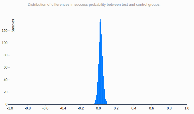
Let’s consider the following simulation setting:
One reference with a 5% conversion rate
One variation with a 5.5% conversion rate (a 10% relative improvement)
5,000 visitors as daily traffic
14 days (2 weeks) of data collection
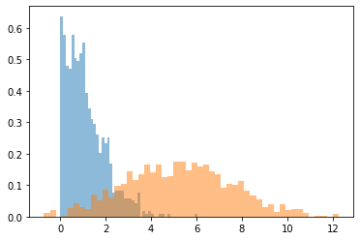
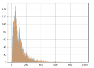
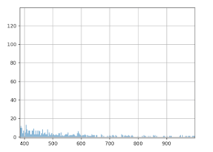
We ran thousands of such experiments to get histograms for different decision index
In the following histogram, the horizontal axis is the day when the sequential testing crosses the significance threshold. The vertical axis is the ratio of experiments which stopped on this day.
In this setting, day 10 is the most likely day for the sequential testing to reach significance. This means that you will need to wait until the planned end of the test to respect the “same sampling each day” rule. And it’s very unlikely that you will get a significant positive result in one week. Thus, in practice, determining the winner sooner with sequential testing doesn’t apply in CRO.
Sequential testing objection 2: “Yes, (effect) size does matter”
In sequential testing, this is often a less obvious problem and may need some further clarification to be properly understood.
In CRO, we consider mainly two statistical indices for decision-making:
The pValue or any other confidence index, which is linked to the fact that there exists (or not) a difference between the original and the variation. This index is used to validate or invalidate the test hypothesis. But a validated hypothesis is not necessarily a good business decision, so we need more information.
The Confidence Interval (CI)around the estimated gain, which indicates the size of the effect. It’s also central to business decisions. For instance, a variation can be a clear winner but with a very little margin that may not cover the implementation or operating costs such as coupon offerings that need to cover the coupon cost.
Confidence intervals can be seen as a best and worst case scenario. For example a CI = [1% ; 12%] means “in the worst case you will only get 1% relative uplift,” which means going from 5% conversion rate to 5.05%.
If the variation has an implementation or operating cost, the results may not be satisfying. In that case, the solution would be to collect more data in order to have a narrower confidence interval, until you get a more satisfying lower bound, or you may find that the upper bound goes very low showing that the effect, even if it exists, is too low to be worth it from a business perspective.
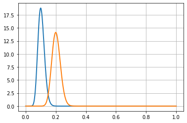
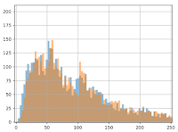
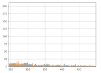
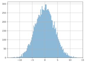
Using the same scenario as above, the lower bound of the confidence interval can be plotted as follows:
Horizontal axis – the percentage value of the lower bound
Vertical axis – the proportion of experiments with this lower bound value
Blue curve – sequential testing CI
Orange curve – classical fixed horizon testing
We can see that sequential testing has a very low confidence interval for the lower bound. Most of the time, this is lower than 2% (in relative gain, which is very small). This means that you will get very poor information for business decisions.
Meanwhile, a classic fixed horizon testing (orange curve) will produce a lower bound >5% in half of the cases, which is a more comfortable margin. Therefore, you can continue the data collection until you have a useful result, which means waiting for more data. Even if by chance the sequential testing found a variant reaching significance in one week, you will still need to collect data for another week to do two things: have a useful estimation of the uplift and sample each day equally.
This makes sense in light of the purpose of sequential testing: quickly detect when a variation produces results that differ from the original, whether for the worse or better.
If done as soon as possible, it makes sense to stop the experiment as soon as the gain confidence interval lays mostly either on the positive or negative side. Then, for the positive side, the CI lower bound is close to 0, which doesn’t allow for efficient business decisions. It’s worth noting that for other applications other than CRO, this behaviour may be optimal and that’s why sequential testing exists.
When does sequential testing in CRO make sense?
As we’ve seen, sequential testing should not be used to quickly determine a winning variation. However, it can be useful in CRO in order to detect losing variations as soon as possible (and prevent loss of conversions, revenue, …).
You may be wondering why it’s acceptable to stop an experiment midway through when your variation is losing rather than when you have a winning variation. This is because of the following reasons:
The most obvious one: To put it simply, you’re losing conversions. This is acceptable in the context of searching for a better variation than the original. However, this makes little sense in cases where there is a notable loss, indicating that the variation has no more chances to be a winner. An alerting system set at a low sensitivity level will help detect such impactful losses.
The less obvious one: Sometimes when an experiment is only slightly “losing” for a good period of time, practitioners tend to let this kind of test run in the hopes that it may turn into a “winner”. Thus, they accept this loss because the variation is only “slightly” losing but they often forget that another valuable component is lost in the process: traffic, which is essential for experimentation. For an optimal CRO strategy, one needs to take these factors into account and consider stopping this kind of useless experiment, doomed to have small effects. In such a scenario, an automated alert system will suggest stopping this kind of test and allocate this traffic to other experiments.
Therefore, sequential testing is, in fact, a valuable tool to alert and stop a losing variation.
However, one more objection could still be raised: by stopping the experiment midway, you are breaking the “sample each day the same” rule.
In this particular case, stopping a losing variation has very little chance to be a bad move. In order for the detected variation to become a winner, it first needs to gain enough conversions tobe comparable to the original version. Then it would need another set of conversions to be a “mild” winner and that still wouldn’t be enough to be considered a business winner (and cover the implementation or exploitation costs of that winner). To be considered a winner for your business, the competing variation will need another high amount of conversions with a sufficient margin. This margin needs to be high enough to cover the cost of implementation, localization, and/or operating costs.
All the aforementioned events should happen in less than a week (ie. the number of days needed to complete the current week). This is very unlikely, which means it’s safe and smart to stop such experiments.
Conclusion
It may be surprising or disappointing to see that there’s no business value in stopping winning experiments early as others may believe. This is because a statistical winner is not a business winner. Stopping a test early is taking away the data you need to reach a significant effect size that would increase your chances of getting a winning variation.
With that in mind, the best way to use this type of testing is as an alert to help spot and stop tests that are either harmful to the business or not worth continuing.
About the Author:
Hubert Wassner has been working as a Senior Data Scientist at AB Tasty since 2014. With a passion for science, data and technology, his work has focused primarily on all the statistical aspects of the platform, which includes building Bayesian statistical tests adapted to the practice of A/B testing for the web and setting up a data science team for machine learning needs.
After getting his degree in Computer Science with a speciality in Signal Processing at ESIEA, Hubert started his career as a research engineer doing research work in the field of voice recognition in Switzerland followed by research in the field of genomic data mining at a biotech company. He was also a professor at ESIEA engineer school where he taught courses in algorithmics and machine learning.
Doing CRO at Scale? AB Tasty’s Testing Alerts Prevent Revenue Loss
Hubert Wassner
When talking about CRO at scale, a common fear is, what if some experiments go wrong? And we mean seriously wrong. The more experiments you have running, the higher the chance that one could negatively impact the business. It might be a bug in a variant, or it might just be a bad idea – but conversion can drop dramatically, hurting your revenue goals.
That’s why it makes sense to monitor experiments daily even if the experiment protocol says that one shouldn’t make decisions before the planned end of the experiment. This leads to two questions:
How do you make a good decision using statistical indices that are not meant to be used that way? Checking it daily is known as “P-hacking” or “data peeking” and generates a lot of poor decisions.
How do you check tens of experiments daily without diverting the team’s time and efforts?
The solution is to use another statistical framework, adapted to the sequential nature of checking an experiment daily. This is known as sequential testing.
How do I go about checking my experiments daily?
Good news, you don’t have to do this tedious job yourself. AB Tasty has developed an automatic alerting system, based on a specialized statistical test procedure, to help you launch experiments at scale with confidence.
Sequential Testing Alerts offer a sensitivity threshold to detect underperforming variations early. It triggers alerts and can pause experiments, helping you cover your losses. It enables you to make data-driven decisions swiftly and optimize user experiences effectively. This alerting system is based on the percentage of conversions and/or traffic lost.
When creating a test, you simply check a box, select the sensitivity level and you’re done for the rest of the experiment’s life. Then, if no alert has been received, you can go ahead and analyze your experiment as usual; but in case of a problem, you’ll be alerted through the notification center. Then you head on over to the report page to assess what happened and make a final decision about the experiment.
Can I also use this to identify winners faster?
No; this may sound weird but it’s not a good idea, even if some vendors are telling you that you should do it. You may be able to spot a winner faster but the estimation of the effect size will be very poor, preventing you from making wise business decisions.
But what about “dynamic allocation”?
First of all, what is dynamic allocation? As its name suggests, it is an experimentation method where the allocation of traffic is not fixed but depends on the variation’s performance. While this may be seen as a way to limit the effect of bad variations, we don’t recommend using it for this purpose for several reasons:
As you know, the strict testing protocol strongly suggests not to change the allocation during a test, so dynamic allocation is an edge case of A/B testing. We only suggest using it when you have no other choice. Classic use cases are very low traffic, or very short time frames (flash sales, for instance). So if your only concern is avoiding big losses from a bad variation, alerting is a better and safer option that respects the A/B testing protocol.
Since dynamic allocation changes the allocation, in order to avoid the risk of missing out on a winner, it always keeps a minimum traffic amount for the supposed losing variation, even if it’s losing by a lot.
Therefore, dynamic allocation isn’t a way to protect revenue but rather to explore options in the context of limited traffic.
Other benefits
Another benefit of the sequential testing alert feature is better usage of your traffic. Experiments with a lot of traffic with no chance to win are also detected by the alerting system. The system will suggest to the user to stop that experiment and make better use of the traffic for other experiments.
The bottom line is: you can’t do CRO at scale without an automated alert system. Receiving such crucial alerts can protect you from experiments that could otherwise cause revenue loss. To learn more about our sequential testing alert and how it works, refer to our documentation.
Have you ever had an experiment leave you with an unexpected result and were unsure of what to do next? This is the case for many when receiving neutral, flat, or inconclusive A/B test results and this is a question we aim to answer.
In this article, we are going to discuss what an inconclusive experimentation result is, what you can learn from it, and what the next step is when you receive this type of result.
What is an inconclusive experiment result?
We have two definitions for an inconclusive experiment: a practitioner’s answer and a more broken-down answer. A basic practitioner’s answer is a numerical answer that shows statistical information depending on the platform you’re using:
The probability of a winner is less than 90-95%
The pValue is bigger than 0.05
The lift confidence interval includes 0
In other words, an inconclusive result happens when the results of an experiment are non-statistically significant or an uplift is too small to be measured.
However, let’s take note of the true meaning of “significance” in this case: the significance is the threshold one has previously set as a metric or a statistic for measurement. If this previously set threshold is crossed, then an action will be made, usually implementing the winning variation.
Setting thresholds for experimentation
It’s important to note that the user sets the threshold and there are no magic formulas for calculating a threshold value. The only mandatory thing that must be done is that the threshold must be set before the beginning of an experiment. In doing so, this statistical hypothesis protocol provides caution and mitigates the risks of making a poor decision or missing an opportunity during experimentation.
To set a proper threshold, you will need a mix of statistical and business knowledge considering the context.
To make things simple, let’s consider that you’ve set a significance threshold that fits your experiment context. Then, having a “flat” result may have different meanings – we will dive into this more in the following sections.
The best tool: the confidence interval (CI)
The first thing to do after the planned end of an experiment is to check the confidence interval (CI) that can tell useful information without any notion of significance. The usage is a 95% confidence level to build these intervals. This means that there is a 95% chance that the real value lies between its boundaries. You can consider the boundaries to be an estimate of the best and worst-case scenarios.
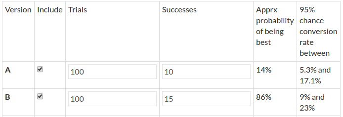
Let’s say that your experiment is collaborating with a brand ambassador (or influencer) to attract more attention and sales. You want to see the impact the brand ambassador has on the conversion rate. There are several possible scenarios depending on the CI values:
Scenario 1:
The confidence interval of the lift is [-1% : +1%]. This means that in the best-case scenario, this ambassador effect is a 1% gain and in the worst-case scenario, the effect is -1%. If this 1% relative gain is less than the cost of the ambassador, then you know that it’s okay to stop this collaboration.
A basic estimation can be done by taking this 1% of your global revenue from an appropriate period. If this is smaller than the cost of the ambassador, then there is no need for “significance“ to validate the decision – you are losing money.
Sometimes neutrality is a piece of actionable information.
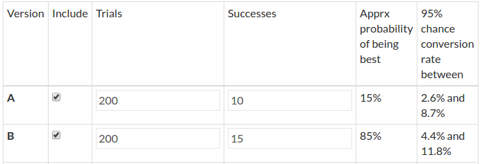
Scenario 2:
The confidence interval of the lift is [-1% : +10%]. Although this sounds promising, it’s important not to make quick assumptions. Since the 0 is still in the confidence interval, you’re still unsure if this collaboration has a real impact on conversion. In this case, it would make sense to extend the experiment period because there are more chances that the gain will be positive than negative.
It’s best to extend the experimentation period until the left bound gets to a “comfortable” margin.
Let’s say that the cost of the collaboration is covered if the gain is as small as 3%, then any CI [3%, XXX%] will be okay. With a CI like this, you are ensuring that the worst-case scenario is even. And with more data, you will also have a better estimate of the best-case scenario, which will certainly be lower than the initial 10%.
Important notice: do not repeat this too often, otherwise you may be waiting until your variant beats the original just by chance.
When extending a testing period, it’s safer to do it by looking at the CI rather than the “chances to win” or P-value, because the CI provides you with an estimate of the effect size. When the variant wins only by chance (which you increase when extending the testing period), it will yield a very small effect size.
You will notice the size of the gain by looking at the CI, whereas a p-value (or any statistical index) will not inform you about the size. This is a known statistical mistake called p-hacking. P-hacking is basically running an experiment until you get what you expect.
The dangers of P-hacking in experimentation
It’s important to be cautious of p-hacking. Statistical tests are meant to be used once. Splitting the analysis into segments, to some extent, can be seen as portraying different experiences. Therefore, if making a unique decision at a 95% significance level means accepting a 5% risk of having a false positive, then checking for 2 segments implicitly leads to doubling this risk to 10% (roughly).
We recommend the following advice may help to mitigate this risk:
Limit the number of segments you are studying to only segments that could have a reason to interact differently with the variation. For example: if it’s a user interface modification (such as the screen size or the navigator used), it may have an impact on how the modification is displayed, but not the geolocation.
Use segments that convey strong information regarding the experiment. For example: Changing the wording of anything may have no link to the navigator used. It may only have an effect on the emotional needs of the visitors, which is something you can capture with new AI technology when using AB Tasty.
Don’t check the smallest segments. The smallest segments will not greatly impact your business overall and are often the least statistically significant. Raising the significance threshold may also be useful to mitigate the risk of having a false positive
Should you extend the experiment period often?
If you notice that you often need to extend the experiment period, you might be skipping an important step in the test protocol: estimating the sample size you need for your experiment.
Unfortunately, many people are skipping this part of the experiment thinking that they can fix it later by extending the period. However, this is bad practice for several reasons:
This brings you close to P-hacking
You may lose time and traffic on tests that will never be significant
Asking a question you can’t know the answer to can be very difficult: what will be the size of the lift? It’s impossible to know. This is one reason why experimenters don’t often use sample size calculators. The reason you test and experiment is because you do not know the outcome.
A far more intuitive approach is to use a Minimal Detectable Effect (MDE) calculator. Based on the base conversion rate and the number of visitors you send to a given experiment, an MDE calculator can help you come up with the answer to the question: what is the smallest effect you may be able to detect? (if it exists).
For example, if the total traffic on a given page is 15k for 2 weeks, and the conversion rate is 3% – the calculator will tell you that the MDE is about 25% (relative). This means that what you are about to test must have a quite big impact: going from 3% to 3.75% (25% relative growth).
If your variant is only changing some colors to a small button, developing an entire experiment may not be worth the time. Even if the new colors are better and give you a small uplift, it will not be significant in the classic statistical way (having a “chance to win” >95% or a p-value < 0.05).
On the other hand, if your variation tests a big change such as offering a coupon or a brand new product page format, then this test has a chance to give usable results in the given period.
Digging deeper into ‘flatness’
Some experiments may appear to be flat or inconclusive when in reality, they need a closer look.
For example, frequent visitors may be puzzled by your changes because they expect your website to remain the same, whereas new visitors may instantly prefer your variation. This combined effect of the two groups may cancel each other out when looking at the overall results instead of further investigating the data. This is why it’s very important to take the time to dig into your visitor segments as it can provide useful insights.
This can lead to very useful personalization where only a given segment will be exposed to the variation with benefits.
What is the next step after receiving an inconclusive experimentation result?
Let’s consider that your variant has no effect at all, or at least not enough to have a business impact. This still means something. If you reach this point, it means that all previous ideas fell short; You discovered no behavioral difference despite the changes you made in your variation.
What is the next step in this case? The next step is actually to go back to the previous step – the hypothesis. If you are correctly applying the testing protocol, you should have stated a clear hypothesis. It’s time to use it now.
There might be several meta-hypotheses about why your hypothesis has not been validated by your experiment:
The signal is too weak. You might have made a change, but perhaps it’s barely noticeable. If you offered free shipping, your visitors might not have seen the message if it’s too low on the page.
The change itself is too weak. In this case, try to make the change more significant. If you have increased the product picture on the page by 5% – it’s time to try 10% or 15%.
The hypothesis might need revision. Maybe the trend is reversed. For instance, if the confidence interval of the gain is more on the negative side, why not try the opposite idea to implement?
Think of your audience. Another consideration is that even if you have a strong belief about your hypothesis, it’s just time to change your mind about what is important for your visitors and try something different.
It’s important to notice that this change is something that you’ve learned thanks to your experiment. This is not a waste of time – it’s another step forward to better knowing your audience.
Yielding an inconclusive experiment
An experiment not yielding a clear winner (or loser), is often called neutral, inconclusive, or flat. This still produces valuable information if you know how and where to search. It’s not an end, it’s just another step further in your understanding of who you’re targeting.
In other words, an inconclusive experiment result is always a valuable result.
CRO Metrics: Navigating Pitfalls and Counterintuitive KPIs
Hubert Wassner
Metrics play an essential role in measuring performance and influencing decision-making.
However, relying on certain metrics alone can lead you to misguided conclusions and poor strategic choices. Potentially misleading metrics are often referred to as “pitfall metrics” in the world of Conversion Rate Optimization.
Pitfall metrics are data indicators that can give you a distorted version of reality or an incomplete view of your performance if analyzed in isolation. Pitfall metrics can even cause you to backtrack in your performance if you’re not careful about how you evaluate these metrics.
Metrics are typically split into two categories:
Session metrics: Any metrics that are measured on a session instead of a visitor basis
Count metrics: Metrics that count events (for instance number of pages viewed)
Some metrics can mesh into both categories. Needless to say, that’s the worst option for a few main reasons: no real statistical model is used when meshing into both categories. There is no direct/simple link to business objectives and these metrics may not need standard optimization.
While metrics are very valuable for business decisions, it’s crucial to use them wisely and be mindful of potential pitfalls in your data collection and analysis. In this article, we will explore and explain why some metrics are very not wise to use in practice in CRO.
Session-based metrics vs visitors
One problem with session-based metrics is that “power users” (AKA users returning for multiple sessions during the experimentation) will lead to a bias with the results.
Let’s remember that during experimentation, the traffic split between the variations is a random process.
Typically you think of a traffic split as very random but very even groups. When we talk about big groups of users – this is typically true. However, when you consider a small group, it’s very unlikely that you will have an even split in terms of visitor behaviors, intentions and types.
Let’s say that you have 12 power users that need to be randomly divided between two variations. Let’s say that these power users have 10x more sessions than the average user. It’s quite likely that you will end up with a 4 and 8 split, a 2 and 10 split, or another uneven split. Having an even split randomly occur is very unlikely. You will then end up in one of two very likely situations:
Situation 1: Very few users may make you believe you have a winning variation (which doesn’t yet exist)
Situation 2: The winning variation is masked because it received too few of these power users
Another problem with session-based metrics is that a session-based approach blurs the meaning of important metrics like transaction rates. The recurring problem here is that not all visitors display the same type of behavior. If average buyers need 3 sessions to make a purchase while some need 10, this is a difference in user behavior and does not have anything to do with your variation. If your slow buyers are not evenly split between the variations, then you will see a discrepancy in the transaction rate that doesn’t actually exist.
Moreover, the metric itself will lose part of its intuitive meaning over time. If your real conversion rate is around 3%, but counted by session and not by unique visitors, you will only likely only see a 1% conversion rate when switching to unique visitors.
This is not only disappointing but very confusing.
Imagine a variation urging visitors to buy sooner by using “stress marketing” techniques. Let’s say this leads to a one session purchase instead of three sessions. You will see a huge gain (3x) on the conversion per session. BUT this “gain” is not an actual gain since the number of conversions will have no effect on the revenue earned. It’s also good to keep in mind that visitors under pressure may not feel very happy or comfortable with such a quick purchase and may not return.
It’s best practice to avoid using session-based metrics unless you don’t have another choice as they can be very misleading.
Understanding count metrics
We will come back to our comparison of these two types of metrics. But for now, let’s get on the same page about “count metrics.” To understand why count metrics are harder to assess, you need to have more context on how to measure accuracy and where exactly the measure comes from.
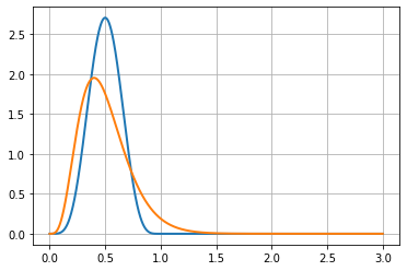
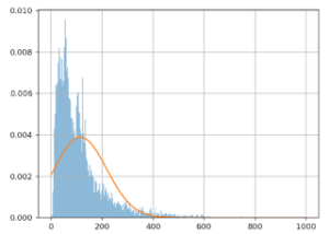
To model rate accuracy measures, we use beta distribution. In the graph below, we see the measure of two conversion ratios – one blue and one orange. The X-axis is the rate and Y-axis is the likelihood. When trying to measure the probability that the two rates are different, we implicitly explore the part of the two curves that are overlapping.
In this case, the two curves have very little overlap. Therefore, the probability that these two rates are actually different is quite high.
The more narrow or compact the distribution is, the easier it is to see that they’re different.
Want to start optimizing your website with a platform you can trust?AB Tasty is the best-in-class experience optimization platform that empowers you to create a richer digital experience – fast. From experimentation to personalization, this solution can help you activate and engage your audience to boost your conversions.
The fundamental difference between conversion and count distributions
Conversion metrics are bounded into [0:1] as a rate or [0%:100%] as a percentage. But, for count metrics the range is open, and the counts are in [0,+infinity].
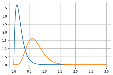
The following figure shows a gamma distribution (in orange) that may be used with this kind of data, along with a beta distribution (in blue).
These two distributions are based on the same data: 10 visitors and 5 successes. This is a 0.5 success rate (or 50%) when considering unique conversions. In the context of multiple conversions, it’s a process with an average of 0.5 rate conversion per visitor.
Notice that the orange curve (for the count metric) is non-0 above x = 1, this clearly shows that it expects that sometimes there will be more than 1 conversion per visitor.
We will see that comparisons between this kind of metric depend on whether we consider it as a count metric or as a rate. There are two options:
Either we consider that the process is a conversion process, using a beta distribution (in blue), which is naturally bounded in [0;1].
Or we consider that the process is a count process, using gamma distribution (in orange), which is not bounded on the right side.
On the graph, we see an inner property of count data distributions, they are dissymmetric: the right part goes slower to 0 than the left part. This makes it naturally more spread out than the beta distribution.
Since both curves are distributions, their surface under the curve must be 1.
As you can see, the beta distribution (in blue) has a higher peak than the gamma distribution (in orange). This exposes that the gamma distribution is more spread out than the beta distribution. This is a hint that count distributions are harder to get accurate than conversion distributions. This is also why we need more visitors to assess a difference when using count metrics rather than when using conversion metrics.
To understand this problem you have to imagine two gamma distribution curves, one for each variation of an experiment. Then, gradually shift one on the right, showing an increasing difference between the two distributions. (see figure below)
Since both curves are right-skewed, the overlap region will occur on at least one of the skewed parts of the distributions.
This means that differences will be harder to assess with count data than with conversion data. This comes from the fact that count data works on an open range, whereas conversion rates work on a closed range.
Do count metrics need more visitors to get accurate results?
No, it is more complex than that in the CRO context. Typical statistical tests for count metrics are not suited for CRO in practice.
Most of these tests come from the industrial world. A classic usage of count metrics is counting the number of failures of a machine in a given timeframe. In this context, the risk of failure doesn’t depend on previous events. If a machine already had one failure and has been repaired, the chance of a second failure is considered to be the same.
This hypothesis is not suited for the number of pages viewed by a visitor. In reality, if a visitor saw two pages, there’s a higher chance that they will see a third page compared to a visitor that just saw one page (since they have a high probability to “bounce”).
The industrial model does not fit in the CRO context since it deals with human behavior, making it much more complex.
Not all conversions have the same value
The next CRO struggle also comes from the direct exploitation of formulas from the industrial world.
If you run a plant that produces goods with machines, and you test a new kind of machine that produces more goods per day on average, you will conclude that these new machines are a good investment. Because the value of a machine is linear with its average production, each extra product adds the same value to the business.
But this is not the same in CRO.
Imagine this experiment result for a media company:
Variation B is yielding an extra 1,000 page views more than the original A. Based on that data, you put variation B in production. Let’s say that variation B lost 500 people that saw 2 pages and variation B also won 20 people that saw 100 pages each. That makes a net benefit of 1000 page views for variation B.
But what about the value? These 20 people, even if they spent a lot of time on the media, are maybe not the same value as 500 people that come regularly.
In CRO each extra value added to a count metric does not have the same value, so you cannot trust measured increment as a direct added value.
In applied statistics, one adds an extra layer to the analysis: a utility function, which links extra counts to value. This utility function is very specific to the problem and is unknown to most CRO problems. Even if you get some more conversions in a count metric context, you are unsure about the real value of this gain (if any).
Some count metrics are not meant to be optimized
Let’s see some examples where raising the number of a count metric might not be a good thing:
Page views: If the count of page views rises, you can think it’s a good thing because people are seeing more of your products. However, you can also think that people get lost and need to browse more pages to find what they need.
Items added to cart: We have the same idea for the number of products added to the cart. If you do not check how many products remain in the cart at the checkout stage, you don’t know if the variation helps to sell more or if it just makes the product selection harder.
Product purchased: Even the number of products purchased may be misleading as a business objective alone if used alone in an optimization context. Visitors could be buying two cheaper products instead of one high-quality (and more expensive) product.
You can’t tell just by looking at these KPIs if your variation or change is good for your business or not. There is more that needs to be considered when looking at these numbers.
How do we use this count data then?
We see in this article how counterintuitive optimization based on sessions is. And even worse, we see how misleading count metrics are in CRO.
Unless you have both business and statistics expert resources, it’s best practice to avoid them, at least as a unique KPI.
As a workaround, you can use several conversion metrics with specific triggers using business knowledge to set the thresholds. For instance:
Use one conversion metric for count is in the range [1; 5] called “light users.”
Use another conversion metric in the range [6,10] called “medium users.”
Use another one for the range [11,+infinity] called “heavy users”.
Splitting up the conversion metrics in this way will give you a clearer signal about where you gain or lose conversions.
Another piece of advice is to use several KPIs to have a broader view.
For instance, although analyzing the product views alone is not a good idea – you can check the overall conversion rate and average order value at the same time. If product views and conversion KPIs are going up and the average order value is stable or goes up, then you can conclude that your new product page layout is a success.
Counterintuitive Metrics in CRO
Now you see that except for conversions counted on a unique visitor basis, nearly all other metrics can be very counterintuitive to use in CRO. Mistakes can happen because of statistics that work differently, and also because the meaning of these metrics and their evolutions may have several interpretations.
It’s important to understand that CRO skill is a mix of statistics, business and UX knowledge. Since it’s very rare to have all this within one person, the key is to have the needed skills spread across a team with good communication.
If your website traffic numbers aren’t as high as you may hope for, that’s no reason to give up on your conversion rate optimization (CRO) goals.
By now you must have noticed that most CRO advice is tailored for high-traffic websites. Luckily, this doesn’t mean you can’t optimize your website even if you have lower traffic.
The truth is, any website can be optimized – you just need to tailor your optimization strategy to suit your unique situation.
In order to make this article easier to understand, let’s start with an analogy. Imagine that instead of measuring two variants and picking a winner, we are measuring the performance of two boxers and placing bets on who will win the next 10 rounds.
So, how will we place our bet on who will win?
Imagine that boxer A and boxer B are both newbies that no one knows. After the first round, you have to make your choice. In the end, you will most likely place your bet on the boxer who won the first round. It might be risky if the winning margin is small, but in the end, you have no other way to base your decision.
Imagine now that boxer A is known to be a champion, and boxer B is a challenger that you don’t know. Your knowledge about boxer A is what we would call a prior – information you have before that influences your decision.
Based on the prior, you will be more likely to bet on boxer A as the champion for the next few rounds, even if boxer B wins the first round with a very small margin.
Furthermore, you will only choose boxer B as your predicted champion if they win the first round by a large margin. The stronger your prior, the larger the margin needs to be in order to convince you to change your bet.
Are you following? If so, the following paragraphs will be easy to grasp and you will understand where this “95% threshold” comes from.
Now, let’s move on to tips for optimizing your website with low traffic.
1. Solving the problem: “I never reach the 95% significance”
This is the most common complaint about CRO for websites with lower traffic and for lower traffic pages on bigger websites.
Before we dig into this most common problem, let’s start by answering the question, where does this 95% “golden rule” come from?
The origin of the 95% threshold
Let’s start our explanation with a very simple idea: What if optimization strategies were applied from day one? If two variants with no previous history were created at the same time, there would be no “original” version challenged by a newcomer.
This would force you to choose the best one from the beginning.
In this setting, any small difference in performance could be measured for decision-making. After a short test, you will choose the variant with the higher performance. It would not be good practice to pick the variant that had lower performance and furthermore, it would be foolish to wait for a 95% threshold to pick a winner.
But in practice, optimization is done well after the launch of a business.
So, in most real-life situations, there is a version A that already exists and a new challenger (version B) that is created.
If the new challenger, version B, comes along and the performance difference between the two variants is not significant, you will have no issues declaring version B “not a winner.”
Statistical tests are symmetric. So if we reverse the roles, swapping A and B in the statistical test will tell you that the original is not significantly better than the challenger. The “inconclusiveness” of the test is symmetric.
So, why do you set 100% of traffic toward the original at the end of an inconclusive test, implicitly declaring A as a winner? Because you have three priors:
Version A was the first choice. This choice was made by the initial creator of the page.
Version A has already been implemented and technically trusted. Version B is typically a mockup.
Version A has a lot of data to prove its value, whereas B is a challenger with limited data that is only collected during the test period.
Points 1 & 2 are the bases of a CRO strategy, so you will need to go beyond these two priors. Point 3 explains that version A has more data to back its performance. This explains why you trust version A more than version B. Version A has data.
Now you understand that this 95% confidence rule is a way of explaining a strong prior. And this prior mostly comes from historical data.
Therefore, when optimizing a page with low traffic, your decision threshold should be below 95% because your prior on A is weaker due to its traffic and seniority.
The threshold should be set according to the volume of traffic that went through the original from day one. However, the problem with this approach is that we know that the conversion rates are not stable and can change over time. Think of seasonality – i.e. black Friday rush, vacation days, Christmas time increases in activity, etc. Because of the seasonal changes, you can’t compare performances in different periods.
This is why practitioners only take into account data for version A and version B taken at the same period of time and set a high threshold (95%) to accept the challenger as a winner in order to formalize a strong prior toward version A.
What is the appropriate threshold for low traffic?
It’s hard to suggest an exact number to focus on because it depends on your risk acceptance.
According to the hypothesis protocol, you should structure a time frame for the data collectionperiod in advance.
This means that the “stop” criteria of a test are not a statistical measure or based on a certain number. The “stop” criteria should be a timeframe coming to an end. Once the period is over, then you should look at the stats to make an appropriate decision.
AB Tasty, our customer experience optimization and feature management software, uses the Bayesian framework which produces a “chances to win” index which encourages a direct interpretation instead of a p-value, which has a very complex meaning.
In other words, the “chances to win index” is the probability for a given variation to be better than the original.
Therefore, a 95% “chance to win” means that there is a 95% probability that the given variation will be the winner. This is assuming that we don’t have any prior knowledge or specific trust for the original.
The 95% threshold itself is also a default compromise between the prior you have on the original and a given level of risk acceptance (it could have even been a 98% threshold).
Although it is hard to give an exact number, let’s make a rough scale for your threshold:
New A & B variations: If you have a case where variation A and variation B are both new, the threshold could be as low as 50%. If there is no past data on the variations’ performance and you must make a choice for implementation, even a 51% chance to win is better than 49%.
New website, low traffic: If your website is new and has very low traffic, you likely have very little prior on variation A (the original variation in this case). In that case, setting 85% as a threshold is reasonable. Since it means that if you put aside the little you know about the original you still have 85% to pick up the winner and only 15% to pick a variation that is equivalent to the original, and a lesser chance that it performs worse. So depending on the context, such a bet can make sense.
Mature business, low traffic: If your business has a longer history, but still lower traffic, 90% is a reasonable threshold. This is because there is still little prior on the original.
Mature business, high traffic: Having a lot of prior, or data, on variation A suggests a 95% threshold.
The original 95% threshold is far too high if your business has low traffic because there’s little chance that you will reach it. Consequently, your CRO strategy will have no effect and data-driven decision-making becomes impossible.
By using AB Tasty as your experimentation platform, you will be given a report that includes the “chance to win” along with other statistical information regarding your web experiments. A report from AB Tasty would also include the confidence interval on the estimated gain as an important indicator. The boundaries around the estimated gain are also computed in a Bayesian way, which means it can be interpreted as the best and the worst scenario.
The importance of Bayesian statistics
Now you understand the exact meaning of the well-known 95% “significance” level and are able to select appropriate thresholds corresponding to your particular case.
It’s important to remember that this approach only works with Bayesian statistics since frequentist approaches give statistical indices (such as p-Values and confidence intervals that have a totally different meaning and are not suited to the explained logic).
2. Are the stats valid with small numbers?
Yes, they are valid as long as you do not stop the test depending on the result.
Remember the testing protocol says once you decide on a testing period, the only reason to stop a test is when the timeframe has ended. In this case, the stat indices (“chances to win” & confidence interval) are true and usable.
You may be thinking: “Okay, but then I rarely reach the 95% significance level…”
Remember that the 95% threshold doesn’t need to be the magic number for all cases. If you have low traffic, chances are that your website is not old. If you refer back to the previous point, you can take a look at our suggested scale for different scenarios.
If you’re dealing with lower traffic as a newer business, you can certainly switch to a lower threshold (like 90%). The threshold is still higher because it’s typical to have more trust in an original rather than a variant because it’s used for a longer time.
If you’re dealing with two completely new variants, at the end of your testing period, it will be easier to pick the variant with the higher conversions (without using a stat rest) since there is no prior knowledge of the performance of A or B.
3. Go “upstream”
Sometimes the traffic problem is not due to a low-traffic website, but rather the webpage in question. Typically, pages with lower traffic are at the end of the funnel.
In this case, a great strategy is to work on optimizing the funnel closer to the user’s point of entry. There may be more to uncover with optimization in the digital customer journey before reaching the bottom of the funnel.
4. Is the CUPED technique real?
What is CUPED?
Controlled Experiment Using Pre-Experiment Data is a newer buzzword in the experimentation world. CUPED is a technique that claims to produce up to 50% faster results. Clearly, this is very appealing to small-traffic websites.
Does CUPED really work that well?
Not exactly, for two reasons: one is organizational and the other is applicability.
The organizational constraint
What’s often forgotten is that CUPED means Controlled experiment Using Pre-Experiment Data.
In practice, the ideal period of “pre-experiment data” is two weeks in order to hope for a 50% time reduction.
So, for a 2-week classic test, CUPED claims that you can end the test in only 1 week.
However, in order to properly see your results, you will need two weeks of pre-experimentdata. So in fact, you must have three weeks to implement CUPED in order to have the same accuracy as a classic 2-week test.
Yes, you are reading correctly. In the end, you will need three weeks time to run the experiment.
This means that it is only useful if you already have two weeks of traffic data that is unexposed to any experiment. Even if you can schedule two weeks of no experimentations into your experimentation planning to collect data, this will be blocking traffic for other experiments.
The applicability constraint
In addition to the organizational/2-week time constraint, there are two other prerequisites in order for CUPED to be effective:
CUPED is only applicable to visitors browsing the site during both the pre-experiment and experiment periods.
These visitors need to have the same behavior regarding the KPI under optimization. Visitors’ data must be correlated between the two periods.
You will see in the following paragraph that these two constraints make CUPED virtually impossible for e-commerce websites and only applicable to platforms.
Let’s go back to our experiment settings example:
Two weeks of pre-experiment data
Two weeks of experiment data (that we hope will only last one week as there is a supposed 50% time reduction)
The optimization goal is a transaction: raising the number of conversions.
Constraint number 1 states that we need to have the same visitors in pre-experiment & experiment, but the visitor’s journey in e-commerce is usually one week.
In other words, there is very little chance that you see visitors in both periods. In this context, only a very limited effect of CUPED is to be expected (up to the portion of visitors that are seen in both periods).
Constraint number 2 states that the visitors must have the same behavior regarding the conversion (the KPI under optimization). Frankly, that constraint is simply never met in e-commerce.
The e-commerce conversion occurs either during the pre-experiment or during the experiment but not in both (unless your customer frequently purchases several times during the experiment time).
This means that there is no chance that the visitors’ conversions are correlated between the periods.
In summary: CUPED is simply not applicable for e-commerce websites to optimize transactions.
It is clearly stated in the original scientific paper, but for the sake of popularity, this buzzword technique is being misrepresented in the testing industry.
In fact, and it is clearly stated in scientific literature, CUPED works only on multiple conversions for platforms that have recurring visitors performing the same actions.
Great platforms for CUPED would be search engines (like Bing, where it has been invented) or streaming platforms where users come daily and do the same repeated actions (playing a video, clicking on a link in a search result page, etc).
Even if you try to find an application of CUPED for e-commerce, you’ll find out that it’s not possible.
One may say that you could try to optimize the number of products seen, but the problem of constraint 1 still applies: a very little number of visitors will be present on both datasets. And there is a more fundamental objection – this KPI should not be optimized on its own, otherwise you are potentially encouraging hesitation between products.
You cannot even try to optimize the number of products ordered by visitors with CUPED because constraint number 2 still holds. The act of purchase can be considered as instantaneous. Therefore, it can only happen in one period or the other – not both. If there is no visitor behavior correlation to expect then there is also no CUPED effect to expect.
Conclusion about CUPED
CUPED does not work for e-commerce websites where a transaction is the main optimization goal. Unless you are Bing, Google, or Netflix — CUPED won’t be your secret ingredient to help you to optimize your business.
This technique is surely a buzzword spiking interest fast, however, it’s important to see the full picture before wanting to add CUPED into your roadmap. E-commerce brands will want to take into account that this testing technique is not suited for their business.
Optimization for low-traffic websites
Brands with lower traffic are still prime candidates for website optimization, even though they might need to adapt to a less-than-traditional different approach.
Whether optimizing your web pages means choosing a page that’s higher up in the funnel or adopting a slightly lower threshold, continuous optimization is crucial.
Want to start optimizing your website?AB Tasty is the best-in-class experience optimization platform that empowers you to create a richer digital experience – fast. From experimentation to personalization, this solution can help you activate and engage your audience to boost your conversions.
Bayesian vs. Frequentist: How AB Tasty Chose Our Statistical Model
Hubert Wassner
The debate about the best way to interpret test results is becoming increasingly relevant in the world of conversion rate optimization.
Torn between two inferential statistical methods (Bayesian vs. frequentist), the debate over which is the “best” is fierce. At AB Tasty, we’ve carefully studied both of these approaches and there is only one winner for us.
There are a lot of discussions regarding the optimal statistical method: Bayesian vs. frequentist (Source)
But first, let’s dive in and explore the logic behind each method and the main differences and advantages that each one offers. In this article, we’ll go over:
[toc]
What is hypothesis testing?
The statistical hypothesis testing framework in digital experimentation can be expressed as two opposite hypotheses:
H0 states that there is no difference between the treatment and the original, meaning the treatment has no effect on the measured KPI.
H1 states that there is a difference between the treatment and the original, meaning that the treatment has an effect on the measured KPI.
The goal is to compute indicators that will help you make the decision of whether to keep or discard the treatment (a variation, in the context of AB Tasty) based on the experimental data. We first determine the number of visitors to test, collect the data, and then check whether the variation performed better than the original.
There are two hypotheses in the statistical hypothesis framework (Source)
Essentially, there are two approaches to statistical hypothesis testing:
Frequentist approach: Comparing the data to a model.
Bayesian approach: Comparing two models (that are built from data).
From the first moment, AB Tasty chose the Bayesian approach for conducting our current reporting and experimentation efforts.
What is the frequentist approach?
In this approach, we will build a model Ma for the original (A) that will give the probability Pto see some data Da. It is a function of the data:
Ma(Da) = p
Then we can compute a p-value, Pv, from Ma(Db), which is the probability to see the data measured on variation B if it was produced by the original (A).
Intuitively, if Pv is high, this means that the data measured on B could also have been produced by A (supporting hypothesis H0). On the other hand, if Pv is low, this means that there are very few chances that the data measured on B could have been produced by A (supporting hypothesis H1).
A widely used threshold for Pv is 0.05. This is equivalent to considering that, for the variation to have had an effect, there must be less than a 5% chance that the data measured on B could have been produced by A.
This approach’s main advantage is that you only need to model A. This is interesting because it is the original variation, and the original exists for a longer time than B. So it would make sense to believe you could collect data on A for a long time in order to build an accurate model from this data. Sadly, the KPI we monitor is rarely stationary: Transactions or click rates are highly variable over time, which is why you need to build the model Ma and collect the data on B during the same period to produce a valid comparison. Clearly, this advantage doesn’t apply to a digital experimentation context.
This approach is called frequentist, as it measures how frequently specific data is likely to occur given a known model.
It is important to note that, as we have seen above, this approach does not compare the two processes.
Note: since p-value are not intuitive, they are often changed into probability like this:
p = 1-Pvalue
And wrongly presented as the probability that H1 is true (meaning a difference between A & B exists). In fact, it is the probability that the data collected on B was not produced by process A.
What is the Bayesian approach (used at AB Tasty)?
In this approach, we will build two models, Ma and Mb (one for each variation), and compare them. These models, which are built from experimental data, produce random samples corresponding to each process, A and B. We use these models to produce samples of possible rates and compute the difference between these rates in order to estimate the distribution of the difference between the two processes.
Contrary to the first approach, this one does compare two models. It is referred to as the Bayesian approach or method.
Now, we need to build a model for A and B.
Clicks can be represented as binomial distributions, whose parameters are the number of tries and a success rate. In the digital experimentation field, the number of tries is the number of visitors and the success rate is the click or transaction rate. In this case, it is important to note that the rates we are dealing with are only estimates on a limited number of visitors. To model this limited accuracy, we use beta distributions (which are the conjugate prior of binomial distributions).
These distributions model the likelihood of a success rate measured on a limited number of trials.
Let’s take an example:
1,000 visitors on A with 100 success
1,000 visitors on B with 130 success
We build the model Ma = beta(1+success_a,1+failures_a) where success_a = 100 & failures_a = visitors_a – success_a =900.
You may have noticed a +1 for success and failure parameters. This comes from what is called a “prior” in Bayesian analysis. A prior is something you know before the experiment; for example, something derived from another (previous) experiment. In digital experimentation, however, it is well documented that click rates are not stationary and may change depending on the time of the day or the season. As a consequence, this is not something we can use in practice; and the corresponding prior setting, +1, is simply a flat (or non-informative) prior, as you have no previous usable experiment data to draw from.
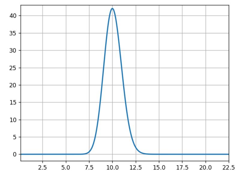
For the three following graphs, the horizontal axis is the click rate while the vertical axis is the likelihood of that rate knowing that we had an experiment with 100 successes in 1,000 trials.
(Source: AB Tasty)
What usually occurs here is that 10% is the most likely, 5% or 15% are very unlikely, and 11% is half as likely as 10%.
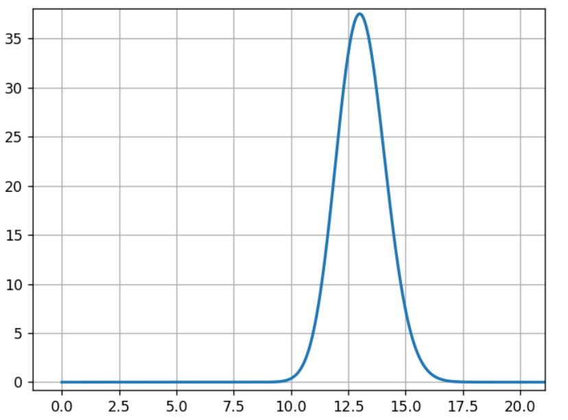
The model Mb is built the same way with data from experiment B:
Mb= beta(1+100,1+870)
(Source: AB Tasty)
For B, the most likely rate is 13%, and the width of the curve’s shape is close to the previous curve.
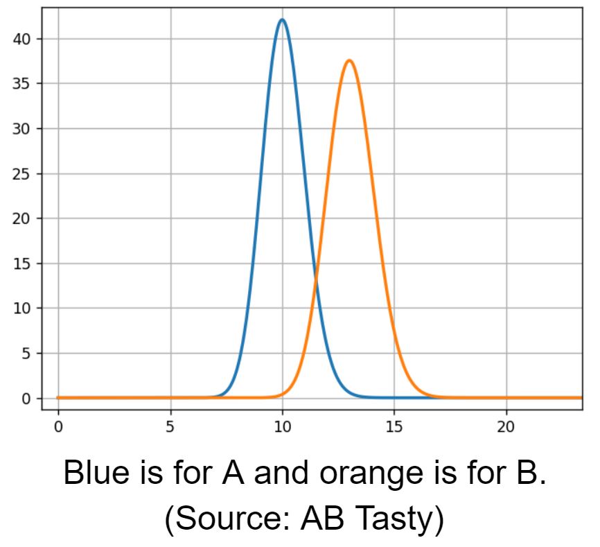
Then we compare A and B rate distributions.
Blue is for A and orange is for B (Source: AB Tasty)
We see an overlapping area, 12% conversion rate, where both models have the same likelihood. To estimate the overlapping region, we need to sample from both models to compare them.
We draw samples from distribution A and B:
s_a[i] is the i th sample from A
s_b[i] is the i th sample from B
Then we apply a comparison function to these samples:
the relative gain: g[i] =100* (s_b[i] – s_a[i])/s_a[i]for all i.
It is the difference between the possible rates for A and B, relative to A (multiplied by 100 for readability in %).
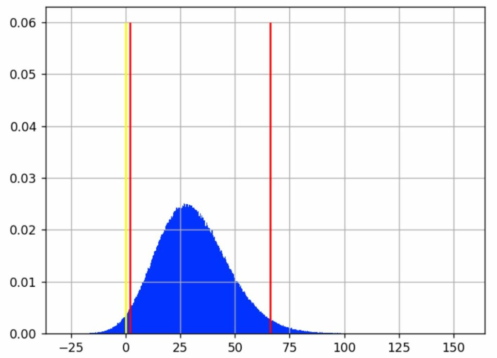
We can now analyze the samples g[i] with a histogram:
The horizontal axis is the relative gain, and the vertical axis is the likelihood of this gain (Source: AB Tasty)
We see that the most likely value for the gain is around 30%.
The yellow line shows where the gain is 0, meaning no difference between A and B. Samples that are below this line correspond to cases where A > B, samples on the other side are cases where A < B.
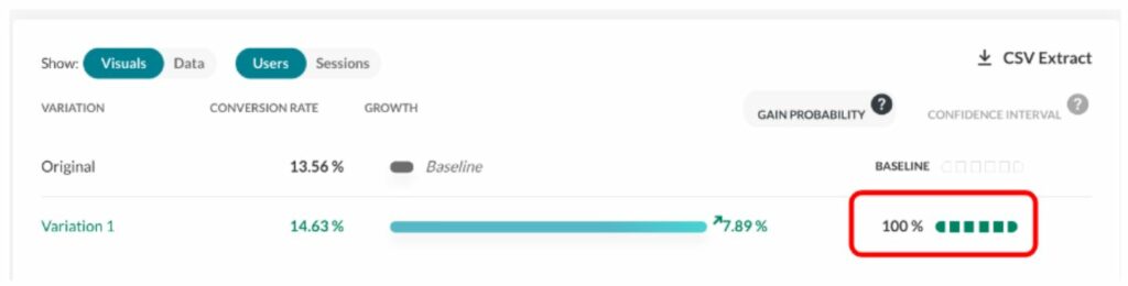
We then define the gain probability as:
GP = (number of samples > 0) / total number of samples
With 1,000,000 (10^6) samples for g, we have 982,296 samples that are >0, making B>A ~98% probable.
We call this the “chances to win” or the “gain probability” (the probability that you will win something).
The gain probability is shown here (see the red rectangle) in the report:
(Source: AB Tasty)
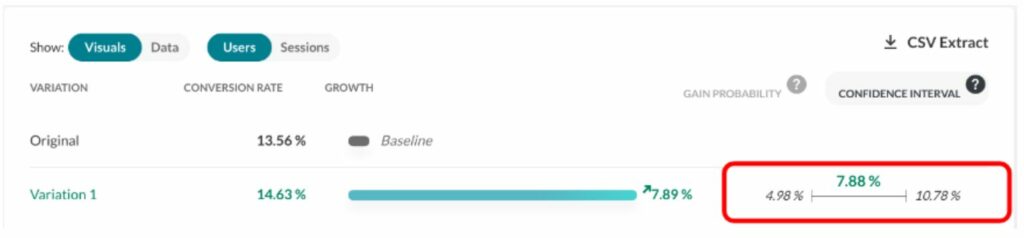
Using the same sampling method, we can compute classic analysis metrics like the mean, the median, percentiles, etc.
Looking back at the previous chart, the vertical red lines indicate where most of the blue area is, intuitively which gain values are the most likely.
We have chosen to expose a best- and worst-case scenario with a 95% confidence interval. It excludes 2.5% of extreme best and worst cases, leaving out a total of 5% of what we consider rare events. This interval is delimited by the red lines on the graph. We consider that the real gain (as if we had an infinite number of visitors to measure it) lies somewhere in this interval 95% of the time.
In our example, this interval is [1.80%; 29.79%; 66.15%], meaning that it is quite unlikely that the real gain is below 1.8 %, and it is also quite unlikely that the gain is more than 66.15%. And there is an equal chance that the real rate is above or under the median, 29.79%.
The confidence interval is shown here (in the red rectangle) in the report (on another experiment):
(Source: AB Tasty)
What are “priors” for the Bayesian approach?
Bayesian frameworks use the term “prior” to refer to the information you have before the experiment. For instance, a common piece of knowledge tells us that e-commerce transaction rate is mostly under 10%.
It would have been very interesting to incorporate this, but these assumptions are hard to make in practice due to the seasonality of data having a huge impact on click rates. In fact, it is the main reason why we do data collection on A and B at the same time. Most of the time, we already have data from A before the experiment, but we know that click rates change over time, so we need to collect click rates at the same time on all variations for a valid comparison.
It follows that we have to use a flat prior, meaning that the only thing we know before the experiment is that rates are in [0%, 100%], and that we have no idea what the gain might be. This is the same assumption as the frequentist approach, even if it is not formulated.
Challenges in statistics testing
As with any testing approach, the goal is to eliminate errors. There are two types of errors that you should avoid:
False positive (FP): When you pick a winning variation that is not actually the best-performing variation.
False negative (FN): When you miss a winner. Either you declare no winner or declare the wrong winner at the end of the experiment.
Performance on both these measures depends on the threshold used (p-value or gain probability), which depends, in turn, on the context of the experiment. It’s up to the user to decide.
Another important parameter is the number of visitors used in the experiment, since this has a strong impact on the false negative errors.
From a business perspective, the false negative is an opportunity missed. Mitigating false negative errors is all about the size of the population allocated to the test: basically, throwing more visitors at the problem.
The main problem then is false positives, which mainly occur in two situations:
Very early in the experiment: Before reaching the targeted sample size, when the gain probability goes higher than 95%. Some users can be too impatient and draw conclusions too quickly without enough data; the same occurs with false positives.
Late in the experiment: When the targeted sample size is reached, but no significant winner is found. Some users believe in their hypothesis too much and want to give it another chance.
Both of these problems can be eliminated by strictly respecting the testing protocol: Setting a test period with a sample size calculator and sticking with it.
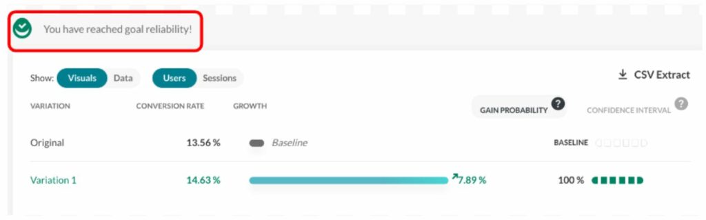
At AB Tasty, we provide a visual checkmark called “readiness” that tells you whether you respect the protocol (a period that lasts a minimum of 2 weeks and has at least 5,000 visitors). Any decision outside these guidelines should respect the rules outlined in the next section to limit the risk of false positive results.
This screenshot shows how the user is informed as to whether they can take action.
(Source: AB Tasty)
Looking at the report during the data collection period (without the “reliability” checkmark) should be limited to checking that the collection is correct and to check for extreme cases that require emergency action, but not for a business decision.
When should you finalize your experiment?
Early stopping
“Early stopping” is when a user wants to stop a test before reaching the allocated number of visitors.
A user should wait for the campaign to reach at least 1,000 visitors and only stop if a very big loss is observed.
If a user wants to stop early for a supposed winner, they should wait at least two weeks, and only use full weeks of data. This tactic is interesting if and when the business cost of a false positive is okay, since it is more likely that the performance of the supposed winner would be close to the original, rather than a loss.
Again, if this risk is acceptable from a business strategy perspective, then this tactic makes sense.
If a user sees a winner (with a high gain probability) at the beginning of a test, they should ensure a margin for the worst-case scenario. A lower bound on the gain that is near or below 0% has the potential to evolve and end up below or far below zero by the end of a test, undermining the perceived high gain probability at its beginning. Avoiding stopping early with a low left confidence bound will help rule out false positives at the beginning of a test.
For instance, a situation with a gain probability of 95% and a confidence interval like [-5.16%; 36.48%; 98.02%] is a characteristic of early stopping. The gain probability is above the accepted standard, so one might be willing to push 100% of the traffic to the winning variation. However, the worst-case scenario (-5.16%) is relatively far below 0%. This indicates a possible false positive — and, at any rate, is a risky bet with a worst scenario that loses 5% of conversions. It is better to wait until the lower bound of the confidence interval is at least >0%, and a little margin on top would be even safer.
Late stopping
“Late stopping” is when, at the end of a test, without finding a significant winner, a user decides to let the test run longer than planned. Their hypothesis is that the gain is smaller than expected and needs more visitors to reach significance.
When deciding whether to extend the life of a test, not following the protocol, one should consider the confidence interval more than the gain probability.
If the user wants to test longer than planned, we advise to only extend very promising tests. This means having a high best-scenario value (the right bound of the gain confidence interval should be high).
For instance, this scenario: gain probability at 99% and confidence interval at [0.42 %; 3.91%] is typical of a test that shouldn’t be extended past its planned duration: A great gain probability, but not a high best-case scenario (only 3.91%).
Consider that with more samples, the confidence interval will shrink. This means that if there is indeed a winner at the end, its best-case scenario will probably be smaller than 3.91%. So is it really worth it? Our advice is to go back to the sample size calculator and see how many visitors will be needed to achieve such accuracy.
Note: These numerical examples come from a simulation of A/A tests, selecting the failed ones.
Confidence intervals are the solution
Using the confidence interval instead of only looking at the gain probability will strongly help improve decision-making. Not to mention that even outside of the problem of false positives, it’s important for the business. All variations need to meet the cost of its implementation in production. One should keep in mind that the original is already there and has no additional cost, so there is always an implicit and practical bias toward the original.
Any optimization strategy should have a minimal threshold on the size of the gain.
Another type of problem may arise when testing more than two variations, known as the multiple comparison problem. In this case, a Holm-Bonferroni correction is applied.
Why AB Tasty chose the Bayesian approach
Wrapping up, which is better: the Bayesian vs. frequentist method?
As we’ve seen in the article, both are perfectly sound statistical methods. AB Tasty chose the Bayesian statistical model for the following reasons:
Using a probability index that corresponds better to what the users think, and not a p-value or a disguised one;
Providing confidence intervals for more informed business decisions (not all winners are really interesting to push in production.). It’s also a means to mitigate false positive errors.
At the end of the day, it makes sense that the frequentist method was originally adopted by so many companies when it first came into play. After all, it’s an off-the-shelf solution that’s easy to code and can be easily found in any statistics library (this is a particularly relevant benefit, seeing as how most developers aren’t statisticians).
Nonetheless, even though it was a great resource when it was introduced into the experimentation field, there are better options now — namely, the Bayesian method. It all boils down to what each option offers you: While the frequentist method shows whether there’s a difference between A and B, the Bayesian one actually takes this a step further by calculating what the difference is.
To sum up, when you’re conducting an experiment, you already have the values for A and B. Now, you’re looking to find what you will gain if you change from A to B, something which is best answered by a Bayesian test.
Better Understand (And Optimize) Your Average Basket Size
Hubert Wassner
When it comes to using A/B testing to improve the user experience, the end goal is about increasing revenue. However, we more often hear about improving conversion rates (in other words, changing a visitor into a buyer).
If you increase the number of conversions, you’ll automatically increase revenue and increase your number of transactions. But this is just one method among many…another tactic is based on increasing the ‘average basket size’. This approach is, however, much less often used. Why? Because it’s rather difficult to measure the associated change.
A Measurement and Statistical Issue
When we talk about statistical tests associated with average basket size, what do we mean? Usually, we’re referring to the Mann-Whitney-U test (also called the Wilcoxon), used in certain A/B testing software, including AB Tasty. A ‘must have’ for anyone who wants to improve their conversion rates. This test shows the probability that variation B will bring in more gain than the original. However, it’s impossible to tell the magnitude of that gain – and keep in mind that the strategies used to increase the average basket size most likely have associated costs. It’s therefore crucial to be sure that the gains outweigh the costs.
For example, if you’re using a product recommendation tool to try and increase your average basket size, it’s imperative to ensure that the associated revenue lift is higher than the cost of the tool used….
Unfortunately, you’ve probably already realized that this issue is tricky and counterintuitive…
Let’s look at a concrete example: the beginner’s approach is to calculate the average basket size directly. It’s just the sum of all the basket values divided by the number of baskets. And this isn’t wrong, since the math makes sense. However, it’s not very precise! The real mistake is comparing apples and oranges, and thinking that this comparison is valid. Let’s do it the right way, using accurate average basket data, and simulate the average basket gain.
Here’s the process:
Take P, a list of basket values (this is real data collected on an e-commerce site, not during a test).
We mix up this data, and split them into two groups, A and B.
We leave group A as is: it’s our reference group, that we’ll call the ‘original’.
Let’s add 3 euros to all the values in group B, the group we’ll call the ‘variation’, and which we’ve run an optimization campaign on (for example, using a system of product recommendations to website visitors).
Now, we can run a Mann-Whitney test to be sure that the added gain is significant enough.
With this, we’re going to calculate the average values of lists A and B, and work out the difference. We might naively hope to get a value near 3 euros (equal to the gain we ‘injected’ into the variation). But the result doesn’t fit. We’ll see why below.
How to Calculate Average Basket Size
The graph below shows the values we talked about: 10,000 average basket size values. The X (horizontal) axis represents basket size, and the Y (vertical) axis, the number of times this value was observed in the data.
It seems that the most frequent value is around 50 euros, and that there’s another spike at around 100 euros, though we don’t see many values over 600 euros.
After mixing the list of amounts, we split it into two different groups (5,000 values for group A, and 5,000 for group B).
Then, we add 3 euros to each value in group B, and we redo the graph for the two groups, A (in blue) and B (in orange):
We already notice from looking at the chart that we don’t see the effect of having added the 3 euros to group B: the orange and blue lines look very similar. Even when we zoom in, the difference is barely noticeable:
However, the Mann-Whitney-U test ‘sees’ this gain:
More precisely, we can calculate pValue = 0.01, which translates into a confidence interval of 99%, which means we’re very confident there’s a gain from group B in relation to group A. We can now say that this gain is ‘statistically visible.’
We now just need to estimate the size of this gain (which we know has a value of 3 euros).
Unfortunately, the calculation doesn’t reveal the hoped for result! The average of group A is 130 euros and 12 cents, and for version B, it’s 129 euros and 26 cents. Yes, you read that correctly: calculating the average means that average value of B is smaller than the value of A, which is the opposite of what we created in the protocol and what the statistical test indicates. This means that, instead of gaining 3 euros, we lose 0.86 cents!
So where’s the problem? And what’s real? A > B or B > A?
The Notion of Extreme Values
The fact is, B > A! How is this possible? It would appear that the distribution of average basket values is subject to ‘extreme values’. We do notice on the graph that the majority of the values is < 500 euros.
But if we zoom in, we can see a sort of ‘long tail’ that shows that sometimes, just sometimes, there are values much higher than 500 euros. Now, calculating averages is very sensitive to these extreme values. A few very large basket size values can have a notable impact on the calculation of the average.
What’s happening then? When we split up the data into groups A and B, these ‘extreme’ values weren’t evenly distributed in the two groups (neither in terms of the number of them, nor their value). This is even more likely since they’re infrequent, and they have high values (with a strong variance).
NB: when running an A/B test, website visitors are randomly assigned into groups A and B as soon as they arrive on a site. Our situation is therefore mimicking the real-life conditions of a test.
Can this happen often? Unfortunately, we’re going to see that yes it can.
A/A Tests
To give a more complete answer to this question, we’d need to use a program that automates creating A/A tests, i.e. a test in which no change is made to the second group (that we usually call group B). The goal is to check the accuracy of the test procedure. Here’s the process:
Mix up the initial data
Split it into two even groups
Calculate the average value of each group
Calculate the difference of the averages
By doing this 10,000 times and by creating a graph of the differences measured, here’s what we get:
X axis: the difference measured (in euros) between the average from groups A and B.
Y axis: the number of times this difference in size was noticed.
We see that the distribution is centered around zero, which makes sense since we didn’t insert any gain with the data from group B. The problem here is how this curve is spread out: gaps over 3 euros are quite frequent. We could even wager a guess that it’s around 20%. What can we conclude? Based only on this difference in averages, we can observe a gain higher than 3 euros in about 20% of cases – even when groups A and B are treated the same!
Similarly, we also see that in about 20% of cases, we think we’ll note a loss of 3 euros per basket….which is also false! This is actually what happened in the previous scenario: splitting the data ‘artificially’ increased the average for group A. The gain of 3 euros to all the values in group B wasn’t enough to cancel this out. The result is that the increase of 3 euros per basked is ‘invisible’ when we calculate the average. If we look only at the simple calculation of the difference, and decide our threshold is 1 euro, we have about an 80% chance of believing in a gain or loss…that doesn’t exist!
Why Not Remove These ‘Extreme’ Values?
If these ‘extreme’ values are problematic, we might be tempted to simply delete them and solve our problem. To do this, we’d need to formally define what we call an extreme value. A classic way of doing this is to use the hypothesis that the data follow ‘Gaussian distribution’. In this scenario, we would consider ‘extreme’ any data that differ from the average by more than three times the standard deviation. With our dataset, this threshold comes out to about 600 euros, which would seem to make sense to cancel out the long tail. However, the result is disappointing. If we apply the A/A testing process to this ‘filtered’ data, we see the following result:
The distribution of the values of the difference in averages is just as big, the curve has barely changed.
If we were to do an A/B test now (still with an increase of 3 euros for version B), here’s what we get (see the graph below). We can see that the the difference is being shown as negative (completely the opposite of the reality), in about 17% of cases! And this is discounting the extreme values. And in about 18% of cases, we would be led to believe that the gain of group B would be > 6 euros, which is two times more than in reality!
Why Doesn’t This Work?
The reason this doesn’t work is because the data for the basket values doesn’t follow Gaussian distribution.
Here’s a visual representation of the approximation mistake that happens:
The X (horizontal) axis shows basket values, and the Y (vertical) axis shows the number of times this value was observed in this data.
The blue line represents the actual basket values, the orange line shows the Gaussian model. We can clearly see that the model is quite poor: the orange curve doesn’t align with the blue one. This is why simply removing the extreme values doesn’t solve the problem.
Even if we were able to initially do some kind of transformation to make the data ‘Gaussian’, (this would mean taking the log of the basket values), to significantly increase the similarity between the model and the data, this wouldn’t entirely solve the problem. The variance of the different averages is just as great.
During an A/B test, the estimation of the size of the gain is very important if you want to make the right decision. This is especially true if the winning variation has associated costs. It remains difficult today to accurately calculate the average basket size. The choice comes down soley to your confidence index, which only indicates the existence of gain (but not its size). This is certainly not ideal practice, but in scenarios where the conversion rate and average basket are moving in the same direction, the gain (or loss) will be obvious. Where it becomes difficult or even impossible to make a relevant decision is when they aren’t moving in the same direction.
This is why A/B testing is focused mainly on ergonomic or aesthetic tests on websites, with less of an impact on the average basket size, but more of an impact on conversions. This is why we mainly talk about ‘conversion rate optimization’ (CRO) and not ‘business optimization’. Any experiment that affects both conversion and average basket size will be very difficult to analyze. This is where it makes complete sense to involve a technical conversion optimization specialist: to help you put in place specific tracking methods aligned with your upsell tool.
To understand everything about A/B testing, check out our article: The Problem is Choice.
What Does a Data Scientist Think of Google Optimize?
Hubert Wassner
Note: This article was written by Hubert Wassner, Chief Data Scientist at AB Tasty.
Some of you may have noticed Google’s recent release of a free version of Google Optimize and asked yourselves if it will change the market for SaaS A/B testing tools, such as AB Tasty?
Well, history tells us that when Google enters a market, the effects are often disruptive – especially when the tool is free, like with Google Analytics or Google Tag Manager. To be clear, this new offer will be a free version of Google Optimise, with the premium version starting at around $150,000 per year. Also, note that neither the free nor the paid-for version of Google Optimize offer multi-page testing (i.e. test consistency across a funnel for example) and that Google Optimise is not compatible with native applications.
Before going any further, a disclaimer: I’m the chief data scientist at AB Tasty, the leading European solution for A/B testing and personalization and, therefore, in direct competition with Google Optimize. Nevertheless, I’ll do my best to be fair in the following comparison. I’m not going to list and compare all features offered by the two tools. Rather, I’d like to focus on the data side of things – I’m a data scientist after all..!
Let’s dig into it:
To me, Google Optimize’s first and main limitation is that it is based on Google Analytics’ infrastructure and thus doesn’t take the notion of visitor unicity into account. Google looks at sessions. By default, a session duration is fixed to 30 minutes and can be extended to up to 4 hours only. This means that if a visitor visits a website twice with one day between, or visits first in the morning and a second time in the evening, Google Analytics will log 2 different visitors.
This way of counting has two immediate consequences:
Conversion rates are much lower than they should be. Perhaps, a little annoying, but we can deal with it
Gains are much more difficult to measure. Now, this is a real issue!
Let’s have a closer look…
Conversion rates are much lower
People will normally visit a website several times before converting. For one conversion, Google Analytics (and by extension Google Optimize) records several different sessions. Only the visit during which the visitor converted is recorded as a ‘success’. All the others are considered ‘failures’. Consequently, the success rate is lower as the denominator grows. For Google, conversion rate is based on visits instead of visitors.
You can put up with this limitation if you make decisions based on relative values instead of absolute values. After all, the objective of testing is first and foremost to gauge the difference, whatever the exact value. The Bayesian model for statistics used by Google Optimize (and AB Tasty) does this very well.
Say 100 visitors saw each variation, 10 converted on A and 15 on B.
Based on these hypotheses, variation A is 14% more likely to be best. The rate reaches 86% for variation B.
Now say that the above conversions occur after 2 visits on average. It doubles the number of trials and simulates a conversion rate by session instead of visitor.
Results are very similar as there is just a 1% difference between the two experiments. So, if the goal is to see if there is a significant difference between two variations (but not the size of the difference), then taking the session as reference value works just fine.
NB: This conclusion stays true as long as the number of visits per unique visitor is stable across all variations – which is not certain.
It’s impossible to measure confidence intervals for gain with the session approach
Confidence intervals for gain are crucial when interpreting results and in making sound decisions. They predict worst and best case scenarios that could occur once changes are no longer in a test environment.
See results below for the same sample as previously:
100 visits, 10 successes on variation A
100 visits, 15 successes on variation B
This curve shows the probability distribution of the real value of the gain linked to variation B.
The 95% confidence interval is [ – 0.05; +0.15 ], which means that with a 95% confidence rate, the actual value of the gain is above -0.05 and below +0.15.
The interval being globally positive, we can draw the same conclusion as previously: B is probably the winning variation but there are doubts.
Now let’s say that there are 2 visits before conversion on average. The number of trials is doubled, like previously – this is the kind of data Google Optimize would have.
Here is the curve showing the probability distribution of the real value of the gain.
This distribution is much narrower than the other, and the confidence interval is much smaller: [ – 0.025; 0.08 ]. It gives the impression that it’s more precise – but as the sample is the exact same, it’s not! The bigger the number of sessions before conversion, the more striking this effect would be.
The root of the problem is that the number of sessions for a unique visitor is unknown and varies between segments, business models and industries. Calculating a confidence interval is, therefore, impossible – although it’s essential we draw accurate conclusions.
To conclude, the session-based approach promises to identify which variation is best but doesn’t help estimate gain. To me, this is highly limiting.
Then, why has Google made this (bad) choice?
To track a visitor over multiple sessions, Google would have to store the information server-side, and it would represent a huge amount of data. Given that Google Analytics is free, it is very likely that they try to save as much storage space as they can. Google Optimize is based on Google Analytics, so it’s no surprise they made the same decision for Google Optimize. We shouldn’t expect this to change anytime soon.
I’d say Google Optimize is very likely to gain substantial market share with small websites. Just as they chose Google Analytics, they will go for Google Optimize and gratuity. More mature websites tend to see conversion rate optimization as a game changer and generally prefer technology that can provide more accuracy – results based on unique visitors, real customers.
Overall, the introduction of Google Optimize represents a great opportunity for the market as a whole. As the tool is free, it will likely speed up awareness and optimization skills across the digital industry. Perhaps even the general understanding of statistics will increase! As marketers put tests in place and realize results don’t always follow outside the testing environment, they may very well look for more advanced and precise solutions.