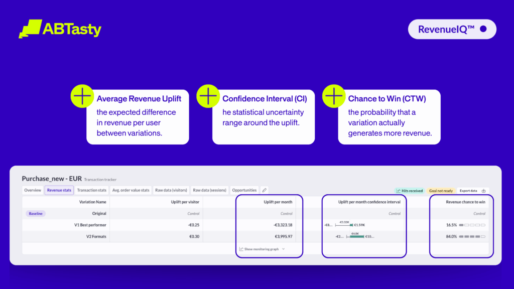
Sample Size Calculation for A/B Tests Made Simple
At its heart, the A/B testing process is designed to generate reliable results so you can make decisions based on hard data. But working out just how many visitors you need to sample to have confidence in these can depend on a number of different factors. Fortunately, online tools can now help you take the guesswork out of the process, without the need for a math’s degree.
How Sample Size Calculation Works
The key reason for calculating the correct sample size for a given test is to ensure that this is representative of your entire audience. This in turn will ensure that your test results are reliable and help you to avoid false positives and negatives. If your sample size is too small, you could end up with wildly misleading results. If it’s too big, you could be wasting time and resources without gaining any useful insights.
A very general rule of thumb is to have a minimum sample of 10,000 visitors per test variation and at least 300 conversions for each. However, you can calculate the correct sample size for a given A/B test variation with the aid of a standard mathematical formula which looks like this:
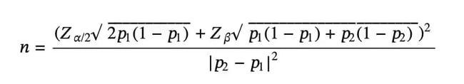
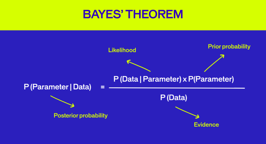
Here’s a breakdown of what each letter stands for in the equation:
- n is the required sample size per test variation
- p1 is the Baseline Conversion Rate
- p2 is the conversion rate lifted by absolute Minimum Detectable Effect
- Z⍺/2 is the Z-score for Statistical Significance Level
- Zβ is the Z-score for Statistical Power
Looks complicated? Before you start reaching for the algebra textbook, don’t panic! Instead, let’s have a look at what the above variables actually mean:
- Baseline Conversion Rate: the current conversion rate for the specific goal that you are trying to improve. This might be something like subscription rate, transaction rate, or click though rate.
- Minimum Detectable Effect (MDE): the smallest change in the conversion rate that you want to detect with statistical confidence. This essentially determines how sensitive your A/B test will be.
- Statistical Significance Level: the probability that the difference in your baseline conversion rate and the conversion rate of a test variation is not caused by chance. The accepted standard for statistical significance is 95%. The Z-score for 95% significance is 1.96.
- Statistical Power: the probability that your test will detect a real effect where one exists. Again, standard practice is to set power at 80%, meaning you have an 80% chance of catching a true winner. The Z-score for 80% power is 0.84.

Fortunately, there are now a range of tools available online that will perform this somewhat intimidating calculation for you. For most of these, all you typically need to do is enter the variables above.
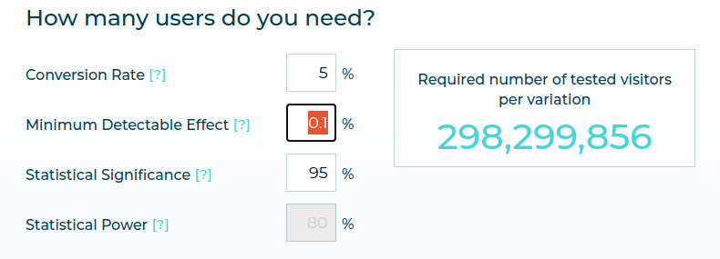
It’s worth noting that both the Minimum Detectable Effect (MDE) and statistical power have a direct relationship on the sample size of a test. If you want higher statistical power (i.e. more chance of catching a winner) or a smaller MDE (i.e. greater test sensitivity), your sample size will need to be bigger. That can affect the time taken for a test to run and the resources involved.
At some point, you’ll have to ask yourself: is it worth it?
Different Approaches to Calculating Sample Size
Many online platforms recommend calculating the sample size of an A/B test in the pre-test planning phase. But at AB Tasty, we think this is too late. Because If you discover that this number is too high, meaning the test would need to run too long to be practically feasible, then it is just useless to build the variant.
That’s why we’ve developed an MDE calculator specifically for the pre-test planning phase. This helps you understand the minimum uplift required and how much time you would need for an experiment to achieve statistical significance based on your actual historical data. This will ensure that you set realistic expectations before you launch a test.
Using our Minimum Detectable Effect Calculator couldn’t be easier:
Input
Define Your Baseline
Input your current website visitors and the conversion rate for the specific goal you intend to improve.
Calculate
Map the Opportunity
The calculator estimates the minimum uplift needed for significance. See exactly how many days it takes to reach your confidence threshold.
Launch
Eliminate Waste
Avoid wasting time and resources on tests that are unlikely to produce conclusive or statistically significant results.
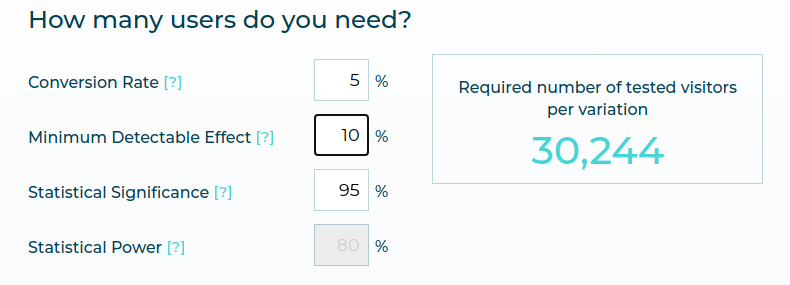
We also have a Sample Size Calculator which helps you determine the required number of visitors for your test and estimate how long your test should run for to achieve the desired results. This should be used for ongoing tests, and not for pre-test planning.
To Estimate the Number of Visitors :
- You input the current conversion rate for the goal you are trying to improve and the expected uplift between test variations.
- Our calculator then estimates the required number of test visitors per test variation.
To Estimate the Duration of Your A/B Test:
- In addition to the information entered in the previous step, you input the average number of daily unique visitors a tested page receives and the total number of test variations including the control version.
- Our calculator then estimates the minimum required test duration in days to achieve the desired results. However, this number comes with a caveat, as explained below.
Best Practices and Pitfalls
Now let’s look at some of the major dos and don’ts to keep in mind when calculating test duration and sample size.
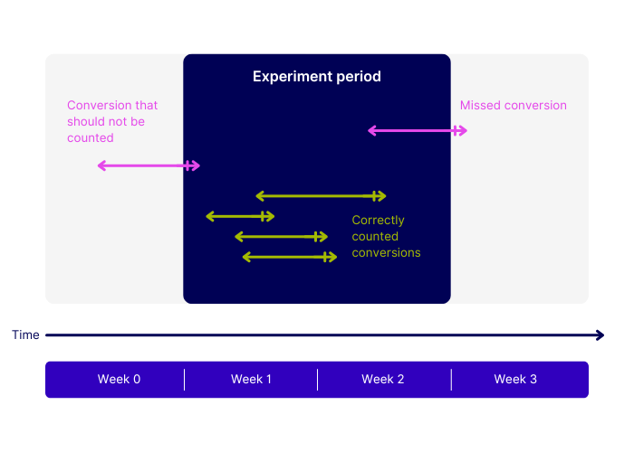
1. Run tests for a minimum of 14 days
Even if you reach your target sample size in a few days, or our test duration calculator suggests otherwise, it’s best practice to run an A/B test for a minimum of two weeks. This helps to account for variations in user behavior, such as weekday versus weekend traffic, and ensures your data is much more reliable.
2. Account for external factors like seasonality
Certain periods of the year, like Christmas, Black Friday, or Bank Holiday weekends can skew your results if you’re running a test at these times. You’ll need to take these into account if you want your sample to remain representative of your normal audience.
3. Don’t stop a test too early
You also need to avoid the temptation of checking on test results before both the test duration and sample size have been reached. Doing so dramatically increases the chances of coming to a false conclusion about the test.
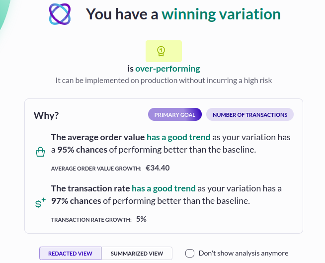
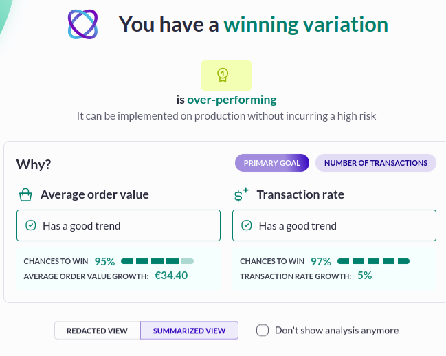
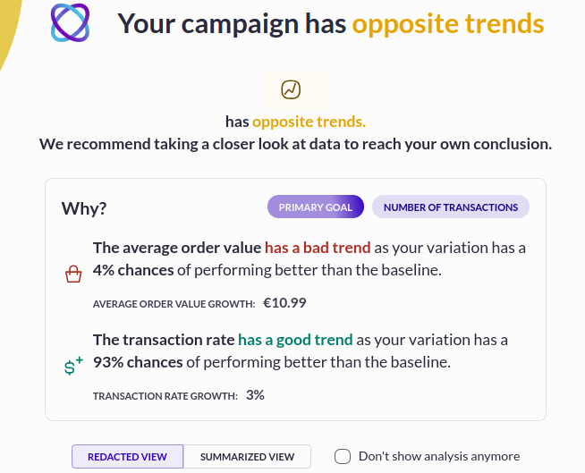
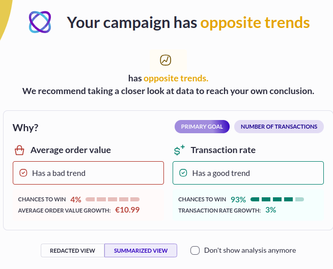
Our Evi Analysis AI agent relies on statistical significance to tell you whether a particular variation is a winner. For it to do its job correctly, you should only ask Evi to interpret the results after the test has reached the number of visitors recommended by the Sample Size Calculator. That’s because Evi Analysis can’t inherently know that you planned to have a sample size of, say 100,000 visitors, but decided to stop after only 10,000.
4. Don’t overlook practical significance
Having test results that are statistically significant doesn’t automatically mean they have a practical application for your business. If it will be too costly to implement a change indicated by a test variation it might not be worth running the test in the first place.
5. Prioritize high-traffic pages
Testing should be initially focused on pages of your website that are likely to receive the most visitors. For example, the homepage, product listing pages (PLPs), or product detail pages (PDPs). The greater volume of traffic to these pages means you’ll be able to gather data more quickly and run faster tests.
6. Limit the number of variations
Testing more variations at once can seem more efficient, but it increases the risk of false positive results. If you’re testing on pages with low traffic volume, using fewer variations avoids splitting sample visitors too thinly.
7. Target broadly
When possible, run A/B tests across multiple countries or segments to increase the sample size.
Conclusion: From Guesswork to Growth
Calculating the correct sample size for your A/B tests is the key to delivering statistically significant results you can trust. But you no longer have to be a math whizz to figure out how big your sample size needs to be.
By using our MDE calculator for pre-test planning and adhering to best practices for sample size and test duration, you can ensure your A/B tests will be both more effective and more reliable.
Ready to go from calculating to converting?
FAQs
Still have questions about sample size calculators? Here are the answers you need.
Why is sample size calculation important in A/B testing?
Sample size calculation allows your test to have enough power to detect a meaningful difference between variants while avoiding wasted resources. Too small a sample may lead to false negatives, whereas too large of a sample size may be inefficient or expose too many users unnecessarily.
Which approach should I use to calculate sample size?
Usually, you use a power analysis that considers the expected effect size, significance level (α), and desired power (1−β). Tools like online calculators or statistical software can help, working under the notion a binomial or normal approximation depending on your metric.
How do you determine the minimum detectable effect (MDE) for an A/B test?
MDE is the smallest change between your control and variant that you consider practically significant. This is calculated based on business goals, baseline conversion rates, and the statistical power you want – usually by deciding what lift in metrics (e.g., click-through rate, revenue) would justify implementing the new variant.

About the Author
Hubert Wassner
Hubert Wassner is Chief Data Scientist at AB Tasty with over thirty years of experience in AI and machine learning. He builds advanced statistical models, shares insights on the blog, and helps brands make confident, data-driven decisions. His most recent achievement is obtaining a patent for RevenueIQ.