In today’s mobile-first world, where smartphones dominate more than half of global web traffic, optimizing for mobile has never been more crucial. Mobile usage surpassed desktop in the US in 2022 and in the UK in 2023, signaling a clear shift in consumer behavior. Brands are now urged to design with mobile in mind first, adapting for desktop as needed, rather than the reverse. This shift may seem daunting for teams, but it’s a necessary evolution to meet the expectations of today’s users.

Whether your customers are researching products or making purchases, their mobile experience can make or break their journey with your brand. While it’s clear that more shopping is done on mobile devices than on desktop, the real question remains: how significant is mobile shopping overall? Today’s mobile-savvy consumer isn’t just using their device for convenience, but to blend their in-store and online shopping into one seamless experience. In fact, nearly 80% of shoppers globally use their smartphones to browse a retailer’s website while shopping in-store, and 74% use the store’s app. However, only 33% of consumers prefer making purchases on their phones, with 49% reporting a smoother experience on desktop or tablet. This highlights just how important it is for brands to enhance their mobile offerings for a seamless experience across all devices.
To delve into the complexities of mobile optimization Mary Kate, AB Tasty’s Head of Growth Marketing for North America, teamed up with Allie Tkachenko, a UI/UX Strategist at WPromote, for a webinar on mastering mobile. AB Tasty’s platform enables brands to deliver personalized customer experiences, while Wpromote helps design and optimize engaging web experiences that convert. They emphasize a key message: mobile optimization isn’t just about resizing for a smaller screen – it’s about creating an intuitive, seamless journey that aligns with today’s mobile-first consumer’s behaviors and expectations.
It’s critical that mobile websites excel in areas like speed, navigation, and user-friendliness. Let’s dig into three actionable strategies from the webinar to help your brand stay ahead and deliver an improved mobile experience for your customers.
1. Maximizing limited space
One of the biggest challenges in mobile design is maximizing limited screen space without overwhelming users. The key is to keep crucial content above the fold—on mobile, this means placing essential elements like navigation bars, CTAs, and product highlights in a prominent position, visible without scrolling. This is particularly important on search landing pages, the homepage, and other high-traffic areas. A well-organized and streamlined navigation system that helps users quickly find what they need can lead to higher engagement and reduced bounce rates.
While desktops offer ample space to break down navigation into detailed categories, mobile design requires a more simplified structure due to space constraints. Consider grouping categories under broader buckets like “Top Categories” or similar, allowing users to easily explore the site without feeling overwhelmed by too many options. Another key strategy is leveraging responsible design, such as implementing sticky navigation bars or menus that stay visible as users scroll. This approach, widely adopted across industries, ensures easy access to important links and minimizes the effort required to navigate the site.
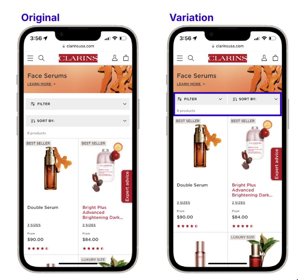
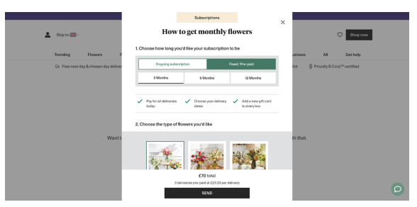
AB Tasty in action
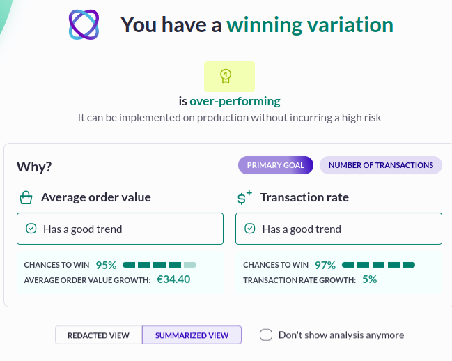
The UX team at Clarins wanted to make their product more visible on their category pages. In the original layout, filtering and sorting functions were stacked, removing space from the second row of products appearing. After testing a column layout for the filtering and sorting menus, the team saw a significant improvement—bounce rates decreased, and clicks to products increased by 34%.
Optimizing screen space solutions
- Keep key elements above the fold
- Simplified navigation
- Use responsive design

2. The thumb zone
The “Thumb Zone” refers to the area of the screen that is easiest for users to reach with their thumbs, typically the lower portion of the screen. Since most users interact with their phones one-handed, placing critical CTAs, buttons, and interactive elements within this zone is important for accessibility and ease of use.
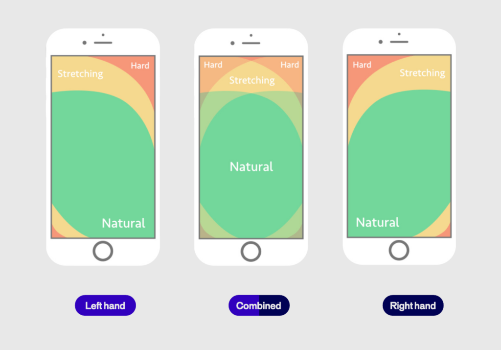
Consider this: a navigation bar that starts at the top of the page but shifts responsively to the bottom as the user scrolls. This keeps it in an expected spot initially, avoiding any disruption to the user’s flow, and then moves it to a more reachable area as they continue browsing.
Another thing to keep in mind is sizing. Whether it’s buttons, images, form fields, or menu links, the size of these elements plays a huge role in usability. You can’t just shrink them to save space—you have to ensure they’re “tappable” so users can easily interact. While reachability is key, think about what doesn’t need to be within reach, like informational banners or logos. You can place those outside the thumb zone, saving prime space for interactive elements.
Brands that prioritize the thumb zone in their mobile designs see improved user engagement and lower frustration levels. This small shift can make a significant difference in usability and customer satisfaction.
AB Tasty in action
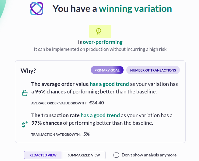
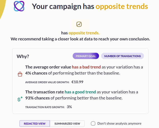
The team at Club Med, a leading travel and hospitality brand, observed that their original mobile site displayed a navigation bar at the top of the page, which would disappear as users scrolled down. To increase user engagement with different category offerings, they created a variation of the mobile homepage with a sticky navigation bar which remained at the bottom of the screen while scrolling.
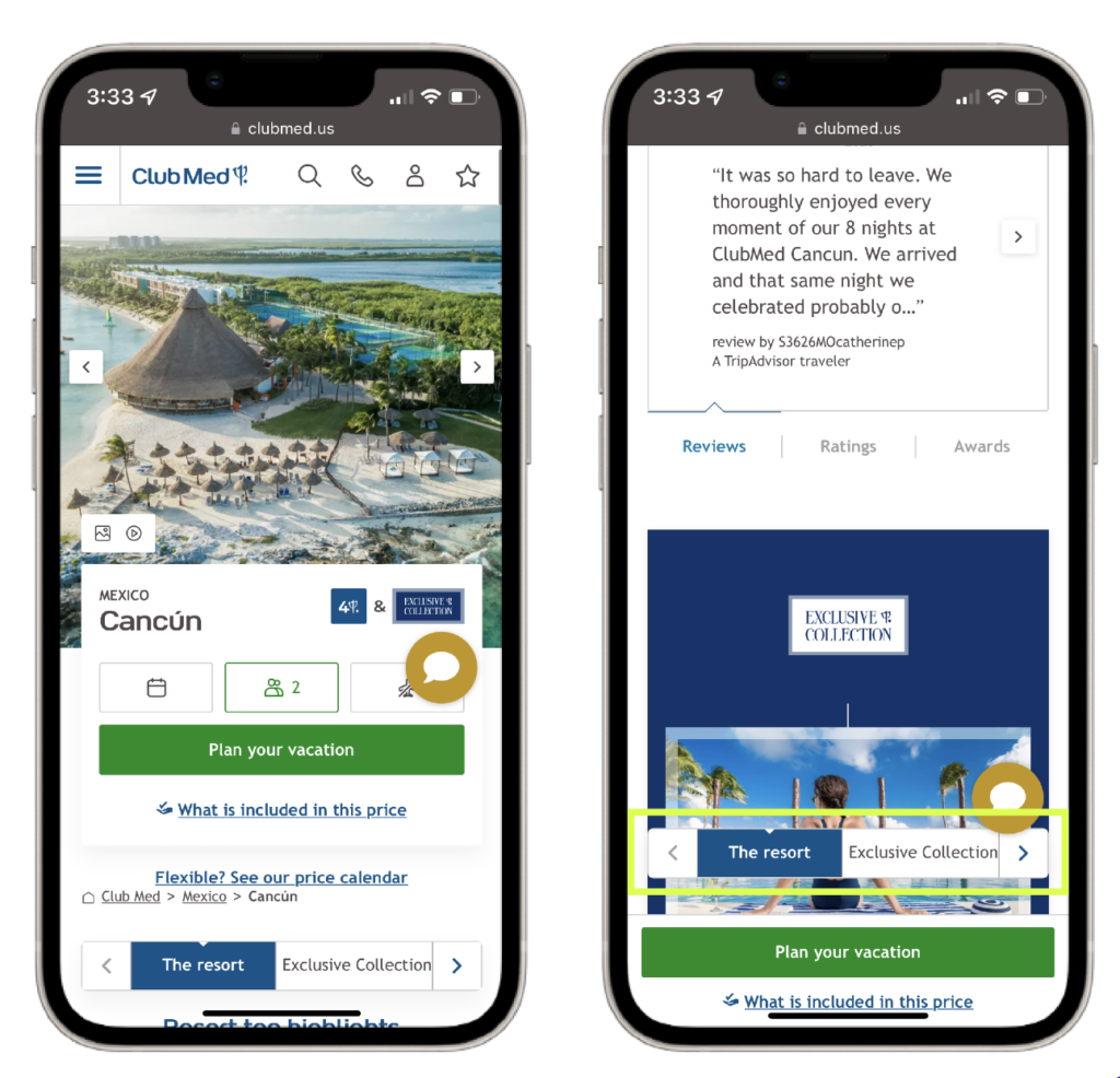
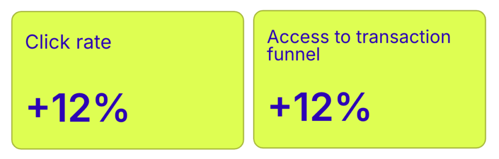
The results of the A/B test revealed a 12% increase in click rates, a 12% increase in access to the transaction funnel, and a 2% decrease in the bounce rate for users showing the variation with the sticky navigation bar. This approach effectively makes information more physically accessible.
Optimizing the thumb zone
- Bottom Navigation
- Sizing
- Reachability
3. Improving processes
Lengthy forms and cumbersome checkout processes are major obstacles to conversion in mobile digital experiences. Mobile users expect a seamless, fast journey, and frustration with complex forms often leads to abandoned carts. Streamlining these processes—especially form fills and checkouts—can reduce friction and improve conversions. We’ve all experienced the annoyance of having to redo a form, fearing progress might be lost, which can lead to users abandoning the process entirely. Key areas for optimization include simplifying checkout by offering guest checkout options and exploring one-click payment methods.
Search and product discovery also present unique challenges on mobile devices due to limited screen space. With condensed menus and site navigation, users often rely heavily on the search function. Optimizing your search results pages to help users quickly find specific products can drastically improve the user experience. The space constraints of mobile mean that every element, including search results, should guide users efficiently to what they’re looking for.
Lastly, page load speed plays a vital role in retaining users. A slow-loading site can deter users, leading them to abandon your site altogether. Reducing load times is crucial for keeping users engaged. Understanding your audience and continuously optimizing these processes will help ensure your site meets their needs and encourages conversions.
AB Tasty in action
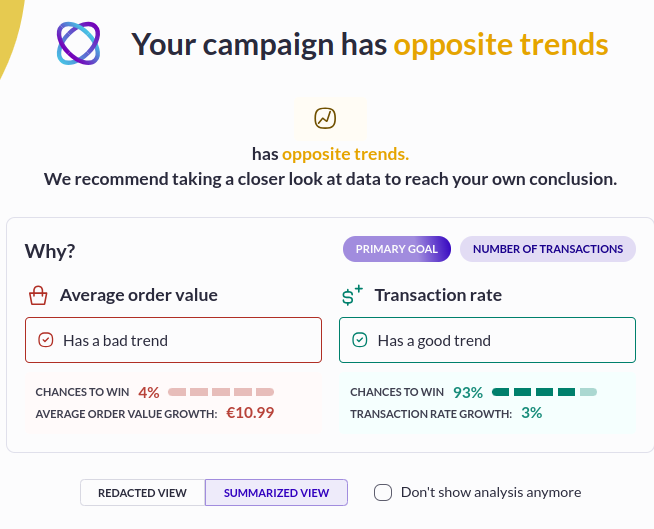
Travel insurance company, DirectAsia, needed users to fill out a form to generate an insurance quote. The team observed that customers were not completing the forms as smoothly as expected. To address this, they implemented a variation in the test where bolded check marks appeared to validate each completed field. This change created a sense of progress for users as they navigated the form and alleviated any uncertainty about needing to go back to correct errors.
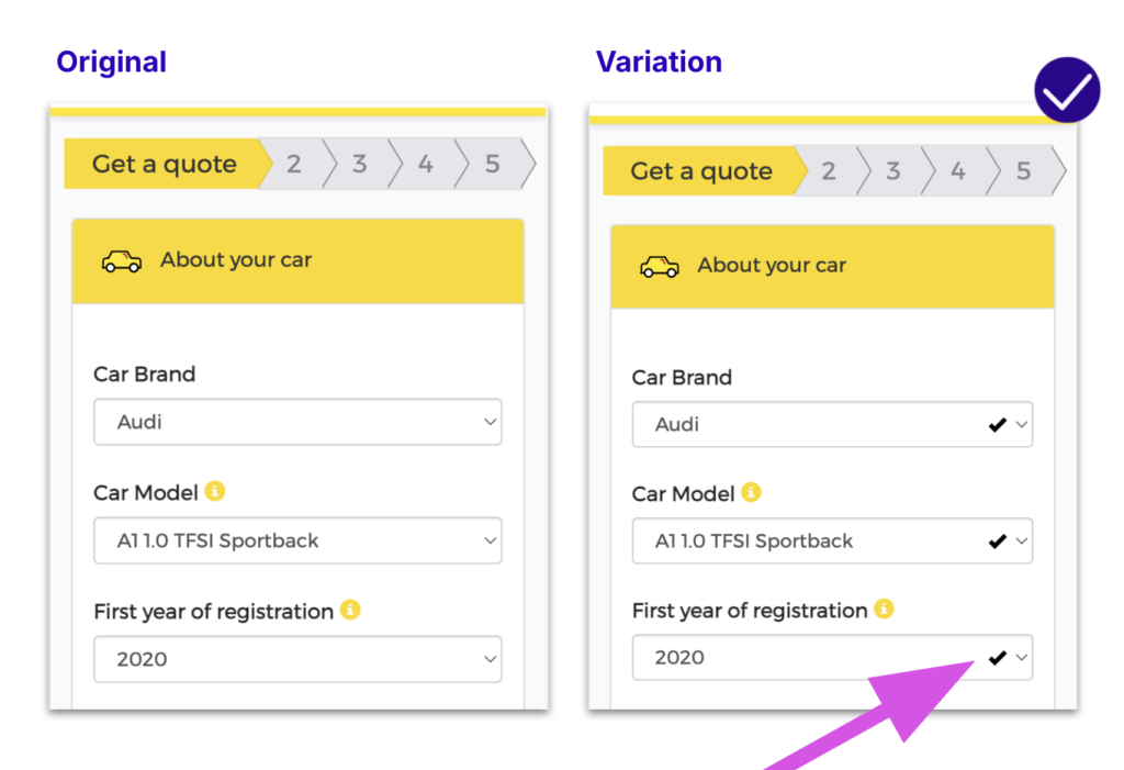
As a result of this test, DirectAsia achieved a 1.97% increase in quote generations and a 7.78% increase in transaction rates. By reassuring users throughout the form-filling process, DirectAsia successfully guided more customers through their quote generation form.
Optimizing mobile processes
- Checkout
- Search and discovery
- Speed & image loading
Wrapping up
Mobile optimization is about much more than making your website look good on a smaller screen; it’s about crafting a seamless, user-friendly experience that enhances the customer journey. Whether you’re focusing on improving site speed, optimizing design for better accessibility, or streamlining complex processes, the suggestions above provide a solid foundation for mastering mobile optimization. By understanding the nuances of mobile behavior and catering to the needs of your users, your brand can create a frictionless experience that drives conversions and fosters customer loyalty.
Stay ahead in the mobile-first era by ensuring your website design and processes align with the expectations of today’s consumers. AB Tasty can help achieve this goal by providing innovative tools and data-driven testing to enhance your mobile strategy. As mobile usage continues to grow, so does the importance of providing a smooth, engaging, and conversion-focused experience.
If you want to get all the details. – watch the webinar below.


