

AB Tasty’s note: This is a guest post by Umesh Kumar, digital marketing evangelist at Designhill.
A/B Testing isn’t a rocket science to understand and implement. It is just about testing two different versions of a page on your site to see which one attracts more audience. More than anything else, this test helps you know and understand your consumers better. After you run an A/B test, you will find that a few more have added in your earlier list of customers.
It surely is one of the best ways to improve your conversion rates. In fact, an article published in CrazyEgg.com reveals that using correct testing methods can increase conversion rates up to 300 percent. But it’s shocking that still, the majority of marketers choose not to use A/B test experiments. Don’t believe us? Check out the following stats:
- For most businesses, conversion rates range from just 1 to 3%. (Source: truconversion.com)
- Most companies spend $92 to acquire customers, but only $1 to convert them. (Source: tweakyourbiz.com)
- Only 22% of businesses are satisfied with their conversion (Source: Contentsquare.com)
- 44% of companies use A/B testing when trying to optimize conversion rates. (Source: Unbounce.com)
- 85% of marketers plan to focus more on conversion rate optimization this year. (Source: Truconversion.com)
Given these stats, it’s no surprise that many marketers steer clear of A/B testing for optimizing their site. But, how exactly can you optimize your conversions with A/B Testing? The answer is simple! Why not do what smart marketers do? Learn lessons from companies that have emerged as shining examples of A/B testing genius.
No matter what is the nature of your business, there is no harm in taking a step back and learning from others’ achievements. To help you, we have listed 5 classic case studies that will provide you with interesting test hypotheses and give you an insight on what and how visitors think. You can learn a lot from these case studies and use the learning to take on the conversion challenges in your way to success headfirst. These examples are quite simple to implement with any A/B testing tool.
Case Study 1: Conversions improve by 11.5% by Adding FAQs, Statistics and Social Proof on Websites
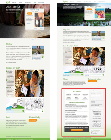
Test Carried Out By Kiva.org, an innovative non-profit organization, allows people to lend money via the Internet to low-income entrepreneurs and students across countries. Kiva conducted an A/B Test as they wanted to increase the number of donations from first-time visitors to their landing page.
Hypothesis: Giving more information to visitors coming to Kiva’s landing page will help boost the number of donors.
Result: Donations increased by 11.5% after adding an information box at the bottom of the landing page.
Version A – original: (left)
Version B: Addition of information box (FAQ, social proof & statistics)
What You Can Learn from This Test?
Ensure that your landing page is designed in such a way that it answers all questions that a visitor may have. In this case, the information box at the bottom of the page helped the organization explain about themselves and their services, providing statistics. The information increased their trustworthiness and credibility as a site.
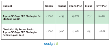
Case Study 2: 2.57% increase in Open Rates 5.84% Higher Click-through Rate (CTR) by Changing the Subject Line of an Email
Test Carried Out By Designhill.com, one of the fastest-growing peer-to-peer crowdsourcing platforms that connect graphic artists with design seekers. They did an email blast a few days before Christmas to promote its content and increase the click-through rate.
Hypothesis: Just mentioning the title of the blog in the subject line of the email would get the majority of click-through rather than requesting recipients to review the post with the blog’s title.
Just writing “Top 10 Off-Page SEO Strategies for Startups in 2015” in the subject line of the email would get the majority of click-through rather than writing “Check out My Recent Post – Top 10 Off-Page SEO Strategies for Startups in 2015”.
Result: The company was able to score 5.84% higher CTR and 2.57% higher open rate by including just the title of the blog in the subject line.
What You Can Learn From This Test:
Your subject line is the first thing the recipient of your email sees. Therefore, your subject line must have the power to entice the readers to open the mail and know more about your products or services. Because after all, it doesn’t really matter what your offer is if it is not opened by your readers. Therefore, choose your words wisely as they will have a higher impact on open rates and click-through. But it’s not only important to ensure great subject lines, but you must also ensure that your logo design is laid out in a way that vital information pop-up. For example, your logo design and contact details must be easily locatable. For another, CTAs and other links must be out of clutter. Read our Beginner’s Guide to A/B Testing your Emails.
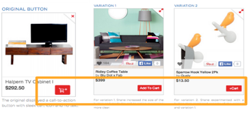
Case Study 3: 49% Increase in CTR by Adding Text in the Call-to-Action Button
Test carried out by Fab, an online community whose members can buy and sell apparel, home goods, accessories, collectibles, etc.
Hypothesis: Making the “Add to Cart” button clearer (by adding text) will lead to an increase in the number of people adding items to their shopping carts.
Result: There was an increase of 49% in CTR over the original after the text “Add to Cart” was included in the CTA button rather than just an image or symbol.
In the following image, you’ll see that the original design (on the far left) features a small shopping cart with a “+” sign and no text. The two versions (middle and right) added text-based designs. Version A helped increase cart adds by 49% over the original.
What You Can Learn From this Test:
Text connects better with visitors than images or symbols which may confuse them. Therefore, try and have a direct and clear CTA which will help consumers know of their actions.
It makes no sense to have a CTA that your visitors don’t understand. They don’t get to know what the button does actually.
Case Study 4: Conversion Rate Improved by 7.46% by Adding an Image Rather than a Blank Background.
Test Carried Out By A company who wanted to check if customers get attracted to a blank background or one with pictures more.
Hypothesis: Using a photo in the background will lead to more conversions than a blank background.
Result: The conversion rate of the background with a photo was 25.14% as compared to 7.68% for the one without a photo.

What you can learn from this test:
You must have heard that a picture is worth a thousand words. People love visuals and there could be no other better place than your site to impress them with the pictures of your products. Having an image of your product or service in the background of your site can drive conversions as they get to see (visualize) what they’ll be getting. Images hold the power to grab the attention of your audience and turn them into customers.
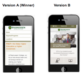
Case Study 5: Leads Increase by 256% after Having a Mobile-Optimized Landing Page
Test Carried Out By Rasmussen College, a for-profit private college and Public Benefit Corporation, who wanted to increase leads from Pay-Per-Click traffic on their mobile site.
Hypothesis: Creating a new mobile-friendly website, featuring a click-through menu, will improve conversions.
Result: Conversions increased by 256% after a new mobile-only (mobile responsive) site was made.
What you can learn from this test:
Hammad Akbar, founder of TruConversion.com says that “Unpleasant mobile experiences and a lack of mobile-friendliness makes 48% users believe that the company doesn’t care about their business.” A mobile-responsive website enhances the browsing experience of the site visitors. It is essential if you don’t want to lose customers just because your site took time to load. Keep the design of your site simple with only the basic information on the first page. Try and find different way of improving mobile navigation such as having a drop-down menu.
Conclusion
We hope that after reading this post, you are inspired to hold some amazing A/B tests on your own site. It is actually exciting and amazing to see what your customers like or dislike. But don’t forget that these tests are mere a guiding tool and nothing can replace your own tests and judgments about your visitors as well as the site. Remember, there is always a scope for improvement.
So, happy testing!
Download our guide to learn all there is to know about A/B testing!
Author Bio: Umesh Kumar is a digital marketing evangelist who works with Designhill, the fastest-growing custom design marketplace, to develop and execute their marketing strategies. He started his online marketing career in 2008 and is actively engaged within internet business modeling, website development, social networks, lead generation, search engine optimization, and search engine marketing. In addition, he loves blogging and shares his expertise about tips, tricks, and upcoming trends in the world of digital marketing. Get in touch Facebook | Twitter | Google+


