What Happens When Two Competitors Put Their Egos Aside?
Angelique de Taddeo
For years, the digital experience industry has been driven by competition. Vendors compare features, publish competitive battlecards, launch migration campaigns, and work hard to differentiate themselves. That competition has played an important role in pushing the industry forward.
But it also led us to ask a different question:
What if the next breakthrough didn’t come from competing harder, but from building together?
A different way of thinking
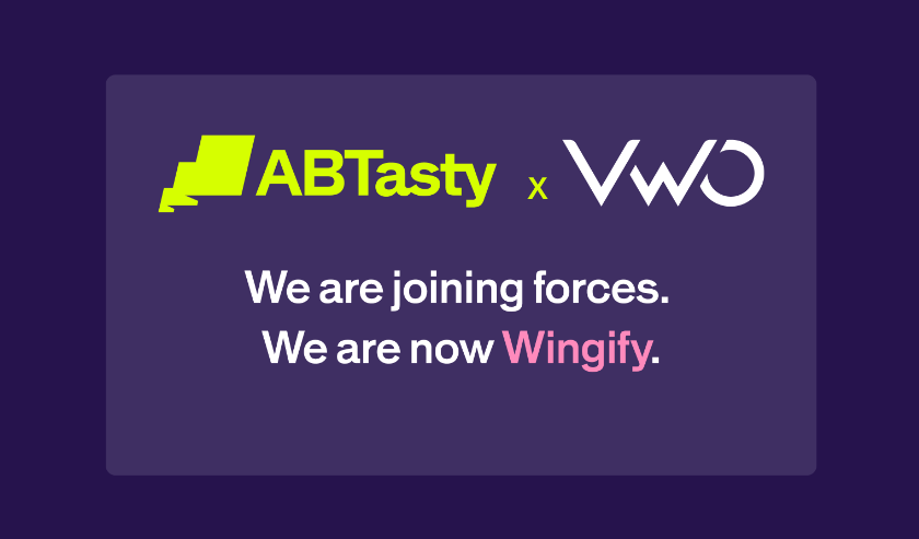
When VWO and AB Tasty joined forces under Wingify, the question everyone asked was: why would two competitors team up? The answer is simpler than you’d think. Both companies had built products people trusted, teams they were proud of, and thousands of customers who relied on them. Neither needed the other to survive. But both shared the same belief: customer value matters more than company ego.
So instead of fighting over features or pricing, we asked a better question — how do we build the best possible platform for the people who use it? The answer was a partnership. Two teams, complementary strengths, and decades of shared expertise — coming together to build something neither could have created alone. That’s not competition. That’s progress.
Performance isn’t a feature. It’s an engineering philosophy.
There’s another reason this merger made sense.
Long before Wingify existed, both engineering teams had already spent years optimizing something customers rarely see—but benefit from every day: Performance.
The independent Third Party Web project analyzes JavaScript execution using Lighthouse data collected across approximately four million websites. Its goal is to measure how much work third-party scripts ask browsers to perform.
One detail is particularly important.
These measurements don’t represent the cost of a single feature.
They represent the execution cost of the entire platform delivered through a single tag.
For VWO, that includes capabilities such as experimentation, personalization, behavioral insights, feature rollouts, and more.
In other words, these aren’t the numbers of a lightweight A/B testing library. They’re the numbers of a complete digital experience platform.
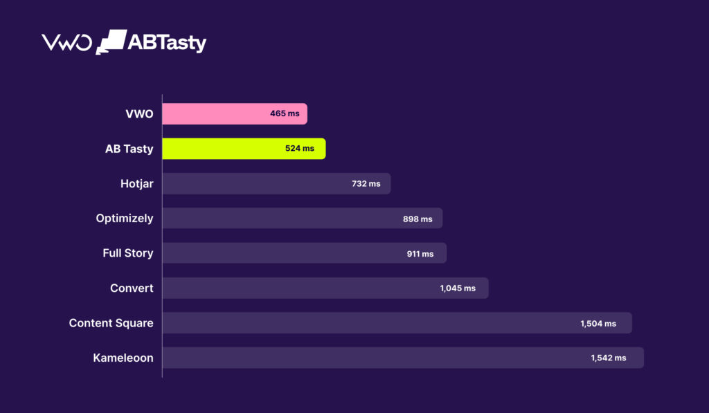
The latest benchmark reports:
Platform
Average JavaScript execution impact
VWO
465 ms
AB Tasty
524 ms
Hotjar
732 ms
Optimizely
898 ms
FullStory
911 ms
Convert
1,045 ms
ContentSquare
1,504 ms
Kameleoon
1,542 ms
Lower is better.
According to this independent benchmark, VWO delivers the lowest average JavaScript execution impact among the major digital experience platforms listed.
AB Tasty is closely behind, performing better than several well-known competitors, including Optimizely, ContentSquare and Kameleoon.
These aren’t marketing claims. They’re independent measurements.
Better engineering, not fewer capabilities
What makes these numbers meaningful is the context behind them.
Delivering experimentation, personalization, feature management, behavioral insights, and AI capabilities — while maintaining a low execution footprint — is genuinely hard.
Performance at this level doesn’t happen by accident. It’s the result of thousands of engineering decisions made over many years.
Looking at this benchmark, one thing becomes clear: both VWO and AB Tasty had already developed that engineering culture independently.
Better together
This merger between AB Tasty and VWO is about multiplying strengths.
Over the years, both companies have built deep expertise in different but highly complementary areas of digital experience optimization. VWO stands out with a powerful platform spanning experimentation, feature management, behavioral insights, and platform engineering. While, AB Tasty shines as a leader in personalization, merchandising, recommendations, and enterprise optimization.
Bringing these capabilities together wasn’t simply about expanding a product portfolio. It was about creating a unified platform where these technologies work seamlessly together, powered by a shared AI layer, a single tag and one engineering vision.
In many industries, companies spend years protecting their territory and trying to outperform one another. We chose a different path. We believed our customers would benefit far more from collaboration than from another decade of vendor rivalry.
Competition helped both companies become stronger. Collaboration is what we believe will take the industry further. Because ultimately, our ambition isn’t to win against competitors—it’s to build the platform our customers will still choose five years from now.
About the Author
Angélique de Taddeo
Angélique de Taddeo is Chief of Staff at AB Tasty with a focus on web experience and conversion strategy. She has a background in user experience design and digital marketing, having led the revamp of the company’s blog with a strong conversion-focused approach.
Inside Wingify: The Digital Experience Optimization Suite Driven by AB Tasty and VWO
Stephanie Safdie
Main Takeaways
› Wingify is the Digital Experience Optimization (DXO) suite that now houses both AB Tasty and VWO.
› It unites personalization, experimentation, feature management, customer insight, and AI under a single roof.
› Current AB Tasty and VWO products keep running as-is while they’re gradually folded into one Wingify experience.
› Wandz is the AI engine woven through every part of the suite.
Wingify is a Digital Experience Optimization (DXO) suite built for teams that need to build, test, personalize, and refine digital experiences across web, mobile, and backend environments. With the 2026 merger of AB Tasty and VWO, Wingify has become the shared suite brand for both platforms, and the tools you’re already using are steadily coming together into a single ecosystem, sitting on one data and AI foundation.
Below, we break down what the suite actually contains, how the different pieces work together, and what changes (and what doesn’t) if you’re currently on AB Tasty or VWO.
What is Wingify?
Wingify brings two established, independently built platforms, AB Tasty and VWO, together under one roof, reachable at app.wingify.com. For now, in mid-2026, each still functions as its own suite while the underlying engineering, data models, and workflows are merged step by step over the coming quarters. Nothing about your current contract, pricing, or support changes in the meantime.
In practical terms, Wingify is built around seven interlocking capability areas: personalization, experimentation, feature management, behavioral insight, user surveys, commerce, and AI, topped off with an enterprise governance layer so larger organizations can run everything at scale across teams and geographies.
What you get inside Wingify
Wingify folds everything AB Tasty and VWO used to offer separately into one DXO suite. Rather than juggling several point tools, teams can now move through every stage of optimization from a single place.
Personalize every customer touchpoint
This is where AB Tasty’s DNA is most visible. It covers:
Experience personalization: delivering different content, page layouts, or flows to different visitor groups, without maintaining separate page versions.
Behavioral targeting: firing personalized experiences based on a visitor’s on-site actions, such as pages browsed, dwell time, cart activity, or how far they scroll.
Dynamic content and product recommendations: showing tailored content or product suggestions to each visitor, widely used across e-commerce and media sites.
Audience segmentation: assembling reusable visitor segments from behavioral, demographic, or CRM data, shared across both personalization campaigns and experiments.
AI-driven personalization: tools such as Emotions AI, which reads on-site behavior to gauge a visitor’s emotional state, and Adaptive CX, which evolves the experience the longer someone stays on a page.
The key difference from a standard A/B test is timing: personalization doesn’t sit around waiting for a statistically significant winner, it continuously serves each segment its best-known experience, while experimentation keeps refining what “best” even means.
Run experiments with confidence
This is the territory most closely tied to VWO’s roots. It spans:
Web A/B testing: pitting two or more page variants against live traffic to see which one moves a target metric, such as signups, purchases, or add-to-cart rate.
Split URL testing: comparing entirely separate URLs, useful when a redesign is too extensive to represent as a single-page variant.
Multivariate testing (MVT): testing several page elements in combination (say, headline, image, and CTA together) to find the strongest overall combination instead of isolating one variable at a time.
Server-side experimentation: running tests within backend logic, essential for anything client-side JavaScript can’t touch, like pricing logic, algorithms, or checkout flows.
Mobile app experimentation: running controlled tests inside native iOS and Android apps through an SDK, including feature testing that doesn’t depend on app-store review cycles.
This matters because real product decisions rarely live in just one layer, a checkout overhaul, for example, might need a front-end A/B test, a server-side pricing experiment, and a mobile counterpart, all tracked against the same success metric.
Power commerce performance
For retail and e-commerce teams, Wingify offers AB Tasty Commerce, bringing product search, recommendations, and merchandising together in one system instead of three separate tools.
It packages AI-driven product recommendations (frequently bought together, recently viewed, trending, and similar items, among other models), on-site search that understands typos and natural-language queries without manually built synonym lists, and merchandising controls that let business teams reorder products, promote or suppress specific items, and launch campaigns without pulling in a developer. Because search, recommendations, and merchandising draw on the same rules and data, a change made in one place is reflected consistently everywhere, with reporting that covers all three together.
This layer is aimed squarely at lifting conversion rate and average order value on product-heavy sites, working alongside the broader experimentation and personalization layers rather than overlapping with them.
Ship features without the risk
This is where product engineering meets experimentation, giving teams a way to release code without staking the entire rollout on launch day:
Feature flags: switches that turn functionality on or off without a fresh deployment.
Progressive rollouts: rolling a feature out to a growing share of users (1% → 10% → 50% → 100%) instead of releasing to everyone simultaneously.
Kill switches: a way to shut off a misbehaving feature in production instantly, with no code changes required.
Canary releases: trying a new feature out on a small, often internal or low-risk group before a broader release.
Feature experimentation: running a genuine A/B test on what a new feature actually does to key metrics, rather than shipping it and hoping for the best.
Understand what customers are actually doing
Every other layer depends on the insight this one provides:
Heatmaps show where visitors click, scroll, and move across a page.
Session recordings replay individual visitor sessions so you can see precisely what happened and where someone got stuck.
Funnel analysis pinpoints where visitors abandon a multi-step process, like checkout or onboarding.
Visitor behavior analytics roll up how traffic engages with a site or app over time.
AI-enhanced research, surveys, and feedback, powered by Blitzllama’s technology (acquired by Wingify in 2025) and branded Pulse, which layers AI-assisted analysis on top of qualitative input like open-text survey answers and user feedback.
This layer is what tells a team what to test next; it’s the diagnostic step ahead of a hypothesis, not simply a dashboard you glance at after the fact.
Optimize everything with Wandz
Wandz is Wingify’s AI layer, and it lives inside the suite itself rather than sitting off to the side as a bolt-on assistant. That distinction is important: a generic AI tool knows nothing about your actual experiment setup, variations, traffic split, success metrics, or audience definitions, so every question starts with exporting data and re-explaining context from scratch. Wandz skips that step because it already operates inside the same environment where the experiment lives.
Wandz merges what AB Tasty previously delivered through its Evi assistant with what VWO offered through Copilot. In practice, it can:
Explain results in plain language, answering things like “how did this campaign perform on mobile versus desktop” or “show me every test we’ve run on the checkout page,” without anyone touching a CSV export first.
Suggest hypotheses and experiment ideas grounded in real campaign performance and behavioral data, and able to factor in outside material like a competitor screenshot or a project brief.
Check configurations before launch, scanning metrics, audience targeting, and traffic allocation for likely errors before a test or rollout goes live, essentially a pre-launch QA check.
Build and modify campaigns via the AI Editor, letting teams set up or tweak an experiment through natural-language instructions, with every change staying visible and reversible before the team ships it.
Wandz is built to cover the full experimentation journey: setup, targeting, analysis, and iteration, rather than being confined to a single feature.
Govern optimization at enterprise scale
For organizations running optimization programs across several teams, brands, or regions, Wingify provides:
Role-based permissions that govern who can launch, edit, or view experiments and campaigns.
Audit logs that track changes for compliance and accountability purposes.
Collaboration workflows, approval chains, and shared workspaces, so marketing, product, and engineering can work off the same experiment without colliding.
APIs and integrations linking the suite to analytics platforms, CDPs, CMSs, and internal data warehouses.
Security, compliance, and multi-team governance controls are the safeguards larger or regulated organizations need to run experimentation at scale.
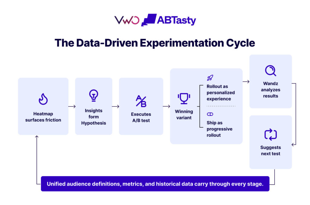
How it all fits together
Bringing these layers together only pays off because they run on the same underlying data, letting a team move through the entire loop without re-exporting or re-explaining context at each handoff:
A winning variation is rolled out as a personalized experience for a specific segment or shipped as a feature behind a progressive rollout.
Wandz analyzes the outcome and proposes the next test.
The same audience definitions, metrics, and historical data flow through every stage, illustrated below:
Who is Wingify built for?
Marketers
Test campaigns, personalize content, and lift conversion rates.
Product managers
Validate product ideas, oversee releases, and improve feature adoption.
Ecommerce teams
Deliver personalized shopping journeys and optimize every step of the customer path.
Growth teams
Run continuous experiments and surface the highest-impact optimization opportunities.
CX teams
Understand user behavior through a mix of qualitative and quantitative insight.
Engineers
Release features safely using feature flags and progressive rollouts.
What current AB Tasty and VWO customers need to know
Is AB Tasty becoming Wingify?
Yes. AB Tasty is moving under the shared Wingify brand, and over time, both AB Tasty and VWO are expected to fully converge under that umbrella. This is a branding shift, not a functional one.
Is VWO becoming Wingify too?
Yes, in the same way. VWO has also moved under the unified Wingify brand: the application moved from app.vwo.com to app.wingify.com (effective June 13, 2026), and VWO product names are being renamed accordingly (VWO Insights, for instance, is now Wingify Insights). Your existing plans, features, data, and access are unaffected.
Will the products themselves change?
Not right away. Your live website campaigns, mobile SDK campaigns, server-side experiments, tracking snippets, feature flags, and data collection keep working normally through the transition; only the dashboard changes. Over the medium term, expect AB Tasty’s strengths in personalization and AI-driven targeting to be woven more closely with VWO’s experimentation, analytics, and behavioral insight tools into one shared roadmap.
What happens to existing contracts?
Your current contracts, pricing, and service levels carry over unchanged as a result of the merger, and the team supporting you today keeps doing so.
What happens to logins?
If you’re a VWO customer, your account, settings, and credentials transfer over to app.wingify.com, though active sessions end the moment the domain switches, so you’ll need to sign back in at the new address. Single Sign-On (SSO) and SAML setups keep working automatically, since the SSO callback URL redirects to the new domain without any action needed on your side. Passkeys are the exception, since they’re tied to a specific domain for security reasons. A passkey created for app.vwo.com won’t transfer, so you’ll need to create a new one after logging in at the new domain. System emails, password resets, reports, and notifications now come from @wingify.com instead of @vwo.com, so it’s worth having your IT team allowlist that domain to keep them out of spam.
What happens to integrations?
Your integrations stay intact. VWO’s REST APIs are now served on the Wingify domain, and existing integrations keep working with no changes needed. The VWO SmartCode already installed on your site doesn’t need replacing either. IT teams should whitelist wingify.com and its subdomains in company firewalls to prevent disruption to features like session recording playback that run on those domains.
What stays exactly the same?
Your historical data, reports, settings, integrations, audiences, and configurations remain fully intact and accessible from the new domain. Contract terms, pricing, your support team, and service levels don’t change. Tracking snippets and live campaigns run uninterrupted throughout the switch. In short: what’s changing is the brand, and eventually, how deeply AB Tasty and VWO’s capabilities are integrated, not what you’re already paying for or how it works today.
Where digital experience optimization is headed
The next phase of digital optimization is about bringing personalization, experimentation, feature management, customer insights, and AI into a single suite, where each capability builds directly on the last.
That’s precisely the role Wingify is built to play.
Wingify gives teams one foundation for continuous digital growth, from understanding customer behavior through to launching new features and refining every interaction. Start a free trial or book a demo to see both platforms working as one unified suite.
Still have questions about Wingify? Here are the answers you need.
What is Wingify?
Wingify is the combined Digital Experience Optimization suite formed by AB Tasty and VWO following their 2026 merger.
What’s included in Wingify?
Wingify covers web, mobile, and server-side experimentation; personalization and product recommendations; feature management (progressive rollouts and kill switches included); behavioral insight tools like heatmaps, session recordings, and surveys; and Wandz, the suite’s shared AI layer.
Does Wingify support feature flags?
Yes. Feature management, including progressive rollouts and kill switches, is built into the suite, giving engineering and product teams a way to roll features out gradually and shut them off instantly if something goes wrong.
Does Wingify handle personalization?
Yes, it’s one of the suite’s core pillars, drawing heavily on AB Tasty’s strength in adaptive, behavior-based targeting, including Emotions AI for reading user emotional state and Adaptive CX for adjusting the experience as a visitor spends more time on-site.
What exactly is Wandz?
Wandz is Wingify’s shared AI layer, built directly into the experimentation and personalization workflow rather than bolted on as a separate tool. It combines what AB Tasty previously offered through Evi with what VWO offered through Copilot, so teams can ask plain-language questions about campaign performance, generate experiment ideas from real data, check campaign configurations before launch, and build or adjust campaigns through an AI Editor using natural language.
Does Wandz work across every Wingify product?
Wandz is designed to span the full experimentation journey, from campaign setup and audience targeting through to results analysis and hypothesis generation, rather than being limited to one feature. As AB Tasty and VWO’s underlying suites continue merging, Wandz is intended to extend across that combined surface, though how quickly it reaches every individual feature will vary as integration work continues.
About the Author
Stephanie Safdie
Stephanie Safdie holds a bachelor’s degree in English Language and Literature from the University of Maryland, specializing in multimedia studies. She has worked as a social media video creator, freelance copywriter, SEO copywriter at Greenly climate tech, and runs a travel blog Destination Dreamer Diaries.
The Secret to Boosting Summer Travel Bookings: It’s Simpler Than You Think
John Hughes
Main Takeaways
› How major airlines optimize their travel bookings
› The secret to boosting summer travel bookings
› Areas where airlines struggle the most throughout the booking process
› Our tried-and-true best experimentation methods for travel brands
The Peak-Season Illusion: Why Airline Optimization Happens Behind the Scenes Before Summer Travel
Summer is in full swing: long vacations under the sunshine accompanied by outdoor lunches and dips in the pool are no longer a part of our “middle of winter” fantasies.
When this time of year rolls around, travel brands are in “all hands on deck” execution mode. The beaches are packed, flights are full, and marketing budgets are maxed out.
But airlines and OTAs alike don’t rake it in the minute the sun comes out of hiding. Trying to fix a leaky booking funnel during peak season is like trying to change a plane engine mid-flight.
Most travel brands, like airlines and hotels, mistakenly think that prime-time summer is where the goldmine for conversions are – but in reality, the best of summer travel bookings happen during the quiet, off-shoulder travel season months of February, March, and April.
In fact,80% of monthly airline traffic is now on mobile, but conversion rates lag behind desktop. This is exactly where airline brands looking to increase their summer travel conversion rates have the opportunity window to bridge the gap.
From our findings in our recent Airline Mobile Booking Benchmark Report, we’re going to break down the best ways that airlines can prepare for summer travel to maximize their earnings by optimizing their mobile booking funnel before the peak season begins – achieving a steady conversion rate and getting people under the summer sun sooner than later.
Boost Your Airline Revenue Beyond Your Wildest Dreams.
Why the “Shoulder Season” (Feb–Apr) is the Ultimate Optimization Window
February to April is one of the most critical planning phases for travelers. It’s when they are able to align everyone’s schedules and start dipping their toes in the water to see what kind of vacation is even possible.
In turn, this time of year is just as important for airlines – as low season means lower risk for running high-impact experiments.
Testing the Tide: The Ultimate Summer Travel Booking Playground
Running experiments during high-traffic, high-stakes periods can be stressful – especially when it comes to something as momentous as summer travel.
Doing these tests during shoulder season, such as during February to April, allows airlines to:
Collect ample search traffic to gather statistically sound data
Allow room to fail and iterate without risking peak summer revenue
Create a head start to ship validated winners before the summer rush
Industry Insight: The narrowing mobile-to-desktop conversion gap (shrunk from 60% to 24% in just two years).
The Mobile Booking Reality Check: Where Travel Funnels Leak
Knowledge is key to creating change. This is especially true when trying to find where summer travel funnels leak the most, and how to optimize them accordingly during shoulder season to ensure next season’s sales go through the roof.
This is exactly where the information we uncovered in our2026 Mobile Booking Friction Report. Across the board, we broke down six different systemic failures across 6 major European airlines (Air Europa, Lufthansa, SWISS, TAP Air Portugal, Iberia, Ryanair).
We discovered that despite mobile driving over 80% of monthly airline traffic, many airlines are unknowingly driving customers away at the most critical moments. Our latest benchmark report reveals a stark industry benchmark: not a single major airline scored above 80/100 on the friction scale. Even the industry’s top-performing digital teams are leaving massive amounts of peak-season revenue to sink to the bottom of the ocean instead of soaking up the sun – which happens as a result of avoidable, systemic hurdles.
To secure your summer bookings, these four critical friction points must be addressed before the shoulder season ends:
1. The “Price Surprise” & Tax Transparency
Trust is built on transparency, and yet – zero out of the six major airlines we tested display tax-inclusive pricing on their initial search results page.
Waiting for the vacation itself is hard enough, let alone trying to be patient to wait and know how big the bill for the bookings will be. Forcing travelers to proceed multiple steps into the checkout funnel just to see the actual cost of their ticket is the ultimate cart-abandonment trigger.
2. The Trip Summary Bottleneck
The “Trip Summary” phase represents the most critical drop-off zone, averaging a mere 5.7/10 across the industry. When passengers arrive at the payment screen without a clear, consolidated view of their itinerary, baggage allowances, or selected extras – they hesitate. This lack of visual reassurance forces users to back-pedal, often resulting in abandoned sessions.
3. Obstacle-Ridden Search Entries
When people book for summer travel, they want it to be breezy just like the beach they plan to be suntanning on. That’s why forced sign-ins and intrusive app download pop-ups disrupt the natural browsing flow.
For example, Lufthansa and SWISS aggressively push registration prompts mid-search, while Ryanair enforces a rigid login wall right before the payment screen. Every unnecessary barrier introduced before payment lowers the chances of conversion.
4. Overwhelming Ancillary Fatigue
While upselling is essential for profitability, how it’s presented can make a huge difference. Ryanair forces users through up to six consecutive, mandatory ancillary screens – such as for bags, seats, and travel insurance. This can contribute to intense user fatigue, as the sheer amount of options could prove overwhelming to the user – causing them to leave the page altogether.
There’s a good way to kick this obstacle to the curb. Leaders like SWISS and Lufthansa reduce this friction by consolidating these options into a single, high-impact screen – which can encourage users to move forward with the summer travel booking process.
Proven Experimentation Tactics to Step-Up Before Summer
The period between February and April is the ultimate “testing playground” for travel brands. With lower seasonal risk but sufficient traffic to reach statistical significance, this is the perfect time to solidify validated winners that will carry your revenue through August.
Here are four high-impact experimentation tactics you can implement right now.
Tactic 1: Clear the Path with Upfront Pricing & Reassurance
A major driver of mobile abandonment is “price shock” late in the funnel. Instead of hiding taxes and fees, airlines should experiment with transparency.
The Experiment: Test tax-inclusive labels or calendar-based pricing that surfaces the lowest fares directly inside the date picker – a tactic effectively used by TAP Portugal to set expectations before the user even starts selecting anything from the search button.
The Metric: Watch for an increase in the downstream conversion rate and a significant reduction in payment-page abandonment.
Tactic 2: Reorganize and Simplify Ancillaries
Travelers suffer from decision fatigue when faced with endless screens for seats, bags, and travel insurance.
The Experiment: Airlines and travel brands should move toward dynamic fare bundling. This can be done by grouping ancillaries into targeted “Trip Packs” for specific segments (i.e., a “Business Pro” pack including a seat, bag, and priority boarding) rather than bombarding them with individual choices.
Real-World Impact: When Iberojet used AB Tasty to reorganize their search tabs based on historical user intent, they saw a 25% surge in searches and a 22% reduction in friction caused by unnecessary tab-switching.
Tactic 3: Optimize the Flight Summary & Passenger Form Flow
The transition from selecting a flight to entering passenger details is a high-friction zone when booking travel on mobile devices.
Real-World Impact:Air Europa used AB Tasty to optimize their mobile flight summary and multi-step passenger forms. By refining the layout and reducing field clutter, they achieved a +9% conversion rate increase from the flight summary to the passenger details page, a +5% increase in form completion, and a jump in CSAT from 81% to 87%.
Tactic 4: Algorithm-Driven Sorting Over Static Price Sorting
Price is a deciding factor, but it isn’t the only factor. Airlines that limit themselves by sorting by “cheapest” could end up hiding high-value options that better suit a traveler’s needs.
The Experiment: Surface a “Recommended” listing at the top of search results based on a dynamic relevance algorithm (considering time of day, duration, and baggage) rather than a static price list.
Real-World Impact: In controlled tests, switching to dynamic algorithm-driven sorting resulted in a +2.8% revenue uplift and a +4.6% increase in Average Order Value (AOV).
The Shared Platform Opportunity: Fix Once, Win Multiple Times
When operating a multi-brand travel group, optimization is rarely an isolated effort – but rather an opportunity for exponential impact. Our latest mobile booking friction report highlights this beautifully through what we call “The Lufthansa Group Paradox.”
During our assessment, Lufthansa and SWISS scored identical results across all seven evaluation stages of the booking funnel. This happened because both carriers shared the same friction points across their respective booking journeys.
This shared predicament presents a massive Group Multiplier Effect. For airlines like these, resolving a single friction point on a shared platform is a “solve it once, scale the win” strategy. A single optimized checkout flow, a streamlined ancillary screen, or a clearer trip summary can instantly lift performance and conversion rates across your entire portfolio of brands at the exact same time.
This systemic approach to optimization is crucial as the competitive landscape shifts. Online Travel Agencies (OTAs) are rapidly closing the digital experience gap. Unlike many carrier apps, OTAs rarely interrupt users with forced registration walls mid-booking and are highly disciplined at keeping trip summaries transparent and distraction-free.
To win back direct customer relationships from OTAs, travel brands looking to boost summer travel must leverage their proprietary data. By implementing continuous, platform-wide experimentation, travel groups can transform their shared digital assets into highly optimized conversion engines just in time for the summer rush.
How AB Tasty Helps You Navigate the Optimization Flight Path
Identifying friction points in your booking funnel is only the first step to securing summer travel “checkouts” from travelers.
To capture peak seasonal demand, travel brands must move beyond “we think” to “we know”.
Heuristic reviews and guesswork can point to potential problems, but only live, statistically sound experiments can quantify exactly what a fix is worth to your bottom line. Instead of rolling out unproven changes during high-traffic periods, experimentation replaces assumptions with data, letting you validate every pixel of your mobile experience before the summer rush begins.
How To Empower Your Summer Travel Booking Journey
AB Tasty provides the specialized capabilities travel brands need to systematically eliminate booking friction and maximize conversion rates:
Low-Latency Server-Side Testing: Run complex feature experiments on critical backend systems, search algorithms, and pricing structures directly from your servers. This ensures dynamic changes are delivered instantly without the dreaded “flicker” effect that hurts mobile user experience.
Dynamic Segmentation & Personalization: Instantly adapt the native app or web interface based on real-time, in-session behaviors. Tailor banners, baggage promotions, or fare summaries to specific passenger profiles without relying on third-party cookies.
Unified Tooling: Break down organizational silos by bringing product managers, engineers, and marketers onto a single platform. This unified environment dramatically increases testing velocity, letting teams ship and validate winners at scale.
The Bottom Line: Better Optimization Leads to Better Summer Bookings
Remember, peak-season revenue isn’t earned during the summer peak – it’s secured during the quiet winter and spring months before summer travel is in full bloom.
By tackling booking friction before the annual summer rush, travel brands can ensure their summer bookings take flight with ease.
Don’t leave your summer conversions on the runway.
Still have questions about boosting summer travel bookings? Here are the answers you need.
Why should travel brands prioritize testing during the shoulder season (February to April) instead of peak summer?
Testing during the shoulder season minimizes revenue risk while leveraging ample traffic to address the industry-wide reality that no major airline currently scores above 80/100 on the friction scale. This critical window allows teams to bridge the 24% mobile-to-desktop conversion gap and ship validated winners before high-stakes peak volume arrives.
What specific mobile friction benchmarks should airlines target to improve summer bookings?
With 80% of monthly airline booking traffic now on mobile, brands should target the “Trip Summary” phase, which currently averages a failing score of just 5.7/10 across the industry. Optimizing these high-friction zones during the off-season can lead to proven results such as Air Europa’s +9% increase in conversion from flight summary to passenger details.
What are the best A/B tests for hotels and travel brands before the summer booking season?
The best pre-summer A/B tests are the ones that reduce hesitation and decision fatigue, such as showing clearer total pricing earlier, bundling add-ons more intelligently, and streamlining booking forms on mobile. These types of experiments are especially valuable before summer because validated winners can be rolled out ahead of peak demand and carry performance gains through the busy season.
Why should travel companies optimize booking journeys before summer instead of during peak season?
Travel companies should optimize before summer because peak season is the worst time to introduce unproven changes into a high-stakes booking journey. Running experiments earlier gives teams time to validate ideas, reduce mobile friction, and launch proven improvements before the highest-volume summer traffic arrives.
About the Author
John Huges
John Hughes is the Vice President of Marketing for AB Tasty, with over 20 years experience in tech and SaaS. He is passionate about creativity and global growth, contributing to the blog with insights on AI, optimization, and travel industry marketing applications strategies tools.
Gen Z vs Millennials: How to Optimize for Each Generation
Stephanie Safdie
The Myth of the “Universal User”: Why Generational Intelligence is Your Best Conversion Tool
As brands race to expand their reach across an increasingly crowded social media landscape, many have lost sight of an important reality: not every customer is the same, and a one-size-fits-all approach is no longer enough.
From a young adult scrolling on TikTok in comparison to older age groups on Facebook could have entirely different needs or interests, meaning each of them deserves an experience tailored to their intent, context, and generational perspective.
One way to meet the high expectations and personalized needs of younger generations, like Gen Z and Millenials, is with Audience Segmentation. When we make assumptions about user needs according to age, we don’t have enough concrete data to act accordingly. That’s why at AB Tasty, we believe it’s important to be brave and test bold: as all assumptions are simply hypotheses until they are validated through experimentation.
This article will break down the differences between Gen Z and Millennials when shopping online and the ways that brands can optimize their pages accordingly.
Defining the Gap: From the Great Recession to the Digital Natives
Although some Gen Z and Millennials aren’t even 20 years apart, the two age groups couldn’t be more different.
According to the Census Bureau, we can define generational boundaries between Millennials and Gen Z:
Millennials:
Gen Z:
People born between 1982 and 2000
People born between 1997 and 2012
prefer emails
more social media savvy
opt for face-to-face communication
were born with the digital world and are accustomed to instantaneous, screen-based communication
overall more skeptical
practice positivity and optimism
How are Gen Z and Millennials Different?
Gen Z are known to be far more tech savvy than their Millennial counterparts – who witnessed the birth of technology and the transition from analog to digital, but didn’t grow up with it. As a result, Millennials are more bound to do this “the old school way” – such as searching for reviews on Google or looking for more information about a brand online.
It’s also important to note that Millennials were conditioned to be more skeptical due to the Great Recession – which can apply to their shopping habits, too.
Ultimately, Millennials serve as the bridge between previous generations and the hyper-connected future.
Gen Z, on the other hand, is far more likely to use social media apps to vet if a potential product or service is worth considering. They are true digital natives who grew up with a mobile phone as an extension of their identity.
This contrast in expectations highlights a massive shift, and one that is worth learning about if brands want to optimize for each generation accordingly.
The Search Revolution: Social Media as the Modern Google
The thing that brands should be most aware of today is that social media is no longer just for connection; it’s a search engine where many people are more likely than not going to find your brand.
This is increasingly relevant to understand when it comes to optimizing your webpages for Gen Z. In fact, 67% use Instagram and 62% use TikTok as their primary search tools for discovery. This makes it all the more important to ensure that you personalize the experience for them after they find you on their respective social media apps (link social media optimization article here for publishing).
The Impact on Web Optimization
When a user discovers your brand through a peer recommendation or influencer campaign, they expect a seamless transition to your website. If they click a link from an interactive, highly visual social app and land on a static, generic homepage, the disconnect is jarring.
For younger generations, this immediate friction is a primary driver of high bounce rates. They have developed a distinct digital intuition shaped by endless scroll feeds. To keep them engaged, your website must maintain that “social aesthetic.” This means prioritizing highly visual layouts, integrating user-generated content directly onto product landing pages, and presenting a flow that feels native to the interactive platforms they use every single day.
Using AB Tasty, you can dynamically tailor your landing pages based on referral sources. For instance, if a visitor arrives from social media, such as Instagram or TikTok – the platform automatically recognizes the source and instantly swaps out generic banners for video-first content, personalized product recommendations, or curated lookbooks that mirror the exact “vibe” of the ad or post they just came from.
By aligning the on-site experience with the context of their arrival, you ensure the web journey feels as fluid and engaging as their favorite social feed. This level of responsiveness is no longer just an advantage – it is a baseline requirement to capture and convert younger audiences
Optimizing for the Millennial Pragmatist (The Efficiency Seekers)
Attracting and keeping Millennials attention is an entirely different ball game. This is because Millennials are inherently much more pragmatic than Gen Z, meaning it’s important to cater to their needs accordingly.
How to Optimize Your Web Pages for Millennials with AB Tasty
Trust Signal Testing
Using our Visual Editor to test the placement of reviews and security badges to satisfy their need for credibility. This is because Millennials still compare and contrast reviews, more likely to read the written comments on say, a Google review or website page than Gen Z.
Cross-Device Optimization
Ensuring a seamless flow between mobile phone research and desktop checkout. Millennials shop on their computers more than Gen Z does, meaning it’s important to ensure that desktop setups remain consistent and approachable.
The Loyalty Edge
Personalizing homepages based on repeat-purchase behavior, as Millennials prioritize brand loyalty.
Millennials Value: Convenience and speed. They remember the slow web and have no patience for it.
Optimizing for the Gen Z Purist (The Authenticity Seekers)
Gen Z is infamous for being attached to their phones and one-with-the-digital-world. While it may come off as a con to older generations, there are a lot of upsides to using their digital fluency to your brand’s advantage.
How to Optimize Your Web Pages for Gen Z with AB Tasty
Mobile-First Personalization
If your mobile site isn’t perfect, they’re gone. This is because Gen Z has a short attention span for electronic layouts that feel sterile or visually unappealing – especially when a site appears outdated.
Visual Merchandising
Using our Commerce suite to prioritize short-form video content over static text. This is because Gen Z is much more likely to research a product or service via video content over written text.
The “Vibe” Test
Using A/B testing to find the right balance of user-generated content (UGC) vs. professional photography. Gen Z gravitates more towards user-generated content, so it’s important to attract them with this in your web pages.
Gen Z Values: Authenticity and real-experiences. These post millennials can spot “corporate fake” a mile away. They want visual-first, high-vibe, and personalized.
The AB Tasty Advantage: Turning Insight into Conversion Uplift
Granular Segmentation: Tailoring the Journey for Every Generation
Creating segments catered to different age groups to test unique flows for each doesn’t have to be a mystery with AB Tasty.
Here’s a breakdown of how audience segmentation would work with AB Tasty:
Build Your Segment: You can build a segment for your younger generations by targeting visitors who arrive via mobile-specific social referrers (like TikTok or Instagram) and exhibit rapid scroll speeds.
Establish Separate Segments for Gen Z vs. Millennials: Simultaneously, you can maintain a separate segment for older generations who land on your desktop site via organic search or email campaigns.
Develop Unique Tests for Each Age Group: Once these custom segments are established, it’s easier to then directly test unique digital journeys for each group. This could include serving Gen Z users a highly visual, swipe-friendly product layout designed for quick decision-making, or presenting Millennials with a structured page that prominently features detailed product specs, verified customer reviews, and clear return policies.
This dynamic approach allows your team to stop guessing what works and starts acting on experiences that directly match the distinct browsing habits of every generation.
Conclusion: The Progress is Personal
Ultimately, decoding the shifting preferences between Millennials and Gen Z isn’t about slotting your audience into rigid boxes. It’s about realizing that every single visitor arriving on your site carries unique intents, expectations, and digital preferences.
True optimization goes far beyond generic age brackets. It’s about putting the user first and using real-time behavioral cues to make every individual feel seen, understood, and valued.
Whether your visitor is a desktop-loyal shopper or a mobile-first social browser, their journey should feel tailor-made for them. Bridging this generational divide doesn’t require guesswork – but the right toolkit.
Optimizing according to each generation doesn’t have to be a mystery.By using AB Tasty’s comprehensive experimentation and personalization platform to bridge the generational divide and remove digital friction – your brand can successfully boost your conversion rates today.
Still have questions about optimizing for Gen Z vs. Millenails Here are the answers you need.
How do Gen Z and Millennials shop differently?
Gen Z is more likely to come across future products and purchases through social media, influencers, and short videos – as they often value brand authenticity and social impact. Millennials rely more on online reviews, comparison shopping, and brand loyalty when making purchases.
How can brands optimize for Gen Z’s preference for authenticity?
As Gen Z values brand authenticity, the post-click experience should prioritize User-Generated Content (UGC) and visual consistency. AB Tasty helps brands test various user-generated content, such as galleries and multi-angle imagery on webpages, which provide the immediate, unfiltered social proof this generation needs to feel they “know” a product before buying.
How does message alignment cater to the Millennial need for detailed information?
Millennials are driven by online reviews and brand loyalty. By using AB Tasty to ensure that a specific social ad’s message is depicted the same way on a dedicated landing page, brands build a consistent, transparent narrative. This alignment satisfies the Millennial need for reliable info while avoiding the high costs of manual PDP personalization.
Why is closing the ‘Expectation Gap’ critical for both generations?
Whether a visitor is a Gen Z influencer-follower or a Millennial comparison-shopper, a landing page that doesn’t match the energy of the social post leads to instant drop-off. AB Tasty allows brands to bridge this gap by curating the funnel and showing users the exact information and visuals they expect based on where they came from.
About the Author
Stephanie Safdie
Stephanie Safdie holds a bachelor’s degree in English Language and Literature from the University of Maryland, specializing in multimedia studies. She has worked as a social media video creator, freelance copywriter, SEO copywriter at Greenly climate tech, and runs a travel blog Destination Dreamer Diaries.
The Optimization Loop: How Behavioral Data Fuels Continuous Progress
Stephanie Safdie
Main Takeaways
› The importance of behavioral data in experimentation
› Examples of behavioral data such as heatmaps, scroll depth, and funnel analysis
› Clarifying how optimization should be viewed as a continuous process
› How Wingify’s AI tools can help brands develop faster and smarter experimentation
Brands at a crossroads don’t need to look any further to find the answers they’re looking for: behavioral data doesn’t lie.
Every optimization team has been there. You land on a 3% dip in conversion on your checkout page. Your dashboard tells you exactly what happened, but it doesn’t say a word about why.
So, you starting throwing out random guesses – is the CTA color off? Shipping info too far down on the page?
You launch an A/B test based on a hunch just like these, wait two weeks, and… nothing new happens. No uplift. No insight. Just a flat line.
Testing based on a gut feeling is like trying to fix a car engine by looking at the dashboard. You can see the “check engine” light is on, but you won’t know if it’s a spark plug or a fuel line until you pop-up the hood and get to the underlying problem.
In the world of optimization, behavioral analytics is exactly how you pop the hood – helping brands to stop guessing, and start acting.
But here’s the thing: you don’t just pop the hood once. True optimization isn’t a one-way destination from data to test – but a continuous loop where every insight feeds the next test, and every experiment uncovers a new layer of user behavior.
The Upside of Knowing Where Friction Lives
Teams that start with observed behavior don’t just run better tests: they run fewer bad ones.
That means increased cost savings, less impact on tight budgets, fewer inconclusive results, and more resources to implement the experiments that actually move the needle on conversion, engagement, and revenue.
The difference between a team that guesses and a team that watches is compounding. Every revelation sharpens the next hypothesis. Every test result feeds back into the behavioral picture. Over time, that loop becomes your biggest competitive advantage – as your brand won’t just be moving towards its better once, but over and over again.
“What” vs. “Why”: The Gap Behavioral Analytics Closes
Traditional analytics tools are great at counting… but not at telling.
They can keep track of clicks, sessions, and revenue – but they’re terrible at showing the full story behind those user behaviors. It’s kind of like showing you the finish line, but not showing you the journey it took to get there.
Behavioral analytics tools, like heatmaps, session recordings, and funnel analysis – fill that gap. It shifts the focus from what users are doing to how they’re experiencing your site.
Additional ways that these tools can help brands better pinpoint friction include:
Scrollmaps: A visual layer that shows how far down a page users end up scrolling. The darker areas reveal the main point people reached, whereas the lighter areas represent more significant drop-off. This can help brands determine whether a CTA, a value proposition, or a product detail is even being seen, and if not – how to adjust the page accordingly to make sure that it is.
Form Analytics: A field-by-field breakdown of how users interact with your forms. This will demonstrate which fields take the longest to fill, which ones get skipped, which ones cause people to abandon entirely, and where the drop-off happens before someone hits submit. In turn, form analytics are the difference between knowing your form has a low completion rate and knowing exactly which field is causing people to not fill it out until the end.
Experience Scoring: An automatic friction-detection layer that scores sessions based on signals like rage clicks, dead clicks, and error clicks – which then surfaces the highest-friction sessions and segments for your team. Instead of manually hunting through recordings to find problems, experience scoring flags them for you. Think of it as your early warning system for UX issues that haven’t hit your support queue yet.
When you stop looking at users as numbers on a chart and start watching them move through your site as people, your perspective shifts. This is because you’ll finally see the hesitation, confusion, and rage clicks that are working against you – shedding on light on the experiments you could do to finally make them work for you.
That’s where real progress starts.
From Observation to Hypothesis
The goal of watching a session recording or looking at a heatmap isn’t just to find your main points of friction – but to gather enough evidence to build a better hypothesis. Basically, we’re not just trying to find the root of the problem – but create innovative ways to solve it.
Type of hypothesis
Example
Weak hypothesis
“We think changing the button color will increase clicks because it’s more visible.”
Strong, evidence-backed hypothesis
We noticed in session recordings that 40% of mobile users are rage-clicking the non-interactive header icon instead of the ‘Buy Now’ button. By clarifying the visual hierarchy, we expect to reduce confusion and increase conversion.”
That’s the main difference right there: one is a shot in the dark – and the other is a targeted, surgical strike.
Six Dimensions of Behavior: What Each One Tells You
Here’s how Wingify’s Analyze suite breaks it down:
1. Heatmaps and Scrollmaps
Think of these as your “attention” maps. They show you where people are looking, and just as importantly – where they aren’t. If your key value proposition is passed where the user usually scrolls, you’ve found your first test idea. Scrollmaps are especially powerful for long-form pieces of content where page placements can make or break engagement.
2. Session Recordings
Session recordings are the next best thing to sitting right next to your customer in real life. By filtering for friction signals like dead clicks, rage clicks, or hesitations, you can go straight to the moments that matter – without watching hours of footage. This is considered as the most powerful way to build empathy for your users.
3. Funnel Analysis
Break your user journey into measurable steps. By breaking down the shakiest parts of the customer journey and identifying the main drop-off points, you can jump directly into the session recordings of those specific users to see exactly what pushed them away from your website and ultimately – from converting.
4. Form Analytics
Forms are often one of the most stressful parts of a user’s journey. Shedding light on the fields that they skip, whether it be phone number, date of birth, address, or needing to keep refilling their password – form analytics will help pinpoint the exact moment where the momentum dies before someone ever hits submit.
5. Segment Analysis
Not all friction is universal. Segment analysis lets you filter any insight by device, geography, traffic source, or behavior. What frustrates a mobile user from paid search may be completely invisible to a desktop user arriving organically. Knowing the difference changes everything.
6. Experience Scoring
Experience scoring serves as your brand’s early warning system, as it automatically flags high-friction sessions. This allows your team to be free of the need to manually hunt for problems. By surfacing visitor segments the cause the most issues – brands can act before they churn, and working to avoid the problem before it even occurs.
One Suite, Endless Ways to Test
The beauty of behavioral evidence is that it doesn’t just fuel A/B tests, but several different types of experimentation.
Once you understand the why, you can choose the best test to move forward and improve your brand’s conversion rate and loyalty long-term:
A/B Testing
For when you have two distinct ways to solve a friction point.
For when you need to understand how multiple elements on a page interact with each other.
Personalization
For when a friction point affects a specific segment – like mobile users from a paid campaign.
Feature Rollouts
For when you want to see how users interact with a new feature in real time before releasing it to everyone.
The same behavioral insight can power all of them. That’s what makes Analyze the foundation of a full optimization program as opposed to a simple A/B testing add-on.
Wandz: The AI Layer That Keeps the Loop Moving
We’ve built Analyze to work seamlessly in conjunction with Wingify’s experimentation and personalization tools.
When you find a friction point in a session recording, you shouldn’t have to switch tools or rewrite a brief to start a test. That’s why we’ve made it possible to move from discovery to running an experiment in minutes.
That connection is made possible by our AI layer, by Wandz – which holds the entire Analyze suite together. Wandz powers the “Identify Friction” button, which means teams without Analyze won’t have access to it, ultimately serving as the intelligence layer that turns six tools into one coherent workflow.
In practice, Wandz helps your team:
Summarize session recordings: Instead of watching hundreds of videos to get inside your customer’s mind, your brand can get a clear picture of patterns across sessions in seconds.
Analyze heatmap data: Heatmaps allow brands to uncover the most meaningful click and scroll patterns without needing to manually interpret the data. This permits teams to dedicate their time and resources to testing new ideas instead of the grunt work associated with trying to interpret the information from scratch.
Generate hypotheses: Brands can move from a friction signal to a testable idea faster, with AI-backed context from your own campaign data.
Think of Wandz as the engine that keeps the loop spinning. It ensures your team spends less time digging through data and more time acting on it – all at the speed your customers actually move.
These days, teams are under immense pressure to move faster – making it tempting to pursue short-cuts like copying and pasting reports into generic AI Tools. But there’s a hidden cost to doing this.
Generic AI doesn’t know how your traffic is split amongst differing demographics, variations, audience segmentations, and past experiments – meaning it may answer with confidence that possibly shouldn’t even exist. This can be misleading information for brands trying to pave the path for greater success in web optimization.
Wandz is different as it lives directly inside the platform. It doesn’t just summarize, but acts as an intelligent interface between you and the real user data. Since this AI tool is woven into the experimentation journey, Wandz can take analytical data and suggest exactly where to test it on your behalf – allowing you to move from lessons to actions in seconds.
Dare to Look Closer & Loop Longer
Optimization isn’t a project with a single said-and-done deadline. It’s a continuous habit of asking better questions, listening more closely, and acting in line with those observations to stay ahead of the game.
By closing the gap between behavior and experimentation, you create a cycle where every test – win or lose – makes your next move smarter.
Teaming up with Wingify means brands can stop guessing, start watching, and keep the optimization loop moving.
Ready to see where your customers are actually getting stuck?
Still have questions about behavioral data? Here are the answers you need.
What is Behavioral Data?
Behavioral data refers to different aspects of human behavior. In the context of the experimentation world, behavioral data refers to the various ways a user interacts with a page that analytics tools track and measure – such as scroll depth, page views, and length of time on the page.
Why is Behavioral Data Important in Experimentation?
Behavioral data is important in experimentation as it allows brands to better understand customer patterns – such as how they interact with a page and for how long. By using behavioral data tools like heatmaps, scroll depth, form analytics, and funnel analysis – brands can curate an improved user experience to better accommodate what their users are looking for, which can encourage increased engagement, conversions, and brand loyalty.
Why is it important for brands to continuously optimize their landing pages, homepages, PDPs, and PLPs?
High bounce rates from social traffic usually point to an expectation gap – the page people land on doesn’t match what the post, ad, or reel promised them. Social visitors arrive with a specific intent shaped by what they just saw. If the landing page feels generic, slow to load, or visually disconnected from the content that drove the click, they leave – meaning it’s important to optimize accordingly to keep their interest all the way to checkout.
How will Analyze help my brand boost conversions?
Analyze shows you exactly where your visitors are struggling – the pages they abandon, the forms they give up on, and the buttons they can’t find. This allows every test you run to be grounded in real behavior, not guesswork. That means sharper hypotheses, higher-impact experiments, and more conversions from the traffic you already have.
About the Author
Stephanie Safdie
Stephanie Safdie holds a bachelor’s degree in English Language and Literature from the University of Maryland, specializing in multimedia studies. She has worked as a social media video creator, freelance copywriter, SEO copywriter at Greenly climate tech, and runs a travel blog Destination Dreamer Diaries.
Introducing Commerce: The Unified Platform for Product Discovery
Emily Healy
Consumer preferences don’t wait. Neither do margins. E-commerce teams are under more pressure than ever — to move fast, stay relevant, and make every product interaction count. The challenge? Most teams are still juggling disconnected tools to manage search, recommendations, and merchandising separately. Fortunately, VWO AB Tasty has the answer.
One platform for every e-commerce need
VWO AB Tasty Commerce lets you manage your entire e-commerce strategy with just one platform. It unites search, recommendations, and merchandising to control every touchpoint and deliver consistent, personalized shopping experiences for every shopper. The result is consistent campaigns, easier implementation, and a single source of truth.
Finally, you can use one system to control product visibility, ranking, and prioritization safely and at scale. Commerce also provides a single UX that adapts to every user, goal, and product offering.
Unified data and personalization: Every click, search, and purchase instantly shapes both search results and recommendations, delivering a truly personalized experience at every touchpoint.
Unified merchandising across channels: Promote products anywhere on your site with ease. Merchandising rules also sync across search and recommendations for consistent, sitewide impact.
Real-time adaptation: Commerce updates search rankings and recommendations in real-time to keep offers fresh and compelling, letting you stay ahead of trends and inventory changes.
Unified reporting: Commerce lets you see what’s working across search, recommendations, and merchandising, letting you test, optimize, and analyze all in one place.
Fast implementation: Commerce uses any product feed, meaning no new data collection, no new website tracker, and no discrepancies.
Semantic-first search for modern shoppers
Traditional search was built around keywords, synonym dictionaries, and manual rules. That works for some catalogs — but it’s not how most shoppers actually behave. Today’s shoppers describe what they need. They use natural language, imprecise terms, and context. They expect search to keep up.
That’s why VWO AB Tasty’s search module is built on a semantic-first approach that starts from understanding meaning. We’ve specifically designed it to reflect how shoppers actually search: with intent, context, and natural language. It allows brands to use synonyms and precision controls for complex catalogs while giving teams a more intent-driven foundation that makes them less dependent on manual rule management.
What our Search module brings to your team:
Unifies the search experience: Delivers a multi-modal search that blends conversational, discovery, and keyword search into one seamless journey.
AI-powered rankings: Marketers get smart tools to spotlight key products, tailor results to individual behavior, and act on actionable insights.
Full control for non-technical teams: Low-code and no-code tools let business teams iterate fast, without waiting on developers.
Getting started is simple too. Deploy via widget — a lightweight overlay that activates when shoppers click the search bar, no code required. It includes a search-as-you-type experience so results update in real time. When you’re ready to scale, integrate via the Search API for even stronger site performance.
The Search Challenges We Help You Solve
Shoppers can’t find what they’re looking for
When shoppers can’t find what they’re looking for, they leave. VWO AB Tasty Search uses AI-powered semantic search to surface the right products even when shoppers use natural language, misspellings, or terms that don’t match your catalog exactly — no endless synonym lists required.
Search rankings don’t reflect your business priorities
Best-sellers buried. Out-of-stock products surfaced. Promotions nowhere to be seen. Our strategy builder lets your team create rules for specific queries, boost or bury individual products, and align search results with your actual commercial goals — without the fragile, hard-to-scale manual rules.
Search optimization is manual, slow, and reactive
Adding synonyms one by one, reacting after customers complain, waiting on developers for every small change — it slows everything down. VWO AB Tasty Search gives teams native widgets to style overlays, edit visuals, apply custom code, and run A/B tests, all without a ticket queue.
No visibility into performance or customer intent
If you can’t see which queries are failing or how search connects to revenue, you can’t improve. VWO AB Tasty Search centralizes all your monitoring and reporting — top queries, failing queries, relevance issues, and revenue impact — so your team always knows what’s working and where to focus next.
However, today’s shoppers don’t just search for products. They also browse, compare, refine, and explore. To be truly effective, search needs to be part of a broader product discovery strategy that includes recommendations and merchandising. Search sits within a larger optimization and product discovery ecosystem. This lets you connect search with recommendations, merchandising, and experimentation strategies instead of trying to manage search in isolation.
Recommendations & Merchandising That Move With Your Shoppers
Today’s shoppers send clear signals throughout their time on a website. And AI now enables brands to respond dynamically to what each shopper is doing in real-time, making product discovery more relevant for every visitor. This not only creates a stronger personalization strategy, it also has a direct impact on conversion rates and customer satisfaction.
Our recommendations & merchandising solution lets you deploy personalized recommendations across websites, email campaigns, and CMS platforms while merchandising product catalogs to optimize both visibility and sales performance. It uses AI product recommendation algorithms which can be refined with business-specific filters and attributes.
Uses any type of AI models: combine as many algorithms as you need, including our out-of-the-box models, those tailor-made for you, or leverage your existing data and algorithms to capitalize on your internal assets.
Gives full control to merchandisers: low-code widget development and intuitive merchandising rules let teams boost or bury products, spotlight campaigns, and adjust rankings in real time, without waiting on developers.
Integrates quickly and easily: platform integrates through API endpoints, JavaScript tags, and direct CMS connections, with built-in A/B testing capabilities to optimize algorithm selection, design elements, and banner placement.
Our 1:1 recommendations adapt in real time to highlight the perfect picks for each shopper based on past behavior. You can empower customers to find exactly what they want, while still promoting what’s important to you, according to your business goals and campaign priorities. Our Commerce suite gives you full control over product placement and lets you customize your merchandising strategy for each category – highlighting what matters most to every shopper segment.
The Recommendations & Merchandising Challenges We Help You Solve
Driving AOV and protecting margin
It’s not just about conversion rate — it’s about selling the right products. Margin levels feed directly into our algorithms as a key decision lever. Multi-variant stock logic ensures products most likely to convert are prioritized. And our cross-sell strategy drives a 5–10% increase in AOV and selling index using leading AI models.
Managing a large catalog with limited resources
Not every category gets the attention it deserves. Our AI algorithms automate strategies across your full catalog — with the flexibility to set a global approach and carve out exceptions where needed.
Not enough time, too many priorities
Seasonal events, tight deadlines, legacy systems. Sound familiar? Our AI handles the heavy lifting so your team can focus where it matters most. And with an easy-to-use interface, new strategies can go live in minutes — not weeks.
Balancing competing business priorities
Visual appeal vs. sales performance. Brand positioning vs. trade marketing needs. Stock levels vs. campaign goals. VWO AB Tasty lets you combine multiple strategies in one platform — and A/B test them to find out what actually works.
Lack of control and transparency
Opaque AI shouldn’t be the norm. Our solution gives you transparent rules, full preview capabilities, and the ability to use any product attribute to filter, push, or hide products. Third-party data integrates easily too.
Key features of Commerce
Semantic site search: Deliver relevant results even with misspellings, natural language, or catalog mismatches – without endless synonym lists.
Promote products: Push products or categories across your site or to specific widgets. Exclude products: Exclude specific products, products already purchased, or products already in the cart.
Edit rules: Add, edit, prioritize or delete rules in an intuitive back-end.
Combine data feeds: Leverage all your data, including online, offline, CRM, purchase, traffic sources etc.
Email recommendations: Drive improved CTR and more conversions through email recommendations that generate at open.
Widgets: Add widget placeholders throughout the customer journey.
Advanced analytics: Dive into search term, click, and revenue performance.
Easy integration: Integrate our API for front-end control or let us handle the entire process with our Java Script code.
High-level recommendation logic: Build a recommendation strategy across several tenants.
One Journey. One Platform. Commerce.
Shoppers don’t experience search, recommendations, and merchandising as separate systems. They experience one journey. So why juggle multiple vendors or tools to optimize it? VWO AB Tasty is unique in offering personalized search, AI-powered recommendations, and robust merchandising tools in a single, unified platform. Unlike other solutions, our platform also enables seamless experimentation, personalization, and feature management – letting you optimize every step of the customer journey from one platform.
Conversion in Social Media: Where Do People Land Afterwards
Stephanie Safdie
Main Takeaways
› How to help brands carry social media visitors to conversion
› How personalization and testing can support social media conversion
› Fast loading and personally curated landing pages are key for social media conversion.
› How testing, AI, and real-time personalization help businesses boost social media conversion
Your Social Media Shapes the Journey. Here’s How to Make It Count.
Breaking news that you probably already knew: influencers and social media reputation management are taking over the world.
You’ve been there before. Late nights on TikTok, with a brand mentioning a product you might like – and suddenly, you find yourself doom-scrolling the comments, Googling the brand name, and landing on the website: all within mere minutes.
It’s no wonder that over 90% of consumers consider a brand’s online reputation before buying.
This reveals the deeper truth: your social media presence doesn’t just build awareness: it actively shapes where people go next and what they do when they get there.
Social reputation isn’t just about damage control – but an opportunity for conversion.
Brands may find it challenging to cover the gap between “I’ve heard of you” and “I trust you enough to buy” – a journey that lives after that first social touchpoint.
In this article, we’re going to walk through what happens after someone finds you on social – and how to make that journey work smarter, not harder.
Why Social Media Conversion Matters More Than Ever for Gen Z and Millennials
Social media reputation management is more important than ever before: as younger generations like Gen Z and Millennials are audiences bound to research brands on social media apps before they Google them.
In fact, TikTok and Instagram are now search engines – with 40% of Gen Z now using Tik-Tok over Google for basic searches, like, “best places to eat in Paris” or “best mascara for long lashes”. This is how many consumers have discovered a product unintentionally on social media apps.
Brands should think of social media as another homepage. That’s because what people say about you often outweighs what your brand says about itself. Remember, UGC (user generated content) is perceived as 2.4x more authentic than brand-created content.
The Moment After the Scroll: Where Do People Actually Land?
The Click-Through Moment
Getting someone to click is one thing. Getting them to stay, and convert, is another.
After discovering your brand on social, users typically land on one of these pages, each with different conversion potential:
Landing Destination
Avg. Conversion Rate
Why It Matters
Homepage
1–3%
First touchpoint, but requires navigation to find the product
Curated view, but less focused than a dedicated landing page
Each of these is a different experience — and a different opportunity to move someone from curious to converted.
The Expectation Gap
When users find your brand’s product or service on social media – what they saw in a reel or ad now sets an expectation that they expect to be met.
If the landing page doesn’t match the energy, tone, or promise of the social content – it can result in instant drop-off. This is exactly where reputation management meets UX optimization.
The journey from social engagement to customer conversion is not random, but a carefully crafted experience shaped by trust, messaging, usability, and consistency. Every touchpoint, from a social post to a landing page, influences perception and guides users toward confident purchasing decisions.
Why Most Brands Lose People Here
The flip cards below will reveal some of the most common reasons why brands lose people after they find them on social media:
Slow Load Times
People scrolling on social media have little to no patience; they want to find what they’re looking for as fast as possible.
Generic Landing Pages
Users need a flow that reflects the social context—the reel, ad, or image that interested them in the first place.
No Continuity
Seamlessness is everything. A lack of continuity between the post and the page leads to instant drop-off.
Lack of Social Proof
Without reviews, UGC, or trust signals on-site, new visitors arriving from social channels won’t feel confident enough to convert.
Reputation Signals That Actually Drive Clicks (and Which Ones Kill Them)
How UGC Content Helps to Build Trust for Social Media Conversion
When User-Generated Content (UGC) leads users to your webpages, you’re probably dealing with visitors who have yet to learn what your brand is all about.
In these moments, being able to communicate who you are swiftly and authentically is crucial to quickly closing the potential trust gap.
There is a lot that brands can do to boost trust with potential customers via social media reputation management, such as:
Clear Messaging: Social media engagement is all about consistency. People want a reliable, human brand voice across platforms. This is why something that immediately strikes them as, “Hey, I know that brand!” is always best.
Transparency: A whopping 65% of consumers trust brands that openly address mistakes on social media. Brands that aim to respond to negative comments honestly and follow through on promises to improve build trust immediately with consumers.
Active Community Engagement: Immediate replies, collaborations with influencers or celebrities, and reposting UGC all help people feel more engaged with your brand and validate your presence to new visitors.
Verified Profiles: That “little check” next to a social media profile goes a long way to first time visitors. It remains a powerful signal, verifying that the account is “the real thing” with up-to-date information.
Beyond the Click: Optimizing the On-Page Experience for Arrivals From Social Media
When users land on your site from social media, the transition from a fleeting reel or ad to your webpage is arguably the most crucial part of the conversion funnel. To bridge the gap between their expectations and reality, your on-page experience must be curated to match the intent and energy of the social content that brought them there in the first place.
Curating the Journey with Message Alignment
Landing pages offer the unique ability to control exactly what a user sees based on their origin. While standard Product Detail Pages (PDPs) can be expensive and challenging to personalize, dedicated landing pages allow you to make your brand better known, such as with:
Align Messaging: If you are running a specific ad set, your landing page should reflect that exact message. Consistency between the ad group and the landing page is key to preventing instant drop-off.
Guide the Funnel: Unlike a broad homepage, a curated landing page helps “hand-hold” the user through a specific journey, reducing friction and helping them navigate toward checkout faster.
Unified Visuals and Unique Brand Voice
To look like a professional eCommerce business rather than a third-party marketplace, your site needs a cohesive visual and verbal identity:
Product Photography Style Guide: Each product should be shot with unified lighting, size ratios, and layouts. This prevents your categories from looking like a disjointed “eBay” or “Google Shopping” feed and helps customers compare items objectively.
The “I Know This Product” Effect: Use several images at multiple angles to give users a comprehensive view. This creates a sense of familiarity and confidence, or the feeling of “knowing” the product, before they’ve even bought it.
Unique Product Descriptions: Your copy should never be a copy-paste from a vendor. It requires a mix of solid brand identity and technical info, ensuring descriptions are unique to your brand’s voice.
Bridging the Trust Gap
Visitors arriving via User-Generated Content (UGC) often don’t know your brand yet. You have seconds to communicate who you are and why they should trust you.
Here are some ways that you can quickly and successfully secure a user’s trust:
The Power of Reviews: According to Market Watch, 90% of customers do not trust items that have no reviews.
Show Alternatives: If a specific product isn’t quite right, use optimization tools to show related alternatives, keeping the user within your ecosystem rather than bouncing back to social media.
Extensive Detail & Social Proof: Beyond displaying star ratings, it’s important to provide information that existing customers care about:
Sizing accuracy (does it run small or big?).
Quality and value ratings.
UGC in Action: Images of the product in real customer homes or offices.
Practical advice and reviews on how to use the product.
The Signals That Create Doubt
Brands should keep in mind the specific social media behaviors that can create doubt:
Ghosting or Sketchy Comments: Negative reviews deter up to 94% of consumers. Unanswered complaints, deleted comments, or inconsistent messaging between social and website could deter users from converting later.
Outdated Content: Information that isn’t up-to-date, missing details about a new product or service, or even ghost accounts can have users question the legitimacy of the brand.
Too-Perfect Brand Voice: Even in the age of AI, people still appreciate clever human voices. Anything overly polished or inauthentic could sway users the wrong way.
The Speed Factor
Social media crises spread 1,200% faster than traditional news cycles. That’s why response time is a reputation signal in itself.
Slow replies on your brand’s social media accounts can signal indifference to user’s interaction or satisfaction with the product or service.
If you want to come across as passionate about putting the customer first, setting up monitoring alerts can allow your team to respond before a thread spirals.
Stay one step ahead of the social media spiral can help brands to seem cool, calm, and collected – all of which can further interest users to buy after they leave the social media ad they initially found the product on.
From Scroll to Site: Optimizing the Landing Experience
To get users who found you on a social media site like Instagram or Tik Tok to stay on your site, it’s important to align every step to make users feel the transition from social media to “add to cart” is seamless.
Match the Message to the Moment
The page someone lands on should feel like a continuation of what they saw on social media.
For example, if a TikTok video shows a product being used in a specific way, the landing page should lead with that same use case. This is better known as, “message match” – and it’s one of the highest-impact things you can test
Mobile-First Is Non-Negotiable
The vast majority of social traffic arrives on mobile. This is why slow pages, hard-to-tap CTAs, and cluttered layouts can kill conversions before they even start.
Here is where the opportunity lies for brands to check load speed, CTA placement, image sizing, and form length – as seamless experiences for all of these can encourage people to go from laughing on social media to pulling out their payment info after adding to cart.
Social Proof on the Page
Bringing the social world onto your website can help people remember that the two are one-and-the-same.
Promoting things from social media like reviews, star ratings, UGC galleries, and influencer quotes can all help to boost trust and conversions – especially for users who already arrived at the site skeptical about the brand and what it has to offer.
Brands can test this by running an experiment to discover if social proof above the fold performs better than below.
Why “Best Practices” Aren’t Enough
What works for one brand’s audience won’t necessarily work for yours.
Remember, best practices are a starting point. The real answer to your brand’s long-term success is your data – as it can reveal which areas are most successful and which still have room for improvement.
This is where experimentation comes in. Testing can remove the guesswork and replace it with confidence.
code here:
FAQs
Still have questions about conversion in social media? Here are the answers you need.
How does personalization work for social media traffic specifically?
Personalization for social traffic means adapting the on-site experience based on where someone came from and what they engaged with. Think of a visitor who clicked from an Instagram story: they usually want to be brought to that specific product instead of a generic homepage. Even small, targeted adjustments like this can make a meaningful difference in conversions, relevance, and reducing drop-off rates.
Why is my social media traffic bouncing so quickly after landing on my site?
High bounce rates from social traffic usually point to an expectation gap – the page people land on doesn't match what the post, ad, or reel promised them. Social visitors arrive with a specific intent shaped by what they just saw. If the landing page feels generic, slow to load, or visually disconnected from the content that drove the click, they leave – meaning it’s important to optimize accordingly to keep their interest all the way to checkout.
My social following is growing, but my website conversions aren't. What's going wrong?
High bounce rates from social traffic usually point to an expectation gap – the page people land on doesn't match what the post, ad, or reel promised them. Social visitors arrive with a specific intent shaped by what they just saw. If the landing page feels generic, slow to load, or visually disconnected from the content that drove the click, they leave – meaning it’s important to optimize accordingly to keep their interest all the way to checkout.
How do I know which social platform is actually driving quality traffic to my site?
Not all social traffic is the same. A thousand clicks from TikTok and a thousand clicks from LinkedIn can produce very different conversion outcomes depending on your product, audience, and the content that drove the click. This is why it’s important to use a UTM link on every social media share to learn which pages are successful and which ones could use more testing.
Should I be sending social traffic to my homepage or a dedicated landing page?
A dedicated landing page will usually outperform your homepage for social traffic. This is because homepages are built for broad audiences with varied intentions. A visitor arriving from a specific Instagram ad or TikTok post has a much narrower intent. A dedicated landing page lets you match the message, imagery, and CTA to exactly what brought them there – all of which helps reduces friction and keep people moving toward conversion.
How important is page speed for social media visitors specifically?
Page speed is extremely important for visitors arriving from social media – as they are coming from an environment of instant, frictionless content. As they’re used to things loading in milliseconds, if your landing page takes more than two or three seconds to load on mobile – a significant portion of that audience will leave before they've even seen your offer. Running key pages through a speed test, prioritizing mobile performance, and compressing images without sacrificing quality can boost conversion potential.
About the Author
Stephanie Safdie
Stephanie Safdie holds a bachelor's degree in English Language and Literature from the University of Maryland, specializing in multimedia studies. She has worked as a social media video creator, freelance copywriter, SEO copywriter at Greenly climate tech, and runs a travel blog Destination Dreamer Diaries.
Why Your Experimentation AI Should Live Inside Your Testing Platform
Emily Healy
AI has quickly become part of the modern marketer’s workflow. Teams use it to draft copy, summarize research, brainstorm campaign ideas, and speed up repetitive tasks. Experimentation teams are no exception.
When an A/B test ends, many teams already turn to generic AI tools for help. They take screenshots of campaign reports, export data, copy performance summaries, or paste research findings into tools like ChatGPT and ask:
“What does this test result mean?”
“Can you summarize this campaign?”
“Why did mobile users behave differently?”
“What should we test next?”
“Can you suggest hypotheses based on this data?”
This behavior makes sense. Experimentation teams are under pressure to move faster, interpret more data, and continuously identify new opportunities for optimization. AI can help.
But there is a problem: generic AI tools were not built for your experimentation workflow.
They do not automatically understand your campaign setup. They do not know your variations, metrics, traffic split, hypotheses, audience segments, report links, or past experiments. They cannot easily connect one campaign to another. And they cannot help you move directly from insight to action inside your testing platform.
In other words, generic AI may be useful — but it is disconnected. That’s why experimentation AI should live inside your testing platform.
The hidden cost of copy-paste AI workflows
At first, using a generic AI tool to analyze experimentation data feels efficient: Export a report, upload a screenshot, ask a question, and get a summary in seconds.
But over time, the friction becomes clear. Users still have to manually gather the right information: campaign details, results, segment data, objectives, and business context. If they leave out a key metric, audience detail, variation description, or goal, the AI may produce an answer that sounds confident but misses what matters.
The workflow also stops short of action. A generic AI tool might suggest a new test idea, but the user still has to return to the experimentation platform, find the right campaign or page, set up the test, define metrics, configure targeting, and QA the experience.
The result is a fragmented workflow: data in one place, AI in another, and campaign setup somewhere else. For teams trying to scale experimentation, that fragmentation slows decisions and makes it harder to turn insights into action.
Wingify’s AI layer
AB Tasty and VWO are joining forces to become Wingify.
If you’ve used AB Tasty’s Evi or VWO’s Copilot, you’re already familiar with AI that’s built for the experimentation space. In our new platform, Wingify, our combined AI layer is called Wandz.
Unlike a bolt-on feature or a standalone assistant sitting beside your workflow, Wandz is woven throughout the platform. From campaign setup and audience targeting to results analysis and hypothesis generation, Wandz is present at every stage of the experimentation journey. It’s not just smarter AI. It’s AI built for experimentation — and it’s finally in the right place.
Wingify’s AI layer brings intelligence into the workflow
Wingify’s AI, Wandz, layer is designed to solve this problem by bringing AI directly into the experimentation platform.
Instead of exporting data or pasting screenshots into a separate tool, users can ask questions in natural language inside our platform. Wingify’s AI layer, Wandz, acts as an intelligent interface between teams and their experimentation data, helping them explore campaign performance, compare results, generate ideas, audit setup, and identify next steps without switching dashboards.
For example, users can ask:
“Tell me about my homepage CTA test.”
“Compare desktop vs. mobile performance.”
“Show me all tests run on checkout flow.”
“Suggest ideas to improve my cart abandonment rate.”
Because our platform’s AI is connected to the experimentation environment, it can return campaign-specific context such as variation details, traffic split, hypothesis, primary and secondary metrics, report links, and decision status.
That is the key difference between asking a generic AI tool to interpret copied information and asking an AI assistant that understands where that information comes from.
Key idea
AI is not valuable simply because it responds quickly.
AI is valuable when it responds with the
right context.
From insight to next action
The real promise of AI in experimentation is not just summarizing what happened. It is helping teams decide what to do next.
Wandz, Wingify’s AI layer, can generate data-backed experiment ideas based on campaign performance, user behavior, and business goals. Users can also upload screenshots, competitor designs, UI mockups, project briefs, or research findings, allowing the AI to connect performance data with business and design context.
That means teams can move from results to stronger hypotheses faster — with recommendations grounded in both experimentation data and the broader context behind the customer experience.
AI that supports setup, not just analysis
Another limitation of generic AI tools is that they typically stop at advice.
Wingify’s AI layer, Wandz, can go further by supporting the campaign setup phase. It can audit draft campaigns, reviewing configurations such as metrics, target audience, traffic split, and goals to help determine whether a campaign is ready to go live.
This gives teams an additional QA layer before launch and helps reduce the risk of configuration gaps.
Our AI Editor also helps users create or modify campaigns through natural-language prompts. Importantly, this does not remove human control. Users can review the AI’s changes, refine them, and continue managing key campaign settings. The AI acts as an accelerator, not a black box.
Stop moving your data to AI. Bring AI to your data.
The rise of generic AI tools has shown that teams want faster ways to analyze information and generate ideas. But for experimentation, the next step is clear: AI needs to be embedded in the workflow.
Copying and pasting campaign data into external tools can provide quick help, but it also creates friction, removes context, and separates insight from action.
Wingify’s AI layer, Wandz, brings AI directly into the experimentation platform, where it can work with campaign context, report links, metrics, segments, and supporting business documents. It helps teams ask better questions, get faster answers, generate stronger ideas, and move toward campaign creation with less manual effort.
Because the future of experimentation is not just more AI, it’s AI in the right place.
About the Author
Emily Healy
Emily Healy holds a Bachelor’s degree in Public Relations and a Bachelor’s degree in Spanish from the University of Louisiana, and a Master’s in Business from UC3M. She has worked in content and product marketing and holds PMA certifications in brand, positioning, messaging, and AI marketing.
How Optimization Software Boosts Ancillary Revenue
Stephanie Safdie
Main Takeaways
› How to help brands increase profits by offering useful add-ons beyond their core products and service
› Why personalization, timing, and customer experience is important
› How to avoid poorly timed, too generic, or friction-based pop-ups during the customer journey.
› How testing, AI, and real-time personalization help businesses boost ancillary revenue
Ancillary Revenue Is No Longer Extra — It’s a Core Growth Lever
Ancillary revenue, which refers to any type of income generated outside of a company’s core products and services, has never been more integral for future business success.
This is especially relevant for brands in travel, hospitality, and digital commerce. As 63% of travel bookings are now made on mobile devices, there are ample opportunities to present ancillary offers to users – which remain crucial to profitability and driving long-term growth.
Ancillary revenue isn’t just about selling more, but offering relevant add-ons to improve the customers experience. For instance, when you’re booking a flight and a pop-up to purchase extra-leg room comes up – it isn’t just to blindly sell the customer something, but to actually make their travel experience more comfortable and enjoyable.
Effective ancillary experiences require specific optimization techniques, like personalization, to successfully appeal to the customer.
In this article, we’ll break down what ancillary revenue is, how it works, and exactly how optimization software like AB Tasty can help brands to break through their ancillary revenue bubbles and dare to go further.
What Is Ancillary Revenue? A Quick Definition With Big Business Impact
Ancillary Revenue is any type of income that is generated outside of a brand’s core product or service.
The main goal with ancillary revenue is to offer products and services in support of the primary or initial purchase made by the customer. In turn, the company earns additional revenue from related extras, upgrades, or complementary purchases.
For example, Apple is predominantly known for selling laptops, phones, and tablets. Anytime they make a sale on an accessory for one of these products, such as a laptop case or interactive pen for tablets – they are benefiting from revenue generated by ancillary products.
The table below will provide additional, popular examples of ancillary revenue:
Industry/Event
Example of Ancillary Revenue
Airlines
Charging for checked bags, seat selection, and Wi-Fi on board.
Hotels
Earning money from minibar purchases, parking fees, and room upgrades
Movie Theaters
Selling popcorn, drinks, and upgraded seating.
Theme Parks
Selling fast passes, souvenir photos, and food packages.
Keep in mind that ancillary revenue can come from optional services before, during, or after the core purchase.
Why is Ancillary Revenue Important?
Ancillary revenue is important because it allows brands to boost their income beyond their main product or service, making their business more profitable as a whole.
By offering various products and services to diversify their income streams, companies can also use ancillary revenue as a way to enhance the overall customer experience through additional upgrades or services.
This is why ancillary revenue is especially important for travel and e-commerce industries, as companies can significantly increase profits through add-ons, travel upgrades, and complementary purchases
Why Ancillary Revenue Growth Depends on Experience, Not Just Offers
Ancillary products aren’t just an avenue to secure additional revenue, but a way to enrich the overall experience.
Think of being at your favorite artist’s concert or football team’s tournament. Having your favorite drink or a new t-shirt to serve as a souvenir from the day can enhance the overall experience and further contribute to creating lasting memories.
The problem is that brands often focus on what they offer rather than how they offer it.
Remember, the main goal of ancillary revenue is for businesses to increase their revenue. This is why airlines are often trying to sell seat upgrades, entertainment services, or loyalty subscriptions.
But the thing is that in their efforts to boost ancillary revenue, brands can easily overload the experience with too many upsells, creating friction, fatigue, or even distrust. That’s why personalization is so important. Poor timing, irrelevant recommendations, or cluttered interfaces can weaken ancillary performance instead of improving it.
Customers are far more likely to engage with ancillary offers when they feel timely, useful, and personalized to their needs.
This is where optimization plays a critical role, helping brands strike the right balance between revenue growth and user experience.
Where Brands Miss Out on Ancillary Revenue Opportunities
The opportunities for brands to benefit from ancillary revenue are vast, but they still often miss the mark on how to design and deliver these offerings in a way that feels seamless and genuinely adds value to the customer experience.
The interactive overview cards below will reveal some of the most common mistakes that limit businesses from fully benefiting from ancillary revenue:
Add-ons
Offering too many add-ons at once can overwhelm users and deter them from completing an ancillary purchase.
Pop-Ups Passed Their Prime
Surfacing extras too late in the journey reduces the likelihood of converting users on ancillary products or services.
Too Generic Messaging
When messaging is not tailored to the user, they may not understand how the additional product benefits their experience.
Poor Personalization
Failing to personalize based on traveler or shopper intent limits relevance and does not support healthy ancillary revenue.
Hidden Value
Unclear pricing or poor UX can weaken the perceived value of an ancillary product and discourage users from purchasing.
Missed Moments
Not identifying the right moment to present an offer can cause brands to miss high-intent opportunities for ancillary conversion.
Therefore, even when there are strong ancillary offers – they can often underperform when the surrounding experience adds friction.
The Average Ancillary Journey Timeline
Below is the average step-by-step process for how brands present ancillary offers and either secure or deter the user from purchasing the product or service:
Core Journey Focus: Brands design the customer experience around the main product or service (flight, ticket, subscription) and treat everything else as secondary.
Late-stage Add-ons: Ancillary products are introduced only at checkout or after purchase, which makes them less known and reduces the chance of meaningful engagement – as most users want to be done with the shopping process by then.
Fragmented Touchpoints: Extras (like upgrades, merchandise, or add-ons) are scattered across different steps or platforms, making the experience feel disconnected and harder to navigate.
Low Emotional Stakes: Add-ons are presented as transactional upsells rather than part of the experience, meaning that customers don’t inherently associate them with enhancing the journey.
Missing Context: Opportunities to offer relevant extras at high-intent moments (booking, anticipation, experience, reflection) are overlooked.
Poor Timing & Relevance: Offers are shown when they don’t align with customer mindset, such as after the initial purchase has already been made instead of before checkout, reducing conversion and perceived value.
Lost Ancillary Revenue Realization: Since the ancillary journey isn’t designed as an end-to-end experience, customers don’t engage with optional extras – even if they would provide added value (like WiFi on a business trip). This leads to missed revenue and less optimal experiences: whether it be for travel, live events, or e-commerce.
How Optimization Software Improves Ancillary Revenue Across the Customer Journey
Ancillary revenue, as it’s often tacked on closer to the end of the user’s shopping experience, can be a little more challenging for brands to get right. This is where partnering with optimization software like AB Tasty can help to boost ancillary revenue.
Iberojet: Tailoring the Search Funnel to User Intent
Getting the very first interaction right is crucial to moving travelers down the purchase path. A great real-world example comes from the Spanish travel agency Iberojet, who questioned whether the default tab order on their homepage search widget (“Holiday Packages” vs. “Travel Circuits and Long-Distance Trips”) was ideal.
Instead of relying on static layouts, they used AB Tasty to dynamically swap the order of the homepage tabs based on each user’s specific browsing history. This simple, intent-driven personalization caused a 25% surge in clicks on the “Search” button and cut tab-switching friction by 22% – proving that small, personalized adjustments to the homepage can unlock massive conversion potential.
Go Towards Growth: Test What Actually Drives Ancillary Revenue
It’s hard to grow if you don’t know what’s driving your success, or holding it back, in the first place.
This is where A/B testing and multivariate testing can be used to help support healthier ancillary revenue – as both offer opportunities to compare offer placement, design, messaging, bundles, and timing.
By moving beyond assumptions and seeing what really influences shoppers to buy ancillary products and services, companies can take one step closer to unlocking new levers of success with ancillary revenue.
Elevating Trust Signals for Higher Conversions
Trust is a critical driver when booking travel online. If your key reassurance points, like price guarantees or round-the-clock support, are buried too far down the page – customers may hesitate and abandon the checkout process.
In one notable experiment, a travel operator decided to test moving their core trust signal banner (highlighting their Price Promise and 24/7 customer support) from the bottom of the page to a prominent position higher up the screen.
Making these trust factors visible early in the customer journey resulted in a remarkable 35% increase in transaction rates. If you want travelers to click “book,” make sure your credibility cues are visible right from the start.
Personalize Ancillary Offers for Relevance, Not Noise
One of the main factors that deters people from purchasing ancillary products or services is that they don’t feel relevant to them.
This is where personalization steps in, especially real-time personalization – which adapts to what the user wants right now in the moment.
By being able to determine what would feel most applicable to the shopper while they are still on the site, brands can present better-suited ancillary offers according to each individual user. This helps to make ancillaries feel helpful instead of intrusive.
Our latest Mobile Booking Friction Report highlights exactly why this tailored, upfront approach is so critical. In our benchmark evaluation of major European airlines, we discovered that 0 out of 6 airlines showed tax-inclusive pricing on their results page. When passengers encounter these “price surprises” later in the journey, it damages brand trust and triggers cart abandonment.
Given that 80% of airline traffic is now on mobile devices, brands can no longer rely on generic, one-size-fits-all digital experiences that fail to convert. By leveraging real-time personalization to present transparent, relevant ancillary offers dynamically, brands can eliminate friction, rebuild customer confidence, and protect vital conversion rates.
To be successful with ancillary revenue, it’s important to simplify how ancillary options are displayed.
This include tactics like:
Clarify pricing
Describing the benefits
Cleaner or more aesthetically pleasing selection flows
Removing unnecessary complexity that causes drop-off
In making the presentation for ancillary offers simpler, brands can boost the chances of conversion for these additional products and services.
Build Trust While Increasing Ancillary Revenue
Ancillary revenue isn’t just an opportunity to boost sales, but to establish trust with your customers and increase brand loyalty.
Offering ancillary products and services gives brands a valuable opportunity to demonstrate transparency, provide reassurance, and clearly communicate value. This reveals how showing customers trust and revenue growth go hand in hand.
Optimize Beyond Checkout for Long-Term Revenue Opportunities
Opportunities for ancillary revenue don’t start and end with one ancillary product or service being offered and purchased, but rather opens a continuous line of potential ancillary purchases.
By using optimization software to improve pre-trip, in-trip, and repeat-purchase moments – brands can successfully use ancillary offers as a way to boost brand loyalty.
Driving Ancillary Revenue Through Intelligence, Not Just Testing
Choosing the right strategy for ancillary revenue is no longer about running isolated experiments, but about creating a seamless, intelligent ecosystem that anticipates what a traveler needs before they even ask. While traditional testing identifies where a button should go, AI-powered Recommendations and Visual Merchandising determine what should be inside that offer to make it convert.
However, many generic personalization engines fall short in high-stakes travel environments – as the majority of travel purchases remain a highly emotional endeavor for users. A general e-commerce engine might recommend products based on simple browser cookies, but airline booking requires a much more robust, industry-specific approach.
In order to drive effective conversion rates without overwhelming passengers, travel operators must personalize based on real-time booking parameters, route characteristics, and passenger intent.
Boost Ancillary Revenue with AB Tasty
Here are just a few of the ways that this can be done when brands partner with AB Tasty:
Route-Based Personalization: Instead of showing the same generic lounge-pass popup to everyone, airlines can use AB Tasty to dynamically tailor offers based on flight length and destination. For example, a traveler on an overnight flight from Madrid to Buenos Aires is automatically prioritized for an extra bag or a premium seat upgrade, while a business traveler on a short 45-minute domestic shuttle is shown fast-track security lane access to help make their journey even shorter.
Dynamic Fare Bundling: Rather than cluttering the screen with multiple separate ancillary screens (which our Airline Mobile Booking Friction Report revealed is a major contributor to mobile passenger fatigue), operators can use AB Tasty’s segmentation to group ancillaries into targeted packages. For instance, “decisive” booking profiles who select flights quickly can be offered a pre-packaged “Trip Pack” (baggage + seat selection) directly on the results page to capture high intent and make them more confident in their purchase.
Intent-Driven Discovery: This approach has been proven to unlock significant conversion potential, such as with Iberojet – who used AB Tasty to dynamically reorganize the search widget tabs on their homepage based on a traveler’s prior search history. This allowed them to move from static to adaptive personalization, as they were able to relay the most relevant travel circuits first, resulting in a 25% surge in searches and a 22% reduction in tab-switching friction.
Trust as a Conversion Catalyst: In high-value travel transactions, price transparency is paramount. By raising core trust signals, such as price guarantees and 24/7 customer support, travel operators have seen a 35% uplift in transactions. This shows that when customers feel secure and see no hidden “price surprises,” they are much more likely to engage with higher-margin ancillary services.
Ultimately, successful ancillary growth happens when you combine intelligent, airline-specific capabilities with a human-centric approach – taking small steps to turn what used to be a friction-filled funnel into a helpful, fluid part of the booking journey.
How AB Tasty Helps Brands Turn Ancillary Revenue Into Smarter Revenue
For years, travel, hospitality, and e-commerce brands have approached ancillary revenue as a secondary checklist tacked onto the very end of the booking funnel. In the past, it’s been treated as a transactional afterthought: a static pop-up for baggage, a generic travel insurance checkbox, or an intrusive upgrade screen right before payment.
But in today’s mobile-first market, where 80% of airline traffic is now on mobile devices – generic, high-friction upsells are no longer just ignored – but often encourage cart abandonment.
In our benchmark analysis of major European airlines, we saw the repercussions of poor personalization in real-time. For instance, Ryanair’s “more is more” approach, where they force users through six separate ancillary screens, creates an overstimulated experience for the user and induces greater friction. Implementing the opposite approach has shown to be more successful, as leaders like Lufthansa and SWISS achieved significantly higher conversion scores by consolidating ancillaries into a single, high-impact screen with clear skip options.
The lesson is clear: Ancillary revenue is an opportunity to incite conversation as opposed to a simple transaction.
At AB Tasty, we help brands move past generic, one-size-fits-all layouts to build an intelligent, conversion-driven booking funnel using specific, powerful optimization capabilities.
Here’s a breakdown of how our personalization tools can help your ancillary revenue take flight:
Real-Time Personalization & Intent-Driven Flow with Evi AI
Instead of forcing every user through the same six-step upgrade “pamphlet” if you will, brands can use AB Tasty’s real-time personalization tools like AdaptiveCX and EmotionsAI to dynamically adapt the booking path based on user intent.
Example: Spanish carrier Iberojet noticed massive drop-offs on their homepage search widget. Rather than serving a static layout, they used AB Tasty to dynamically swap the order of search tabs based on a visitor’s immediate browsing history. This simple, intent-driven personalization allowed for a 25% surge in “Search” button clicks and slashed tab-switching friction by 22%.
Emotional Audience Segmentation with EmotionsAI
When designing the perfect personalization plan for clients, we frequently address how to segment users based on why they buy instead of what they buy.
By using our inhouse tool called Emotions AI, travel operators can separate users based on their emotional intent to tailor ancillary displays to each individual user.
Examples of how using EmotionsAI can help to boost ancillary revenue include:
The “Conscious Planner” Segment: Reveals reassurance signals, carbon-offset options, and flexible refund insurance early in the funnel to help users feel secure in their purchases.
The “Value Hunter” Segment: Bundles ancillary items (like baggage and priority boarding) into a single discounted package at high-intent moments, which can encourage these kinds of shoppers to buy more without cluttering the screen.
AI-Powered Merchandising & Smarter Sorting
Ancillary offers underperform when they feel like “noise” to shoppers trying to move through the booking funnel. With AB Tasty’s One Platform and Commerce and Intelligent Recommendations suite, brands can access a one-stop-shop to discover better timing, placement, and sorting algorithms for their websites.
Example: Instead of recommending random add-ons, Online Travel Agencies (OTAs) use our sorting algorithms to dynamically display destination-specific ancillaries – such as car rentals in suburbia or airport transfers in big cities. Testing these personalized, high-relevance bundles has proven to significantly boost average order value (AOV) while keeping the checkout interface clean.
Safe Deployment & Risk-Free Rollouts
Rebuilding a booking flow or changing an ancillary pricing structure is a massive risk for engineering teams. AB Tasty’s Feature Management allows product and engineering teams to run progressive rollouts of new ancillary layouts in production.
The Use Case: A major travel operator wanted to test moving their core trust signal banner (highlighting price guarantees and 24/7 support) higher up the page to combat price-surprise friction. By rolling out this change to small, controlled segments using feature flags, they proved the layout modification drove a 35% increase in transaction rates before deploying it globally, entirely eliminating launch risk.
Your Next Step to Smarter Revenue
Ancillary growth happens when you treat the digital experience as an asset, not an obstacle.
With AB Tasty, brands can access a single, unified platform that enables marketing, product, and engineering teams to experiment boldly, personalize contextually, and drive sustainable, high-margin revenue on every single visit.
The Bottom Line: Better Optimization Leads to Better Ancillary Revenue
Remember, ancillary revenue growth depends on relevance, timing, trust, and experience design.
Together, smarter optimization and teamwork can boost ancillary revenue for virtually any kind of business.
By partnering with optimization platforms like AB Tasty, brands can test and improve every step of the ancillary journey – helping to making ancillary revenue a reliable source of income possible.
Brands that treat ancillary revenue as a worthwhile experience and investment as opposed to a challenge will not just succeed in a traditional sales tactic, but position their businesses to grow past their original goals.
Ready to personalize your ancillary revenue experience for progress?
Still have questions about ancillary revenue? Here are the answers you need.
How do upsell recommendations increase revenue?
The most effective recommendations are relevant and accommodate what a user wants in real-time. They should be complementary items that align with the customer’s original purchase or interests, instead of randomized pop-ups that could prove off-topic and frustrating. Personalized suggestions help improve customer satisfaction and increase conversion rates.
What types of products or services work best for recommendations?
Ancillary revenue refers to income that is generated outside of a businesses main source of revenue. An example of ancillary business is when artists sell merchandise, like sweatshirts, tote bags, hats, or upgraded VIP packages at a concert. The main source of the artist’s income would be music sales, streaming, and concert ticket sales – whereas the ancillary revenue would be additional merchandise that they sell.
Who benefits from ancillary revenue?
Businesses based in sales and service-based industries benefit the most from ancillary revenue. This is because ancillary offers not only help to boost turnover, but also create a better customer experience – which can encourage repeat customers and increased brand loyalty for long-term business growth.
How does optimization software help to boost ancillary revenue?
Optimization software like AB Tasty can help to boost ancillary revenue as improved personalization tactics, stronger A/B or multivariate testing, and more can reveal friction points that keep users from booking ancillary offers – especially in travel.
About the Author
Stephanie Safdie
Stephanie Safdie holds a bachelor’s degree in English Language and Literature from the University of Maryland, specializing in multimedia studies. She has worked as a social media video creator, freelance copywriter, SEO copywriter at Greenly climate tech, and runs a travel blog Destination Dreamer Diaries.
Summer of Success: How Our G2 Summer Sweep is a Win for Every Customer
Stephanie Safdie
Customers Creating the Way Success
Industry analyst reports, vendor comparisons, and corporate press releases frequently claim “market leadership – but at AB Tasty, we believe there is only one jury that truly matters: our customers, and the one we hope to greet in the future.
G2’s Summer 2026 Reports signal our continued progress in the world of experimentation. While we are incredibly proud to see AB Tasty secure top honors and multiple “Leader” badges across critical categories, such as in A/B Testing, Personalization, and Feature Management – we don’t view these badges as corporate trophies. Instead, we view them as a representation of our shared journey to success with customers and how our established platform continues to attract future clients.
When our users take the time to share their honest feedback on G2, they aren’t just reviewing a software platform – but rating the partnerships we build, the problems we solve together, and the real-world business impact we unlock.
This article dives deep into what G2 badges actually represent, why they are the ultimate benchmark for software selection, and how our Summer 2026 sweep proves that AB Tasty remains the most optimal choice for digital experimentation.
Steady Swings, Strong Success: AB Tasty’s Summer 2026 G2 Badges
We’re pleased to announce that we were awarded a whopping 17 G2 Badges for Summer 2026.
The flip cards below will reveal just a few of the G2 badges that AB Tasty received this summer:
Leader
Recognizes products with high customer satisfaction and strong market presence in their category.
Regional Leader
Highlights products that stand out for customer satisfaction and market presence within a specific region.
Easiest Admin
Awarded to solutions that make administration simple, helping teams manage workflows with less friction.
Easiest to Do Business With
Recognizes vendors that deliver a smooth customer experience, from communication to support and partnership.
Best ROI
Highlights products that help customers achieve strong estimated return on investment from their software.
High Performer
Awarded to products with strong customer satisfaction, especially among users in their segment or category.
High User Adoption
Recognizes products that see strong adoption among users, showing that teams are actively using the platform.
From Leaderin Enterprise and Mid-Market to sweeping critical categories like Best Estimated ROI, Highest User Adoption, Easiest Admin, and Easiest To Do Business With – our G2 summer badges reveal how our platform has cemented its place at the top of the digital experience optimization space.
If you were to ask one of our customers, they would tell you that these badges are not just stickers for show – but a direct result of real users logging in every day, solving complex problems, and transforming their digital experiences.
Moving Forward with Teamwork, Together: A Customer-First Integration
Our G2 Summer 2026 rankings arrive at a highly symbolic moment. Following the recent coming-together of AB Tasty and VWO, we have transitioned from a decade of parallel growth into a unified, collaborative powerhouse.
Not only did we perform well on our G2 Summer 2026 badges, but so did VWO – who we have recently announced our merger with (link to NYC Experience Next article here). Having received many of the same badges and accolades for their recent G2 reviews with an average rating of 4.4/5 – this highlights our shared vision moving forward to put the user first.
We plan to continue integrating our capabilities, together – working to create an incredibly powerful combined offering that spans experimentation, deep personalization, intelligent commerce, advanced analytics, feature management, and dynamic engagement.
Instead of turning inward, our teams have focused entirely on making sure our combined customers get the absolute best of both worlds. The G2 badges we’ve earned this summer prove that this customer-centric approach is a success.
By integrating our capabilities, we’ve created an incredibly powerful combined offering that spans experimentation, deep personalization, intelligent commerce, advanced analytics, feature management, and dynamic engagement.
This G2 sweep belongs to our users, who have revealed that the future of CRO is being built hand-in-hand with them.
Not only did we perform well on our G2 Summer 2026 badges, but so did VWO – who we have recently announced our merger with. Having received many of the same badges and accolades for their recent G2 reviews – this highlights our shared vision moving forward to put the user first.
We plan to continue integrating our capabilities, together – working to create an incredibly powerful combined offering that spans experimentation, deep personalization, intelligent commerce, advanced analytics, feature management, and dynamic engagement.
Deep Dive: What Sets AB Tasty Apart in the Summer 2026 Reports
When we look closely at the feedback that secured our G2 Summer 2026 badges, several key pillars stand out.
These are the elements our customers consistently cite as the reasons why your brand should choose AB Tasty as its preferred digital optimization partner.
1. Relationships Over Transactions: “Best Relationship” & “Easiest to Do Business With”
At AB Tasty, we believe that software is only part of the equation – and this philosophy is reflected in our consistently high marks for Customer Relationship.
We don’t just sell you a platform and leave you to figure it out. From day one, our clients are paired with a dedicated Customer Success Manager (CSM) and global support teams who act as an extension of their own internal resources.
Whether a client is running a basic A/B test on a landing page or launching a complex server-side feature flag campaign, they have immediate access to world-class expertise. G2 reviews highlight that our team is proactive, responsive, and genuinely invested in helping brands achieve their key performance indicators (KPIs).
2. Fast Time-to-Value: “Most Implementable” & “Fastest Setup”
In digital optimization, speed is everything. If a platform takes six months to implement and requires heavy development resources just to get a tag live, brands can lose valuable time and revenue.
AB Tasty has always prioritized performance and ease of deployment. With one of the fastest tags on the market and our built-in Performance Center, we ensure that adding optimization capabilities to your site doesn’t compromise page-load speeds.
Our G2 reviews this summer highlight how quickly teams can go from signing a contract to launching their first experiment. By lowering the technical barrier to entry with our intuitive Visual Editor, we empower marketing and product teams to run front-end tests on their own, freeing up developer bandwidth for complex, backend server-side experimentation.
3. A One-Stop-Shop Platform Suite
Optimization is no longer just about testing a headline or changing a CTA button color. Modern digital experiences require a multifaceted approach.
Our G2 reviews show that customers highly value the breadth of our unified multi-product platform:
Experimentation: Running clean A/B and multivariate tests to validate ideas safely.
Personalization: Delivering real-time, contextually relevant experiences using tools like AdaptiveCX.
Feature Management: Giving developers and product managers the ability to safely toggle features on or off using progressive rollouts and feature flags.
Commerce & Analytics: Offering advanced Product Search, Recommendations, and Visual Merchandising – all supported by deep behavioral insights.
Instead of juggling five different point-solutions that don’t talk to each other, our customers appreciate having a single, reliable hub to manage the entire user journey.
Real Voices From Our Community
To truly understand why AB Tasty continues to dominate the G2 Grids, we must look at the direct feedback left by our users.
Here are a few key themes highlighted by verified G2 reviewers this summer:
Put screenshots of comments here/widget… pick from other screenshots in rest of doc
Shooting for the Stars: How AB Tasty’s Tools Could Help Your Brand Unlock New Levels of Success
One of the most persistent challenges optimization teams face is the heavy technical dependency on developers to run simple front-end tests. When marketing and growth teams have to wait weeks in a developer queue to edit a simple hero banner, the momentum of a conversion rate optimization (CRO) program stalls.
Our G2 reviews this summer highlight that AB Tasty successfully solves this common roadblock found in our industry. As one verified, Mid-Market reviewer shared:
How We Solve It: Visual Editor + Copilot AI
To systematically eliminate developer bottlenecks, AB Tasty pairs its highly intuitive Visual Editor with Copilot AI for seamless, no-code modifications. Marketers can instantly run front-end experiments, swap messaging, and adjust layouts in a visual environment, while developers can redirect their valuable bandwidth to complex, server-side feature experimentation.
Personalization at Scale: The Power of Deep Segmentation and Emotions AI
In digital optimization, treating your audience as a single, static block of traffic is a fast track to missed revenue. Modern consumers expect highly relevant, context-aware web journeys.
As one of the more challenging topics to nail in the experimentation industry, this is in part why AB Tasty was awarded so many badges this summer.
Discover the review below which highlights our ability to segment and target visitors with surgical precision.
How We Solve It: Geolocation, Behavioral Audiences, and Emotions AI
AB Tasty enables teams to conquer personalization at scale by combining:
Behavioral Audiences: Targeting users based on real-time activity, scroll depth, or referral sources.
Geolocation Targeting: Delivering regional offers and localized messaging dynamically.
Emotions AI: Segmenting visitors by their psychological and emotional shopping states (e.g., trend-focused vs. safety-focused).
Re-Bounce Strategies: Reacting to exit intent or cart abandonment before the user clicks away.
Real Success Story: Iberojet
Rather than relying on static, generic layouts, Spanish travel agency Iberojet wanted to tailor their search funnel based on immediate user intent. By using AB Tasty, they set up dynamic personalization to automatically reorder the search tabs on their homepage based on a traveler’s prior browsing history.
This highly targeted segmentation resulted in a 25% surge in clicks on the “Search” button and slashed tab-switching friction by 22% – proving that granular, behavior-driven personalization unlocks massive business outcomes.
A Single, Unified Platform for All Teams
As optimization programs mature, brands often suffer from “tool bloat”– relying on one point solution for visual web testing, another for server-side feature flags, and a third for product recommendations.
One of our reviews on G2 highlights how much our customers appreciate the “one-stop-shop” style found with AB Tasty’s experimentation platform:
This disjointed stack causes siloed data, implementation delays, and inconsistent user experiences.
AB Tasty’s G2 reviews show that customers highly value our unified, multi-product platform. By housing Experimentation, Personalization, Commerce (Recommendations & Search), and Feature Management in a single dashboard, we give cross-functional teams a shared workspace.
How We Solve It: From Web Testing to Dynamic Product Merchandising
Our unified ecosystem allows marketing, product, and engineering teams to work in perfect alignment:
Smarter Sorting & Recommendations: In one case study, an e-commerce platform moved away from traditional “lowest-price-first” sorting. By testing a “Recommended” algorithm that ranked items based on real-time user relevance, they achieved a +2.8% revenue uplift and a +4.6% increase in average order value (AOV).
Combatting Dead Ends: Another travel provider replaced a cold “no flights available” message with personalized fallback recommendations (nearby airports, flexible dates). This simple on-site personalization rescued lost traffic, driving a +35% increase in flight search modifications and a +14% conversion rate improvement.
Unmatched Customer Support: Easiest To Do Business With
Even the most advanced optimization tool will fail without the right strategic guidance. G2’s Summer 2026 reports heavily rewarded AB Tasty’s customer-first philosophy, crowning us with the Easiest To Do Business With and Best Relationship badges.
Our users consistently write that our support model is a major differentiator compared to competitors who outsource their service.
Check out the comment below revealing how many of our clients highlight our exception customer service:
How We Solve It: Overcoming Platform Anxiety and Onboarding Hurdles
We support our customers at every stage of their optimization maturity curve. Our dedicated Customer Success Managers (CSMs) and support teams actively help clients overcome common operational challenges:
Platform Transition Anxiety: Resolved via a clear Artemis migration timeline, optional migration paths, and contract stability.
Data-Driven Culture Shifts: Supported through structured test programs, custom training sessions, and personalized optimization roadmaps.
Recommendation & Integration Issues: Handled by dedicated implementation support, widget fixes, and precise attribute mapping.
Insight Adoption: Accelerated through dedicated Pulse & Insights training sessions and detailed demo walkthroughs.
Trust and ROI: High Performance That Pays Off
Ultimately, optimization is about driving measurable business value and maximizing return on investment. Securing the Best Estimated ROI Enterprise and multiple High Performer badges in Summer 2026 proves that AB Tasty’s speed and efficiency translate directly to the bottom line.
We put performance first. With one of the fastest, most lightweight tags on the market and a built-in Performance Center, we ensure your experiments never slow down the user experience.
Real Success Story: Boosting Transactions with Trust Signals
Optimization isn’t just about where you place a button; it’s about giving users the confidence to buy. A travel operator we worked with noticed that their Price Promise guarantee and 24/7 customer support details were buried too low on their homepage.
By using AB Tasty’s feature flags to roll out an experiment which moved their trust banner higher up the page, they made reassurances prominent early in the customer journey. This minor layout optimization triggered a stunning 35% increase in transaction rates.
Looking to the Future: Hand-in-Hand
We want to extend a massive thank you to our global community of users, partners, and team members. These G2 Summer 2026 badges are a direct reflection of your trust, your creativity, and your feedback – we’re proud to be daring to go further, together.
We are incredibly excited about the future as we continue to create a team filled with the greatest minds in optimization to build a faster, smarter, and more human-centric experimentation suite.
If you are ready to see why real users have voted AB Tasty as a consistent leader in digital optimization, we invite you to take the next step.
Still have questions about Viva Tech Run? Here are the answers you need.
Why do customers love using AB Tasty?
Customers love to use AB Tasty due to our deep segmentation with Emotions AI, visual editor, drag-and-drop no code platform capabilities, how user-friendly the platform is, and our exceptional customer support.
What does AB Tasty’s Visual Editor do?
AB Tasty’s WYSIWYG Visual Editor allows teams to easily create and edit website content directly on the fly by clicking on different page elements. Users can modify visual styles, change text, insert pre-coded HTML, reorder items, and add action trackers without needing deep coding knowledge.
What does AB Tasty’s One Platform do?
One Platform unifies client-side and server-side experimentation, combining front-end no-code testing with backend feature experimentation and rollouts into a single workflow. This consolidates marketing and product efforts, breaking down team silos so organizations can safely de-risk feature deployments and optimize entire customer journeys consistently.
What does AB Tasty’s One Platform do
Your answer hereOne Platform unifies client-side and server-side experimentation, combining front-end no-code testing with backend feature experimentation and rollouts into a single workflow. This consolidates marketing and product efforts, breaking down team silos so organizations can safely de-risk feature deployments and optimize entire customer journeys consistently.
About the Author
Stephanie Safdie
Stephanie Safdie holds a bachelor’s degree in English Language and Literature from the University of Maryland, specializing in multimedia studies. She has worked as a social media video creator, freelance copywriter, SEO copywriter at Greenly climate tech, and runs a travel blog Destination Dreamer Diaries.