Best Practice for Optimizing Mobile vs Desktop Experiences
For product and web teams, the prospect of mobile is both wonderful and terrifying. The wonderful: your product or website is available all the time! The terrifying: you now have to create and develop two (or three, or four) user experiences, all at once.
While your customers probably walk around with their phones all the time, they may also spend the majority of their workday on a desktop computer. They might browse your mobile website or app during sporadic free moments throughout the day, then finish their customer journey later, when they’re not limited by small screen sizes and thumb-based typing.
The bottom line? Your entire product experience needs to be seamless, and combined across all platforms and devices. When you’re building an app, chances are you’re building a desktop version for web browsers, and at least two versions for mobile: iOS and Android. Given that people might also use the app on their phone’s web browser—a different experience than on a desktop but not quite the same as a native phone app—it’s easy to wonder where to start with the design process!
Below we’ve outlined some key tips for doing just that.
Plan an Entire Digital Experience
Regardless, your designs across both desktop and mobile have two requirements right out of the gate: they must be intuitive, and they must be accessible for people with disabilities.
You’ll also want to consider the fact that designing apps with a “mobile first” mindset is now a standard, because 1) users will expect to be able to access your digital ecosystem from their phones, and 2) web apps that are optimized for mobile rank higher on Google, which can lead to more conversions.
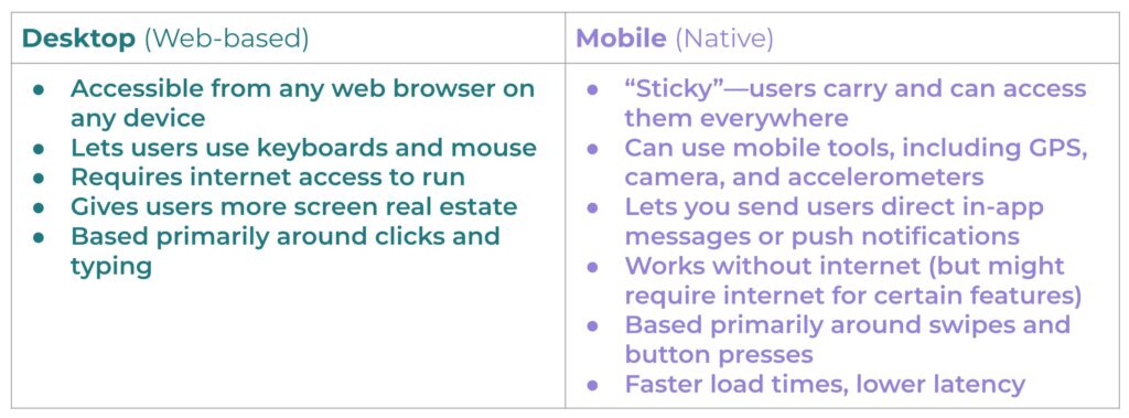
Before you start designing your app, make sure you plan to accommodate the key differences between desktop and mobile:
Both desktop and mobile experiences are crucial for customer conversion and retention, but often in different ways and in different circumstances. Below, we’ll take a look at best practices for keeping your mobile and desktop experiences updated and healthy for your sales funnel.
Best Practice for the Mobile Digital Experience
Whether your mobile experience exists within a dedicated iOS or Android app or simply as a responsive web-based app, there are some key best practices to be aware of when building your design strategy to maximize conversions and retention.
1. Keep it accessible, always
If your website or app is used by the public, it legally must comply with accessibility standards. These include:
- Text size options
- Large, easy-to-use buttons and CTAs
- Minimum color contrast ratios
- Simple touchscreen gestures
- Adjustable screen orientation
- Compatibility with screen readers
- Content translation ability
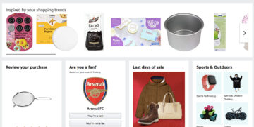
2. Make sure your mobile content is consistent with desktop
If your users regularly hop between their computer and phones, it’s important that they can easily and consistently find what they need. This can include information, tools, actions, products, and more. If they’re available on desktop, they should also be available on mobile!
For example, if you have a menu on your desktop app that offers users different ways to contact customer service but it’s missing on mobile, it will likely cause frustration when users are trying to get help on the go.
3. Consider your mobile users’ needs
Ask yourself: What data, tools, or functions will your users be accessing? Make everything easy to find, navigate, and use. This might start with an intuitive navigation system that lets users easily:
- Make purchases
- Find specific tools they love to use
- Manage their account or subscription
- Get help from your support team
You’ll also want to consider what your different users will be trying to do and from where. Will they be using cellular data (slow) or wi-fi (fast)? Will they be reserving certain actions for mobile vs. desktop? Will tasks that may have started on a processor-heavy desktop app later migrate to mobile (or vice versa)?
For example, a video editor might need to use a desktop app to edit terabytes’ worth of cinema-quality video before switching to mobile to share the final piece on social media. Personal workflows might vary, but it all gets down to having the right tools on hand at all times.
4. Check how your site and app perform across different devices
You’ve built your iOS app. You’ve built your Android app. Your responsive website’s parameters are set so they’ll adjust responsively for users accessing from phones and tablets.
Now comes the testing. App Store or Google Play installations should work seamlessly. Each button, form, menu, and action must work flawlessly. Load times should be fast, and there should be little to no latency between screens (though this can vary with web-based apps, depending on how they’re constructed).
For responsive sites, each element will have CSS parameters that dictate how it will appear on a phone, tablet, or desktop computer. You don’t need separate versions of your website, but each element must be tagged correctly so it renders properly on each device.
5. Make UX choices that encourage conversion and retention
Good UX (user experience) comes from good user research and robust product analytics, but it’s customer conversion and retention that will keep your app alive. If users buy items or services through your app, you’ll want to keep these top UX tips in mind:
- Never hide menus and navigation options.
- Make search bars easy to find.
- Make product browsing simple.
- Choose familiar, suitable icons for cart checkout processes.
- Label all icons, buttons, and navigation items.
- Make checkout funnels easy (including credit card selection/adding), or incorporate simple payment options like Apple Pay or Google Pay.
- Consider adding a subscription option so users can set it once and forget it!
Don’t forget that there are product analytics tools available to analyze the particular actions your users take, including Session Replays. These help you identify which parts of your UX design are working and which parts are causing friction.
Best Practice for Desktop Optimization
Desktop apps (many of which are web-based) are also commonly used and have more screen real estate to work with. Here are five tips to optimize your desktop experience to convert (and retain) new customers:
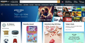
1. Create an engaging homepage
A great UX on your homepage can make or break conversion rates. When you’ve spent time and resources optimizing SEO, you’ll want to give potential customers a good first impression with a strong design. Here’s what we recommend to maximize conversion and retention:
- Keep your design simple with a single, clear CTA.
- Make sure it meets accessibility standards.
- Use a catchy headline and simple buzzwords to make your value proposition clear and concise.
- Choose the right colors by employing and understanding color psychology.
- Differentiate hyperlinked text with an accent color.
- Embrace white space! Space around your text can keep people reading it.
- Use well-lit, professional images and videos where they fit organically.
- Again, make sure your site is responsive to serve mobile users!
2. Improve website speed
Nothing deflects a website visitor faster than a glacially slow load time. To avoid losing possible customers, you can:
- Optimize your images by saving compressed versions at 72dpi.
- Limit the number of assets needed to load your page correctly—this can help reduce HTTP requests, which speeds up load times.
- Limit the use of external scripts.
- Remove unnecessary text, white space, and comments from CSS and Javascript files.
- Use browser HTTP caching—this can offer faster load times for users who frequently visit your site.
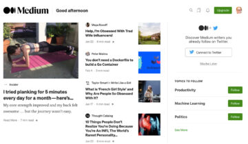
3. Develop intuitive site navigation
Site navigation—typically in the form of a top menu, side-bar menu, or organized icons—shows users what to do once they reach your site. Use descriptive labels for each item, and simplify drop-down menu structures so users won’t get overwhelmed.
4. Make it easy to search for terms
Adding a search bar to your top menu can be a great way to give users a way to search your site for any term (or action) they want. This gives them a shortcut to find exactly what they need!
5. Ready your desktop site for final steps of conversion and retention
Often, consumers are more likely to say that desktop offers a more “convenient” shopping experience than mobile, and a majority of people complete purchases on a desktop.
As such, desktop websites are still used and still valuable, particularly for final conversation and ongoing retention. Whether it’s because customers are making complex purchases or simply seeing your checkout funnel more clearly on desktop, it’s essential to make sure every step of your experience is seamless.
Once you’ve converted customers, it can also help to keep track of their preferences so you can personalize their experience going forward.
Gain Valuable Insights with Heap
This is a guest blog written by Ben Lempert, Head of Content and Web at Heap.
Heap And AB Tasty provide businesses with the ability to collect and analyze user data efficiently, leading to more informed decisions and higher conversion rates. This dynamic combination offers a comprehensive solution for optimizing web experiences and increasing revenue through data-driven strategies.
Curious how you can find out what your users are doing across both desktop and mobile? Heap offers tools to help you track, measure, and ultimately optimize every touchpoint of users’ journeys across your entire digital experience.


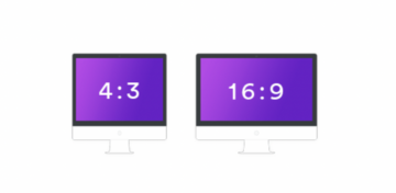 Knowing one dimension makes it possible to calculate the other. If you have an element with 1000px width, your height would be 750px. This calculation is made as follows:
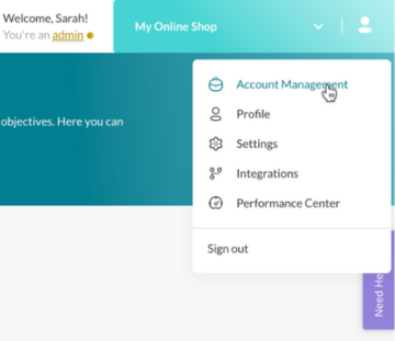


