

We’ve all been through the pain of filling out never-ending forms where we eventually gave up because it was so complicated.
Simple or complex, sign-up forms are everywhere. You are either the one creating the forms or the one filling them out. From e-commerce to SaaS and media platforms, there is no way to escape them. They’re a part of our everyday digital life.
Because consumers are used to filling out sign-up forms, the smallest mistakes in design or the information you’re asking for can have huge consequences on your conversions.
In this article, we’ll cover the basics, the different types of sign-up forms, and 10 best practices for designing powerful sign-up forms that convert.
What is a sign-up form?
A sign-up form is a webpage, questionnaire, document or popup that visitors must fill out with their personal data in order to access specific content or subscribe to a service.
Sign-up forms can have multiple purposes, but typically share a common goal: acquire personal consumer information, such as their name and email, in exchange for access to top-notch information or services.
For many websites, sign-up forms can also represent the entry point that makes all further conversions possible. This is particularly true for freemium or subscription-based models.
E-commerce websites also rely heavily on these forms because they’re a mandatory step prior to any purchase.
Why do sign-up forms matter so much?
Sign-up forms are where conversions happen. In other words, sign-up forms create business.
In our digital era, forms are how companies can get up close and personal with their potential customers. This is the beginning of their interactions where they collect emails, basic user information, leads and deliver content.
In short, forms are at the center of many digital interactions:
- For the service industry, forms are where leads are made.
- For the e-commerce industry, forms are where purchases are made.
- For the SaaS industry, forms are where you acquire customers.
As you can see, sign-up forms are the central piece of the puzzle.
Knowing this, it’s no surprise that neglecting forms is detrimental to any business. In fact, even a single mistake can promptly cost big companies millions in lost revenues.
For example, travel company Expedia found out that adding one extra line in their registration form had cost them over 12M$ per year, as measured with analytics after correction.
Finding out what’s wrong with a form takes time. It requires your team to test out your sign-up forms using A/B testing to see what is the most appealing for your users.
AB Tasty is an example of an A/B testing tool that allows you to quickly test elements of your sign-up form or different portions of your web page. With AB Tasty’s low-code solution, you can get these tests launched with ease, gather insights via an ROI dashboard, and start increasing your conversions.

4 main types of sign-up forms
1. Email sign-up forms
Emails are a precious touchpoint that shouldn’t be neglected.
These are forms aimed at harvesting email addresses to enhance your email list and generate potential leads.
In the image below, we can see an example of Hubspot using FOMO (fear of missing out) to promote their Service Blog by asking for only one email address.
By keeping the sign-up simple and offering some value through your email content, you’re encouraging your prospects to engage in a short, informational exchange.

2. Product sign-up forms
Product sign-up forms are crucial to e-commerce websites because they’re the last barrier before any purchase is made.
For product sign-up forms, it’s best practice to show the actual product, be very clear, and display security elements to give your customer peace of mind.
While there’s no consensus around the question, we think that e-commerce product forms should be reduced to the bare minimum to decrease the shopping cart abandonment rate.
In any case, delivery and payment options can be separated in order to streamline the checkout process.
3. Subscription sign-up forms
Subscription sign-up forms are a central piece of any subscription-based digital business; it’s where the conversions happen.
However, converting someone into a paying user isn’t always so simple.
Typically, SaaS and subscription-based businesses need time to educate their potential customers, which is why their subscription forms are key for them.
For subscription forms, it’s always important to remember the key information that you’re looking for and to provide value by offering a demo or a free trial.
See how Lancôme increased revenue by 15% by optimizing their account sign-up pathway.
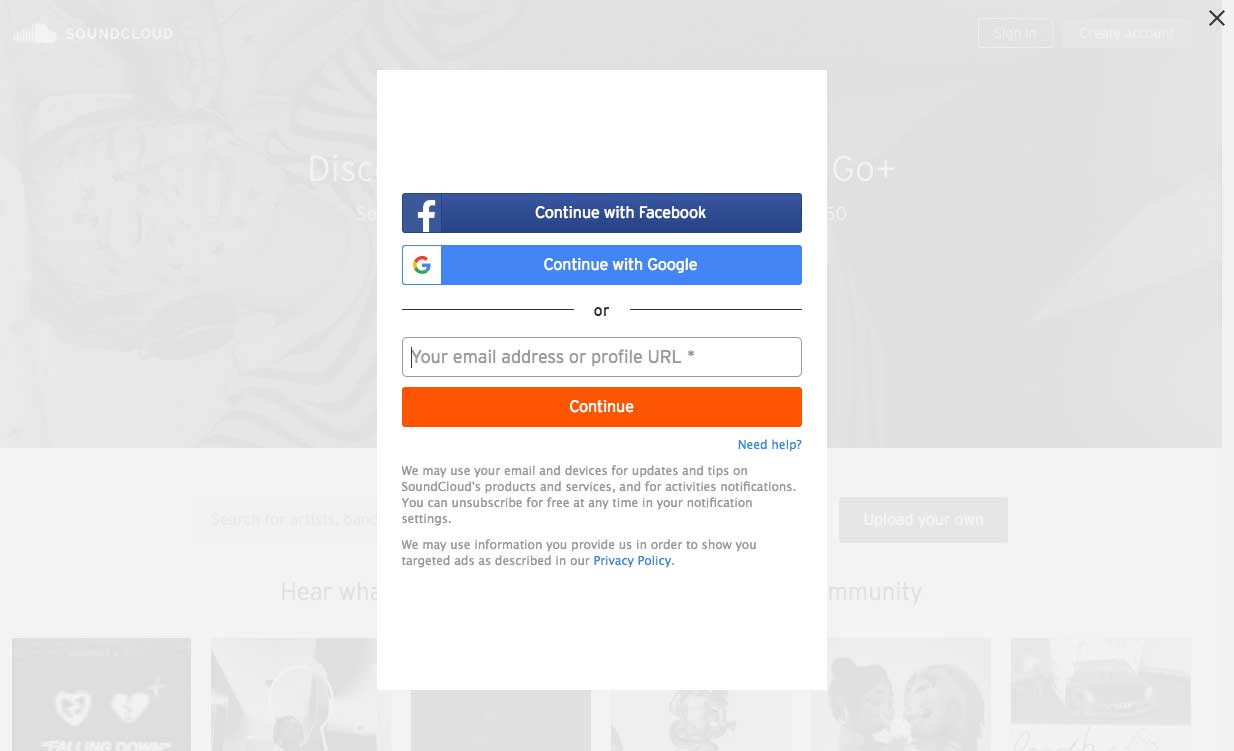
4. Service sign-up forms
Service sign-up forms differ from subscription forms as they do not necessarily bind the user through a subscription.
Service sign-up forms, like Spotify in the image below, are typically aimed at converting a maximum number of visitors into users. For that to happen, one of the best tools that you can use is a social media sign-up process.
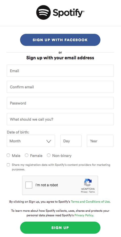
Offering users a quick alternative way to register with social media or Google could multiply your conversion rate.
10 Expert Sign-up Forms Best Practices
1. Make it contextual and obvious
Your forms only serve one purpose: to be filled out by your visitors.
For that reason alone, make sure that your forms are easily found on your website with distinctive colors.
However, it’s great to keep in mind that making your sign-up forms obvious doesn’t mean that you should display them everywhere. Context really matters when it comes to asking your visitors for their personal data.
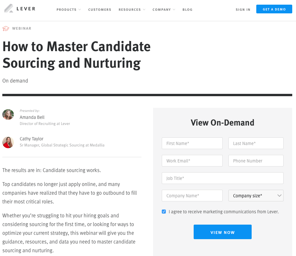
Let’s take a look at Lever in the example below. Lever offers gated content on specific HR subjects that requires you to register. It uses a clear call-to-action and offers a brief summary that helps them “sell” their content before visitors fill out their personal information.
2. Multi-Step vs Single-Step forms
According to VentureHarbour, multi-step forms tend to outperform single-step forms when it comes to lead generation.
Multi-step forms leave a less intimidating impression on visitors because they only ask for sensitive information at the very end of the form. This method generally leads to better results.
However, when it comes to product and subscription sign-up forms, we’d recommend a clear single-step sign-up form as long forms can discourage even the bravest visitors.
3. Keep your forms simple and easy
There’s a lot of debate when it comes to measuring our online attention span but one thing’s for sure: if your online content isn’t attractive and sharp, you’ll lose potential customers.
In fact, your form length mostly depends on the context. Some industries benefit from longer forms because it gives their websites more credibility, while others see a better return from shorter forms.
Here is one example of a truly simple sign-up form:
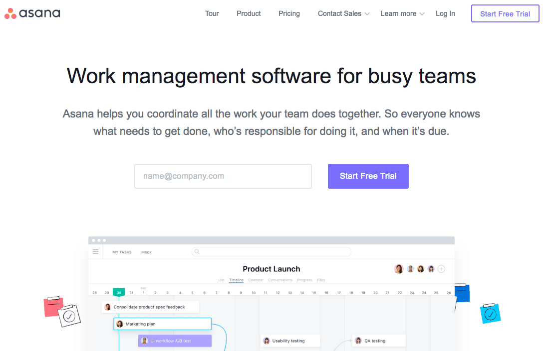
Asana does an awesome job at keeping the registration process easy – they only ask for your email address in exchange for a free subscription. Of course, Asana’s team knows that more information is required to properly use their solution. However, they wait until the onboarding process to ask for more user information later on.
On a larger scale, several studies report that shorter forms (fewer fields) tend to yield better results (more conversions).
With every additional field, there’s more of a potential to lose leads or customers. For e-commerce stores, our advice is to reduce the number of fields to the bare minimum. Your goal is to offer a slick and swift buying process.
It’s important to keep in mind that a simple form doesn’t mean removing all fields. A simple form means that you only focus on mandatory information that helps you meet your business objectives like the users’ name and email address.
4. Provide some real value
Visitors are asked about their personal information almost everywhere, and data privacy is becoming a prominent concern for many internet users.
With this issue in mind, it’s important to design your sign-up forms in a way that provides value for your visitors in exchange for them filling out the form.
To accomplish this goal, the most popular option is to craft a powerful value proposition to sell your form. This value proposition doesn’t have to be long and detailed – it can be effective by getting straight to the point.
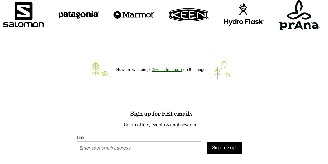
In the example below, outdoor gear specialists REI keeps it very simple with a clear value proposition in their email subform: “co-op offers, events & cool new gear.” When you put your email in the box, you have a very clear idea of what you’re signing up for.
5. Leverage your social proofs
Social proofs help you sell your services and products because it plays on our deeply rooted social nature.
Showing your visitors that many people did the same before gives them comfort in trusting your product or service. This also enhances your brand credibility and helps you achieve higher conversion rates.
It’s all about convincing your visitors to go through the next steps.
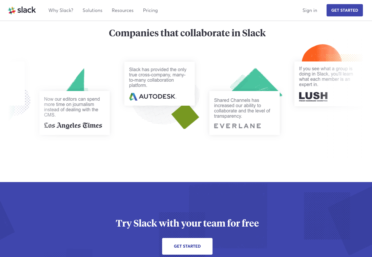
In the example below, you can see how Slack leverages social proof by displaying customer testimonials from famous tech companies just above their sign-up form.
6. Make it mobile friendly
As more than half of web traffic comes from mobile devices, mobile friendliness is becoming more important each year.
Knowing that more than half your visitors browse your website with their smartphone, you need to ensure that you pay close attention to your sign-up forms’ mobile layout.
The screen size adaptability of your form could play a decisive role in improving your conversion rate.
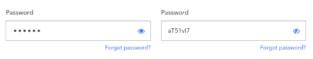
7. Don’t ask for password confirmation
Password confirmation typically doesn’t help with conversions. In fact, it slows down the process and actually increases the chances of a user misspelling their password.
Rather than asking for confirmation, allow your visitors to see what they just typed with an icon that unmasks their password. This will give them peace of mind knowing that their password is correct without the frustration of misspelling it.
8. Avoid using Captchas
Although spam is a real issue, you might want to consider avoiding the addition of an anti-spam solution on your visitors’ shoulders.
Captchas, like the one displayed in the image below, can sometimes get messy and irritating, which is why they shouldn’t be overused when it comes to building efficient sign-up forms.
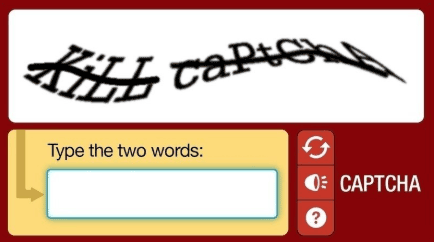
However, if your team feels more comfortable having an anti-spam solution, there are better alternatives to captchas to prevent spam.
9. Allow for social sign-ups
As we’ve mentioned a few times in this article, social sign-ups significantly reduce the time it takes for visitors to sign-up thanks to Google or Facebook’s auto-fill.
Implementing social sign-ups makes it easy to subscribe and gives your brand some much-needed credibility. People generally assume that Facebook and Google sign-ups are more secure.
With just one click, it’s an excellent tool to quickly generate leads and improve sign-up conversions.
10. Optimize and test your sign-up forms
Implementing best practices is a good practice in itself. But measuring the changes and their improvements is even better.
Do three fields perform better than six? Is implementing a social media sign-up worth it? Does social proof really give visitors the extra push to fill out your form? Tracking your sign-up form experimentation is the only way to find out.
Your marketing team should test several variations. Using an A/B testing solution, you’ll be able to:
- Create assumptions based on your analytics
- Test several variations and find a winner
- Measure your conversion gains at every stage
Want to get started on A/B testing for your website? AB Tasty is a great example of an A/B testing tool that allows you to quickly set up A/B tests with low code implementation of front-end or UX changes to sign-up forms on your web pages, gather insights via an ROI dashboard, and determine which route will increase your revenue.

Conclusion
As the conversion opportunities for the subscription service industry continue to skyrocket, so does the competition. Online customers are overwhelmed with choices – and often many good ones.
To convert online visitors to your website, you have to have a very consumer-friendly and optimized page. To find what turns your visitors into subscribers, get started on A/B testing your sign-up forms today.


