Have you ever been to a big department store that doesn’t have signs directing you where to go? Without signs pointing you in the right direction or a map with pinpointed locations, you could expect shoppers to leave.
That’s exactly what happens when an online store gets its product categories wrong. Shoppers don’t wait around to figure it out. They bounce and they don’t come back.
Product categories are the backbone of every online shop. Get them right, and you’re guiding customers straight to what they need. Get them wrong, and you’re losing conversions every single day without knowing why.
In this article, we’ll break down what product categories are, how to structure them, and how to turn them into a real marketing lever, one that drives traffic, increases conversions, and grows your average order value.
What is a product category?
Think of product categories as a road map for your store.
Shoppers need guidance, especially when your catalog is large. The clearer the signaling, the faster they reach their destination. And in e-commerce, that destination is always the same: the product they came for.
A product category is a grouping of related products that share a common purpose, audience, or attribute. It’s the organizational backbone of your store, the system that tells both shoppers and search engines what you sell and how to find it.
Categories can be broad (e.g.,”Apparel”) or specific (e.g.,”Men’s Running Shoes”), and they typically nest within one another to form a hierarchy. The goal is always the same: get the right shopper to the right product in as few steps as possible.
Whether your customers are searching for skincare, winter coats, kitchen tools, or holiday candles — intuitive product categories aren’t optional. They’re essential.
Examples of product categories
To make this concrete, here are some of the most common top-level categories in e-commerce:

Fashion & Apparel
Clothing, shoes, and accessories — sorted by gender, season, or occasion.

Electronics & Media
Smartphones, laptops, wearables, and streaming devices.

Health & Beauty
Skincare, supplements, and personal care essentials for everyday wellness.

Home & Garden
Furniture, kitchen tools, and garden equipment for every space.

DIY & Hardware
Power tools, building materials, and home improvement fixtures.
Category pages provide links to products with common themes or attributes, funneling customers toward the items they’re most interested in. A well-named, well-structured category page does two things at once: it helps shoppers navigate, and it signals relevance to search engines.
What are the types of product categories in marketing?
You can create as many product categories as there are features, locations, functions, or use cases. At its core, a category groups products that share similar properties and deliver a similar benefit to your customers.
Categories can be built hierarchically, in the form of a tree structure. In the “Clothing” category, for example, you’d typically find a split between women’s and men’s. Those categories then branch into subcategories like “Pants,” “Jackets,” and so on.
Before you start categorizing, it’s worth understanding the four major product classifications. These aren’t rigid boxes, they overlap, but they’re a useful lens for thinking about how your customers shop.
Convenience goods
Purchased regularly with low involvement. Price and quality barely differ between brands — loyalty is habitual, not emotional.
Shopping goods
Purchased less frequently at a higher price. Customers research, compare, and deliberate — your category pages need to deliver the right information.
Specialty & luxury goods
Sought after by brand-conscious customers. It’s about exclusivity and status — high consideratioan, strong brand preference, and top revenue despite lower purchase frequency.
Unsought goods
Only purchased when a specific problem arises. These categories benefit from smart search and contextual placement rather than browsing.
Check out our Product Recommendation Engine Guide →
What are product category structures in e-commerce?
Traditional classification methods
Traditional classification organizes products based on shared characteristics, like function, demographics, or area of application. It’s the most intuitive approach for both customers and internal teams, because it mirrors how people naturally think about and search for products.
Common methods include:
- Functional categorization — grouping by what a product does (e.g., “cleaning supplies,” “cooking tools”)
- Demographic categorization — organizing by audience (e.g., men’s, women’s, kids’)
- Occasion or use-case categorization — grouping by context (e.g., “back to school,” “home office setup”)
This approach also has an internal benefit: it standardizes how your team talks about products across inventory systems, marketing copy, and customer support. This way reducing errors and keeping everyone aligned.
Hierarchical category structures
A hierarchical structure moves from broad to specific, a tree with 3 to 5 levels of depth. For example:
Level 1
Home
The root of the site — the starting point for every shopper’s journey.
Level 2
Clothing
Top-level category grouping all apparel across genders and styles.
Level 3
Women’s Clothing
Gender-specific subcategory narrowing the browsing context significantly.
Level 4
Dresses
Product-type category where intent becomes much clearer and more actionable.
Level 5
Formal Dresses
Deep subcategory revealing high purchase intent — the ideal moment to personalize and convert.
This kind of taxonomy does two things well: first, it helps shoppers navigate intuitively, and, second, it makes SEO implementation significantly easier. This is especially true when your naming conventions include the words customers actually search for.
A few practical rules of thumb:
- Aim for fewer than 15 top-level categories
- Keep it to 2–3 levels of depth where possible (5 levels maximum)
- For most stores, 8 top-level categories with 4–8 subcategories each is a clean, scalable structure
The goal isn’t complexity, it’s clarity. The simpler the structure, the faster shoppers find what they need.
What is product category marketing?
Product category marketing is the strategic use of your product taxonomy to guide customers through your catalog, influence purchasing decisions, and hit your business goals.
It goes beyond organizing products. It means actively using your category structure as a marketing lever: to attract organic traffic, personalize the shopping experience, promote specific product lines, and grow revenue per visitor.
Done well, your category structure can promote high-margin product types, highlight seasonal occasions, or surface bestsellers. All without a single paid click.
Why is product category marketing important?
A well-structured product category system is one of the most impactful decisions an e-commerce team can make. Get it right, and you reduce friction for shoppers, improve SEO rankings, and directly increase revenue. Get it wrong, and you’re losing conversions every day, quietly and consistently.
According to Nosto, 69% of online shoppers go straight to the search bar when visiting e-commerce sites, but 80% leave due to a poor experience. Category pages are critical touchpoints where structure, content quality, and technical optimization all converge. It even affects both search rankings and conversion rates.
Optimized category pages with engaging content, clear navigation, and high-quality visuals don’t just convert better. They build the kind of experience that keeps customers coming back.
Curious about how personalization fits into this? Our Everything You Need to Know About Personalization resource breaks it down →
What are the benefits of product category marketing in e-commerce?
With product categories, you can track and evaluate how customers browse your store. You can analyze purchasing behavior, which enables you to make individually tailored product recommendations, because very few customers have any interest in your entire catalog.
The data you gather through category-level analysis provides valuable insight into how shoppers navigate, what they click, and what they buy. That’s intelligence you can act on.
You can also use categories to deliver product recommendations: surfacing relevant products on the homepage, displaying matching items from a specific category, or personalizing the order in which products appear based on individual browsing and purchase behavior.
Breaking your catalog into categories also lets you monitor which pages get the most visits and which have the highest conversion rate. This will give you a richer, more actionable picture of customer behavior than product-level data alone.
How to categorize products for your marketing strategy
As previously mentioned, a product category is created by grouping similar products that share similar features. Those shared characteristics, the ones that determine how items in your catalog are grouped, should be baked into your marketing strategy from day one.
That said, categories aren’t set-and-forget. What resonated with shoppers a few years ago may not land the same way today. Timeliness matters. Relevance matters. Your categories should evolve with your customers.
How to analyze and update your product categories
A category analysis starts with recording and evaluating product features, and identifying the factors that positively or negatively influence demand. Your own traffic data is essential here, but competitor stores can also be a valuable source of inspiration.
Beyond assigning categories, a thorough analysis digs into each product type individually. How do customers perceive these categories? How do they talk about them? What does their purchasing behavior reveal?
A comprehensive analysis also helps you spot emerging market trends and develop new strategies for category creation. Review your category pages at least quarterly, and always when you’re adding new product lines, responding to seasonal shifts, or noticing patterns in customer support questions.
How to create product categories successfully for your e-commerce
Here are three steps to build product categories that actually work.
Step 1: Identify the purpose of each page
Your product detail pages and category pages serve different purposes, and it’s important to be clear on both.
Product category pages are conversion-focused. They’re where the decision gets made.
Category pages are navigation-focused. They’re where customers orient themselves and move through your range. Their job is to guide, not to sell.
Design each page type with its purpose in mind.
Step 2: Design with your customer in mind
Always build from the customer’s perspective. What motivates them to buy? What information do they need at this stage of their journey?
A few practical moves:
- Summarize and describe your categories clearly. Use your groupings to define main and submenu items. Keep naming specific and searchable.
- Personalize the menu order. A customer who browses “sneakers” regularly should see that category first. Someone else might see “jackets” at the top. Personalized navigation reduces friction and increases relevance.
- Design attractive category pages. Show product details that help visitors differentiate items (size, type, key specs). Use clear images — visuals help shoppers orient themselves far faster than text. Aim for 10–50 products per page: enough variety, not enough to overwhelm.
- Personalize product ranking. Surface “relevant” products at the top — based on the collective click and purchase behavior of your visitors.
Step 3: Give customers ways to narrow their choices
Reducing the number of items displayed makes it easier to choose — and increases conversion. Here’s your toolkit:
- Subcategories — divide broad categories into more specific ones
- Functional categorization — group by what the product does
- Demographic categorization — organize by gender, age, or audience
- Area of application — where or how the product is used (bathroom, kitchen, outdoor)
- Specific attributes — size, color, material, or other product-level characteristics
- Solution-based categorization — group by the problem the product solves (e.g., “muscle recovery,” “better sleep”)
- Filters and faceted navigation — let shoppers narrow results themselves
- Onsite search — for customers who know exactly what they want
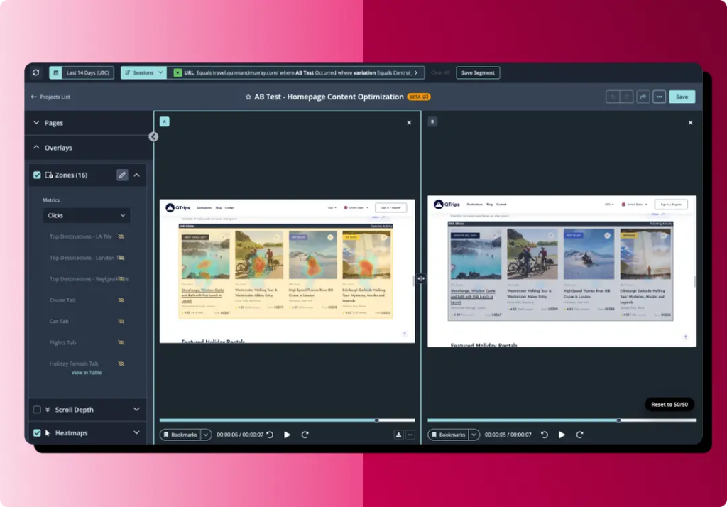
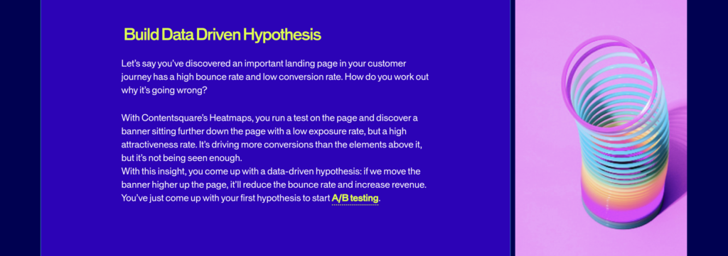
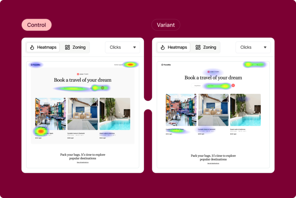
See how teams use A/B testing to optimize CRO →
Product category marketing examples
The best category strategies don’t just organize products — they reflect how customers actually think, shop, and discover. Here are four brands doing it well.
Alltricks — Cycling & Running
+5%
Average Order Value (AOV)
+7%
Revenue per user
Alltricks, a specialist cycling and running retailer, was managing product recommendations manually — which meant slow load times, irrelevant suggestions, and zero mobile coverage.
By switching to AB Tasty’s AI-powered recommendation engine, they were able to surface complementary products automatically at the right moment: when a customer adds a mountain bike to their cart, they now see helmets, gloves, and maintenance products that other customers commonly buy alongside it.
The result: more items in the basket, more revenue per visit, and a category experience that works as hard as the products themselves.
Read the Alltricks case study here →
Devred — Men’s Fashion
4x
more spent by recommendation-engaged users
35%
of total revenue driven by recommendations
Devred, a French men’s ready-to-wear brand, had a clear challenge: a large catalog, a loyal customer base, and an e-commerce experience that wasn’t pulling its weight.
They worked with AB Tasty to combine personalized recommendations, merchandising optimization, and A/B testing — transforming their category and product discovery experience from the ground up.
The results were striking: users who engaged with recommendations spent four times more than those who didn’t, and recommendations now account for 35% of the site’s total revenue.
Read the Devred case study here →
Maison Francis Kurkdjian (LVMH) — Luxury Fragrances
Higher average basket value
Significant growth in sales index within weeks
For a luxury fragrance brand, every product page is a category unto itself — and the path from browsing to buying needs to feel effortless and elevated.
Maison Francis Kurkdjian partnered with AB Tasty to implement a smart recommendation and merchandising strategy, A/B testing different approaches to surface the right products at the right moment.
Within weeks of going live, they saw a measurable increase in average basket value — particularly for new collections — and meaningful growth in their overall sales index.
Read the Maison Francis Kurkdjian case study →
Why product category marketing is indispensable for e-commerce
Product categorization is a core pillar of conversion optimization. When you understand how customers click and buy, you can design a category structure that guides them more effectively — reducing bounce rates, increasing conversions, and generating insights that feed every other part of your marketing strategy.
Here’s what’s really at stake.
Conversion Rate
Well-structured category pages reduce friction. They guide visitors toward relevant products, present the right information at the right moment, and make the path to purchase feel effortless.
The more precisely your categories are structured and named, the more likely you are to attract high-intent visitors who are ready to buy. Long-tail keywords — the kind that map to specific category names — convert at around 36%, compared to 11.5% for short-tail terms. That’s not a small gap. That’s a structural advantage.
When done right, a strong category architecture doesn’t just improve rankings — it creates a shopping experience that converts and keeps customers coming back.
SEO and Organic Traffic
Category pages are your highest-value SEO real estate. They target commercial keywords — “wireless headphones,” “running shoes for women,” “natural skincare for sensitive skin” — that attract shoppers in research and comparison mode. These are the terms that drive qualified traffic, and category pages are built to capture them.
Category pages sit at the intersection of discovery and intent, which is exactly where you want to be in organic search.
Category pages also build topical authority. Search engines treat them as hubs that signal your site’s expertise in specific product areas. And every product linked from a category page receives ranking signals — creating compound SEO benefits as your catalog grows.
Average Order Value (AOV) and Cross-Sells
Well-designed category pages don’t just convert — they expand the basket.
A shopper who lands on “Yoga Mats” is also a candidate for “Yoga Blocks,” “Water Bottles,” and “Activewear” — but only if your category structure makes those connections visible. Cross-selling is responsible for 35% of Amazon’s revenue. Studies show that upsells and cross-sells can increase AOV by 20–30%.
Effective product categorization acts as a built-in cross-sell engine. When customers see an entire category page full of relevant options, they’re more likely to add multiple items — especially when personalized recommendations surface products that match their behavior.
Discover how to boost your Average Order Value here →
Internal Alignment
Here’s a benefit that often gets overlooked: product categories don’t just serve customers, they align your entire organization.
A clear, consistent taxonomy standardizes how your team talks about products across inventory systems, marketing copy, paid campaigns, and customer support. Inconsistent naming leads to reporting errors, misaligned campaigns, and stock management headaches.
When your category structure is solid, your marketing, merchandising, and logistics teams all work from the same framework. Campaigns are easier to build. Reports are easier to read. And new team members can get up to speed faster.
Internal alignment isn’t a soft benefit. It’s a growth driver.
Conclusion
Product category marketing is far more than a back-end organizational task. It’s a strategic pillar of e-commerce success, one that touches every part of the customer journey, from first click to final checkout.
Get your categories right, and you’re doing several things at once: attracting qualified organic traffic, reducing friction for shoppers, surfacing cross-sell opportunities, and giving your internal teams a shared language to work from.
The key is to treat your categories as living assets. Analyze them regularly. Design them from your customer’s perspective. Test, iterate, and refine. In a competitive e-commerce landscape, the brands that win are the ones that make it easiest to find what you’re looking for, or discover something you didn’t know you needed.
That’s not just good UX. That’s good marketing.
Ready to go further? Let’s build better experiences together →
FAQs
What is a product category?
A product category is a grouping of related products that share a common purpose, audience, or attribute. It’s the organizational backbone of an e-commerce store, helping both shoppers and search engines understand what you sell and how to find it.
What are the types of product categories?
The main types are: convenience goods (frequently purchased, low involvement), shopping goods (less frequent, higher consideration), specialty and luxury goods (brand-loyal, high exclusivity), and unsought goods (only purchased when a specific need arises).
Why are product categories important for SEO?
Category pages typically have the highest search potential of any page on an e-commerce site. A clean, keyword-rich category structure drives qualified organic traffic, helps search engines index your products correctly, and builds topical authority for your domain.
How do product categories affect conversion rates?
Well-structured category pages reduce friction in the shopping journey, guide users toward relevant products, and create natural cross-sell and upsell opportunities — all of which contribute to higher conversion rates and average order value.
How often should I update my product categories?
Review your category pages at least quarterly — and whenever you’re adding new product lines, responding to seasonal shifts, or noticing patterns in customer questions or support tickets.


