


If you ask most e-commerce marketers how to optimize your website to generate more conversions, they’ll tell you to focus on your homepage or product detail pages. While that answer is technically correct, there is a potential goldmine for clicks that even the most seasoned marketers overlook: product listing pages
While these pages are often used as a catalog for your products and services, they can offer much more than an opportunity to optimize the customer experience. Since visitors browsing your product listing pages are already engaged with your online store, they just need one final push to convert.
In this article, we’ll show you everything you need to know about product listing pages, how to optimize your PLPs, and some examples of great product listing pages.
What are product listing pages?
Product listing pages (sometimes called PLPs or category landing pages) are pages on a website that display products based on a selected category; they may also be based on applied search filters. Product landing pages lead visitors to product detail pages where they can find more information on the items they’re interested in or even add said items to their cart.
One of the main drivers for optimizing your product listing pages is the opportunity they present for optimizing your user experience, as they can be tailored to shoppers with different user intent. On the one hand, we have buyers who visit a website knowing exactly what they are looking for. These potential buyers want to view the items that are most relevant to their search or intent (e.g. a user looking for a mountain bike doesn’t want to view road bikes). On the other hand, other visitors simply love browsing and use your PLPs to sift through the list of products that suit their preferences.
Of course, your product listing pages are not only about navigation and UX. They do much more. With a well-optimized PLP, you’ll be able to boost your SEO, increase user engagement, and improve your conversion rate!
Key elements of a product listing page and how to design your PLPs for better conversions
Creating an effective product listing page starts with the basics. Designing your product listing pages in an optimal way, with all the relevant elements, will increase the odds of shoppers finding the products they are looking for and making a purchase. Here’s what you should make sure to include in your product listing pages:
1. PLP page name: Descriptive title
Remember that Google will only display the first 25, 50, or 64 characters of your title, so make sure your PLP title is optimized accordingly. For example, if you are selling cell phones, you might want to structure your titles according to make, model, memory size, and color so that shoppers can see the most important information upfront.
2. Description: Keyword-rich
The product description and title have a big impact on your PLP’s SEO and product discoverability. Make sure that your descriptions are thorough and contain all the relevant keywords that will help you rank higher. Remember: the more specific, the better.
3. Breadcrumbs: Proper category name
Make sure that each product is placed in the most relevant category to both orient your shoppers and help them discover similar products. Breadcrumbs can display the parent category/subcategories so that users can jump back and forth between product listing pages with ease.
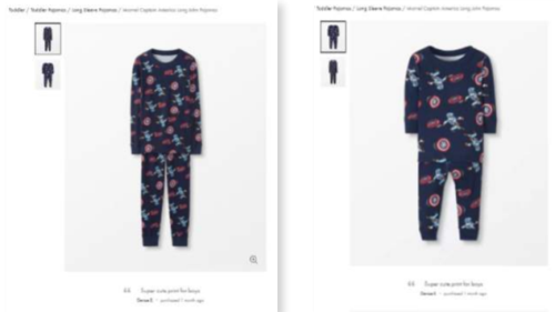
4. Imagery: Thumbnail
People process visual information faster than anything else, and your product images will be the first thing a customer sees. Use high-quality photos and be consistent (for example, use the same color background for every image). If you use various backgrounds, colors, and sizes, your customers will be distracted. Want proof? Read our case study on Hanna Andersson where they have proven that keeping all images simple, clear, and harmonized will work wonders for results.
5. Price
Make sure that your pricing is competitive. Do your research and benchmark your prices against your competitors and make amendments. Highlight any other elements that make your pricing more competitive, like free shipping, or buy-one-get-one-free offers.
6. CTAs
Call to action buttons (also known as CTAs) are items that use imperative wording to nudge your users towards the action you want them to take, like “Add to cart now!” or “Save to Wishlist” if a product is unavailable. It’s important to create an effective CTA by following design best practices and carefully testing different variations of your call to action’s copy, location and colors.
Make sure that your button is visible against the background and all the other elements on the page. This not only draws the visitor’s eye to the call to action but shows them that the button is clickable. It’s important that your button looks like a button, even if you want to adopt a more minimalistic design for your website.
Next, make sure that your call to action conveys urgency. Using phrases like “Sign up now,” “Hurry” or “Don’t delay” encourages your users to not only act, but to act fast. It’s also a good idea to utilize first-person copy so that the visitor feels more connected to the CTA.
7. Filter menu
This menu displays the filtering options available to refine searches by attributes, like pricing, color, style, availability, size, and more. This will help your customers find what they are looking for easily.
8. Sorting menu
The sorting menu presents different options for organizing products using a dropdown menu, including “Price: Low to High,” “Newest,” or “Rating: High to Low.”
Sorting options have a sole purpose: narrowing down the number of products in order to increase conversion. Your sorting options should be based on your audience’s needs and expectations regarding your products. Thinking in the minds of your customers is crucial for optimization at this point in the digital customer journey.
Let’s take WatchShop as an example.
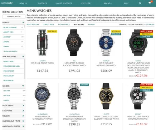
WatchShop knows that watches come in all sorts of shapes and colors, so they created various sorting options to match visitors’ requests. This includes water resistance, strap type, case color, movement type, and so on.
It’s all tailored to match customers’ expectations – and it delivers.
10 best practices for creating and optimizing product listing pages
Now that you know how to design your product listing pages, let’s get into how to optimize them for the best results:
1. Optimize headers or banners
Headers play the “title” role of each category and listing page design.
They’re the main indication of the page’s content and should be treated as the most important thing. If the header does not properly describe the page or the category, visitors will not be able to find what they are looking for.
Headers can reinforce your branding, so use the space on the top of your page to create a great-looking banner that engages and informs without adding clutter. In addition, never forget to include your keywords inside your <h1> tags. Not only will this make them more visible on the page, but they’re also a bit part of your on-page SEO efforts that will help you appear higher in search results.
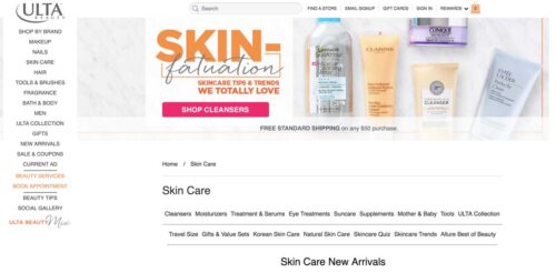
In the image below, beauty specialist Ulta bets on shiny visuals to increase its headers’ visibility. It’s a good solution to avoid “all text” headers that can seem dull at first glance.
Note: headers can also be used as promotional spaces to display featured products, special offers, and discounts.
2. Experiment with multiple layouts on your product listing display
Your product listing display has a significant impact on the way your customers interact with the products. Unfortunately, there’s no easy answer when it comes to choosing between list and grid views. In fact, it all depends on what type of products you’re selling and what experience you want to provide. The most common choices are list view or grid view:
List view
List views require a little more scrolling but can display more product information than a grid. This makes it easy for shoppers to compare product attributes, like dimensions or features. Some sites let customers toggle between a list or grid view, depending on their preferences.
The list view is better suited for products that require extensive information and specifications in order to help customers compare aspects of similar products.
It’s a great fit for technical products like TVs, computers, electronics, DVDs, hardware, etc. However, this isn’t the only time to use list view for your product pages.
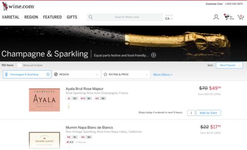
If we take a look at the image below, Wine.com sells luxury wines and champagnes. In this case, it’s important that visitors take their time benchmarking the brands and “grands crus” before making a purchase decision.
Notice how they capitalize on the extra horizontal space to display ratings.
Grid view
Grid views allow customers to browse and compare products next to each other. This is a good option if your site is picture-heavy and doesn’t require a lot of description outside the product titles.
Grid view is mostly used for products that rely a lot on pictures and can be compared quickly without paying much attention to the specifications. It also allows for more visual experiences.
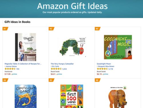
Amazon uses grid view to display products inside its “gift ideas” category. They also use tags to rank the bestsellers and lure visitors into clicking on the products based on their popularity.
3. Add persuasion triggers
Persuasion triggers create a sense of urgency or scarcity. You most often see this on hotel booking sites or the sales section of a fashion store (“Only 1 item left at this price!” or “Selling out fast!”). These labels trigger visitors’ fear of missing out and push them to take action, so be sure to add them to your images to nudge them into making a purchase.
4. Personalize the shopping experience
Personalization can dramatically increase conversions, boost engagement, and help shoppers discover relevant products by sorting them according to their individual preferences. Personalization has also been known to reduce bounce rates by 20-30% and increase customer loyalty.
One thing you can do to personalize the experience for your visitors is to display complementary products that they might be interested in. For example, customers shopping for a new bedspread might also be interested in buying pillowcases or sheets, so steer them in that direction.
5. Use recommendations
If someone is already browsing your product listing page, the chances are that they already have the intent of making a purchase. This is the best time to make suggestions and cross-sell or upsell your products:
- Some customers suffer from decision fatigue when they are presented with too many options. Gently recommend popular products, others within the same category and with the same tags, or similar (but slightly pricier) alternatives.
- Show customers recommended products that might be relevant to the one they are viewing. For example, clients who are interested in a technical product would appreciate a “People who purchased this product also purchased” section that shows the accessories that go along with it.
- Present seasonal bestsellers to add specificity and relevance, which could lead to more clicks and conversions. We tend to think that other people’s actions are the correct ones, so if a product is tagged as “trending,” it gains additional legitimacy that could push a customer to make a decision.
Want more information about buyer behaviors in e-commerce? Check out our 2024 consumer study report!

6. Implement intuitive navigation
Your navigation has to be tailored to help prospective customers find what they are looking for as easily as possible with as little friction as possible. There are a few tips and tricks you can try, including:
- Put your best-selling items front and center: We’ve already touched on the fact that customers like knowing what items others are buying. The most popular options are often seen as the safest ones to buy. Throw in some social proof messages like user ratings to really drive the point home.
- Site speed is a crucial factor for UX: Make sure that your site loads quickly on both desktop and mobile devices to ensure that customers have an enjoyable experience.
- Ensure that your navigation bar is fixed to the top of the page and organizes your products in a logical fashion.
No matter the level of page depth, navigation always plays a crucial role in the user’s experience – and your product listing page should not be different. Because some products have complex specifications and require extensive sorting options, pay attention to your website’s performance when it comes to sorting products and helping customers find their perfect product.
In the image below, RevZilla does a great job of guiding customers through the endless journey of finding the right motorcycle helmet.
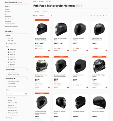
They use their left column to help customers sort and rank products according to several criteria (faceted search):
- Color
- Type
- Shape
- Category
- Size
- Gender
- Bonus point: RevZilla provides visitors the opportunity to only display products that have a video review. This is a huge value proposition compared to their competitors.
7. What information to display on your PLPs?
There are tons of options regarding which information you can display on your product listing pages and category pages. Simply put, you need to display information that will effectively help and convince consumers to move down the funnel and make a purchase.
In order to help you choose, here’s a list of information that may be displayed on your product listing page:
- Star ratings
- Discounts
- Color options
- Stock availability
- Best-sellers
- Add to cart
- New / Used
- Short descriptions
As an example in the image below, BestBuy does a great job of providing useful information on its product listing page. Besides the pictures and the price, they also added: star ratings, discounts, and an add to cart button with a smart color hierarchy.ㅤ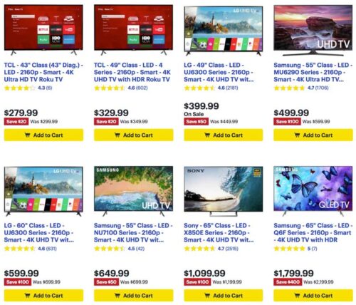
8. Optimize SEO for product listing pages
SEO is a big deal for most e-commerce players. In fact, search engine traffic accounts for around 50% of all e-commerce traffic according to a 2023 study led by SmartInsights.
There are two main reasons that justify the dominance of product listing pages regarding SEO:
A. Product listing pages are keyword-rich
Because they contain the names, brands, prices, specifications, and descriptions of products, category pages tend to be keyword-rich. This means that they naturally rank for a lot of keywords in search engines.
B. Product listing pages are the most heavily linked to
Product listing pages are typically where you want your customers to start their journey (or alternatively on the product page itself), which is why SEO pros tend to focus their efforts on these pages. Besides this, all products within a category generally link back to that category, which is a strong internal link-building pattern.
Tips for optimizing SEO on your product listing pages:
- Optimizing your title tags
- Using unique and original product and meta descriptions
- Linking to internal pages
- Using image alt attributes and rich snippets
9. Should you use Quick View or add-to-cart buttons?
Quick View is an e-commerce function that allows visitors to generate a miniature version of the desired product page. In other words, it’s a mini product page that generally embeds a direct “add to cart” button.
Not all products require lengthy deliberation and consideration before making a purchase, especially for returning customers or others purchasing fast-moving goods like groceries. Creating add-to-cart buttons makes it easier to speed through the checkout process. You can also implement add-to-wishlist buttons for more complex or expensive items to maximize conversions.ㅤ
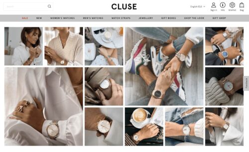
10. Use clear and concise CTAs
Call to action buttons can have a massive impact on your conversions. When Dutch watch brand Cluse noticed that their product listing pages had high bounce rates (and that clicks to the product display pages were low), they turned to AB Tasty to find a solution.
Cluse set up a simple test to see whether changing their CTA’s location and color would improve the results. The team’s hypothesis was correct, and the site saw a 2.39% increase in the click-through rate to the product display page and a 1.12% uplift in transactions during the three-week test.
Examples of effective product listing pages
ASOS
ASOS uses short but descriptive copy on their product listing pages.
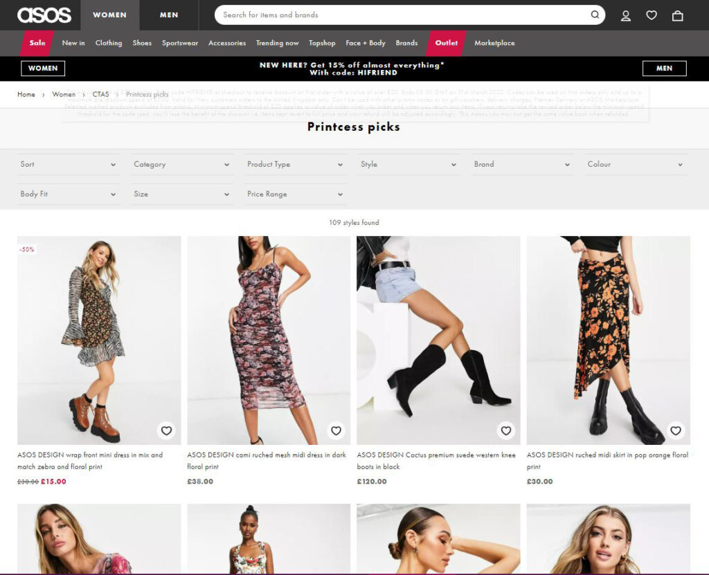
The clothing retailer’s product listing pages are categorized by trends and style. They use extremely simple copy and appealing photographs to convince shoppers to make a purchase. Users can add items to their wishlist or cart directly from the product listing page and check out using the simple navigation banner.
Everlane
Everlane uses quick add-to-cart buttons to optimize their product listing pages
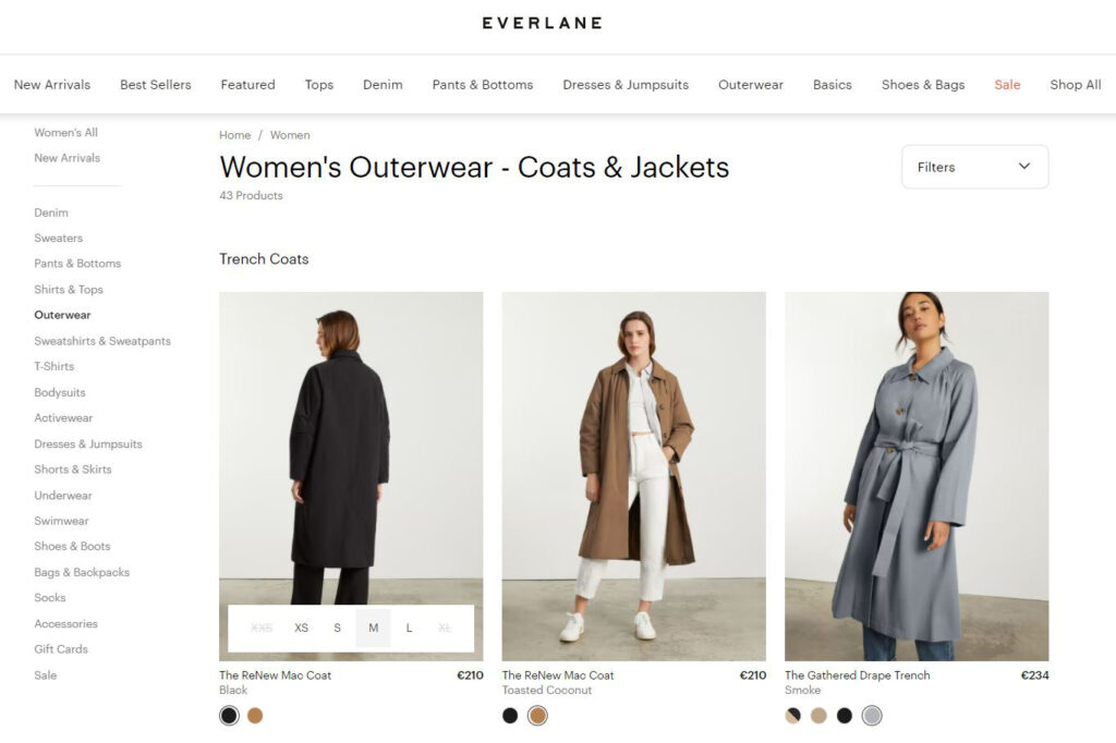
Everlane uses a number of features from the best practice guidebook, including adding product size options as an overlay in the image, easy navigation using the grid view and sidebar, and quick add-to-cart buttons.
Walmart
Walmart uses compelling headers and content on their product listing page.
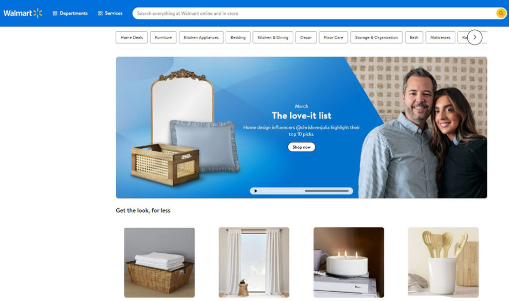
Walmart puts bestsellers on top of their product listing pages, Walmart puts bestsellers on top of their product listing pages, along with engaging headers that feature collections by influencers like Sofia Vergara and Kim Kardashian. They also use quick add-to-cart buttons to make it easier to shop. The copy is clear and concise, and users are able to comfortably scroll through galleries of attractive images. Returning users are greeted with a warm, personalized message.
How many products per page and per row to display on your PLP?
If you opt for a grid view template, there’s no doubt that you’ll eventually come to the question, how many products per row?
As for choosing between list view and grid view, there’s no single answer that will fit everyone’s needs. In fact, the number of products displayed per row depends on 3 main factors:
- Image size – If you choose to display big, high-resolution images; there’s no doubt that you will have a hard time squeezing more than 4-5 products in a row.
- Number of products – The number of products listed per row also depends on your total number of products for a given category. If you only have 12 products to display, it’s a lot more coherent to opt for a 4X3 grid structure rather than 2X6. You need to fill the page visually.
- Volume of information – Not all products are considered equal when it comes to their product description. Some products natively require more information than others. The more space they need, the fewer products you will display.
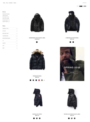
In the image below, Canada Goose, a high-quality outerwear provider, relies on a 2-products-per-row structure. This strategy highlights the visuals and delivers a more premium feeling to the user’s experience.
How to find what works best on your product listing pages?
A/B test your product listing pages.
There is no secret when it comes to Conversion Rate Optimization (CRO) – testing is what makes it work. The recipe for success doesn’t change for your product listing pages, you just have to A/B test them.
Now the question is, how can you do that? We have great news for you: we’re A/B testing specialists.
Making a good product listing page isn’t easy. You will have to identify elements that work and elements that don’t to gradually increase your conversions and offer an overall better user experience to your customers.
Want to start optimizing your product listing pages? AB Tasty is the best-in-class experience optimization platform that empowers you to create a richer digital experience – fast. From experimentation to personalization to smart search and recommendations, our solution can help you activate and engage your audience to boost your conversions.
Conclusion: The ultimate product listing page
Product listing pages can be conversion machines. When they’re properly optimized, they’re key for delivering an exceptional customer experience, helping you rise to the top of search engine results, and increasing basket size.
Whether you’re a seasoned seller or are venturing into the world of e-commerce for the first time, it may seem overwhelming to hit all the right notes – and find the best ideas to take your product listing pages to the next level!
Creating product listing pages will look a bit different depending on your market sector. However, for maximum performance, keep these best practices in mind for your e-commerce brand.
