


Let’s be honest: your hotel’s real front door is digital. The entire guest experience now begins not in a lobby, but on a landing page. That first, make-or-break moment of hospitality has moved online, and it all kicks off with a single click.
For modern travelers, the digital experience isn’t a prelude to their stay; it’s part of it. They expect the same level of intuitive, personal service from your website that they’d expect in your lobby. They’re looking for a seamless journey, one that understands what they need before they even have to ask.
Delivering that isn’t about a massive, one-time overhaul. It’s about embracing a mindset of continuous optimization. It’s about seeing every interaction as a chance to learn, to test, and to improve. It’s about moving from “trial and error” to “trial and better.” This is the path to turning lookers into bookers and first-time visitors into lifelong guests. Let’s walk through how to build it, one step at a time.
From landing pages to lobbies
The shift is simple but profound: your website is no longer just a tool for transactions, it’s the start of the entire guest relationship. A slow-loading page, a confusing booking engine, or an offer that misses the mark doesn’t just cost you a sale, it subtly damages your brand’s promise of a stress-free, welcoming experience. The feeling a guest gets from your website is the feeling they’ll associate with your brand.
That means your digital presence needs to embody the very essence of hospitality. It should be effortless to navigate, anticipate your guests’ needs, and make them feel seen and valued from the moment they arrive. Every element, from your homepage hero image to the copy on your call-to-action buttons, contributes to this digital-first impression.
The great news is that you have more opportunities than ever to make that impression a brilliant one. While a front desk agent can only interact with one guest at a time, your website interacts with thousands. Each of those interactions is a rich source of data, a clue that can help you understand your guests on a deeper level and refine their experience. The challenge isn’t a lack of opportunity, but knowing where to start.
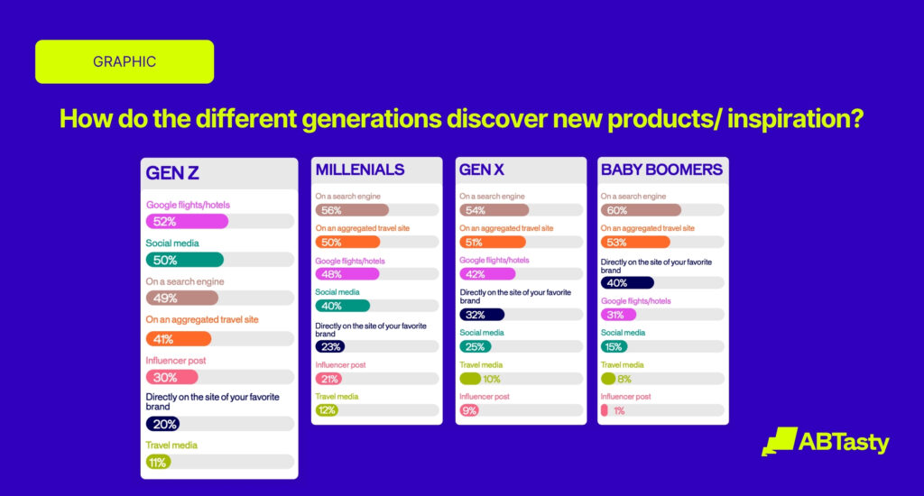
First, learn who’s at the door
Before you can offer a guest the perfect room, you need to know why they’re traveling. Are they on a family vacation, a solo business trip, or a romantic getaway? Just as a great concierge listens before making a recommendation, a great website must first understand user intent. Your visitors are telling you what they want through their behavior, you just have to learn how to listen.
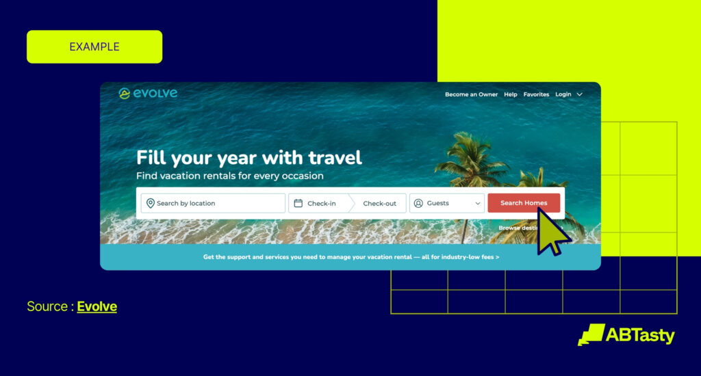
A fantastic example of this comes from Evolve Vacation Rental. They recognized that not all traffic is created equal when it came to attracting new homeowners to list their properties. A visitor arriving from a targeted Google search for “how to rent my vacation home” has a very different intent than someone who clicked a beautiful, brand-aware ad on Facebook. The first user is actively looking for a solution and is ready for details about fees, services, and qualifications. The second is likely in an earlier, more curious phase, just exploring the possibility.
By separating these traffic sources, Evolve was able to tailor its landing pages to match the visitor’s mindset. The high-intent Google visitor got straight to the point with clear calls-to-action and qualifying questions, while the Facebook visitor received more inspirational content. It’s a simple, powerful idea: speak to the journey your guest is on, not just the one you want them to take. Start by analyzing your traffic sources. What are your visitors’ search queries telling you? How does engagement differ between channels? Every click is a clue.
Using segmentation to deliver relevant offers
Once you have a sense of who’s at the door, you can start personalizing their welcome. A one-size-fits-all approach to offers is like a hotel restaurant with only one item on the menu, it’s bound to disappoint most of your guests. Segmentation is the key to creating a menu of experiences that feels personal to each visitor.
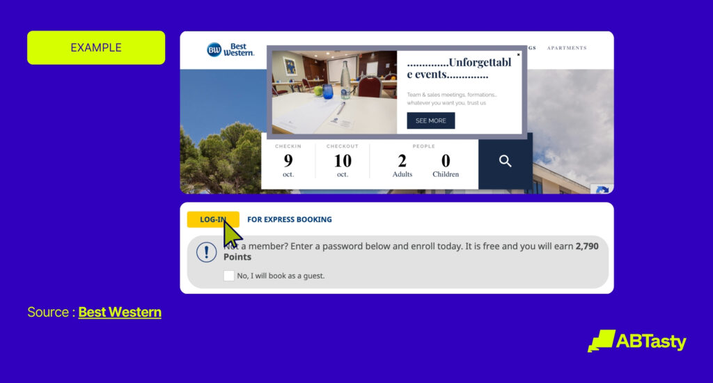
This is where we can learn from a leader in the industry, Best Western Hotels & Resorts. Their team wanted to encourage more visitors to sign up for their Best Western Rewards program. But instead of just showing the same generic pop-up to everyone, they got smart. They used data from their visitors’ search queries to create relevant, timely offers.
Here’s how it worked: a visitor searching for a one-night stay might be a business traveler with a specific need. But a visitor searching for a stay of two nights or longer is likely a leisure traveler with more flexibility. Best Western created different audience segments for these users. The leisure traveler looking for a longer stay was shown a pop-up with a special promotional offer, available only by signing up for a Rewards account. The result? A 12% increase in sign-ups from the campaign. They didn’t just shout about their loyalty program, they showed visitors exactly how it could benefit them, right when they were most receptive.
Make ‘book now’ the easiest click of their day
You’ve welcomed your visitor, understood their needs, and presented them with the perfect offer. Now comes the most critical moment: the booking. All the great work you’ve done can be undone in an instant by a clunky, confusing, or frustrating checkout process. At this stage, your one and only job is to remove friction.
Sometimes, the biggest barriers are the smallest things. The travel company Smartbox believed the “Add to Cart” CTA on their vacation packages wasn’t visible enough. They formed a simple hypothesis: a more vibrant, contrasting color would draw more attention and, therefore, more clicks. Using a simple A/B test, they changed the button color from aqua to a bright pink. This tiny change generated a 16% increase in clicks. It wasn’t a guess, it was a data-backed decision that made the user’s path clearer.
Similarly, Evolve Vacation Rental tested the copy on their call-to-action button for homeowners interested in listing their properties. The original read “See if You Qualify,” while the variation said “Start for Free.” The new phrasing, which better aligned with the user’s goal of understanding the service, resulted in a staggering 161% increase in conversions. These tests prove that you don’t need a complete redesign to see dramatic results. You need a willingness to question every element and let your users’ behavior guide you to the better option.
The journey doesn’t end at the confirmation page
What if the most hospitable digital experiences are the ones that know when to stop being purely digital? The goal isn’t just to build a self-service journey, but to create one that’s smart enough to recognize when a guest is confused or frustrated. Instead of letting that friction lead to an abandoned booking, you can proactively offer a human interaction to guide them through it. This is about augmenting the digital journey with a personal touch, right when it’s needed most.
The most forward-thinking brands understand that their website and physical properties are not separate channels, they are two parts of one holistic experience. We can draw inspiration from the travel agency Havas Voyages. Their team implemented a clever strategy for users who showed “exit intent”. Instead of just letting them go, a pop-up appeared offering them an appointment with a travel planner at their nearest physical agency. They saved a potential lost lead by seamlessly offering a human alternative.
The application for a hotel is incredibly powerful. Imagine a user struggling on a complex booking page and showing signs of leaving. What if, instead of losing them, you triggered a pop-up offering a “live chat with our concierge” or a “call back from the front desk within five minutes”? This is more than a conversion-saving tactic; it’s a brand-defining moment. It shows that your hospitality isn’t confined to your lobby. It proves your team is ready to help, across any channel, at any time. By blending your digital tools with a human touch, you build a unified brand experience that creates trust and earns loyalty.
Ready to find your better? We help teams like yours turn brave ideas into brilliant results. Let’s talk about what you want to achieve.
