During software development, software goes through a series of stages. Testing, for its part, is a critical stage of the software development life cycle as it can determine the quality of the software that is to be released to live production environments.
In this article, we will be focusing on test environments and the types of testing that can be run in such environments and why test environments are an important part of your software pre-release strategy.
What is a test environment?
Once software tests are designed, they need an interface where they can be run or executed; this is what is referred to as a test environment.
A test environment is basically a combination of hardware, software, data and configurations in order to run tests.
Test environments need to be configured according to the needs of the software being tested and must be set to ensure that the software operates in the right conditions. In other words, there is no one-size-fits-all solution as it is the code that dictates the environment’s setup.
Thus, no two test environments are the same as they require a different setup to test different parts of the code- the parts that make the whole.
Certain test cases may also require the environment to be prepared according to a particular set of data. This is what is referred to as a test bed. Thus, a test bed is a test environment prepared with test data to help you identify cases requiring a particular data setup.
The main purpose of such environments is to allow QA teams to check system components and uncover errors and issues so the environment must closely replicate real user conditions. Once issues are detected, they can be fixed without affecting real users and negatively impacting their experience.
The elements of a test environment include the following:
- The software to be tested
- Test data
- Network configuration
- Device on which the software is to be tested
- Database server
Types of environments
Before we delve deeper into test environments, we will first discuss the types of environments that precede and follow test environments. In this context, environments refer to the server location of the application or software, which are divided according to the state of the software.
Generally speaking, there are four types of environments in software development:
- Development
- Testing
- Staging
- Production
We will briefly go through each of these environments to better understand how they are linked to distinct stages in the release process.
Development environment
As the name suggests, this is where the development of the software takes place. It is the first environment where developers write the first lines of code and do all the code updates.
This environment usually consists of a server that is shared by several developers working together on the same project.
Therefore, when multiple developers are involved, a developer would have a copy of the source code on their own machine and then changes are submitted to the repository which are then integrated into the trunk or branch.
A number of preliminary testing takes place at this stage before moving on to the next stages.
For example, if developers have adopted a continuous integration methodology for their software development process then several changes daily would be committed to the trunk.
Testing environment
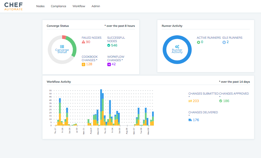
The testing environment allows QA engineers to test new and changed code whether via automated or non-automated techniques.
Development environments are ever-changing as developers keep adding new functionalities which makes it difficult for QA teams to run time-consuming tests so a testing environment is where they can execute more complex and time-consuming tests.
The code at this stage usually goes through more than one QA environment where unit tests are first conducted and the code is moved to further test environments.
Thus, you can either run tests one after the other or you can create several testing environments that allow for parallel testing to take place, depending on the sophistication of your testing environment.
More details about the different types of software tests will be discussed in the next sections.
Nonetheless, the focus here is testing individual components rather than the entire application, to check the compatibility between old and new code, the system’s performance and so on.
If there is a test failure, the faulty code can be removed in this environment. Thus, testers can ensure the quality of the code by finding any bugs and reviewing all bug fixes. However, if all tests pass, the test environment can automatically move the code to the next deployment environment.
Staging environment
This environment is a nearly exact replica of the production environment so it seeks to mirror an actual production environment as closely as possible to ensure the software works correctly.
The staging environment is often restricted to a small number of selected users and so it is limited to certain IPs and developer teams.
The purpose of this environment is to test on a near-production level but in a non-production environment to verify that the application will behave correctly after deployment. Thus, it represents a safe space away from the public eye to make sure everything works as expected; it is kept invisible from end-users.
The focus here is to test the application or software as a whole. In other words, staging environments are where you can conduct tests to ensure that no problems come up in production and limit negative impact on users there so that when the software is deployed to the production environment, there will be fewer errors to fix.
Examples of the kind of test that can be run in this environment include smoke testing and in particular load testing since it can be difficult to replicate high volumes of traffic in a staging environment to test the software or application under stress.
However, keep in mind that a staging environment is not meant to be a substitute for a real-world production environment.
To ensure your product works as it should, you need both a testing and staging environment, where the testing environment makes sure that every component does its job while the staging environment ensures that your software would behave correctly in an environment almost exactly the same as production.
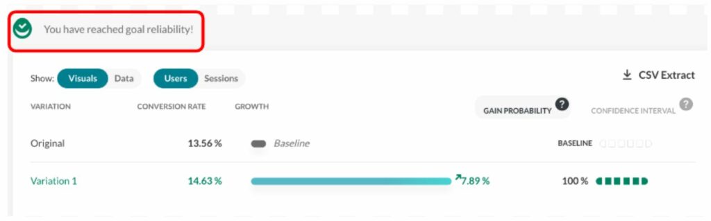
While you can run many tests in a staging environment, the best way to truly determine how a feature performs is to test it on users in real-time, for example, through testing in production.
Production environment
This is where the software is produced and is running on a production server. It has officially gone live to real users.
When deploying a new release to production, rather than immediately deploying to all users, the release can be deployed in phases to a segment of your users first to see how it performs to catch and fix any additional bugs before deploying to the rest of your users.
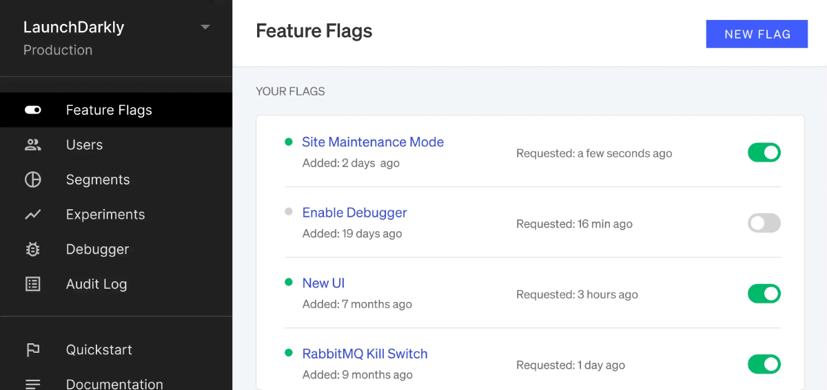
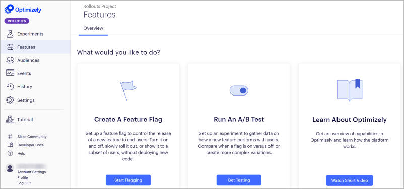
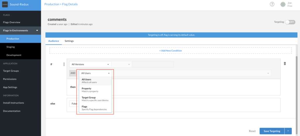
In other words, just because you’re in the production environment, it doesn’t mean tests have to end here. You can and should still be testing in production. This can be done with the help of feature flags, which allow you to safely test in production on a pre-selected number of users.
Now that we’ve covered the main environments a software progresses through in its lifecycle, we will turn back to test environments and the type of testing that can be conducted in that particular environment.
Why is software testing required?
While we’re big advocates of testing in production, we acknowledge that some cases require dedicated test environments before moving forward onto production environments.
Before we move further to the types of software tests, it is important to shed light on why software testing is an essential modern software development practice. Choosing to skip this process is not advisable and may end up negatively impacting your products and business.
Before we move further to the types of software tests, it is important to shed light on why software testing is an essential modern software development practice. Choosing to skip this process is not advisable and may end up negatively impacting your products and business.
Below are just some of the reasons why software testing is so imperative nowadays:
- Cost effective– testing your software will end up saving you money in the long run as testing the software will allow you to uncover bugs early on when it would cost less to fix them.
- Security– software testing ensures that the software you’re releasing is free of any issues and thus you can guarantee your customers that your products are trust-worthy and safe to use.
- Product quality-as software goes through continuous and diversified levels of testing, this ensures that bugs are detected along the software’s development process resulting in higher quality products.
- Customer satisfaction– one of the main reasons tests are conducted are to ensure they provide the best user experience possible by making sure that the releases are stable and without any issues thereby achieving customer satisfaction.
- Continuous delivery– an efficient setup of software testing would allow developers to push code changes into a CI/CD pipeline to go through the various levels of testing. If the code passes the tests, it can be automatically into production and if it fails it would notify developers so that they fix the issue. In other words, setting up automated testing allows you to maintain continuous delivery and to deliver higher-quality releases to end-users quickly.
Meanwhile, having a test environment to run these tests is essential as it provides you with a dedicated environment where you can isolate the code and verify the behavior of the application so it provides you with accurate feedback about the quality and performance of the software you’re testing.
Types of software testing
There are different types of tests that help analyze various elements of the software such as performance, security and user experience.
While a staging environment allows teams to replicate real testing conditions, tests will still need to be run beforehand to test its individual components to make sure that it all works well together to satisfy quality assurance requirements.
Below, we will highlight some of the most common tests which can be run during the software’s lifecycle:
Performance testing
These tests measure how fast an application responds to an interaction and so various aspects of the application such as page load speeds, stability and reliability are tested so that developers can make improvements as needed.
System integration testing
The main purpose of this testing is to ensure that all modules of an application work together smoothly and can communicate with each other. The interaction with the database is also tested.
Thus, it is all about making sure that the individual parts can function together as a whole.
User acceptance testing (UAT)
This testing is conducted to ensure that the application meets the business requirements of users and to ensure that functionalities of the application achieves customer satisfaction. UAT requires the whole application to be up and running and so usually represents the final stage of testing.
This type of testing also usually requires a staging environment- identical to a production environment but not accessible to end-users.
Alpha testing
After user acceptance testing is carried out within the development and product teams, testing can be expanded to include other kinds of users.
During Alpha testing, the release is tested outside of the teams involved in the project. It is typically conducted on internal users or employees within the organization and is usually followed by beta testing.
This test helps identify any bugs or issues before finally releasing the software to the end-user.
It attempts to simulate a real user environment by carrying out the same tasks and operations that the actual user will perform within the release to make sure it satisfies all of its functionalities.
Beta testing
In this testing environment, the software is released to a limited number of real-world users outside the organization to obtain their feedback which is then forwarded back to developers to optimize and improve the release as needed before releasing to all users.
It also tests the application or software under stress, where such load testing will help uncover any bugs that were not previously spotted.
Read more: Difference between alpha and beta testing
Test environments best practices
As we’ve seen, testing is an essential part of the software development life cycle and so test environments must be efficient and reliable to ensure the quality of your products and they must be well-managed.
In this section, we’ll highlight some of the essential best practices for test environment management:
First, it is important you start testing early on in the development process. In other words, don’t wait too long to run tests on every commit.
Otherwise, when teams don’t test early, they end up with a number of bugs later on and at that point fixing these bugs would require a lot of time, cost and effort.
Second, try to reduce manual processes by introducing more automation as that will save you time and resources while your team can dedicate their time to building and improving the product instead of tedious manual tasks.
Furthermore, before creating yet another new test environment, verify if it’s possible to use an existing one. If you already have an existing infrastructure, then that will go a long way in saving you time and money.
Another thing to verify is that you actually have all the required software and hardware, which includes physical servers, licenses, operating systems, etc.
It also goes without saying that you need to consider how to ensure the maintenance of the test environment such as who’s responsible for its maintenance and how to ensure the reliability of the environment.
The main takeaway here should be to…
Test, test and then test some more starting early on in the software development process.
To reiterate, test environments represent an efficient and a safe space to conduct all your essential and most basic tests.
However, don’t forget that just because you think you have run a sufficient number of tests in your test environment that you should discard testing in production altogether.
Yes, test environments are great for ruling out bugs early on but they are not an actual production environment. The best way to guarantee the quality of your products is to test them on a segment of your users during production, i.e in the production environment.
You can now do this safely with feature flags, which allow you to test on a small segment of users and disable any buggy features instantly.
Find out how AB Tasty leverages the power of feature flags to safely test new features in production by signing up for a free trial now.