You may not be aware of this, but it’s likely that you’ve come across the serial position effect on more than one occasion.
A concept coined by renowned psychologist, Hermann Ebbinghaus, the serial position effect refers to how the location of an item in a sequence influences a person’s memory or recall.
The concept dictates that people usually remember items at the beginning or the end of a list or sequence with greater accuracy than those in the middle.
User experience (UX) designers leverage the serial position effect to improve their designs and create a richer, more seamless experience for consumers. This approach to digital design is present in the websites, apps or landing pages of iconic brands such as Apple, Nike or Electronic Arts (EA).
Here we’re going to explore the serial position effect in more detail, explore some notable design examples, and consider how you can use this powerful principle to improve your brand’s UX offerings.
What is the serial position effect?
When it comes to UX optimization, the order of things matter. As humans, we do indeed tend to remember the items near the start or end of a list — much like our brains respond well to storytelling.
Hermann Ebbinghaus coined the phrase based on in-depth studies on the short as well as long term memory and its impact on how we remember or perceive information. These studies were further developed by psychologists B.Murdock in 1962 and Glanzer & Cunitz in 1966.
These extensive studies resulted in the two vital serial position effect concepts: the primacy effect and the recency effect.
Primacy effect
The primacy effect is based on the discovery that an individual is likely to recall items, assets or information from the start of a list.
For instance, when someone attempts to remember something from a long list of words, they are likely to recall the terms words listed at the beginning, rather the middle.
As such, the primacy effect helps a user to remember the information they absorb first better than the information they see later on in their journey (further down a landing page, for example).
Recency effect
Essentially, the recency effect is a concept contrary to the primary effect. Rather than recalling information absorbed earlier on, the recency effect is based on the notion of people remembering the information they see last with more clarity. This model is dependent on short-term memory.
A mix of studies suggests that the recency effect is prevalent in the courtroom. In many cases, jurors are more likely to recall, and agree with, the argument or conclusion they hear last.
In a UX design context, for instance, a potential customer will recall the last two items they saw on a personalized product recommendation carousel and purchase one of these products as a result.
The primacy and recency effect combined make up key elements of the serial position effect, which brings us onto our next point.
Applying the serial position effect to design
Now that you understand the fundamental concepts of the serial position effect, we’re going to consider how you can apply it to design — or more specifically, to user design interfaces.
Both the primacy and recency effect can have a significant impact on the design of user interfaces. Extensive lists of information put a strain on the human memory, often hindering perception and recall; and, by utilizing both ends of the serial position effect spectrum (primacy and recency), you can enhance your designs significantly.
By understanding that items or assets in the middle of a sequence are usually absorbed the least, it’s possible to leverage the serial position effect to minimize the loss of information. In doing so, it’s possible to create interface designs that are richer, more valuable, and easier to navigate.
Considering that 38% of consumers will bounce off a web page if its layout is poor or unattractive, getting your design right will prove critical to your long term success.
Applying the serial position effect to your interface design process is at its core, down to ensuring that users can navigate the items or information on your page intuitively.
If your design is digestible, fluid, and seamless, users will recall vital information with more clarity while taking desired actions like signing up to a newsletter or buying a specific product.
Here are four essential principles of applying the serial position effect to interface design:
1. Provide practical, task-relevant information
Adding and maintaining task-relevant information to your interface will not only make your design more engaging, but it will reduce the strain on users’ focus or recall.
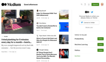
Medium User Interface (Source)
Publishing platform Medium, for instance, has designed its user interface to simplify its interactions from a reader’s as well as a writer’s perspective.
With a host of visual tools tailored to the users’ preferred topics or interests, you gain a visual snapshot of information that offers access to relevant content and to your reading list, and allows you to create a new piece of content with swift, seamless actions.
2. Add recognizable cues
Adding dynamic cues to your user interface design minimizes cognitive strain while facilitating informational recall.
Audible notifications (e.g. pings when you receive a message) or textual cues (e.g. small informational pop-up boxes) create a real sense of recognition. Video games like ‘Need For Speed’ or ‘Broken Sword’ are excellent examples of cue-based design for user interfaces.
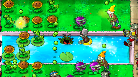
Plants vs Zombies EA video game (Source)
EA Games’ once popular ‘Plants vs Zombies’ game, for instance, utilizes a multitude of recognizable visual and audio cues to help players navigate their way through the game and remain ‘in the moment’ without pushing them to their cognitive limits.
Foley-style sounds unique to each move the player makes (planting sounds, digging sounds etc.), text-based captions that tell the player what to expect next, and visual icons at the top of the screen all work cohesively to make the user experience feel as natural as possible. You can apply similar cues to e-commerce sites to enrich your designs and make them more intuitive.
3. Reduce the level of recall required
The human attention span has its limits and, typically, can only retain five pieces of information at any one time.
If you prioritize limiting the necessity for recall, you will guide users through their journey in a way that helps them remember relevant information as and when required.
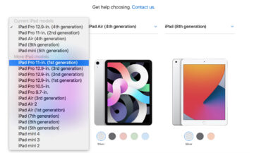
Apple website’s information selection (Source)
Technology colossus Apple utilizes a visual grid system with informational titles and scannable dropdown boxes to help its customers comprare models with ease and pick a product that suits their specific needs. At any one point in the interface journey, users are only presented with the information they need — details including essential specs, main comparisons, and price.
This simple yet effective design prioritizes the most valuable information, minimizing the need for recall in the process.
4. Emphasize essential information at the start and end
Playing directly into the hands of the primacy and recency effect, highlighting or placing the most essential information at the start and the end (or the top and bottom) of your interface, placing the less important items in the center.

Amazon Homepage (Source)
World-renowned e-commerce leader Amazon, for example, displays digestible personalized prompts, commands, and information at the top of its homepage.
In the center of the page, you gain access to trending products and deals. At the bottom of the page, or interface, you’re presented with personalized suggestions based on your shopping history or browsing behavior:
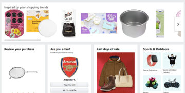
Amazon cross selling (Source)
This design technique maximizes the potential for users to recall the information that offers the most value or is likely to prompt further engagement. An effective approach that enriches the user experience while increasing the chances of regular consumer conversions.
“Design used to be the seasoning you’d sprinkle on for taste; now it’s the flour you need at the start of the recipe.”
— John Maeda, design & UX expert
Serial position effect for landing page UX
From the user interface design methods we’ve explored, it’s clear that the order, as well as the way you present information, have a significant impact on how people interact with your brand or business.
In today’s hyper-connected digital age, your UX offerings count more than ever. 88% of users are unlikely to return to a website or landing page after a poor user experience.
To enhance your landing page UX and create an experience that will increase engagement while encouraging customer loyalty, you should consider implementing the serial position effect.
To reiterate the impact the serial position effect can have on landing page UX, here’s a visualization of the serial position curve.
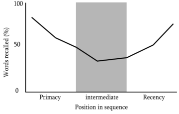
Serial position curve (Source)
From a digital marketing perspective, the serial position curve clearly demonstrates that people recall information towards the start and end of an informational sequence, with items or messaging in the middle of a landing page absorbed least. It’s a steady consistent curve that can offer a practical framework for your landing pages’ UX designs.
Russian e-commerce brand, Marc Cony, uses the serial effect methodology to increase new user engagement through its primary landing page.

Marc Cony homepage highlighting discount information (Source)
Here, you can see that the landing page design is clean and minimal to simplify user navigation while highlighting its most engagement-driving messaging as soon as you visit.
As you navigate your way down the landing page, there is a clear hierarchy of information. Scroll down and you’re presented with the opportunity to personalize your shopping experience, before viewing content surrounding the brand’s blog and social media pages.
Finally, there is a clean, concise call to action (CTA) button that prompts you to sign up to the brand’s newsletter and ‘convert.’ This is an excellent example of how using serial effect principles can create a seamless user experience while guiding consumers towards a desired action — in this case, viewing sale items or becoming an email subscriber.
Online retail innovator, Thread, offers an interactive and visually-rich approach to reduce consumer recall and optimize its landing page for increased brand engagement.
Thread’s clean, grid-based design is easy to scan and it’s above the fold messaging prompts the user to take action without having to second-guess themselves.
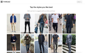
Thread homepage visually-rich approach
This interactive approach offers personal value while offering an incentive to interact. Clicking on preferred styles requires minimal recall and, as such, keeps the information at the top of the page fresh in the mind of the consumer.
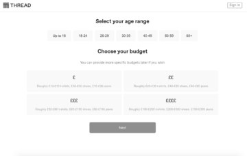
Thread website, subheadings navigation
Once you’ve selected your preferred styles, you’re directed to a new landing page. Clear subheadings help you navigate your way through the page with minimal cognitive strain, and once you reach the bottom, the ‘Next’ CTA tells you what to do.
This approach to the serial position effect helps to streamline the user experience while keeping consumers engaged in the brand at all times.
A well-crafted informational hierarchy and interactive visual approach is a testament to the power of presenting information effectively without overwhelming the user with unnecessary data. This is definitely a driving force behind the startup’s ongoing success!
Thread’s landing page is a solid example of a UX-boosting concept known as ‘priming’. Read our practical guide on priming users expectations to improve UX to find out more.
Whether you’re selling goods or services, applying the serial position effect will help you improve your landing pages’ UX and increase your conversion rates.

The Digital Marketing Institute, primacy and recency effect on Homepage (Source)
Digital marketing course provider, the Digital Marketing Institute, utilizes both the primacy and recency effect to UX optimize many of its landing pages.
The DMI’s homepage, for example, includes a clearly labelled ‘Download Brochure’ button at the very top of the page. The main banner tells the user exactly what the brand does and how they will benefit from enrolling (using a second ‘Download Button’ to prompt action), thus leveraging the primacy effect to encourage conversions.
At the bottom of the landing page, the Digital Marketing Institute includes graphics showcasing its top-level clients to create a sense of brand authority that sticks in the consumers’ mind while providing clear, concise FAQs in a clean dropdown format.
This recency effect-style approach ensures that visitors can recall essential details about the courses the DMI provides while remembering the impressive clients that brand has served.
Applying the serial position effect to your landing pages will give your UX design and content concepts definitive direction, improving navigation and boosting engagement in the process.
To build on the examples we’ve explored, here are some additional tips based on the serial position effect to help you improve your landing page UX:
- Place your most expensive items or services at the top of your landing page to make your mid-range items or services appear less expensive and increase your average order value (AOV).
- Add an alluring image, strapline, and CTA button to your top of page banner to deliver important information in a way that minimizes cognitive strain and increases consumer conversions.
- Break up the text in the middle of the page with subheadings, images, bolded or italicized font, bullet points and small chunks of text to make your UX design more navigable. Doing so will also increase your chances of leading consumers to important information further down the page.
- Position valuable information and USPs towards the bottom of the page and use informational CTA buttons to tell the user what to do next.
- Always ensure that your landing page design is clean, logical, and easy to navigate. If you don’t put functionality first, it’s likely that your UX offerings will be poor and your visitors will not retain any information.
How to use experimentation in design
Applying effective design and copywriting principles to your various digital touchpoints while leveraging the serial position effect to deliver valuable information to your consumers will accelerate your commercial success.
But, in an increasingly saturated digital age where the consumer has a wealth of their fingertips, how do you know if your design and serial position effect-based efforts are working as they should?
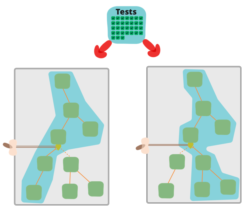
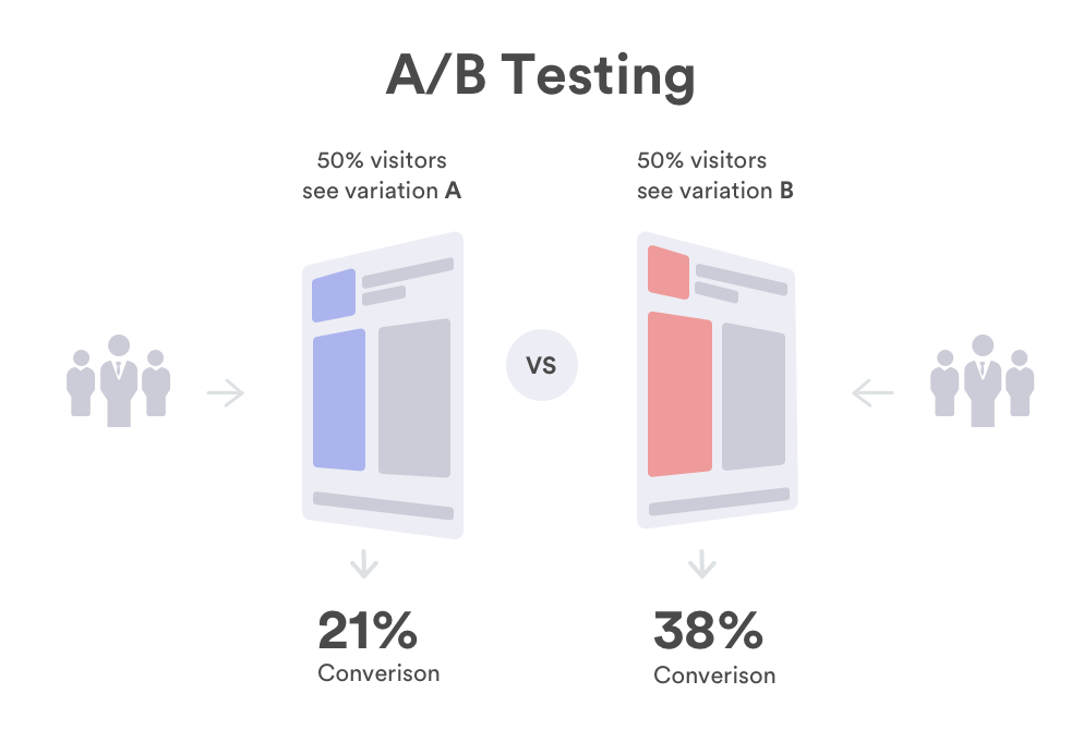
A range of factors including color, layout, design elements, and even a consumer’s cognitive bias can impact landing page browsing behavior. So, the best way to understand if your initiatives are working and experiment with design effectively is though A/B testing. With a combination of effective data and the right A/B testing platform, it’s possible to pinpoint a specific landing page or user interface’s strengths or weaknesses.
By developing two versions of the same landing page, you can drill down into specific page elements and discover which performs best.
For example, you might find that version ‘A’ of a landing page is earning more engagement above the fold due to the design or placement of a ‘Shop Now’ button. Through testing, you might also find that version ‘B’ is converting more email subscribers as a result of a particular piece of copy or messaging.
If you hone in on this wealth of comparative information, you will gain the power to experiment with every design element imaginable, taking the best-performing elements to create a fully-optimized version of a specific page or touchpoint.
A/B testing will give your design experimentation activities shape while protecting your marketing budget.
If you understand which messaging or design elements to focus on, you can get to the root of the issue and make tweaks for optimizations that are likely to offer the best possible return on investment (ROI).
Concerning the serial position effect, through A/B testing and experimentation you will be able to flatten the serial position curve to balance the information on your interfaces or landing pages.
By balancing the information elements on your interfaces or landing pages, you can make your UX designs easier to navigate while improving brand engagement. You will also gain the ability to experiment with design elements to emphasize the information or assets featured at the top or bottom of your digital touchpoints.
Essentially, if users aren’t engaging with the information at the top or bottom of a specific page, it will become clear that your serial position effect-centric efforts aren’t working. From there, you can experiment with the hierarchy of your information in addition to design elements including buttons, color combinations, imagery, copy formatting, and text boxes.
At this point, it’s worth noting that in our ever-evolving commercial landscape, experimentation never stops. What works today may not tomorrow — and to optimize your digital touchpoints for sustainable growth, constant testing and evolution is essential.
“Design creates culture. Culture shapes values. Values determine the future.”
— Robert L. Peters, Graphic Designer
Final thoughts
We’ve outlined the fundamentals of the serial position effect and looked at how to apply the concept to UX and landing page design while outlining the importance of experimentation and testing.
Reflecting on our journey, what is crystal clear is that, in order to deliver the very best designs and UX offerings to your consumers, you need to reduce cognitive strain as much as possible.
The serial position effect helps us to understand human limitations in terms of both long term and short term memory, as well as the importance of ordering your information effectively.
As designers, when applying the serial position effect, it’s critical to empower the user by providing task-relevant information on the screen where possible, sharing concise prompts or cues, reducing the level of recall needed across the user journey, and highlighting the most valuable information at the start and end of a sequence where necessary.
When interacting with your digital touchpoints or interfaces, your users shouldn’t be overwhelmed with information. They should be able to navigate every aspect of your interfaces or landing pages intuitively, with little additional thought, while understanding what to do next and why they are doing it.
Your UX and design offerings should deliver relevant, valuable information to your users in a way that is completely seamless — and, by using the serial position effect to guide your decision, you will set yourself apart from the competition.
Discover more business-boosting advice, read our complete guide to A/B testing.

 Sarah Davis