Statistical significance is a powerful yet often underutilized digital marketing tool.
A concept that is theoretical and practical in equal measures, you can use statistical significance models to optimize many of your business’s core marketing activities (A/B testing included).
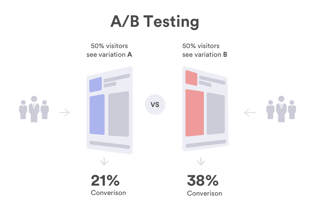
A/B testing is integral to improving the user experience (UX) of a consumer-facing touchpoint (a landing page, checkout process, mobile application, etc.) and increasing its performance while encouraging conversions.
By creating two versions of a particular marketing asset, both with slightly different functions or elements, and analyzing their performance, it’s possible to develop an optimized landing page, email, web app, etc. that yields the best results. This methodology is also referred to as two-sample hypothesis testing.
When it comes to success in A/B testing, statistical significance plays an important role. In this article, we will explore the concept in more detail and consider how statistical significance can enhance the A/B testing process.
But before we do that, let’s look at the meaning of statistical significance.
What is statistical significance and why does it matter?
According to Investopedia, statistical significance is defined as:
“The claim that a result from data generated by testing or experimentation is not likely to occur randomly or by chance but is instead likely to be attributable to a specific cause.”
In that sense, statistical significance will bestow you with the tools to drill down into a specific cause, thereby making informed decisions that are likely to benefit the business. In essence, it’s the opposite of shooting in the dark.

Calculating statistical significance
To calculate statistical significance accurately, most people use Pearson’s chi-squared test or distribution.
Invented by Karl Pearson, the chi (which represents ‘x’ in Greek)-squared test commands that users square their data to highlight possible variables.
This methodology is based on whole numbers. For instance, chi-squared is often used to test marketing conversions—a clear-cut scenario where users either take the desired action or they don’t.
In a digital marketing context, people apply Pearson’s chi-squared method using the following formula:
Statistically significant = Probability (p) < Threshold (ɑ)
Based on this notion, a test or experiment is viewed as statistically significant if the probability (p) turns out lower than the appointed threshold (a), also referred to as the alpha. In plainer terms, a test will prove statistically significant if there is a low probability that a result has happened by chance.
Statistical significance is important because applying it to your marketing efforts will give you confidence that the adjustments you make to a campaign, website, or application will have a positive impact on engagement, conversion rates, and other key metrics.
Essentially, statistically significant results aren’t based on chance and depend on two primary variables: sample size and effect size.
Statistical significance and digital marketing
At this point, it’s likely that you have a grasp of the role that statistical significance plays in digital marketing.
Without validating your data or giving your discoveries credibility, you will probably have to take promotional actions that offer very little value or return on investment (ROI), particularly when it comes to A/B testing.
Despite the wealth of data available in the digital age, many marketers are still making decisions based on their gut.
While the shooting in the dim light approach may yield positive results on occasion, to create campaigns or assets that resonate with your audience on a meaningful level, making intelligent decisions based on watertight insights is crucial.
That said, when conducting tests or experiments based on key elements of your digital marketing activities, taking a methodical approach will ensure that every move you make offers genuine value, and statistical significance will help you do so.
Using statistical significance for A/B testing
Now we move on to A/B testing, or more specifically, how you can use statistical significance techniques to enhance your A/B testing efforts.
Testing uses
Before we consider its practical applications, let’s consider what A/B tests you can run using statistical significance:
- Emails clicks, open rates, and engagements
- Landing page conversion rates
- Notification responses
- Push notification conversions
- Customer reactions and browsing behaviors
- Product launch reactions
- Website calls to action (CTAs)
The statistical steps
To conduct successful A/B tests using statistical significance (the chi-squared test), you should follow these definitive steps:
1. Set a null hypothesis
The idea of the null hypothesis is that it won’t return any significant results. For example, a null hypothesis might be that there is no affirmative evidence to suggest that your audience prefers your new checkout journey to the original checkout journey. Such a hypothesis or statement will be used as an anchor or a benchmark.
2. Create an alternative theory or hypothesis
Once you’ve set your null hypothesis, you should create an alternative theory, one that you’re looking to prove, definitively. In this context, the alternative statement could be: our audience does favor our new checkout journey.
3. Set your testing threshold
With your hypotheses in place, you should set a percentage threshold (the (a) or alpha) that will dictate the validity of your theory. The lower you set the threshold—or (a)—the stricter the test will be. If your test is based on a wider asset such as an entire landing page, then you might set a higher threshold than if you’re analyzing a very specific metric or element like a CTA button, for instance.
For conclusive results, it’s imperative to set your threshold prior to running your A/B test or experiment.
4. Run your A/B test
With your theories and threshold in place, it’s time to run the A/B test. In this example, you would run two versions (A and B) of your checkout journey and document the results.
Here you might compare cart abandonment and conversion rates to see which version has performed better. If checkout journey B (the newer version) has outperformed the original (version A), then your alternative theory or hypothesis will be proved correct.
5. Apply the chi-squared method
Armed with your discoveries, you will be able to apply the chi-squared test to determine whether the actual results differ from the expected results.
To help you apply chi-squared calculations to your A/B test results, here’s a video tutorial for your reference:
By applying chi-squared calculations to your results, you will be able to determine if the outcome is statistically significant (if your (p) value is lower than your (a) value), thereby gaining confidence in your decisions, activities, or initiatives.
6. Put theory into action
If you’ve arrived at a statistically significant result, then you should feel confident transforming theory into practice.
In this particular example, if our checkout journey theory shows a statistically significant relationship, then you would make the informed decision to launch the new version (version B) to your entire consumer base or population, rather than certain segments of your audience.
If your results are not labelled as statistically significant, then you would run another A/B test using a bigger sample.
At first, running statistical significance experiments can prove challenging, but there are free online calculation tools that can help to simplify your efforts.
Statistical significance and A/B testing: what to avoid
While it’s important to understand how to apply statistical significance to your A/B tests effectively, knowing what to avoid is equally vital.
Here is a rundown of common A/B testing mistakes to ensure that you run your experiments and calculations successfully:
- Unnecessary usage: If your marketing initiatives or activities are low cost or reversible, then you needn’t apply strategic significance to your A/B tests as this will ultimately cost you time. If you’re testing something irreversible or which requires a definitive answer, then you should apply chi-squared testing.
- Lack of adjustments or comparisons: When applying statistical significance to A/B testing, you should allow for multiple variations or multiple comparisons. Failing to do so will either throw off or narrow your results, rendering them unusable in some instances.
- Creating biases: When conducting A/B tests of this type, it’s common to apply biases to your experiments unwittingly—the kind of which that don’t consider the population or consumer base as a whole.
To avoid doing this, you must examine your test with a fine-tooth comb before launch to ensure that there aren’t any variables that could push or pull your results in the wrong direction. For example, is your test skewed towards a specific geographical region or narrow user demographic? If so, it might be time to make adjustments.
Statistical significance plays a pivotal role in A/B testing and, if handled correctly, will offer a level of insight that can help catalyze business success across industries.
While you shouldn’t rely on statistical significance for insight or validation, it’s certainly a tool that you should have in your digital marketing toolkit.
We hope that this guide has given you all you need to get started with statistical significance. If you have any wisdom to share, please do so by leaving a comment.


 Sarah Davis