Article

6min read

What Does a Data Scientist Think of Google Optimize?

Note: This article was written by Hubert Wassner, Chief Data Scientist at AB Tasty.

Some of you may have noticed Google’s recent release of a free version of Google Optimize and asked yourselves if it will change the market for SaaS A/B testing tools, such as AB Tasty?

Well, history tells us that when Google enters a market, the effects are often disruptive – especially when the tool is free, like with Google Analytics or Google Tag Manager. To be clear, this new offer will be a free version of Google Optimise, with the premium version starting at around $150,000 per year. Also, note that neither the free nor the paid-for version of Google Optimize offer multi-page testing (i.e. test consistency across a funnel for example) and that Google Optimise is not compatible with native applications.

Before going any further, a disclaimer: I’m the chief data scientist at AB Tasty, the leading European solution for A/B testing and personalization and, therefore, in direct competition with Google Optimize. Nevertheless, I’ll do my best to be fair in the following comparison. I’m not going to list and compare all features offered by the two tools. Rather, I’d like to focus on the data side of things – I’m a data scientist after all..!

Let’s dig into it:

To me, Google Optimize’s first and main limitation is that it is based on Google Analytics’ infrastructure and thus doesn’t take the notion of visitor unicity into account. Google looks at sessions. By default, a session duration is fixed to 30 minutes and can be extended to up to 4 hours only. This means that if a visitor visits a website twice with one day between, or visits first in the morning and a second time in the evening, Google Analytics will log 2 different visitors.

This way of counting has two immediate consequences:

  • Conversion rates are much lower than they should be. Perhaps, a little annoying, but we can deal with it
  • Gains are much more difficult to measure. Now, this is a real issue!

Let’s have a closer look…

Conversion rates are much lower

People will normally visit a website several times before converting. For one conversion, Google Analytics (and by extension Google Optimize) records several different sessions. Only the visit during which the visitor converted is recorded as a ‘success’. All the others are considered ‘failures’. Consequently, the success rate is lower as the denominator grows. For Google, conversion rate is based on visits instead of visitors.

You can put up with this limitation if you make decisions based on relative values instead of absolute values. After all, the objective of testing is first and foremost to gauge the difference, whatever the exact value. The Bayesian model for statistics used by Google Optimize (and AB Tasty) does this very well.

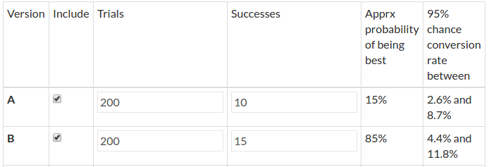
Say 100 visitors saw each variation, 10 converted on A and 15 on B.

screenshot1

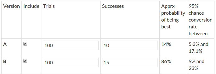
Based on these hypotheses, variation A is 14% more likely to be best. The rate reaches 86% for variation B.

Now say that the above conversions occur after 2 visits on average. It doubles the number of trials and simulates a conversion rate by session instead of visitor.

screenshot2

Results are very similar as there is just a 1% difference between the two experiments. So, if the goal is to see if there is a significant difference between two variations (but not the size of the difference), then taking the session as reference value works just fine.

NB: This conclusion stays true as long as the number of visits per unique visitor is stable across all variations – which is not certain.

It’s impossible to measure confidence intervals for gain with the session approach

Confidence intervals for gain are crucial when interpreting results and in making sound decisions. They predict worst and best case scenarios that could occur once changes are no longer in a test environment.

Here is another tool, also based on Bayesian statistics, that illustrates potential gain distribution: https://making.lyst.com/bayesian-calculator/

See results below for the same sample as previously:

  • 100 visits, 10 successes on variation A
  • 100 visits, 15 successes on variation B

graph1

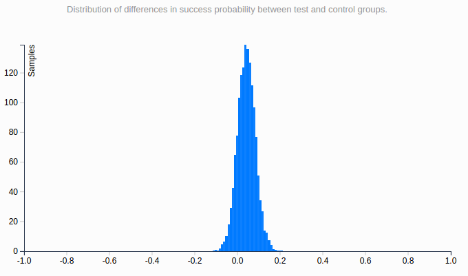
This curve shows the probability distribution of the real value of the gain linked to variation B.

The 95% confidence interval is [ – 0.05; +0.15 ], which means that with a 95% confidence rate, the actual value of the gain is above -0.05 and below +0.15.

The interval being globally positive, we can draw the same conclusion as previously: B is probably the winning variation but there are doubts.

Now let’s say that there are 2 visits before conversion on average. The number of trials is doubled, like previously – this is the kind of data Google Optimize would have.

Here is the curve showing the probability distribution of the real value of the gain.

graph2

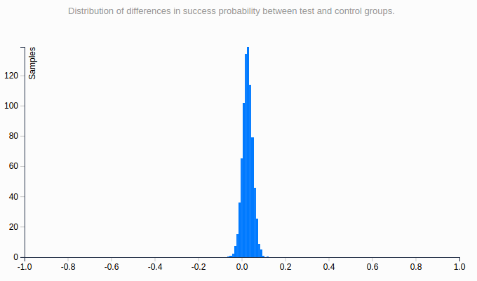
This distribution is much narrower than the other, and the confidence interval is much smaller: [ – 0.025; 0.08 ]. It gives the impression that it’s more precise – but as the sample is the exact same, it’s not! The bigger the number of sessions before conversion, the more striking this effect would be.

The root of the problem is that the number of sessions for a unique visitor is unknown and varies between segments, business models and industries. Calculating a confidence interval is, therefore, impossible – although it’s essential we draw accurate conclusions.

To conclude, the session-based approach promises to identify which variation is best but doesn’t help estimate gain. To me, this is highly limiting.

Then, why has Google made this (bad) choice?

To track a visitor over multiple sessions, Google would have to store the information server-side, and it would represent a huge amount of data. Given that Google Analytics is free, it is very likely that they try to save as much storage space as they can. Google Optimize is based on Google Analytics, so it’s no surprise they made the same decision for Google Optimize. We shouldn’t expect this to change anytime soon.

I’d say Google Optimize is very likely to gain substantial market share with small websites. Just as they chose Google Analytics, they will go for Google Optimize and gratuity. More mature websites tend to see conversion rate optimization as a game changer and generally prefer technology that can provide more accuracy – results based on unique visitors, real customers.

Overall, the introduction of Google Optimize represents a great opportunity for the market as a whole. As the tool is free, it will likely speed up awareness and optimization skills across the digital industry. Perhaps even the general understanding of statistics will increase! As marketers put tests in place and realize results don’t always follow outside the testing environment, they may very well look for more advanced and precise solutions.

Subscribe to
our Newsletter

bloc Newsletter EN

We will process and store your personal data to send you communications as described in our  Privacy Policy.

Article

9min read

5 A/B Test Case Studies and What You Can Learn From Them

AB Tasty’s note: This is a guest post by Umesh Kumar, digital marketing evangelist at Designhill.

A/B Testing isn’t a rocket science to understand and implement. It is just about testing two different versions of a page on your site to see which one attracts more audience. More than anything else, this test helps you know and understand your consumers better. After you run an A/B test, you will find that a few more have added in your earlier list of customers.

It surely is one of the best ways to improve your conversion rates. In fact, an article published in CrazyEgg.com reveals that using correct testing methods can increase conversion rates up to 300 percent. But it’s shocking that still, the majority of marketers choose not to use A/B test experiments. Don’t believe us? Check out the following stats:

Given these stats, it’s no surprise that many marketers steer clear of A/B testing for optimizing their site. But, how exactly can you optimize your conversions with A/B Testing? The answer is simple! Why not do what smart marketers do? Learn lessons from companies that have emerged as shining examples of A/B testing genius.

No matter what is the nature of your business, there is no harm in taking a step back and learning from others’ achievements. To help you, we have listed 5 classic case studies that will provide you with interesting test hypotheses and give you an insight on what and how visitors think. You can learn a lot from these case studies and use the learning to take on the conversion challenges in your way to success headfirst. These examples are quite simple to implement with any A/B testing tool.

Case Study 1: Conversions improve by 11.5% by Adding FAQs, Statistics and Social Proof on Websites

Test Carried Out By Kiva.org, an innovative non-profit organization, allows people to lend money via the Internet to low-income entrepreneurs and students across countries. Kiva conducted an A/B Test as they wanted to increase the number of donations from first-time visitors to their landing page.

Hypothesis: Giving more information to visitors coming to Kiva’s landing page will help boost the number of donors.

Result: Donations increased by 11.5% after adding an information box at the bottom of the landing page.

Version A – original: (left)

Version B: Addition of information box (FAQ, social proof & statistics)

ab-test-1

What You Can Learn from This Test?

Ensure that your landing page is designed in such a way that it answers all questions that a visitor may have. In this case, the information box at the bottom of the page helped the organization explain about themselves and their services, providing statistics. The information increased their trustworthiness and credibility as a site.

Case Study 2: 2.57% increase in Open Rates 5.84% Higher Click-through Rate (CTR) by Changing the Subject Line of an Email

Test Carried Out By Designhill.com, one of the fastest-growing peer-to-peer crowdsourcing platforms that connect graphic artists with design seekers. They did an email blast a few days before Christmas to promote its content and increase the click-through rate.

Hypothesis: Just mentioning the title of the blog in the subject line of the email would get the majority of click-through rather than requesting recipients to review the post with the blog’s title.

Just writing “Top 10 Off-Page SEO Strategies for Startups in 2015” in the subject line of the email would get the majority of click-through rather than writing “Check out My Recent Post – Top 10 Off-Page SEO Strategies for Startups in 2015”.

Result: The company was able to score 5.84% higher CTR and 2.57% higher open rate by including just the title of the blog in the subject line.

img_56cf0fba1f873

What You Can Learn From This Test:

Your subject line is the first thing the recipient of your email sees. Therefore, your subject line must have the power to entice the readers to open the mail and know more about your products or services. Because after all, it doesn’t really matter what your offer is if it is not opened by your readers. Therefore, choose your words wisely as they will have a higher impact on open rates and click-through. But it’s not only important to ensure great subject lines, but you must also ensure that your logo design is laid out in a way that vital information pop-up. For example, your logo design and contact details must be easily locatable. For another, CTAs and other links must be out of clutter. Read our Beginner’s Guide to A/B Testing your Emails.

Case Study 3:  49% Increase in CTR by Adding Text in the Call-to-Action Button

Test carried out by Fab, an online community whose members can buy and sell apparel, home goods, accessories, collectibles, etc.

Hypothesis: Making the “Add to Cart” button clearer (by adding text) will lead to an increase in the number of people adding items to their shopping carts.

Result: There was an increase of 49% in CTR over the original after the text “Add to Cart” was included in the CTA button rather than just an image or symbol.

In the following image, you’ll see that the original design (on the far left) features a small shopping cart with a “+” sign and no text. The two versions (middle and right) added text-based designs. Version A helped increase cart adds by 49% over the original.

img_56cf0fdd0a773

What You Can Learn From this Test:

Text connects better with visitors than images or symbols which may confuse them. Therefore, try and have a direct and clear CTA which will help consumers know of their actions.

It makes no sense to have a CTA that your visitors don’t understand. They don’t get to know what the button does actually.

Case Study 4: Conversion Rate Improved by 7.46% by Adding an Image Rather than a Blank Background. 

Test Carried Out By A company who wanted to check if customers get attracted to a blank background or one with pictures more.

Hypothesis: Using a photo in the background will lead to more conversions than a blank background.

Result: The conversion rate of the background with a photo was 25.14% as compared to 7.68% for the one without a photo.

img_56cf1044b8de0 img_56cf101ca63db

What you can learn from this test:

You must have heard that a picture is worth a thousand words. People love visuals and there could be no other better place than your site to impress them with the pictures of your products. Having an image of your product or service in the background of your site can drive conversions as they get to see (visualize) what they’ll be getting. Images hold the power to grab the attention of your audience and turn them into customers.

Case Study 5: Leads Increase by 256% after Having a Mobile-Optimized Landing Page

Test Carried Out By Rasmussen College, a for-profit private college and Public Benefit Corporation, who wanted to increase leads from Pay-Per-Click traffic on their mobile site.

Hypothesis: Creating a new mobile-friendly website, featuring a click-through menu, will improve conversions.

Result: Conversions increased by 256% after a new mobile-only (mobile responsive) site was made.

img_56cf10a3b0a5b

What you can learn from this test:

Hammad Akbar, founder of TruConversion.com says that “Unpleasant mobile experiences and a lack of mobile-friendliness makes 48% users believe that the company doesn’t care about their business.” A mobile-responsive website enhances the browsing experience of the site visitors. It is essential if you don’t want to lose customers just because your site took time to load. Keep the design of your site simple with only the basic information on the first page. Try and find different way of improving mobile navigation such as having a drop-down menu.

Conclusion

We hope that after reading this post, you are inspired to hold some amazing A/B tests on your own site. It is actually exciting and amazing to see what your customers like or dislike. But don’t forget that these tests are mere a guiding tool and nothing can replace your own tests and judgments about your visitors as well as the site. Remember, there is always a scope for improvement.

So, happy testing!

Download our guide to learn all there is to know about A/B testing!

Author Bio: Umesh Kumar is a digital marketing evangelist who works with Designhill, the fastest-growing custom design marketplace, to develop and execute their marketing strategies. He started his online marketing career in 2008 and is actively engaged within internet business modeling, website development, social networks, lead generation, search engine optimization, and search engine marketing. In addition, he loves blogging and shares his expertise about tips, tricks, and upcoming trends in the world of digital marketing. Get in touch Facebook | Twitter | Google+