Article

19min read

Examples of the Best Landing Page Designs in 2019

If you run a website, then you know how difficult it can be to convince a visitor to stay on your page and even more to convince them to buy! Your landing page’s design plays an important role.

How to choose your landing page’s design?

Designed to convert your visitors into leads or customers, landing pages focus visitors’ attention on your value proposition in order to get them to perform an action that you have previously determined: purchasing a product, filling out a form or participating in a free trial.

But with all the offers available and all the competitors that exist on the market, it can be hard to stand out from the crowd. For this, you must create a striking, persuasive landing page adapted specifically to your business.

Because we know it can be difficult to find inspiration before sitting down to design your future landing page, we have selected for you ten modern and efficient landing pages that convert in 2018.

If you have questions about landing pages and would like to learn more before you get started, check out our articles on landing pages with best practices and concrete examples.

These examples are taken from real sites; see for yourself! Of course, none of these landing pages is perfect: perfection does not exist, and it is up to you to adapt your design to your customers’ requirements. We also recommend you A/B test your landing pages.

10 examples of the best landing page design

LeadQuizzes

LeadQuizzes is a company specialized in selling “quizzes” designed to capture “leads”. We immediately notice the (very well designed) explanatory video of the service that answers basic questions such as:

  • What is it for?
  • Is it relevant to me?
  • What does it offer me?

Secondly, the orange call-to-action stands out from the rest of the page and very clearly invites you to click: “Try it Free” reassures us that we will not pay immediately and that there is a free trial. Find out more about the optimization of calls to action.

The social proof is obvious and well developed: the references are well-known market players, and the text indicates that more than 3 million leads have been generated via LeadQuizzes: it makes you want it!

Design Landing Page Lead Quizzes

Design Landing Page Social Proof

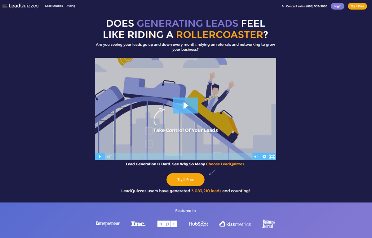
The rest of the landing page does not disappoint either: it is built around educating the visitor of the product’s usefulness. The goal: use a (big) page to convince visitors that LeadQuizzes’s service is powerful and used by the big players in digital technologies.

Design Landing Page Lead Quizzes Social Proof

Social proof is strongly highlighted on the LeadQuizzes landing page. It answers concrete and tangible questions that concern potential buyers:

  • How many more sales will I make?
  • How many new prospects can I capture?

GrowthHackers

GrowthHackers is a company that markets software to increase marketing teams’ productivity and coordinates business development actions and new ideas from innovative teams.

Similar to LeadQuizzes, the orange call-to-action stands out nicely from the rest of the page’s colors and invites action. We are also invited to a “free trial” to reassure a large number of visitors who would not be willing to pay until they have been convinced of the service’s usefulness.

Landing Page Design Growth Hackers

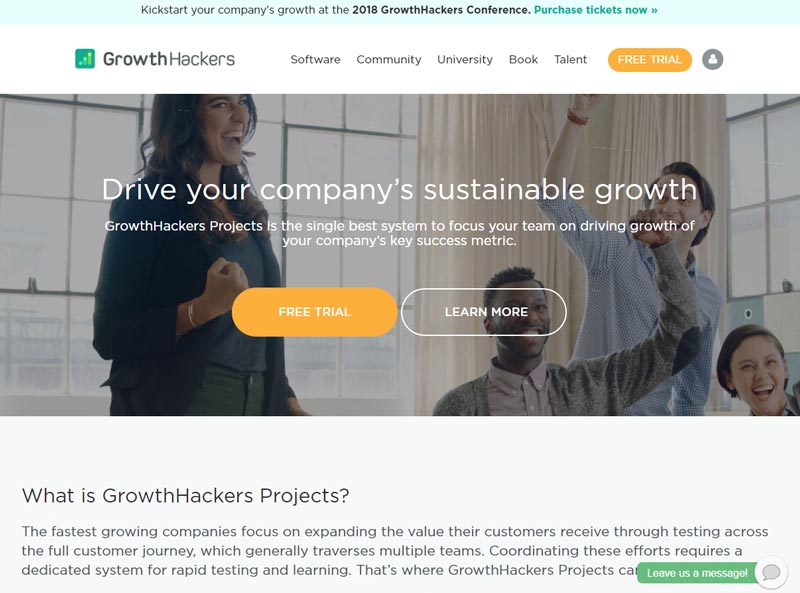
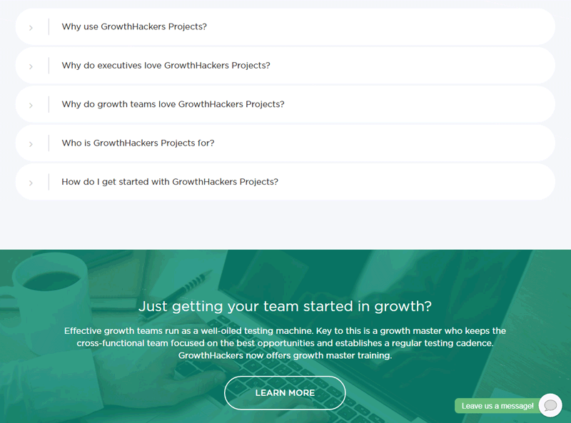
The landing page continues with navigation in the form of a drop-down menu that answers the main questions asked by potential GrowthHackers Project users.

  • “Why should I use the service? “
  • “Why do managers love the software? “
  • “Who is this service for? “

We also notice that a “chat” bubble is there to ask questions: a useful feature when we are undecided or have questions.

Landing Page Design Growth Hackers

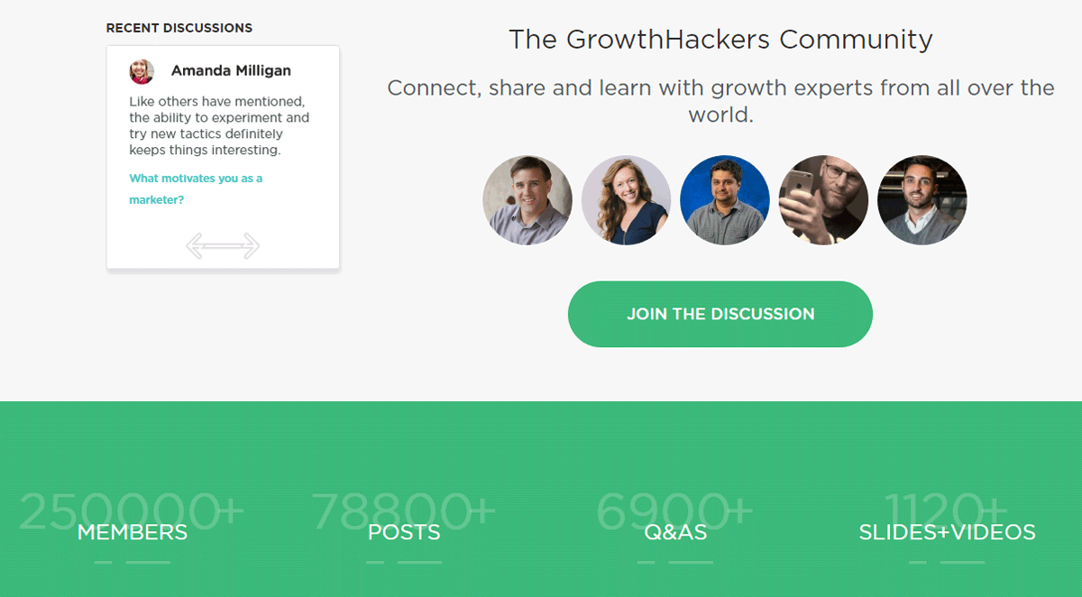
As for social proof, it is highlighted in two ways:

  • We see that a “community” exists around the service.
  • We see that many people use the service and are active in the community.

One could criticize, however, that the numbers may not be visible enough.
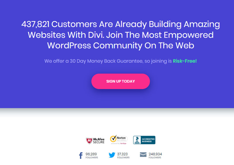
Landing Page Design Growth Hackers

ElegantThemes

ElegantThemes is a company specializing in selling WordPress templates or “themes” and also markets a “builder” called Divi, which allows users to create pages in WordPress visually. On this topic, see our examples of landing page templates for WordPress.

We immediately see the social proof: it is the first element put forward that reassures the visitor about the service’s popularity: more than 400,000 users according to the site.

Landing Page Design Elegant Themes

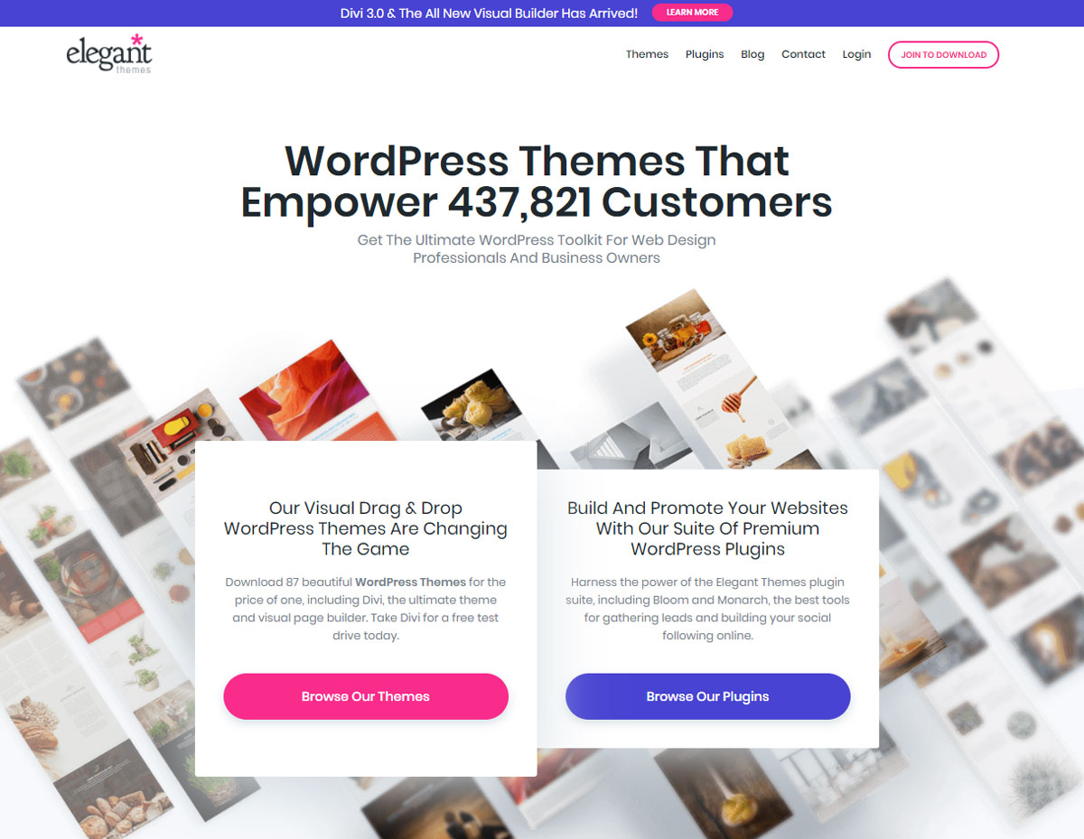
We then notice that the value proposition is twofold and that two separate call-to-actions were created for the occasion: one to discover the ready-made templates and another to discover the brand’s plugins.

Another interesting element: on the lower right side a conversation bubble appears, ready to answer questions that a visitor might ask.

The chat module is especially interesting since it also allows the user to send attachments, emojis, and GIFs which can only enhance the richness of the interaction.

Design Landing Page Divi Builder

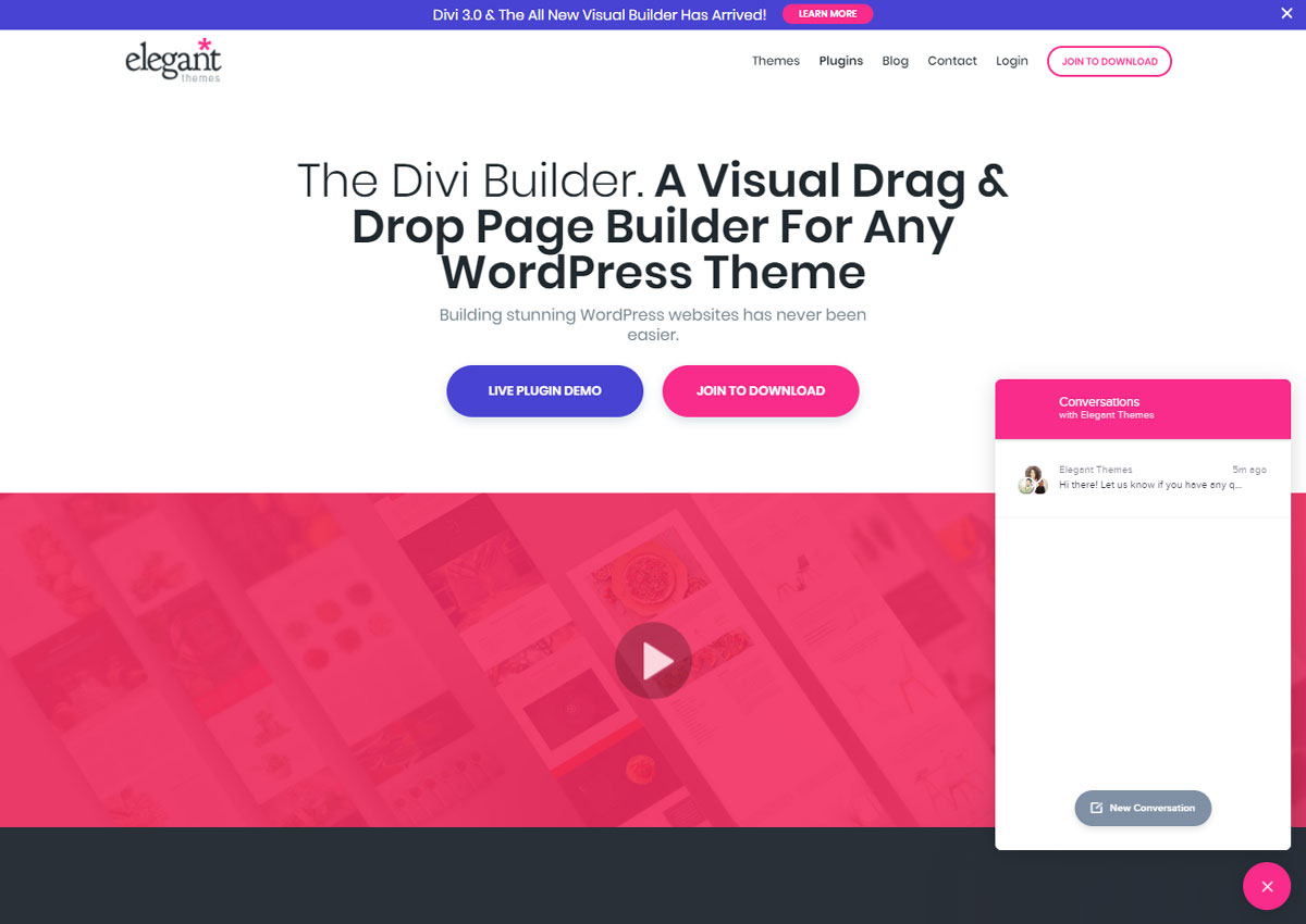
While browsing the landing page, visitors are offered the opportunity to try a “live” demonstration of the Divi Builder. This is a significant and compelling value proposition as users can discover the product directly without paying or even registering.

Example Landing Page Design

Further down on the landing page, the social proof is reiterated, and the paragraph contains an element intended to reassure potential buyers: a 30-day refund.

Additionally, the red-pink call-to-action contrasts with the blue background of the page, reinforcing our curiosity: we are visually attracted to the button placed in the center of the page.

Shopify

Shopify is a CMS that allows you to quickly and easily create e-commerce sites without programming knowledge. They stand out with their numerous resources available to users (guides, videos, podcasts, forums) as well as additional services that complement their core business: a store of ready-to-use “themes”, a library of free photos, etc.

Design Landing Page Shopify Hero Image

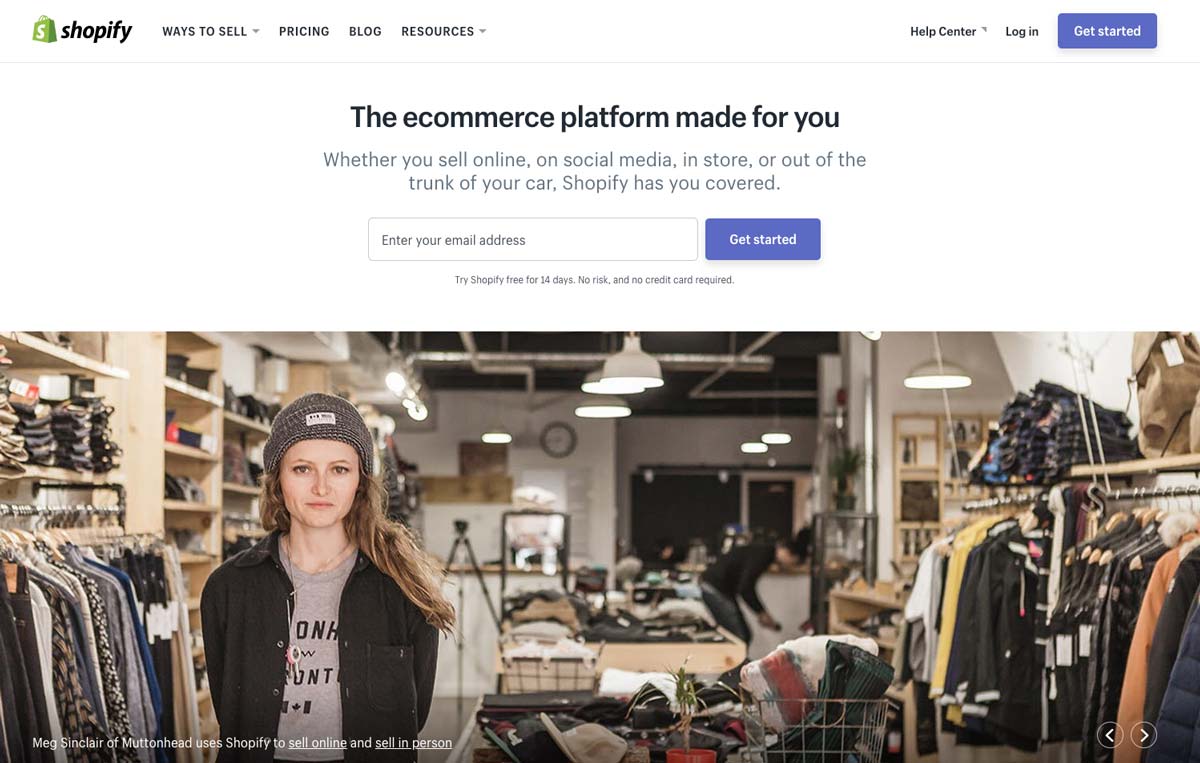
On the landing page, the value proposition is immediately put forward: “the e-commerce platform made for you”. The idea is therefore to address a large, often independent audience as evidenced by the photo illustration.

The special feature of this landing page is that the call-to-action contains a field for an e-mail address. This field is required to access the 14-day free trial offered just below that specifies that no credit card is required for the test: it is a major argument.

Design Landing Page Shopify Value Proposition

Design Landing Page Shopify Value Proposition

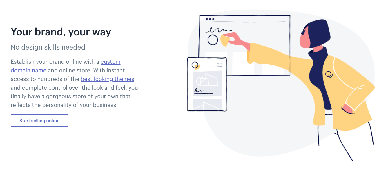
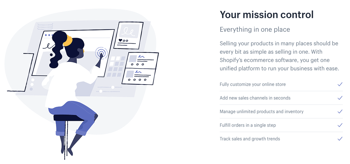
The rest of the landing page focuses on the features of the Shopify service.

With unique illustrations and short paragraphs, the company presents Shopify’s features and benefits to convince visitors to take advantage of the free trial or purchase a monthly subscription.

A major argument in the CMS sector, the widespread use of the service is highlighted with two elements:

  • The graphical representation of the number of users and the income generated
  • Testimonials from real customers whose sites are online.

Design Landing Page Shopify Social Proof

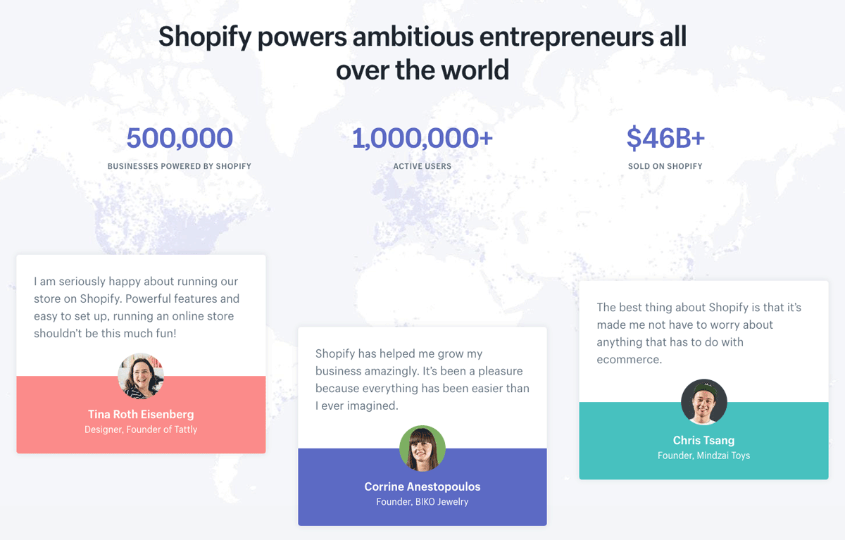
The idea is to create a feeling of mimicry in the minds of visitors: “If 1,000,000 people use Shopify to create real shops without programming, so can I”.

Salesforce

Salesforce needs no introduction. The king of “CRM” (Customer Relationship Management), the American company has several particularly well-developed landing pages that are worth a look.

Design Landing Page Salesforce

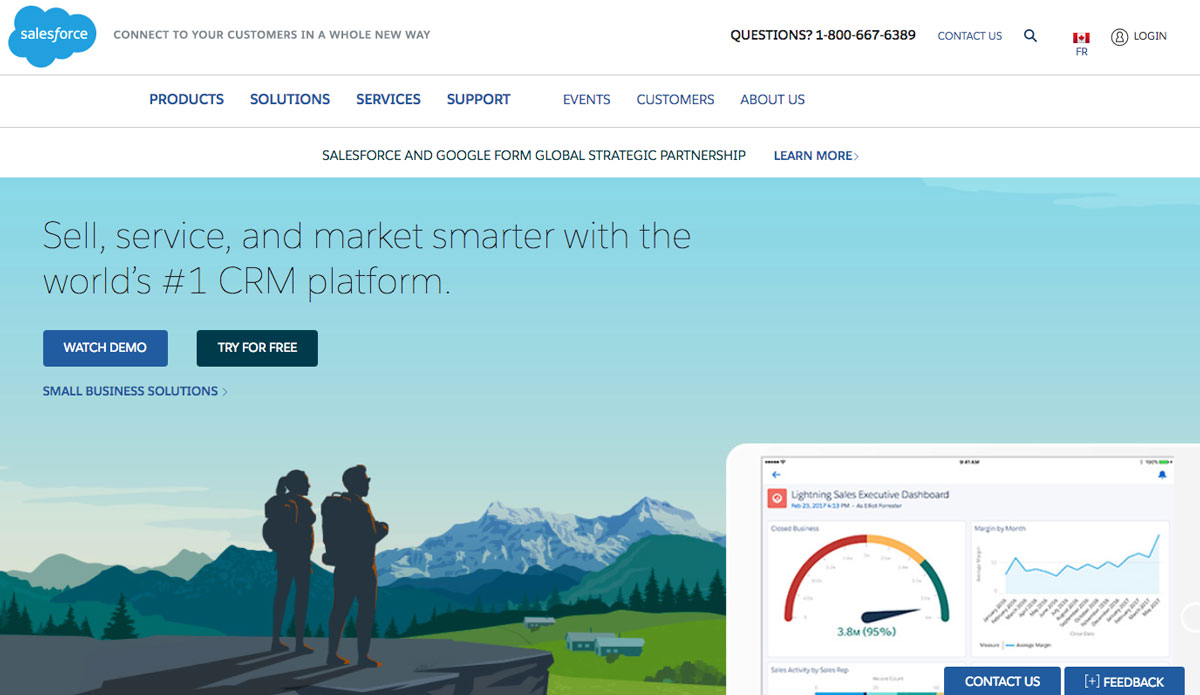
The first thing that jumps out is the illustrations and colors. An overview of solutions on Computer-Tablet-Mobile is presented on a background that inspires calm and serenity.

We also note that two calls to action are present on the upper left part above the fold: one for a demonstration and a second for a free trial.

Salesforce also offers a solution for large companies whose call to action is placed to the right of the free trial: great for capturing potential leads from large companies.

Subscription Form Design Landing Page Salesforce

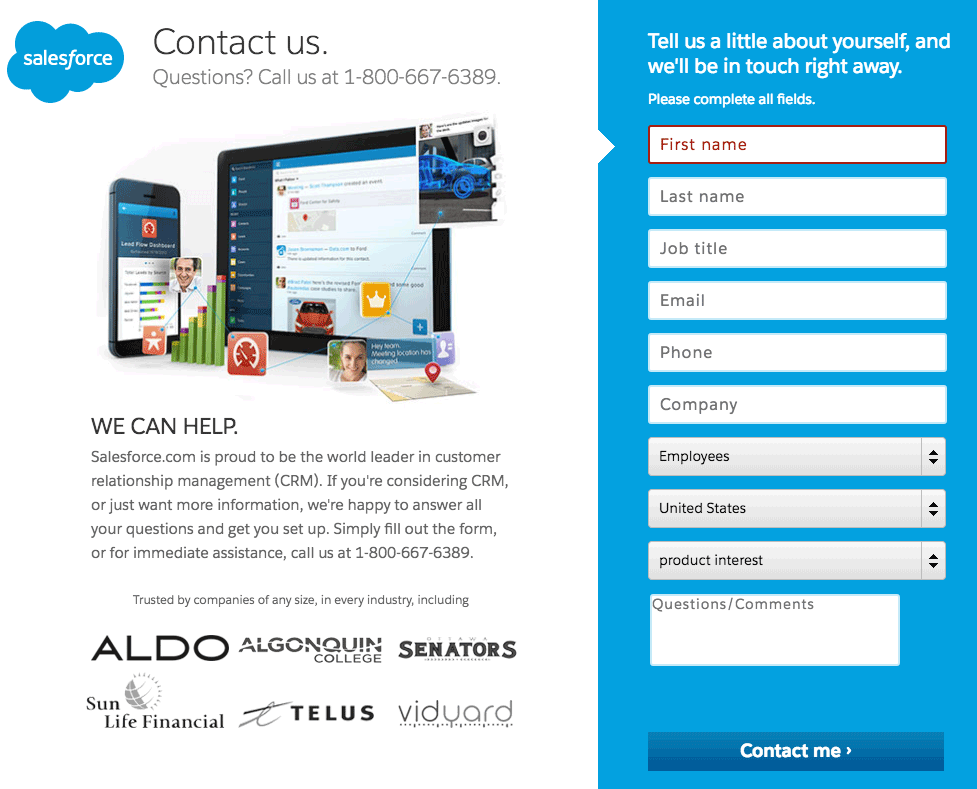
When a visitor clicks on a call-to-action, they go from the home page to a landing page created specifically to convince as many people as possible to sign up for the free trial.

Among the elements that stand out, we can see:

  • The reminder of value proposition, “30-day free trial”
  • A telephone support hotline
  • The statement “no download, no software” in capital letters
  • Social proof by including logos of well-known references
  • Easy sign-up with Google+, Facebook, and LinkedIn

Neil Patel

Neil Patel is a digital marketing consultant with a big reputation in the United States and around the world. His site receives several million hits a month thanks to an accessible content strategy and a variety resources created for visitors: blog articles, YouTube videos, practical guides, etc.

Neil Patel Design Landing Page

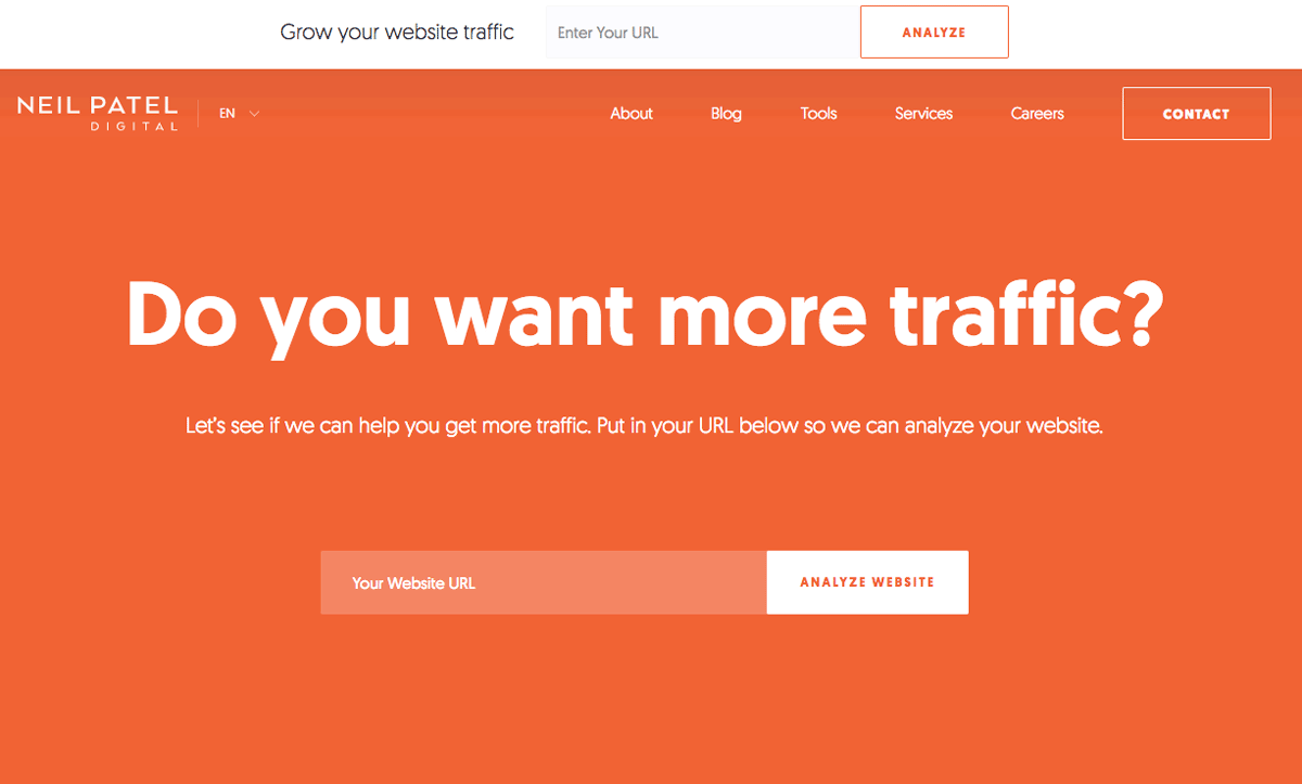
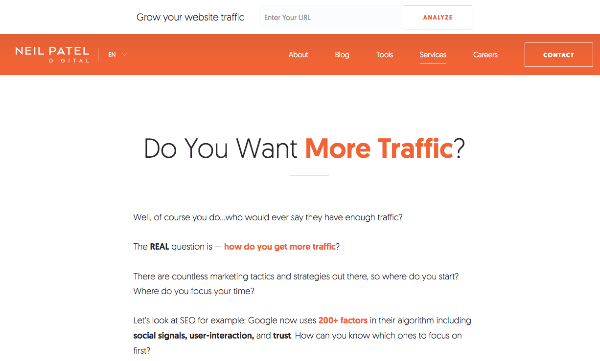
What strikes us first on Neil Patel’s site is its uninhibited and straightforward approach to the issue.

The color theme is extremely simple and plays on the contrast between the orange background and the white text. The idea: ask visitors a direct, simple and short question to build engagement to a maximum.

We also notice that the landing page offers a field (above the fold) designed to perform a live analysis of your site: it is a show of force that leads the visitor to discover by him or herself what could be improved on their own site.

Design Landing Page Benefits Neil Patel

The particularity of Neil Patel’s site is that almost all pages are designed as landing pages each with one goal: to convert a maximum number of visitors.

The “Services” page, for example, (shown above) shows a long set of text that acts as a proof of authority for visitors. It explains what Neil can do for you, but also what he has done (see below) and the clients he has worked for.

Design Landing Page Proof Neil Patel

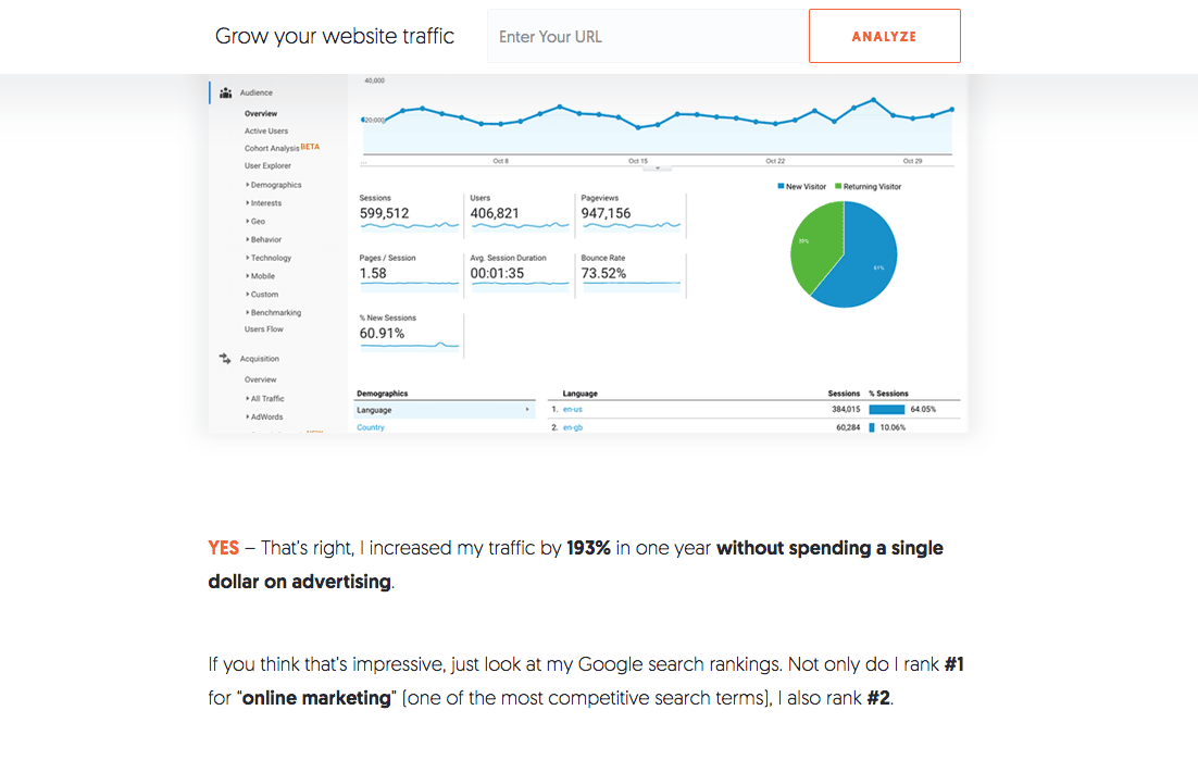
The approach is always very direct and focused on results and benefits.

Neil’s idea is to prove by A + B that he has the skills to help you improve your SEO.

Neil Patel Call to Action Design Landing Page

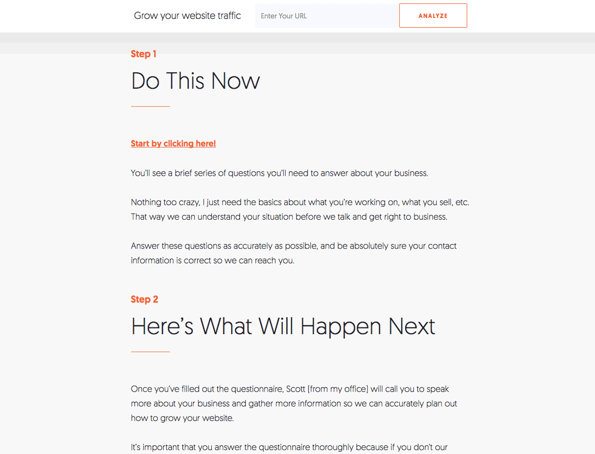
On the same “Services” page, the call to action comes at the end (and one can wonder, is it a good idea?). It is structured in several stages that invite visitors to enter their information in order to be contacted later.

UpWork

UpWork is a world-renowned freelance platform. It allows companies to find skilled labor quickly for various assignments and allows the self-employed to register on the platform to offer their services.

Design Landing Page Upwork

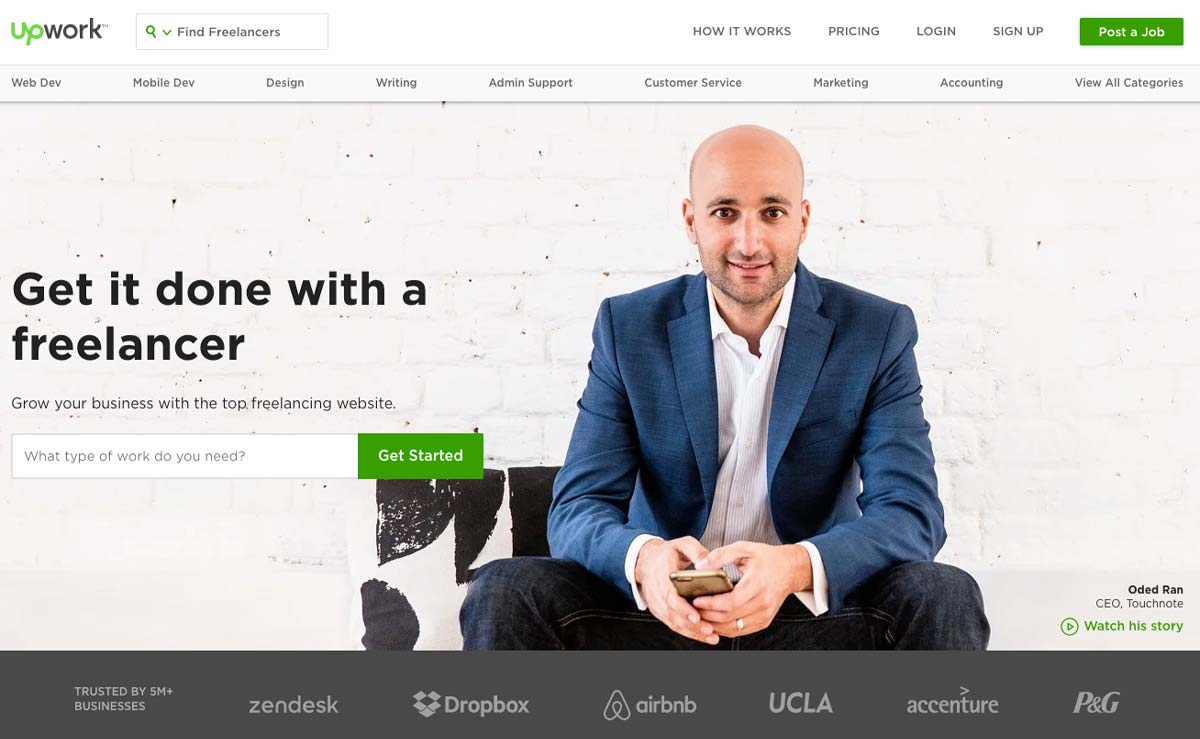
On the homepage, we can see from the outset that the graphical design is clear and that it is the “professional” aspect that is highlighted. Interestingly, the chosen tagline is not for freelancers but for companies.

The tone is direct, effective, and clear; we immediately understand the value proposition: to subcontract work efficiently.

The call to action is placed on the left side above the fold. Its green color sets it apart from the rest of the landing page and consists of a search bar used to indicate the type of work that visitors want to outsource. If we pay attention to details, we can see that the background is actually a customer testimonial and we can watch the story: it has a lot of impact!

Design Landing Page Upwork

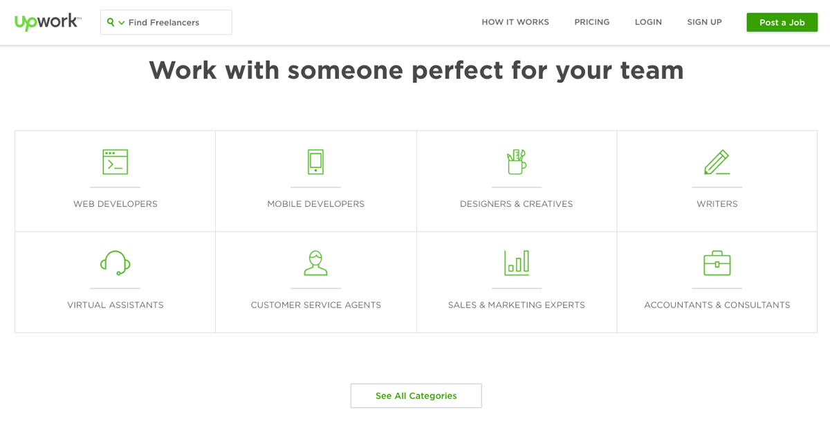
The rest of the landing page is classic: it details the various services offered by freelancers and shows the paid offers for users.

CodeCombat

CodeCombat is an interesting example. It is an educational game that allows children (and adults) to learn to program using a video game. The concept is simple: you program to progress in the game.

Code Combat Landing Page

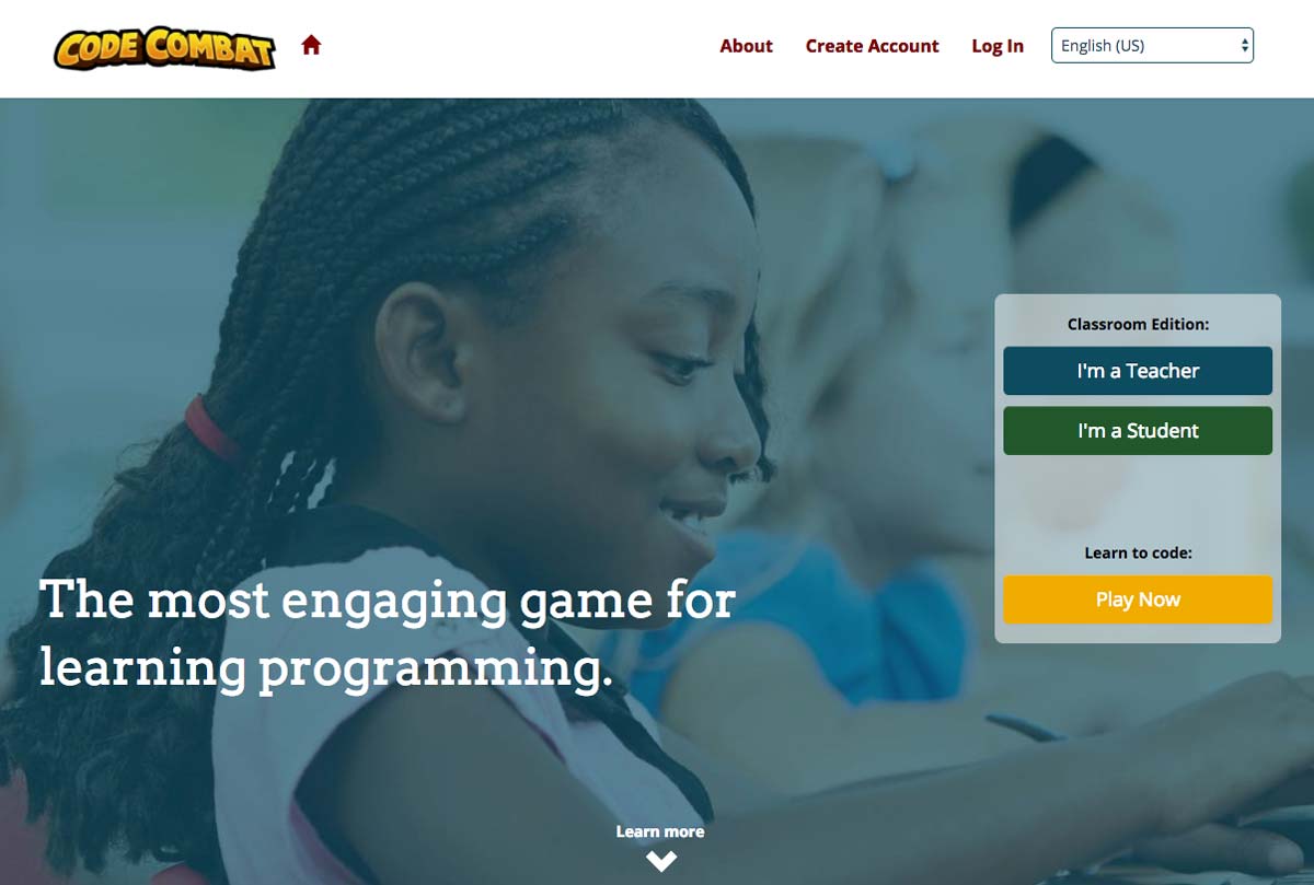
The first interesting point of CodeCombat’s landing page is that the audience is twofold: it targets both teachers (who wish to use it in class) and children (who discover it by themselves or through by word of mouth).

The landing page’s focus is therefore on teaching and the program’s ease of use. Thus, we can see two calls to action: one for teachers and one for children/players.

Design Landing Page Code Combat

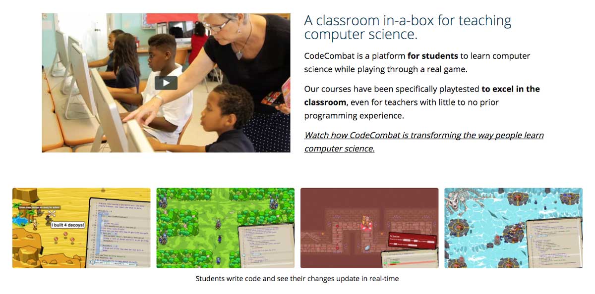
The rest of the landing page presents the benefits of using CodeCombat as well as screenshots to make the service “tangible”.

Testimonial Design Landing Page Code Combat

In a fairly traditional way, the rest reiterates the service’s strengths and includes a customer testimonial adapted to the target: that of a school principal.

Plated

Plated is a company specializing in delivering recipe ingredients: you select inspirations for recipes, and the company delivers all the ingredients needed to make the dish.

Plated Landing Page

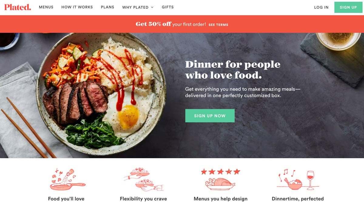
The first thing that strikes us about the Plated landing page is the graphic design; the colors are studied, and the company has a real visual identity. The photos of dishes stand out well, and the illustrations are well chosen.

Words are chosen carefully and are well suited to a target of “food lovers”: we would get hungry just looking at the site!

The call-to-action is clear, well placed above the fold; its green color clearly distinguishes it from the rest of the page.

Call to Action Landing Page Plated

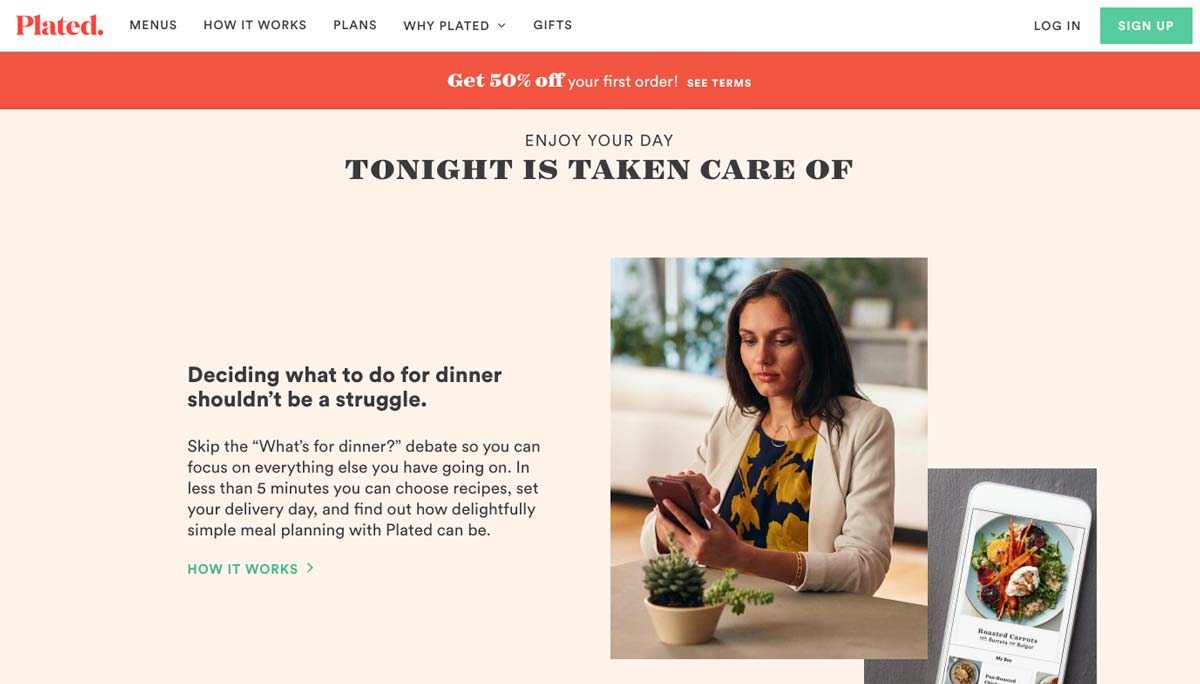
The Plated landing page is long: you have to scroll for a long time to reach the end. However, each paragraph of the home page is thought of as an argument or a benefit in order to convince:

  • Save time
  • Large range of choice
  • No more shopping
  • Quality products
  • Save money

Design Landing Page Plated

We can also see a particularly attractive instant discount coupon in the header and whose color stands out.

By offering 50% off the first order, Plated encourages the undecided to take action by decreasing the financial commitment.

Social proof is highlighted at the end of the landing page. Although it could have been placed higher, it remains visible and relevant.

Live Chat Landing Page Plated

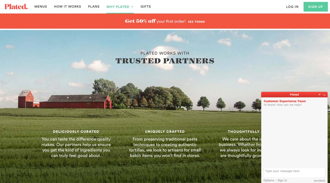
Plated offers chat support, something we find more and more on landing pages.

By offering this service, the idea is to make up for the lack of human interactions that one would find in stores and to provide help to undecided visitors.

Plated’s strengths are highlighted successfully using simple, soothing images that convey simplicity and serenity to show that Plated makes your life easier.

MailChimp

MailChimp is an extremely popular automated marketing and emailing company. Their services are used by many to create e-mail, marketing and newsletter campaigns for e-commerce sites.

Design Landing Page Mailchimp

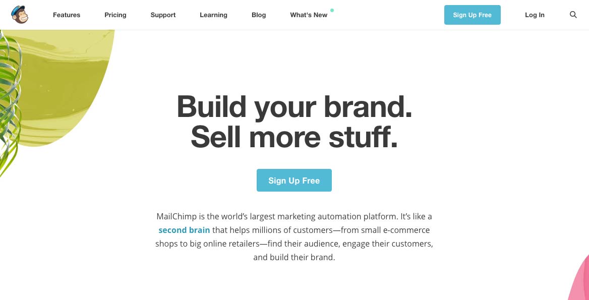
As direct as Neil Patel, this landing page is extremely clear and straightforward: it addresses visitors in a frank manner while remaining vague: “Build your brand, Sell more stuff.”.

This allows MailChimp to address visitors globally by avoiding excluding too many users from the outset.

The value proposition is as simple as possible: build your brand, sell more.

This straightforward and uninhibited approach is prevalent in Software as a Service (SaaS) solutions: the goal is to speak directly to business leaders of all sizes and get straight to the point.

Note that the call to action is very visible: it is located in the central position above the fold and offers a free trial (another one?!).

Call to Action Landing Page Mailchimp

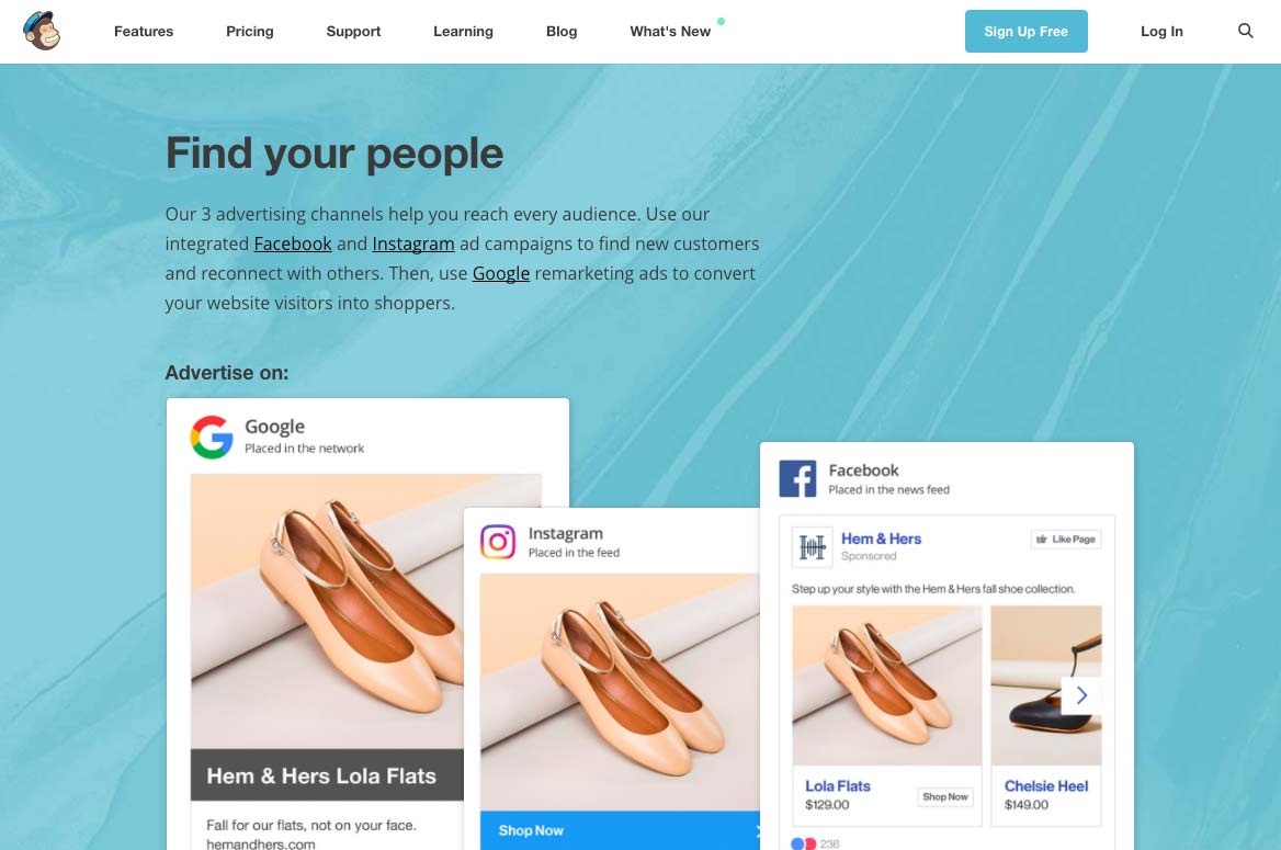
As on Plated, the rest of the landing page details the benefits of using the service. This allows visitors to quickly “visualize” the service’s added value and get a clear idea of the following question: “Is this service for me?”.

By building a long landing page, you allow your visitors to “scroll” as much as they want: this allows them to answer as many questions as possible while acting as a commercial brochure to highlight your added value.

Design Landing Page Mailchimp

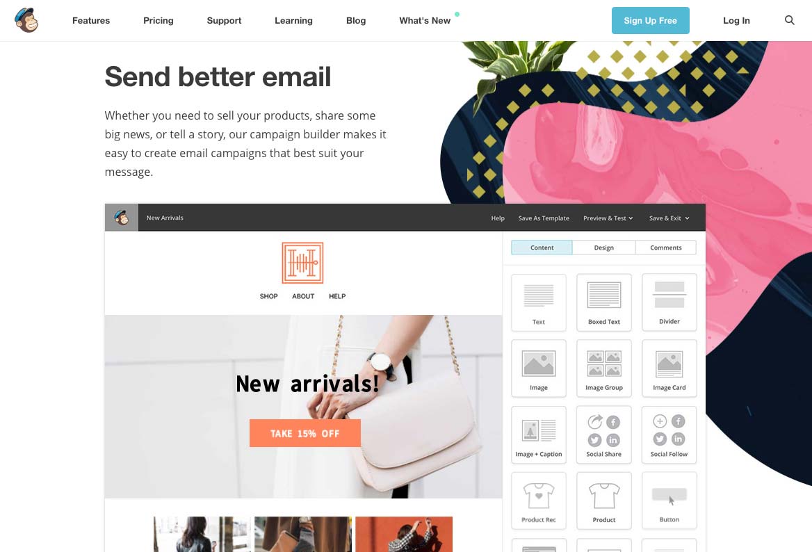
By using screenshots, MailChimp allows visitors to project themselves more easily. The idea is to help visitors better understand the service by viewing a sample. This technique can be adapted to video or even in the form of a live demonstration as ElegantThemes does.

We note that the free trial’s call-to-action is always accessible, wherever you are on the page, here at the top right.

Register Form Mailchimp

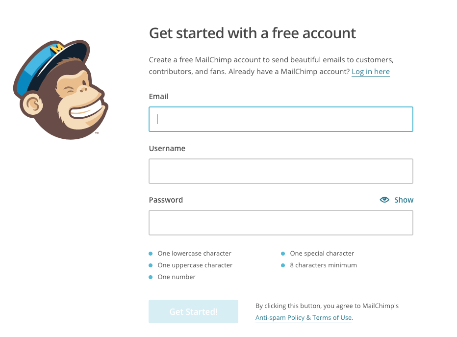
Once in the conversion funnel, visitors land on the form page needed to activate the free trial. In order to maximize conversions, the MailChimp registration form is intentionally:

  • Short
  • Clear
  • Specific

By limiting the number of fields to three, MailChimp allows hesitant visitors to take the plunge more easily. The commitment requested is kept to a minimum: an e-mail, a username, and a password.

If it were to be improved, we could consider adding quick signup via Facebook or Google that would encourage even more conversions.

Did you like this article? If you are inspired and want to take the plunge, read our article dedicated to Bootstrap landing page templates. It’s the perfect asset for a successful landing page.

Article

6min read

How to Avoid Flickering in A/B Tests

Flickering, also called FOOC (Flash of Original Content) is when an original page is briefly displayed before the alternative appears during an A/B test. This happens due to the time it takes for the browser to process modifications. There is no miracle fix to this problem, and those claiming to be quick fixes have limited effectiveness. The good news is that there are several best practices to accelerate the application of your modifications, effectively masking the flickering effect.

Update: to get rid of flickering, you can switch from Client-Side testing to Server-Side testing. The latter doesn’t involve any kind of Javascript to apply modifications on your pages and completely removes the FOOC. Read more about this feature now available within AB Tasty.

What is flickering, exactly?

Although you may have never heard of flickering, you have undoubtedly experienced it without even knowing: a test page loads and, after a few milliseconds, your modifications show up. In the blink of an eye, you’ve seen two versions of your page—the old and the new. The result is poor user experience, not to mention that your users now know your test is just that: a test.

Flickering is caused by the basic client-side operation of A/B testing solutions that apply a JavaScript overlayer during page loading to ensure elements are modified. In most cases, you will not notice it at all, but if your site takes a while to load or relies on intensive external resources, your modifications can take time to be applied, giving way to a previously unnoticeable flickering.

Is there a miracle cure for flickering?

Some providers claim to use innovative techniques that get rid of flickering. Beware, however, that although the techniques they use are commonplace and available to anyone, they present a certain number of technical limits. By analyzing market leaders’ documentation, it is also clear that such “miracle” methods are only implemented as a last resort, when no other options have worked for a lasting period of time. This is because flickering can be different for each site and depends a great deal on initial performance.

So how does the method work? For starters, displayed content is temporarily masked using CSS properties such as visibility: hidden or display: none for the body element. This property masks page content as quickly as possible (since the solution’s tag is located in the page’s <head> element), before redisplaying it again once the modifications have had enough time to be applied. This effectively eliminates the “before/after” flicker effect, but replaces it with a “blank page/after” effect.

The risk of using such a method is that if the page encounters any loading problems or there are implementation problems, users might end up with a blank page for a few seconds, or they could even be stuck with a blank screen with nowhere to click. Another drawback of this solution is that it gives off the impression that site performance is slow. That’s why it is important to ensure that rendering is not delayed for more than a few milliseconds at most—just enough for the modifications to be applied. And of course, for valid results, you’ll need to apply this delayed rendering to a control group to prevent bias in your analysis of behaviors linked to the various rendering speeds.

So there you have it. If your modifications take time to apply, you won’t want a blank page to greet your users. When it comes down to it, you should always adhere to the best practices listed below. Among other things, they aim to ensure modifications are applied at an accelerated rate.

That’s why we here at AB Tasty don’t recommend the above method for most of our users and why we don’t suggest it by default. Nonetheless, it is easy to implement with just a few lines of JavaScript.

How can flickering be limited?

If you don’t want to use the aforementioned method, what are your options? Here are some best practices you can use to reduce flickering and maybe even eliminate it:

  • Optimize your site’s loading time by all means possible: page caching, compression, image optimization, CDNs, parallel query processing with the HTTP/2 protocol, etc.
  • Place the A/B testing solution tag as high as possible in the source code, inside the <head> element and before intensive external resources (e.g. web fonts, JavaScript libraries, etc.) are called.
  • Use the synchronous version of the AB Tasty script, since the asynchronous version increases flickering odds
  • Don’t use a tag manager to call your solution’s tags (e.g. Google Tag Manager). This might not be as convenient, but you’ll have an easier handle on your tag’s firing priority.
  • Do not insert a jQuery library in the tag if your site provider already uses one. Most client-side A/B testing solutions use jQuery. AB Tasty nonetheless makes it so you don’t have to integrate the infamous JavaScript framework if you already use it elsewhere, so you can cross a few kb off your transfer list.
  • Reduce the size of your solution’s script by removing inactive tests. Some solutions include the entirety of your tests in their script, whether they are suspended or in draft mode. AB Tasty includes only active tests by default. If, however, you have a high number of ongoing customizations, it might be appropriate to make them permanently operational and deactivate them on AB Tasty.
  • Pay attention to the nature of modifications. Adding several hundred lines of code to obtain your modification will cause more flickering than a minor change to CSS styles or wording.
  • Rely as much as possible on style sheets. It is usually possible to obtain the desired visual effect using style sheets. For example, you can simply implement a JavaScript instruction that adds a CSS class to an element, letting the class modify its aspect, rather than writing lines of script to manipulate its style.
  • Optimize your modified code. When fiddling around with the WYSIWYG editor to try and implement your changes, you may add several unnecessary JavaScript instructions. Quickly analyze the generated code in the “Edit Code” tab and optimize it by rearranging it or removing needless parts.
  • Ensure that your chosen solution uses one (or many) CDNs so the script containing your modifications can be loaded as quickly as possible, wherever your user is located.
  • For advanced users: Add jQuery selectors to the cache as objects so they don’t need to be reorganized in the DOM multiple times. You can also make modifications in JavaScript rather than in jQuery, particularly when dealing with elements by class or ID.
  • Use redirect tests where possible and if useful after an evaluation of the relation between the modification’s nature and the time required to put the test into place.

If you still see flickering after performing these optimizations, you may want to use the content-masking technique detailed above. If you’re not comfortable doing this alone, contact our support team.

Article

4min read

User Testing and A/B Testing… Strengths and Differences

Companies often opt for one or the other of these tests without realizing the benefits of using them together. Given that the benefits of one test may sometimes outweigh the disadvantages of the other, the lessons from user testing and A/B testing complement each other to refine your conversion optimization strategy.

All sites are trying to attract more traffic, but they are also seeking to increase their conversion rate in order to raise profits. The understanding and optimization of their customer paths are therefore essential.  In order to understand the problems faced by their websites, it is possible to design a series of tests, such as user testing and A/B testing.

User testing

User testing, or usability testing, makes it possible to understand the needs of users and observe their behavior. This data is qualitative and offers a rich, detailed and very helpful source of information which provides the company with an understanding of what works or does not work in its offer.

Advantages

  • Provides better knowledge of the user as a person (and not just as a virtual visitor).
  • Offers comprehensive and often unsuspected sources of data through which the company discovers new areas of improvement.
  • Always offers a workable response to improve the user experience.

Weaknesses

  • Significant investment of time and money for purely theoretical results.
  • Observed results are not quantified and do not allow the company to estimate the revenue potential of the test findings.
  • Returns are based on the subjective behavior and opinion of a few users.

A/B testing

A/B tests are based on an idea pre-conceived by the company, which seeks to test and quantify the effectiveness or otherwise of a proposed change. They are based on specific, targeted changes whose outcomes will be automatically quantified.

Advantages

  • Rapid implementation and real-time monitoring (number of clicks, conversion rates, heatmap).
  • Quantified and representative results (KPIs and ROI simulation).
  • Allows significant flexibility in changing one or more points on a page.
  • Very cheap and requires minimal effort in the long term.

Weaknesses

  • Significant advance preparation (targeting areas to change/watch).
  • Not all tests always produce results.
  • Requires a large number of visits to statistically validate the assumptions.

Different but complementary tests

The choice between these two tests mainly depends on the question you want to answer: How much? Why? If your question concerns quantifiable results regarding a specific change on your website, then you must perform an A/B test. If the purpose of your question is to understand your consumers’ behavior, usability testing will better meet your needs.

Although users testing and A/B testing differs in their setup and objectives, their features can easily complement each other. It is recommended that you use both types of tests sequentially. Starting with a usability test allows you to locate the points of friction to address. You can then conduct an A/B test to validate the relevance of the changes you are considering.

The most important prerequisite for achieving valid results from your A/B testing is to build strong test hypotheses that will involve the modification of elements that are actually used in the conversion process or really hamper the process. Find out more about the formulation of test hypotheses.

By combining the two methods, it is possible to make reasonable use of your time and money, while obtaining usable quantitative and qualitative results. Using a tool such as A/B testing is advisable only when an idea for improvement has been identified. If you lack ideas, your users may not – test them!

Article

4min read

Eight Mistakes not to Make in A/B Testing

The following mistakes can completely distort the results of your A/B testing program. Learn how to avoid them!

1. Changing the control version during the test

Making changes to the control version (i.e. the original version of your page), especially the items you are testing, while the test is in progress, is to be strenuously avoided. The results of the variation will mean nothing if the original version on which the comparison is based has also changed.

2. Testing your changes over different time periods

The whole purpose of A/B testing is to divide your traffic between two versions of your page: a Control version A, and a Variation version B. Collecting data variation on Version A for some time and then doing the same on Version B is not A/B testing and will yield unusable results, because the test conditions have changed! There is no assurance that the traffic you will have fully directed to Version A and then to version B is the same; quite the contrary. Many other factors may come into play: if you test Version A for a normal working period and then test Version B during the holidays, the results you get will have been distorted by changes in timetables and user habits. For these reasons, one of the golden rules of A/B testing is that the two versions must be tested simultaneously: by deploying the variation alongside the control and by distributing the traffic between the two, you will be sure that any factors affecting traffic will affect both versions. You can then confidently learn from your results.

3. Simultaneously editing multiple variables

Actual A/B testing consists in testing a variation of a page that differs in one way only: a test, a variable. Testing several variations of several different elements is no longer A/B testing, but multivariate testing, a significantly more advanced technique. If you set an A/B test with several simultaneous variables, you will have great difficulty, once the test is complete, in determining precisely what variable(s) is(are) responsible for the results you have achieved. If you want to test several elements on a page using A/B tests, first test the most radical changes, then refine the changes with each successive test. Alternatively, you can use multivariate testing.

4. Drawing conclusions before achieving 95% reliability

In the AB Tasty reporting tool, each test is assigned a statistical reliability rate. This is a confidence level whose calculation depends in part on the duration of the test and on the traffic assigned. What you must bear in mind is the figure of 95%: if your test has a reliability rate of 95% or more, you can consider the results reliable. Below this rate, the results you get are just not reliable enough to draw definitive conclusions. If you take a decision on the basis of results without at least 95% reliability, you are relying on potentially false results; it is entirely possible that they will subsequently change.

5. Allowing a test to run for too long

Conversely, if your test has reached 95% statistical reliability and you have enough information to learn lessons, it is best not to let the test go on for too long. Stop your tests when they meet their target! Otherwise, you could waste time waiting for a marginal improvement of already good results and you expose some of your traffic to a variation that is already tested, whereas these visitors could be contributing to new tests. How long should I run my A/B tests?

6. Not being honest when interpreting data

For your A/B testing to be truly effective, you must accept the results, whatever they are (provided of course they have reached 95% statistical reliability). Of course, this is easier said than done when you see the variation that you spent weeks designing fail against the control version! The importance of A/B testing is precisely to tell you unambiguously which page version works best with your users, even though it was not your preferred version.

7. Surprising your most loyal visitors

If you have a high rate of repeat visitors, it is better not to surprise them too suddenly with a radically different variation. Your loyal visitors are regulars whom an abrupt change to your site could drive away, even though the variation in question may be not the one ultimately chosen. In addition, if you test your new visitors, you’ll be sure that their behaviour will not be biased.

8. Choosing your KPIs poorly

Finally, be sure to choose KPIs that are truly representative of your goals. If you choose a KPI that is too far from the goal, you will get a numerical result with no great connection to your goal. Another common mistake is to take only one KPI whereas the test that has been deployed can impact several others: it is then possible that the test improves the KPI which is being monitored at the expense of others, without you being able to realise this immediately.

Learn more tips to be up and running with A/B Testing. Download our A/B Testing ebook.

Article

4min read

Before you Start A/B Testing, Define your Roadmap

What tests should I launch? In what order? How do I stop several tests from interfering with each other? What risks are involved and how do I minimise these? Before you begin, these are the questions to ask. Follow our advice to establish your roadmap and get results from your A/B tests.

Before you start testing, you must mark out your route. A roadmap is essential, not only for clearly defining your goals, priorities and risks, but also for setting out a timetable. With this, you can track the progress of your project, and keep all of your contributors informed.

Your roadmap should, in particular, consider the following 8 aspects:

Test names

Be sure to give your tests precise, explicit names (preferably the same as you use in your AB Tasty tool). For example, a short name such as “[HP]wordingCTA” is preferable to an entire phrase such as “Test on the wording of the CTA on the homepage”.

Test descriptions

So that all your contributors are in step with your testing procedure and can follow it as it evolves, write a short, explicit description. For example, “Replace CTA wording ‘Create an account’ with ‘Sign up now’” will allow anybody to understand the content and goals of the test.

Test priority level

It is vital to rank your tests in the order of their importance in order to decide the order in which you will launch them. It is up to you to gauge:

  • The expected benefits of the test
  • The technical difficulty of the test

After the results of your first few tests, you will be able to adjust your ranking to optimise the effectiveness of your tests.

Test range

It is also crucial to include in your roadmap the range of pages targeted by your test. This way, you will stop different tests from interfering with each other (when you have several tests taking place at the same time on the same page) or possible side effects. To guard against this, we advise you to cut your site into slices and to give each slice a different colour in your roadmap: for example, blue for the homepage, orange for category pages, green for product pages, yellow for the conversion funnel, etc.

Primary and secondary KPIs

For each test, you should define a primary key performance indicator (KPI) (associated with a macro conversion). This indicator, which is the main reason for creating the test, will allow you to evaluate its benefits. It might be the click-through rate from the button “Add to basket”, the number of signups to your newsletter, revenue generated, etc.

You should also define secondary KPIs (associated with microconversions), which will complement your analysis and allow you to better understand the results of your test. Examples might include time spent on the site, number of pages seen, bounce rate, and so on.

Resources required

Some tests might require:

  • Technical development
  • Ergonomic development
  • A specific launch date

These kinds of requirements must be specified in your roadmap.

Launch date and estimated end date

This information will make your team’s reports easier to read, and make it easier to plan potential future tests. In the meantime it will allow you to plan your testing activity precisely.

Possible side effects, Who to contact, Alerts

You should include a space for “notes” for each test, which will be useful in case of any problems. Here, you can write contacts, useful information, important things to remember, and so forth. This will save you a lot of time and worry.

Article

5min read

Six Ways for Getting Started with A/B Testing with Low Traffic

A/B testing is a key tool when it comes to optimizing your conversion rates. However, an effective A/B test campaign requires certain conditions and, in particular, a substantial level of traffic and conversions. Should you rule out A/B testing if your traffic is too low? The answer is no, you’ll be glad to hear! There are methods which can be implemented to make the most of an A/B test campaign, even when traffic is low. The main obstacle to setting up A/B tests with low traffic lies in statistical significance. If the test results are to be considered reliable, the reliability index needs to be over 95%. Below 95%, the data are not deemed reliable and drawing conclusions can be risky. In simple terms, the lower the traffic, the more time it takes to reach that level. The following techniques will help you reduce that time.

#1: be patient!

First of all, if your traffic does not exceed a few hundred visits per month, you are no doubt better off waiting. Focus on building an audience by applying the conventional traffic acquisition levers (production of interesting and potentially viral content, building your presence on the social networks, etc.). At this stage, take the opportunity to collect qualitative information on your visitors’ behaviour (their impressions, their feedback, etc.). As your traffic is low, this feedback can be analysed manually and can provide valuable avenues to be explored once you have acquired more traffic.

#2: get more traffic temporarily

If your traffic is low, tackle the problem at the source! Temporarily increasing traffic to the pages you want to test is a good way of obtaining reliable statistics more rapidly. The simplest way to do this is via a pay-per-performance advertising model (pay per click): sponsored Google AdWords links, Facebook Ads, sponsored news on LinkedIn, etc. This means investing financially, but it rapidly brings traffic. If you have a large community, set up an emailing campaign to draw traffic to the page you want to test. You should of course make sure you redirect your campaigns to a landing page that is close to the final conversion stage, rather than to your website’s home page.

#3: test the pages with the most traffic

Make the most of the traffic you already have by focusing efforts on the pages where you get the most traffic. By doing this, you will increase your chances of getting significant results faster. When you have more traffic across the whole website, you will then be able to test the other pages.

#4: limit the number of variations

The more variations you compare, the less each one of them will get traffic and the more time it will take to get a sufficient sample for each variation. Don’t create more than two variations in addition to the original version. Depending on your traffic, you may need to limit yourself to a single variation. If this out-performs, start a second test to compare its performance with the variation you had set aside. Also forget about multivariate tests (MVT) which are only designed for websites with very high traffic levels.

#5: change the conversion measurement criteria

The aim of an A/B test is usually to increase the number of conversions. But how do you define conversion? As a sale? In a test where traffic is low, it is preferable to select a criterion related to your main criterion but which occurs more often. Rather than a sale, target the downloading of a test version or the viewing of a demonstration video, for example. These conversion criteria are always directly linked to your main criterion (here, the sale), but are likely to occur more often and will therefore bring you results faster. You can also target interaction with your website, for example by recording a conversion when a visitor spends a certain amount of time on your website or visits a certain number of pages.

#6: test significant changes rather than small modifications

We often think that A/B testing is used to define the best color for a call-to-action or to optimise a title. This is just one facet of A/B testing but this kind of micro-optimization can only be applied where traffic is substantial. Where traffic is low, look at the bigger picture! Test changes likely to lead to a high increase in conversions, not the details seeking a 0.1% increase. Change the position of elements, rewrite entire titles and test two completely different versions of your page. If you opt for this latter option, do not waste time modifying your page in the AB Tasty editor but instead opt for the split testing solution. The principle is simple: you create a completely different design for your page, you host it on your own server and you use it as a variation. Web visitors are redirected to this page in a fully transparent manner. AB Tasty takes care of the traffic breakdown and collects statistics for each version, according to the parameters you have indicated, just like a conventional test.

Conclusion

Just because your website has low traffic, it does not mean you should forget about A/B testing – on the contrary! Set your goals and set you up your first tests.