The airline checkout is where booking intent becomes revenue. Yet for most airlines, it’s also where the majority of customers drop off. This high abandonment rate isn’t just a cost of doing business; it’s a direct result of a complex booking process failing to meet modern traveler expectations. Fixing this friction is one of the biggest opportunities for growth in the industry.
This drop-off isn’t just a technical problem, it’s a human one. The checkout flow is where a traveler’s excitement meets anxiety, and where price sensitivity clashes with the desire for comfort. For airline and travel professionals, understanding this interplay is the key to conversion.
The answer isn’t to guess what travelers want or to copy a competitor’s design. It’s to listen, learn, and adapt by building a system that lets you ask customers what they prefer, not with a survey, but with their clicks. As we discuss in our Travel Essentials Kit e-book, this is the world of experimentation, where every test becomes part of a continuous cycle of learning and iteration.
Why airline checkout is so complex
Unlike a simple e-commerce purchase, booking a flight is rarely a one-click affair. The complexity is baked right into the business model. You’re not just selling a seat; you’re selling a multi-faceted travel experience, and each component adds another layer to the checkout.
First, there’s the core booking. A simple round-trip flight is one thing, but multi-leg journeys with different carriers, layovers, and time zones create a significant cognitive load for the user. Then come the additional services, such as seats, bags, meals, or insurance, where each choice is a potential exit point. Finally, regulatory requirements can create long, intimidating forms.
The result of this complexity is an abandonment rate that, according to Inai, hits 90%. To put it another way, nine out of every ten potential customers that start booking a flight will leave without paying. That’s significantly higher than the already high average e-commerce site abandonment rate of 70%. And the problem is even worse on mobile.
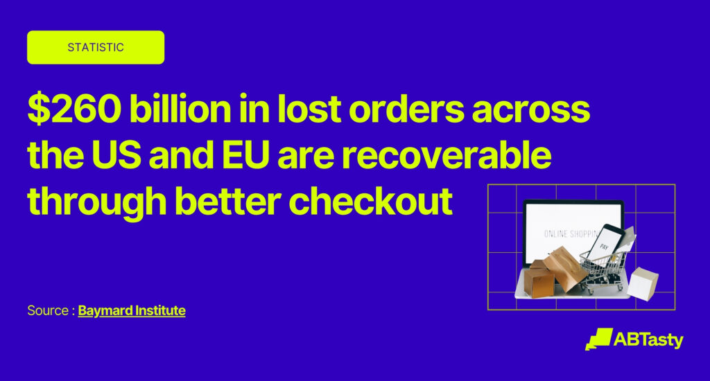
This is more than a user experience flaw; it’s a massive financial bleed. The Baymard Institute estimates that $260 billion in lost orders across the US and EU are recoverable through better checkout design alone. It’s a multi-billion dollar design challenge waiting for a solution, but the fix doesn’t require a complete and costly overhaul. A commitment to analyzing user data, testing hypotheses, and letting the results guide incremental, high-impact changes will have your customers soaring through your checkout process in no time.
Decoding consumer behavior at checkout
To optimize the checkout flow, you have to get inside the traveler’s mind. Their behavior is driven by powerful psychological factors, and your data shows exactly where the friction is.
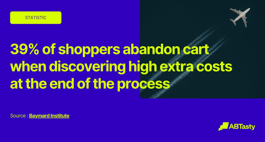
The single biggest culprit is cost ambiguity. The top reason for cart abandonment, cited by 39% of shoppers in research aggregated by the Baymard Institute, is discovering high extra costs at the end of the process. This points directly to the airline industry’s practice of “drip pricing.” The low base fare gets them in the door, but the steady drip of fees erodes trust. It’s not just the final price; it’s the feeling of being misled.
Next is process friction. The same research found a “too long or complicated” checkout will cause 18% of users to leave. Forcing a user to create an account is another major barrier, responsible for another 19% of abandoned carts. This accumulation of friction—multiple pages, endless form fields, and mandatory sign-ups—creates a powerful negative momentum that pushes users to exit.
Finally, there’s the trust deficit. A staggering 19% of users will abandon a purchase simply because they didn’t trust the website with their payment information. This isn’t just about SSL logos. A user who experiences a price increase through drip pricing is psychologically primed to be more skeptical when it’s time to enter their payment details, as the final cost no longer aligns with their initial expectation.
Understanding these behaviors isn’t about exploiting them. It’s about designing a smoother, more transparent, and less stressful experience that guides the traveler confidently toward their destination while also building brand credibility.
Experimentation as a window into the traveler’s mind
So, how do you solve for cost ambiguity or process friction? The answer is to ask your users, not with a survey, but by testing different approaches and measuring the results. Experimentation, through A/B and multivariate testing, is the most effective way to understand what travelers actually do.
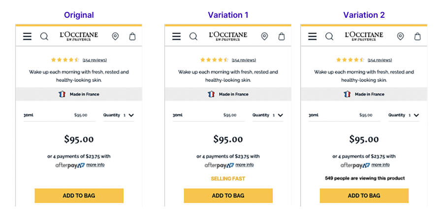
The process starts with a data-driven hypothesis. For example, if your analytics show a high drop-off rate on the passenger details page, you could hypothesize that reducing the number of form fields will reduce friction and increase conversions. From there, you can run a simple A/B test: Version A is your current, longer form, and Version B is the new, simplified one. By showing each version to different segments of your audience, you can measure which one leads to more completed bookings. The result is no longer a guess; it’s a data-backed insight that de-risks design changes and allows you to make improvements with a measurable impact.
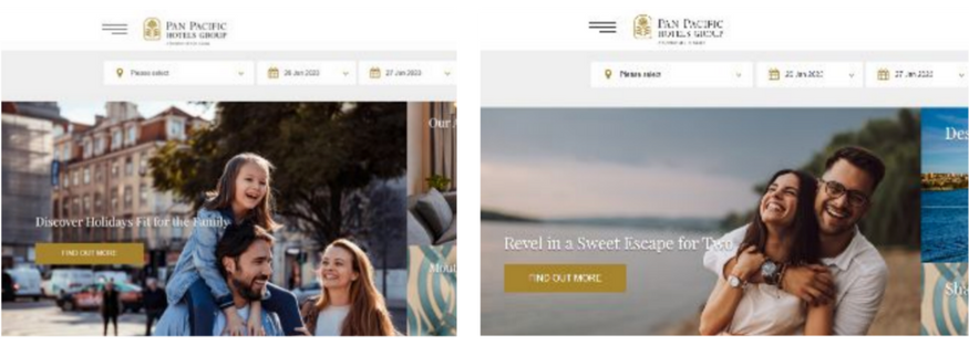
But this isn’t just about one-size-fits-all fixes. You can take it a step further with personalization and segmentation. A first-time booker might need more guidance and reassurance during checkout, while a frequent flyer would prefer a streamlined experience that pre-fills their preferences and key information. Experimentation allows you to test different, tailored experiences for these segments, ensuring every traveler gets the smoothest possible path to booking.
What airlines can test in checkout
Once you embrace an experimentation mindset, you’ll see test opportunities everywhere. The goal is to challenge assumptions and find what truly moves the needle. Here are a few powerful areas to start:
- Call-to-action design: Don’t underestimate the power of a button. We worked with Smartbox to test colour variations of their “Add to cart” button, and a simple color change resulted in a 16% increase in clicks.
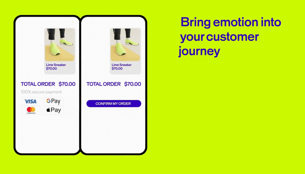
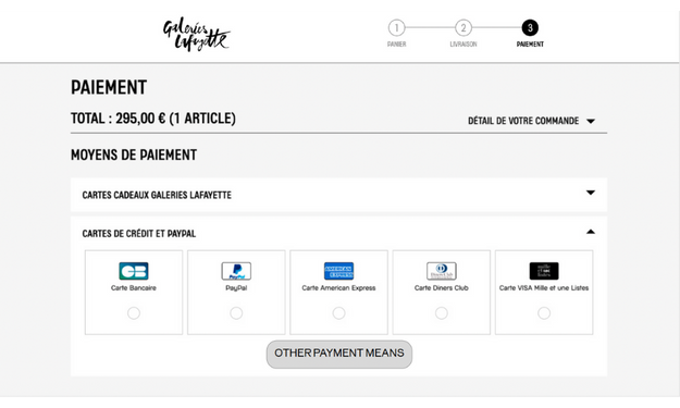
- Payment options: The payment step is the final hurdle. Adding digital wallets is one of the most impactful changes you can make. An analysis by Stripe found that businesses enabling Apple Pay saw an average 22% increase in conversion. It’s a powerful antidote to checkout friction, especially on mobile. You could even explore digital boarding passes that integrate directly with mobile wallets.
- Form factor and flow: Is a single-page checkout less intimidating than a multi-step progress bar? Test it and see!
- Trust-building elements: Reinforce security at the moment of payment. Test the placement of security seals and clear language around your cancellation policies. A simple statement like “Free 24-hour cancellation” can provide the reassurance a hesitant traveler needs.
- Upsell placement: How and when you present add-ons matters. Test bundling services versus offering them a la carte. You might find users are more receptive to upsells like early check-in or seat selection via a follow-up email after the booking is confirmed, reducing friction in the initial checkout.
- Mobile-first experiences: Your mobile checkout shouldn’t just be a shrunken version of your desktop site. Test mobile-specific designs with larger tap targets, simplified navigation, and form fields that trigger the correct mobile keyboard layout.
From insights to impact: Building a culture of experimentation
The true power of optimization isn’t found in a single winning test. It’s found in building a culture of continuous learning. When your product, marketing, and engineering teams are united by an experimentation mindset, you stop debating opinions and start making decisions based on data. You dare to go further.
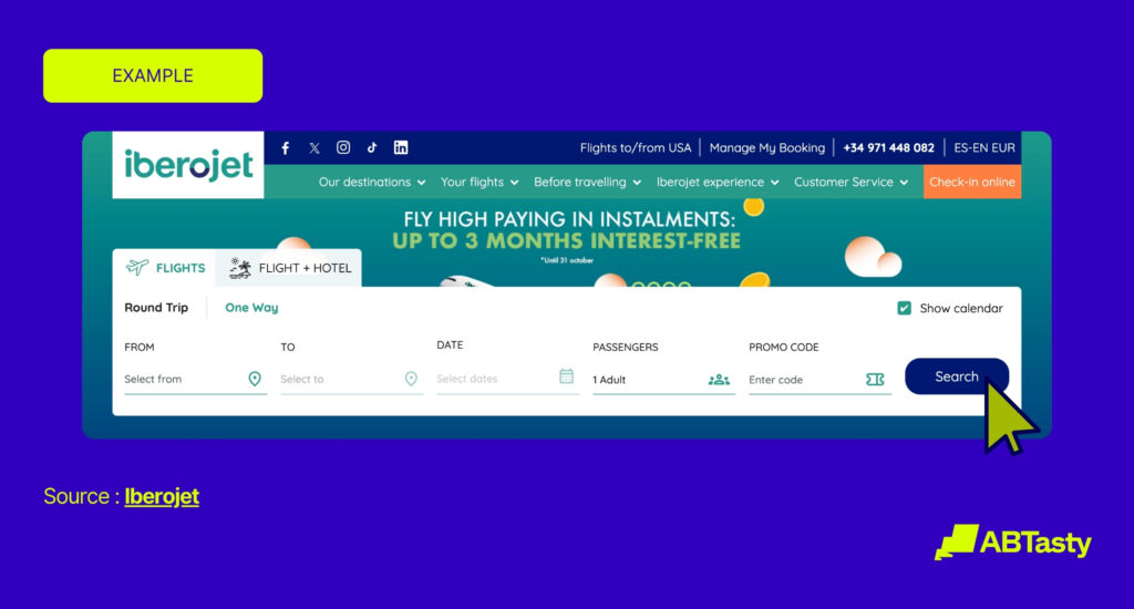
Take Iberojet, for example. The online travel agency questioned whether the order of tabs on their homepage was ideal. Working with us, they ran a simple A/B test to change the order based on user browsing history. That small change increased clicks on the “Search” button by 25%, pushing more users down the conversion funnel.
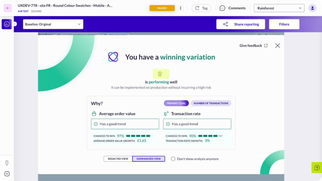
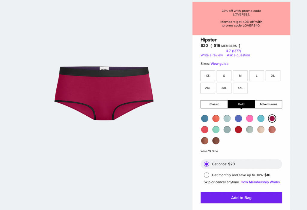
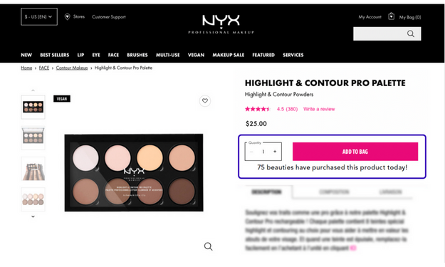
Another powerful example is Ulta Beauty. Working with us, they’ve embedded experimentation into their innovation process, scaling their program from 20 tests per year to over 65. Rather than relying on assumptions, their teams use testing to get quick, data-driven answers. For example, by testing an overlay with product recommendations in the shopping cart, they drove a 9% increase in revenue and a 15% increase in “add to bag” clicks, proving the value of a nimble, “fail-fast” environment.
This is how you find your better. It’s not about finding one perfect, final version of your checkout. It’s about the restless, determined pursuit of a better experience for every traveler, on every device, every single day. The journey starts with a single question: What will you try?