Main Takeaways
› How major airlines optimize their travel bookings
› The secret to boosting summer travel bookings
› Areas where airlines struggle the most throughout the booking process
› Our tried-and-true best experimentation methods for travel brands
The Peak-Season Illusion: Why Airline Optimization Happens Behind the Scenes Before Summer Travel
Summer is in full swing: long vacations under the sunshine accompanied by outdoor lunches and dips in the pool are no longer a part of our “middle of winter” fantasies.
When this time of year rolls around, travel brands are in “all hands on deck” execution mode. The beaches are packed, flights are full, and marketing budgets are maxed out.
But airlines and OTAs alike don’t rake it in the minute the sun comes out of hiding. Trying to fix a leaky booking funnel during peak season is like trying to change a plane engine mid-flight.
Most travel brands, like airlines and hotels, mistakenly think that prime-time summer is where the goldmine for conversions are – but in reality, the best of summer travel bookings happen during the quiet, off-shoulder travel season months of February, March, and April.
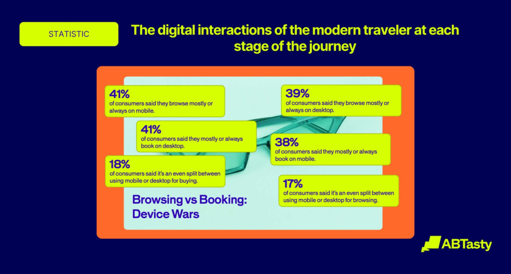
In fact, 80% of monthly airline traffic is now on mobile, but conversion rates lag behind desktop. This is exactly where airline brands looking to increase their summer travel conversion rates have the opportunity window to bridge the gap.
From our findings in our recent Airline Mobile Booking Benchmark Report, we’re going to break down the best ways that airlines can prepare for summer travel to maximize their earnings by optimizing their mobile booking funnel before the peak season begins – achieving a steady conversion rate and getting people under the summer sun sooner than later.
Why the “Shoulder Season” (Feb–Apr) is the Ultimate Optimization Window
February to April is one of the most critical planning phases for travelers. It’s when they are able to align everyone’s schedules and start dipping their toes in the water to see what kind of vacation is even possible.
In turn, this time of year is just as important for airlines – as low season means lower risk for running high-impact experiments.
Testing the Tide: The Ultimate Summer Travel Booking Playground
Running experiments during high-traffic, high-stakes periods can be stressful – especially when it comes to something as momentous as summer travel.
Doing these tests during shoulder season, such as during February to April, allows airlines to:
- Collect ample search traffic to gather statistically sound data
- Allow room to fail and iterate without risking peak summer revenue
- Create a head start to ship validated winners before the summer rush
Industry Insight: The narrowing mobile-to-desktop conversion gap (shrunk from 60% to 24% in just two years).
The Mobile Booking Reality Check: Where Travel Funnels Leak
Knowledge is key to creating change. This is especially true when trying to find where summer travel funnels leak the most, and how to optimize them accordingly during shoulder season to ensure next season’s sales go through the roof.
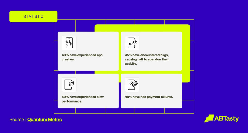
This is exactly where the information we uncovered in our 2026 Mobile Booking Friction Report. Across the board, we broke down six different systemic failures across 6 major European airlines (Air Europa, Lufthansa, SWISS, TAP Air Portugal, Iberia, Ryanair).
We discovered that despite mobile driving over 80% of monthly airline traffic, many airlines are unknowingly driving customers away at the most critical moments. Our latest benchmark report reveals a stark industry benchmark: not a single major airline scored above 80/100 on the friction scale. Even the industry’s top-performing digital teams are leaving massive amounts of peak-season revenue to sink to the bottom of the ocean instead of soaking up the sun – which happens as a result of avoidable, systemic hurdles.
To secure your summer bookings, these four critical friction points must be addressed before the shoulder season ends:
1. The “Price Surprise” & Tax Transparency
Trust is built on transparency, and yet – zero out of the six major airlines we tested display tax-inclusive pricing on their initial search results page.
Waiting for the vacation itself is hard enough, let alone trying to be patient to wait and know how big the bill for the bookings will be. Forcing travelers to proceed multiple steps into the checkout funnel just to see the actual cost of their ticket is the ultimate cart-abandonment trigger.
2. The Trip Summary Bottleneck
The “Trip Summary” phase represents the most critical drop-off zone, averaging a mere 5.7/10 across the industry. When passengers arrive at the payment screen without a clear, consolidated view of their itinerary, baggage allowances, or selected extras – they hesitate. This lack of visual reassurance forces users to back-pedal, often resulting in abandoned sessions.
3. Obstacle-Ridden Search Entries
When people book for summer travel, they want it to be breezy just like the beach they plan to be suntanning on. That’s why forced sign-ins and intrusive app download pop-ups disrupt the natural browsing flow.
For example, Lufthansa and SWISS aggressively push registration prompts mid-search, while Ryanair enforces a rigid login wall right before the payment screen. Every unnecessary barrier introduced before payment lowers the chances of conversion.
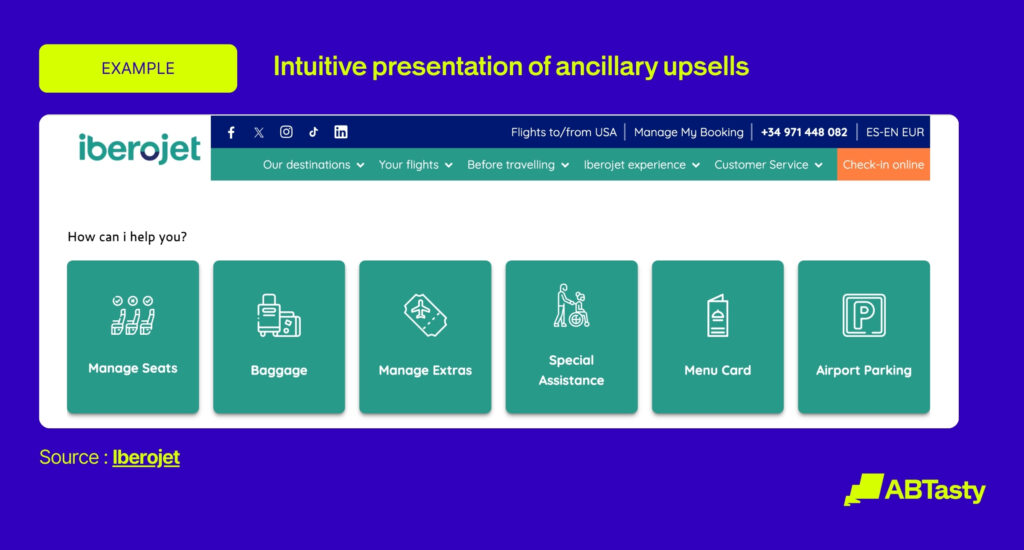
4. Overwhelming Ancillary Fatigue
While upselling is essential for profitability, how it’s presented can make a huge difference. Ryanair forces users through up to six consecutive, mandatory ancillary screens – such as for bags, seats, and travel insurance. This can contribute to intense user fatigue, as the sheer amount of options could prove overwhelming to the user – causing them to leave the page altogether.
There’s a good way to kick this obstacle to the curb. Leaders like SWISS and Lufthansa reduce this friction by consolidating these options into a single, high-impact screen – which can encourage users to move forward with the summer travel booking process.

Proven Experimentation Tactics to Step-Up Before Summer
The period between February and April is the ultimate “testing playground” for travel brands. With lower seasonal risk but sufficient traffic to reach statistical significance, this is the perfect time to solidify validated winners that will carry your revenue through August.
Here are four high-impact experimentation tactics you can implement right now.
Tactic 1: Clear the Path with Upfront Pricing & Reassurance
A major driver of mobile abandonment is “price shock” late in the funnel. Instead of hiding taxes and fees, airlines should experiment with transparency.
- The Experiment: Test tax-inclusive labels or calendar-based pricing that surfaces the lowest fares directly inside the date picker – a tactic effectively used by TAP Portugal to set expectations before the user even starts selecting anything from the search button.
- The Metric: Watch for an increase in the downstream conversion rate and a significant reduction in payment-page abandonment.
Tactic 2: Reorganize and Simplify Ancillaries
Travelers suffer from decision fatigue when faced with endless screens for seats, bags, and travel insurance.
- The Experiment: Airlines and travel brands should move toward dynamic fare bundling. This can be done by grouping ancillaries into targeted “Trip Packs” for specific segments (i.e., a “Business Pro” pack including a seat, bag, and priority boarding) rather than bombarding them with individual choices.
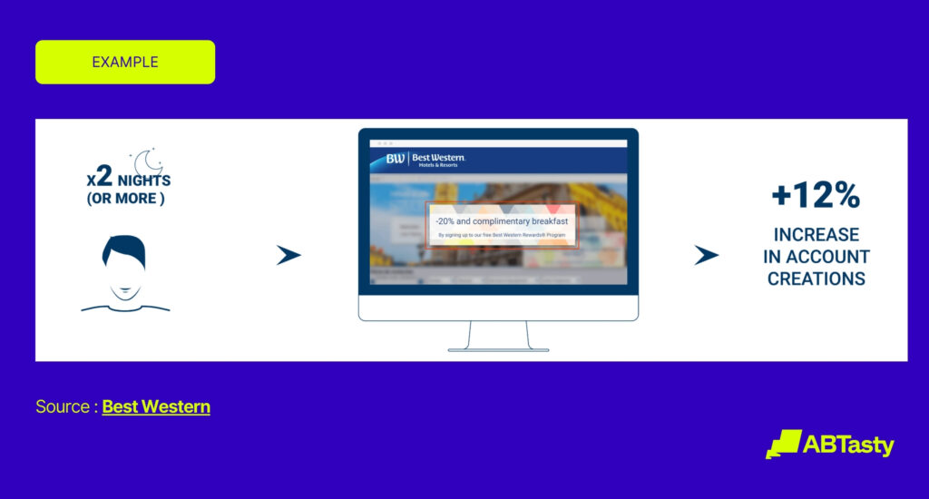
- Real-World Impact: When Iberojet used AB Tasty to reorganize their search tabs based on historical user intent, they saw a 25% surge in searches and a 22% reduction in friction caused by unnecessary tab-switching.
Tactic 3: Optimize the Flight Summary & Passenger Form Flow
The transition from selecting a flight to entering passenger details is a high-friction zone when booking travel on mobile devices.
- Real-World Impact: Air Europa used AB Tasty to optimize their mobile flight summary and multi-step passenger forms. By refining the layout and reducing field clutter, they achieved a +9% conversion rate increase from the flight summary to the passenger details page, a +5% increase in form completion, and a jump in CSAT from 81% to 87%.
Tactic 4: Algorithm-Driven Sorting Over Static Price Sorting
Price is a deciding factor, but it isn’t the only factor. Airlines that limit themselves by sorting by “cheapest” could end up hiding high-value options that better suit a traveler’s needs.
- The Experiment: Surface a “Recommended” listing at the top of search results based on a dynamic relevance algorithm (considering time of day, duration, and baggage) rather than a static price list.
- Real-World Impact: In controlled tests, switching to dynamic algorithm-driven sorting resulted in a +2.8% revenue uplift and a +4.6% increase in Average Order Value (AOV).
The Shared Platform Opportunity: Fix Once, Win Multiple Times
When operating a multi-brand travel group, optimization is rarely an isolated effort – but rather an opportunity for exponential impact. Our latest mobile booking friction report highlights this beautifully through what we call “The Lufthansa Group Paradox.”
During our assessment, Lufthansa and SWISS scored identical results across all seven evaluation stages of the booking funnel. This happened because both carriers shared the same friction points across their respective booking journeys.
This shared predicament presents a massive Group Multiplier Effect. For airlines like these, resolving a single friction point on a shared platform is a “solve it once, scale the win” strategy. A single optimized checkout flow, a streamlined ancillary screen, or a clearer trip summary can instantly lift performance and conversion rates across your entire portfolio of brands at the exact same time.
This systemic approach to optimization is crucial as the competitive landscape shifts. Online Travel Agencies (OTAs) are rapidly closing the digital experience gap. Unlike many carrier apps, OTAs rarely interrupt users with forced registration walls mid-booking and are highly disciplined at keeping trip summaries transparent and distraction-free.
To win back direct customer relationships from OTAs, travel brands looking to boost summer travel must leverage their proprietary data. By implementing continuous, platform-wide experimentation, travel groups can transform their shared digital assets into highly optimized conversion engines just in time for the summer rush.
How AB Tasty Helps You Navigate the Optimization Flight Path
Identifying friction points in your booking funnel is only the first step to securing summer travel “checkouts” from travelers.
To capture peak seasonal demand, travel brands must move beyond “we think” to “we know”.
Heuristic reviews and guesswork can point to potential problems, but only live, statistically sound experiments can quantify exactly what a fix is worth to your bottom line. Instead of rolling out unproven changes during high-traffic periods, experimentation replaces assumptions with data, letting you validate every pixel of your mobile experience before the summer rush begins.
How To Empower Your Summer Travel Booking Journey
AB Tasty provides the specialized capabilities travel brands need to systematically eliminate booking friction and maximize conversion rates:
- Low-Latency Server-Side Testing: Run complex feature experiments on critical backend systems, search algorithms, and pricing structures directly from your servers. This ensures dynamic changes are delivered instantly without the dreaded “flicker” effect that hurts mobile user experience.
- Dynamic Segmentation & Personalization: Instantly adapt the native app or web interface based on real-time, in-session behaviors. Tailor banners, baggage promotions, or fare summaries to specific passenger profiles without relying on third-party cookies.
- Unified Tooling: Break down organizational silos by bringing product managers, engineers, and marketers onto a single platform. This unified environment dramatically increases testing velocity, letting teams ship and validate winners at scale.

The Bottom Line: Better Optimization Leads to Better Summer Bookings
Remember, peak-season revenue isn’t earned during the summer peak – it’s secured during the quiet winter and spring months before summer travel is in full bloom.
By tackling booking friction before the annual summer rush, travel brands can ensure their summer bookings take flight with ease.
Don’t leave your summer conversions on the runway.
FAQs
Still have questions about boosting summer travel bookings? Here are the answers you need.
Why should travel brands prioritize testing during the shoulder season (February to April) instead of peak summer?
Testing during the shoulder season minimizes revenue risk while leveraging ample traffic to address the industry-wide reality that no major airline currently scores above 80/100 on the friction scale. This critical window allows teams to bridge the 24% mobile-to-desktop conversion gap and ship validated winners before high-stakes peak volume arrives.
What specific mobile friction benchmarks should airlines target to improve summer bookings?
With 80% of monthly airline booking traffic now on mobile, brands should target the “Trip Summary” phase, which currently averages a failing score of just 5.7/10 across the industry. Optimizing these high-friction zones during the off-season can lead to proven results such as Air Europa’s +9% increase in conversion from flight summary to passenger details.
What are the best A/B tests for hotels and travel brands before the summer booking season?
The best pre-summer A/B tests are the ones that reduce hesitation and decision fatigue, such as showing clearer total pricing earlier, bundling add-ons more intelligently, and streamlining booking forms on mobile. These types of experiments are especially valuable before summer because validated winners can be rolled out ahead of peak demand and carry performance gains through the busy season.
Why should travel companies optimize booking journeys before summer instead of during peak season?
Travel companies should optimize before summer because peak season is the worst time to introduce unproven changes into a high-stakes booking journey. Running experiments earlier gives teams time to validate ideas, reduce mobile friction, and launch proven improvements before the highest-volume summer traffic arrives.

About the Author
John Huges
John Hughes is the Vice President of Marketing for AB Tasty, with over 20 years experience in tech and SaaS. He is passionate about creativity and global growth, contributing to the blog with insights on AI, optimization, and travel industry marketing applications strategies tools.