A Key Competitive Advantage: OTAs Hurdling Towards Growth with Website Optimization in 2026
In 2026, website optimization is no longer optional, but essential – especially for entities like Online Travel Agencies (OTAs).
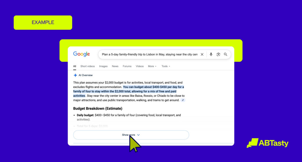
OTAs, once the more popular choice for organizing future travels, is at a crossroads in 2026 – as AI agents and booking-machine-bots are slowly creeping their way into the travel industry.
In turn, OTAs are facing rising customer acquisition costs and stronger direct-booking competition. With the potential for these competitors to be better, faster, and more affordable than OTAs – it’s more important than ever before for OTAs to optimize accordingly.
To retain user’s attention throughout the booking process, it’s paramount to provide a seamless, mobile-first experience – as transparent booking journeys are becoming the best way to turn existing traffic into reliable revenue.
In this article, we’ll break down how website optimization can keep OTAs in the travel booking game by breaking down the best practices to boost conversions and brand loyalty long-term.
A Smarter Way to Test, Learn, and Convert: What Is Website Optimization Software?
Website optimization software is a tool that allows your brand to monitor performance, rankings, and conversion rates and ideas on how to optimize them for further improvement. The goal is to better understand these potential roadblocks that can help digital brands, such as OTAs, successfully redesign their travel booking experiences accordingly for long-term growth.
The flip cards below will reveal just a few of the ways that website optimization software can help brands to improve their digital performance:
A/B Testing
Compare two versions of a webpage or feature to see which one drives stronger engagement, conversions, or bookings.
Multivariate Testing
Analyze how multiple page elements like headlines, images, and buttons work together to improve performance.
Personalization
Tailor content, offers, and recommendations based on user preferences, location, or browsing behavior.
Segmentation
Group users by behavior or characteristics so experiences and marketing strategies can be more precisely targeted.
Behavioral Insights
Understand how users interact with your site and uncover friction points, drop-offs, and opportunities to improve conversions.
Feature Management
Roll out new features gradually, test safely, and reduce risk by controlling who sees what and when.
Website optimization goes beyond basic CRO as it uses data-driven strategies to improve the entire customer journey – from discovery, search, booking, and potential post-purchase engagement like travel upgrades or other ancillary offers.
For OTAs, these various website optimization tactics like testing, personalization, segmentation, and behavioral insights can all create a smoother user experience, increase conversions, and build long-term customer loyalty.
An attractive website can attract potential travelers, but website optimization for OTAs can actually drive customers to book their next dream trip instead of staying stagnant and scared to take the booking leap behind the screen.
Why OTAs Need Website Optimization in 2026 More Than Ever
Website optimization has never been more critical for OTAs.
As OTAs compete in a crowded, high-intent but high-friction digital environment – ensuring that the booking process remains free of pain points to create a smooth, pleasurable experience is crucial for conversions.
Accelerating Against AI & Official Booking Websites
Today, travelers demand relevance, speed, and trust from the first click – something that OTAs may struggle with, especially for users who require reassurance and vetted reviews to make a booking.
As AI booking agents, official airlines, and hotel websites continue improving their direct search and travel booking experiences – OTAs are being challenged to re-establish their worth for travelers.
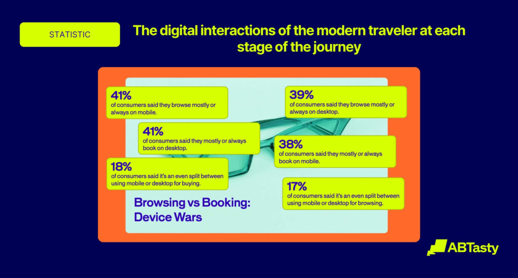
Growth of Mobile Traffic
Today, a whopping 63% of all travel bookings are made on mobile devices. This reveals the importance of mobile traffic, as it continues to dominate travel discovery and booking.
This is precisely why OTAs need website optimization to improve conversions, reduce friction, and stay agile in a fast-changing market where mobile bookings will continue to take precedence over traditional, desktop-oriented travel searches.

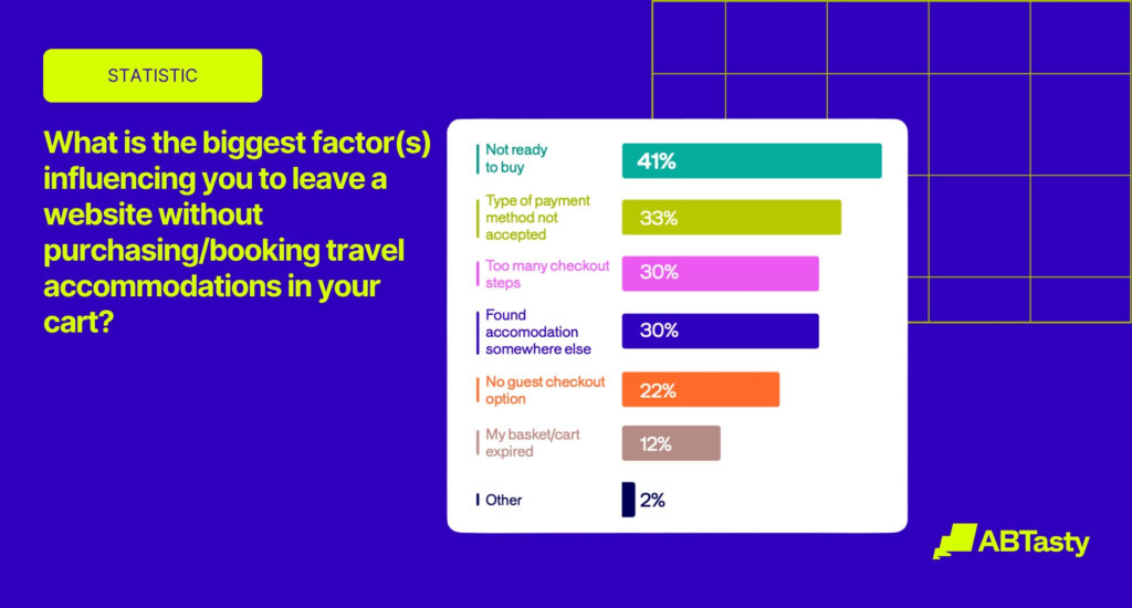
Common Conversion Challenges for Online Travel Agencies & Where Friction Hides
Some of the most common conversion challenges for Online Travel Agencies include high cart abandonment, lack of trust from potential travel bookers, and combating decision fatigue from too many choices.
This is where website optimization can step in, helping to address the following potential challenges:

Decision Fatigue
Too many travel choices, packages, or fare options can overwhelm users and make them more likely to leave without booking.

Complex Search
Search experiences should be tailored to traveler intent, helping users quickly filter and find what matters most to them.

Hidden Fees or Unclear Pricing
Travelers expect pricing transparency. Even when OTAs show tax-inclusive totals, confusing fee structures can still create frustration and distrust.

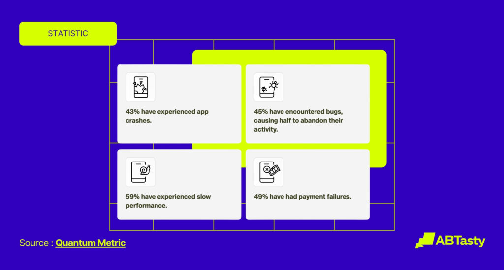
Weak Mobile Experiences
With more than half of bookings now happening on mobile, OTAs need fast, intuitive, mobile-first journeys that convert on smaller screens.

High Abandonment in Checkout or Payment
Long forms, unclear next steps, or generic booking flows can cause users to drop off before purchase, making personalized reassurance essential.

Lack of Trust and Reassurance
Travelers need clear signals around security, flexibility, and credibility before they feel confident enough to complete a booking.

Personalize the Travel Experience
Generic content slows travelers down. OTAs need to match experiences to user intent so visitors can find relevant options faster.
Missed Opportunities
Better presentation of upgrades like bags, insurance, or premium options can help OTAs increase ancillary revenue without adding friction.
Overcoming OTA Challenges with Website Optimization
OTAs operate in a highly competitive environment where even small differences in the booking experience can lead to lost conversions and low customer retention.
Booking a trip entails several emotions all at one: from overwhelm and financial stress to excitement, anticipation, and the pressure of making the “right” decision.
With so many flights, hotels, and package options to choose from all at once: travelers can easily end up abandoning their search entirely. This is why it can be challenging for OTAs to create a booking experience conducive to relaxation, reassurance, and ultimately – conversion.
Website optimization can help OTAs to address these challenges by making the user journey faster, clearer, and more personalized with features like intuitive search tools, transparent pricing, targeted recommendations, and streamlined mobile booking experiences. These mechanisms can help to improve both functionality of the OTA booking site and customer satisfaction.
By reducing friction and aligning content with user intent, website optimization can help OTAs to directly improve conversion rates, strengthen trust, and encourage repeat bookings – which can turn into long-term loyalty.
How Website Optimization Software Improves OTA Performance Across the Booking Journey
We’re going to break down exactly how website optimization software like AB Tasty can help OTAs to improve their booking journeys for a friction-free shopping experience for all travelers.
Improve Search and Discovery With Less Guesswork
The search bar is one of the most pivotal parts of the entire travel booking experience. It can either greatly reduce or cause frustration for visitors trying to find exactly what they’re looking for, making it a crucial component for OTAs to optimize.
Website optimization software can accommodate this challenge by improving search bars with better filters, result pages, and even providing destination inspiration for unsure travelers. This can help users to find relevant options faster and reduce friction from the start of the booking journey.
Reduce Booking Funnel Friction and Keep Momentum High
From deciding where to go, searching for the best airfare, and comparing hotel amenities – the travel booking funnel is long, tedious, and full of potential friction points. This means OTAs need to keep interest high long enough for users to convert.
This can be done through tactics like:
- Improving results pages
- Modifying presentation for fare selection
- Reducing long forms
- Simplifying checkout flow
- Making the payment process easier
- Testing layouts and messaging that reduce hesitation
Personalize the Traveler Journey in Real Time
Since booking travel is an emotionally charged experience, it’s important to make sure the user feels catered to every step of the way.
This requires adapting content, recommendations, and offers based on device, behavior, location, or user search intent. In turn, this can help to differentiate experiences for different types of travelers – from first-time adventure seekers to returning visitors.
By making the booking journey feel more relevant and helpful, OTAs can successfully boost their conversion rates and brand loyalty altogether.
Build Trust at the Moments That Matter Most
As booking a potential trip can be anxiety inducing for many users, it’s important to establish a strong sense of trust to encourage people to proceed to checkout – which is where conversions are most at risk.
Web optimization software can help with this through testing price transparency, cancellation messaging, reviews, social proof, and payment reassurance.
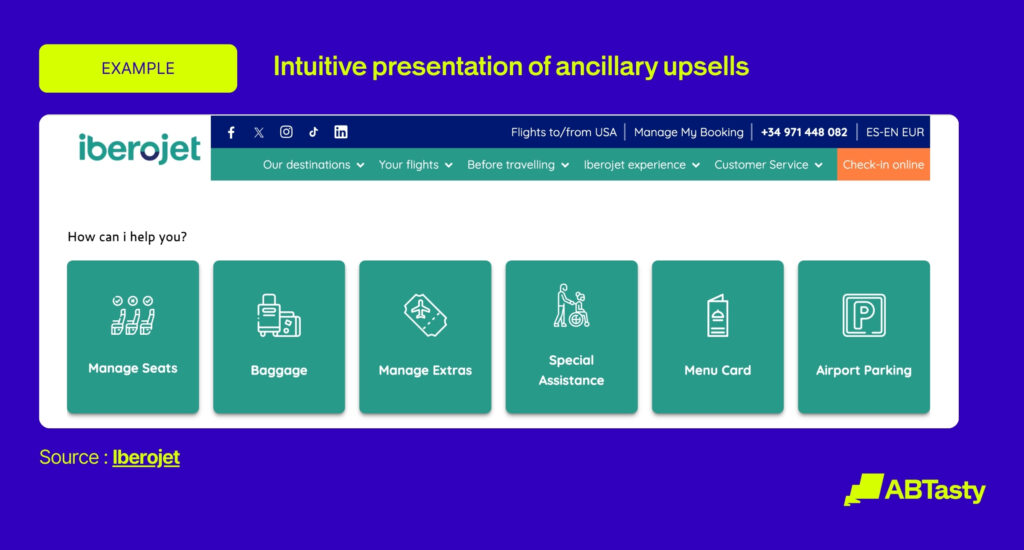
Unlock More Revenue Without Adding More Friction
Ancillary revenue is a huge opportunity for OTAs to increase potential income. Website optimization software can aid in this endeavor by optimizing these ancillary services: from travel bundle deals, premium options, and loyalty offers.
Furthermore, by testing the timing and placement of upsells, OTAs can further refine and maximize the potential of boosting their ancillary revenue through the use of optimization platforms like AB Tasty.

What Features to Look for in Website Optimization Software If You’re an OTA
Choosing the right website optimization platform can be stressful. OTAs and other travel brands need a fair mix of speed, flexibility, and strong cross-team usability to function with ease.
To make it easier for OTAs on the hunt for the right optimization software, we’re providing you with a practical checklist of solution criteria for OTAs:
- Both A/B and Multivariate Testing: While A/B testing remains a tried-and-true method for testing, multivariate testing can be especially useful for travel websites like OTAs.
- Real-time Personalization: Personalizing for users according to their exact needs at the moment is key for travel websites.
- Audience Segmentation: As we explained before, booking travel involves a myriad of emotions – meaning it’s important to understand why each user might be behaving as they are and how to optimize accordingly. This can be done with audience segmentation through tools like EmotionsAI.
- Behavioral Analytics: On that note, continuously seeking to understand what your users need is compulsory for continued success and improvement in industries like travel booking. OTAs should seek website optimization software that aims to turn insights into growth.
- AI-driven Tools: AI can work as a co-pilot in the online travel booking process to reduce friction and make the experience more seamless, such as with insights or recommendations.
- Scalability: OTAs need to scale across devices, markets, and traffic spikes while maintaining fast, reliable booking experiences.
- Fast Execution: Lean OTA teams rely on integrations, analytics tools, and low-code editors to quickly launch tests and optimize experiences without heavy developer support.
Test Your Confidence with AB Tasty: How We Help OTAs Compete in 2026
AB Tasty is a great solution for OTAs that want to partner together to make progress.
By optimizing the full digital journey by combining experimentation, personalization, feature management, and AI-powered capabilities in one flexible platform – OTAs can make their booking process as relaxing as the vacation itself.
Instead of relying on assumptions, our team at AB Tasty can test what actually improves performance across search, results pages, booking flows, checkout, and post-booking experiences. This takes the guesswork out of optimizing OTA websites, allowing their internal teams to focus on other matters.
With AB Tasty, OTAs can:
- Refine search and booking journeys
- Test trust-building elements like pricing clarity
- Compare and contrast fare displays
- Personalize recommendations by audience intent
- Alter click out messaging to reduce drop-off rates
- Develop clear reassurance messaging
- Tailor experiences to different traveler needs in real time
- Optimize ancillary offers such as baggage, insurance, and upgrades
- Improve loyalty experiences through more relevant messaging and smoother paths to conversion
All of these touchpoints matter in travel, where even small moments of friction can lead to abandonment.
Ultimately, AB Tasty helps OTAs move faster, learn continuously, and create smarter digital experiences that increase bookings, build trust, and maximize the value of existing traffic.
The Bottom Line: Website Optimization Helps OTAs Turn Traffic Into Trust, Bookings, and Growth
Overall, OTAs can no longer rely on acquisition alone to compete in 2026 – as smarter optimization, from personalization to improved search tactics, are key to big wins.
Every click starts with a story, and understanding that intent is the secret to driving conversions. This is exactly why website optimization can be a game changer for OTAs looking to transform their traffic into a reliable booking engine conducive to long-term growth.
Remember, some of the biggest gains for OTAs come from:
- Reducing friction in the booking experience
- Personalizing intelligently for each individual travelers
- Building trust to encourage future bookings
Let’s Make OTAs and Optimized Gold Mine, Together
OTAs that embrace experimentation and continuous optimization will be best positioned to grow.
Ready to travel further, together?
FAQs
Still have questions about OTAs and optimization? Here are the answers you need.
What are OTAs?
Online Travel Agencies (OTAs) are digital platforms that allow users to find and compare various booking services like hotels, car rentals, and vacation packages. Popular examples include Booking.com and Expedia.
How are OTAs different from official booking agencies?
OTAs curate their lists from several different providers, which allow travelers to compare and contrast pricing options in one place. As official booking agencies or direct hotel and airline websites only promote and sell their own inventory, it can be more challenging for users to decide which travel brand offers the best loyalty perks, flexibility, or exclusive deals.
How does website optimization help OTAs?
Website optimization can help OTAs by providing an improved user experience, increased conversion rates, and better booking revenue by making search, comparison, and checkout faster and easier. Optimized OTAs also have better SEO rankings, reduced bounce rates, and more personalized recommendations that incite customer engagement.
What are common A/B tests for OTAs?
Common A/B tests for OTAs include experimenting with search filters, CTA text color or size, pricing displays, booking button placement, urgency messaging (“Only 2 rooms left”), and checkout flows.

About the Author
John Huges
John Hughes is the Vice President of Marketing for AB Tasty, with over 20 years experience in tech and SaaS. He is passionate about creativity and global growth, contributing to the blog with insights on AI, optimization, and travel industry marketing applications strategies tools.