Article

9min read

15 Practical Tips to Boost Your Call to Action Click-Through Rate (CTR)

Call to actions (CTAs) count. In fact, more than 90% of consumers who read your headline will also read your CTA copy.

A well-crafted call to action will result in more click-throughs, which typically translates to more conversions.

Your CTA should inspire action, telling your audience what to do next in a way that’s clear, direct, and offers real personal value. If you fail to make an impact with your CTA messaging, then more often than not, the rest of your content will be rendered redundant (or at least become diluted).

So, to help you increase your call to action click-through rate (CTR) and boost your bottom line, here are 15 practical tips.

1) Make your CTA buttons appear ‘clickable’

While this may sound glaringly obvious (making your CTA buttons clickable is the aim of the game, after all), it’s vital. 

To ensure that your CTA messaging stands out on the page and appears clickable to your audience, here are some fundamentals you must consider:

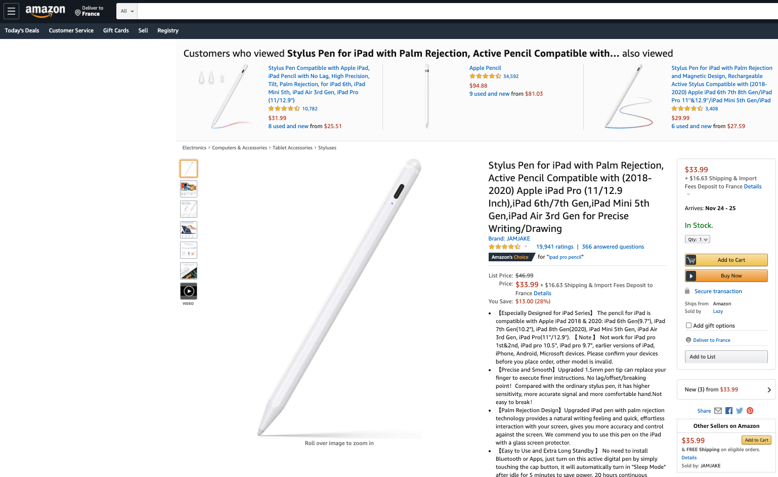
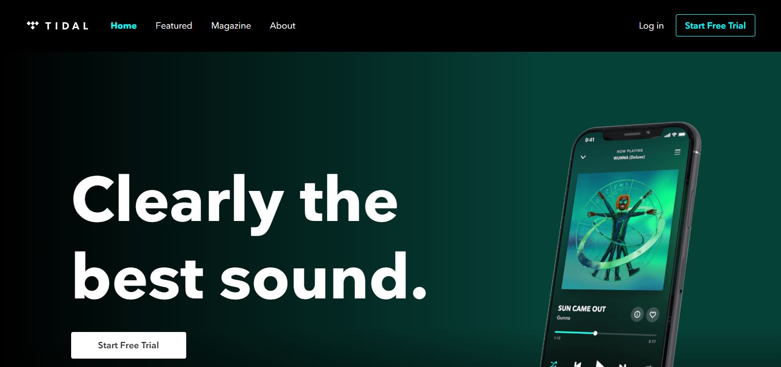
  • Make sure that your CTA button doesn’t clash with other visual elements on the page.
  • Opt for a rounded or rectangular button.
  • Create text and button colors that have a clear contrast. If prospects can’t see your text, it’s unlikely they will take action.

2) Put your CTA buttons in the right places

When it comes to boosting the click-through rate of CTA buttons, placing them in the right place is essential.

An eye-tracking study discovered that most users follow an F-shaped pattern when browsing web pages. That said, there are areas of a webpage where your CTA button will perform better.

Source

Placing your CTA button above the fold will often prove effective, but it’s certainly not compulsory. Providing you place your CTA button in a logical place somewhere in that ‘F browsing shape, you will entice more click-throughs.

Look at your page as if you were a consumer. Follow the browsing pattern and it should become clear (within the context of your content) where to place your CTA button.

3) Focus on your short button copy

Most effective CTAs are concise yet impactful. So, if you focus on your short button copy, you will increase your CTA click-through rate.

Your CTA button will have limited room for text, so you have to make your copy count. Here are some solid short copy examples for inspiration:

  • Get started
  • Subscribe
  • Try for free
  • Join us
  • Join the family
  • Let’s work together
  • The time is now
  • Start your journey

4) Evoke emotion or a sense of enthusiasm

Concerning your CTA click-through rate, the more urgency you create, the more influential the result.

If you create a sense of urgency or generate enthusiasm with your CTA, you will prompt people to click-through.

For instance, if your landing page is focused on selling a brand new product, then once you’ve told your story and highlighted the USPs, you could sign off with, ‘…but they’re selling like hotcakes. Order yours now before it’s too late.’

This level of urgency will prompt click-throughs.

5) Use action words

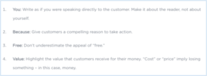
Certain words or phrases will encourage action. Known as marketing action words, these particular terms are punchy, impactful, and will encourage consumers to click-through.

This glossary of marketing action words will boost the success of your CTA click-through rate—and there are plenty to choose from.

glossary-CTA

Source

6) Utilize FOMO

FOMO (fear of missing out) is an approach that will help you boost your CTA click-through rate exponentially. If you’re running a promotion or marketing a new product, the FOMO trick will work wonders.

By producing a CTA that makes your audience feel like they’re going to miss out on something worthwhile (or be the only one left out), you will motivate them to click-though and, potentially, convert.

Phrases like ‘don’t miss out’ work well when it comes to FOMO marketing, as does letting your audience know how many people have bought your product or signed up to your service. And, considering that 69% of millennials have severe FOMO, the fear of missing out card is certainly worth trying.

7) Customize your CTA according to device

The concept here is simple: to ensure a healthy click-through rate for your CTA, you must make sure that it’s optimized for every device.

Whether you’re talking about a CTA button or a powerful text-based sign-off, you must always test your call to action across every device (desktop, mobile, tablet, etc.) to ensure that it’s functional, legible, and creates maximum impact.

If you fail to do so, your CTA click-through rate is likely to dwindle, fast.

8) Use numbers where you can

There is a science related to numerics and the human brain. It appears that we can process numbers more intuitively than words at a glance.

That said, if appropriate, use a number rather than a word as this is likely to help with your click-through rates.

For instance, rather than ‘Shop now: only two days left,’ you should try ‘Shop now: only 2 days left.

9) Step outside the box

This is a phrase that is used so frequently it’s become a cliche. But regarding your CTA CTRs, stepping outside the box will yield positive results.

What we mean here is that when it comes to a call to action, getting a little creative will encourage more engagement.

Here are some tips that will help you step outside the (CTA) box:

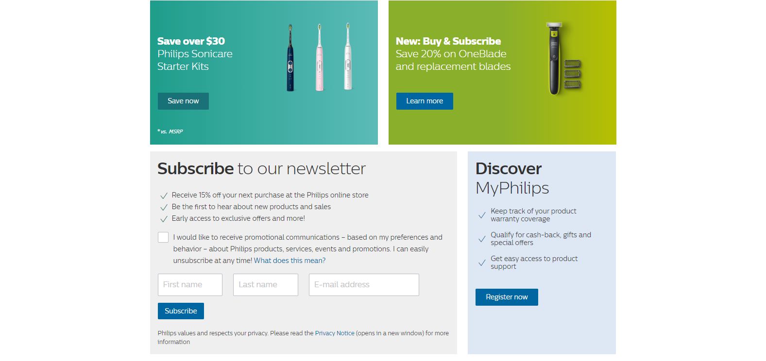
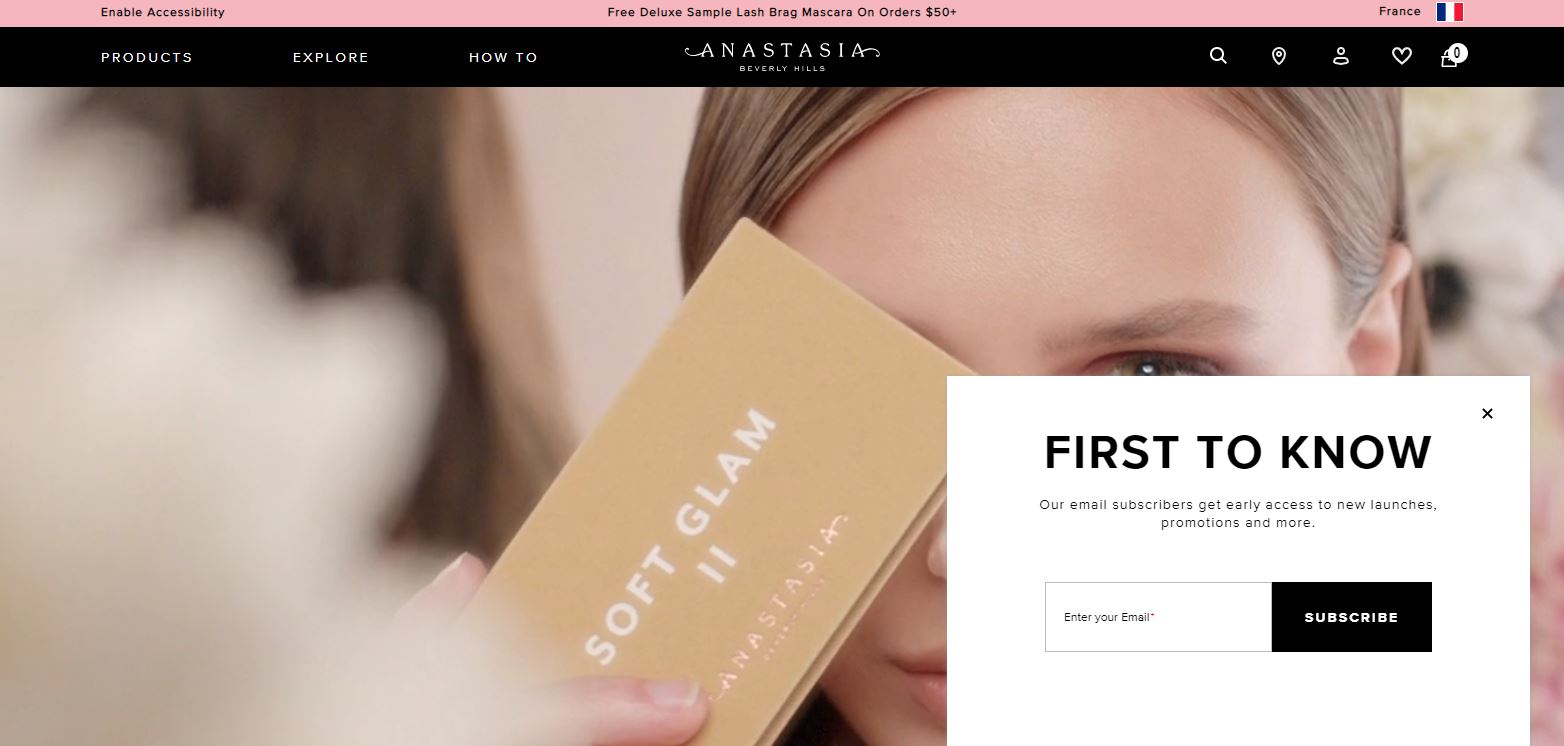
  • Hit your reader with a hint of unexpected messaging. PointBlank SEO’s ‘Be Awesome’ CTA is an excellent example.
  • Experiment with conversational language or regional phrasing (tailored to your target audience).
  • Weave your brand name into your CTA copy. Greetings card brand, GiftRocket, did this well with the CTA copy: ‘Send a GiftRocket.’


Source

10) Build suspense and anticipation

In addition to creating a sense of urgency or taking the FOMO approach, generating suspense will also benefit your CTA CTR.

By creating an air of mystery or somewhat of a cliffhanger with your CTA messaging, you will encourage your readers to click-through and find out more.

As humans, we’re a curious bunch with an affinity for storytelling. Create suspense, sign off with a cliffhanger, and people will have no choice but to click through.

11) Add images where appropriate

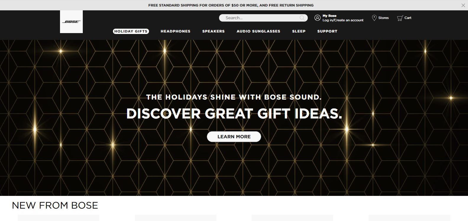
Using a powerful or striking image in conjunction with your CTA will help to encourage click-throughs.

But if you want your image to boost your CTA success rather than hinder it, you should follow these best practices:

  • Choose an image that aligns with your call to action goal.
  • Avoid imagery that is too bright or busy as this will detract from your CTA message.
  • Select images that are likely to evoke the emotion you want your reader to feel. For instance, if you’re a wellness service provider, looking to make people feel uplifted, then using a more animated image of smiling faces might work well.

12) Experiment with colors

When it comes to CTA buttons or text, experimenting with colors will help you increase your click-through rate.

Studies suggest that bold, bright colors are effective for CTAs, so start experimenting with a vibrant palette and see what fits best with your blog post, landing page, or product page.

13) Use white space

Another click-through rate-boosting design tip comes in the form of white space.

By placing a healthy amount of white space around your call to action text or button, you will grab the reader’s attention on the page. 

As a result, your readers will focus more on your messaging, in turn prompting them to click through. This approach will prove especially effective for mobile screens.

14) Follow a natural progression

As we touched on earlier, the human brain responds well to storytelling. To give your CTA a click-worthy punch, your page elements should follow a natural progression or narrative.

When you’re creating your page content, consider the F-shaped scanning pattern, using this logic to tell a story that ultimately flows towards your CTA.

But whatever you do, make sure that this natural progression doesn’t jar the reader and make them bounce off the page. For example, you wouldn’t put a ‘register now’ CTA button above your event or webinar details.

Follow a natural progression that focuses on strong storytelling and the rest will follow.

15) Don’t forget to A/B test

If you want to optimize your CTA performance and maintain consistently high click-through rates, then A/B testing is essential.

By testing two versions of a web or landing page, you can gain a wealth of performance-related insights that will help you make the best possible decisions based on CTA design, copy, and placement.

If you know which elements best resonate with your audience, you will be empowered to create CTAs that will boost your click-through rate time after time. 

Regardless of your niche or industry, creating a strong call to action is essential to your ongoing business success. Follow these tips, test your choices, and you will boost your click-through rate sooner than you think. You can do it!

Subscribe to
our Newsletter

bloc Newsletter EN

We will process and store your personal data to respond to send you communications as described in our  Privacy Policy.

Article

9min read

Drive Digital Transformation With Client-Side and Server-Side Optimization

The further your company is on its digital transformation journey, the more critical experience optimization (EXO) becomes. After all, you want your digital products to deliver the best customer experience to meet your business goals and stay competitive. Marketing and product teams can use a variety of tools to conduct and measure EXO experiments. Most of these solutions fall into two categories: server-side and client-side experimentation tools.

But which is the right solution for your use cases? How do they differ, and what can they do? Let’s find out in this blog post!

What’s the difference between client-side and server-side?

You may already be familiar with the technical concepts behind client-side and server-side tools. In short, client-side solutions operate in your users’ browsers, while server-side tools run on a physical or virtual server.

Client-side tools allow you to test visual or structural variants of your website or web app to optimize the customer experience. In most cases, these tools use JavaScript – a programming language that runs in the browser – to put a new UI layer over your existing website.

Client-side solutions usually don’t require programming skills since they generate the experiment code themselves and don’t modify your site’s code. Instead, they often offer a visual editor in the admin interface, which lets you comfortably alter your website’s look and feel. This makes client-side EXO solutions particularly popular with marketing teams who use them for conversion rate optimization.

Server-side testing require technical expertise and coding skills as you need to incorporate experiments into your code and deploy it. For example, you can use server-side EXO solutions to test business transactions, algorithms, and new functional variants. They’re also incredibly valuable when you want to conduct experiments that shouldn’t be influenced by browser quirks or user devices. 

Yet, these solutions aren’t only relevant to tech teams. Often, non-technical staff team up with product teams to define experiments, which are then executed by the engineers. Once implemented, an experiment can usually be controlled, monitored, and analyzed via a dashboard (if provided by the solution).
The pros and cons of client-side and server-side tools

Now that we’ve covered the two variants in more detail, let’s look at their general advantages and disadvantages.

Client-side pros:

  • Technical independence. Marketing teams can create and edit experiments as they see fit without relying on development and IT resources.
  • Available to everyone. Non-technical teams can quickly and effortlessly set up, modify, and analyze experiments using visual editors.
  • Efficiency. Gain valuable insights and streamline your product’s or service’s customer experience while investing little time and money.

Client-side cons:

  • Flicker effects. Users may notice a brief flicker while the webpage loads. This happens when the experiment’s UI layer is placed on the original website, and the user sees it.
  • Performance. The more JavaScript you load, the slower your website can become. Also, the generated experimentation code’s quality can harm the user interface’s loading speed and responsiveness.
  • Security and secrecy. Everything a browser can read is public and can be read by anyone – if it’s not encrypted. If you want to keep experiments or their logic a secret, it’s usually safer to opt for a server-side solution.

Server-side pros:

  • Flexibility. Tech teams have full control over their server-side code, so they can build experiments precisely as needed without being constrained by the tool.
  • Robustness. Code that runs through deployment processes and QA should meet your company’s quality standards. Experiments cannot be influenced by browsers or devices used and are therefore stable.
  • Omnichannel experiments. You’re not limited to testing websites and web apps in a browser. Conduct experiments on any channel, be it native mobile apps, email, IoT devices, etc.

Server-side cons:

  • Long implementation time. Server-side experiments require code releases. Depending on your deployment and QA strategy, you need to involve different teams and processes, increasing implementation time.
  • Demanding. If the use cases for server-side tools are unclear, you may be using them for the wrong ones. Hence, you may waste time and money implementing and running tests that would have been much easier with a client-side tool.
  • Expensive. Because server-side experiments require many resources to implement, edit and remove, the cost is typically higher than client-side experiments.

As you could see, each solution has drawbacks that you need to consider before choosing the one fit for your use cases. However, should you choose one over the other at all? We believe that the advantages and disadvantages of the tools complement each other well and, if used correctly, can result in significant benefits. 

Let’s find out how you can get the best out of both worlds!

How you can benefit from both methods with AB Tasty

Using client-side and server-side functionalities for experience optimization gives your company the needed agility to meet your consumers’ changing and demanding expectations. Yet, to set up productive workflows, you need to determine when and how which experiments should be utilized by whom.

We recommend splitting up tests and experiments between your marketing and product teams. AB Tasty‘s client-side feature helps your marketers optimize conversions and increase user satisfaction. Product teams use our server-side feature to enhance the functionality of digital products and services. It relies on features flags that could be used in many different ways.
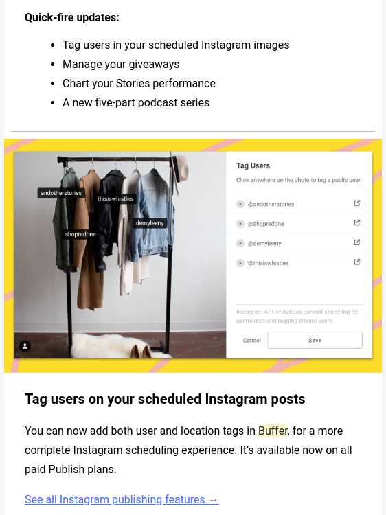
Client-Side vs. Server-Side Experiments [Infographic]

Ultimately, knowing who is responsible for which experiments can save your teams a lot of time and headaches. Let’s paint a clearer picture by talking about how our customers use AB Tasty’s client- and sever-side functionalities to optimize customer experiences.

Temporary changes to your website’s UI

Valentine’s Day, Christmas, and Black Friday provide the perfect opportunity to pamper customers with sales and specials. For the occasion, you may want to give your website the proper festive look or display banners and other new UI elements. However, these events are time-limited, and you want your website to return to its usual look and feel at midnight sharp.

Temporary changes to your website’s UI are the ideal job for client-side experimentation solutions. Marketers and designers can make changes themselves without consuming development resources. As a result, they can put their strategies into practice exactly as they imagined and have full control over what is displayed when.

Experimentation

Experimentation is a big subject and involves many different methods and strategies for client-side and server-side tools. In theory, you can utilize some of these techniques using both solutions, such as A/B tests. As a result, it may not always be clear how you should proceed. Here are a few tips:

Use client-side experiments for anything that focuses on user experience, user engagement, conversion rates, and content personalization. AB Tasty’s client-side experiments offer a quick way to test your ideas to ensure they are getting the ROIs you expect. Conduct A/B tests, Multivariate tests, Split tests, and Multipage tests, and analyze their impact in your ROI dashboard.

Our server-side experimentation feature is primarily used by product and engineering teams. It helps you conduct robust and secure experiments that focus on modifying your products’ functions. For example, you can use it to test a new payment method with a subset of users and see how they adapt. Introduce new features to a specific user group and take the appropriate next steps based on live user feedback and selected KPIs in your dashboard. 

Keep reading: how to run sophisticated experiments using feature flags.

Personalization

Personalization is a powerful way to improve user satisfaction – and something that your consumers may already take for granted. You can utilize personalization on the client and server-side, with each option presenting different possibilities and challenges.

Client-side personalization is based on non-identifiable user data, data segmentation, and data processing by the AB Tasty AI. Put simply, our AI enables marketing teams to create general personalizations based on user group clusters, such as users’ browsing behavior. Let’s say you want to generate personalization campaigns in your electronics web store for users who are interested in Android or Apple. With client-side personalization, you can find and address the right groups of people with ease.

Server-side tools are usually more powerful for 1-to-1 personalization (also known as individualization). The goal is to create unique omnichannel experiences for each user group or even each individual user. For this, however, you need to collect, store, and process assignable user data, e.g., from a logged-in customer. Hence, you need to keep up to date with the latest data protection regulations in your country, such as the GDPR, and make sure that your website or app complies with them.

Wrapping up

Server-side and client-side experimentation are really two sides of the same coin. They are strategically important as they allow marketing and product teams to focus on their core competency for maximum impact. Use both AB Tasty’s client- and server-side functionalities to empower teams to develop a common approach to experimenting, personalizing, and continuously optimizing digital assets. 

Want to learn more about how you can effectively use client-side and server-side experience optimization tools together? Send us a message – we’re happy to help.