In today’s mobile-first world, where smartphones dominate more than half of global web traffic, optimizing for mobile has never been more crucial. Mobile usage surpassed desktop in the US in 2022 and in the UK in 2023, signaling a clear shift in consumer behavior. Brands are now urged to design with mobile in mind first, adapting for desktop as needed, rather than the reverse. This shift may seem daunting for teams, but it’s a necessary evolution to meet the expectations of today’s users.
Whether your customers are researching products or making purchases, their mobile experience can make or break their journey with your brand. While it’s clear that more shopping is done on mobile devices than on desktop, the real question remains: how significant is mobile shopping overall? Today’s mobile-savvy consumer isn’t just using their device for convenience, but to blend their in-store and online shopping into one seamless experience. In fact, nearly 80% of shoppers globally use their smartphones to browse a retailer’s website while shopping in-store, and 74% use the store’s app. However, only 33% of consumers prefer making purchases on their phones, with 49% reporting a smoother experience on desktop or tablet. This highlights just how important it is for brands to enhance their mobile offerings for a seamless experience across all devices.
To delve into the complexities of mobile optimization Mary Kate, AB Tasty’s Head of Growth Marketing for North America, teamed up with Allie Tkachenko, a UI/UX Strategist at WPromote, for a webinar on mastering mobile. AB Tasty’s platform enables brands to deliver personalized customer experiences, while Wpromote helps design and optimize engaging web experiences that convert. They emphasize a key message: mobile optimization isn’t just about resizing for a smaller screen – it’s about creating an intuitive, seamless journey that aligns with today’s mobile-first consumer’s behaviors and expectations.
It’s critical that mobile websites excel in areas like speed, navigation, and user-friendliness. Let’s dig into three actionable strategies from the webinar to help your brand stay ahead and deliver an improved mobile experience for your customers.
1. Maximizing limited space
One of the biggest challenges in mobile design is maximizing limited screen space without overwhelming users. The key is to keep crucial content above the fold—on mobile, this means placing essential elements like navigation bars, CTAs, and product highlights in a prominent position, visible without scrolling. This is particularly important on search landing pages, the homepage, and other high-traffic areas. A well-organized and streamlined navigation system that helps users quickly find what they need can lead to higher engagement and reduced bounce rates.
While desktops offer ample space to break down navigation into detailed categories, mobile design requires a more simplified structure due to space constraints. Consider grouping categories under broader buckets like “Top Categories” or similar, allowing users to easily explore the site without feeling overwhelmed by too many options. Another key strategy is leveraging responsible design, such as implementing sticky navigation bars or menus that stay visible as users scroll. This approach, widely adopted across industries, ensures easy access to important links and minimizes the effort required to navigate the site.
AB Tasty in action
The UX team at Clarins wanted to make their product more visible on their category pages. In the original layout, filtering and sorting functions were stacked, removing space from the second row of products appearing. After testing a column layout for the filtering and sorting menus, the team saw a significant improvement—bounce rates decreased, and clicks to products increased by 34%.
The “Thumb Zone” refers to the area of the screen that is easiest for users to reach with their thumbs, typically the lower portion of the screen. Since most users interact with their phones one-handed, placing critical CTAs, buttons, and interactive elements within this zone is important for accessibility and ease of use.
Consider this: a navigation bar that starts at the top of the page but shifts responsively to the bottom as the user scrolls. This keeps it in an expected spot initially, avoiding any disruption to the user’s flow, and then moves it to a more reachable area as they continue browsing.
Another thing to keep in mind is sizing. Whether it’s buttons, images, form fields, or menu links, the size of these elements plays a huge role in usability. You can’t just shrink them to save space—you have to ensure they’re “tappable” so users can easily interact. While reachability is key, think about what doesn’t need to be within reach, like informational banners or logos. You can place those outside the thumb zone, saving prime space for interactive elements.
Brands that prioritize the thumb zone in their mobile designs see improved user engagement and lower frustration levels. This small shift can make a significant difference in usability and customer satisfaction.
AB Tasty in action
The team at Club Med, a leading travel and hospitality brand, observed that their original mobile site displayed a navigation bar at the top of the page, which would disappear as users scrolled down. To increase user engagement with different category offerings, they created a variation of the mobile homepage with a sticky navigation bar which remained at the bottom of the screen while scrolling.
The results of the A/B test revealed a 12% increase in click rates, a 12% increase in access to the transaction funnel, and a 2% decrease in the bounce rate for users showing the variation with the sticky navigation bar. This approach effectively makes information more physically accessible.
Optimizing the thumb zone
Bottom Navigation
Sizing
Reachability
3. Improving processes
Lengthy forms and cumbersome checkout processes are major obstacles to conversion in mobile digital experiences. Mobile users expect a seamless, fast journey, and frustration with complex forms often leads to abandoned carts. Streamlining these processes—especially form fills and checkouts—can reduce friction and improve conversions. We’ve all experienced the annoyance of having to redo a form, fearing progress might be lost, which can lead to users abandoning the process entirely. Key areas for optimization include simplifying checkout by offering guest checkout options and exploring one-click payment methods.
Search and product discovery also present unique challenges on mobile devices due to limited screen space. With condensed menus and site navigation, users often rely heavily on the search function. Optimizing your search results pages to help users quickly find specific products can drastically improve the user experience. The space constraints of mobile mean that every element, including search results, should guide users efficiently to what they’re looking for.
Lastly, page load speed plays a vital role in retaining users. A slow-loading site can deter users, leading them to abandon your site altogether. Reducing load times is crucial for keeping users engaged. Understanding your audience and continuously optimizing these processes will help ensure your site meets their needs and encourages conversions.
AB Tasty in action
Travel insurance company, DirectAsia, needed users to fill out a form to generate an insurance quote. The team observed that customers were not completing the forms as smoothly as expected. To address this, they implemented a variation in the test where bolded check marks appeared to validate each completed field. This change created a sense of progress for users as they navigated the form and alleviated any uncertainty about needing to go back to correct errors.
As a result of this test, DirectAsia achieved a 1.97% increase in quote generations and a 7.78% increase in transaction rates. By reassuring users throughout the form-filling process, DirectAsia successfully guided more customers through their quote generation form.
Optimizing mobile processes
Checkout
Search and discovery
Speed & image loading
Wrapping up
Mobile optimization is about much more than making your website look good on a smaller screen; it’s about crafting a seamless, user-friendly experience that enhances the customer journey. Whether you’re focusing on improving site speed, optimizing design for better accessibility, or streamlining complex processes, the suggestions above provide a solid foundation for mastering mobile optimization. By understanding the nuances of mobile behavior and catering to the needs of your users, your brand can create a frictionless experience that drives conversions and fosters customer loyalty.
Stay ahead in the mobile-first era by ensuring your website design and processes align with the expectations of today’s consumers. AB Tasty can help achieve this goal by providing innovative tools and data-driven testing to enhance your mobile strategy. As mobile usage continues to grow, so does the importance of providing a smooth, engaging, and conversion-focused experience.
If you want to get all the details. – watch the webinar below.
As we approach the most lucrative time of the year for e-commerce—Black Friday, Cyber Monday, and the broader holiday season—businesses are laser-focused on maximizing their revenue potential. The stakes are high and the competition is fierce, but with the right strategies you can set your brand apart and significantly boost your bottom line. In this blog, we’ll dive into some key tactics for winning big during the holiday season which can all be found in our “30 Tests for Black Friday” e-book.
Understanding the E-Commerce Landscape During the Holidays
The holiday season, particularly around Black Friday and Cyber Monday, represents a critical period for e-commerce businesses. Last year alone, consumers spent over $9 billion on Black Friday. With more and more customers shopping online, the opportunity for e-commerce businesses to capture market share is immense.
However, this opportunity comes with challenges. The influx of traffic can strain your website, and the sheer number of competitors vying for attention can make it difficult to stand out. That’s where a well-designed strategy comes into play.
Prioritize Website Performance and Reliability
One of the first steps to ensure a successful holiday season is to prepare your website for the surge in traffic. Testing your website load is crucial. Even a one-second delay in page load time can lead to a 6% reduction in conversions.
Start by simulating high traffic volumes to identify potential bottlenecks. Optimize your servers, compress images, and streamline your code to ensure your website can handle the holiday rush. Remember, a smooth user experience is non-negotiable.
Craft Compelling and Urgent CTAs
The holiday season is all about urgency. Limited-time offers, countdowns, and exclusive deals create a sense of urgency that drives conversions. We can’t emphasize enough the importance of A/B testing your calls-to-action (CTAs) to find the most effective wording, design, and placement.
Experiment with phrases like “Limited Time Offer,” “Exclusive Black Friday Deal,” or “Shop Now Before It’s Gone.” The goal is to create a sense of FOMO (Fear of Missing Out) that compels customers to take immediate action. A/B testing here is an ideal way to help you find the messaging that works best for your audience.
Personalization is Key
Consumers expect a personalized shopping experience, especially during the holidays. Tailoring your content and offers to individual users can significantly increase engagement and conversions. Use previous interactions, browsing behavior, and purchase history data to deliver personalized recommendations and offers.
For example, if a customer frequently purchases tech gadgets, highlight your latest electronics deals in your email campaigns and on-site recommendations. We strongly advocate using dynamic content that changes based on user behavior, ensuring that each visitor sees the most relevant offers.
Optimize Your Mobile Experience
With more than half of all e-commerce transactions now happening on mobile devices, optimizing your mobile experience is no longer optional—it’s essential. A seamless mobile experience can differentiate between a sale and an abandoned cart.
Ensure your website is responsive, with easy navigation, fast load times, and simplified checkout processes. Test your mobile site thoroughly, focusing on the user experience from landing to checkout. Our mobile-first world demands a smooth mobile experience, so it’s crucial to run mobile-specific A/B tests to identify and fix any friction points.
Leverage Social Proof
Social proof is a powerful tool in the e-commerce arsenal, particularly during the holiday season. Customer reviews, ratings, and user-generated content can significantly influence purchasing decisions.
Consider showcasing recent customer reviews on your product pages or adding a “Trending Now” section highlighting popular items. Social proof can increase trust and encourage hesitant shoppers to make a purchase.
Experiment with Pricing Strategies
Pricing plays a crucial role in holiday season sales. Dynamic pricing, flash sales, and bundling products are just a few strategies that can entice customers to buy more. Running A/B tests on pricing strategies can help you determine what resonates most with your audience.
For instance, you might test a “Buy One, Get One Free” offer against a “25% Off” deal to see which drives more conversions. The key is to stay flexible and willing to experiment until you find the ideal message for your audience.
Use Email Marketing to Drive Conversions
Email marketing remains one of the most effective channels for driving holiday sales. A well-crafted email campaign can keep your brand top-of-mind and encourage repeat purchases. Segment your email list to target different customer groups with personalized offers.
You can test subject lines, send times, email content, and more to optimize open rates and conversions. Consider sending reminder emails for abandoned carts and exclusive early access deals to your most loyal customers.
Streamline Your Checkout Process
Cart abandonment is a major challenge during the holiday season, with many shoppers dropping off at the checkout stage. To combat this, ensure your checkout process is as smooth and simple as possible.
Minimize the number of steps required to complete a purchase, offer multiple payment options, and provide clear shipping information. Test options like a one-click checkout option to see if it reduces cart abandonment rates.
Invest in Retargeting Campaigns
Retargeting is a powerful way to re-engage visitors who have shown interest in your products but haven’t yet made a purchase. During the holiday season, retargeting can help you recover lost sales and boost your conversion rates.
Set up retargeting campaigns that display personalized ads to users who have visited your site or abandoned their carts. Timing is so important when it comes to retargeting—start your campaigns early and increase frequency as the holidays approach.
Offer Free Shipping and Easy Returns
Shipping costs and return policies can make or break a sale, especially during the holidays. Offering free shipping can be a strong incentive for customers to complete their purchases. Likewise, a hassle-free return policy can reduce the perceived risk of buying online.
We suggest promoting these benefits prominently on your website and in your marketing materials. Consider running tests to see how different shipping and return options impact conversion rates. Another great option is to test using a progress bar to encourage larger orders in exchange for free shipping.
Plan for Post-Holiday Retention
While the holiday season is a prime time for acquisition, it’s also an opportunity to focus on retention. Customers acquired during this period can become repeat buyers if nurtured correctly.
Post-holiday, consider running loyalty programs, offering exclusive discounts for future purchases, and sending personalized thank-you emails. Maintaining engagement with your customers beyond the holiday season will build long-term loyalty.
Conclusion: Prepare, Test, and Optimize
The e-commerce holiday season is a marathon, not a sprint. To truly win big, it’s crucial to prepare in advance, test rigorously, and optimize continuously. By implementing the strategies outlined in this blog—and leveraging the proven tests from AB Tasty’s “30 Tests for Black Friday“—you can position your business for success during the most critical time of the year.
Remember, the key to a successful holiday season lies in your ability to adapt and respond to the ever-changing needs of your customers. Stay agile, keep testing, and make data-driven decisions to maximize your holiday sales.
When it comes to optimizing your website for better performance, experimentation is key to uncovering the areas that will make the biggest impact. Every page and interaction is an opportunity to boost conversions, streamline the user experience, and reduce friction. But with so many possibilities, where do you start testing? What are the key hotspots on your website that can deliver quick wins and meaningful improvements?
Finding the right areas to test can be tricky, but knowing where to focus is important for getting results quickly. That’s why we’ve identified five key questions to help guide your experimentation efforts:
Is the content relevant to “me” (the visitor)?
Is the next action clear?
What may be distracting?
What could cause anxiety?
What is creating urgency?
By addressing these questions, you can start identifying the areas on your website—what we call Experimentation Hotspots—that offer the most potential for improvement. In this guide, we’ll explore these important areas, from the homepage to the checkout funnel, that are ideal for testing. Whether you’re optimizing for mobile, app, or desktop, these tips will help you kickstart your experimentation journey and start making impactful changes.
1. Homepage
The homepage is where you show people who you are and what your brand means. It serves as the gateway to various sections, from product categories to special offers, and is where users often return mid-session. Your homepage often sets the tone for the rest of the user’s journey, making optimization crucial.
One effective strategy is to experiment with the placement and labels of your call-to-action (CTA) buttons. Ensuring that users can quickly locate key actions, such as signing up or starting their shopping journey, can make a significant difference in engagement. Testing different CTA labels, such as “Explore Now” versus “Shop Now,” helps determine which drives the most conversions.
Additionally, it’s essential to test the layout and how content is presented. Category links, sales promotions, and other critical pieces of content should be placed in a way that draws attention without overwhelming users. Small adjustments—like changing the placement of sales banners or highlighting popular categories—can enhance the overall user experience and increase interaction with your content.
Areas to optimize
Header
Main Navigation
Categories
Content Pushes
Layout
AB Tasty customer success in action
The beauty brand, Lush, shifted its homepage messaging by testing two variations—one focused on self-care and another on gifting care packages. The version centered on gifting led to a 250% increase in engagement, showing how even minor tweaks in messaging can significantly improve user interactions.
2. Product listing page (PLP)
The product listing page (PLP) is where users begin narrowing down their choices. This page is most effective when visitors can scan and compare products easily, helping them make decisions more efficiently. While it might seem like there’s limited space to display information, there’s a lot of room for optimization that can smooth the path to purchase.
Testing how high-quality images, clear pricing, and CTAs like “Add to Cart” are displayed can improve product visibility. Adding reviews or badges like “Best Seller” can boost credibility and urgency. Experiment with hover effects to show additional details when users hover over a product.
Experiment with the placement and functionality of filters to make product discovery easier. Test whether a sidebar, dropdown, or dynamic filtering works best for your users. Simple adjustments to category labels or sorting options, like by price or ratings, can enhance the shopping experience.
Areas to optimize
Product Card Information (e.g., imagery, price, CTA)
Reviews and Badges
Hover States
Filters and Sorting Options
Headers/Banners
AB Tasty customer success in action
Clarins UK reintroduced the wishlist functionality to their PLP and PDP. This allowed users to save their favorite products for later, which led to a 1.54% increase in basket page views. It also increased the number of transactions by 1.83%, showing the value of small user experience enhancements.
It’s also important to consider the differences between mobile and desktop experiences when testing. A solution that works well on desktop might not perform the same on mobile due to varying user behaviors. Despite a long-standing focus on mobile optimization, it’s still common to overlook these differences.
3. Product display page (PDP)
The product description page (PDP) is the centerpiece of any e-commerce experience and at the center of a customer journey. Many retailers are now asking, “How can we make the PDP feel more like a landing page?” With more customers arriving directly on PDPs from social media, rather than the homepage, the PDP often serves as the first touchpoint. This makes it even more crucial, as it’s where customers ultimately decide whether or not to make a purchase. Reducing friction and providing clear, relevant information are essential to driving conversions at this stage.
Testing how high-quality images, clear pricing, and CTAs like “Add to Cart” are displayed can improve product visibility. Adding reviews or badges like “Best Seller” can boost credibility and urgency. Experiment with hover effects to show additional details when users hover over a product.
Experiment with the placement and functionality of filters to make product discovery easier. Test whether a sidebar, dropdown, or dynamic filtering works best for your users. Simple adjustments to category labels or sorting options, like by price or ratings, can enhance the shopping experience.
Key areas to experiment with
Product Imagery and Descriptions: Ensure your images and descriptions are high-quality, answering common questions about the product (e.g., size, fit, material).
Call-to-Action Buttons: Test the wording, design, and placement of your CTAs to find what drives the most conversions.
Additional areas to optimize
Page Layout (order of information)
Product Images and Videos
Shipping & Return Messaging
Cross-Sell Items
Call to Actions
Reviews and User-Generated Content
Experience for New Visitors
Mobile vs Desktop Experience
Add-to-Cart Behavior & Mini Cart
AB Tasty customer success in action
French beauty product L’Occitane implemented a social proof widget on its PDP, showing how many people had recently viewed a product. The first variation displayed “X people are viewing this product,” while the second version said “Selling Fast.” This simple tweak created urgency and reassurance, leading to a 5.76% increase in transaction rate and a 3.36% increase in revenue per visitor.
Social proof taps into user psychology—when customers see that many others are viewing or purchasing a product, it creates a sense of urgency and reduces anxiety, helping to drive sales.
4. Checkout funnel
The checkout process is where the real magic (or frustration) happens. It’s the final step in the customer journey, and even small obstacles here can lead to abandoned carts. Simplifying the checkout funnel can make the difference between completing a sale and losing a customer at the last moment. This stage is not just about speeding up the process—it’s also about building trust and ensuring customers feel confident in their purchase.
Optimizing your checkout involves refining everything from the mini basket to the confirmation page, making the experience as seamless as possible.
Testing opportunities
Product Imagery and Descriptions: Ensure your images and descriptions are high-quality, answering common questions about the product (e.g., size, fit, material).
Call-to-Action Buttons: Test the wording, design, and placement of your CTAs to find what drives the most conversions.
Additional areas to optimize
Basket Summary
Step Progression
Login and Guest Checkout Options
Account Creation
Form Field Labels & Microcopy
Payment Methods
Coupon Field Visibility & Design
Cross-Sells & Product Recommendations
Confirmation Page
AB Tasty customer success in action
Calvin Klein ran a test where they displayed a “last viewed” carousel on the empty cart page after a user removed all items from their cart. This reminded users of previously viewed products, reducing the bounce rate by 4.19% and increasing orders by 7.5%. By preventing the cart from feeling empty and offering product recommendations, the brand successfully retained potential customers and increased conversions.
5. Personalization
Personalization is key to creating a unique and engaging experience for each visitor. In an online shopping survey, 88% of respondents rated personalized product recommendations as helpful when asked to score them on a scale of 1-5 (with 5 being very helpful and 1 not helpful). By understanding user behavior and segmenting audiences, you can deliver tailored content that enhances user satisfaction and drives higher conversions. Personalization not only improves the shopping experience, but also fosters customer loyalty, encouraging repeat purchases over time.
Start with
Behavioral Targeting: Personalize content based on how users interact with your site. For example, use data on past clicks or scrolling behavior to serve more relevant offers.
Abandoned Cart Reminders: Encourage users to complete their purchase by reminding them of items left behind.
AB Tasty customer success in action
French fashion retailer, Maje created a personalized campaign for users who abandoned their carts. When those users returned to the site, they were shown the products they had previously left behind, making it easy for them to continue shopping. This strategy resulted in an 11% increase on click rate on the pop up, with a significant portion of those users completing their purchases.
In addition, AB Tasty tools like Emotions AI can help recognize emotional triggers or online body language (e.g., scroll behavior or clicks) to tailor content even further, providing users with the most relevant experiences.
Wrapping up
From optimizing your homepage to personalizing the user experience, every aspect of your website offers an opportunity for growth. Even small tests—like changing the placement of a carousel or adjusting CTA wording—can lead to significant results.
By regularly experimenting and optimizing key hotspots on your site, you can improve user engagement, reduce friction, and ultimately increase conversions. Remember, every site is different, so test frequently and use data to inform decisions. This approach helps ensure that you’re continually refining your site for optimal success.
If you want to get all the details. – watch the webinar below.
This guest blog was written by Kit Heighway, Director of Optimization, at Daydot, a digital agency that specializes in crafting exceptional experiences to drive measurable revenue growth. They are experts in Conversion Rate Optimization, Performance UX Design, and Customer Lifecycle Optimization for Subscription, eCommerce, and Non-Profit brands.
Let’s imagine you are relaxing at home after a long day’s work, when the doorbell rings. You jump up, eager to see what’s waiting behind the door – a new clothing item, a cooking kit, or perhaps a treat for your pet? The excitement is real, and it’s all thanks to your recent subscription box sign-up.
Subscription boxes have quickly become consumer’s favorite way to shop from brands they love. In fact, the global subscription box market is projected to exceed $75 billion by 2025.* With so many brands wanting to get in on the action, the key question is: how can you participate in a way that resonates with your audience? A/B testing subscription features is a great starting place.
The Daydot team dive into the subscription box world and try out 5 of the most popular subscription purchase journeys. In the article below, we share what features we loved the most, giving you our round-up of the best features to test on your digital subscription journey.
The subscription journeys reviewed: Abel and Cole, Bloom and Wild, Gin-box, Dear-bump, Bella & Duke, Perky Blenders, Butternut Box.
5 Subscription Trends to Test
1. Combining expected USPs with what makes your business different
In 2024 certain features have become standard expectations in the world of subscription services. Phrases like “Free delivery,” “Home delivery,” or “Cancel anytime” are no longer points of differentiation – they’re baseline consumer expectations. However, these essentials still matter, and this is where the savvier brands really stand out, by mixing their unique personality with those expected USPs.
Take Abel & Cole, for example. As the leader in organic products, they don’t settle for the dull “Free delivery to your door.” Instead, they integrate their brand personality into the message with “Get your ethical food delivery dropped to your door.” It’s a small tweak, but it adds a layer of authenticity and makes a difference in standing out.
Abel and Cole: “Get your ethical food delivery dropped to your door”
Test ideas:
Expected USP copy improvements
2. Cancelation reassurance throughout the user journey
Subscription cancellation will happen but how you handle it can make or break the customer experience. A recent study shows that over 25% of consumers prioritize easy, penalty-free cancellations when choosing a service.* People value the assurance that they can leave without any hassle.
The best brands excel in this area by offering clear, upfront reassurance about cancellation. From the product listing page, where they confidently state, “There’s no commitment – you can skip or cancel at any time,” to the basket page with a gentle reminder, “Delivered weekly, but you can cancel anytime.” Right before the final step, they reinforce the message: “Count on us for reliable weekly delivery, with the flexibility to skip, pause, or cancel anytime.”
By making cancellation easy and transparent, these brands turn a potentially stressful decision into another positive touchpoint, helping customers feel in control from start to finish.
Test ideas:
Homepage cancelation reassurance
Product listing/details cancelation reassurance
Basket cancelation reassurance
Checkout cancelation reassurance
Cancelation messaging tone formal vs friend
3. Showcasing how subscriptions could fit into users’ real lives
For physical subscriptions, the key is to make them feel tangible and exciting in the early stages of the purchase journey. In a digital world getting something tangible is a huge draw.
How can you showcase that experience on a website without sending samples?
Butternut Box achieves this with a fun, heartwarming video on their landing page. It walks potential users through the excitement of the box arriving at the door, the thrill of unboxing, and of course, a happy dog enjoying their treat. It’s more than just a video—it’s a mini-experience that brings the product to life.
And Abel & Cole? They’re leading the way again, by adding recipe ideas and videos directly on the product page. It’s far more engaging than a simple image gallery, sparking users’ imaginations and making their experience more immersive.
Test ideas:
An unboxing or arrival video
A social media feed showing real users enjoying your subscription
Previews of activities you can do with the subscription (like recipe guides, or dog games)
4. Remembering that users don’t just subscribe for themselves
It’s easy to overlook that many users aren’t subscribing for their own needs – they’re often gifting a subscription to someone special. Whether it’s for a child heading off to college or a new colleague at work, recurring subscription businesses miss this opportunity by sticking to a one-size-fits-all approach.
Perky Blenders, however, has mastered the art of gifting by offering flexible three, six, and twelve-month subscription options for their premium, freshly roasted coffee.
Test ideas:
Gifting subscription journey
Business gifting journey
Personalization based on gift giving intent (supporting a friend, new home, starting uni, new parent etc)
5. Not assuming that subscriptions will last forever
Consumers want subscriptions to be as hassle-free as possible. Hidden or complicated cancellation processes can be a major turnoff.
Surprisingly, more businesses aren’t testing fixed, limited-time prepaid subscriptions. Some customers don’t want to commit to an ongoing plan, no matter how easy cancellation is. Offering a set subscription period could disrupt the subscription box journey in a big way.
Bloom & Wild are ahead of the curve here, letting customers pick between three, six, and twelve month subscriptions without any automatic renewal.
Test ideas:
3 month fixed term subscription
6 month fixed term subscription
X time fixed term subscription (reflecting a particular life-stage your product may be purchased for)
Wrapping up
These five innovative strategies are helping subscription leaders enhance their customer journeys, boost conversions and drive revenue growth. Now is a good time to evaluate your own subscription flow and consider integrating some of these ideas. But don’t just copy and paste – Remember, about 80-90% of digital ideas flop because they weren’t tested first. That’s why Experimentation is essential before implementing. It allows you to identify what clicks with your users and ensures that you invest in features that deliver results, rather than relying on assumptions.
A/B testing is often seen as the magic bullet for improving e-commerce performance. Many believe that small tweaks—like changing the color of a “Buy Now” button—will significantly boost conversion rates. However, A/B testing is much more complex.
Random changes without a well-thought-out plan often lead to neutral or even negative results, leaving you frustrated and wondering if your efforts were wasted.
Success in A/B testing doesn’t have to be defined solely by immediate KPI improvements. Instead, by shifting your focus from short-term gains to long-term learnings, you can turn every test into a powerful tool for driving sustained business growth.
This guest blog was written by Trevor Aneson, Vice President Customer Experience at 85Sixty.com, a leading digital agency specializing in data-driven marketing solutions, e-commerce optimization, and customer experience enhancement. In this blog, we’ll show you how to design A/B tests that consistently deliver value by uncovering the deeper insights that fuel continuous improvement.
Rethinking A/B Testing: It’s Not Just About the Outcome
Many people believe that an A/B test must directly improve core e-commerce KPIs like conversion rates, average order value (AOV), or revenue per visitor (RPV) to be considered successful. This is often due to a combination of several factors:
1. Businesses face pressure to show immediate, tangible results, which shifts the focus toward quick wins rather than deeper learnings.
2. Success is typically measured using straightforward metrics that are easy to quantify and communicate to stakeholders.
3. There is a widespread misunderstanding that A/B testing is a one-size-fits-all solution, which can lead to unrealistic expectations.
However, this focus on short-term wins limits the potential of your A/B testing program. When a test fails to improve KPIs, you might be tempted to write it off as a failure and abandon further experimentation. However, this mindset can prevent you from discovering valuable insights about your users that could drive meaningful, long-term growth.
A Shift in Perspective: Testing for Learnings, Not Just Outcomes
To maximize the success and value of your A/B tests, it’s essential to shift from an outcome-focused approach to a learning-focused one.
Think of A/B testing not just as a way to achieve immediate gains but as a tool for gathering insights that will fuel your business’s growth over the long term.
The real power of A/B testing lies in the insights you gather about user behavior — insights that can inform decisions across your entire customer journey, from marketing campaigns to product design. When you test for learnings, every result — whether it moves your KPIs or not — provides you with actionable data to refine future strategies.
Let’s take a closer look at how this shift can transform your testing approach.
Outcome-Based Testing vs. Learning-Based Testing: A Practical Example
Consider a simple A/B test aimed at increasing the click-through rate (CTR) of a red call-to-action (CTA) button on your website. Your analytics show that blue CTA buttons tend to perform better, so you decide to test a color change.
Outcome-Based Approach
Your hypothesis might look something like this: “If we change the CTA button color from red to blue, the CTR will increase because blue buttons typically receive more clicks.”
In this scenario, you’ll judge the success of the test based on two possible outcomes:
1. Success: The blue button improves CTR, and you implement the change. 2. Failure: The blue button doesn’t improve CTR, and you abandon the test.
While this approach might give you a short-term boost in performance, it leaves you without any understanding of why the blue button worked (or didn’t). Was it really the color, or was it something else — like contrast with the background or user preferences — that drove the change?
Learning-Based Approach
Now let’s reframe this test with a focus on learnings. Instead of testing just two colors, you could test multiple button colors (e.g., red, blue, green, yellow) while also considering other factors like contrast with the page background.
Your new hypothesis might be: “The visibility of the CTA button, influenced by its contrast with the background, affects the CTR. We hypothesize that buttons with higher contrast will perform better across the board.”
By broadening the test, you’re not only testing for an immediate outcome but also gathering insights into how users respond to various visual elements. After running the test, you discover that buttons with higher contrast consistently perform better, regardless of color.
This insight can then be applied to other areas of your site, such as text visibility, image placement, or product page design.
Key Takeaway:
A learning-focused approach reveals deeper insights that can be leveraged far beyond the original test scenario. This shift turns every test into a stepping stone for future improvements.
How to Design Hypotheses That Deliver Valuable Learnings
Learning-focused A/B testing starts with designing better hypotheses. A well-crafted hypothesis doesn’t just predict an outcome—it seeks to understand the underlying reasons for user behavior and outlines how you’ll measure it.
Here’s how to design hypotheses that lead to more valuable insights: 1. Set Clear, Learning-Focused Goals
Rather than aiming only for KPI improvements, set objectives that prioritize learning. For example, instead of merely trying to increase conversions, focus on understanding which elements of the checkout process create friction for users.
By aligning your goals with broader business objectives, you ensure that every test contributes to long-term growth, not just immediate wins.
2. Craft Hypotheses That Explore User Behavior
A strong hypothesis is specific, measurable, and centered around understanding user behavior. Here’s a step-by-step guide to crafting one:
● Start with a Clear Objective: Define what you want to learn. For instance, “We want to understand which elements of the checkout process cause users to abandon their carts.”
● Identify the Variables: Determine the independent variable (what you change) and the dependent variable (what you measure). For example, the independent variable might be the number of form fields, while the dependent variable could be the checkout completion rate.
● Explain the Why: A learning-focused hypothesis should explore the “why” behind the user behavior. For example, “We hypothesize that removing fields with radio buttons will increase conversions because users find these fields confusing.”
3. Design Methodologies That Capture Deeper Insights
A robust methodology is crucial for gathering reliable data and drawing meaningful conclusions. Here’s how to structure your tests:
● Consider Multiple Variations: Testing multiple variations allows you to uncover broader insights. For instance, testing different combinations of form fields, layouts, or input types helps identify patterns in user behavior.
● Ensure Sufficient Sample Size & Duration: Use tools like an A/B test calculator to determine the sample size needed for statistical significance. Run your test long enough to gather meaningful data but avoid cutting it short based on preliminary results.
● Track Secondary Metrics: Go beyond your primary KPIs. Measure secondary metrics, such as time on page, engagement, or bounce rates, to gain a fuller understanding of how users interact with your site.
4. Apply Learnings Across the Customer Journey
Once you’ve gathered insights from your tests, it’s time to apply them across your entire customer journey. This is where learning-focused testing truly shines: the insights you gain can inform decisions across all touchpoints, from marketing to product development.
For example, if your tests reveal that users struggle with radio buttons during checkout, you can apply this insight to other forms across your site, such as email sign-ups, surveys, or account creation pages. By applying your learnings broadly, you unlock opportunities to optimize every aspect of the user experience.
5. Establish a Feedback Loop
Establish a feedback loop to ensure that these insights continuously inform your business strategy. Share your findings with cross-functional teams and regularly review how these insights can influence broader business objectives. This approach fosters a culture of experimentation and continuous improvement, where every department benefits from the insights gained through testing.
Conclusion: Every Test is a Win
When you shift your focus from short-term outcomes to long-term learnings, you transform your A/B testing program into a powerful engine for growth. Every
test—whether it results in immediate KPI gains or not—offers valuable insights that drive future strategy and improvement.
With AB Tasty’s platform, you can unlock the full potential of learning-focused testing. Our tools enable you to design tests that consistently deliver value, helping your business move toward sustainable, long-term success.
Ready to get started? Explore how AB Tasty’s tools can help you unlock the full potential of your A/B testing efforts. Embrace the power of learning, and you’ll find that every test is a win for your business.
Welcome to a world where chocolate isn’t just a treat but an experience—a world crafted by Hotel Chocolat, a British group with nearly 31 years of rich history. At the heart of their journey lies a realization: loyalty isn’t bought with discounts—it’s earned through authentic connections and shared values.
Recently, they shared this ethos at the CX Circle event by Contentsquare featuring Mel Parekh, Head of E-commerce at Hotel Chocolat. Mel took the stage to unravel the complexities of customer loyalty—a subject that has never been more critical in the fast-evolving world of eCommerce. The discussion centered around how Hotel Chocolat has navigated the challenges of a changing world while staying true to its brand values using the power of experimentation.
The Secret Ingredient: Authenticity and Quality
Hotel Chocolat stands out in the chocolate industry for its commitment to authenticity and quality. While most chocolate brands are content to source their cocoa, Hotel Chocolat went all-in, growing their own on the lush Rabot Estate in Saint Lucia. This direct control over their supply chain ensures that they use only the highest quality ingredients while helping craft a brand that’s as genuine as the cocoa it cultivates.
Hotel Chocolat has witnessed a constant change in the e-commerce landscape. They’ve learned to adapt to these changes while staying true to their brand identity. One of their key initiatives has been to clearly define who they are as a brand and to create compelling reasons for customers to return to their site time and time again.
A Changing Landscape
It’s no secret that the world of eCommerce is in constant flux. Prices are rising across the board—from raw materials to operating costs—and the competition for customers is fiercer than ever. In this environment, retailers must do more with less, finding innovative ways to stand out.
As customers increasingly engage with various digital platforms and experiences, the range of choices available to them has become almost overwhelming. In this crowded marketplace, standing out from the competition requires more than just eye-catching design elements.
Moreover, the explosion of data in recent years has made it possible for even smaller companies to leverage insights that were once only accessible to larger players. However, the real challenge lies in capturing this data, interpreting it effectively, and, most importantly, implementing it in ways that drive meaningful results. Hotel Chocolat has embraced this data-driven approach, using insights to refine their strategies and create a more personalized experience for their customers with both Contentsquare and AB Tasty.
Building Lasting Relationships with Customers in a Phygital World
Loyalty is the cornerstone of Hotel Chocolat’s strategy in this new era. As a premium brand, they understand that their customers aren’t just looking for a product; they’re looking for an experience that resonates with their values and desires. This understanding has led Hotel Chocolat to focus on building a brand that not only meets customer expectations but exceeds them by offering a unique, personalized experience.
One of the key strategies they’ve implemented is their “phygital” approach, which blends the digital and physical worlds to create a more personalized, engaging shopping experience. This approach is centered on three key principles:
Instant: Reducing delay or lag to ensure a smooth customer experience.
Connected: Creating a more personal connection with each customer.
Engaging: Giving customers a sense of control over their shopping journey.
Make the Experience Personal
With over 120 different chocolate recipes, Hotel Chocolat faced this challenge: how do you help customers find the perfect product without overwhelming them? Their solution was gamification—a method that makes the shopping experience more fun and interactive. In Spring 2023, they launched the “Chocolate Love Match,” a quiz that matches customers to one of six flavor profiles. This not only narrows down the selection from 120 options to 20 or 30, making it easier to shop but also helps customers find the perfect gift for friends and family based on their flavor preferences.
The personalization doesn’t stop there.
Hotel Chocolat also leverages machine learning and tools like AB Tasty to improve their customer experience further. For instance, they’ve been experimenting with “Add to Bag” personalized recommendations. This initiative is crucial, especially as acquisition costs rise, making it more important than ever to maximize the value of each customer interaction.
Using AB Tasty, they tested two variations: one that showed products frequently bought together and another that displayed recently viewed items for easy access. Both approaches tested positively, resulting in a 5.31% increase in average order value and a 2.87% boost in revenue.
Embracing Data for Optimization
Hotel Chocolat has also focused on optimizing its digital presence, particularly their website. Working with AB Tasty, they undertook a redesign of their homepage, recognizing that the layout and user experience across devices play a critical role in customer engagement. The goal was to create a more visually appealing and intuitive experience that could better connect with customers online—especially when you can’t taste or smell the products.
The results speak volumes. By optimizing the homepage, they saw a 10% reduction in bounce rate, a 1.67% increase in visiting time, and significant improvements in conversion rates—up 0.54% overall and a substantial 7.24% on desktop. This uplift was largely due to better highlighting the most attractive elements on the homepage, such as category tiles that drive higher conversion and revenue.
Loyalty from a Brand Perspective
Mel Parekh left us with three takeaways for building a brand that stands the test of time:
Embracing Change: It shows that your brand is up-to-date and ready to adapt. Staying agile ensures that your brand remains relevant and continues to serve your customers, no matter the circumstances.
Listening and Understanding Customers: If loyal customers aren’t heard and understood, they’ll lose their preference for your brand and start considering others.
Sticking to Your Values: Clearly reward loyal customers for their loyalty, and make sure to differentiate between who is loyal and who isn’t.
Conclusion
Loyalty isn’t just about offering a great product; it’s about creating connections that resonate. Hotel Chocolat has perfected this recipe by blending their commitment to quality with a data-centric culture. Experimentation and data from AB Tasty have allowed them to be able to improve in all areas – whether that is personalization, gamification of their loyalty scheme, or the link between their online and physical shops. Experimentation has improved more than just their CRO but has helped define who they are and what they stand for.
Any marketer will tell you that Digital Optimization is crucial to ensure successful e-commerce operations and yield the best possible return on investment (ROI). This practice includes both A/B testing and website personalization: every website presents a unique set of features and designs, which must, in turn, be optimized through A/B testing.
Building a great website is, unfortunately, not simply a matter of following best practices. Even within a single industry, users will hold varied expectations based on your brand, communication style, target audience, funnel, etc. And while browsing the same website, users’ expectations can vary, with some knowing exactly what they want and others needing to explore, check your returns policy, learn about your sustainability initiatives, and so on.
We have all heard the hype about how AI has been revolutionizing how marketers approach experimentation. Generative AI offers new opportunities for optimizing every aspect of the user journey, allowing marketers to:
streamline testing,
create new online experiences,
and create new types of user segments for more precise personalized experiences that drive conversions.
This guest blog post was written by Rodolphe Dougoud, Project Lead at fifty-five—a leading data company that helps brands harness the potential of Generative AI and mitigate associated risks effectively with a comprehensive and pragmatic AI strategy, among other services.
Below, we’ll explore these three perspectives in depth, with real-life examples gleaned from AB Tasty’s new algorithm, Emotions AI, and fifty-five’s work with its clients around GenAI.
AI in Action for Experiences that Matter
Streamline testing
When thinking about A/B testing, you might immediately picture creating an experiment and launching it live on a website. However, the most time-consuming phases of the A/B testing process generally come before and after that: finding new features to try out in order to create a testing roadmap and analyzing the results of these tests. Here, AI can increase test velocity by helping to reduce bottlenecks hindering both of the aforementioned stages.
Test ideation
Your roadmap must not only be top-down but also bottom-up: pay close attention to insights from your UX designers, based on benchmarks from your competitors and industry trends, and data-driven insights based on your own analytics data. Here, AI can facilitate the process by analyzing large datasets (e.g., on-site Analytics data) to find insights humans might have missed.
Result analysis
Similarly, it’s essential to analyze the results of your tests thoroughly. Looking at one KPI can sometimes be enough, but it often represents only one part of a bigger story. An aptly-calibrated AI model can find hidden insights within your testing results.
While we generally know what data we want to access, the actual querying of that data can be time-consuming. Applying a GenAI model to your dataset can also allow you to query your data in natural language, letting the model pull the data for you, run the query, and create instant visualizations for major time gains.
Content creation
While not necessary for most tests, creating new content to be included in the testing phase can take a long time and impact your roadmap. While GenAI cannot produce the same quality of content as your UX team, a UX designer equipped with a GenAI tool can create more content faster. The model used can be trained with your design chart to ensure it integrates with the rest of your content. Overall, adding a GenAI tool as a complement to your design arsenal can yield substantial gains in productivity and, therefore, reinforce your testing roadmap timeline.
Create new online experiences
Marketers should not hesitate to experiment with AI to create unique and interactive experiences. Generative AI can create personalized content and recommendations that can engage users more effectively.
Consider, for instance, fifty-five’s recent work with Chronodrive, a grocery shopping and delivery app. We used AI to address a common user challenge (and, frankly, near-universal issue): deciding what to make for dinner.
With our innovative solution, taking a picture of the inside of your fridge will allow the app to create a recipe based on the ingredients it identifies, while a photo of a dish – taken at a restaurant or even downloaded from social media – will generate a recipe for said dish and its associated shopping list.
Artificial Intelligence opens new creative options that weren’t available with previous LLM models. Chronodrive’s solution may not be applicable to most companies, but every business can think back on their typical user’s pain points and conceptualize how GenAI could help ease them.
Create new types of user segments for more precise personalized experiences
When a customer enters a store, a salesperson can instantly personalize their experience by checking if they want to be helped or just want to browse, if they are discovering the brand or are already sold on it, if they require guidance or know precisely what they want… A website, on the other hand, necessitates extra effort to present the user with a similarly personalized experience.
Online, segmentation thus becomes indispensable to deliver the most satisfying user experience possible. Even during testing phases, deploying A/B tests on user segments makes achieving significant results more likely, as increased precision helps mitigate the risk of obtaining neutral results.
AI can analyze a wide array of user interactions on a given website to determine which elements drive the most conversions, or how different users respond to specific stimuli. This analysis can allow brands to classify users into new segments that could not have been available otherwise. For instance, fifty-five applied AI to split Shiseido’s website users between low and high-lifetime value segments. This allowed Shiseido to run differentiated A/B tests and personalize their website depending on the expected lifetime value of the user, resulting in a 12.6% increase in conversions.
Going even further, what if AI could read your emotions? AB Tasty’s new AI algorithm, Emotions AI, can automatically segment your audience into 10 categories based on emotional needs.
If a user needs to be reassured, the website can emphasize its free return policy
If they need clarity, the website can highlight factual information about your product
And if they need immediacy, the website can hide any unnecessary information to instead focus on its main CTAs
The model estimates the needs of the user by taking into consideration all of their interactions with the website: how long they wait before clicking, whether they scroll through an entire page, where their mouse hovers, how many times they click, etc. This enables stronger personalization, both during testing phases and when deploying online features, by letting you know exactly what your users need.
Want to Learn More?
If you would like to dive deeper into current experimentation trends, watch our webinar replay here, where fifty-five and AB Tasty explored key CRO case studies and more. And if you have any questions or insights you’d like to share, please leave a comment – we would love to hear from you!
Testing as well is such a benefit from de-risking that decision making.
– Tom Shepherd, UX Lead at David Jones
Hosted by Serena Ku, Senior CSM at AB Tasty
Featuring Tom Shephard, UX Lead atDavid Jones
In the fast-paced world of digital commerce, A/B testing and continuous optimization are important processes allowing brands to refine strategies, improve customer experiences, and increase conversion rates over time.
One huge pitfall many businesses face is they look at what their competitors are doing and assume that it will work for them too. But remember, things are not always as they appear.
In this third episode of our CX Optimization Web Series, Tom Shepherd, UX Lead at David Jones joins Serena Ku, Senior Customer Success Manager at AB Tasty to discuss the importance of Continuous Optimization in A/B Testing.
Discover how a business perspective can shift from “we think” to “we know”.
Episode #3:
Why is it important for brands to run A/B tests?
The main benefits are improved content engagement, increased conversion rates and reduced bounce rates.
If you’re not A/B testing, you may already be behind your direct competitors. This by itself is a compelling motivation for why brands should start testing. Speeding up the time it takes to bring an idea or a concept to market is another benefit worth considering A/B testing.
Take note, businesses need to level up and be able to keep up with behavioral changes and look for opportunities where experiences are not achieving the results they should be.
The Role of AB Tasty to empower David Jones’ CRO strategy
In a traditional UX setting, it is quite frustrating when you invest a lot of time mocking up experiences, taking those to customers, and later finding out that they just don’t work.
The Australian luxury department store, David Jones, takes experience optimization seriously. They look closely to understand their customers in all facets. Using GA4 and FullStory, they can draw out ideas and build solutions that will make an experience more seamless, removing friction. With AB Tasty, they launch these experiences quickly and expose them to their customers to gather valuable insights.
As a discipline within the user experience team, David Jones leverages AB Tasty and analytics tools to marry quantitative data with qualitative insights delighting every customer.
Winning customer loyalty
Customer loyalty is all about the experience. Its essence in the e-commerce landscape is where the digital store has made each customer feel highly valued.
Perfecting the art of customer loyalty requires both creativity and precision.–That is why,like your local store attendant, EmotionsAI helps brands understand the emotional needs of audiences to bolster your Experience Optimization roadmap with effective messages, designs and CTAs that activate your visitors.
Factors to consider when testing?
Truly knowing your customer demographics and understanding their behaviors online will allow you to create a well-formulated hypothesis. Consider the time of the year when you launch a test. Is it an off-peak season, are you running promotions, or clearing stocks? Analyze your data and focus on where your conversion points are.
Tom suggests iterating and running as many follow-up tests as possible. If you tested something that worked, you might be up to something even greater. So test more iterations to unlock more results.
The wrap:
The strongest path to customer loyalty, higher conversion, and a customer base nobody can touch is having ‘differentiated experiences’. Start with a deeper knowledge of your industry and beyond. Know your customers and empathize with them. Be mindful that behaviors and preferences are ever-changing. Continuous optimization helps you adapt, execute strategies, and stay ahead of the game.
Talia Wolf reveals how emotional marketing can revolutionize your experimentation process and lift conversions.
Taking a customer-centric approach to marketing, founder and CEO of Getuplift, Talia Wolf, harnesses the power of emotional marketing techniques to increase visitor conversions.
Her natural interest in conversion rate optimization (CRO) and experimentation was sparked through her early work in a social media agency, later moving on to become an expert in the field – consulting for many companies on the subject, and speaking on stage at Google, MozCon and Search Love.
Guest host and AB Tasty’s Head of Growth Marketing UK, John Hughes, spoke with Talia about emotional marketing as a tool for optimization, delving into how customer research can facilitate the experimentation process, reduce the rate of failure, and earn the buy-in from company stakeholders.
Here are some of the key takeaways from their conversation.
What is emotional marketing?
Based upon the idea that emotion drives every single decision that we make in life, the emotional targeting methodology shifts the focus of your online marketing content from your solution, features, or pricing, to your customer. Rather than playing a guessing game and simply reshuffling elements on a page, this technique requires a deeper understanding of human behavior. By identifying customer intent and buying motivation, you can create an optimized experience, which meets their needs and increases conversions.
Backed by academic research, the fundamental role of emotion in our daily choices can be integrated into your strategy to better cater to your customers by figuring out a) their biggest challenges and, b) how they want to feel after finding a solution. What is their desired outcome?
With this in mind, you can optimize your digital communications with high-converting copy and visuals that speak directly to your customers’ needs. By shifting the conversation from the product to the customer, an incredible opportunity opens up to scale and multiply conversions.
How do you build and measure an emotion-based experiment?
Firstly, experimentation should be backed by research. From customer and visitor surveys, to review mining, social listening and emotional competitor analysis, Talia encourages extensive research in order to create the most likely hypothesis upon which to base an A/B test.
Once you know more about your customers, you can review the copy and visuals on your product page for example, and from your research you might discover that your content is not relevant to your target customer. You can then come up with a hypothesis based on their actual needs and interests supported by compelling social proof, and write a brief for your designer or copywriter based on the new information.
From there you can build your experiment into your A/B testing platform with a selected North star metric, whether it’s check-outs, sign-ups or add-to-carts, to prove or disprove your hypothesis. And, while we know that nine out of 10 A/B tests fail, emotional marketing facilitates the hypothesizing process, strengthening the chance of creating a winning experiment by testing variables that can actually impact the customer journey.
How to persuade stakeholders to support your experiments.
When it comes to CRO, there are often too many chefs in the kitchen, especially in smaller organizations where founders have a concrete vision of their customers and their messaging.
Talia explains that a research-based approach to experimentation can offer reassurance as part of a slow-and-steady strategy, backed by evidence. This personalized methodology involves talking to your customers and website visitors and scouring the web for conversations about your specific industry, rather than simply following your competitor’s lead.
It becomes a lot easier to propose a test to a founder or CEO when your hypothesis is supported by data and research, however, Talia recommends resisting the urge to change everything at once and rather, start small. Test the emotional marketing in your ads or send out an email sequence requiring only a copywriter, and share the results.
When you’re trying to get buy-in, you need to have a strong hypothesis paired with good research to prove that it makes sense. If this is the case, you can demonstrate the power of emotional marketing by running a couple of A/B tests: one where the control is the current solution-focused content and the variant is a customer-focused alternative, and another which highlights how customers feel right now versus how they want to feel – two important variations which help you to relate better to your customer. The key to garnering support is to take baby steps and continuously share your research and results.
What else can you learn from our conversation with Talia Wolf?
Why B2B purchases are more emotional than B2C. (15:50)
How to stand out in a crowded market by knowing your customer. (20:00)
How emotional marketing impacts the entire customer journey. (25:50)
How to relate to your customer and improve conversions. (32:40)
About Talia Wolf
Conversion optimization specialist Talia Wolf is the founder and CEO of Getuplift – a company that leverages optimization strategies such as emotional targeting, persuasive design, and behavioral data to help businesses generate more revenue, leads, engagement and sales.
Starting her career in a social media agency, where she was introduced to the concept of CRO, Talia went on to become the Marketing Director at monday.com, before launching her first conversion optimization agency, Conversioner, in 2013.
Today, with her proven strategy in hand, Talia teaches companies all over the world to optimize their online presence using emotional techniques.
About 1,000 Experiments Club
The 1,000 Experiments Club is an AB Tasty-produced podcast hosted by Marylin Montoya, VP of Marketing at AB Tasty. Join Marylin and the Marketing team as they sit down with the most knowledgeable experts in the world of experimentation to uncover their insights on what it takes to build and run successful experimentation programs.
If you ask most e-commerce marketers how to optimize your website to generate more conversions, they’ll tell you to focus on your homepage or product detail pages. While that answer is technically correct, there is a potential goldmine for clicks that even the most seasoned marketers overlook: product listing pages
While these pages are often used as a catalog for your products and services, they can offer much more than an opportunity to optimize the customer experience. Since visitors browsing your product listing pages are already engaged with your online store, they just need one final push to convert.
In this article, we’ll show you everything you need to know about product listing pages, how to optimize your PLPs, and some examples of great product listing pages.
What are product listing pages?
Product listing pages (sometimes called PLPs or category landing pages) are pages on a website that display products based on a selected category; they may also be based on applied search filters. Product landing pages lead visitors to product detail pages where they can find more information on the items they’re interested in or even add said items to their cart.
One of the main drivers for optimizing your product listing pages is the opportunity they present for optimizing your user experience, as they can be tailored to shoppers with different user intent. On the one hand, we have buyers who visit a website knowing exactly what they are looking for. These potential buyers want to view the items that are most relevant to their search or intent (e.g. a user looking for a mountain bike doesn’t want to view road bikes). On the other hand, other visitors simply love browsing and use your PLPs to sift through the list of products that suit their preferences.
Key elements of a product listing page and how to design your PLPs for better conversions
Creating an effective product listing page starts with the basics. Designing your product listing pages in an optimal way, with all the relevant elements, will increase the odds of shoppers finding the products they are looking for and making a purchase. Here’s what you should make sure to include in your product listing pages:
1. PLP page name: Descriptive title
Remember that Google will only display the first 25, 50, or 64 characters of your title, so make sure your PLP title is optimized accordingly. For example, if you are selling cell phones, you might want to structure your titles according to make, model, memory size, and color so that shoppers can see the most important information upfront.
2. Description: Keyword-rich
The product description and title have a big impact on your PLP’s SEO and product discoverability. Make sure that your descriptions are thorough and contain all the relevant keywords that will help you rank higher. Remember: the more specific, the better.
3. Breadcrumbs: Proper category name
Make sure that each product is placed in the most relevant category to both orient your shoppers and help them discover similar products. Breadcrumbs can display the parent category/subcategories so that users can jump back and forth between product listing pages with ease.
4. Imagery: Thumbnail
People process visual information faster than anything else, and your product images will be the first thing a customer sees. Use high-quality photos and be consistent (for example, use the same color background for every image). If you use various backgrounds, colors, and sizes, your customers will be distracted. Want proof? Read our case study on Hanna Andersson where they have proven that keeping all images simple, clear, and harmonized will work wonders for results.
5. Price
Make sure that your pricing is competitive. Do your research and benchmark your prices against your competitors and make amendments. Highlight any other elements that make your pricing more competitive, like free shipping, or buy-one-get-one-free offers.
6. CTAs
Call to action buttons (also known as CTAs) are items that use imperative wording to nudge your users towards the action you want them to take, like “Add to cart now!” or “Save to Wishlist” if a product is unavailable. It’s important to create an effective CTA by following design best practices and carefully testing different variations of your call to action’s copy, location and colors.
Make sure that your button is visible against the background and all the other elements on the page. This not only draws the visitor’s eye to the call to action but shows them that the button is clickable. It’s important that your button looks like a button, even if you want to adopt a more minimalistic design for your website.
Next, make sure that your call to action conveys urgency. Using phrases like “Sign up now,” “Hurry” or “Don’t delay” encourages your users to not only act, but to act fast. It’s also a good idea to utilize first-person copy so that the visitor feels more connected to the CTA.
7. Filter menu
This menu displays the filtering options available to refine searches by attributes, like pricing, color, style, availability, size, and more. This will help your customers find what they are looking for easily.
8. Sorting menu
The sorting menu presents different options for organizing products using a dropdown menu, including “Price: Low to High,” “Newest,” or “Rating: High to Low.”
Sorting options have a sole purpose: narrowing down the number of products in order to increase conversion. Your sorting options should be based on your audience’s needs and expectations regarding your products. Thinking in the minds of your customers is crucial for optimization at this point in the digital customer journey.
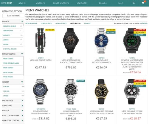
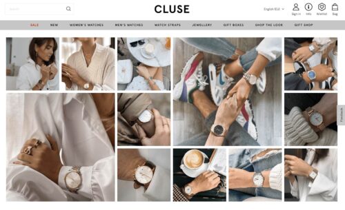
Let’s take WatchShop as an example.
WatchShop knows that watches come in all sorts of shapes and colors, so they created various sorting options to match visitors’ requests. This includes water resistance, strap type, case color, movement type, and so on.
It’s all tailored to match customers’ expectations – and it delivers.
10 best practices for creating and optimizing product listing pages
Now that you know how to design your product listing pages, let’s get into how to optimize them for the best results:
1. Optimize headers or banners
Headers play the “title” role of each category and listing page design.
They’re the main indication of the page’s content and should be treated as the most important thing. If the header does not properly describe the page or the category, visitors will not be able to find what they are looking for.
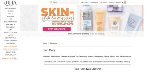
Headers can reinforce your branding, so use the space on the top of your page to create a great-looking banner that engages and informs without adding clutter. In addition, never forget to include your keywords inside your <h1> tags. Not only will this make them more visible on the page, but they’re also a bit part of your on-page SEO efforts that will help you appear higher in search results.
In the image below, beauty specialist Ulta bets on shiny visuals to increase its headers’ visibility. It’s a good solution to avoid “all text” headers that can seem dull at first glance.
Note: headers can also be used as promotional spaces to display featured products, special offers, and discounts.
2. Experiment with multiple layouts on your product listing display
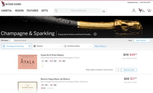
Your product listing display has a significant impact on the way your customers interact with the products. Unfortunately, there’s no easy answer when it comes to choosing between list and grid views. In fact, it all depends on what type of products you’re selling and what experience you want to provide. The most common choices are list view or grid view:
List view
List views require a little more scrolling but can display more product information than a grid. This makes it easy for shoppers to compare product attributes, like dimensions or features. Some sites let customers toggle between a list or grid view, depending on their preferences.
The list view is better suited for products that require extensive information and specifications in order to help customers compare aspects of similar products.
It’s a great fit for technical products like TVs, computers, electronics, DVDs, hardware, etc. However, this isn’t the only time to use list view for your product pages.
If we take a look at the image below, Wine.com sells luxury wines and champagnes. In this case, it’s important that visitors take their time benchmarking the brands and “grands crus” before making a purchase decision.
Notice how they capitalize on the extra horizontal space to display ratings.
Grid view
Grid views allow customers to browse and compare products next to each other. This is a good option if your site is picture-heavy and doesn’t require a lot of description outside the product titles.
Grid view is mostly used for products that rely a lot on pictures and can be compared quickly without paying much attention to the specifications. It also allows for more visual experiences.
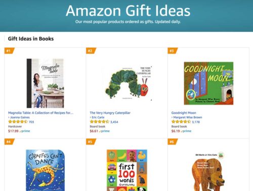
Amazon uses grid view to display products inside its “gift ideas” category. They also use tags to rank the bestsellers and lure visitors into clicking on the products based on their popularity.
3. Add persuasion triggers
Persuasion triggers create a sense of urgency or scarcity. You most often see this on hotel booking sites or the sales section of a fashion store (“Only 1 item left at this price!” or “Selling out fast!”). These labels trigger visitors’ fear of missing out and push them to take action, so be sure to add them to your images to nudge them into making a purchase.
ㅤ
4. Personalize the shopping experience
Personalization can dramatically increase conversions, boost engagement, and help shoppers discover relevant products by sorting them according to their individual preferences. Personalization has also been known to reduce bounce rates by 20-30% and increase customer loyalty.
One thing you can do to personalize the experience for your visitors is to display complementary products that they might be interested in. For example, customers shopping for a new bedspread might also be interested in buying pillowcases or sheets, so steer them in that direction.
5. Use recommendations
If someone is already browsing your product listing page, the chances are that they already have the intent of making a purchase. This is the best time to make suggestions and cross-sell or upsell your products:
Some customers suffer from decision fatigue when they are presented with too many options. Gently recommend popular products, others within the same category and with the same tags, or similar (but slightly pricier) alternatives.
Show customers recommended products that might be relevant to the one they are viewing. For example, clients who are interested in a technical product would appreciate a “People who purchased this product also purchased” section that shows the accessories that go along with it.
Present seasonal bestsellers to add specificity and relevance, which could lead to more clicks and conversions. We tend to think that other people’s actions are the correct ones, so if a product is tagged as “trending,” it gains additional legitimacy that could push a customer to make a decision.
Your navigation has to be tailored to help prospective customers find what they are looking for as easily as possible with as little friction as possible. There are a few tips and tricks you can try, including:
Put your best-selling items front and center: We’ve already touched on the fact that customers like knowing what items others are buying. The most popular options are often seen as the safest ones to buy. Throw in some social proof messages like user ratings to really drive the point home.
Site speed is a crucial factor for UX: Make sure that your site loads quickly on both desktop and mobile devices to ensure that customers have an enjoyable experience.
Ensure that your navigation bar is fixed to the top of the page and organizes your products in a logical fashion.
No matter the level of page depth, navigation always plays a crucial role in the user’s experience – and your product listing page should not be different. Because some products have complex specifications and require extensive sorting options, pay attention to your website’s performance when it comes to sorting products and helping customers find their perfect product.
In the image below, RevZilla does a great job of guiding customers through the endless journey of finding the right motorcycle helmet.
They use their left column to help customers sort and rank products according to several criteria (faceted search):
Color
Type
Shape
Category
Size
Gender
Bonus point: RevZilla provides visitors the opportunity to only display products that have a video review. This is a huge value proposition compared to their competitors.
7. What information to display on your PLPs?
There are tons of options regarding which information you can display on your product listing pages and category pages. Simply put, you need to display information that will effectively help and convince consumers to move down the funnel and make a purchase.
In order to help you choose, here’s a list of information that may be displayed on your product listing page:
Star ratings
Discounts
Color options
Stock availability
Best-sellers
Add to cart
New / Used
Short descriptions
As an example in the image below, BestBuy does a great job of providing useful information on its product listing page. Besides the pictures and the price, they also added: star ratings, discounts, and an add to cart button with a smart color hierarchy.ㅤ
8. Optimize SEO for product listing pages
SEO is a big deal for most e-commerce players. In fact, search engine traffic accounts for around 50% of all e-commerce traffic according to a 2023 study led by SmartInsights.
There are two main reasons that justify the dominance of product listing pages regarding SEO:
A. Product listing pages are keyword-rich
Because they contain the names, brands, prices, specifications, and descriptions of products, category pages tend to be keyword-rich. This means that they naturally rank for a lot of keywords in search engines.
B. Product listing pages are the most heavily linked to
Product listing pages are typically where you want your customers to start their journey (or alternatively on the product page itself), which is why SEO pros tend to focus their efforts on these pages. Besides this, all products within a category generally link back to that category, which is a strong internal link-building pattern.
Tips for optimizing SEO on your product listing pages:
Optimizing your title tags
Using unique and original product and meta descriptions
Linking to internal pages
Using image alt attributes and rich snippets
9. Should you use Quick View or add-to-cart buttons?
Quick View is an e-commerce function that allows visitors to generate a miniature version of the desired product page. In other words, it’s a mini product page that generally embeds a direct “add to cart” button.
Not all products require lengthy deliberation and consideration before making a purchase, especially for returning customers or others purchasing fast-moving goods like groceries. Creating add-to-cart buttons makes it easier to speed through the checkout process. You can also implement add-to-wishlist buttons for more complex or expensive items to maximize conversions.ㅤ
10. Use clear and concise CTAs
Call to action buttons can have a massive impact on your conversions. When Dutch watch brand Cluse noticed that their product listing pages had high bounce rates (and that clicks to the product display pages were low), they turned to AB Tasty to find a solution.
Cluse set up a simple test to see whether changing their CTA’s location and color would improve the results. The team’s hypothesis was correct, and the site saw a 2.39% increase in the click-through rate to the product display page and a 1.12% uplift in transactions during the three-week test.
Examples of effective product listing pages
ASOS
ASOS uses short but descriptive copy on their product listing pages.
The clothing retailer’s product listing pages are categorized by trends and style. They use extremely simple copy and appealing photographs to convince shoppers to make a purchase. Users can add items to their wishlist or cart directly from the product listing page and check out using the simple navigation banner.
Everlane
Everlane uses quick add-to-cart buttons to optimize their product listing pages
Everlane uses a number of features from the best practice guidebook, including adding product size options as an overlay in the image, easy navigation using the grid view and sidebar, and quick add-to-cart buttons.
Walmart
Walmart uses compelling headers and content on their product listing page.
Walmart puts bestsellers on top of their product listing pages, Walmart puts bestsellers on top of their product listing pages, along with engaging headers that feature collections by influencers like Sofia Vergara and Kim Kardashian. They also use quick add-to-cart buttons to make it easier to shop. The copy is clear and concise, and users are able to comfortably scroll through galleries of attractive images. Returning users are greeted with a warm, personalized message.
How many products per page and per row to display on your PLP?
If you opt for a grid view template, there’s no doubt that you’ll eventually come to the question, how many products per row?
As for choosing between list view and grid view, there’s no single answer that will fit everyone’s needs. In fact, the number of products displayed per row depends on 3 main factors:
Image size – If you choose to display big, high-resolution images; there’s no doubt that you will have a hard time squeezing more than 4-5 products in a row.
Number of products – The number of products listed per row also depends on your total number of products for a given category. If you only have 12 products to display, it’s a lot more coherent to opt for a 4X3 grid structure rather than 2X6. You need to fill the page visually.
Volume of information – Not all products are considered equal when it comes to their product description. Some products natively require more information than others. The more space they need, the fewer products you will display.
In the image below, Canada Goose, a high-quality outerwear provider, relies on a 2-products-per-row structure. This strategy highlights the visuals and delivers a more premium feeling to the user’s experience.
How to find what works best on your product listing pages?
A/B test your product listing pages.
There is no secret when it comes to Conversion Rate Optimization (CRO) – testing is what makes it work. The recipe for success doesn’t change for your product listing pages, you just have to A/B test them.
Now the question is, how can you do that? We have great news for you: we’re A/B testing specialists.
Making a good product listing page isn’t easy. You will have to identify elements that work and elements that don’t to gradually increase your conversions and offer an overall better user experience to your customers.
Want to start optimizing your product listing pages? AB Tasty is the best-in-class experience optimization platform that empowers you to create a richer digital experience – fast. From experimentation to personalization to smart search and recommendations, our solution can help you activate and engage your audience to boost your conversions.
Conclusion: The ultimate product listing page
Product listing pages can be conversion machines. When they’re properly optimized, they’re key for delivering an exceptional customer experience, helping you rise to the top of search engine results, and increasing basket size.
Whether you’re a seasoned seller or are venturing into the world of e-commerce for the first time, it may seem overwhelming to hit all the right notes – and find the best ideas to take your product listing pages to the next level!
Creating product listing pages will look a bit different depending on your market sector. However, for maximum performance, keep these best practices in mind for your e-commerce brand.


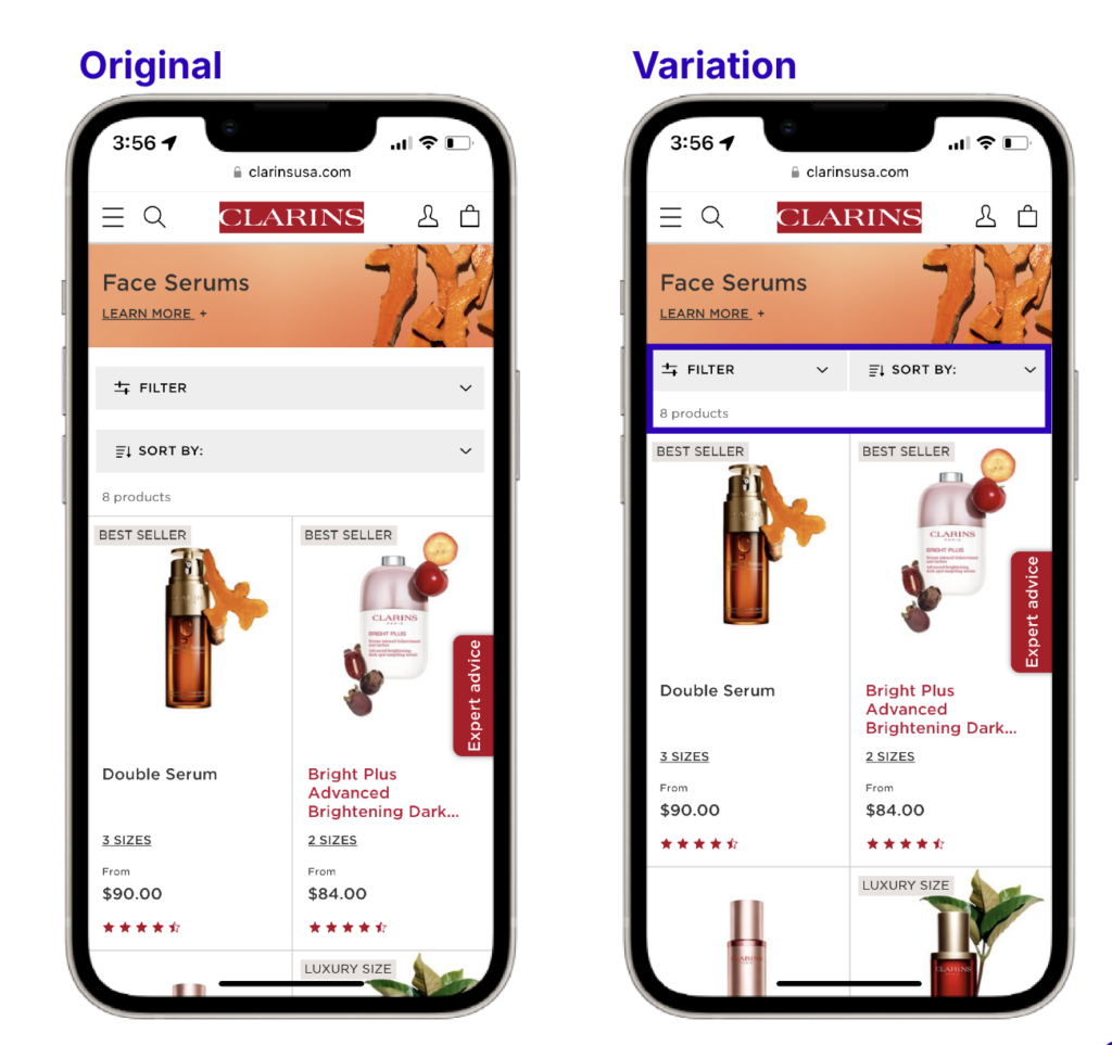

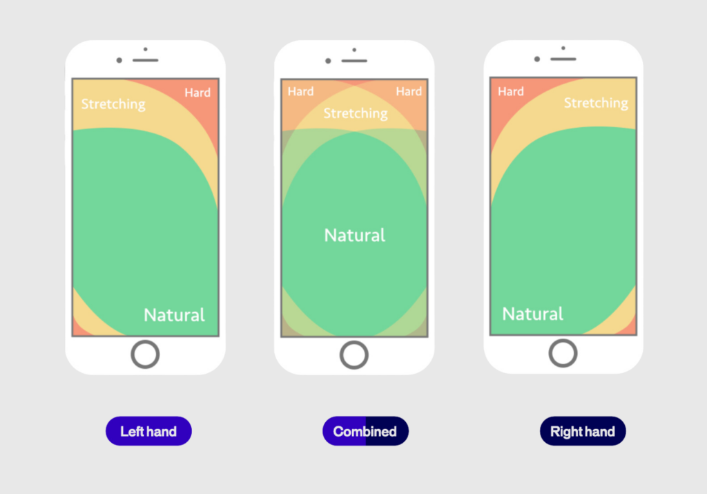
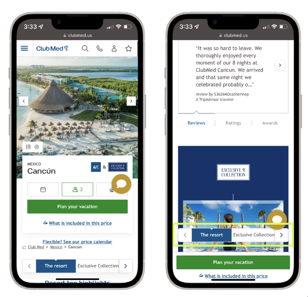
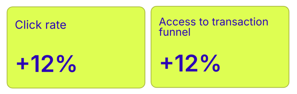
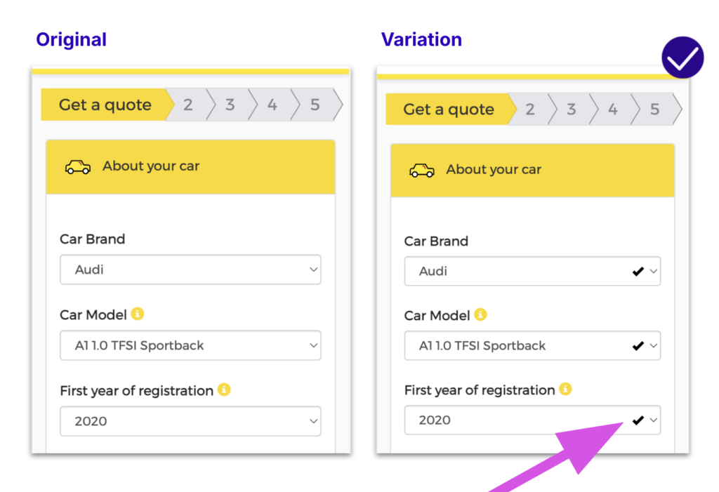


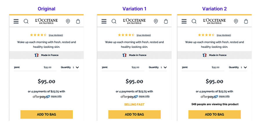
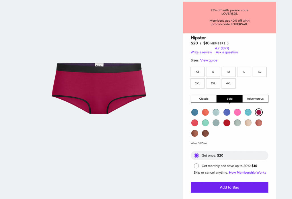
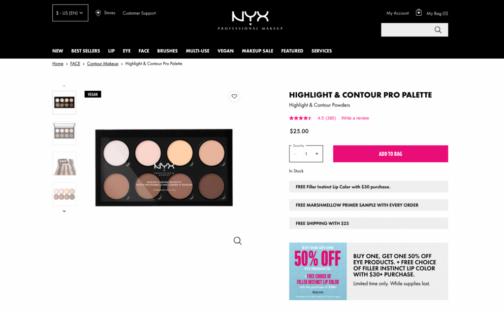

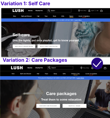
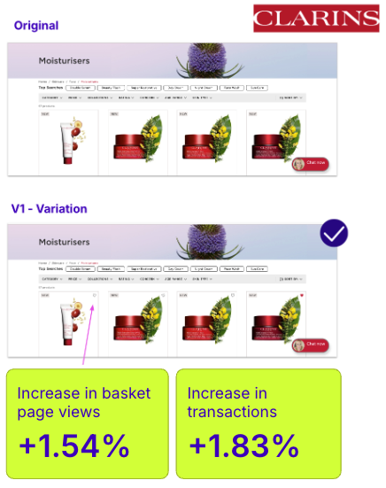
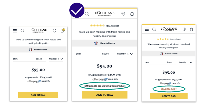
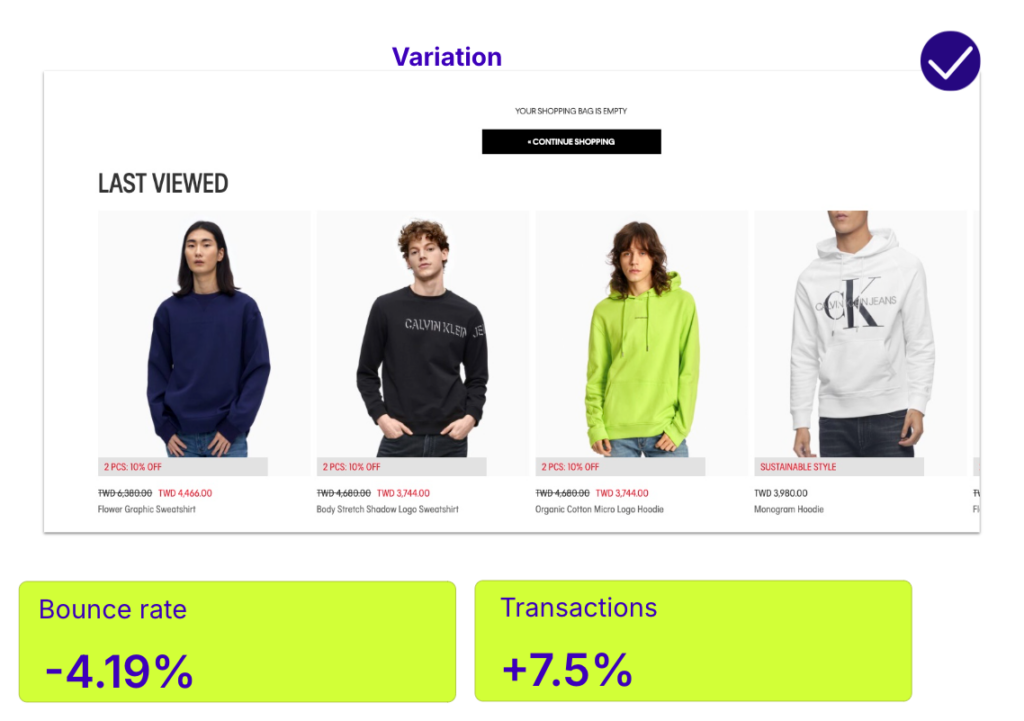
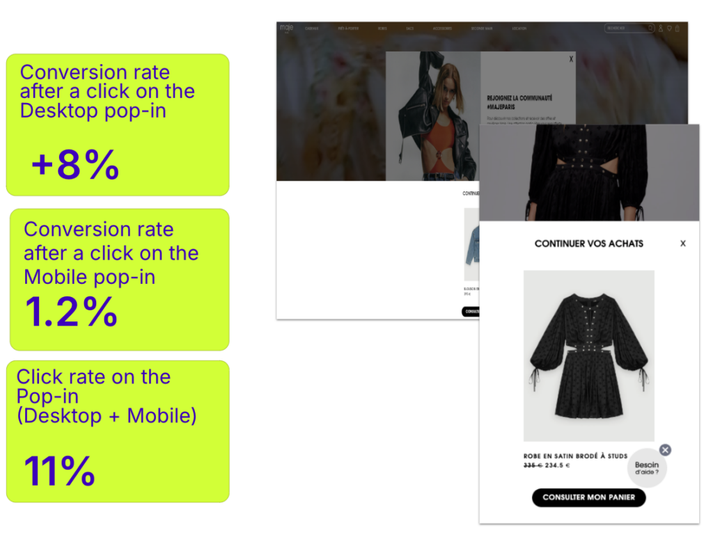
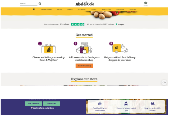
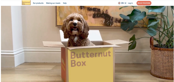
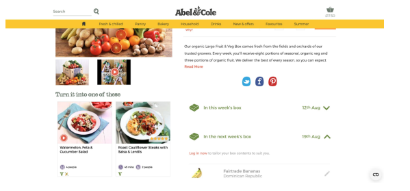
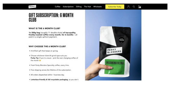
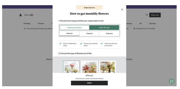
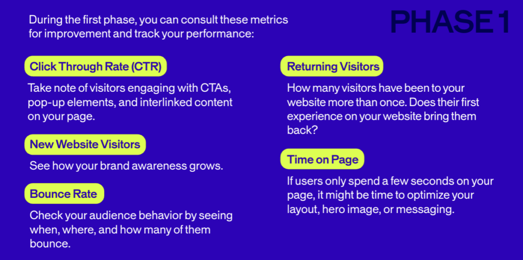

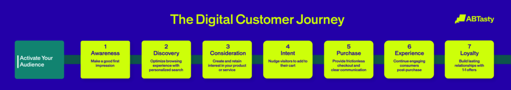


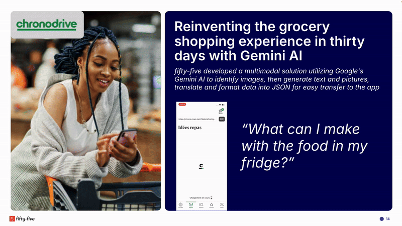
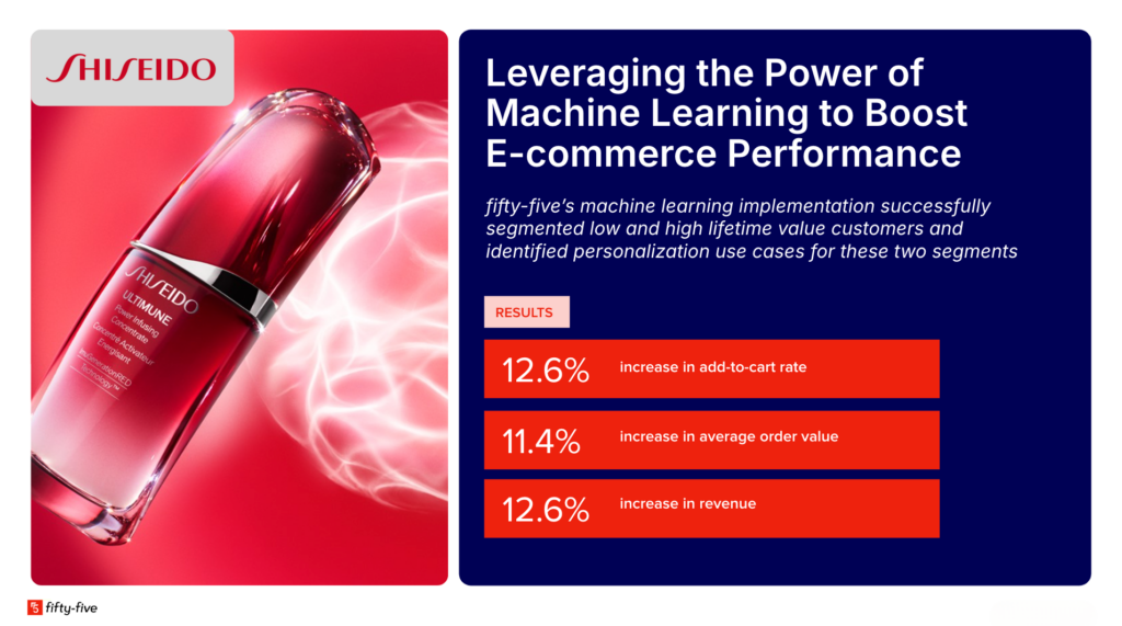
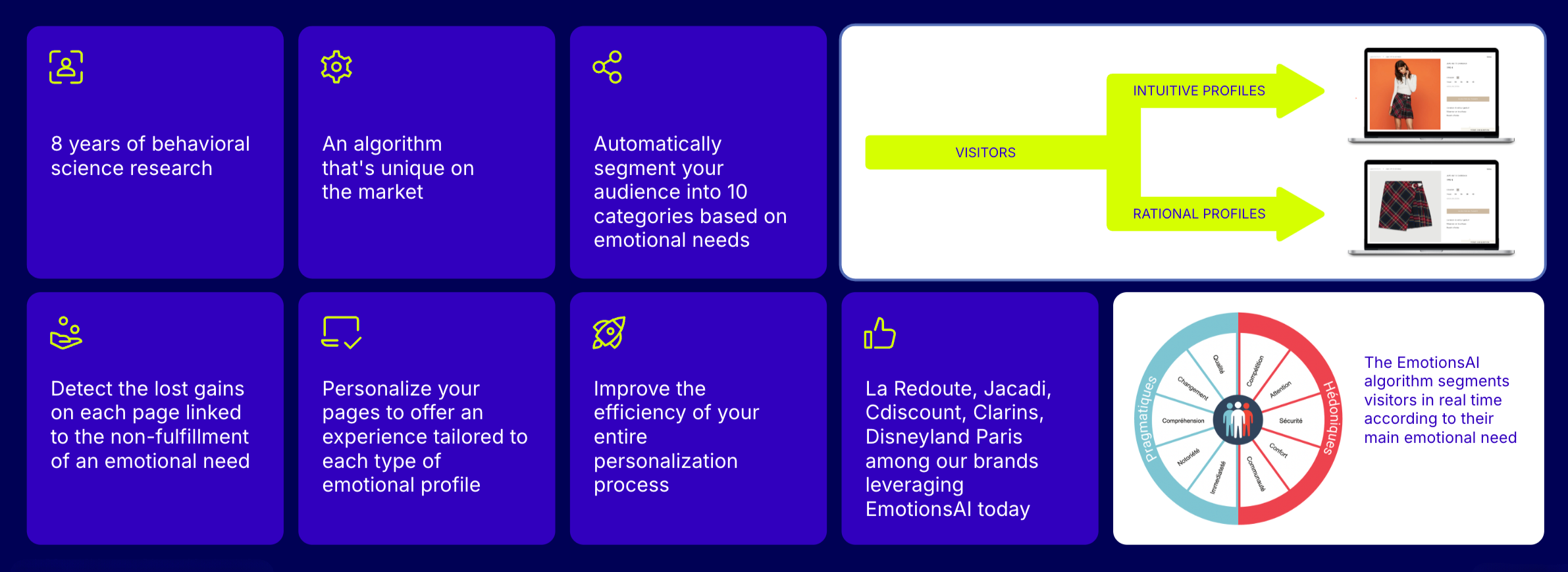
