As organizations increasingly adopt an Agile methodology into their software development processes, this means that teams are now releasing more frequently in smaller batches.
Therefore, changes are being merged into the mainline multiple times a day making it difficult to determine when changes are actually being rolled out.
The developers usually aren’t the only ones who need to know about the release of new changes or features. Product teams are also just as involved in the release process.
As we’ve seen in our release management guide, the product manager is the one who plans releases and will oversee the feature or product as it moves through the different stages of the software development life cycle.
With such frequent releases, things can become highly stressful. Fortunately, nowadays, teams can automate these processes, freeing them up to focus on more important and less repetitive tasks.
One such software is the Jira platform that can contribute to better, more efficient releases.
In this article, we will look into just how you can incorporate Jira software into your release management process to help improve collaboration and communication between your teams.
Jira software overview
First, we will start with a quick overview of Jira software. Created by Atlassian, this software helps you plan, track and release software in software development projects.
It is one of the most popular tools used by Agile teams to manage their releases by offering all team members full visibility over the release process, enhancing collaboration between engineering and product teams to plan and track releases and increase productivity across the organization.
Initially, this software was developed to track issues and bugs and has since evolved into a work management tool for a wide range of use cases.
When it comes to product management, Jira can be used to build roadmaps for each project allowing teams to track and share their progress for the roadmap.
Jira takes a customer-centric approach when it comes to designing projects and it’s highly customizable making it a popular tool among Agile teams to incorporate into software development processes.
Getting started with Jira
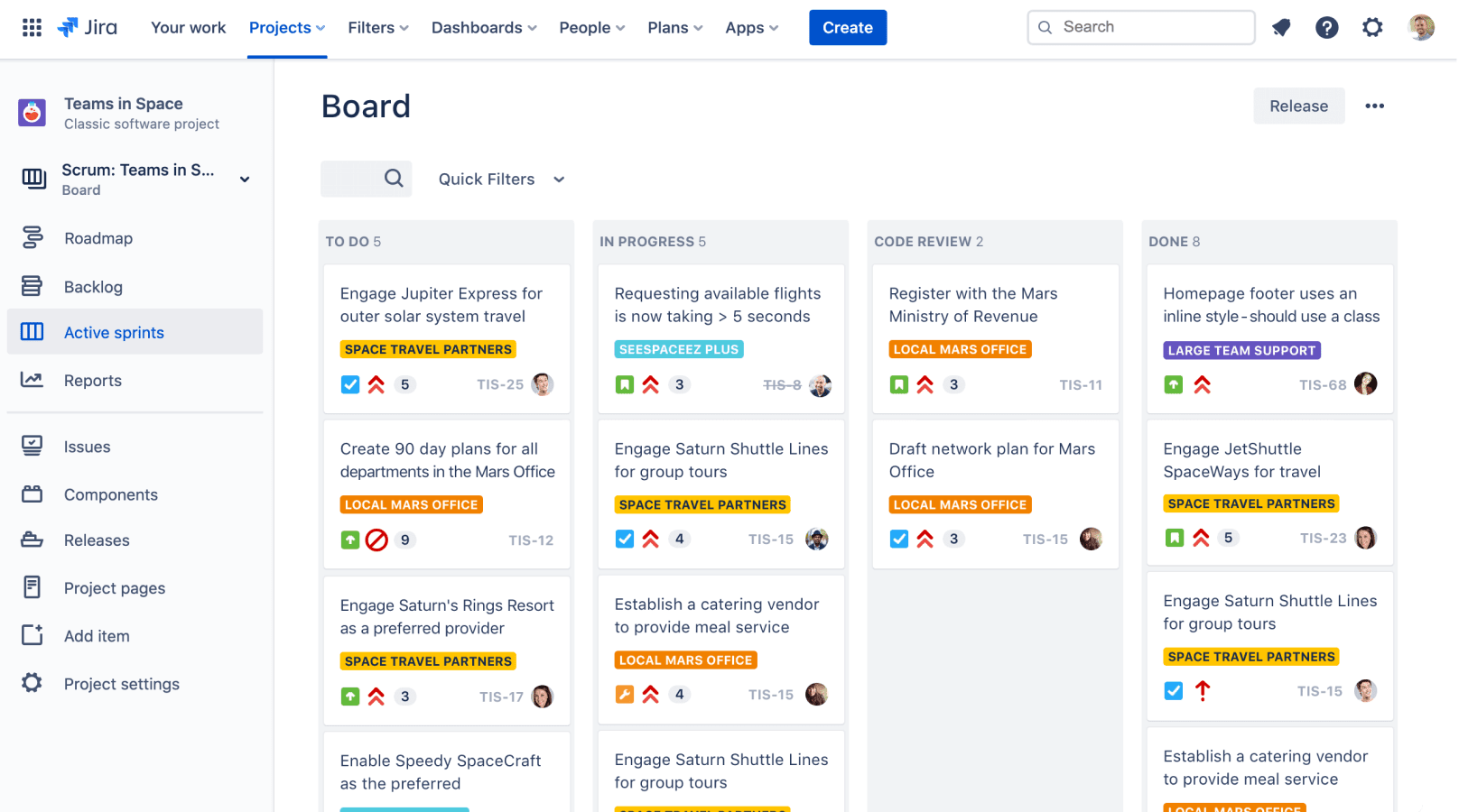
You will start by creating a project, where you will pick a template depending on your team’s requirements. You can choose from scrum, kanban and bug tracking. For every project, Jira creates a board to help you see a visual representation of your work.
Before you create a project, consider how you will organize your projects. The best way to do so is to organize your projects according to how your company runs; whether, for example, you’d rather organize by product if you’re constantly releasing software or if you’d rather organize by team.
To manage releases in Jira, the first step is to create a version.
To do so, click on ‘Releases’ as can be seen in the image above, where you will be prompted to create name, start & end dates and description.
You can then assign any issue type to the releases to track their statuses throughout their life cycle.
The release could contain tasks with different statuses such as in progress or closed.
Better release management with Jira
Jira issues
An issue is a work item that can be tracked throughout its life cycle. It can, for example, be a product feature or software; issues are essentially the building blocks of your Jira software project. It can also be referred to as a task, request or ticket.
Jira issue allows you to track individual pieces of work that should be completed. Thus, it notifies your team of any updates by allowing them to track the issue and lets them know if there are any comments or of any change in update status.
Jira workflows
Jira provides a way to customize the way issues transition through the development phases, also referred to as workflows. These can be customized to suit the needs of your project.
Since the Jira platform is flexible, you can add more statuses to track which issues are included in a specific release.
The default Jira platform has three default statuses:
A few more statuses can be added to help teams track the status of their work more precisely. Thus, more statuses can be added such as:
- Awaiting release
- Ready to merge
Once your team becomes more comfortable with the basic workflow, optimize it by creating statuses for each type of work in the process. Build, design, development, code and test can all, for example, be individual statuses, which can then be shared with the rest of the organization.
Roadmaps in Jira
In our release management guide, we mentioned how essential a product roadmap is to ensure the success of your products.
Roadmaps in Jira help teams see the bigger picture when it comes to their work and how they’re contributing to larger business goals.
Thus, a roadmap will help illustrate your team’s strategic vision to all relevant stakeholders. It gives your team a single, shared source of truth that outlines the direction and progress of a product or team over time to ease cross-team communication and help release more predictably.
Advanced Roadmaps in Jira loads your Jira issues into your plan and suggests releases you can work with, allowing you to track the progress of your releases and determine if they’ll be completed on time.
Tracking releases
You can run a release report in Jira at any time. This report will show you how many total issues there are in the release broken down by how many are in progress or completed.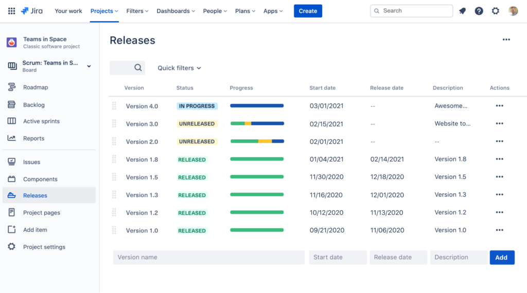
Jira and feature flags
It is possible to apply feature flags to Jira issues. There, you would be able to monitor your flag’s rollout status from your Jira issue. You would even be able to roll out a feature to a certain subset of users.
Feature flags at their simplest level are if/else statements that allow you to decouple deployment from release giving you more control over the release process so that you can ship changes in code confidently and safely.
Using Jira for feature flags has many advantages, primarily allowing teams full visibility over what features have been released or in the process of being released, all from a single place. Thus, it fosters collaborations so that teams can work together efficiently.
Connecting Jira to feature flags gives your team immediate insight into the status of releases once they are deployed. Teams then would be able to see which feature flag has been turned on and which percentage of users have access to it.
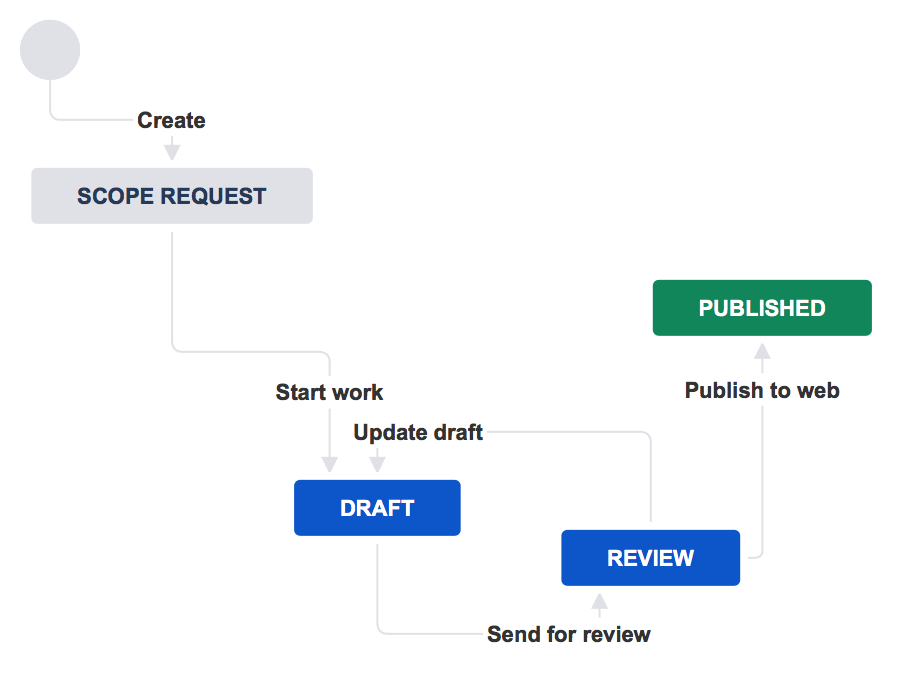
Therefore, you can create a workflow around feature flagging to track the state of each flag. This means that each time a flag is created, an issue in Jira is automatically created and as the flag is rolled out, the issue in Jira automatically moves through the workflow as can be seen in the image below:

Data from Jira issues allows teams to see if there are any bugs in the feature so that they may be immediately fixed before rolling out the feature to the rest of your users.
Additionally, Jira helps reduce technical debt as it enables you to develop rules of governance for feature flags so that your team knows once a flag is rolled out to 100% so that it may be removed from the system.
In other words, whenever a new feature is added to the codebase, you can assign cleanup tickets to engineering or product teams.
Conclusion
The automation capabilities that Jira brings to your releases is essential especially when it comes to managing multiple complex projects.
With feature flags, developers can have even more control over their releases so that they may launch new features quicker than ever before while receiving direct insights from their releases.
Jira as a whole allows you to manage releases according to your unique needs and objectives. It also facilitates an Agile methodology within your organization by creating Agile workflows to help release high quality software faster.
Overall, using releases in Jira significantly improves your tracking and reporting allowing you to have better coordination and planning across your releases.


 Chad Sanderson (Convoy)
 Jonny Longden (Journey Further)