How do you grab a customer’s attention when our world has us on digital information overload?
Capturing attention and standing out in a market saturated with so many options is a challenge now more than ever. To overcome the digital noise, many businesses are aiming to enhance the customer experience with two approaches: customization vs personalization.
What’s the difference between customization and personalization? Are they two terms we can use interchangeably or are they two entirely different concepts?
You guessed it – customization and personalization describe two very different, but not entirely unrelated, practices. Though not the same, (mass) customization and personalization strategies revolve around people’s deep-seated desires for self-expression and recognition – as well as their limited attention spans in a loud, digital world.
Let’s take a deep dive together into the sea of information we have about customization vs personalization.
What’s the difference between customization and personalization?
Customization and personalization are often thought of as synonyms, but while some crossover certainly exists, they are very different terms referring to very different practices. They overlap in their ability to make the customer feel as if they have a unique relationship with the brand in a way that the mass marketing of the past could never achieve.
Both practices have proven particularly well suited to Millennials, the largest consumer age group, who have an instinctive mistrust of older forms of advertisement but are more influenced by both customization and personalization-based marketing. So what exactly are the differences and how do they work?
Customization Definition: Giving the power to the users
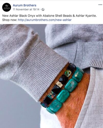
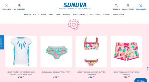
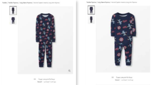
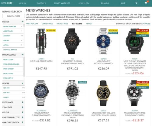
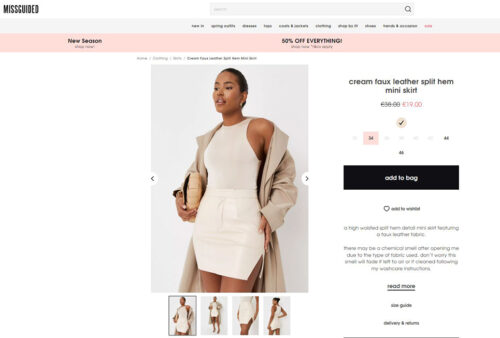
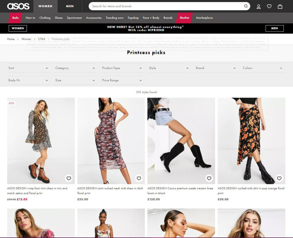
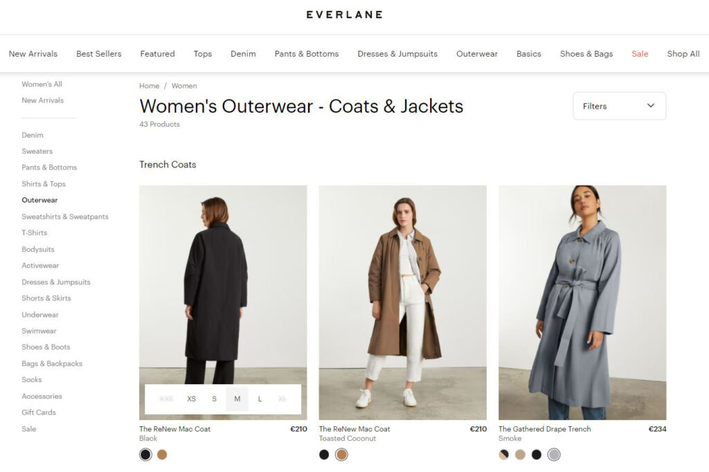
The most common form of customization comes in the form of product customization and is typically found online. Product customization is particularly popular for clothing outlets, whereby shoppers can design a piece of clothing from an online template, using different colors, fabrics, and shapes to make their own ‘unique’ product.
Customization examples:
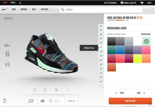
Nike is one of the most important innovators in the field, allowing you to customize every aspect of your sneaker.
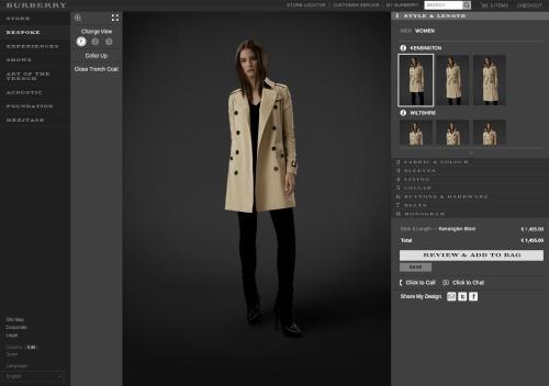
Another brand that has used product customization to great effect is Burberry, which has gone from strength to strength in recent years, partly due to being an innovator in the field of product customization.
This is sometimes referred to as ‘mass customization’ whereby online tools allow the customization process to produce bespoke products at mass-produced prices.
What is mass customization?
Mass customization is all about customer experience, sometimes referred to as CX, which marks an enormous shift from shopping habits that were once almost entirely about the product.
Interacting with brands and producing individual styles, or at least appearing to, is at least as important to Millennials as the functionality of a product, and there is little reason to think that subsequent generations will not have similar expectations in the future, especially with technology becoming so ubiquitous and powerful. Wherever retail goes in the near future, CX is going to be an essential part of it. While the cutting edge of customization is not a major preserve of older generations, the need to keep such platforms simple and easy to use should not be ignored.
One of the issues facing businesses offering product customization is how quickly can each purchase be produced? Convenience is also thought to be a major concern for shoppers in the 21st century, and patience is not seen as a virtue. This goes to the heart of the customer experience and will likely inform how successful the model is for each business. The more complex mass customization becomes, the larger on-demand mass production will be.
One thing is for sure, what was once the preserve of the burger joint or ice cream parlor, customization is fast spreading to all aspects of retail, and as a result, is changing everything.
Personalization Definition: Tailor your user’s entire experience
Personalization is one of the most misunderstood marketing terms of all.
Often misunderstood for customization, recommendation, and even optimization, it is instead a set of well-defined practices with an overall purpose or goal. Unlike customization, which offers a very specific set of tools for customer interaction, personalization has far-reaching methods and possibilities and is currently at the very beginnings of its potential. It also touches upon issues of privacy, politics, and generational divides.
In the broadest sense, personalization is marketing designed with the individual in mind. Obviously, there is no single human observing individual tastes to present products or services that are most relevant. This is where highly sophisticated algorithms come in.
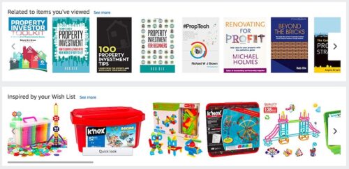
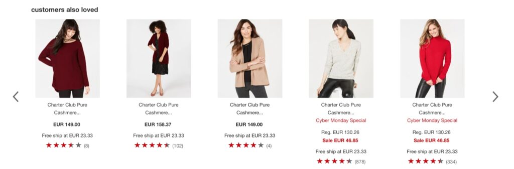
One type of personalization is the recommendation engine, although it should be noted that personalization is not a type of recommendation. The most common of these are websites and streaming services, such as YouTube or Netflix. If you have ever used these sites you will know that certain box sets or videos are recommended based on previous viewing habits. To begin with, these were obviously connected programs.
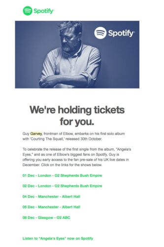
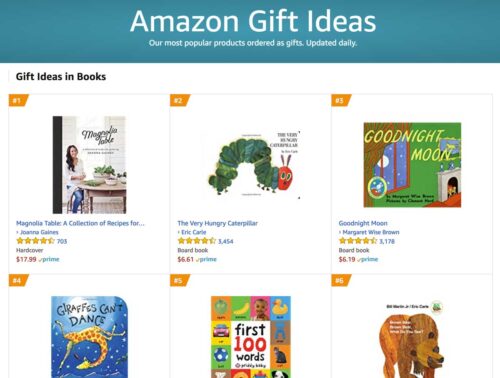
For example, if you had watched a basketball documentary, there’s a good chance that one on baseball would interest you. So far, so simple. But, as recommendation engines become more sophisticated, seemingly unconnected content works just as well. The same type of algorithms are used in retail, most famously by Amazon, and include Email campaigns that are tailored to the individual and addressed personally. This is the beginning of personalization.
Personalization also uses segmentation, for example, individual traits, such as age, gender, or location, all of which can profoundly change how marketing information is presented. Beyond that, a person’s politics, browsing behavior, and even ethical concerns can be taken into account.
We should pause here to consider the two main versions of personalization, rule-based and machine learning.
- Rule-based personalization relies on the previously mentioned segmentation model, whereby the audiences are broken down into both broad and granular segments, such as age or location.
- Machine learning personalization, on the other hand, uses algorithms. These can be those used in recommendation engines and even parts of segmentation marketing, such as behavior.
Whereas basic algorithms can provide broad data, such as what is trending, recommendation engines, and the like, provide more in-depth information for the individual.
Personalization vs customization in e-commerce
Customization can come in many forms, from fast food restaurants that encourage customers to design their food their way, to online stores that allow visitors to design their own clothing.
Personalization, on the other hand, is a far more complex practice that takes into account customer (or potential customer) behavior in order to market the right products, to the right person, at the right time. Using big data and powerful algorithms, personalization is becoming a more powerful tool every day, with a diverse number of businesses implementing it to great success.
Getting the most out of both practices requires an understanding of how they both work and the major differences between them.
You can certainly see the similarities between customization and personalization:
- Both aim to make consumers feel uniquely understood and marketed as individuals.
- Both put a high value on self-expression and personal tastes and experiences.
- Both create the illusion that consumers are being given white-glove treatment and have a one-on-one relationship with the brand.
- Both, in a way, involve the consumer as a co-producer of value – for customization, it means relying on their predilections to craft the product, and for personalization, it’s sharing their data (unbeknownst to them or not) to create personalized marketing messages.
Ultimately, through a product strategy on the part of the company, mass customization is driven by the consumer. Especially appealing to Millennials, it’s a way of validating their own sense of self through ‘build-a-bear’ style product production.
With personalization, the onus is much more on the company to bring value and deliver meaning to the consumer audience they’re targeting.
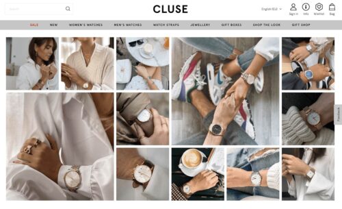
People naturally crave to be in control of their surroundings and personalization techniques create a cherry-picked environment that feeds into that need. Bargain hunting for low-priced kitchenware from your favorite outlet? If ads for the very items you’re looking for suddenly appear all over the internet, it somehow creates a feeling of empowerment, as if in some impossible way, your wishes and needs automatically manifest.
As for information overload, this is the classic argument that contemporary consumers are exposed to a dizzyingly high number of marketing messages, far too many to consciously register, remember, or act on. Personalization strategies both (hopefully) limit the number of marketing messages a consumer is exposed to in the first place, as well as stimulate the brain to recognize these stand-out strategies, as opposed to letting them sit in the background of our consciousness. This is the idea of selective attention or the fact that your brain will automatically pick up on potentially important stimuli – i.e. those most relevant to you.
Web Personalization And Privacy Concerns: Customization and Personalization
Privacy is a major concern for many consumers and personalization has sometimes seemed more like an unwelcome stalker to some as a result. With legislation being debated in various corners of the world, what is deemed as overstepping the mark should be a concern for all.
All generations have some concerns regarding personalization and privacy, not helped by various data leaks and hacks of major companies. The truth of the matter, however, is that personalization shouldn’t be “creepy.” Transparency is a great way to instil trust with customers. Personalization need not be a back-door practice, where using personal data is hidden behind jargon and misleading declarations. Most website visitors are happy to share data as long as they know how it’s being used, especially if there is some advantage in it for them.
Being able to opt-out is another great way to make customers feel as if they have some control over the process. In some cases, the personalization process itself can be customized. While most users won’t bother engaging, they will appreciate the option to.
Evolution From Mass Marketing To One-To-One Marketing
Mass marketing is where a product or service is marketed to an entire population. It essentially treats everyone the same, with the same needs. Although that is clearly not the case, the philosophy revolves around the idea that the more people who receive the message, the more likely you will reach someone who is interested. It’s essentially the practice of selling low-cost and homogenous items at high volumes. While it’s more miss than hit, mass marketing was well suited to mass media markets, such as television, which had the majority of the population engaging with it on a regular basis.
Mass marketing began in the 1920’s, with the advent of radio. The popularity of this form of media made it ripe for advertisers to market products in a way that wasn’t possible before. As attitudes shifted over the decades, mass marketing’s influence rose and fell until the 1980’s and 1990’s, when it reached its peak.
History of mass marketing timeline:
- 1920’s – Begins with the advent of radio
- 1930’s – The great depression reduces its influence
- 1940’s and 1950’s – With income rising, its effectiveness becomes relevant again through the “Mad men” era
- 1960’s and 1970’s – A rise in anti-Capitalism sees its influence wane again
- 1980’s and 1990’s – The peak years of mass marketing during the economic boom
The history of one-to-one marketing is essentially a history of the Internet. When the first HTML dialogue occurred on Christmas Day, 1990, it set in motion the beginnings of personalization. Also in 1993, Webtrends was founded, which was essentially the first commercial web analytics program. Unfortunately, only those well-versed with the technology had any idea of how to read the data, so its effects were minimal.
Things carried on at pace, however, and log file analysis made it possible for non-tech people, most importantly marketers, to make use of the data. This was soon followed by hit counters and Javascript tagging, which became important as the Internet began to use more imagery. With few people using the Internet, however, the advances made during this time were not to be truly helpful for a few years to come.
It wasn’t until 2004 that the type of web analytics we know today began to appear and by 2005 Google had released Google Analytics. This allowed website owners to dig further into the data than had been previously possible, with concise visuals that allowed for easy reading of in-depth information. It’s at this point that personalization becomes more tangible, with conversion rate optimization becoming a particular focus.
Machine learning personalization, such as recommendation engines, soon began to be useful in a way that was not possible before, as algorithms began to exponentiate their capabilities, with Amazon and Netflix leading the way. From Email campaigns to accurate predictions of preferences, the practices of personalization became ubiquitous by 2008.
Mouse tracking and eye tracking also added profound data that improves visitor experience and thus increases interaction. With a deeper understanding of customer habits, personalization is beginning to become more accurate, focused, and effective.
With the advent of multiple devices using the Internet, Google released Universal Tracker in 2012. With more profound data at its fingertips, demographics, behavior, and lifestyle began to be segmented more accurately, further categorizing customers for more predictable results. App personalization becomes more and more important as phone use begins to outstrip laptops/desktops for online use. Machine learning on mobile soon improves.
Soon after, personalization magnifies the effectiveness of CRM (Customer Relation Management), which focuses on user experience and customer retention. This only becomes possible as big data is collected at ever higher rates, allowing companies to truly understand their customer’s needs.
With the use of A/B testing, the future of personalization is now highly managed from beginning to end. No longer is trial and error at the forefront of designers of websites or marketing campaigns. Behavior on site is monitored to a level thought unimaginable just a few years ago and personalization is becoming truly individualized. User experience is now at the heart of personalization, and with the likelihood of more powerful algorithms and customer understanding to come, personalization seems to be very much in its infancy.
Optimize to find your better.
Good things come to those who change.
How to start your personalization strategy
Website personalization shouldn’t be a complicated undertaking. In fact, it is becoming easier, and therefore more widespread, every day. With several tools at a business’s disposal, there are many ways to go about creating personalization that works for each business. In other words, personalization should be personal for each business using it.
The first place to begin is getting to know an audience. Too many start with the concept that the product is key and then try to persuade an audience that they are right. This is similar to a waiter insisting that the customer has made the wrong order when they chose the duck and bringing them beef instead. As should be clear now, customer experience has become one of the most important aspects of personalization, and that cannot be achieved without getting to know exactly what it is your customer expects from the interaction with your website.
Want more on personalization? Read our E-book: Your Guide to Personalization
What’s Better: Personalization or Customization?
You want your customers to feel unique and have a positive experience with your brand. For you, this could mean implementing personalization tactics or dabbling into the world of product customization. Bettering your customers’ experience could mean focusing on customization, personalization, or a mixture of both. If you design your roadmap with your customers in mind, you’ll find customer loyalty and satisfaction along the way.